Employee Dashboard
Pietro Macorig
Data analysis
This dataset contains information about the employee, such as attrition rate, job satisfaction, and other useful KPIs that track how the employee feels inside the company. Because of the quantity of information, I immediately understood that a single sheet wouldn't be enough, so I decided to make a two-sheet dashboard.
Data Visualization
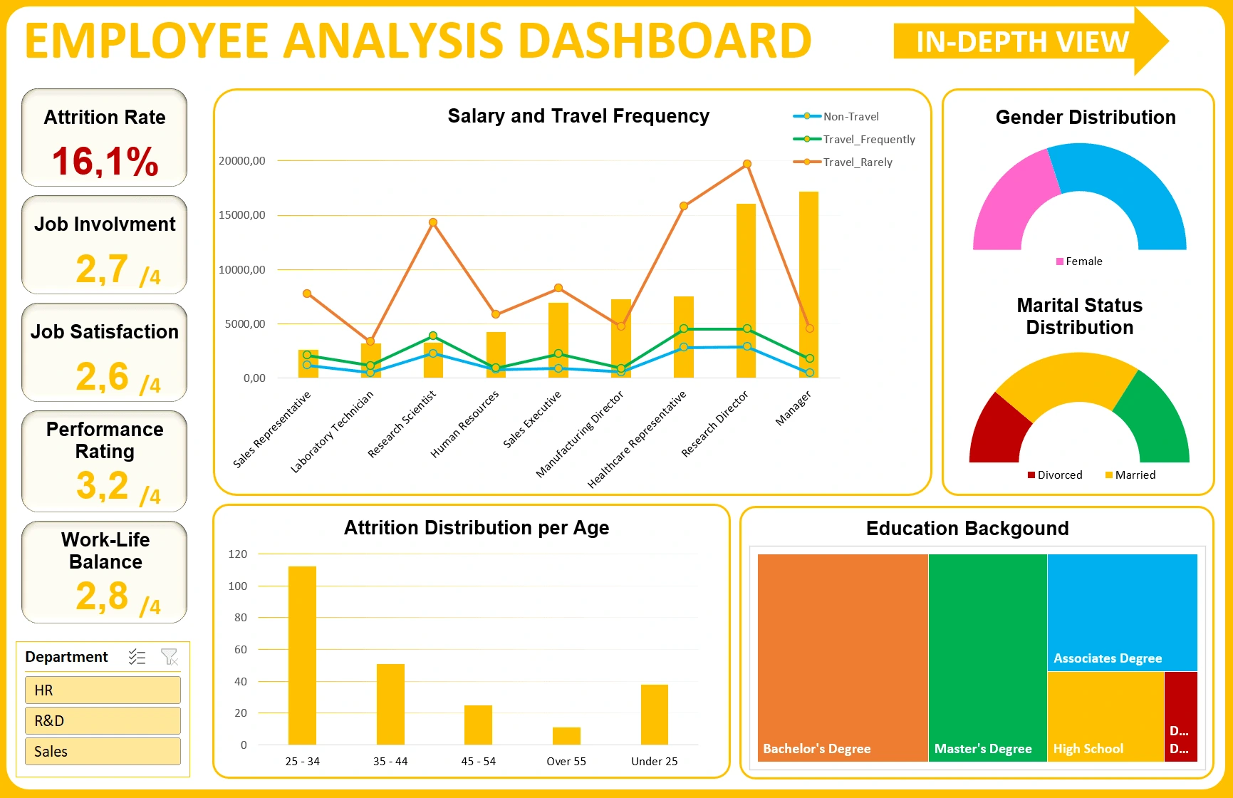
First sheet
For a question of space, I merged two graphs into one, representing the mean salary and the travel frequency per role.
I then added the attrition distribution per age, gender, marital status, and educational background distribution.
Second sheet
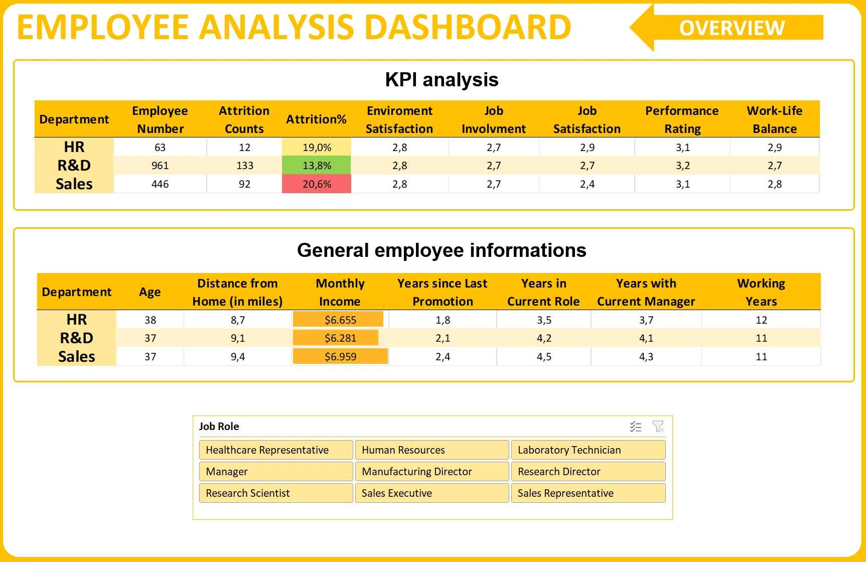
All the information displayed before, and the remaining ones, are visible on the in-depth table view, which can be opened from the left upper corner arrow. This sheet presents two linked images that refer to another table on a support page, the fact that they’re linked implies that, as filters are being applied, the data refreshes.
Like this project
Posted Mar 30, 2024
Two-sheet dashboard for KPIs and employee information
Likes
0
Views
23