Supermarket Sales Dashboard

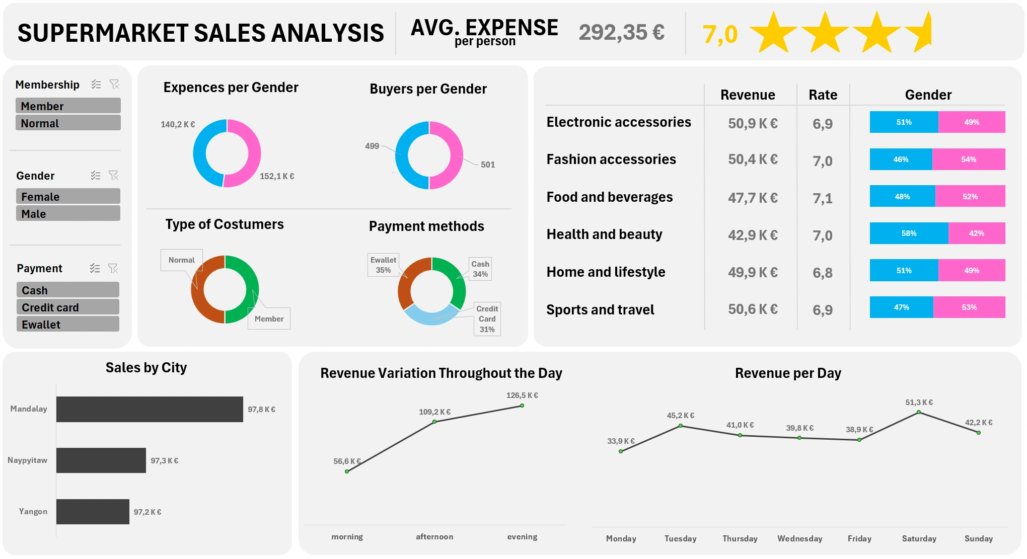
Final dashboard
Data cleaning/processing
I started by cleaning the data. The source had several decimal and calculation errors, so I added corrective columns that I programmed to use later with Pivot Tables.
Data analysis
I tried to imagine what the final dashboard could look like and created the related Pivot Tables. For the table on the right, I had to create three different pivot tables and utilize different formulas.
Data visualization
Then, I put all the work together and delivered the final product.
I decided to put the average spending for a single bill on the top of the dashboard, with the related rating of the experience. Right after, four ring charts are displayed to help the store manager understand what type of customer they are dealing with.
Another piece of information that I thought could be useful was the revenue, rate, and gender distribution per store unit so that the managers could know where to invest more or less.
The dashboard finishes with a revenue chart per city, per day, and per moment of the day. This can help the cashier supervisor understand how many cash registers need to be opened.
Like this project
Posted Mar 28, 2024
Supermarket Sales Dashboard, enriched with data filter, charts, and stars rating system. Starting from data cleaning all the way to data visualization.
Likes
0
Views
16


