ProVita Digital Transformation: One Brand, Dual Experience

Ekene Smart
1 collaborator


Marketing website demo
ProVita – One Brand, One System, Two Digital Experiences
Rebranding a fertility hospital and building a connected digital experience for patients.
Timeline: September 2026 – Ongoing
Status: In Progress
Role: Brand & Product Designer, Webflow Developer
Client: ProVita Specialist Hospital, Tema, Ghana
Deliverables: Brand Identity, Design System, Marketing Website, Patient Portal, Hospital Management System
Tools: Figma, Webflow, Claude, ChatGPT, GSAP
Overview
ProVita Specialist Hospital is a healthcare institution based in Tema, Ghana, providing fertility care, women's health services, diagnostics and specialist surgery.
Despite decades of experience in healthcare, its digital presence didn't fully communicate the quality of care, expertise and reassurance patients needed.
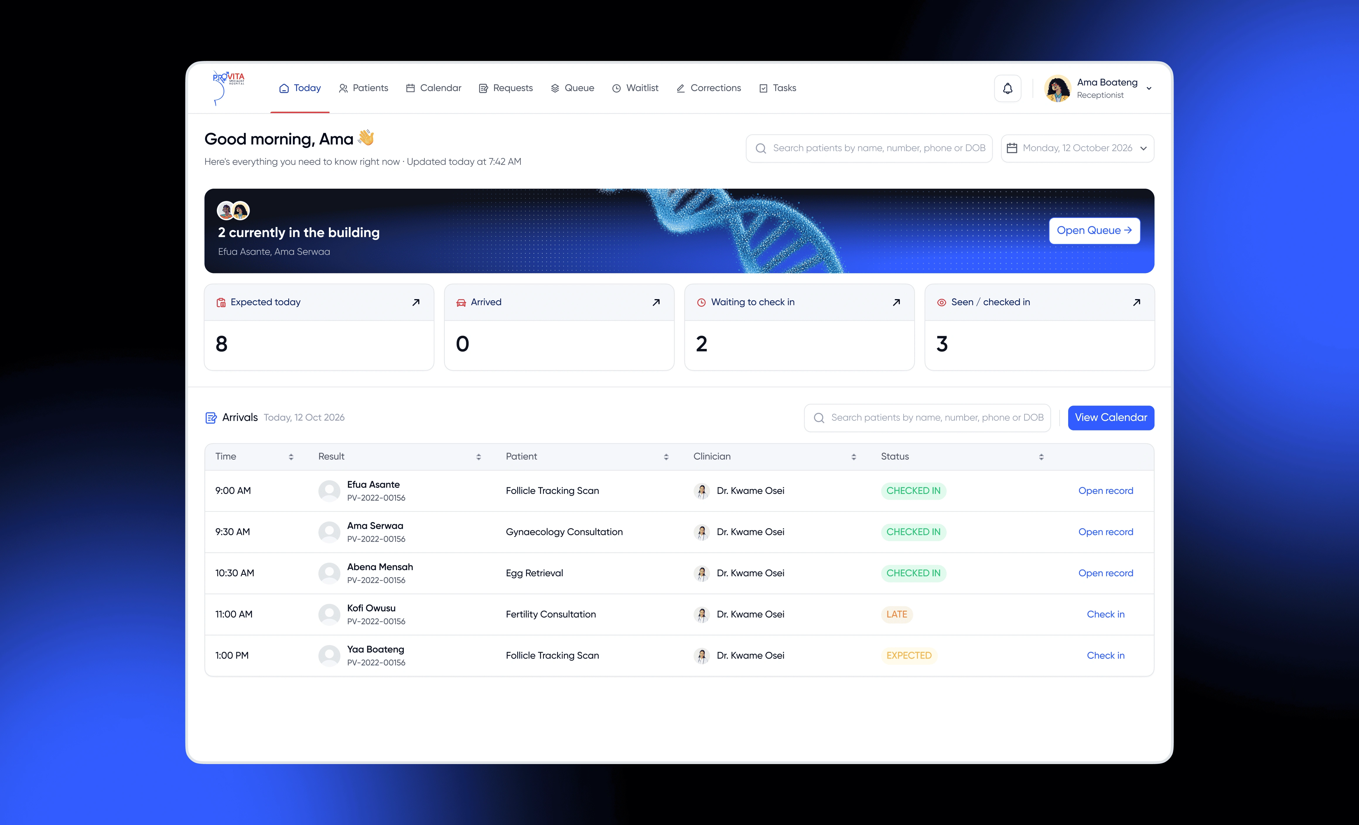
The goal was bigger than redesigning a website. ProVita was building a new digital hospital experience, including a patient portal and supporting internal systems.
I led the brand refresh and website design and development, working alongside Egbemode Abayomi to establish a shared design system that would connect the marketing website with the wider hospital platform.
The result is a unified digital direction designed around one principle: Healthcare experiences should feel as reassuring as the care itself.
The Problem
Fertility care is personal. The digital experience should reflect that.
Choosing a fertility hospital is rarely a casual decision. Patients often arrive with questions, uncertainty and emotional concerns that make trust an essential part of their journey.
ProVita had several challenges to address:
An outdated digital presence: The existing website didn't adequately communicate the hospital's expertise or range of specialist services.
Fragmented experiences: The marketing website and upcoming patient portal needed to feel like parts of the same institution.
Complex healthcare information: Patients needed a clearer way to understand treatments, specialists, appointments and available resources.
Content management: The hospital needed the ability to update services, doctors, articles and patient resources without depending on developers.
The real challenge wasn't just making the website look better. It was creating an experience that could guide patients from their first visit to their ongoing relationship with the hospital.
Core insight: People don't visit a fertility website simply to browse. They arrive looking for reassurance, answers and a clear next step.
Research & Discovery
Before moving into visual design, I focused on understanding the different people interacting with ProVita and what they needed from the platform.
The discovery process involved:
Collaborative working sessions with Egbemode Abayomi to align the website and hospital system.
Mapping the needs of first-time patients, existing patients and international patients travelling to Ghana.
Exploring the information architecture and prioritising the content patients need most.
Identifying the content structures the hospital should be able to manage independently.
Using AI-assisted brainstorming to pressure-test page structure, navigation and communication around sensitive healthcare services.
One decision shaped the entire experience: Calm beats clever.
Every page needed a clear purpose, straightforward communication and an obvious next step.
The Solution
1. A refreshed brand identity
I led the ProVita rebrand, establishing a visual direction that communicates professionalism, confidence and approachability.
Rather than relying on conventional hospital aesthetics, the direction focused on creating a consistent identity that could work across the marketing website and the wider digital hospital ecosystem.
2. A shared design system
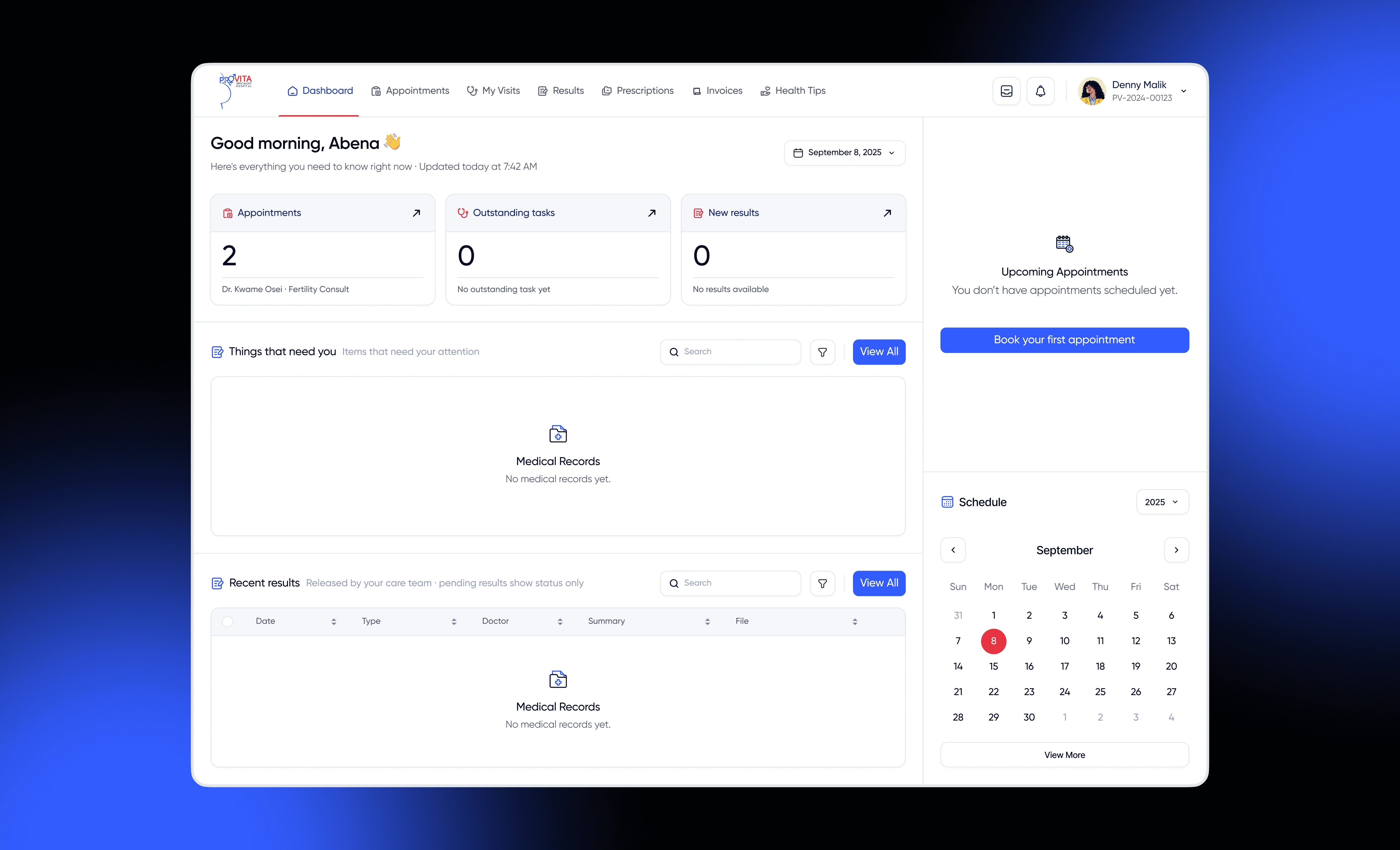
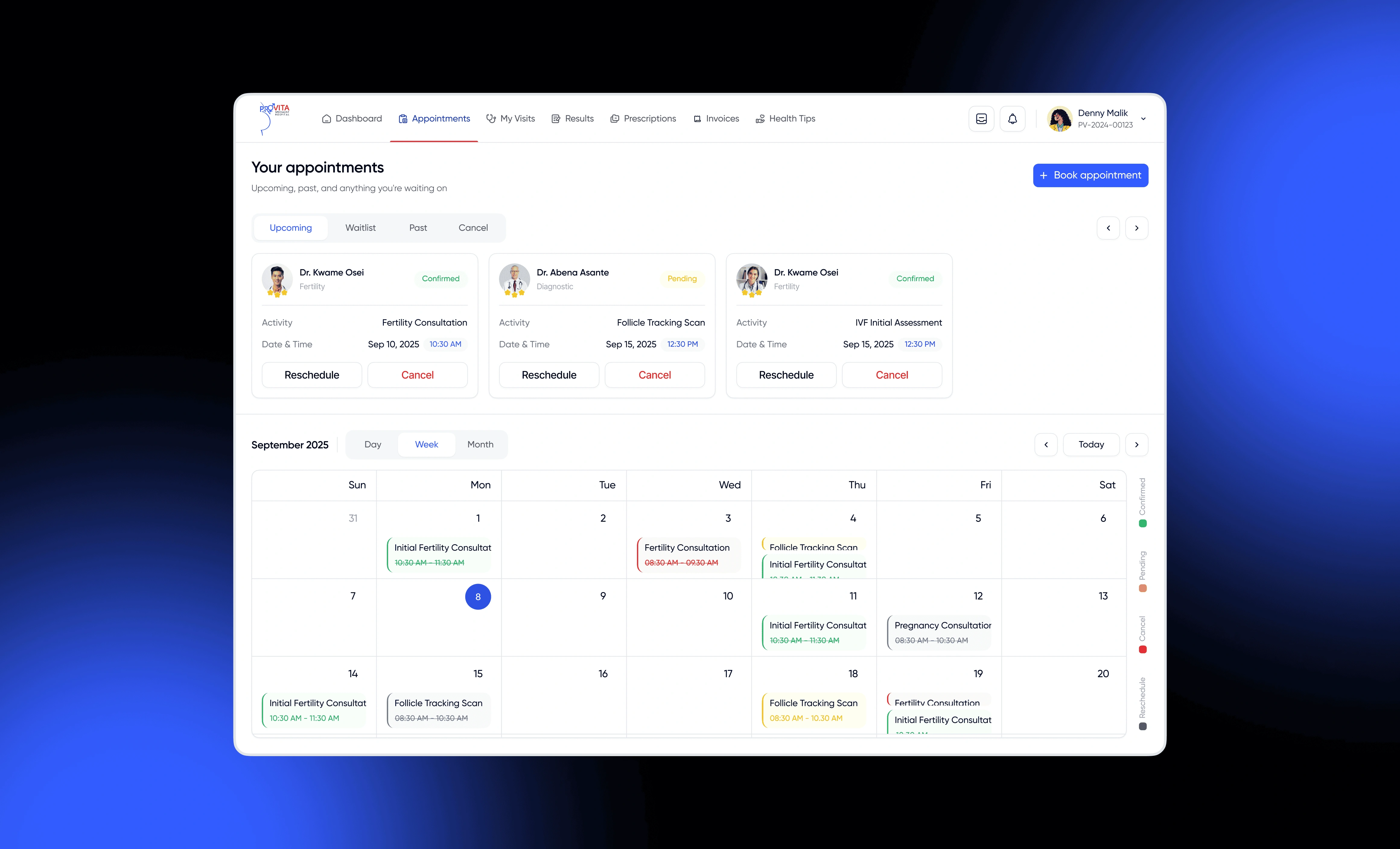
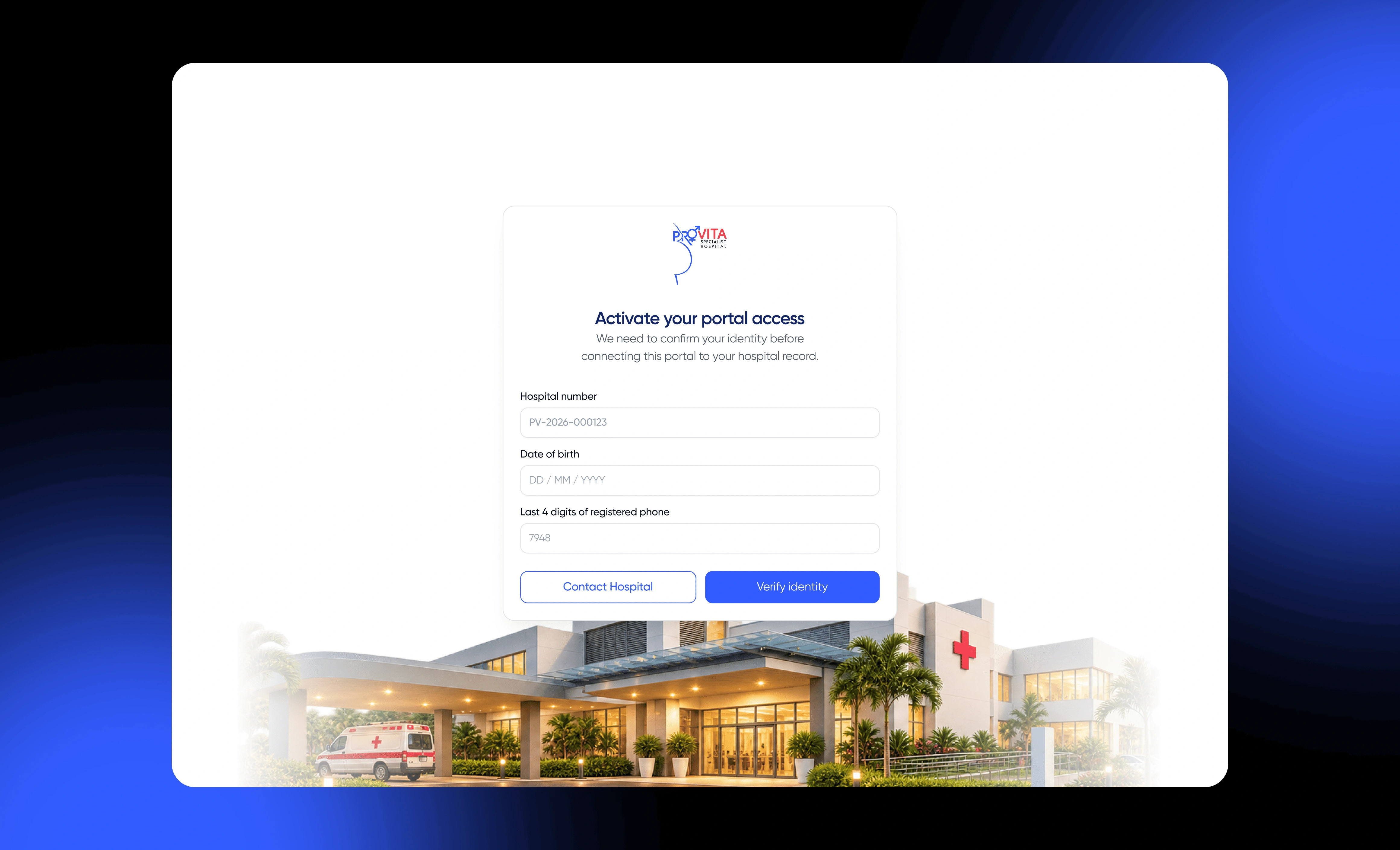
Working with Egbemode Abayomi, I helped establish a Figma design system covering typography, colours, spacing and approximately 40 foundational components.
The system was designed to support both the public-facing website and the hospital's internal products.
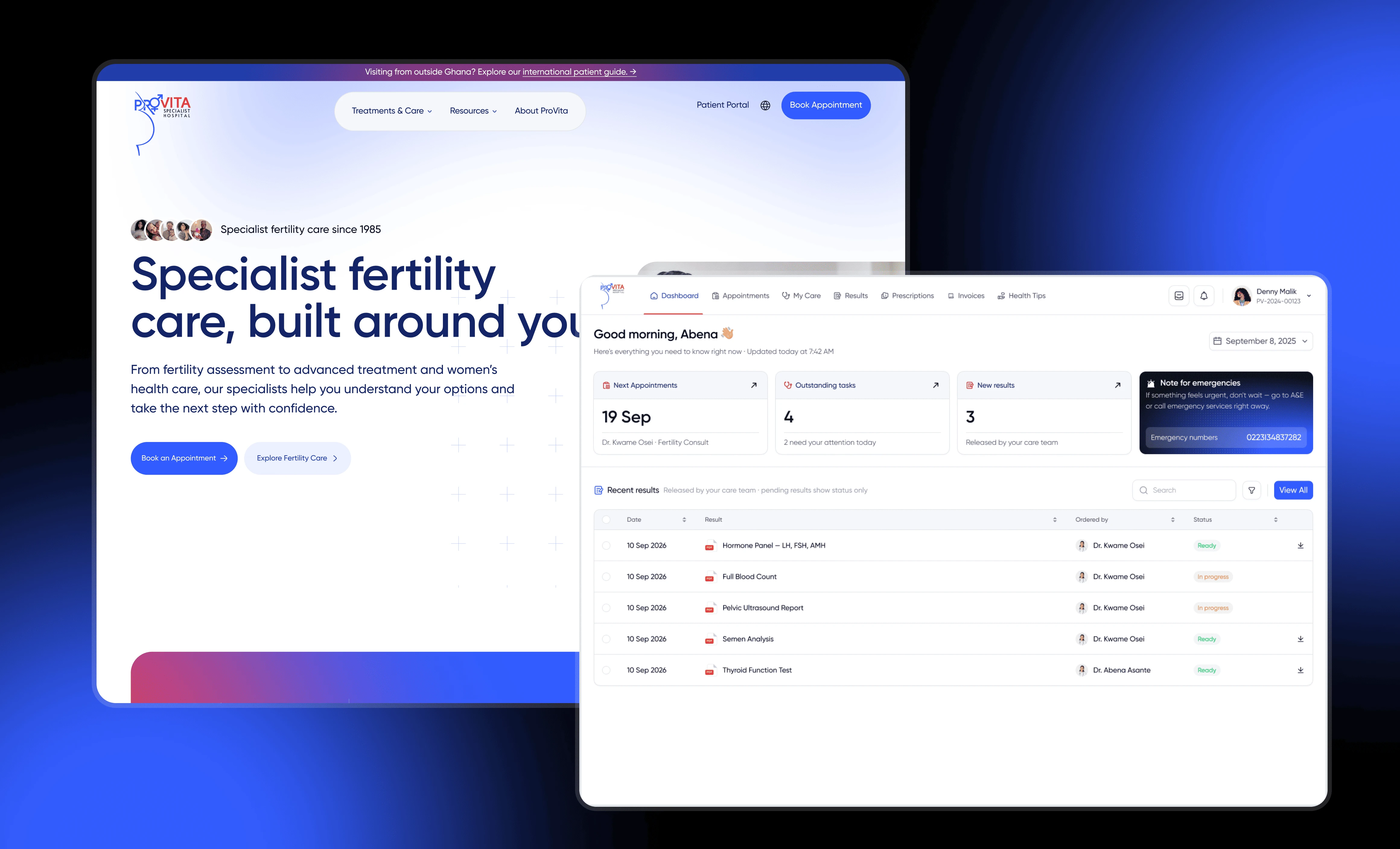
This meant that patients could move between the website and patient portal without feeling like they were interacting with two unrelated platforms.
3. A patient-focused marketing website
The website was structured around the questions patients are most likely to have.
Instead of overwhelming visitors with information, the experience prioritises discoverability, clarity and meaningful actions.
Key experiences include:
Homepage: A focused introduction to ProVita's specialist fertility care, with clear pathways to book appointments or access the patient portal.
Appointment booking: A two-step booking experience with calendar selection, Ghana-based time handling, unavailable slots and contextual validation.
International patients: A dedicated guide covering medical record reviews, visa assistance, airport pickup and remote follow-up.
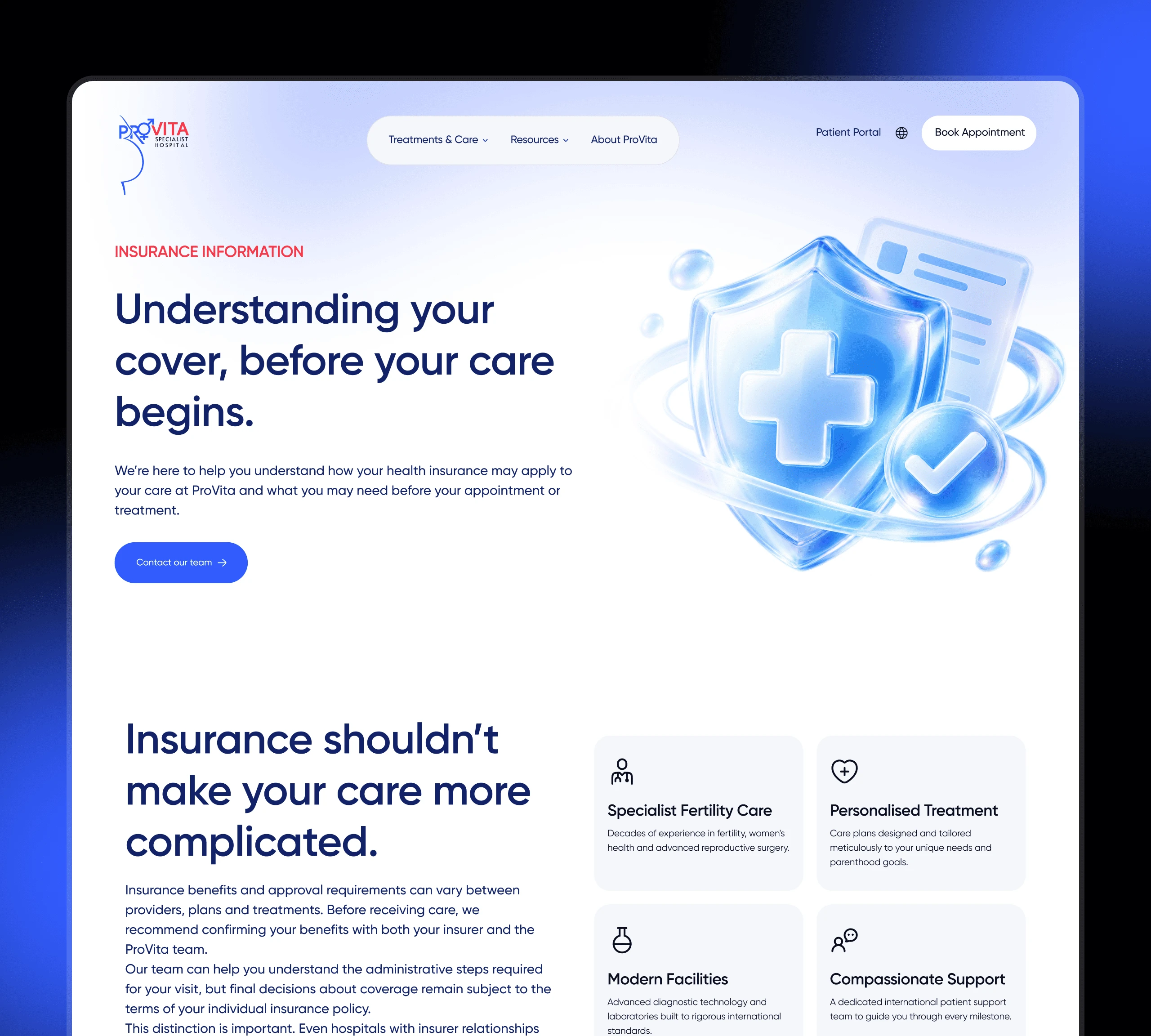
Payments and insurance: A straightforward breakdown of the insurance process, helping patients understand coverage, approvals and personal contributions.
Patient resources: Structured access to educational content, FAQs and relevant healthcare information.
4. A CMS built for the hospital team
The website uses Webflow CMS to make content management easier and more scalable.
I structured ten CMS collections covering:
Services and service categories
Specialists and specialist categories
Blog posts, categories and authors
Patient resources
FAQs
Legal pages
This allows the hospital team to publish new services, update specialist profiles and manage educational content without requiring a developer for routine updates.
5. Interactions and custom development
To make the experience feel more engaging without compromising accessibility, I extended Webflow with custom interactions and code.
Working with Claude, I implemented:
Scroll-triggered reveals using GSAP.
An automatically cycling services tab.
A sticky patient journey timeline.
An animated FAQ experience.
Custom video controls.
I also accounted for reduced-motion preferences so that visitors who prefer fewer animations aren't forced through unnecessary movement.
Some Design Decisions I Particularly Liked
One clear next step
The homepage communicates the hospital's core offering and makes booking an appointment or accessing the patient portal immediately discoverable.
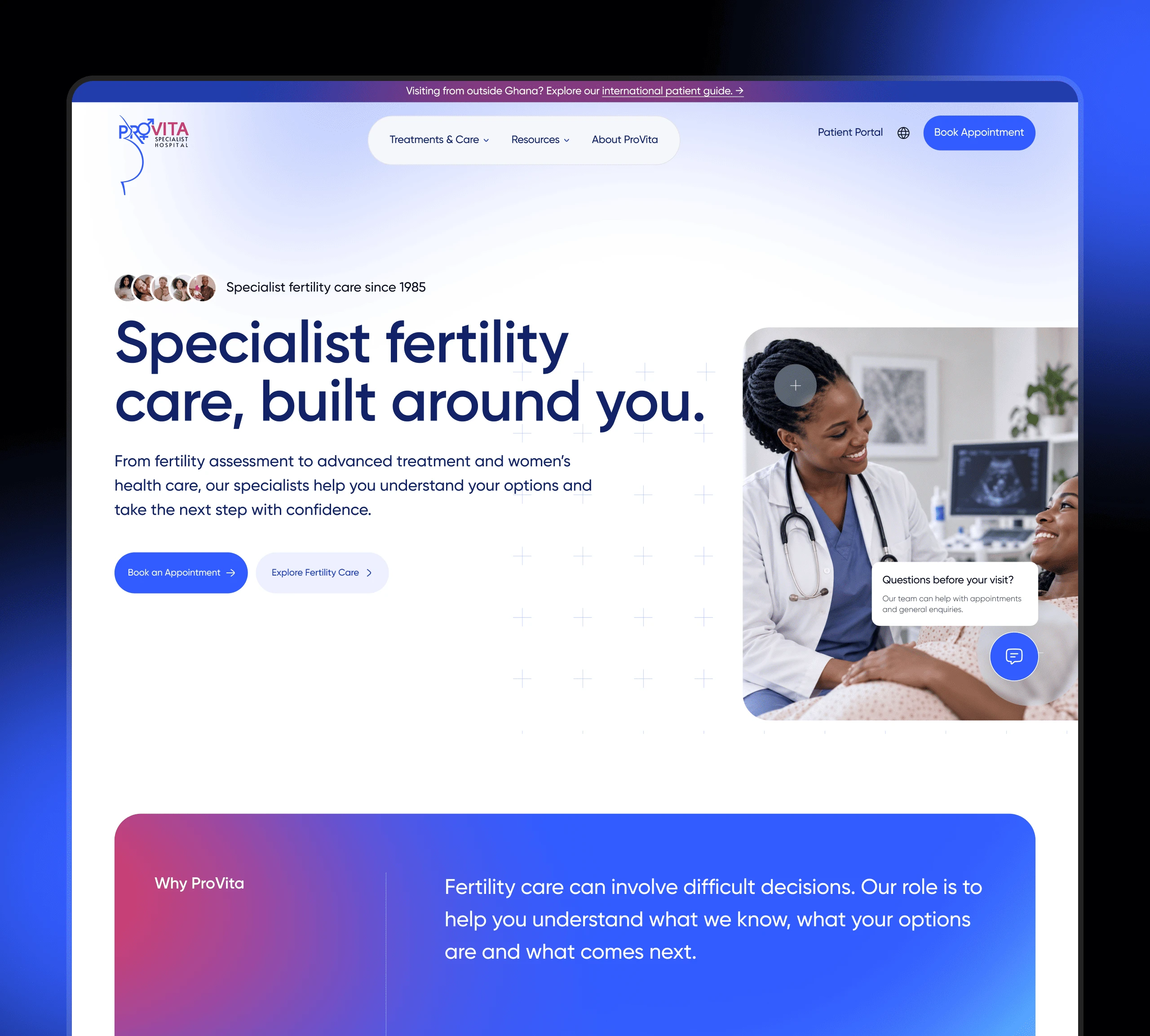
Homepage hero section
Booking that respects local time
The appointment experience uses Ghana time, automatically disables past time slots and provides contextual validation. A progress indicator communicates where users are in the two-step process, including accessible screen-reader feedback.
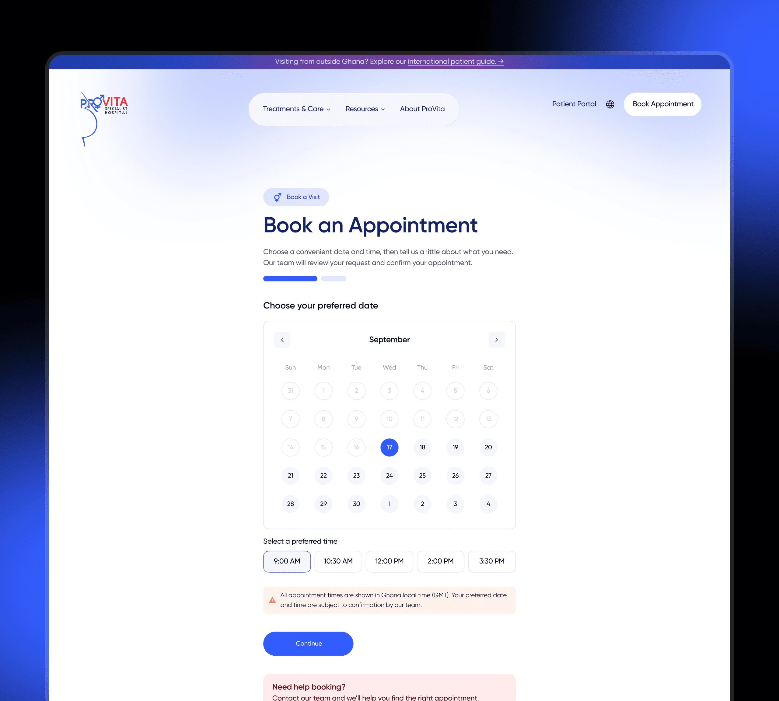
book appointment page
Supporting international patients
Patients travelling to Ghana for treatment need more than a list of medical services. The dedicated international patients page explains the journey from initial record review to travel assistance and remote follow-up.
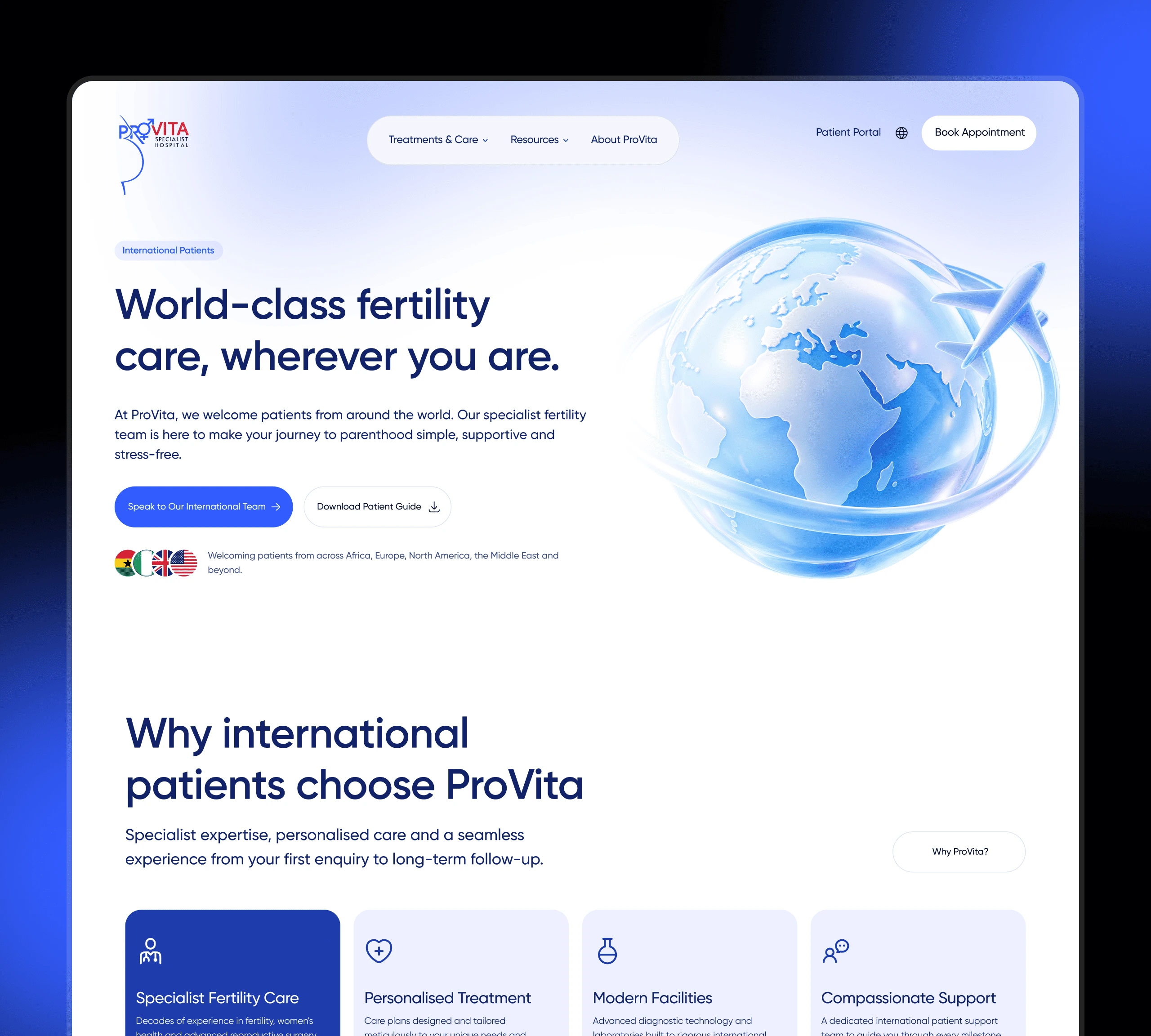
Int'l patient page
Making healthcare payments easier to understand
Insurance and payment information can be intimidating. Breaking the process into four understandable steps helps patients know what to expect before proceeding.
Outcome
A connected digital foundation for a modern healthcare institution.
The project established a unified brand and digital foundation for ProVita, bringing together its public-facing website and the wider hospital system.
Key deliverables include:
A refreshed brand identity.
A shared design system with approximately 40 foundational components.
A responsive Webflow marketing website.
Ten structured CMS collections.
A guided appointment booking experience.
Dedicated international patient and insurance journeys.
Custom interactions and accessibility considerations.
A consistent visual foundation for the patient portal and internal hospital products.
The website and hospital system are still being developed. I'm currently working on the administrative side of the platform.
Reflection
Designing for the person behind the screen.
One of my biggest takeaways from ProVita is that healthcare design requires a different kind of empathy.
A visitor looking for fertility treatment isn't necessarily in exploration mode. They may be anxious, overwhelmed or trying to make an important decision.
That changes how information should be presented, how interactions should behave and how much visual noise an interface can afford.
Three principles I'll carry into future projects:
Design for the uncertain visitor, not just the curious one. Give people the information and reassurance they need before asking them to take action.
Think beyond individual screens. A website, patient portal and internal system should feel like one connected product ecosystem.
Use AI to accelerate execution, not replace design judgement. AI helped me explore ideas and implement custom code faster, but the product decisions remained grounded in the people using the experience.
The goal was never just a prettier hospital website.
It was to create a digital front door that people feel comfortable walking through.
Credits
Brand refresh and Webflow development: Ekene Smart
Website design and design system: Ekene Smart & Abayomi
Hospital system (patient portal, front desk and admin): Collaborative project with Abayomi
Client: ProVita Specialist Hospital, Tema, Ghana
Like this project
Posted Nov 3, 2026
Rebranded ProVita and developed integrated digital systems and experiences.
Likes
1
Views
4
Timeline
Sep 17, 2026 - Ongoing
Collaborators