Crest: A Financial Management Platform -UX. Product Design. SaaS
Client Overview
Crest is a financial management SaaS platform aimed at helping users manage their personal finances. My challenge was to redesign their user experience to cater to a broad user base, including financial novices and seasoned investors, while driving better business metrics such as user retention and feature adoption.
Problem Discovery & Research
Crest approached me with several core challenges:
1. User on-boarding friction: New users found the on-boarding process too long, causing high drop-off rates.
2. Complexity in data visualization: While Crest had extensive financial features, the interface often overwhelmed users.
3. Feature discovery issues: Many users were unaware of valuable tools within the platform, leading to under-utilization.
Research Phase
I conducted comprehensive user interviews with a mix of existing users, personas, and customer support teams. Combining quantitative data from analytics with qualitative feedback revealed key friction points in the experience, especially during the on-boarding process and interactions with complex financial tools. My personas analysis split users into three groups: beginner, intermediate, and advanced. Each group had distinct needs, which had to be balanced in our design decisions.
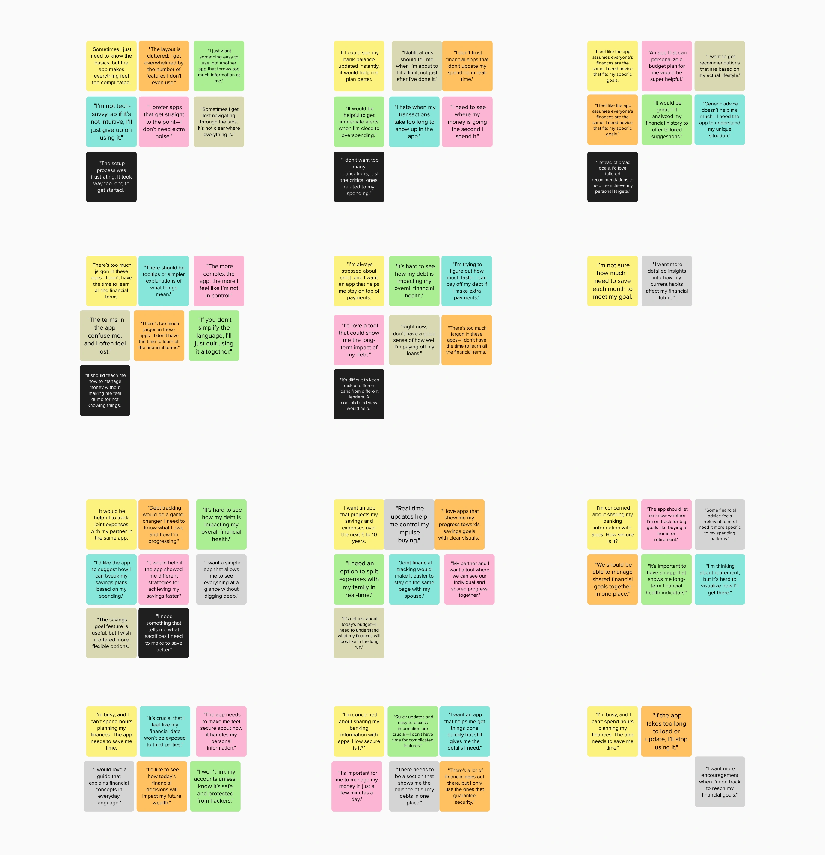
I gathered 50+ key insights across 10+ user interviews
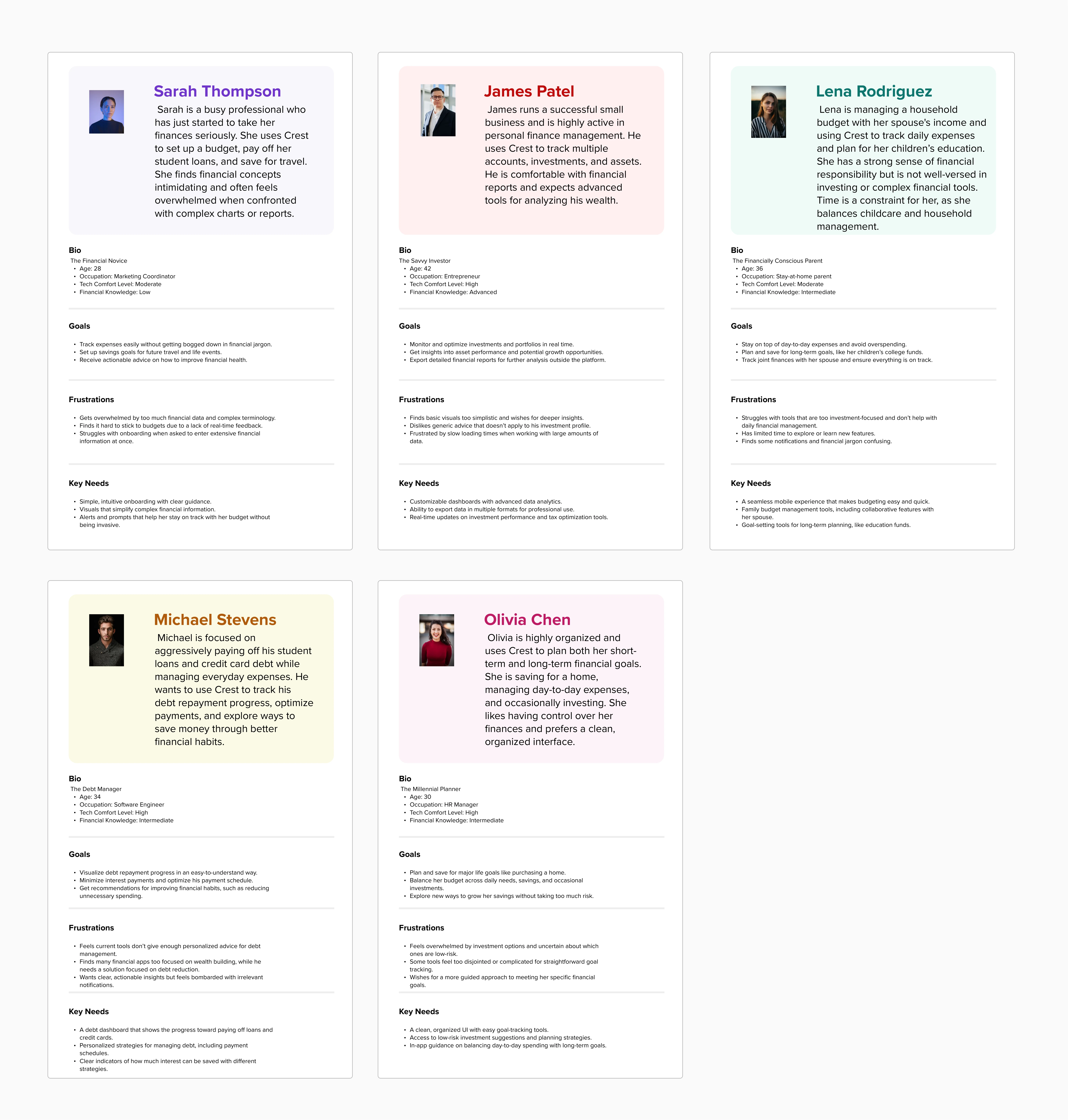
This was followed by creating user personas, which were split into groups based on financial literacy : Beginner, Intermediate, and Advanced.
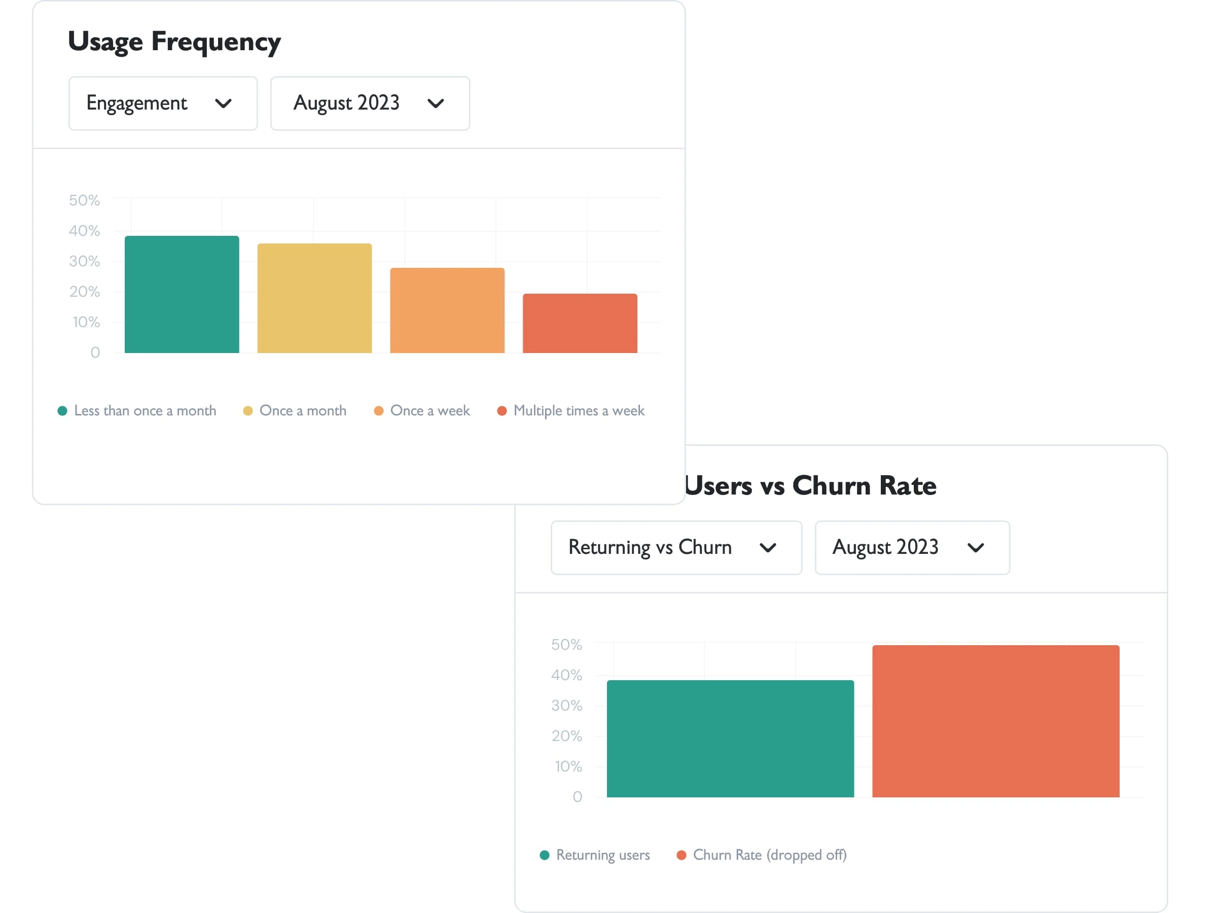
Usage Frequency/Returning Users vs Churn Rate as of August 2023
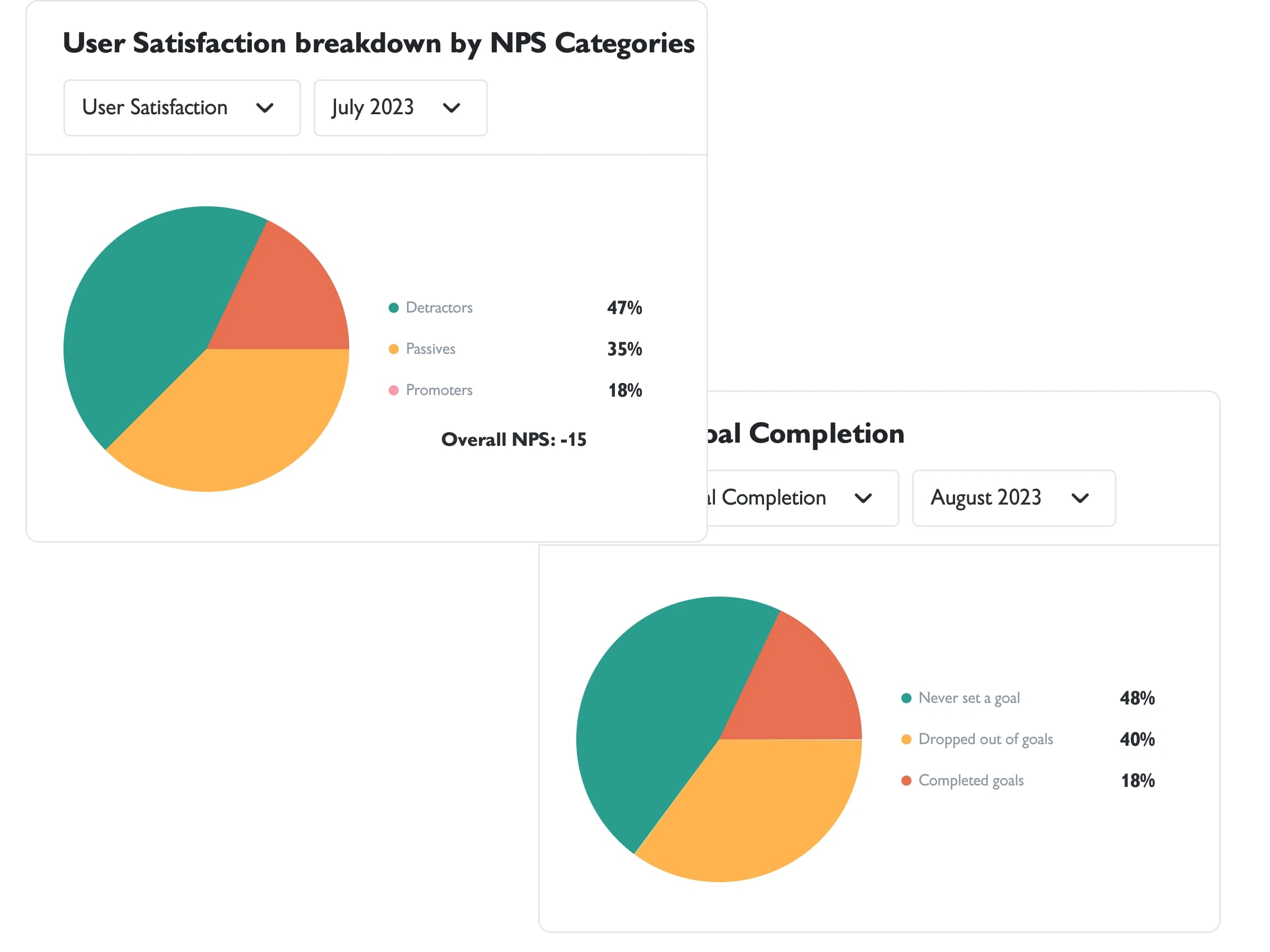
Overall NPS Score/Financial Goal Completion Analytics as of August 2023
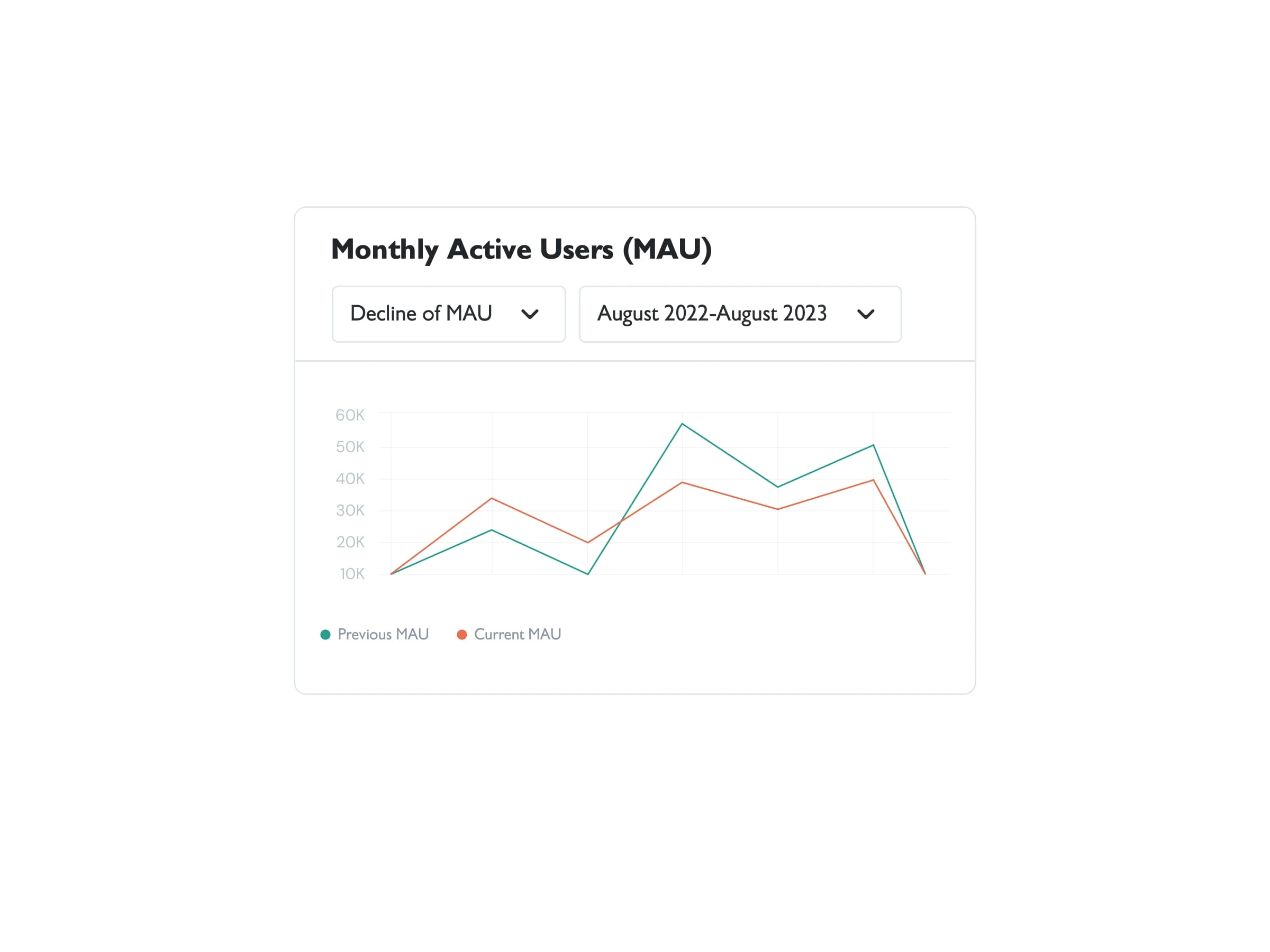
Monthly Active Users as of August 2023
Design Challenges
1. Simplifying complex data visualizations: Crest users relied on charts and graphs to understand their financial status, but current visualizations lacked clarity and customization. We needed to make data more digestible without oversimplifying.
2. Reducing cognitive load during on-boarding: The previous on-boarding experience required users to input numerous financial details, leading to overwhelming first impressions. My goal was to design a friction-less flow that maintained data integrity while keeping users engaged.
3. Balancing user personas: The product needed to cater to a diverse user base. While advanced users wanted detailed analytics and insights, beginners required intuitive navigation and prompts.
Design Process
1. Redefining the on-boarding journey:
Using insights from my research, I redesigned the on-boarding flow to reduce user fatigue. My solution involved a progressive disclosure approach— users would only input data gradually as they explored the app. I integrated clear visual prompts and feedback to guide users through essential steps.
2. Complex problem-solving:
The technical challenge lay in balancing data accuracy with an engaging user experience. We (myself with the dev team), employed real-time feedback loops using data validation scripts to ensure that incomplete inputs wouldn’t affect the quality of the financial data presented.

Preview of the re-designed signup screens

Preview of the re-designed on-boarding screens
3. Data visualization overhaul:
For data visualization, my goal was to simplify without sacrificing the richness of insights. I implemented interactive charts that allow users to customize views based on their financial goals—whether short-term savings or long-term investments. For advanced users, I introduced filter options and export functionalities that allowed for deeper analysis, that could be accessed when users click the 'CUSTOMIZE DASHBOARD' button.
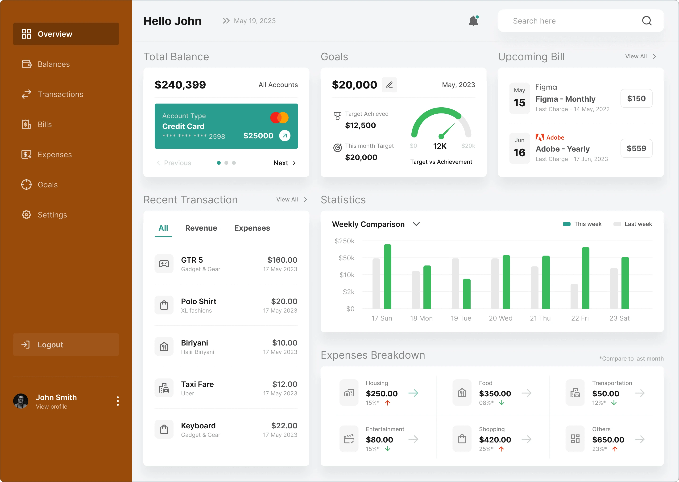
This was the dashboard before my re-design. Most users found it to be 'too busy'. Beginners said that it was too overwhelming.
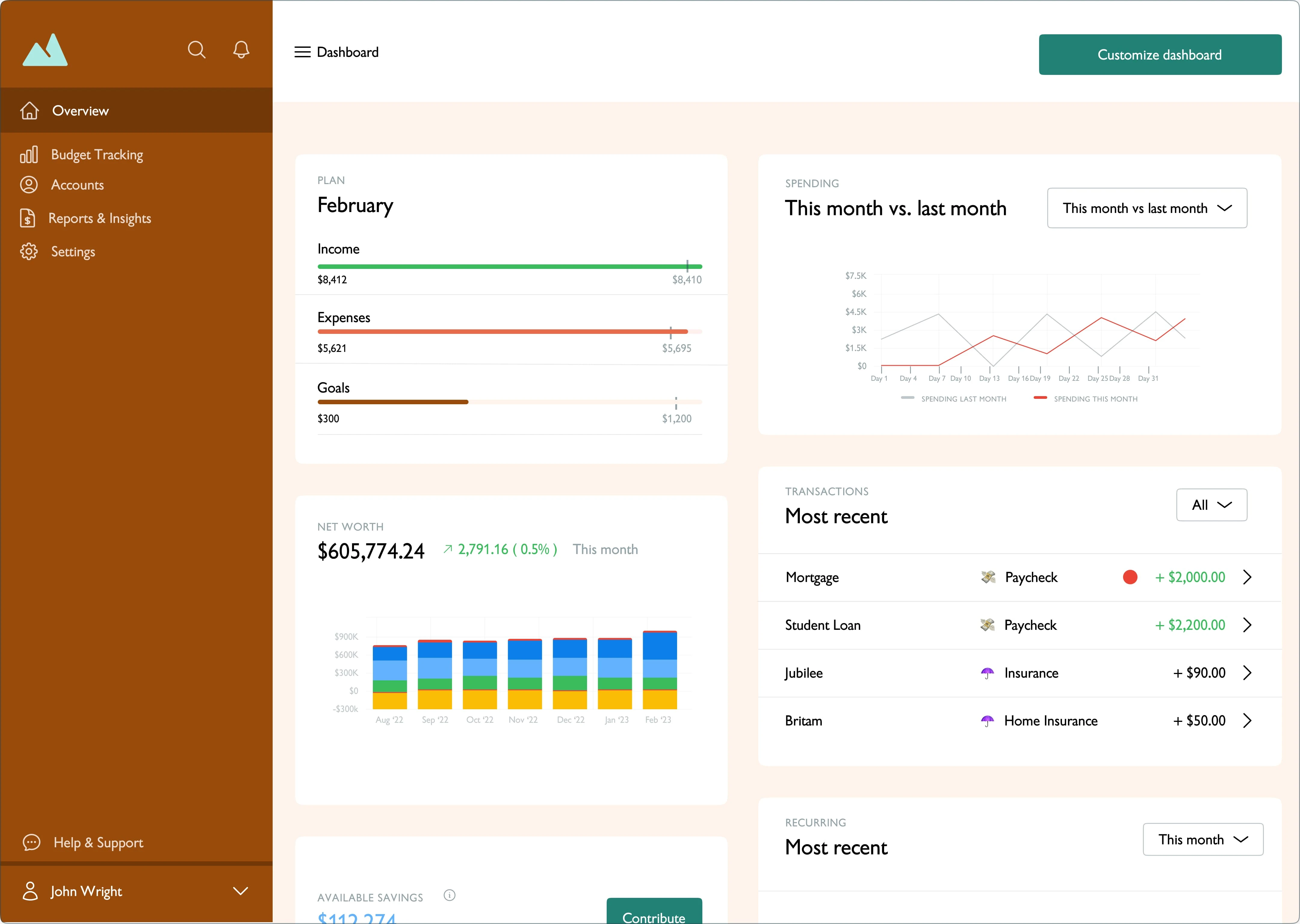
This is the new dashboard that I re-designed, after taking into account how all users (across different personas), prefer to view their data.
Problem-solving focus:
Our technical team ( myself and the developers), faced the challenge of building highly customizable yet fast-rendering charts. By using WebGL rendering techniques and optimizing database queries, we reduced load times by 40%, delivering a smooth, responsive user experience.
4. Enhancing Feature Discoverability
To address feature discovery, I introduced a contextual help system that offers tool-tips, explainer videos, and on-boarding checklists, targeted at different user personas. The help system was designed to blend seamlessly with the product’s interface, offering assistance at crucial moments without interrupting the user flow.
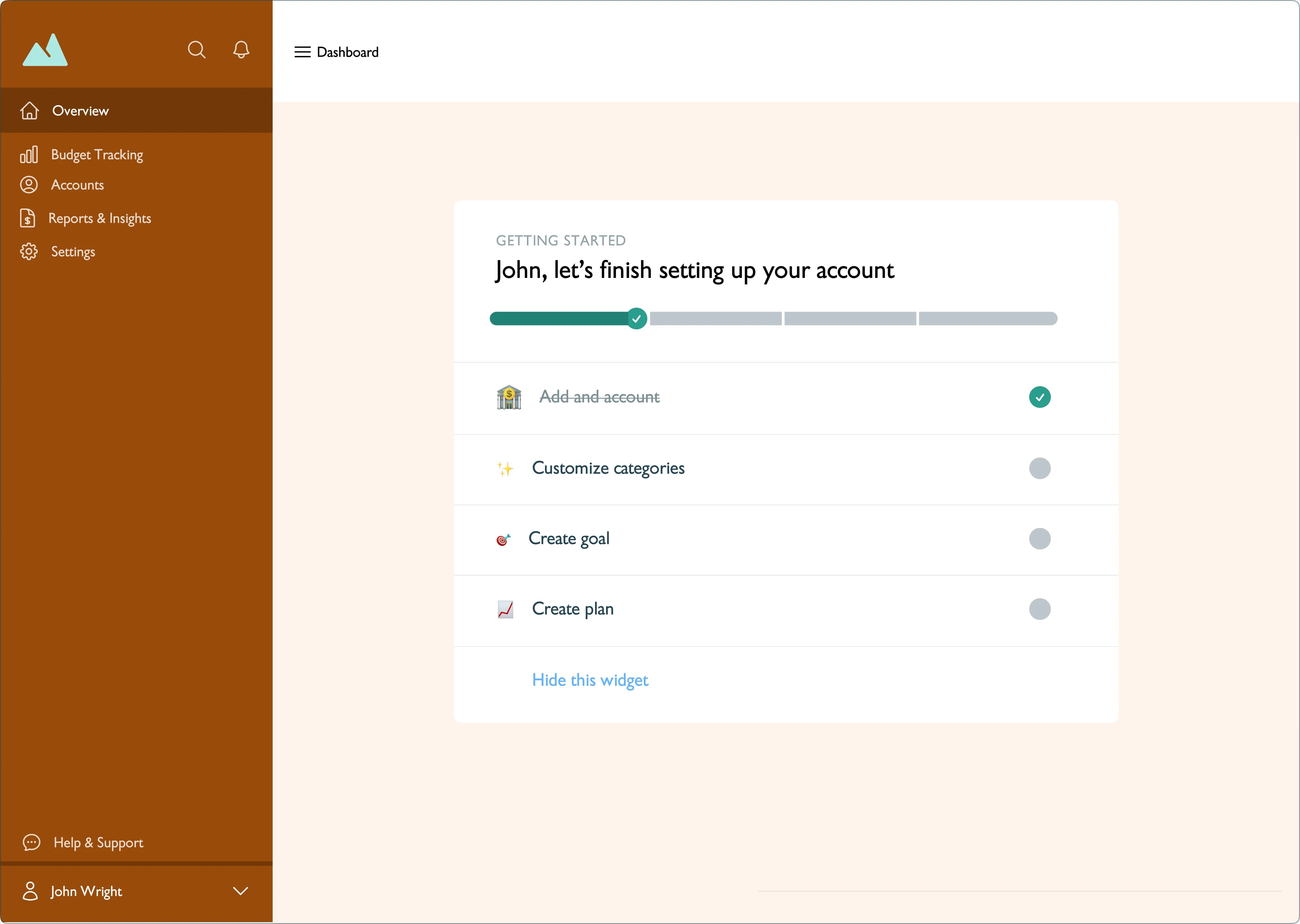
Sample of the contextual help system that I designed, showcasing the on-boarding checklist, which addresses feature discovery for the key features ( Budget tracking and goal setting ).
Complex Design Thinking:
I explored user flows and decision points to understand when users needed help without causing overload. Through A/B testing, we fine-tuned these interventions, increasing feature engagement by 30% within the first month of launch.
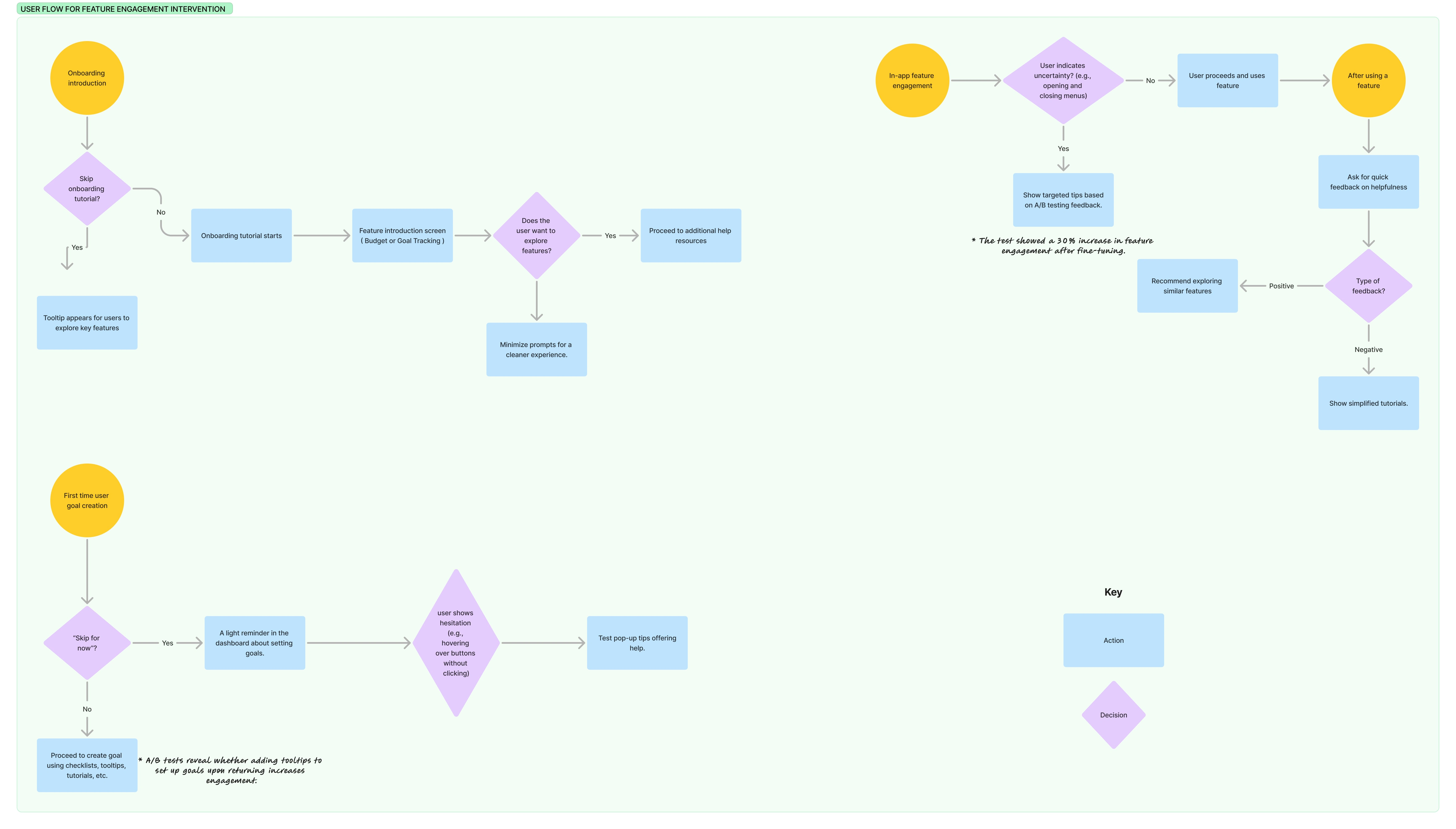
User flow for feature engagement intervention. Using this flow, feature engagement increased by 30%+ in the first month.
Results & Business Impact
The new design led to measurable improvements:
- Drop-off during on-boarding decreased by 25%.
- Feature adoption rose by 30%, especially among beginner users.
- User satisfaction scores improved, as evident from NPS surveys, with advanced users appreciating the ability to customize their experiences.
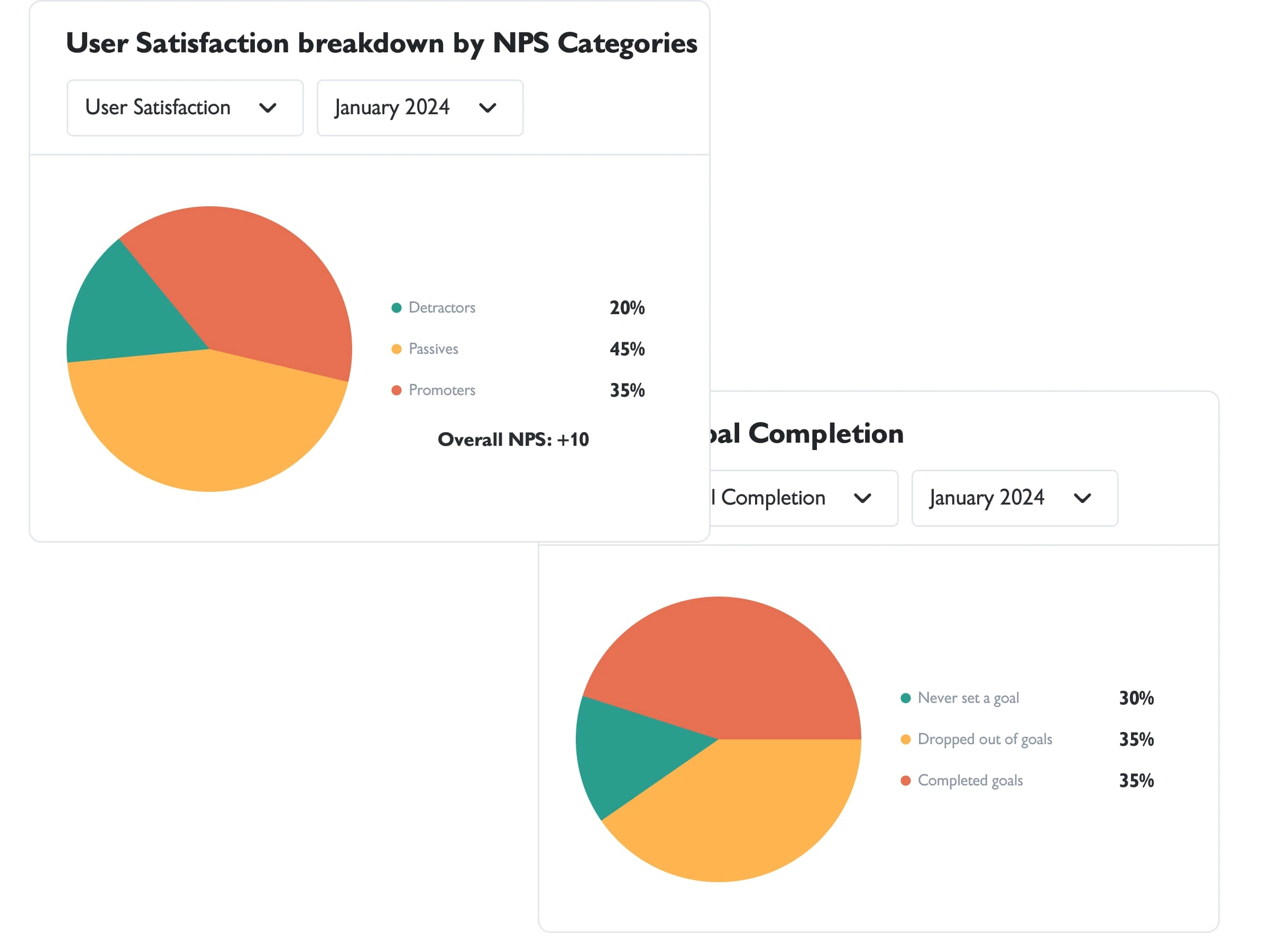
New analytics of Overall NPS Score and Financial Goal Completion after my re-design.
Key Takeaway
By tailoring solutions to user personas and leveraging technology for efficiency, I crafted a balanced experience that serves both novice and expert users without overwhelming either group.
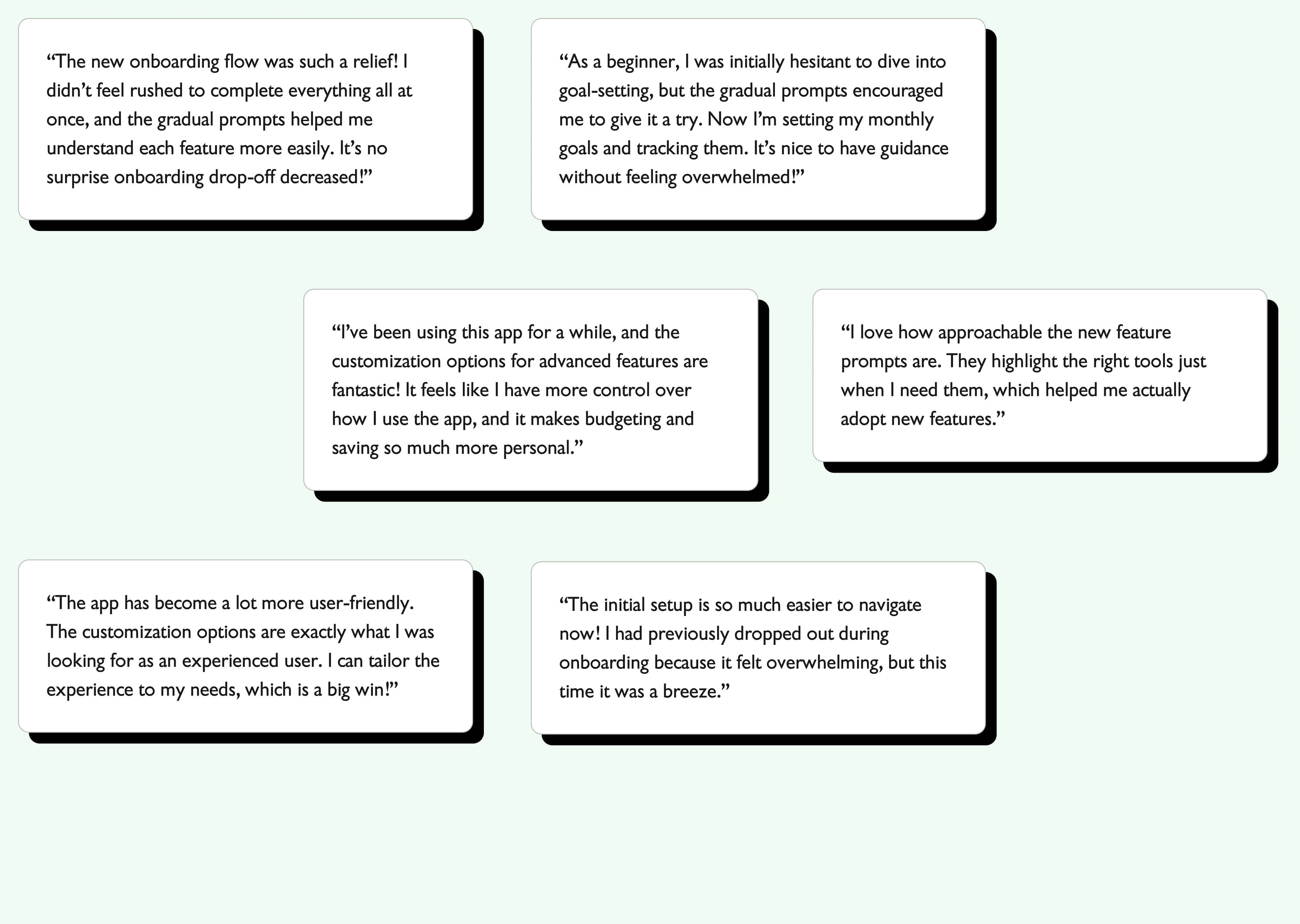
Some testimonials received from Crest users post launch.
Next Steps
My ongoing collaboration with Crest includes refining the user experience based on continuous feedback and expanding the platform to include AI-driven financial forecasting tools that will further enhance the customization options for users.
Like this project
Posted Nov 5, 2024
Re-designed on-boarding and Crest's dashboard to boost feature adoption, goal completion, and satisfaction with user-friendly flows and prompts.
Likes
0
Views
20


