Rozana: Identity Redesign for a Tailoring House
Pedro Lopes
Context
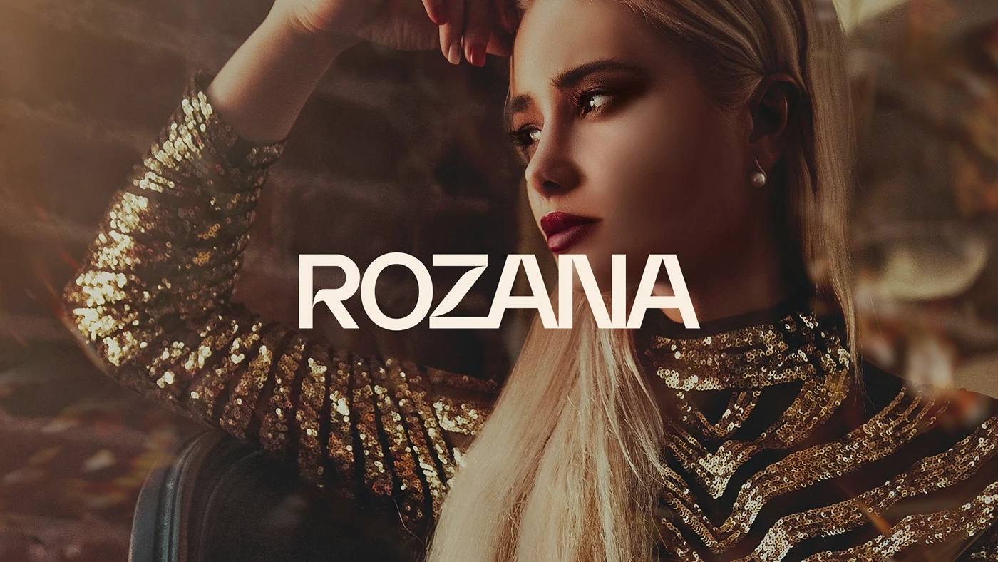
Rozana is a tailoring house with a philosophy built on beauty and self-esteem.
Challenge
A redesign reflecting the brand's growth and its commitment to the women it serves.
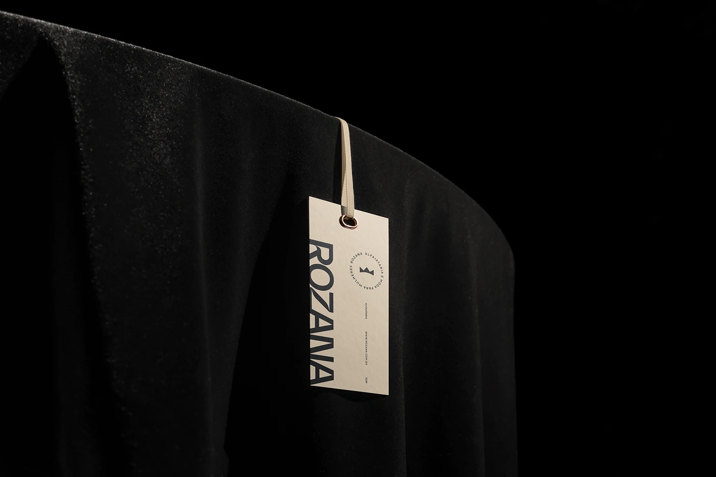
Rozana brand identity
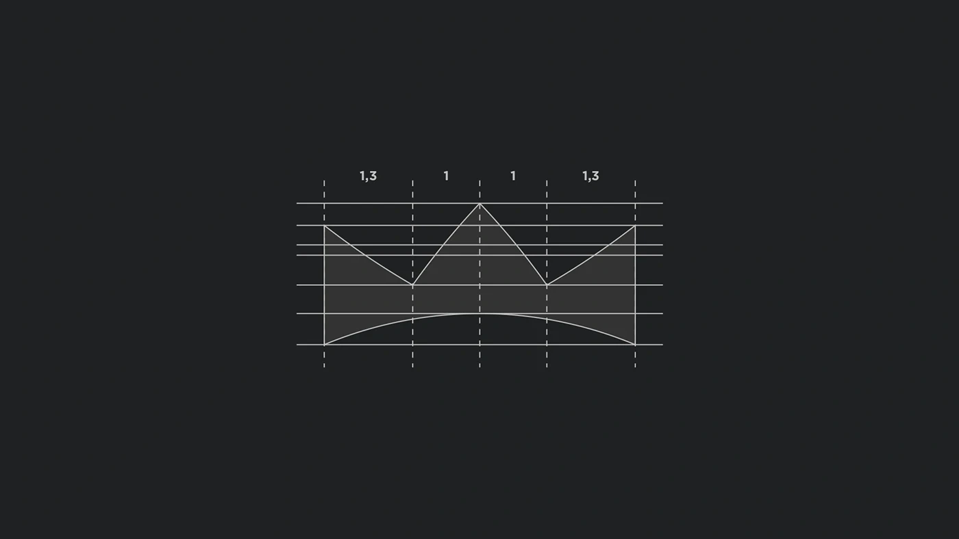
The system
An elegant typographic logotype paired with a crown-like symbol referencing the store's clients. The symbol merges with the letter O: a woman wearing a crown, figure and identity in one mark. Precise arrangement aligns the character of the product with the brand.
Rozana logotype and symbol
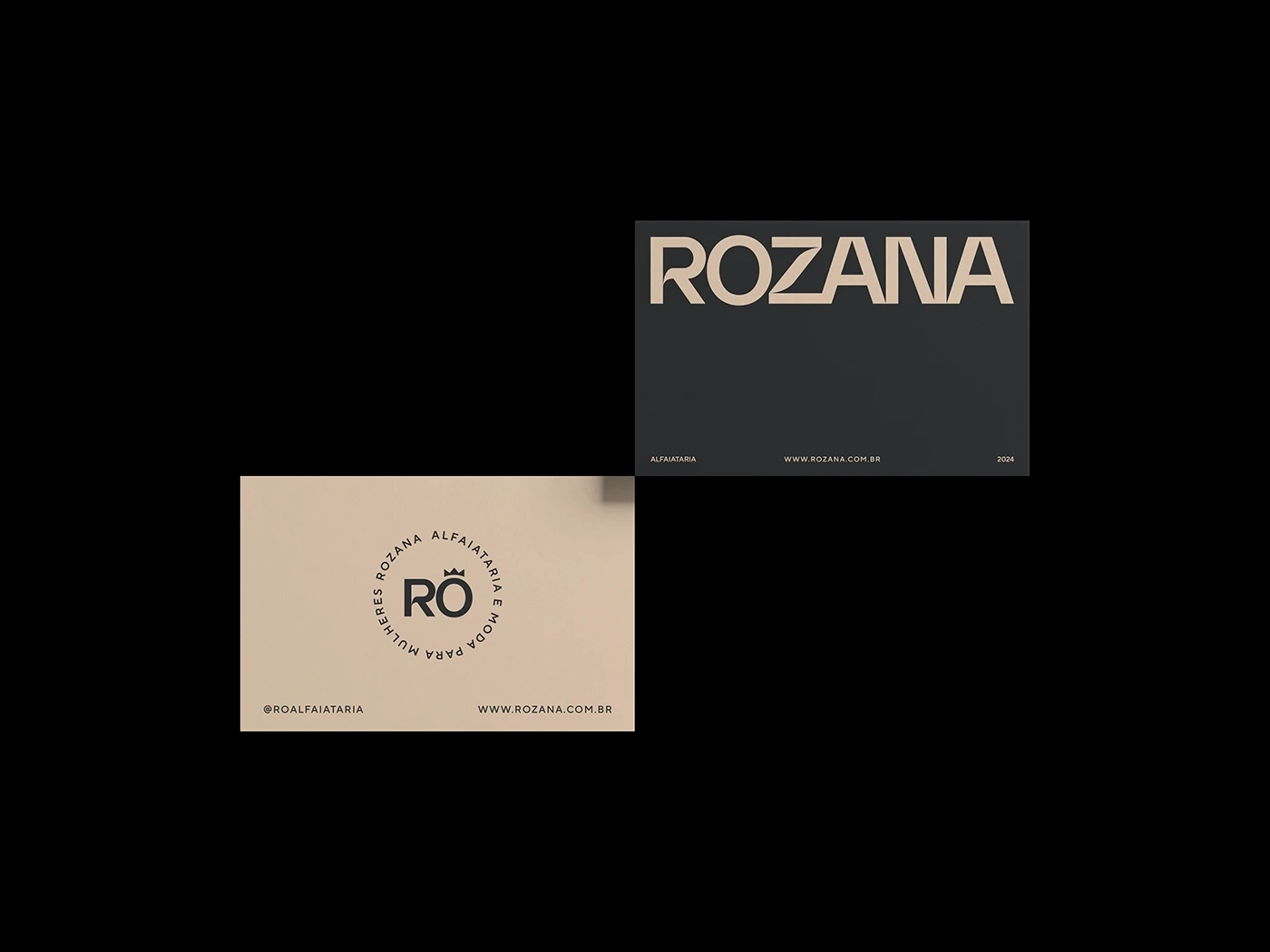
Delivered
Typographic logotype, symbol, visual identity system and guidelines.
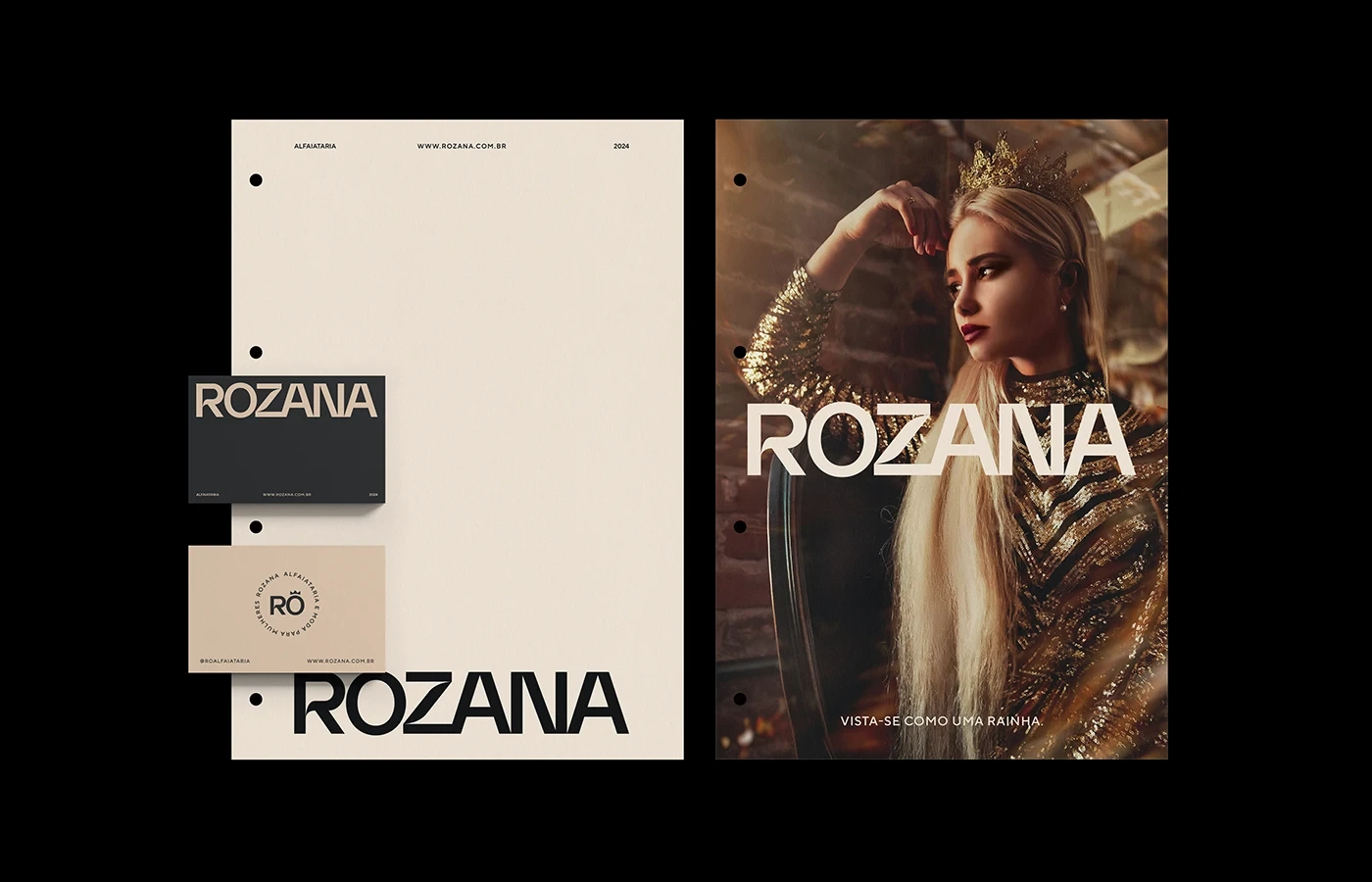
Rozana visual identity applications
Rozana brand applications
Rozana identity details
Like this project
Posted Nov 28, 2025
Identity redesign for a tailoring house: elegant typographic logotype and a crown symbol referencing its clients.