Branding For an E-Bike Rentals: The Gorge E-Bike Adventure
Ayanna Richilano
Behind the Company
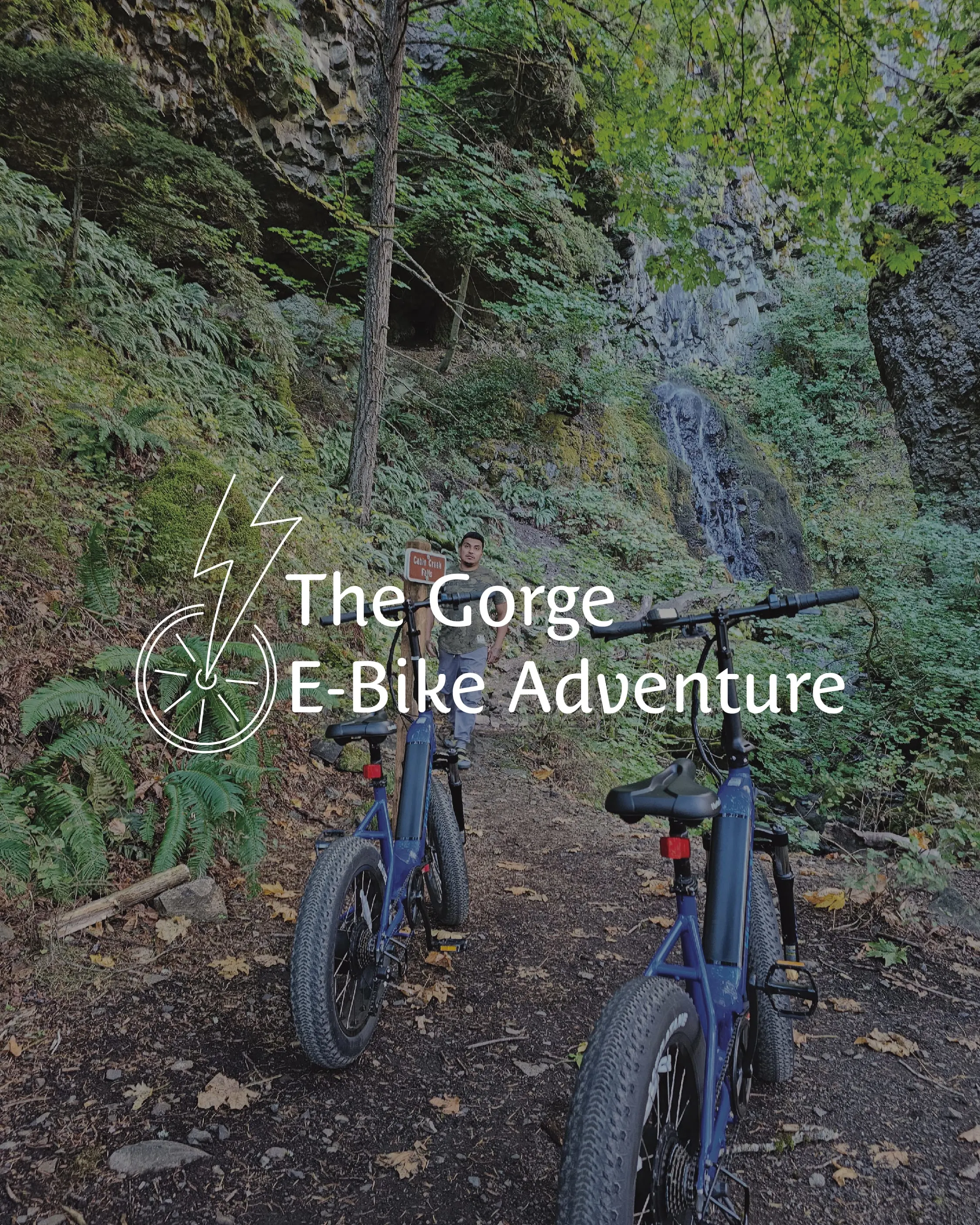
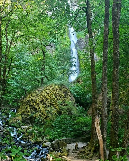
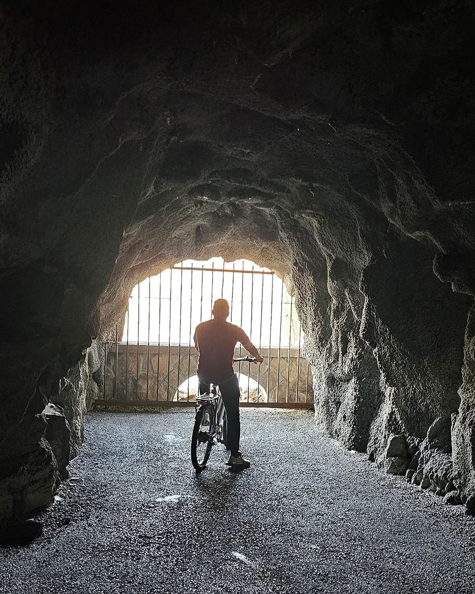
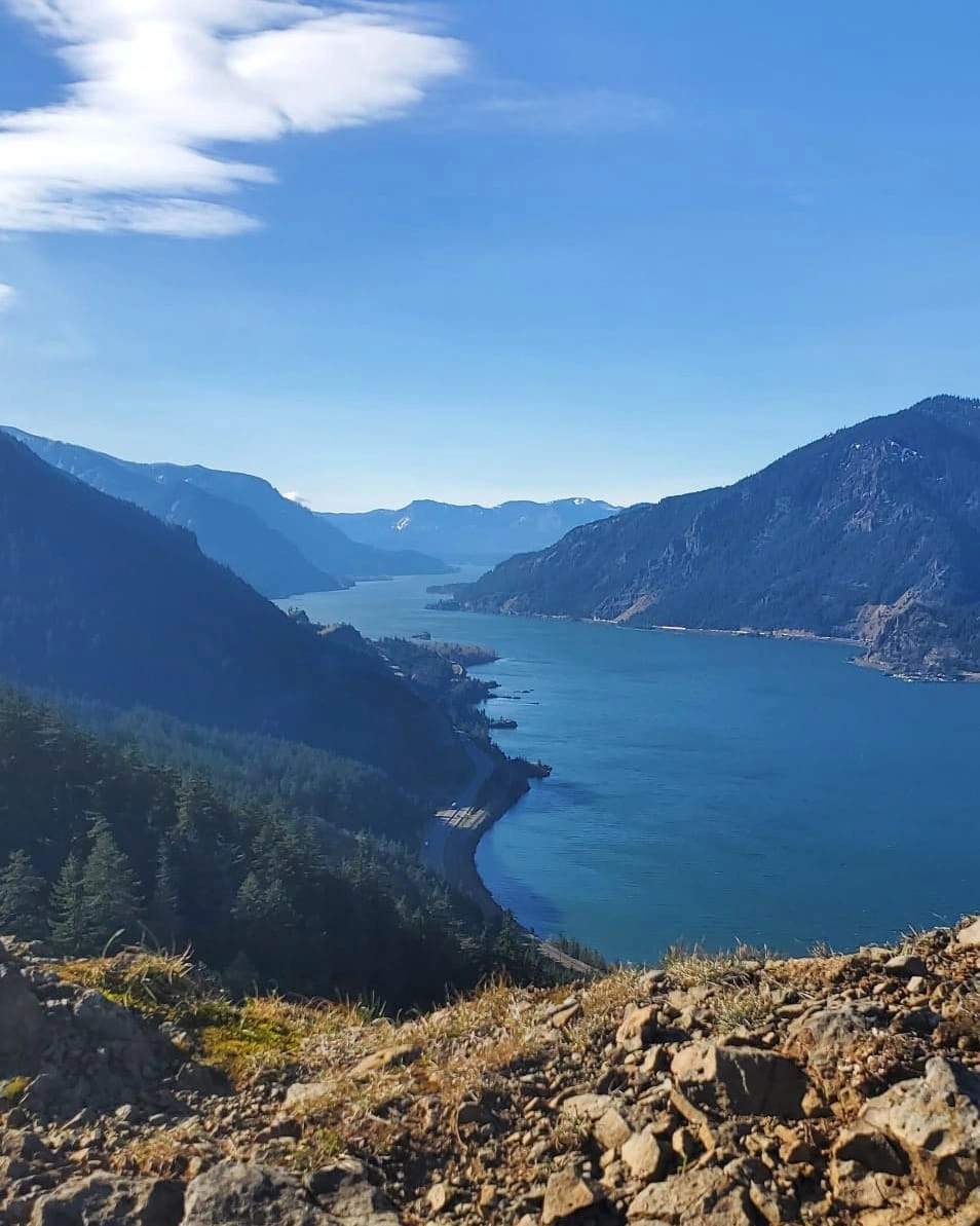
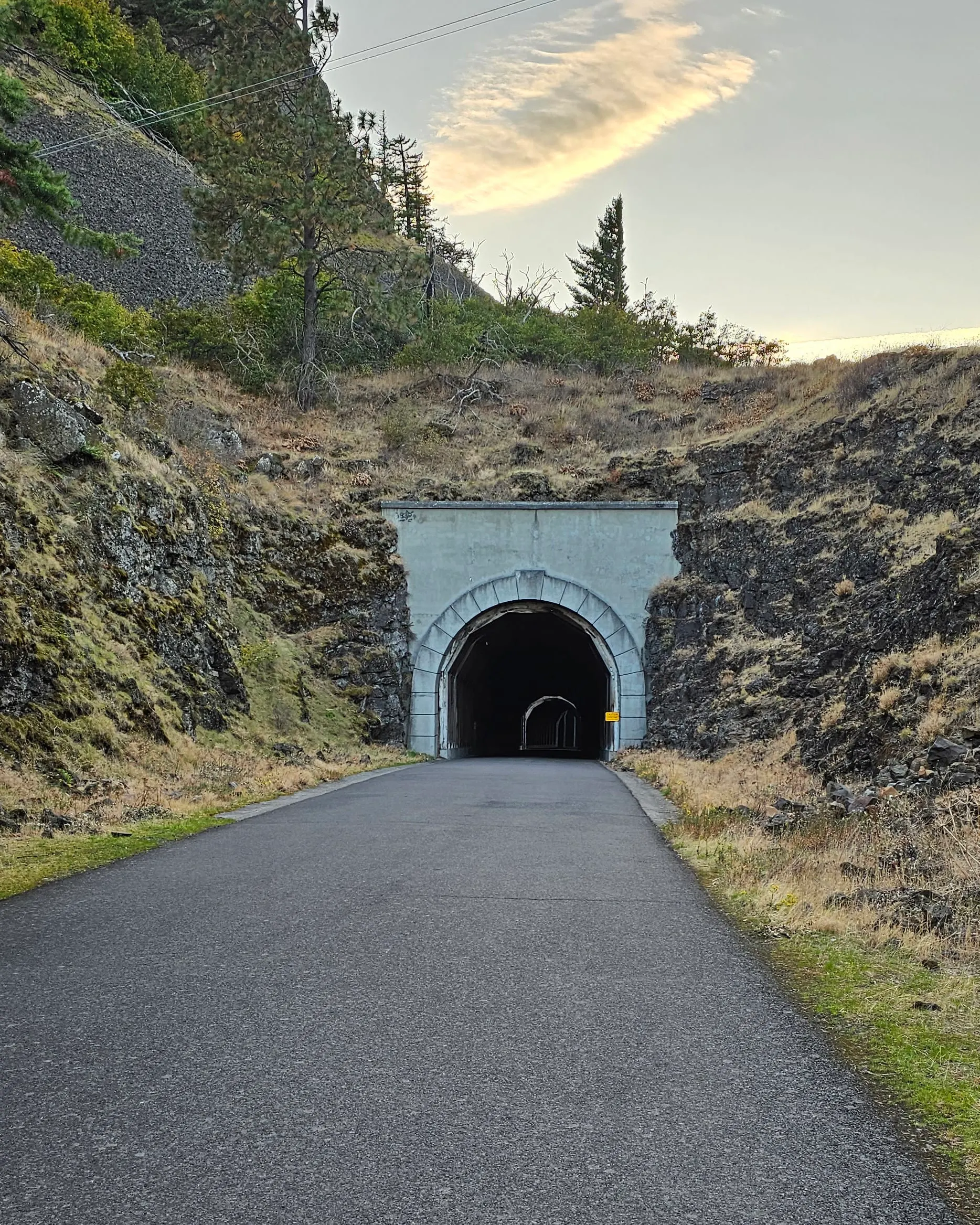
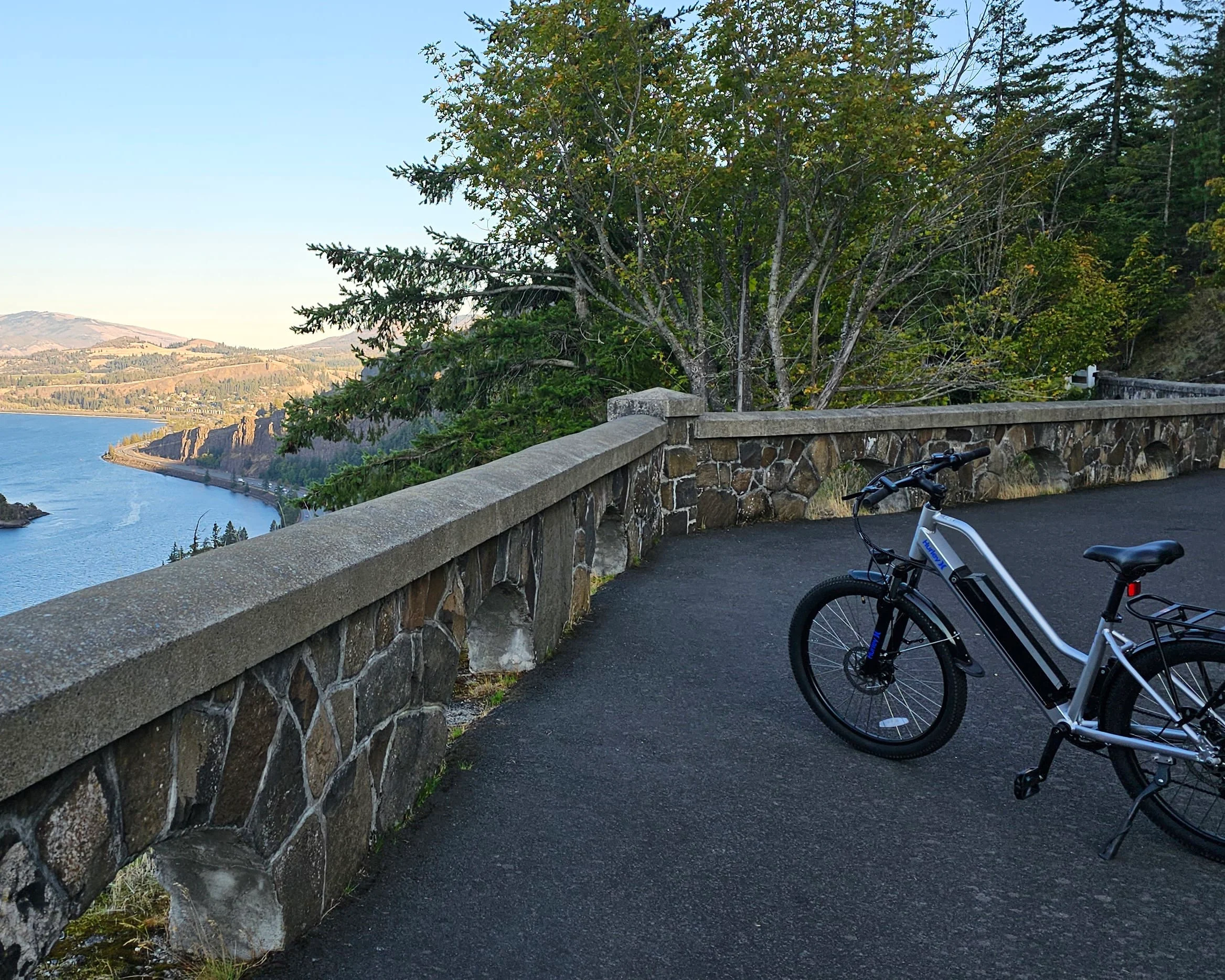
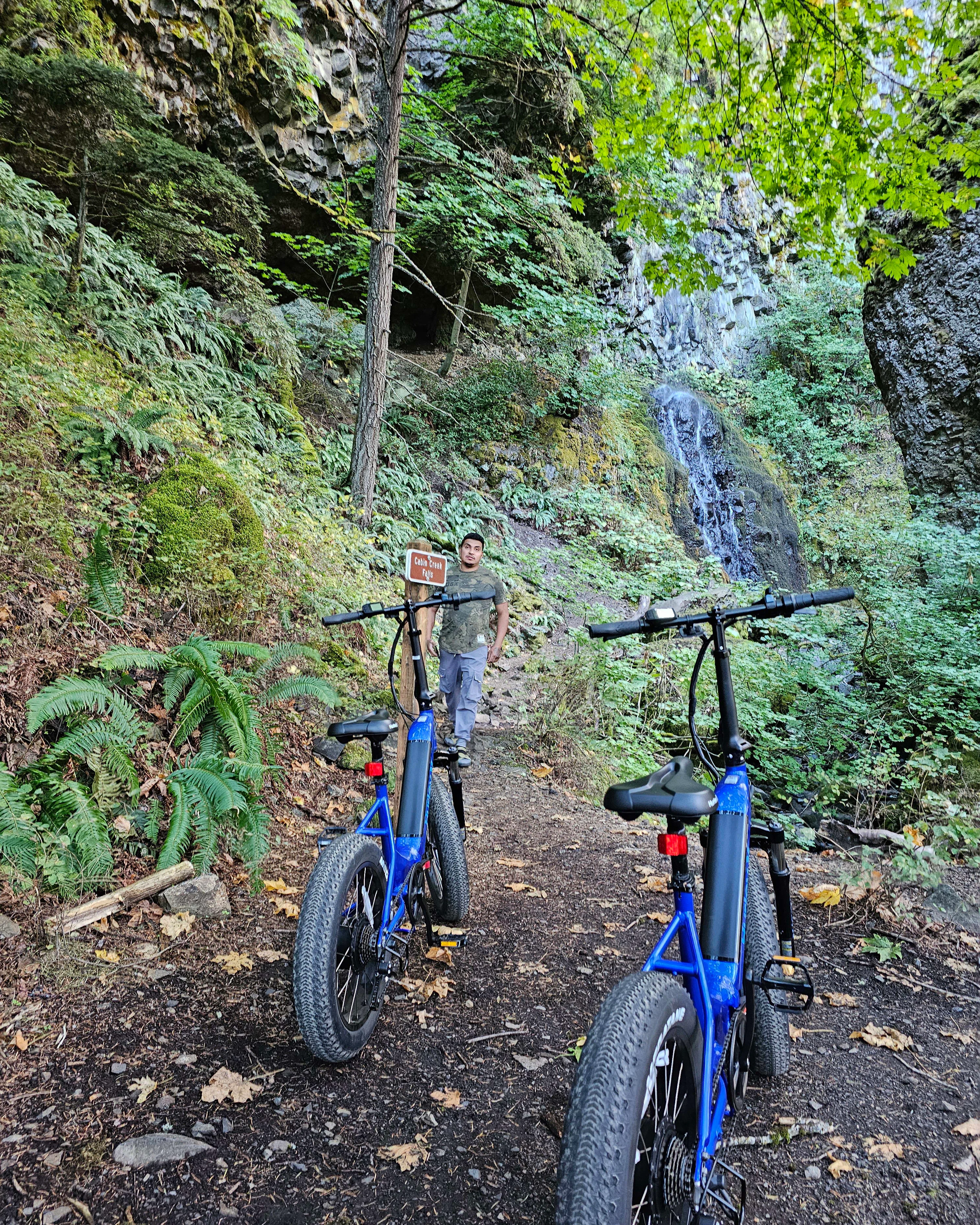
The Gorge E-Bike Adventure is a small E-Bike rental business located in the beautiful Columbia River Gorge. They provide visitors with a more interactive option to explore the Gorge and get right in the middle of nature on their bikes. They provide rentals or tours of the Mosier Twin Tunnels and Viento State Park trails.
Behind the Logo
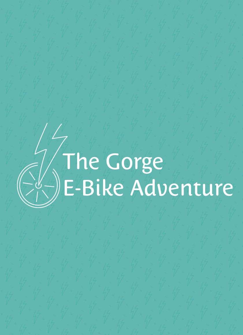
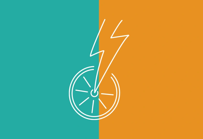
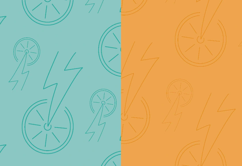
While creating this logo, simplicity and energy were at the forefront. The lightning bolt shape works double time representing the battery aspect of the electric bike and the front section of the bike frame. Tire spokes are an iconic element to a lot of bike illustrations and in this logo they double as a sun representing energy and the nature the bike will be ridden in.


Behind the Application
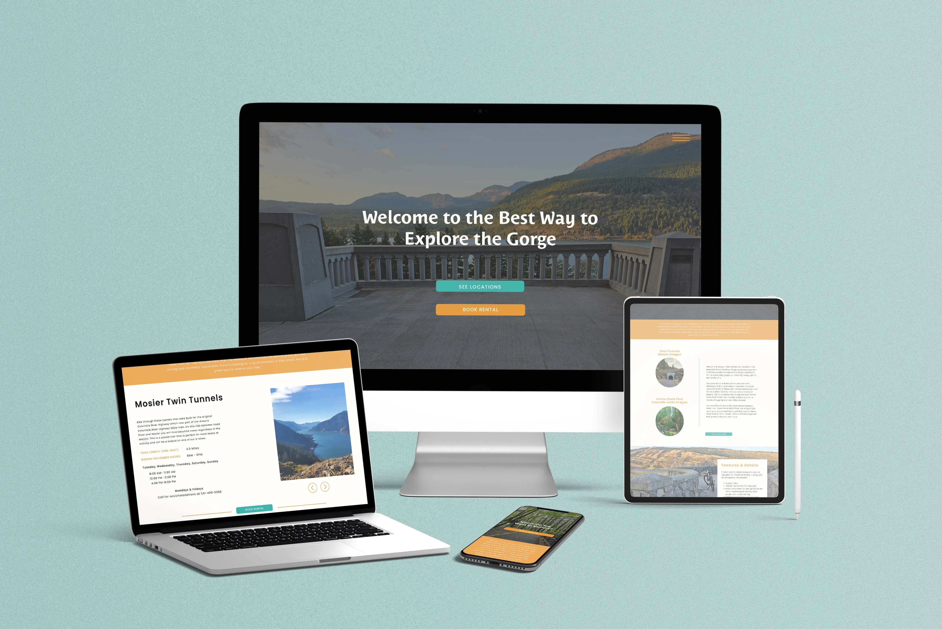
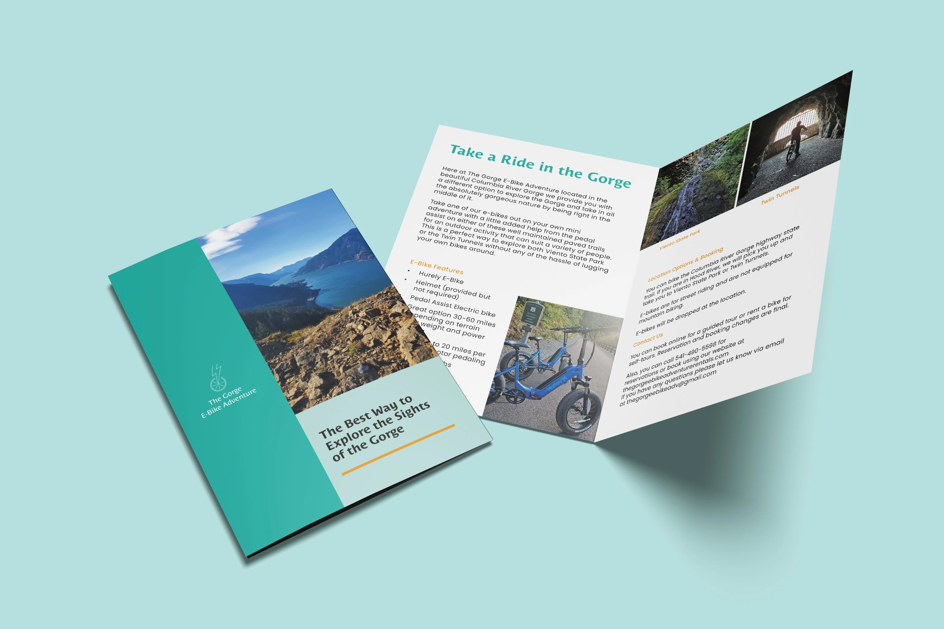
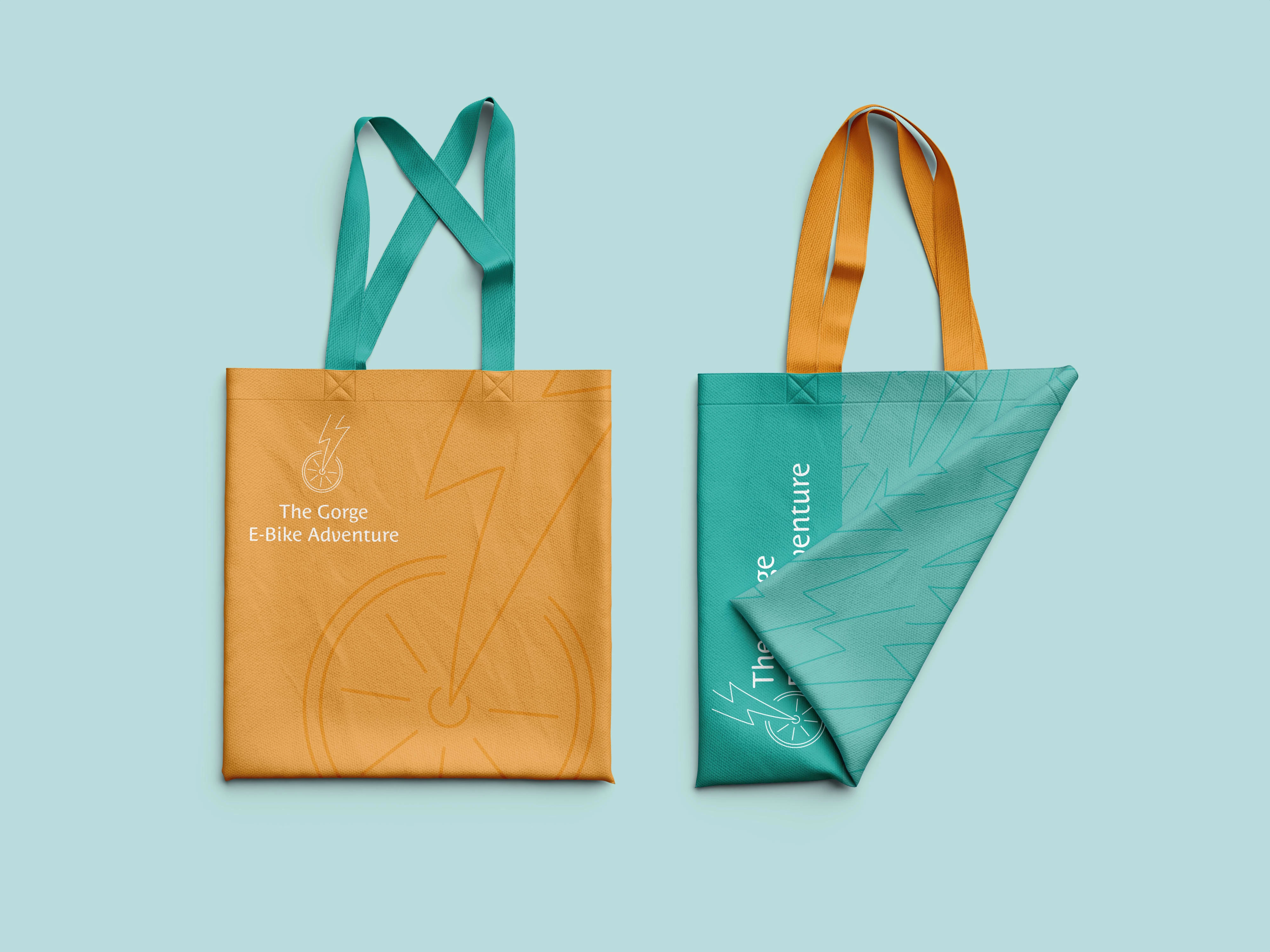
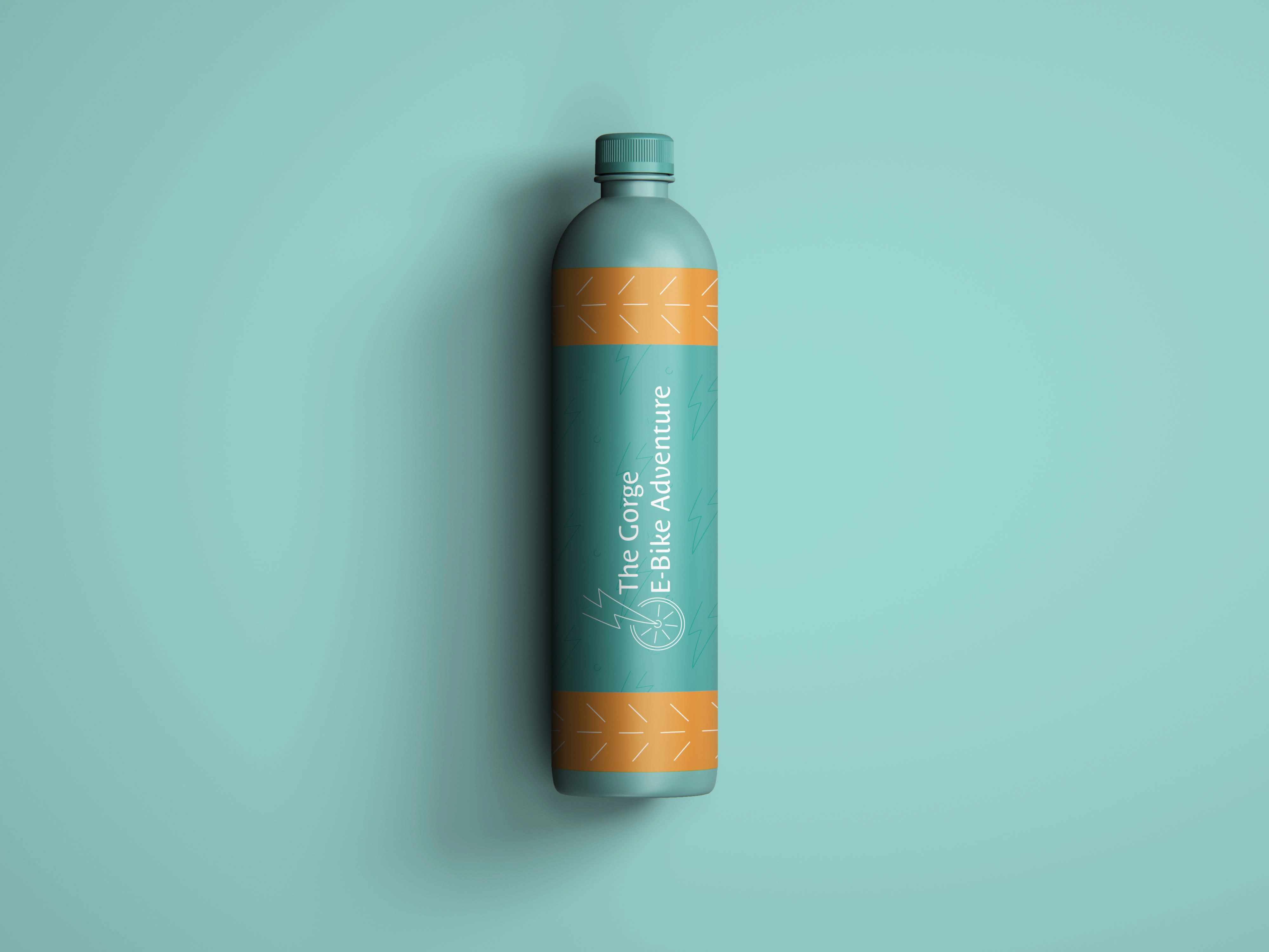
The All The Stops package that was chosen includes website design and some additional collateral designs. A branded website was necessary for providing customers with rental information, locations, and booking options. A brochure design was created to aid in promoting the business at events, and a tote and water bottle was designed as future merchandise options. Each item uses the logo and logo elements slightly differently than the website and brochure while staying on brand. One example is the bike spokes/sun rays on the edge of the bottle label also appear as abstract tire tracks for those who can spot it. All of these elements round out the brand and ensure that those using them get a consistent visual experience.
Color Palette & Typefaces
This color palette reflects a clean, calm vibe with a hint of energy, capturing the warmth of being outdoors, breathing fresh air, and basking in the sun on a perfect biking day. The primary color is a strong blue, evoking a clear, tranquil sky with a touch of green from the trees. Complementing this is a warm orange, symbolizing the energy of the sun and the electric bike's battery. Both typefaces were chosen and customized for similar feelings and practicality, ensuring readability and support for Spanish text. Harsh corners were rounded to soften the look and align with the logo.
Inspiration
InspirationThe client provided some beautiful images to use and stylize that help lead the inspiration of the design. We wanted the brand to feel Adventurous & Refreshing, Welcoming & Warm, and Calm & Serene. These keywords were at the heart of everything created from the logo to the overall branding. After some conversation with the client we also decided the logo and branding should capture the vibrant energy of the outdoors and the power of the e-bike batteries.
Like this project
Posted May 28, 2024
Designed logo, collateral, and a website for The Gorge E-Bike Adventure, an e-bike rental company based in Hood River, Oregon.