Branding For a Small Family Business: A.M. Bees
Behind The Company
A.M. Bees is a company run by a grandfather and grandson, and as such, their brand values are family and honesty. They provide honey to their friends and community, after doing so for a little while, they got to the point that they wanted to have a logo and business cards made and some packaging ideas proposed for future use.
Behind The Logo
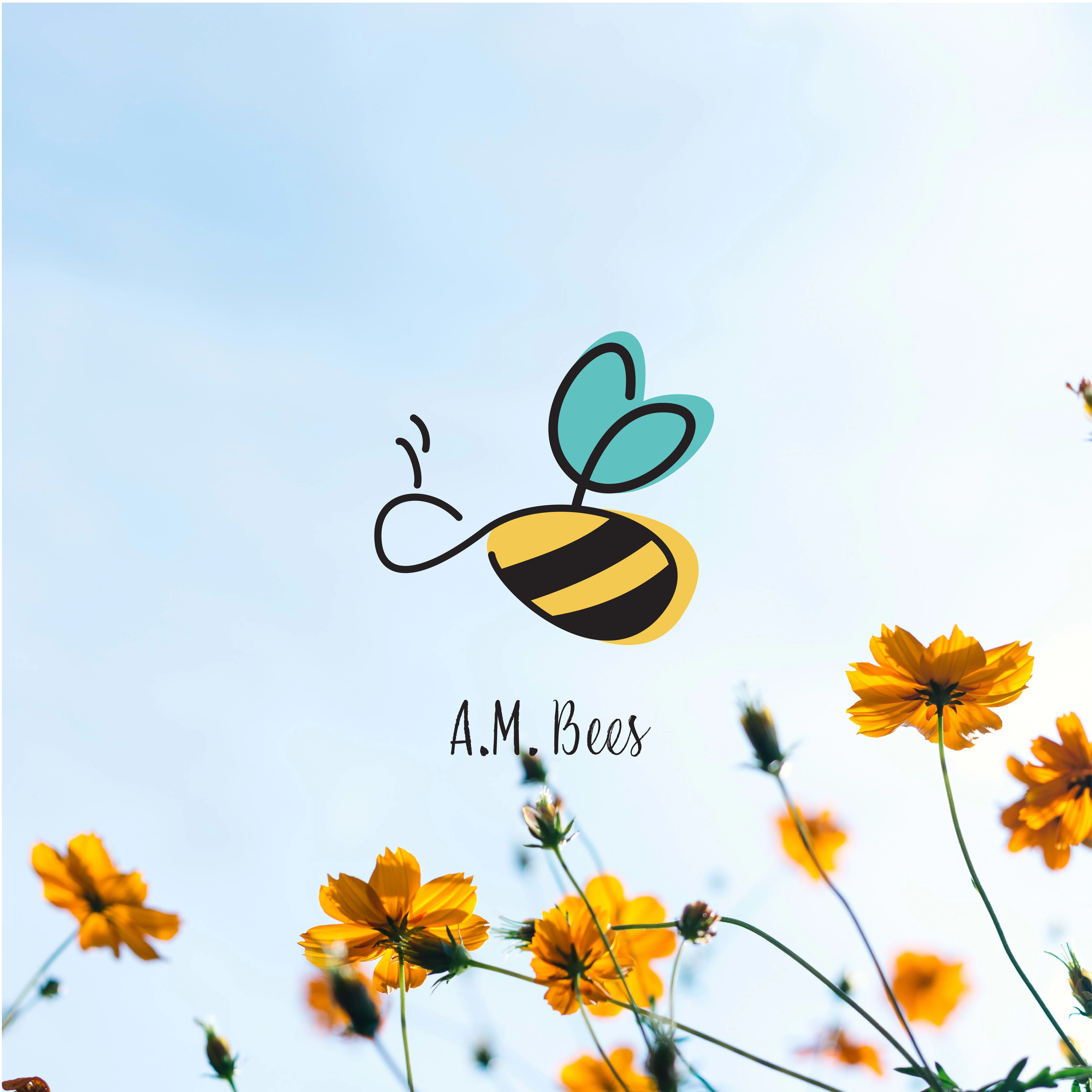
The soft lines and color palette create a welcoming feeling throughout the brand. This feeling ties to their value of family, and the simple no-frills logo visualizes their transparency and honesty in their transactions with their customers.
Behind The Packaging
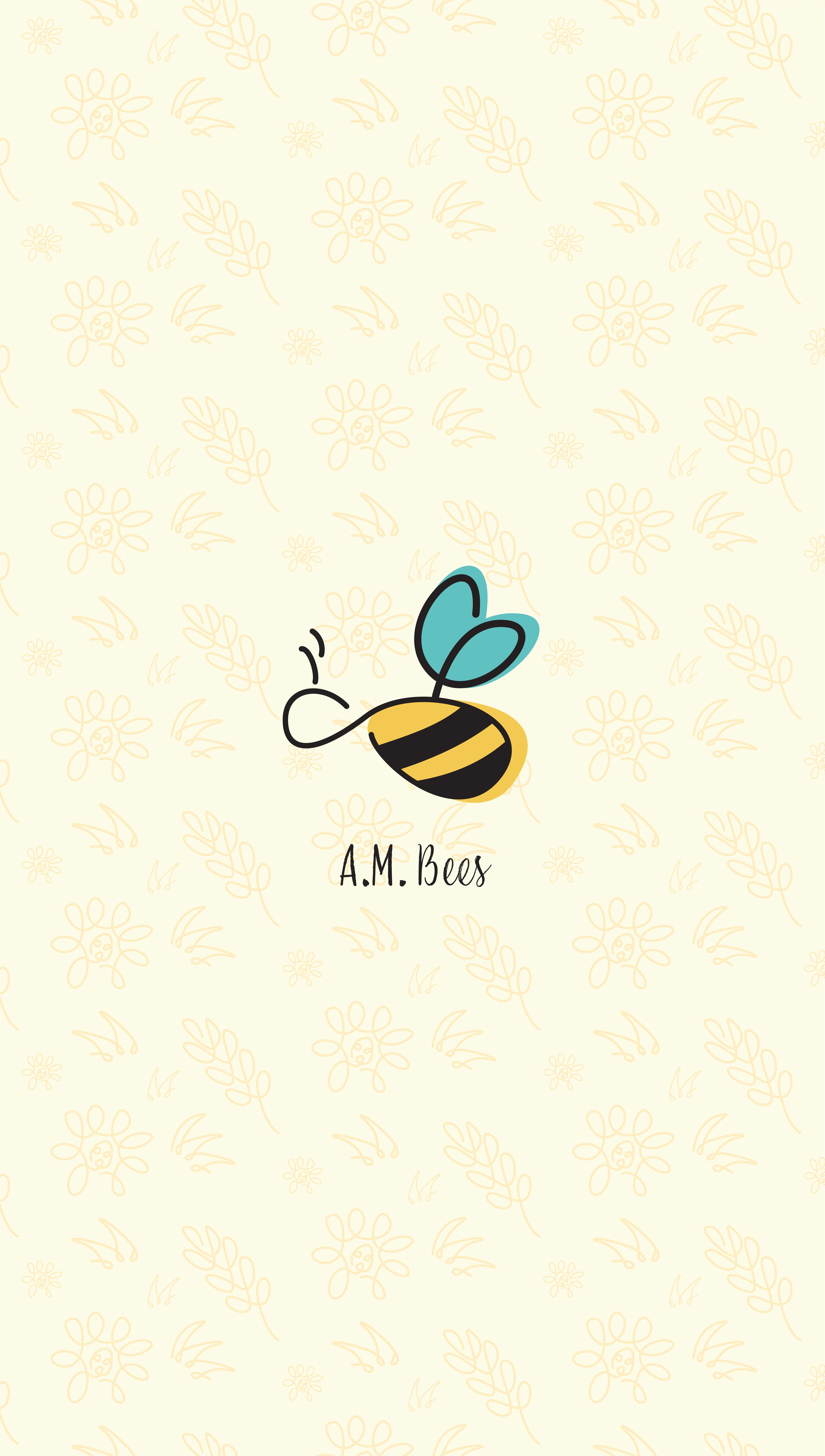
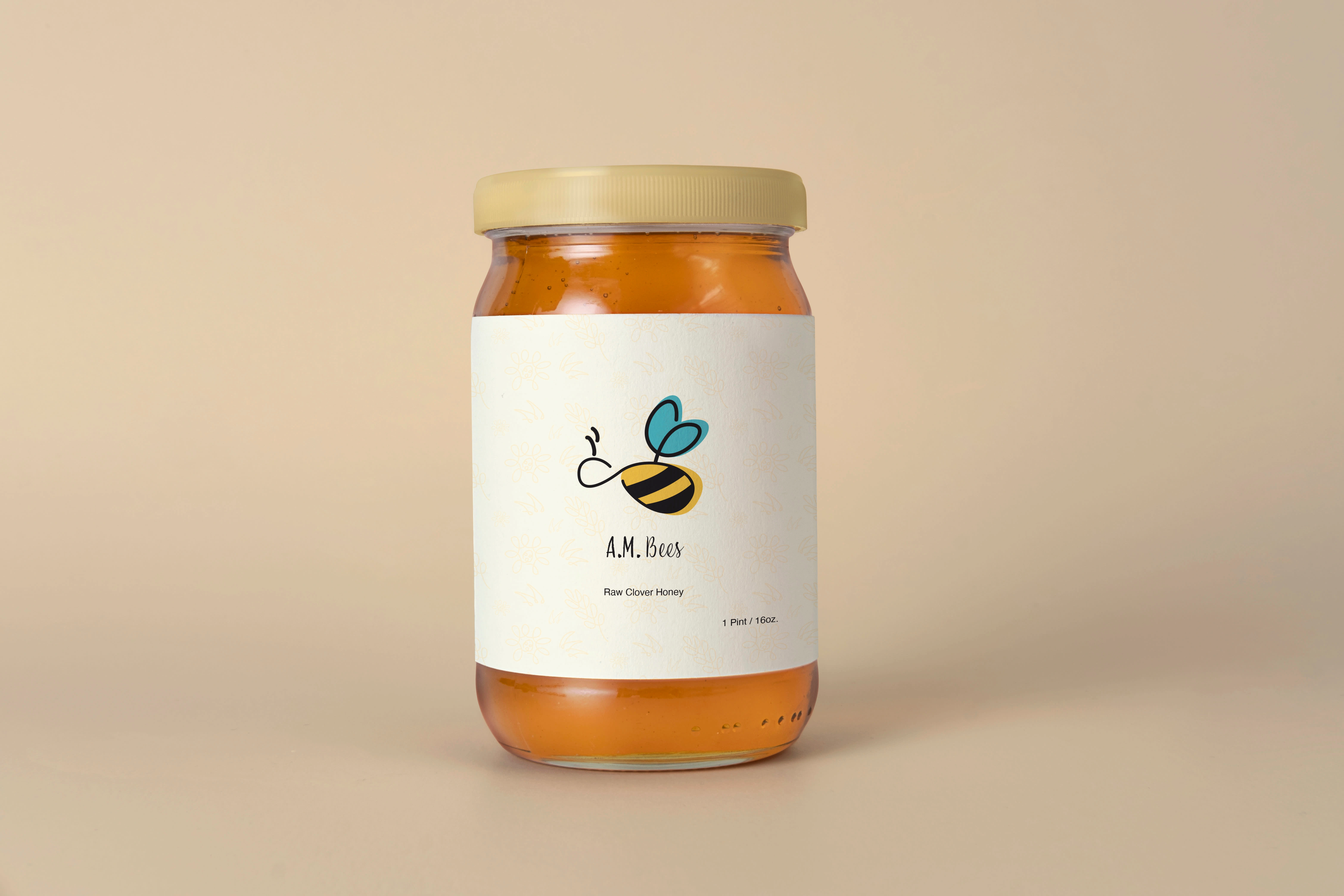
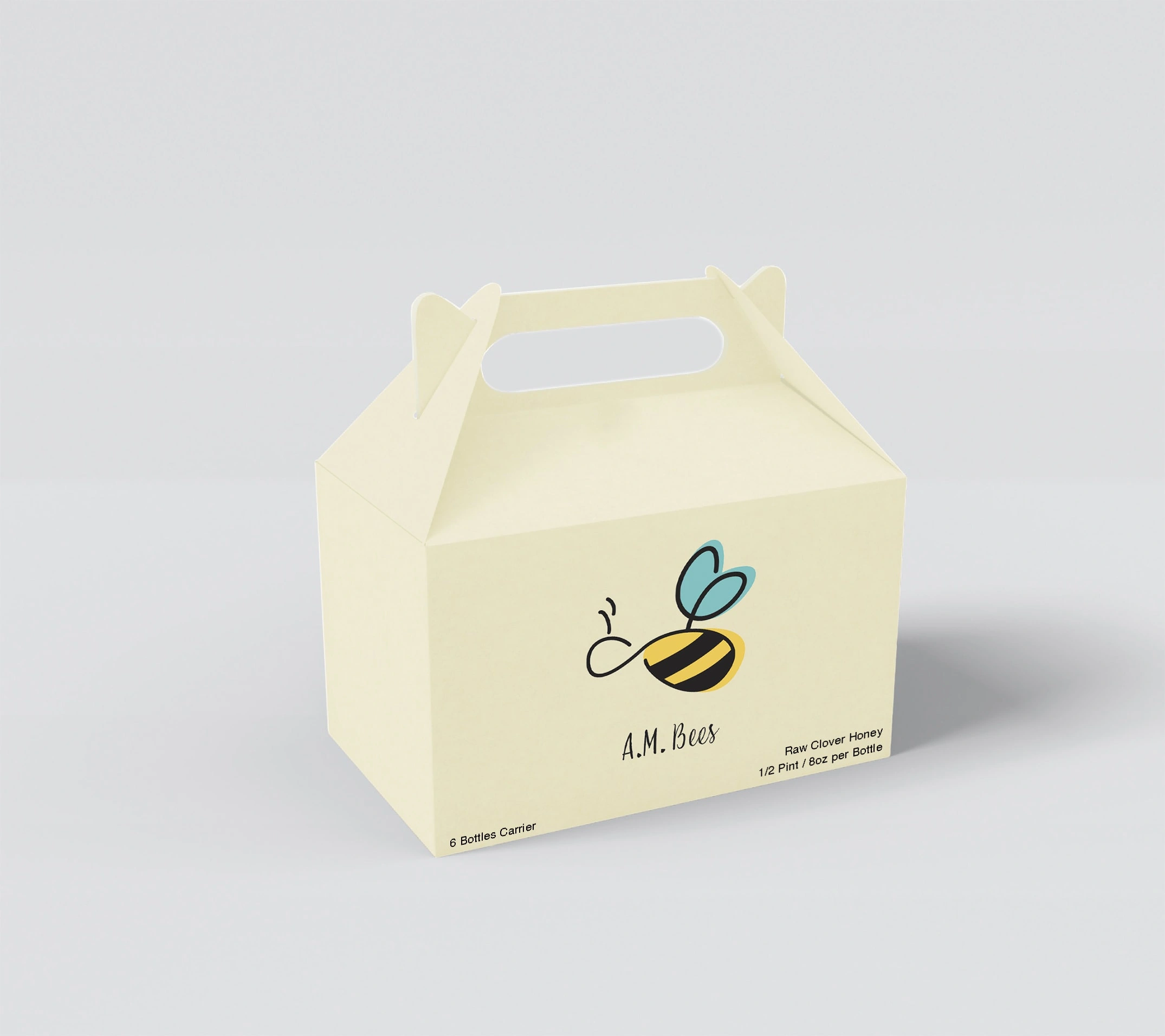
Branded packaging was also discussed so their honey and beeswax products would have a more professional look. Other people seeing the branded packaging would be a free “extra” advertising method as well. It was kept simple and uncluttered. A simple, subtle pattern of flowers was made from some varieties of flowers the bees would pollinate in the area.
Color Palette & Typefaces
These warm colors were selected to carry the same warm and calming feeling throughout the design. A handwritten style font was chosen for the logotype to keep the local feel while still looking professional.
Inspiration
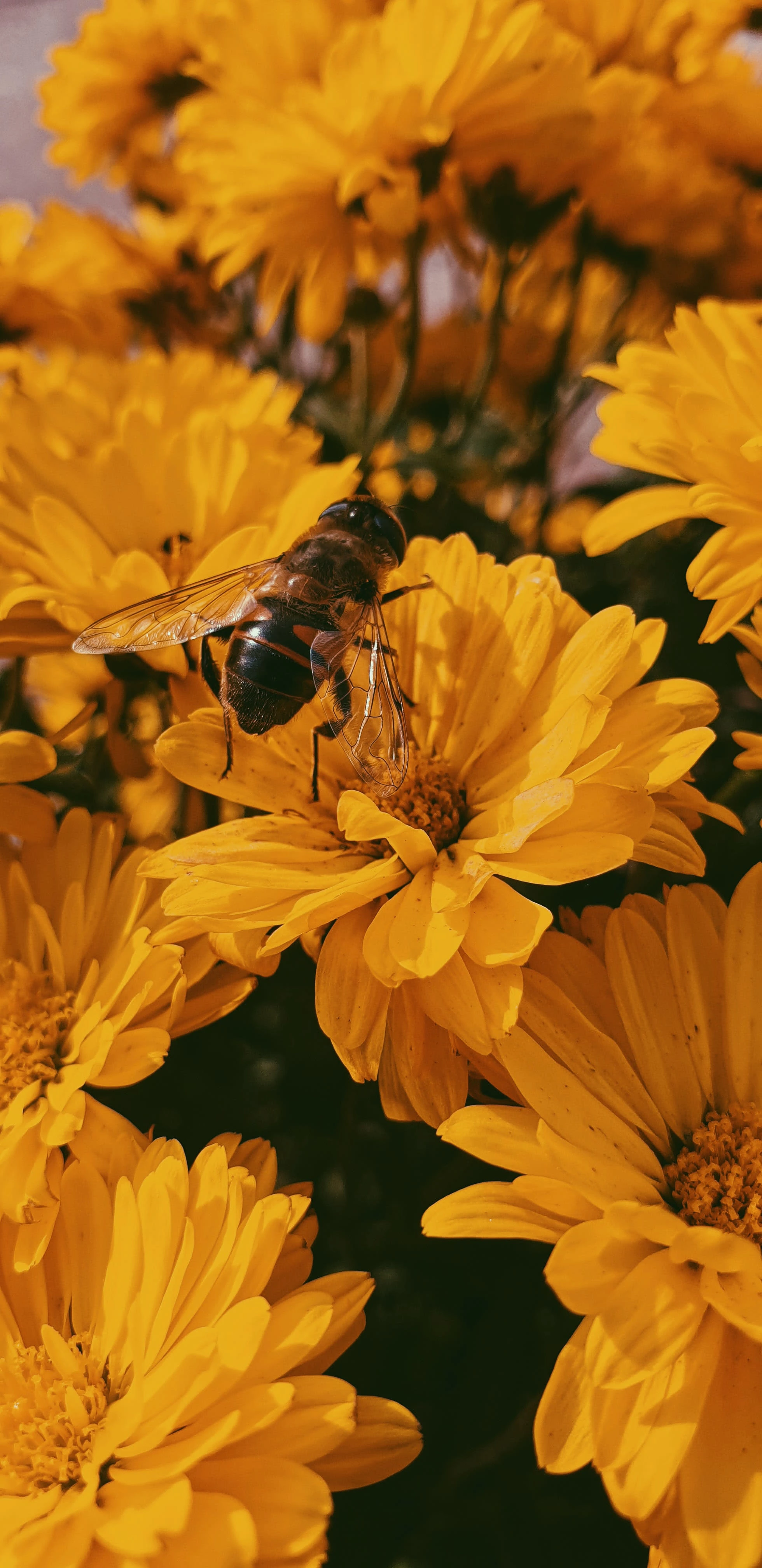
The images used for inspiration give off a warm, welcoming feeling. They take the freshness and calmness of nature. I wanted to bring those same feelings to the logo I created.



Like this project
Posted Aug 15, 2023
Created a simple logo, packaging, & pattern to embody the values & quality of a family honey business that emphasizes honesty & warmth in its branding.

