Branding For An Earring Business: Grace Clay Co.
Ayanna Richilano
Behind The Company
Grace is the owner of a small business making clay earrings and wanted a logo that could be used on packaging and any business accounts to have a united look across all platforms to be more professional.
Behind The Logo
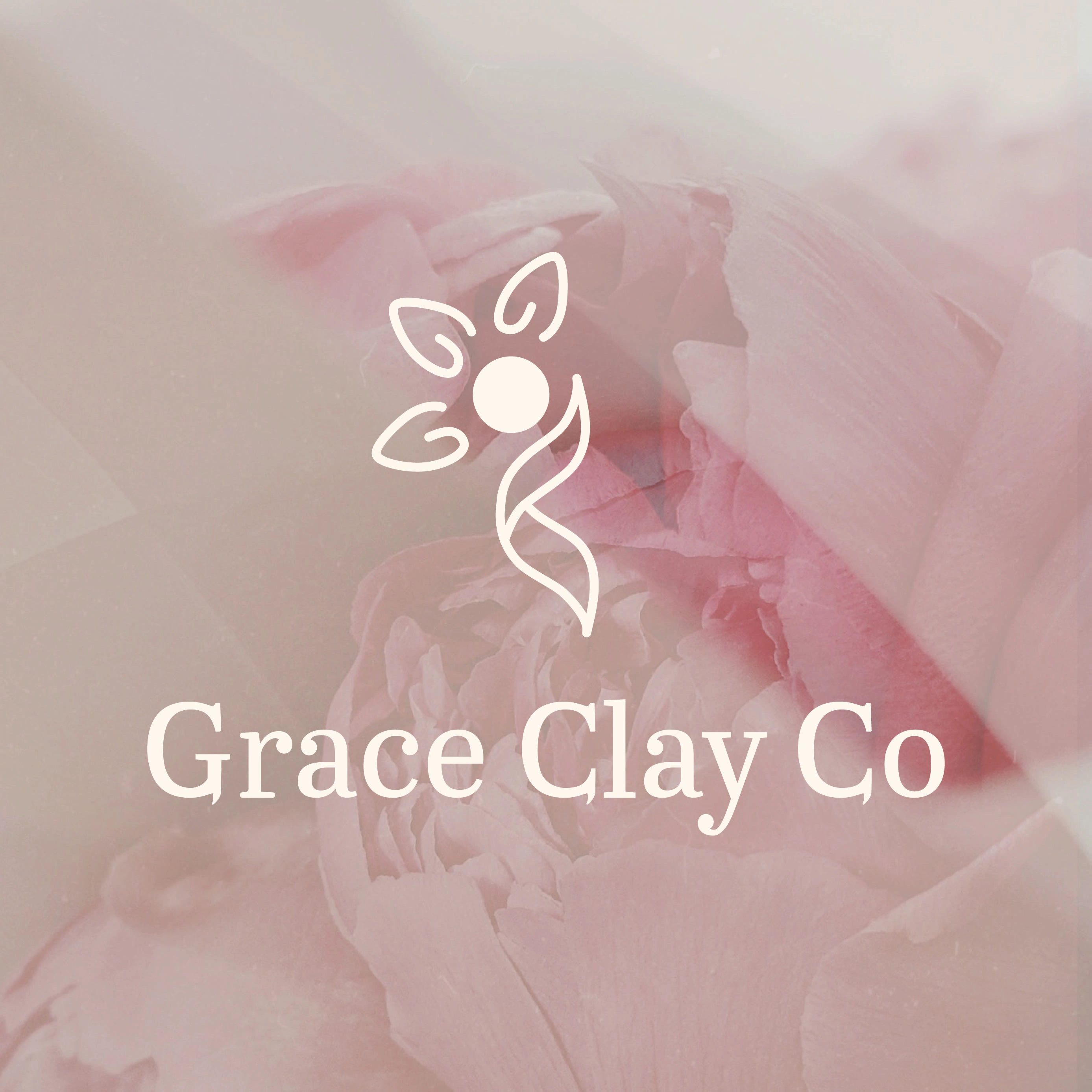
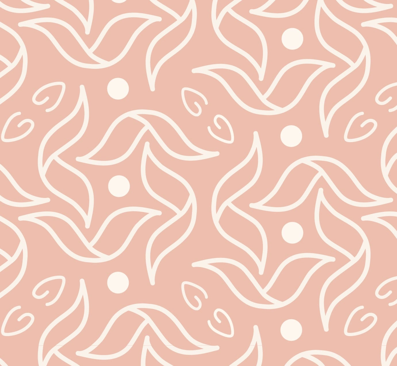
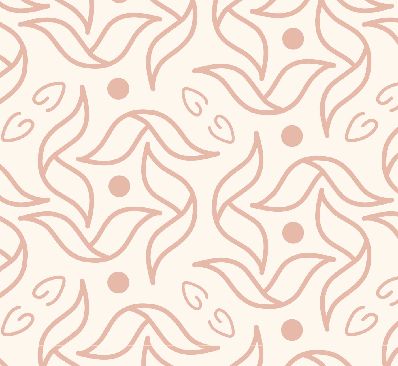
The logo was to have more organic shapes and lines to reflect the soft feminine look of the jewelry and to reflect some of the owner's personality.


Behind The Application
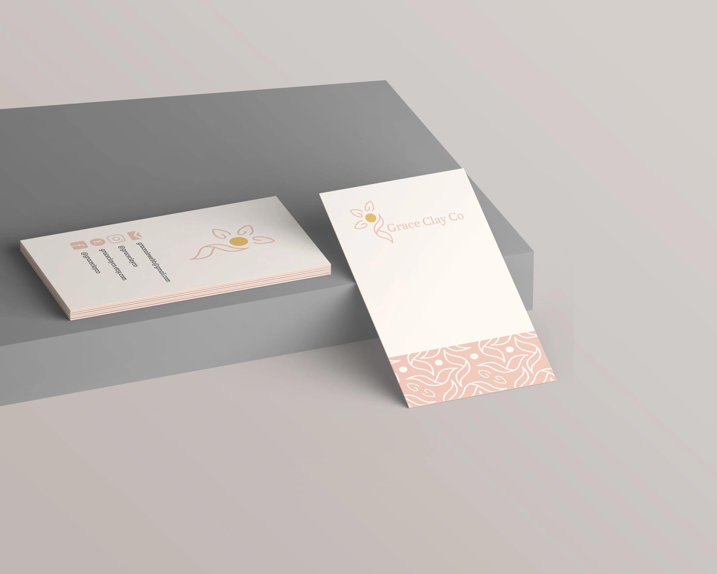
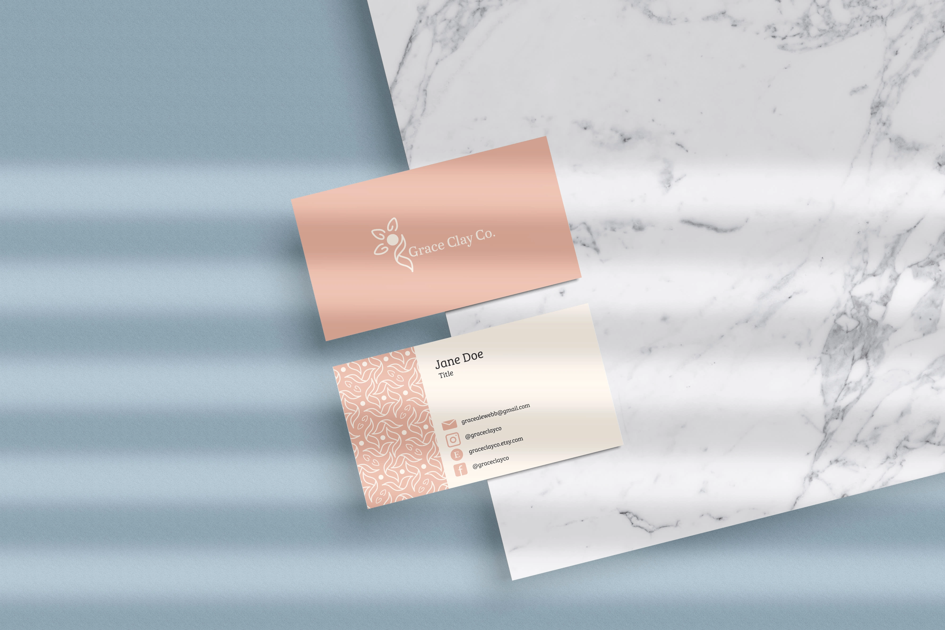
Being a start-up earring brand, one of the most important applications to be made would be a banner and icon for Etsy, where they are primarily sold. The second important piece of collateral to be made was the card that the earring would be mounted onto for sale.


Color Palette & Typefaces
After putting together the mood board, I picked out more specific colors for the brand that reflected the soft feminine feel that I set out to make. The Bree Serif Light font was customized to be more cohesive with the logo by adding elements to the logo. For example, changing the bottom terminals (or ends of the letters) on the uppercase G and C to be reminiscent of the ribbon shape in the logo. Then, a circle was added to the upper terminals on the lowercase A, R, and C, and the descender (the dangly bit on the bottom) of the lowercase Y to match the center of the flower in the logo.
Inspiration
After talking with the client about what felt she wanted the branding, I put together some images, including the ones to the left. After the client confirmed this was the direction she wanted me to go, I got to work sketching and ideating.
Like this project
Posted Aug 15, 2023
Created a logo reflecting femininity & personality for consistent & professional branding across platforms.