KNEAD A TREAT | BRANDING
Sami Toutoungi
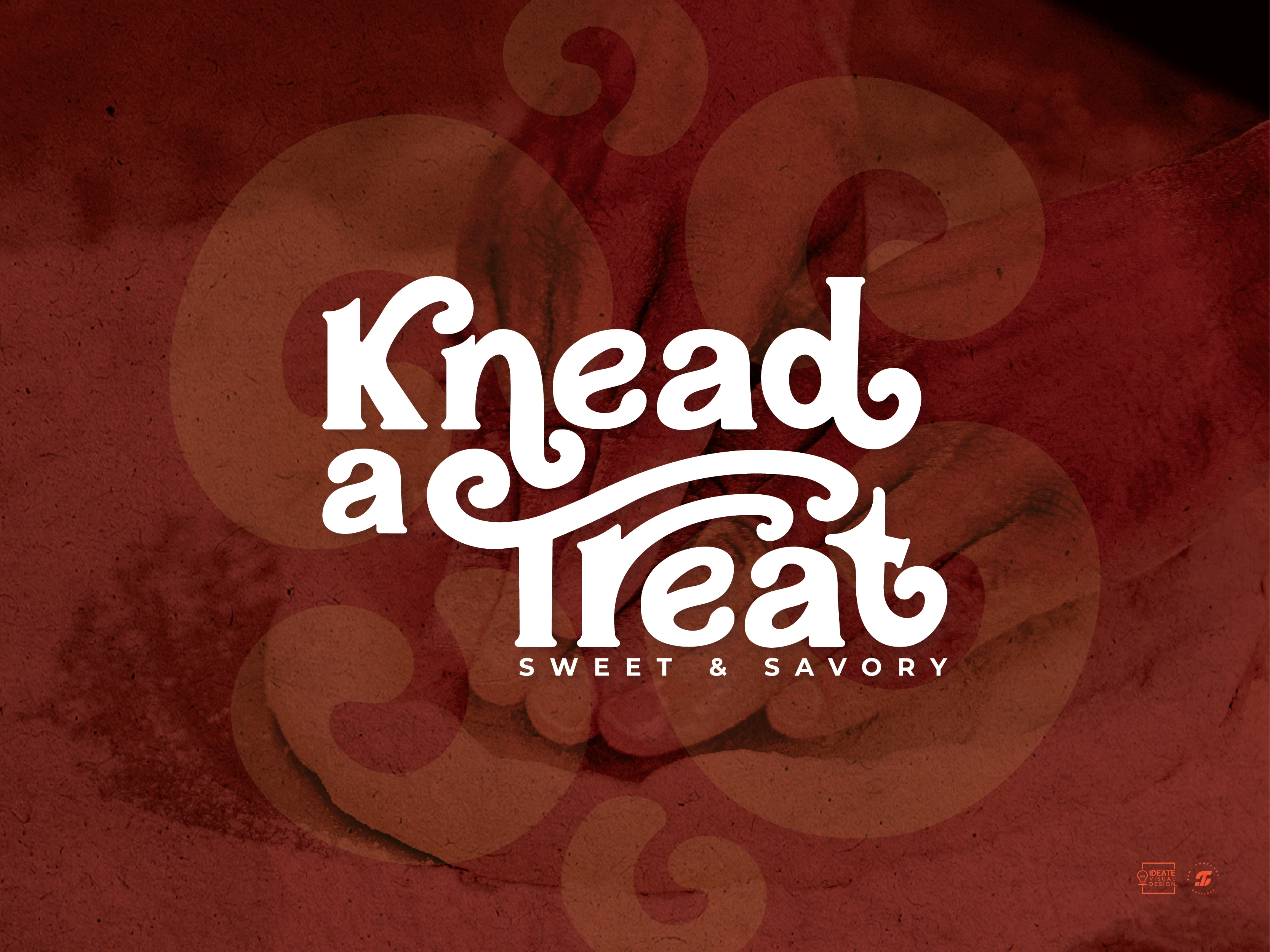
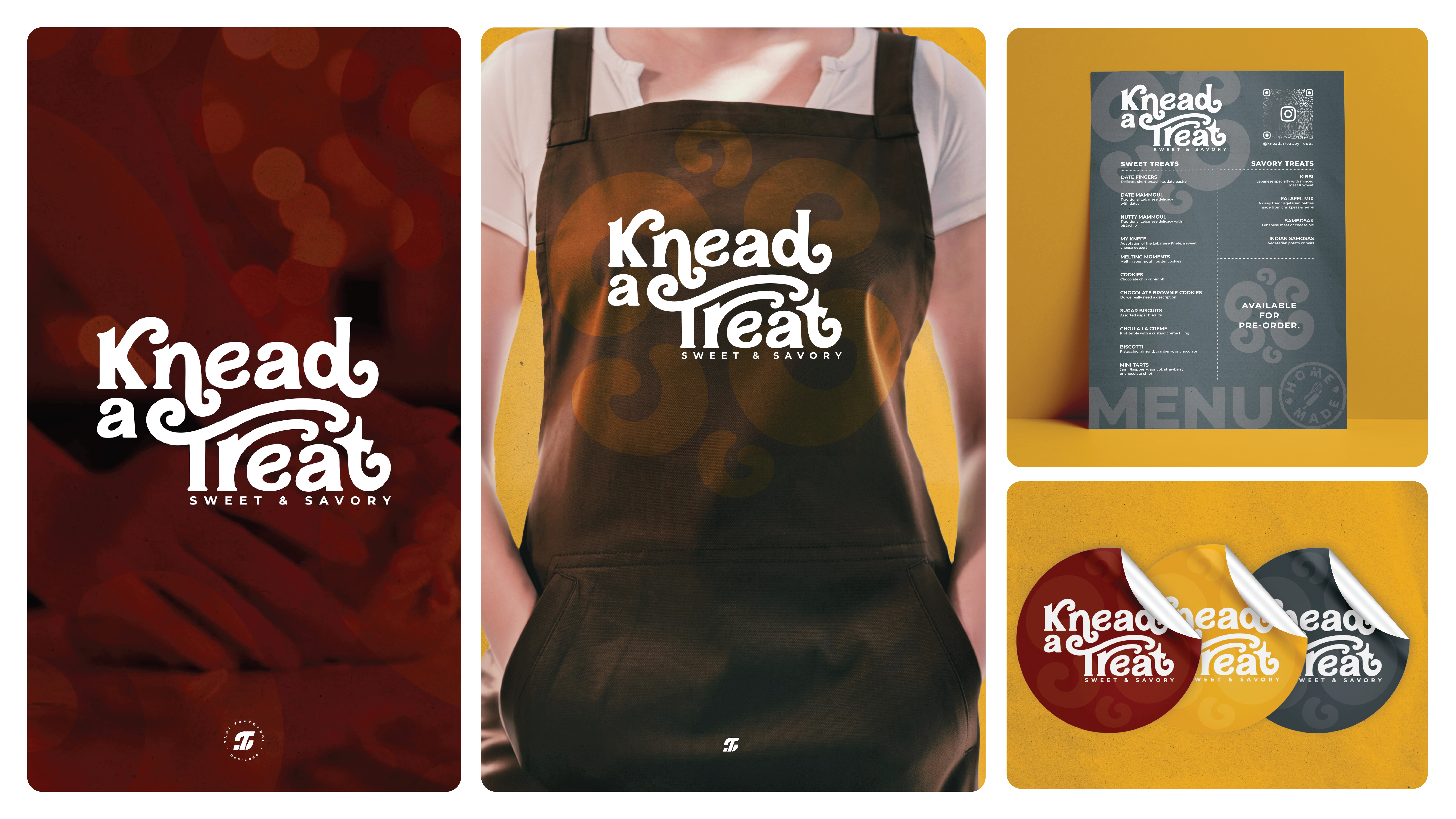
This project was for the development of a brand identity for a brand called Knead a Treat which produces a range of both sweet & savory, homemade baked products.
The word mark logo is inspired by a classic/vintage, bakery/sweet shop concept, featuring a custom hand drawn font style. The design uses serif elements in the font style to give it the classic feel & incorporates spiral shapes reminiscent of the steam that flows off warm freshly baked treats coming out the oven & are also used as a pattern. Together, these elements create a brand identity that reflects a delightful blend of the sweet & savory products.
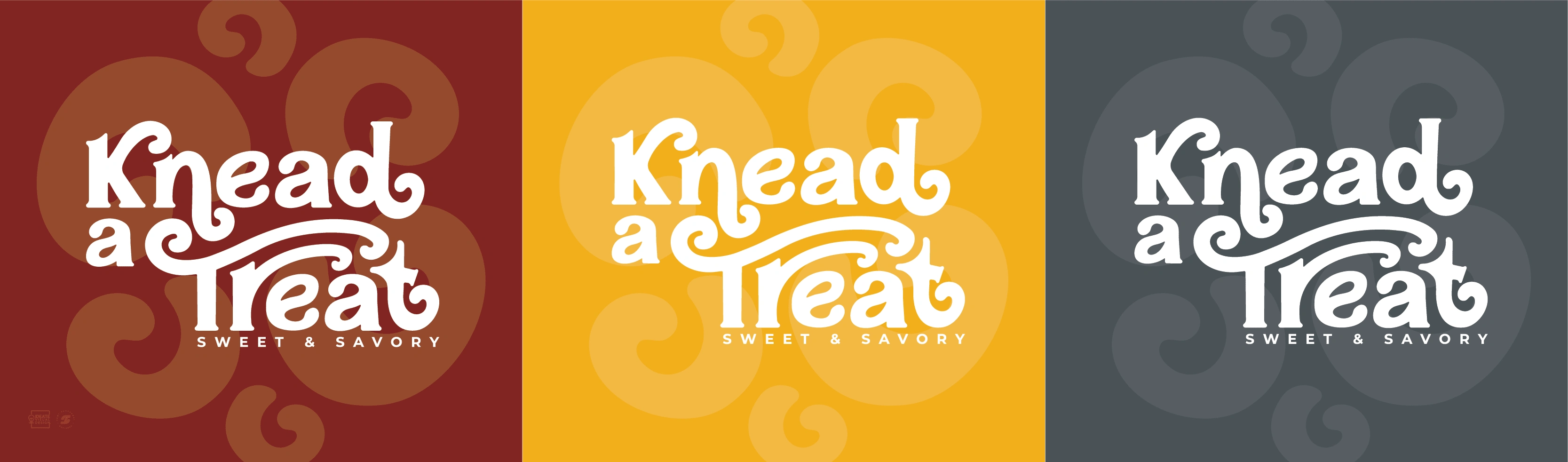
Color Palette
To create a warm brand experience, the color palette is based on a milk chocolate brown tone, warm complementary colors which are a bright yellow & a light beige tone reminiscent of the colors of some baked goods. These elements seamlessly work together to craft a brand identity that immerses customers in a warm, welcoming atmosphere allowing them to fully experience delightful homemade sweet & savory treats.
The Brand Identity In Action
Like this project
Posted Mar 28, 2025
Designed the brand identity for Knead a Treat, a homemade bakery. With a vintage-inspired logo & warm color palette reflect its sweet and savory delights.
Likes
1
Views
26
Timeline
Jan 13, 2025 - Jan 20, 2025