THEORY OF TEA | BRANDING & PACKAGE DESIGN
Sami Toutoungi
This project was for the development of a brand identity & package design for premium tea brand called Theory of Tea made for those who enjoy tea as an experience. With each blend carefully chosen to showcase the unique stories & origin behind the leaves, bringing rich flavor & quality to every cup.
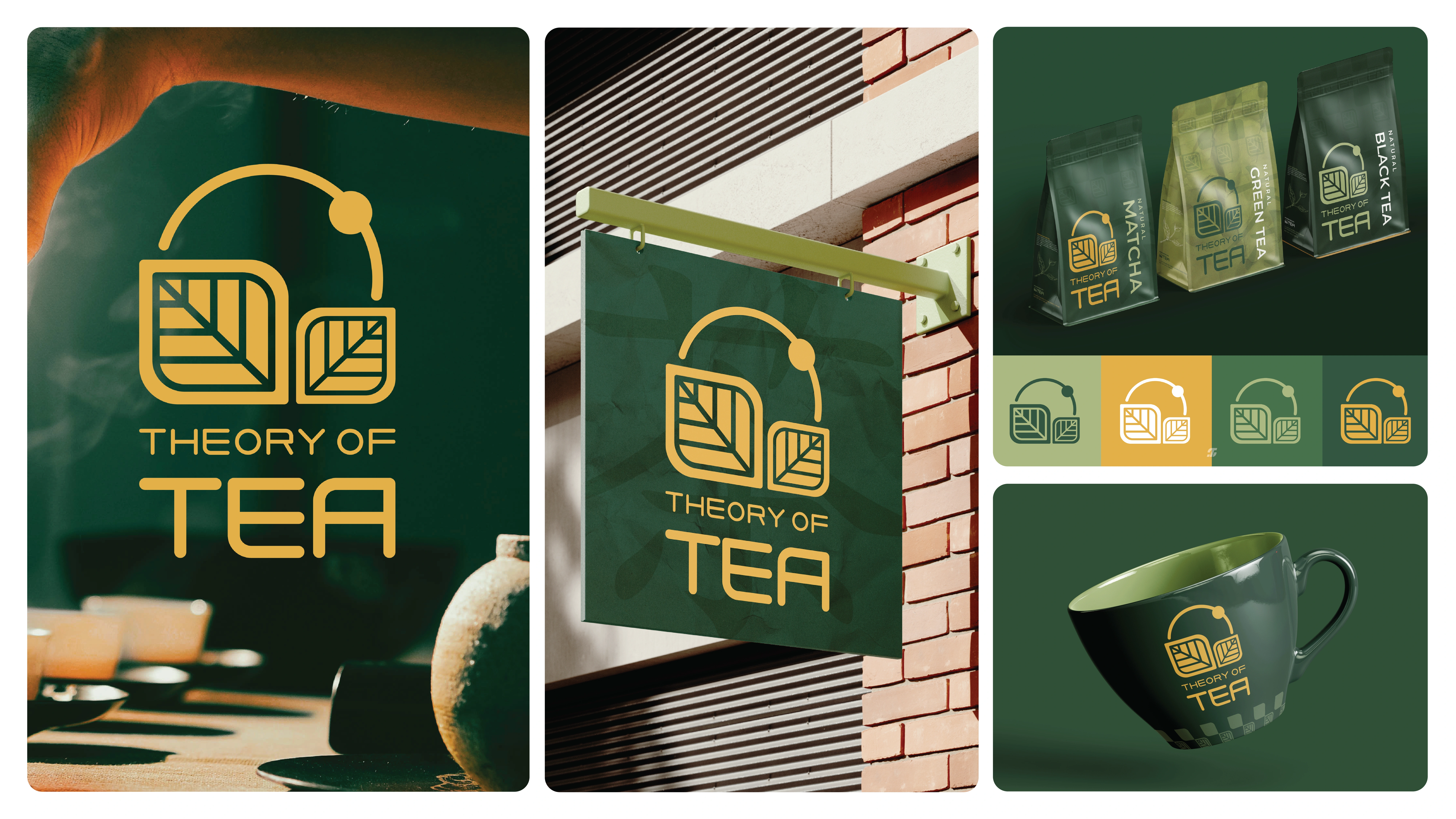
The Brand Identity in Action
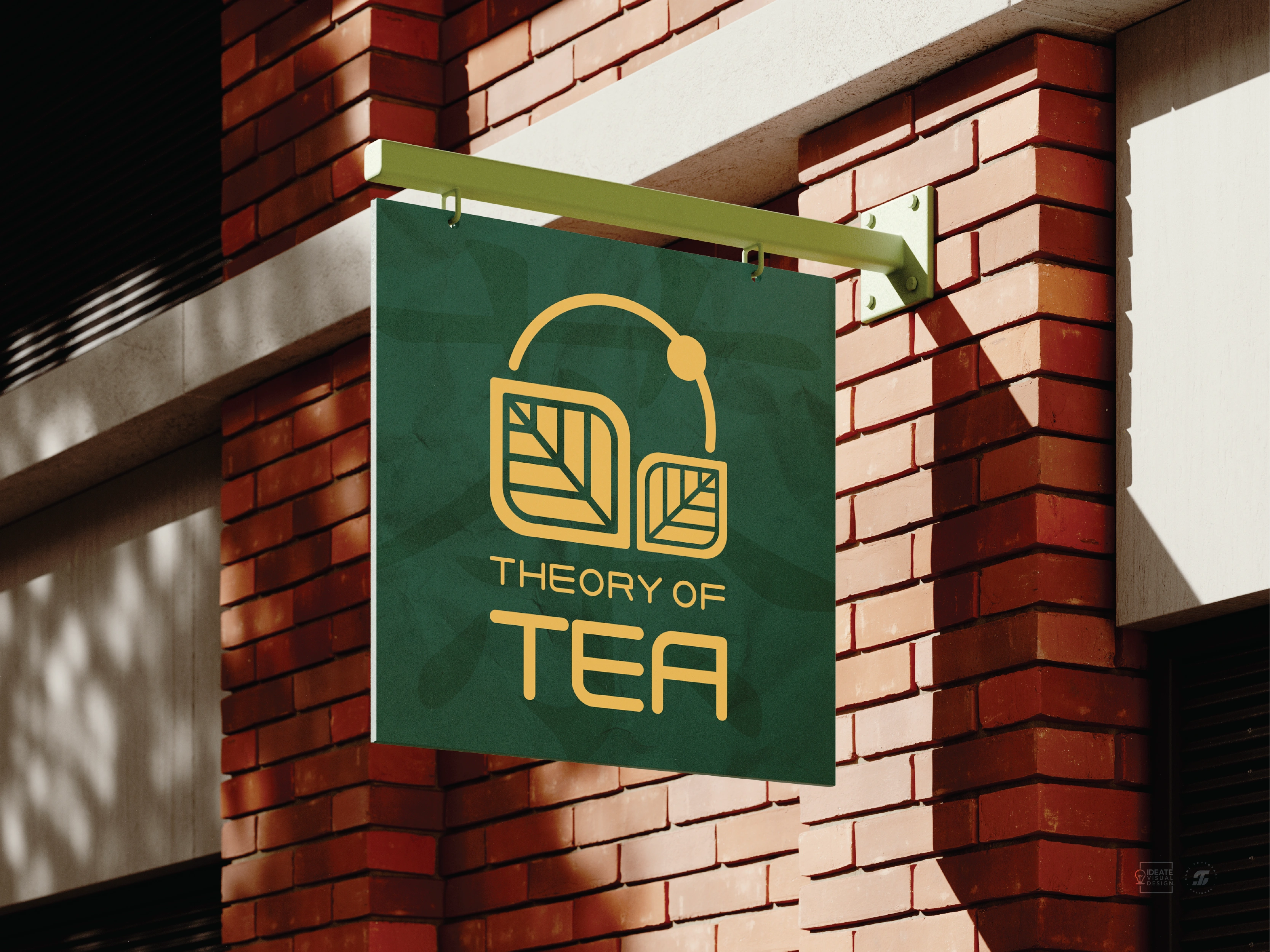
The logo is based on four elements: the tea leaves representing the product, followed by the circular elements which symbolize the word ‘Theory’ in terms in reference to the natural elements, the universe & other scientific theories. Together, they form the third element which is the shape of tea bag with a “string,” created with geometric leaf shapes, circular shapes & negative space in between. The fourth element is the typography which is a custom font specifically designed exclusively for the logo, with text form based on the geometric leaf shapes. Together, these elements harmonize to form a unique & meaningful logo that reflects the essence of the brand.
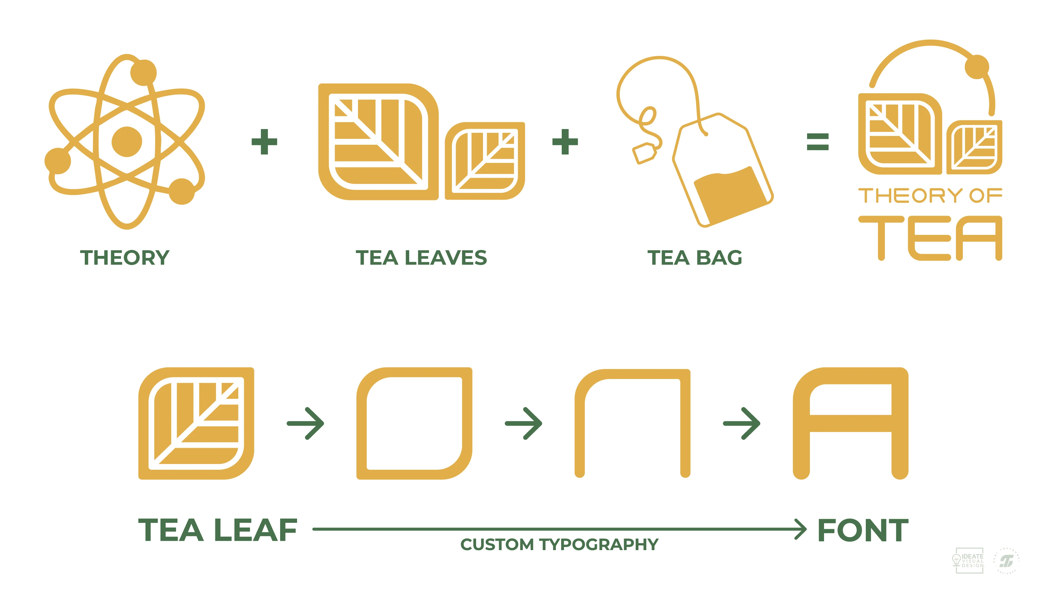
Logo concept breakdown
To create a premium brand experience, the color palette combines tone of the color green as a reflection of the tea flavors & gold to give the brand a luxurious modern feel.
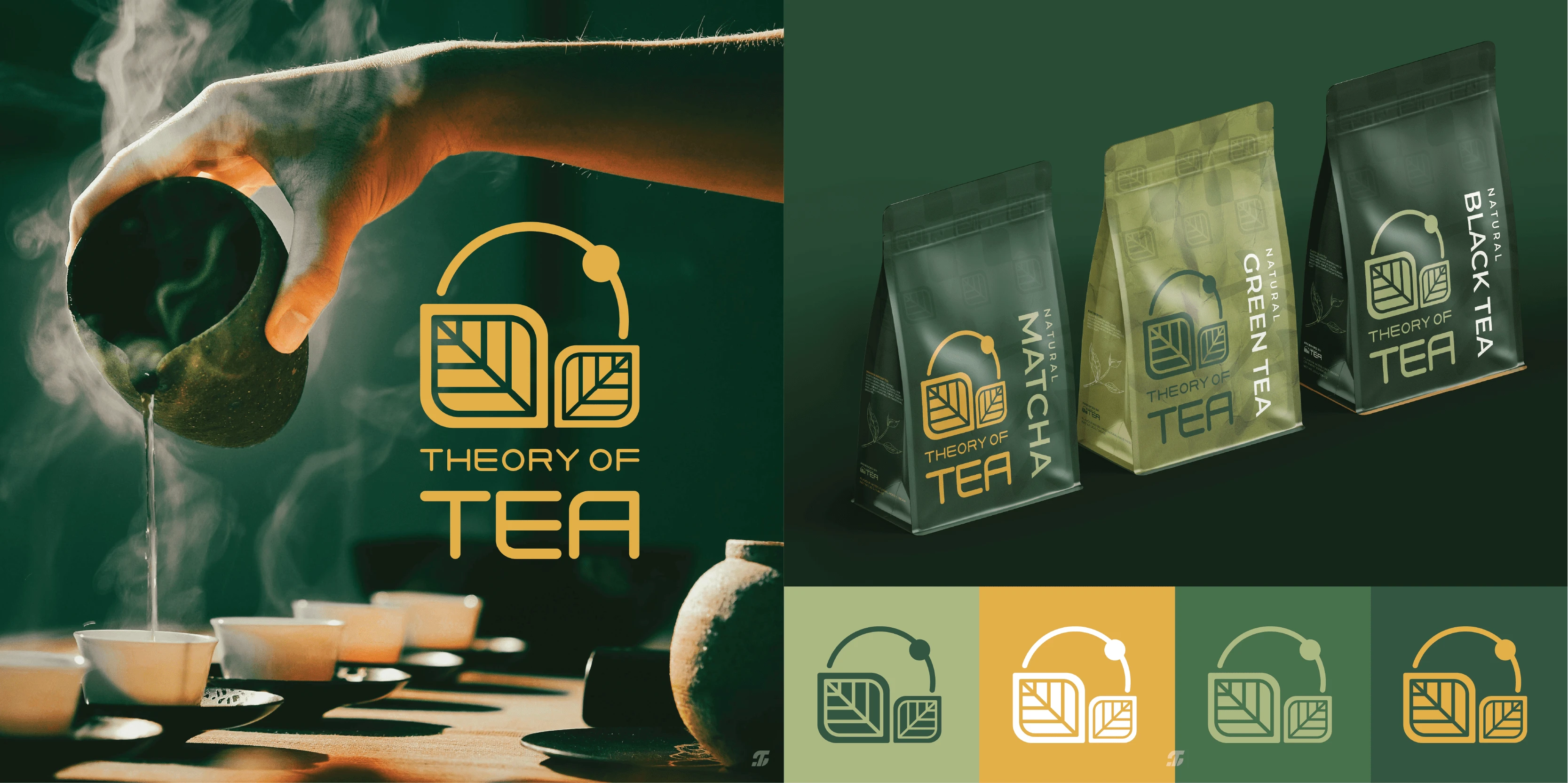
Demonstration of the color palette.
Like this project
Posted Mar 26, 2025
Developed brand identity & packaging for Theory of Tea, a premium tea brand. The design blends nature, science, & luxury to create a rich, immersive experience.
Likes
1
Views
82
Timeline
Nov 1, 2024 - Nov 8, 2024