THE GRID TENNIS CLUB | BRAND IDENTITY DEVELOPMENT
Sami Toutoungi
This project was for the development of a brand identity for a brand called The Grid, which is a membership-based tennis club built for those who live & breathe the game.
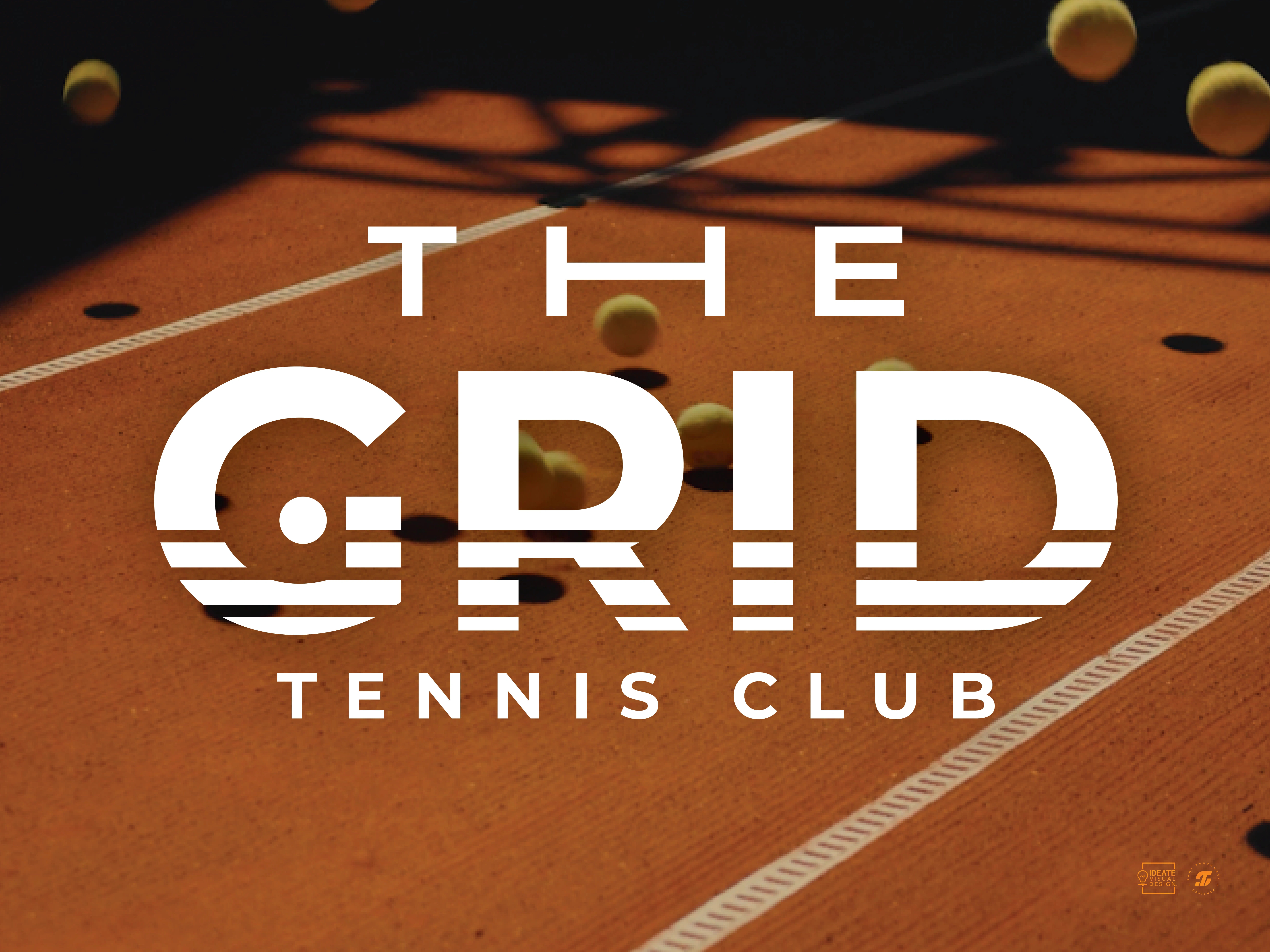
The creative direction for the visual identity draws inspiration from both the sport & the brand name itself, integrating tennis-specific elements into the word mark logo. The grid patterns inspired by tennis courts & racket strings, are integrated into the typography to create distinctive letterforms for the logo, for instance, the letter H is designed using the lines of a tennis court. This also includes a circle that completes the center of the letter G, symbolizing a tennis ball with a subtle nod that adds meaning without compromising simplicity, reinforcing the brand’s core concept. Together, these elements form a brand identity that reflects the club’s dynamic energy & connection to the game.
The Color Palette
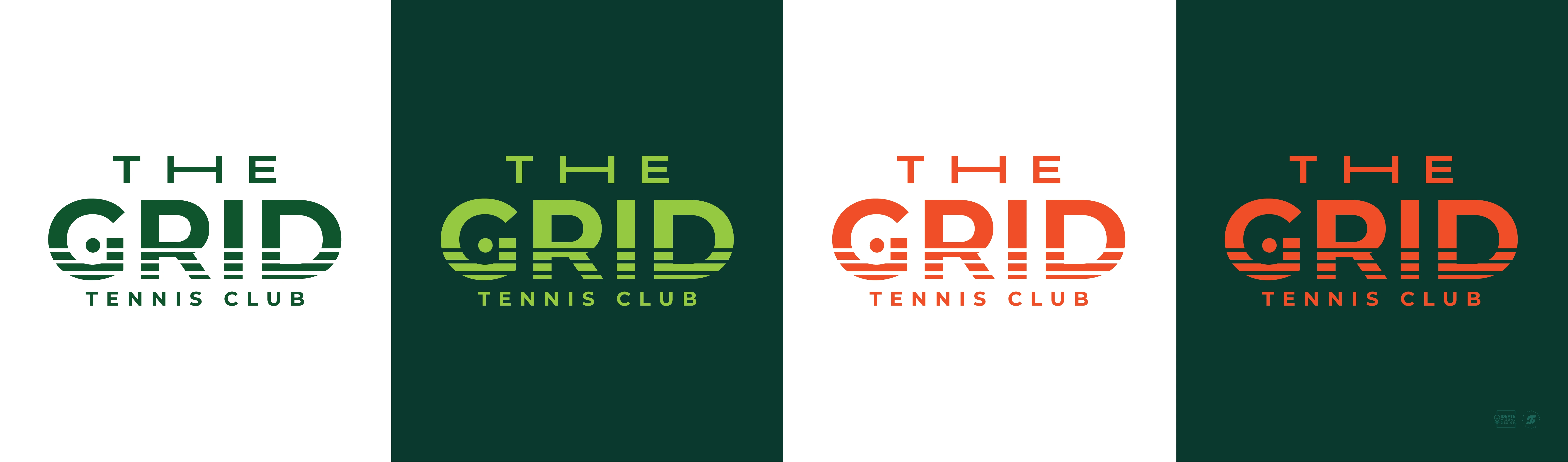
For the color scheme, the palette is based on the colors of various elements of the game, from the courts to the tennis balls. The tones of green represent the tennis balls & the grass courts, & the orange color represents the clay courts.
This is reflected in the deliverables of the project, which include two types of membership cards, one for the avid pro players and one for customers who prefer a monthly membership.
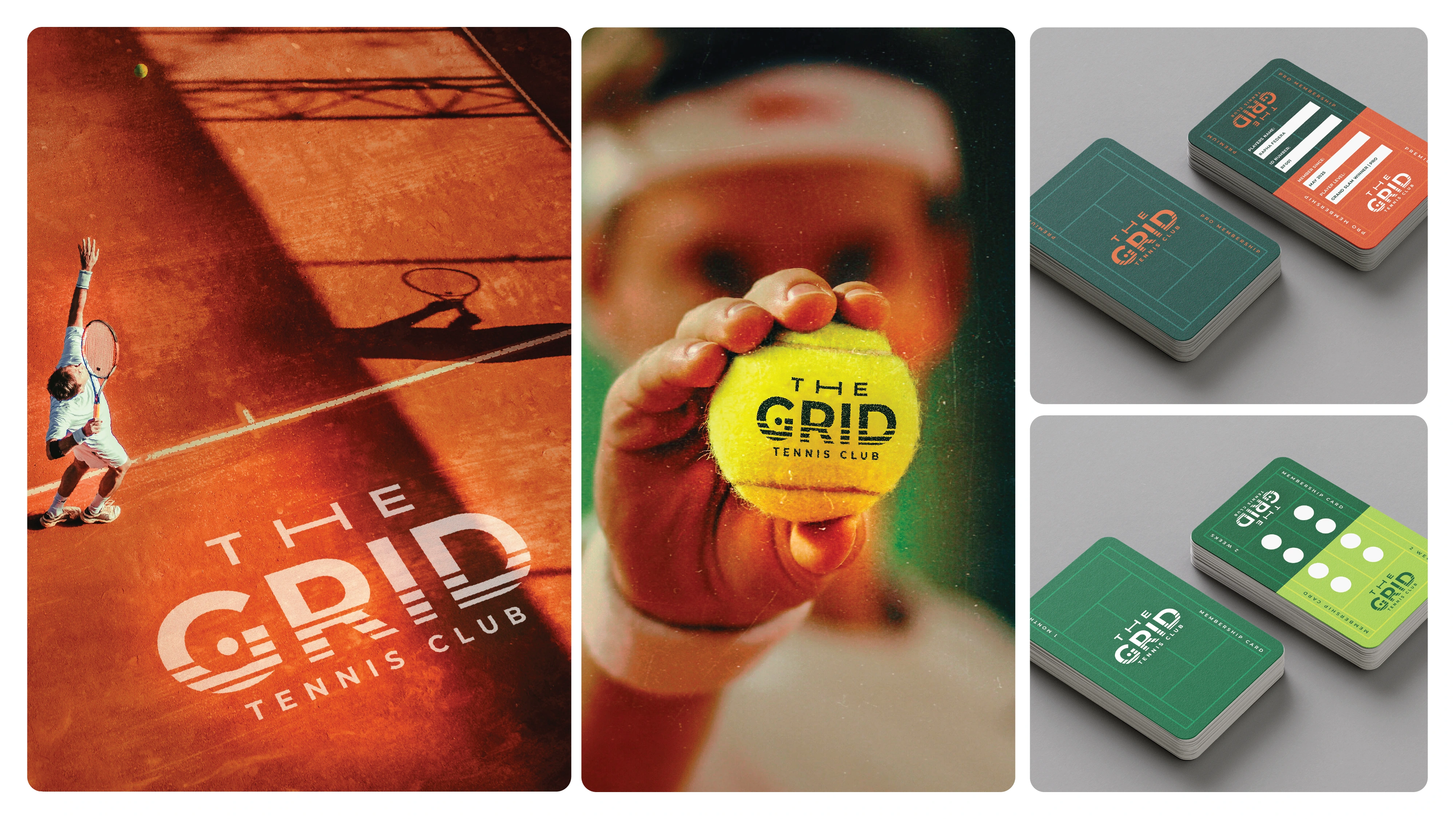
The Brand Identity in Action
Like this project
Posted Jun 4, 2025
Developed a brand identity for a tennis club with visual elements inspired by the sport and the brand name itself.
Likes
1
Views
44
Timeline
May 19, 2025 - Jun 23, 2025