BENZÃO CAFÉ BRASILEIRO | BRANDING & MENU DESIGN
Sami Toutoungi
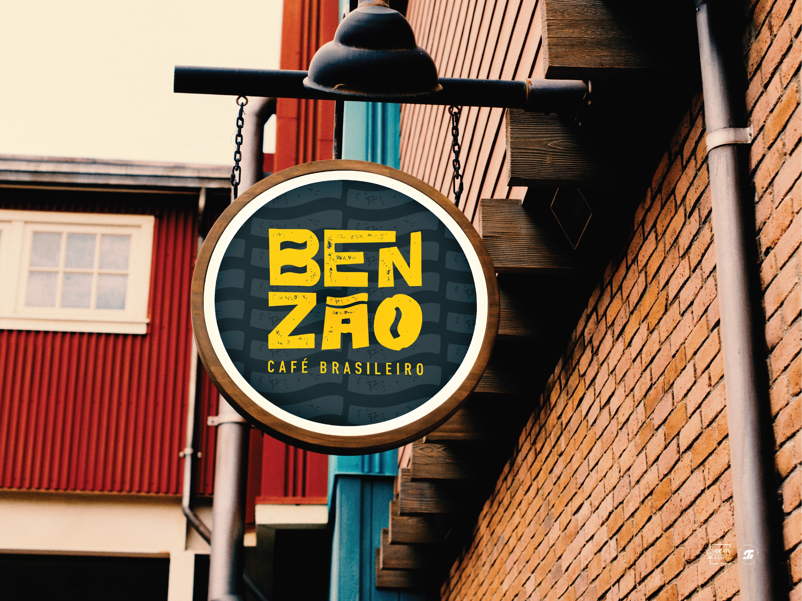
This project was for the development of a brand identity & menu design for Brazilian cafe brand called BENZÃO which is an affectionate term meaning ‘big blessing’. The cafe offers a cozy spot to enjoy traditional Brazilian treats & coffee, with a focus on a warm experience & flavor.
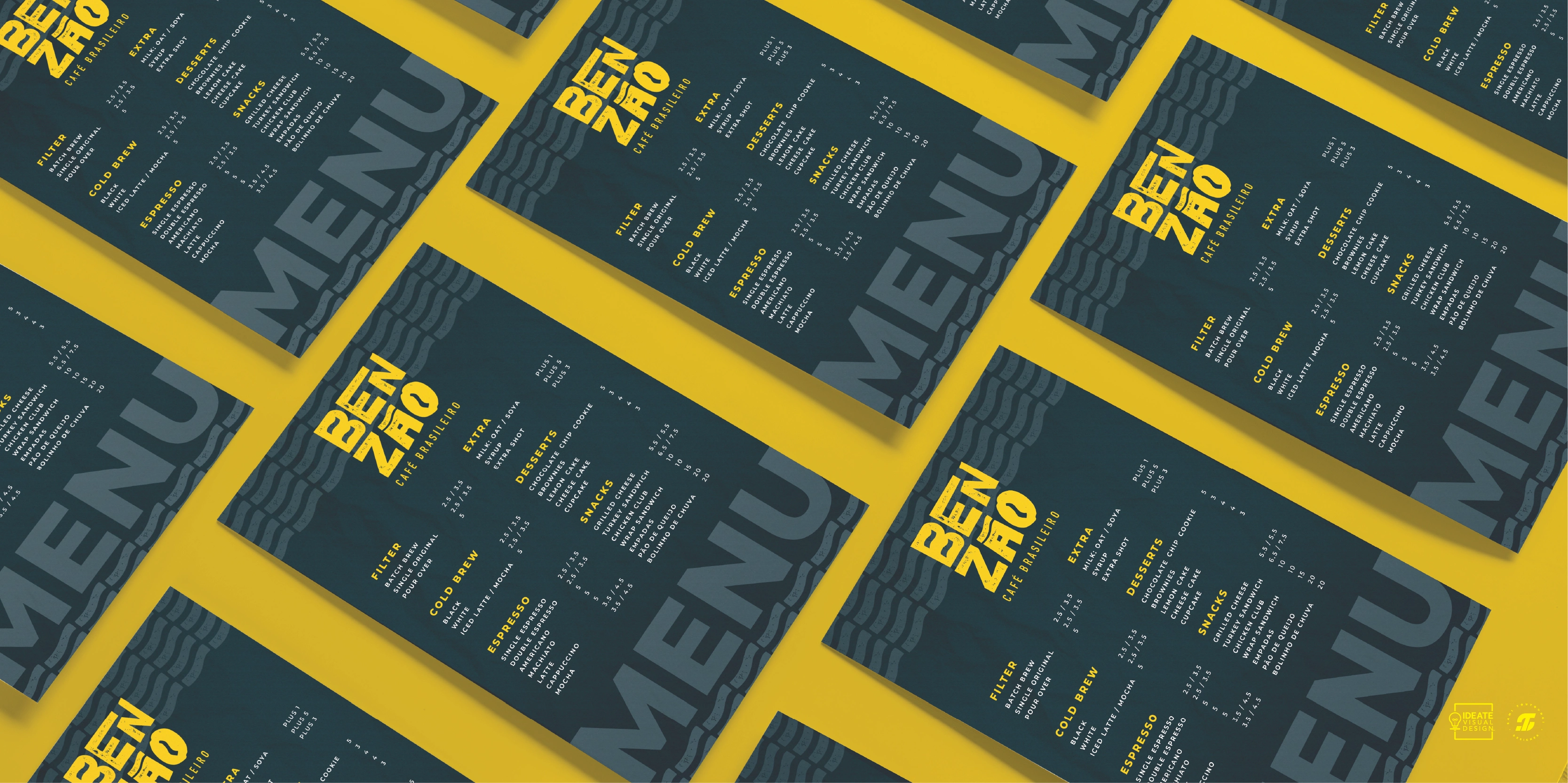
Menu Design Mockup
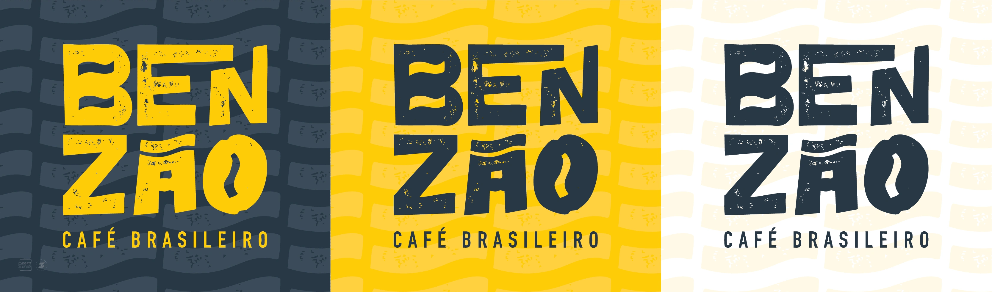
The word mark logo is inspired by a rustic concept, featuring a custom hand drawn textured font style. The design incorporates the lines & shapes reminiscent of a coffee bean, while also drawing influence from the shape of the typography used in the Portuguese spelling of the brand name (BENZÃO), which includes a uniquely shaped accent above the letter ‘Ã’.
Color Palette
To create a warm brand experience, the color palette combines the blue & green colors from the Brazilian flag to create a dark tone that would allow the yellow color to pop. Together, these elements craft a brand identity that immerses customers in a warm, welcoming atmosphere allowing them to fully experience the vibrant Brazilian vibe of the cafe.
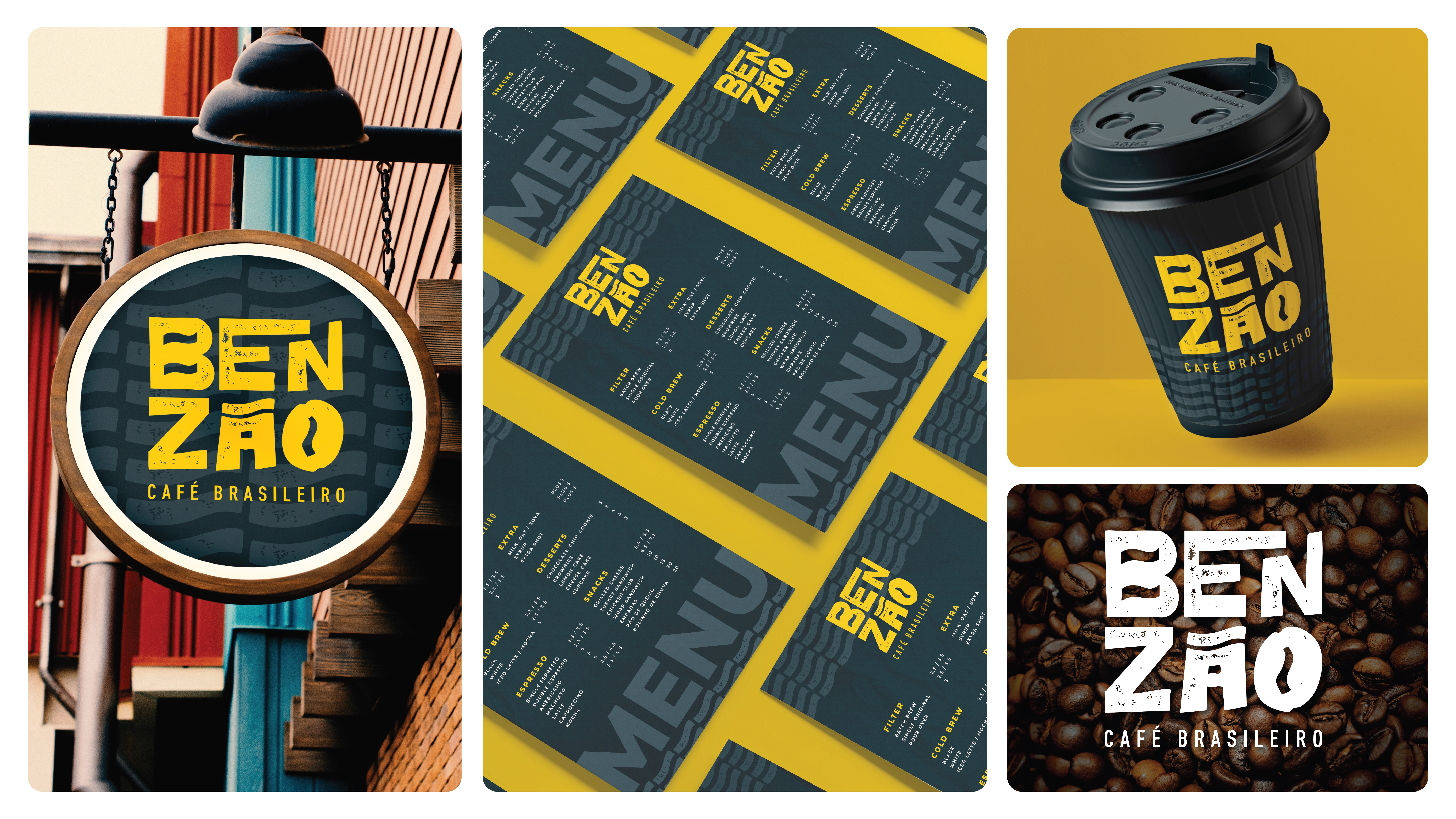
The Brand Identity In Action
Like this project
Posted Mar 27, 2025
Designed a brand identity & menu for BENZÃO, a Brazilian café. With a rustic logo & warm color palette to reflect its cozy atmosphere, rich flavors & culture.
Likes
1
Views
19
Timeline
Nov 18, 2024 - Nov 22, 2024