FORMADE ARCHITECTURE | BRAND IDENTITY DEVELOPMENT
Sami Toutoungi
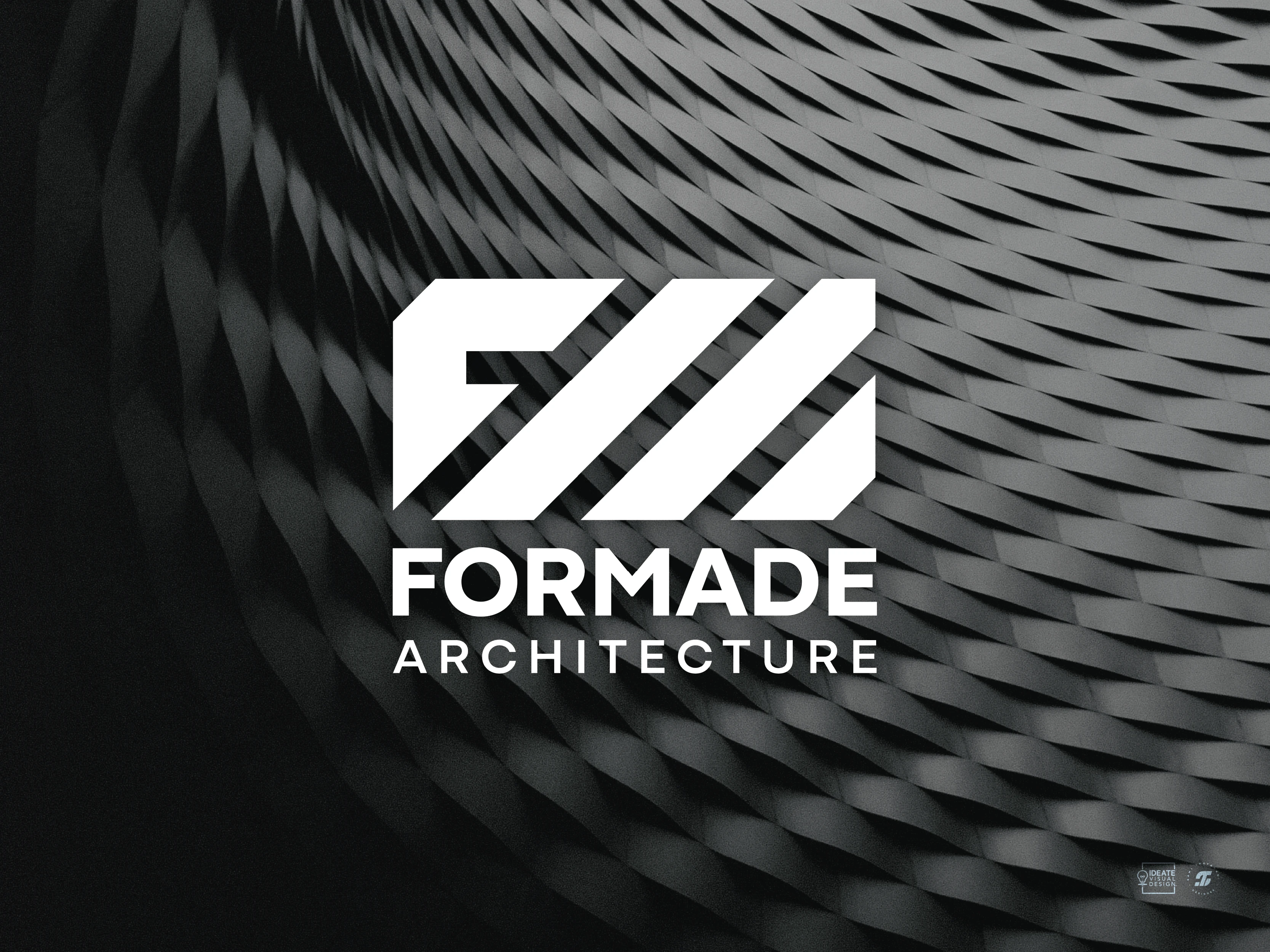
This project involved developing a brand identity for Formade Architecture, a studio dedicated to designing modern spaces that people genuinely enjoy spending time in. The challenge was to create a visual identity that reflects the studio’s belief that design should feel as good as it looks,a balance captured in the phrase “Form Meets Feeling.” Here, form represents the physical design of the space, while feeling speaks to the individual’s emotional experience within it.
The creative direction is focused around three core principles: modern, thoughtful, and professional. These values shaped the brand identity and reflect the studio’s architectural sensibilities. At its heart is a sleek combination mark logo, built from the initials F, M, and A. These letters are abstractly combined using geometric shapes within a rectangular frame, a subtle reference to the shape of a brick, symbolizing architecture’s foundational nature. A visual metaphor for creating spaces that are both practical and emotionally resonate with its users.
The Color Palette
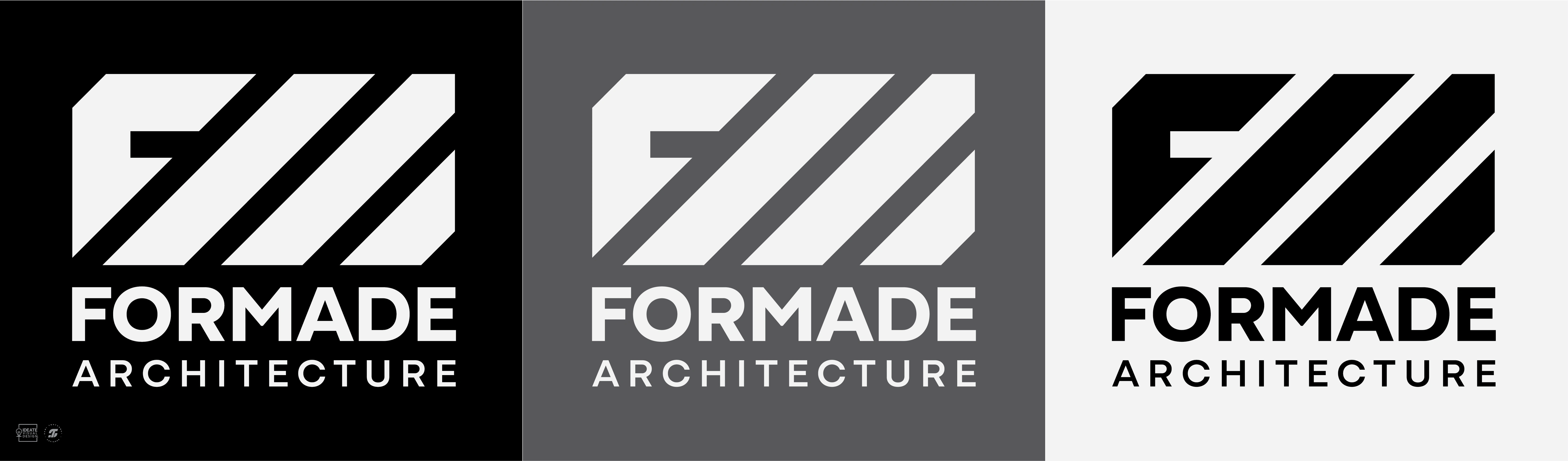
The color palette draws from a contemporary design studio aesthetic. Black and white serve as the primary colors, with gray as the secondary colors, providing smooth transitions and helping establish visual hierarchy across all touch points. This deliberate use of color enhances clarity and strengthens the overall impact of the brand identity.
The visual identity was applied across key brand touch-points, including corporate stationery and signage. Each deliverable was designed to build recognition and communicate Formade’s vision with clarity and cohesion, laying a strong visual foundation for a brand at the start of its journey.
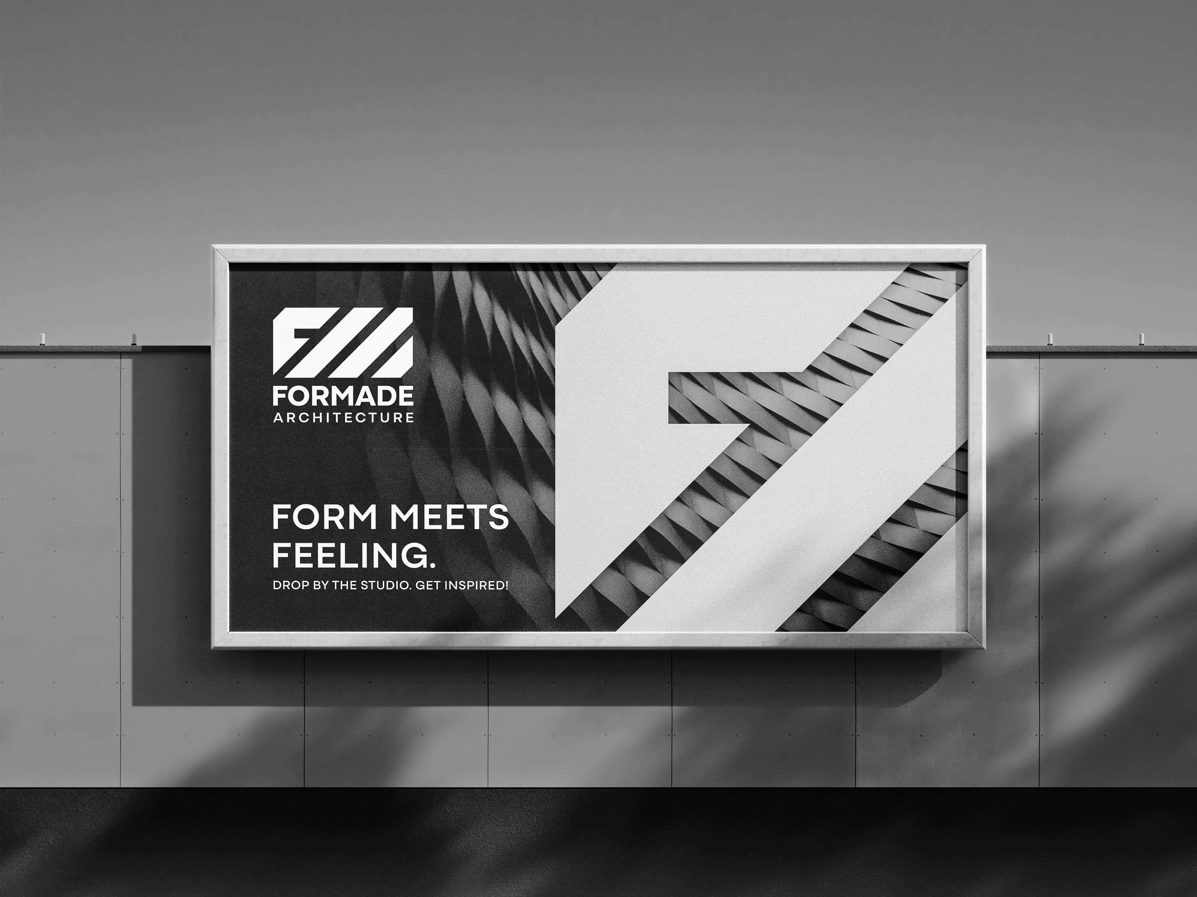
The Brand Identity In Action: Landscape Format Billboard
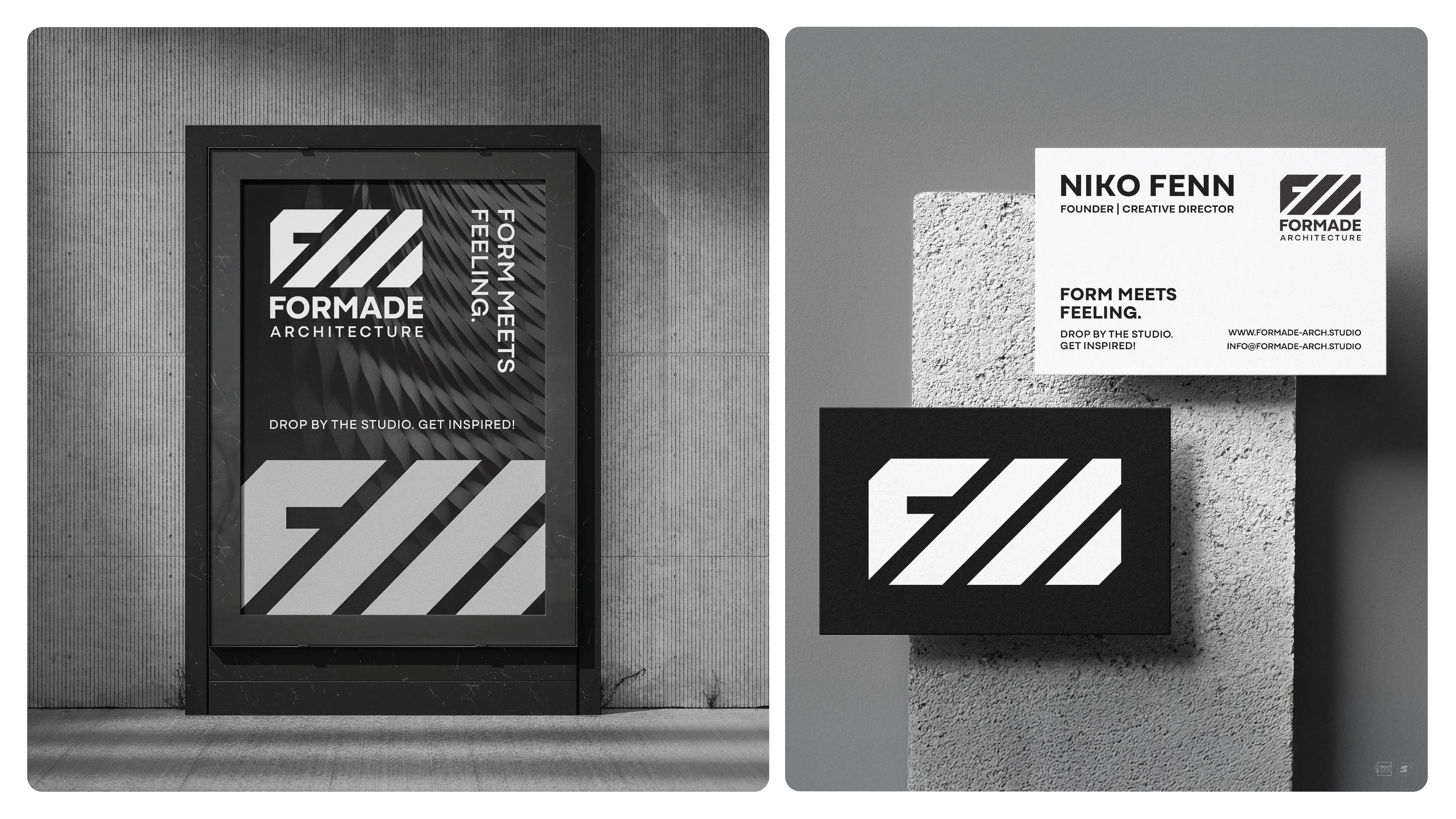
The Brand Identity In Action: Portrait Format Poster / Billboard & Business Card
Like this project
Posted Jun 18, 2025
This project was for the development of brand identity for a sleek, modern brand for a design studio called Formade Architecture.
Likes
1
Views
6
Timeline
Jun 10, 2025 - Jun 16, 2025