Unleashing Seamless Experience: Flappy Bird
Project Overview:
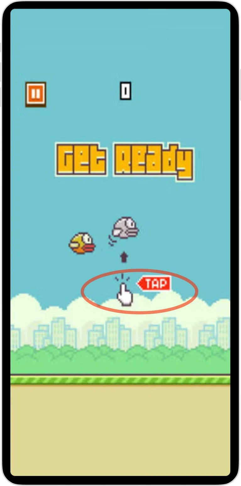
Flappy Bird, the viral sensation of 2013, is known for its simplicity and addictive gameplay. However, its initial tutorial left many players frustrated, creating a steep learning curve that deterred some from continuing. I worked on redesigning the tutorial experience to make it more intuitive and user-friendly, ensuring players started off with confidence while preserving the game’s iconic challenge.
The Challenge:
Player Frustration: Many users struggled to understand the controls immediately, leading to frustration and early abandonment.
Maintaining Simplicity: Any changes needed to align with the game’s minimalist design and straightforward gameplay.
Balancing Engagement: The tutorial had to ease players into the experience without compromising the “tough but addictive” appeal of the game.
My Approach:
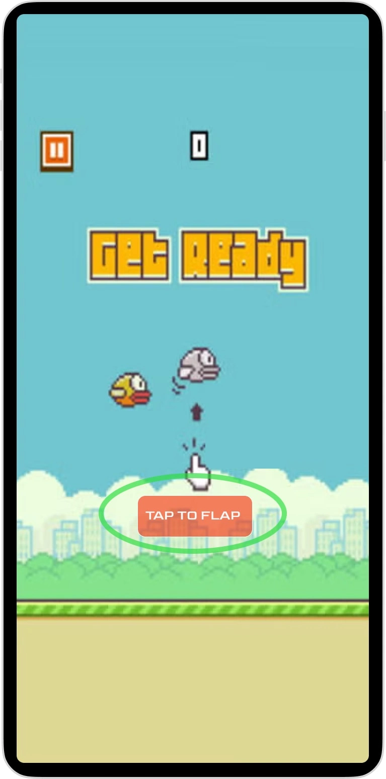
Intuitive Instructions: Added clear and simple messaging like “Tap to Flap,” ensuring players immediately understood the core mechanic of the game.
Seamless Integration: Designed the tutorial to feel like a natural part of the game, maintaining its minimalist aesthetic while providing clarity.
User-Centric Testing: Tested iterations to find the most effective phrasing and timing for tutorial prompts, ensuring they resonated with players without disrupting gameplay.
Results:
Reduced Early Frustration: Players reported feeling more confident and less frustrated when starting the game, leading to a more positive initial experience.
Improved Retention: Simplified onboarding helped players stay engaged longer, fostering a stronger connection to the game.
Preserved Challenge: The redesign retained the game’s difficulty and addictive nature, ensuring its core appeal remained intact.
Why It Matters:
This project demonstrates my ability to enhance user experiences through thoughtful UX writing. By making onboarding intuitive and engaging, I helped players feel connected to the game from the start while maintaining its unique charm and challenge.
Like this project
Posted May 26, 2024
In 2013, Flappy Bird took off like crazy with its super addictive gameplay! I spruced up the tutorial to make it easier for players to dive in smoothly.
Likes
0
Views
9


