CHURN - Packaging Design & identity for a butter brand
Aliza Munir
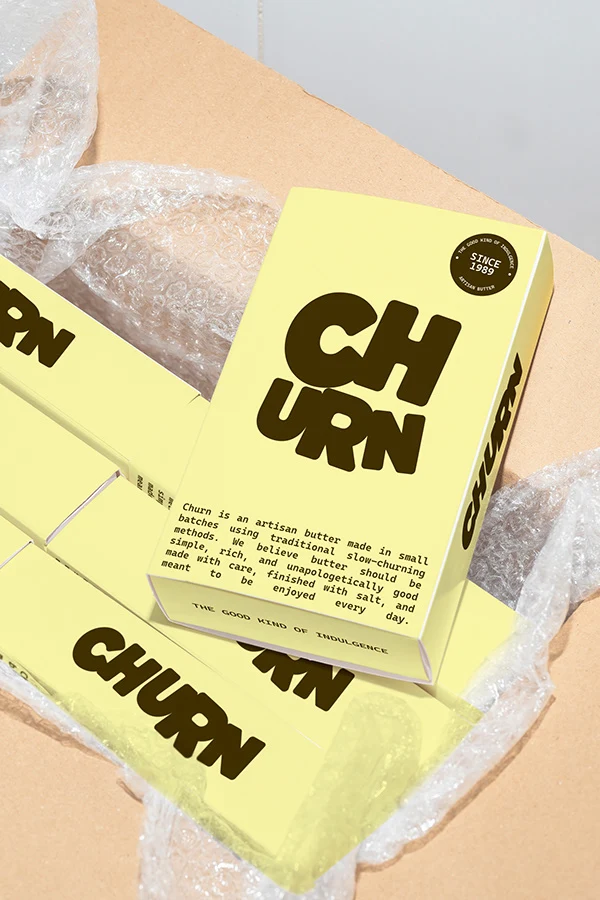
About Churn
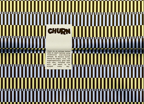
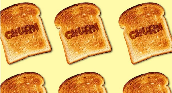
Churn is an artisan butter brand rooted in slow crafted tradition and everyday comfort. The brand is designed to feel warm, honest, and familiar, bringing a sense of calm and quality to a simple kitchen staple.
It celebrates the ritual of good food made with care.
The Challenge
The goal for Churn was to create a brand that feels handcrafted and nostalgic while still working in a modern retail setting.
The challenge was to:
• Build a soft, memorable identity that reflects slow craftsmanship
• Use colour and typography to communicate warmth and quality
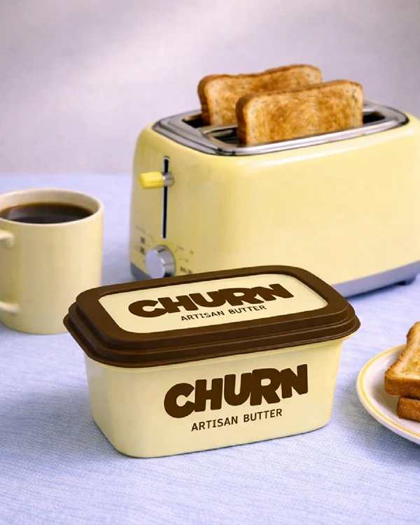
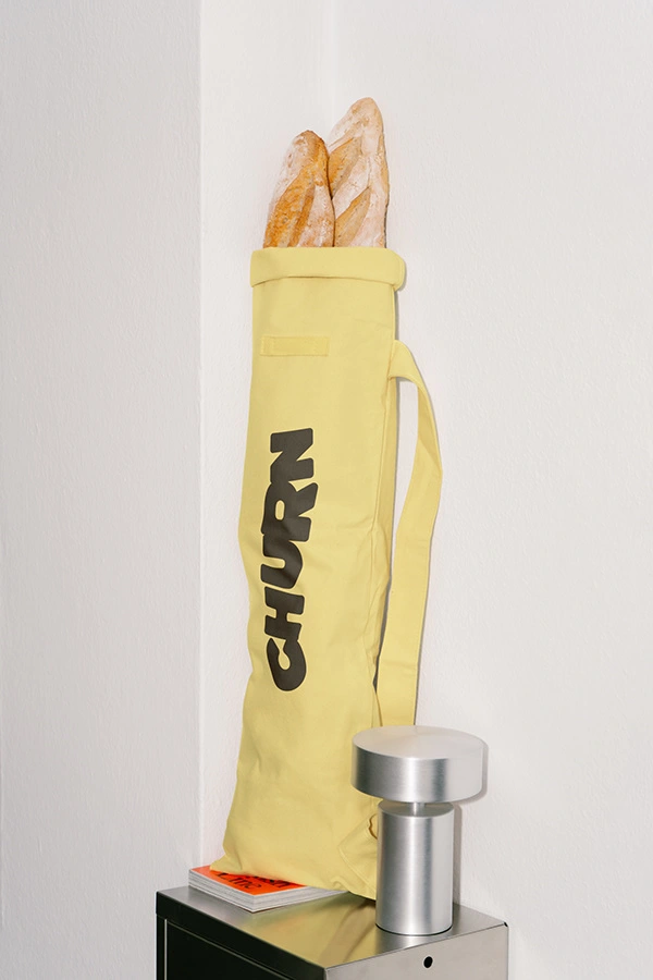
• Create a system that works across packaging, print, and kitchen settings
The Solution
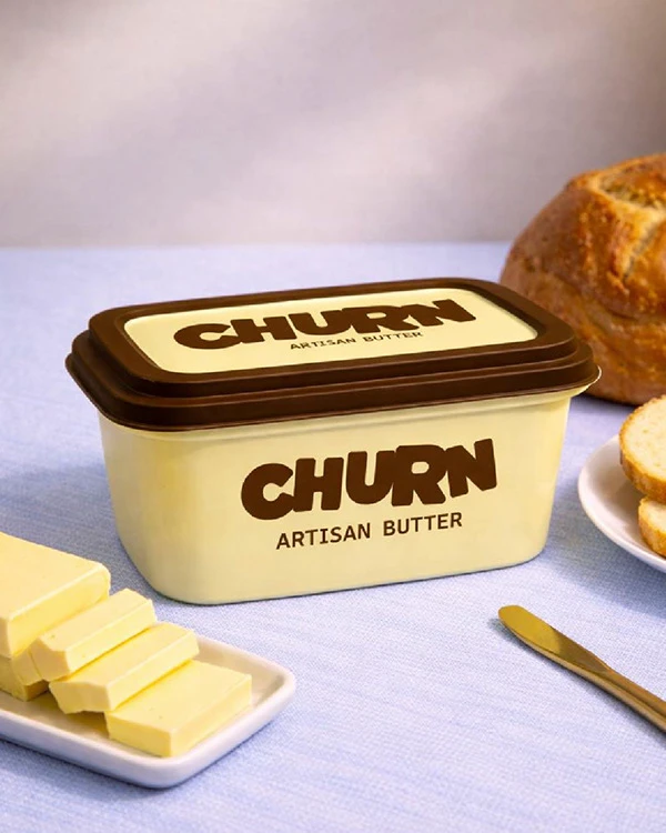
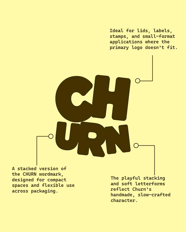
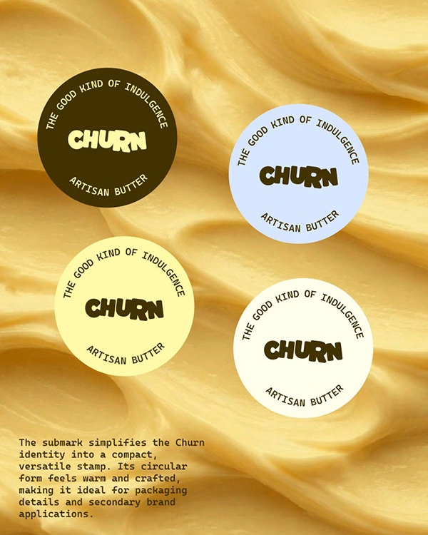
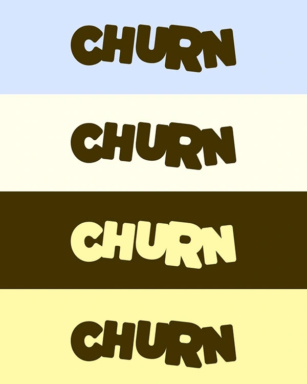
The Churn identity is built around soft, rounded letterforms and an earthy colour palette inspired by butter, bread, and warm kitchens.
The wordmark uses playful but grounded shapes that reflect the handmade nature of the product while still feeling bold and recognisable on shelf.
A muted palette of cream, butter yellow, and deep brown creates a calm, nostalgic tone that feels premium without being overly polished.
Like this project
Posted Feb 28, 2026
I designed a warm artisan butter brand for Churn using soft typography, earthy tones, and nostalgic visuals to create a comforting, handcrafted identity.