Shakey's - Brand Identity, Menu and Loyalty Cards
Aliza Munir
Shakey’s Milkshake Bar
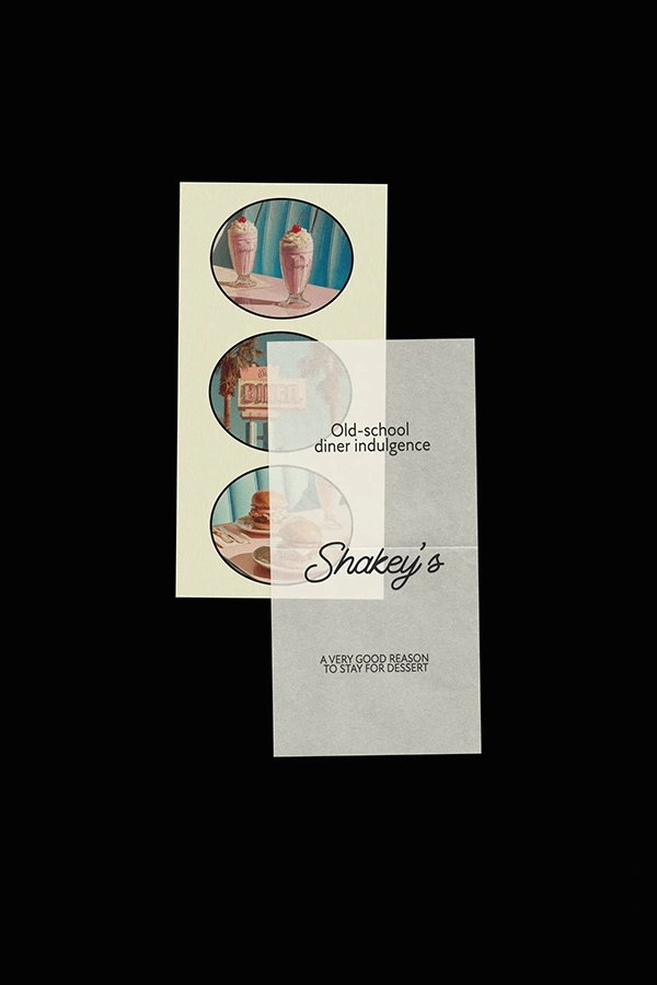
Brand Identity + Menu + Loyalty Cards
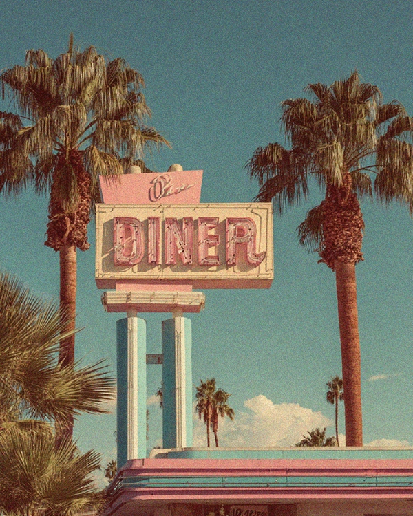
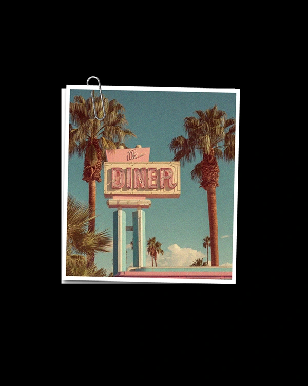
Shakey’s is a nostalgic milkshake bar reimagined for a new generation soft, playful, and intentionally styled. Inspired by classic American diners but refined through a contemporary, feminine lens, the brand celebrates comfort, indulgence, and slow, joy-filled moments.
The Challenge
Milkshake bars and diners often rely on predictable retro tropes and overly literal vintage references. The challenge was to avoid creating something that felt cliché or already done. Instead, the aim was to design a brand that feels nostalgic in spirit while remaining fresh, elevated, and relevant to a design-conscious audience.

The Approach
The identity was built around feeling and atmosphere. Rather than designing a themed retro brand, the focus was on creating a soft, experience-led world that feels comforting and intentional. Mid-century inspiration was balanced with modern layout, gentle colour, and refined typography to create a brand that feels curated, warm, and quietly playful across every touchpoint.
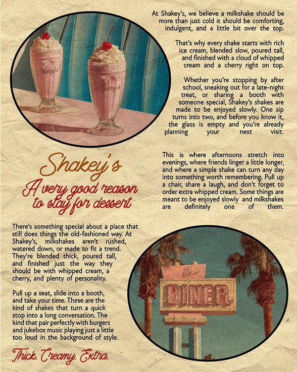
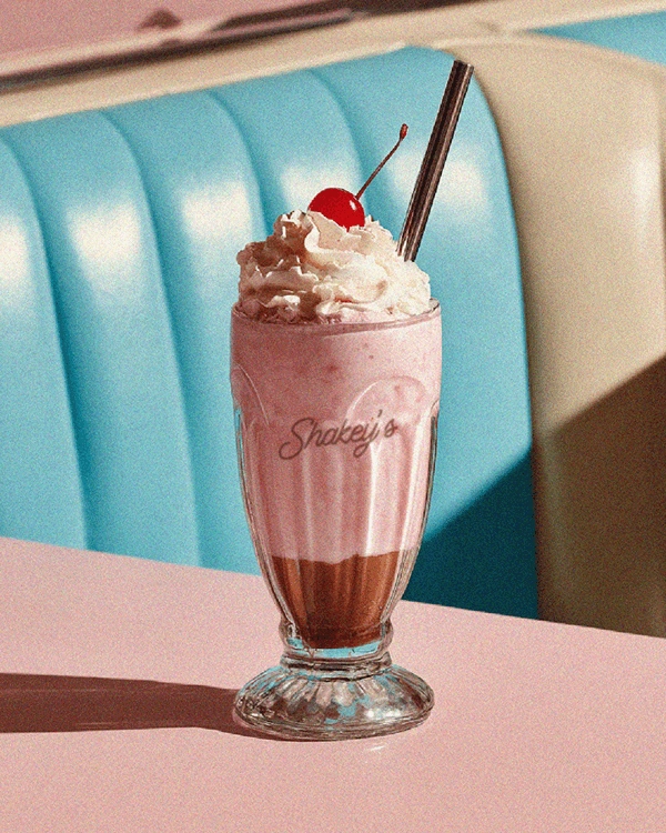
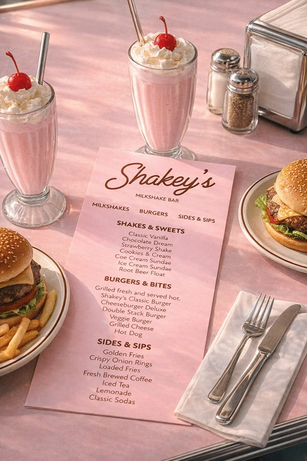
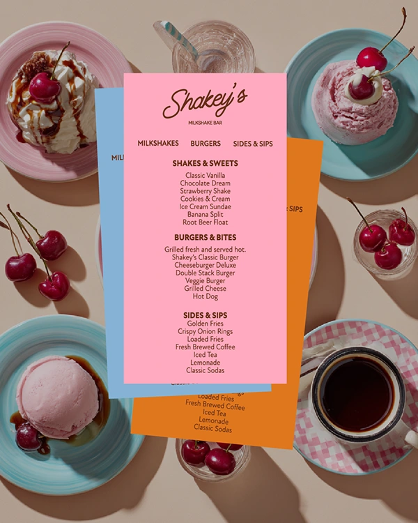
The Visual Identity
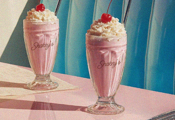
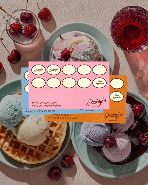
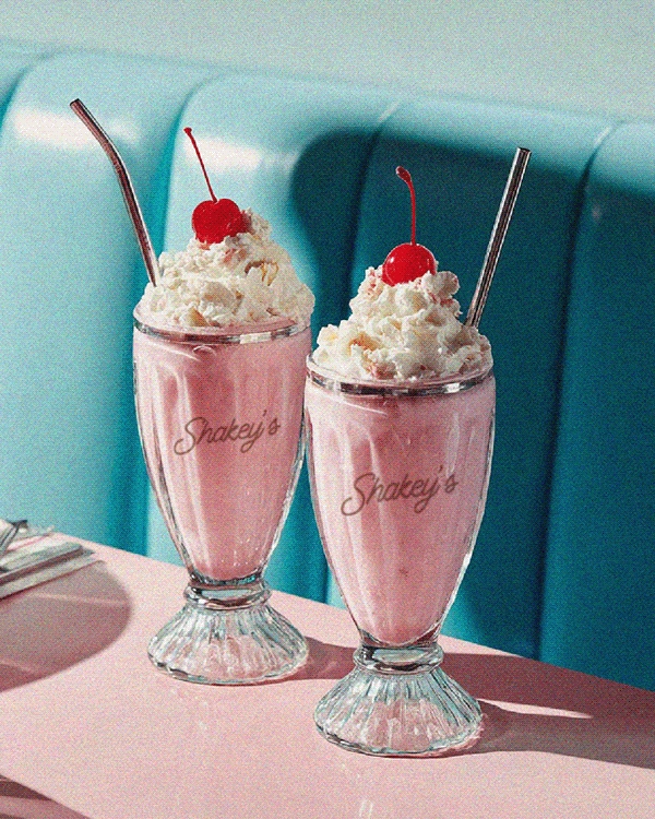
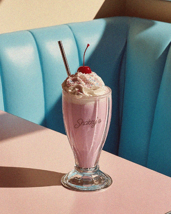
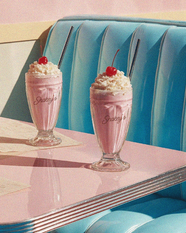
Shakey’s visual language is soft, indulgent, and nostalgic. A pastel-driven palette of pinks, creams, and baby blues is paired with cherry accents and warm neutrals. A flowing script logotype brings personality, while clean supporting type ensures clarity and balance. Rounded shapes, subtle textures, and lifestyle-led imagery complete the identity, creating a brand that feels like a place you want to stay a little longer in.
Like this project
Posted Feb 28, 2026
Designed the brand identity and visual system for Shakey’s Milkshake Bar, a nostalgic diner-inspired concept.