OOLIO Olive Oil Branding & Packaging
Aliza Munir
About Oolio
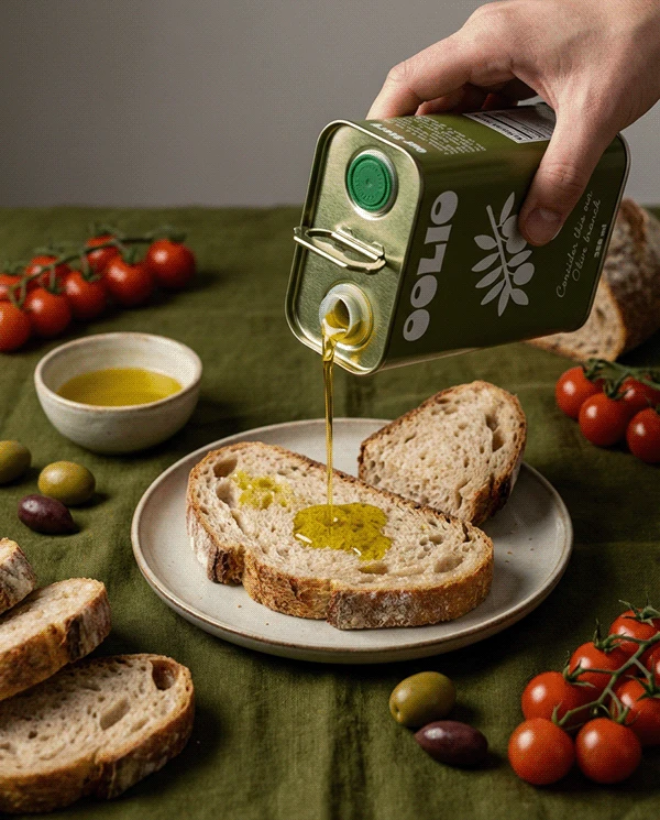
Oolio is a premium olive oil brand inspired by Mediterranean simplicity, quality ingredients, and slow, intentional living. The brand is designed to feel natural, refined, and quietly luxurious.
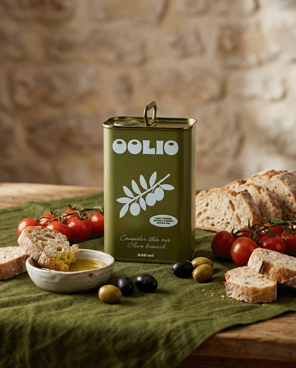
It celebrates the beauty of everyday rituals, from pouring olive oil over fresh bread to preparing meals with care.
The Challenge
The goal for Oolio was to create a brand that feels premium and modern while staying rooted in natural authenticity.
The challenge was to:
• Create a minimal identity that still feels rich and sensory
• Use colour and form to communicate freshness and quality
• Design a system that works seamlessly across packaging, labels, and lifestyle imagery
The Solution
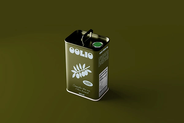
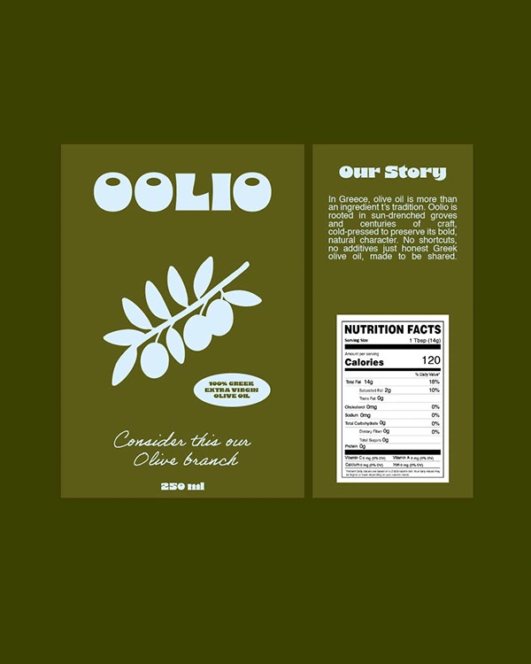
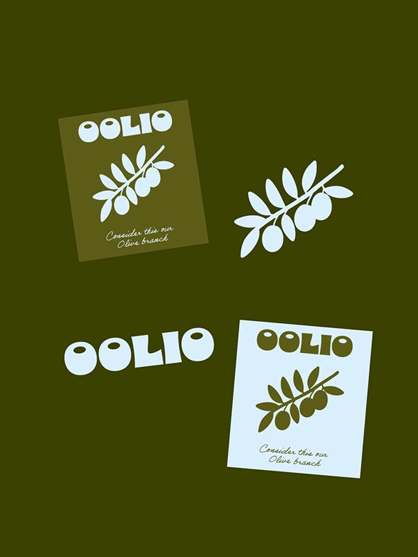
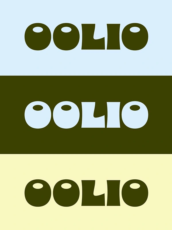
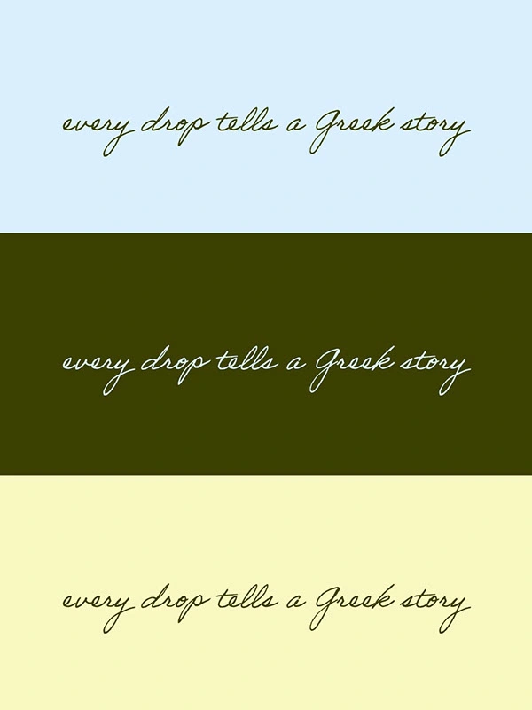
The Oolio identity is built around clean typography, organic shapes, and a deep olive green palette inspired by nature and Mediterranean landscapes.
The wordmark is bold yet simple, creating strong shelf presence while allowing the product to feel elegant and understated.
Soft iconography and olive branch motifs reinforce the natural origin of the product while maintaining a contemporary, premium feel.
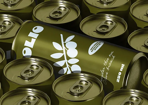
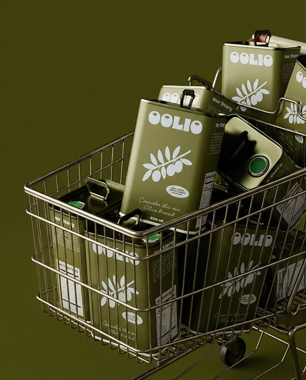
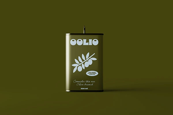
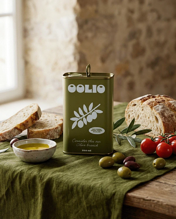
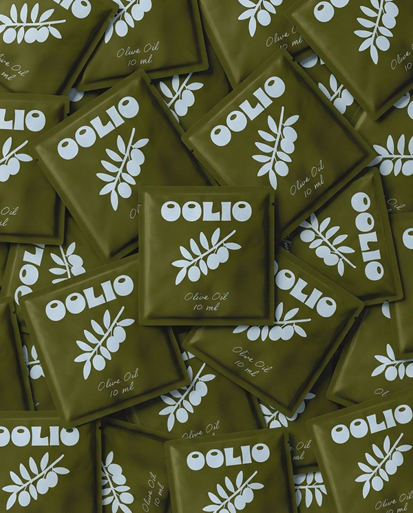
Packaging and Brand Experience
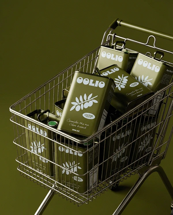
The brand extends across metal tins, labels, and lifestyle packaging applications.
From the minimal front label to the pouring experience and photography direction, every touchpoint reflects purity, quality, and intentional living.
The system is designed to feel cohesive across retail, kitchen settings, and digital content.
Final Thoughts
Oolio transforms a kitchen essential into a refined, lifestyle-driven brand that feels natural, elevated, and timeless.
If you are looking to build a brand with this level of clarity and feeling, feel free to reach out.
Like this project
Posted Feb 28, 2026
I designed an olive oil brand for Oolio using organic forms, rich green tones, and minimal typography to create a premium, Mediterranean-inspired identity.