Nexius - Link-In-Bio Template for Framer
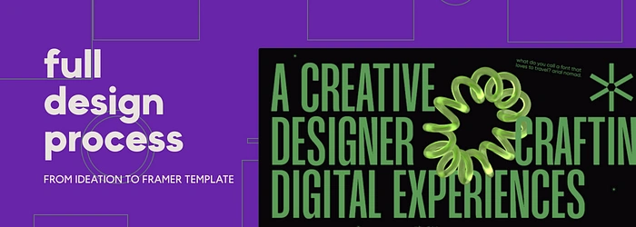
I’ve been falling in love with Framer, the more I design something in it.
But all my previous designs there were…basic.
See, the entire point of no-code is to skip the development part of making a website but none of my designs were getting published.
So I figured, it would be a good idea to design something that could be used by people at the end, or be used as a template.
I also wanted to design something that I would personally use as well.
And this, led to the birth of what I now call Nexius!
Ideation
The goal was clear — design something that fixes an issue for me, and could be scaled for others to use as a template.
Doesn’t need to be anything massy or a very well-detailed product with many features.
Then I remembered, I hated Linktree’s UI for some reason.
Don’t remember exactly why, but I hated it. Probably something to do with the lack of personality.
And bam, there it was.
Design a link-in-bio site but make it look visually appealing and add your personality to it!
Moodboarding
This looks like a non-essential step, but you’ll realize its impact when your final interface looks like a charcuterie board with no style guide.
And since my goal with all my work is to focus more on the visuals, you know I’d never skip this.
I let the Pinterest algorithm god take the front seat after finding my initial pins.
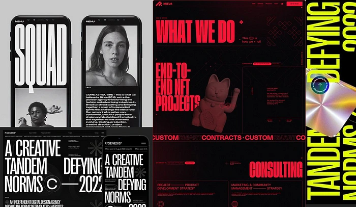
Reference Images
And the final result was this.
It looked good, but a red/yellow/blue on black has been overdone to death.
I wanted something a bit different — so I took the red pill.
Just kidding, I chose to go for a green-on-black theme aka The Matrix (it also sounded on-brand with Nexius).
Wireframing & IA
As someone with a background in illustrations, I believe that the initial sketch makes or breaks the final art piece.
I follow the same principle for my designs as well — everything depends on how well-made my wireframe is.
I chose Mango Grotesque for the header texts and Gilroy for the body and label texts.
Now I also wanted to add one more element for delight — some 3D object that animates when you hover, for fun.
And this took a while, because there are not a lot of 3D assets available with a glass texture and a green color.
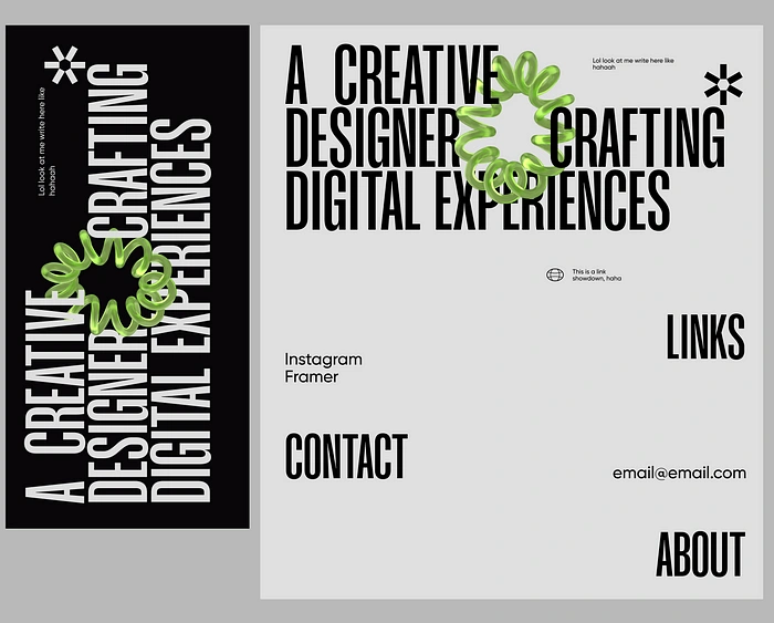
Wireframe
But after a while (2 days) I found one and it looked perfect when I put it on the wireframe, overlapped with the texts.
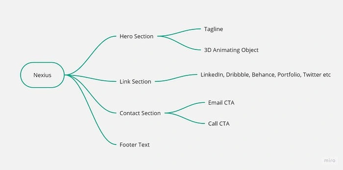
Website IA
The information architecture and user journey would be super simple like…
Hero section + 3D object
Redirecting links
Contact section with CTAs
And that’s it. No need to bloat anything with unnecessary features that most won’t even use.
Designing in Framer
With half the work done, now it’s time to redesign everything from scratch on Framer.
Yes, your boy “designed it in Framer” this time instead of just importing from Figma.
Things to prepare before starting your designs in Framer …
Text styles
Color styles
Elements that will be components
Elements that will be animated
No of breakpoints
And that’s precisely why I wireframed in Figma first, because the planning stage is a bit difficult on Framer.
Now on an empty 1440px canvas, that would keep creating a smaller version for its breakpoints on the side — I got to designing.
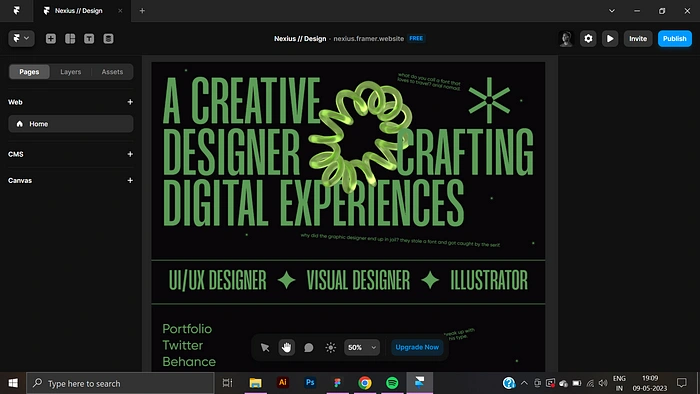
Designing in Framer — 1
Replicating the desktop breakpoint was very easy, but I was not ready at all for the mess that was making the layout responsive.
Few things were stacked but…most were the same size as their desktop counterparts.
I had to keep resizing and seeing the site in action, to see if they were making any sense.
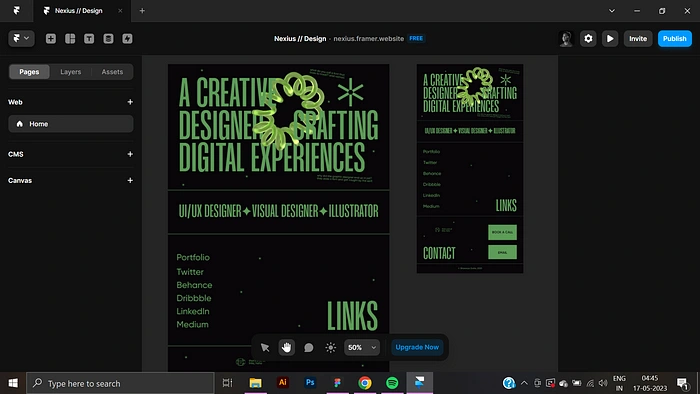
Designing in Framer — 2
They did after a while, a bit of monotonous work but gets done quickly once you gain speed in your workflow.
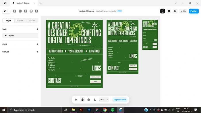
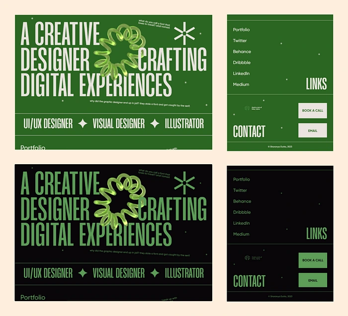
Same website, but in light theme
I forgot to mention that I also made a light theme version of it, just click on the sun icon on the floating navigation to switch.
But the work didn’t just end here.
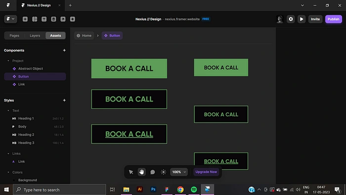
Now I had to componentize elements and add various states so they’re all working properly when clicked or hovered at.
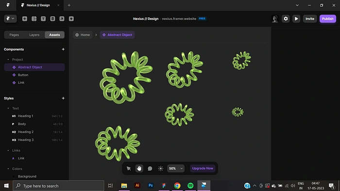
Designing in Framer — 3
The 3D element was easy, just added a scale in animation for it.
Designing in Framer — 4
I created 2 different types of buttons — link and CTA.
The link is plain text with a hover and pressed state, the CTA is your typical pointed square button.
Stupid jokes for delight purposes
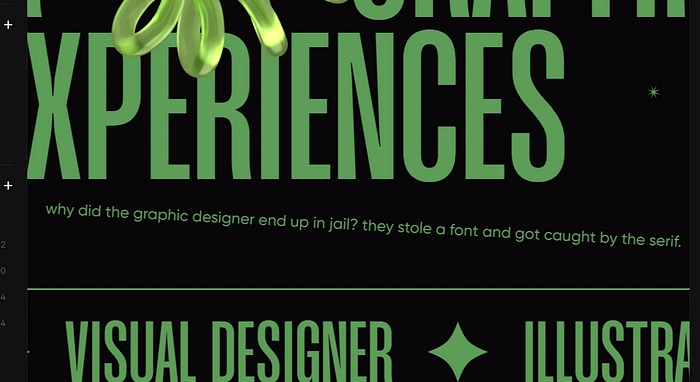
One final touch that will likely go unnoticed are the small jokes I added, I’m a clownish person in real life and that’d add a bit more of me to the design!
Shipping Nexius for Public!
Final UI — Dark & Light Theme
This is the final UI of Nexius, looks very lovely innit ?
With everything done and user-tested with my friends, it was time to work on the copy for the product’s listing on Gumroad and social media posts.
And I recycled a lot of words here and there for it.
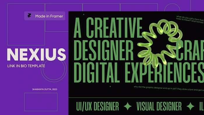
Then I designed a banner that would look cool as a preview — my initial thought here was to opt for a Matrix theme, but that looked indistinguishable from the original design.
So I switched to a purple and yellow tone for the background instead and it looked a lot better, and was ready to be shipped!
Check out Nexius on my shop from the link here, it’s free forever :)
Like this project
Posted Jun 28, 2023
Designed my first template on Framer!
Likes
0
Views
32

