UI Design Case Study: Krispy Kreme App
Top highlight
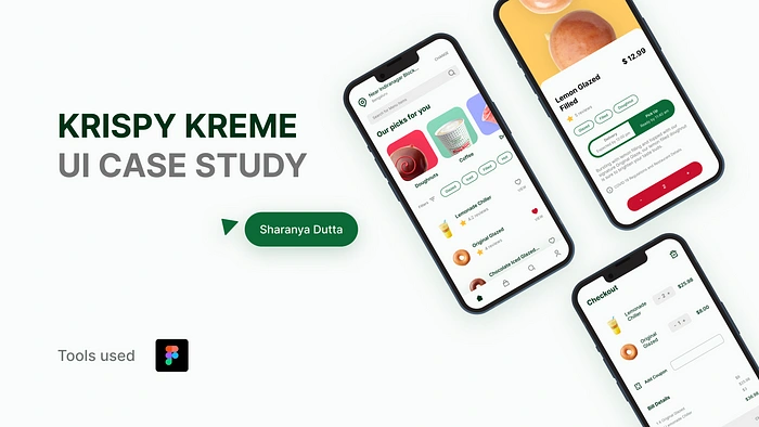
In this case study, I will take you through my entire process of designing interfaces for Krispy Kreme’s food delivery app!
Context
I have been a massive fan of doughnuts my entire childhood, I admire the way they’re prepared and how decorative they can get with a bit of creativity and sugar.
However, I never had one in my life. There are no places to get doughnuts in my city and this has been a topic I wanted to cover for some time. Thus I chose to design an imaginary food delivery app specifically catering to more doughnut lovers like me.
Krispy Kreme -What & Why?
Krispy Kreme is a reputated doughnut and coffee chain from USA popular for their glazed doughnut and authentic and generation old “secret ingredients”.
They have managed to maintain their position in the ever competitive fast food market of America with a long history of culture, controversies and well, lovely sugar drenched doughnuts.
It was a no brainer for me to choose them for my project.
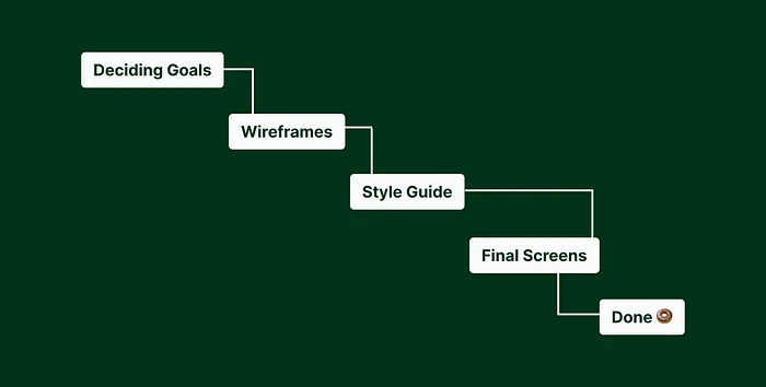
Design Process
Goals
Let users browse the entire menu available at the local outlet of their choice
Have users choose between home delivery or takeout before confirming order
Skim through available items via filters on the main screen, making it easier to finalize order quickly by reducing decision paralysis
Wireframes
I spent couple hours ideating, researching, looking through inspirations and sketching loose boxes which will later turn into a more refined design.
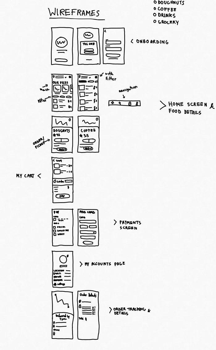
Low Fidelity Wireframes
Once I was done with the lofi wireframes, I had a basic idea of exactly what the final screens were going to look. I proceeded to design high fidelity wireframes for my convenience.
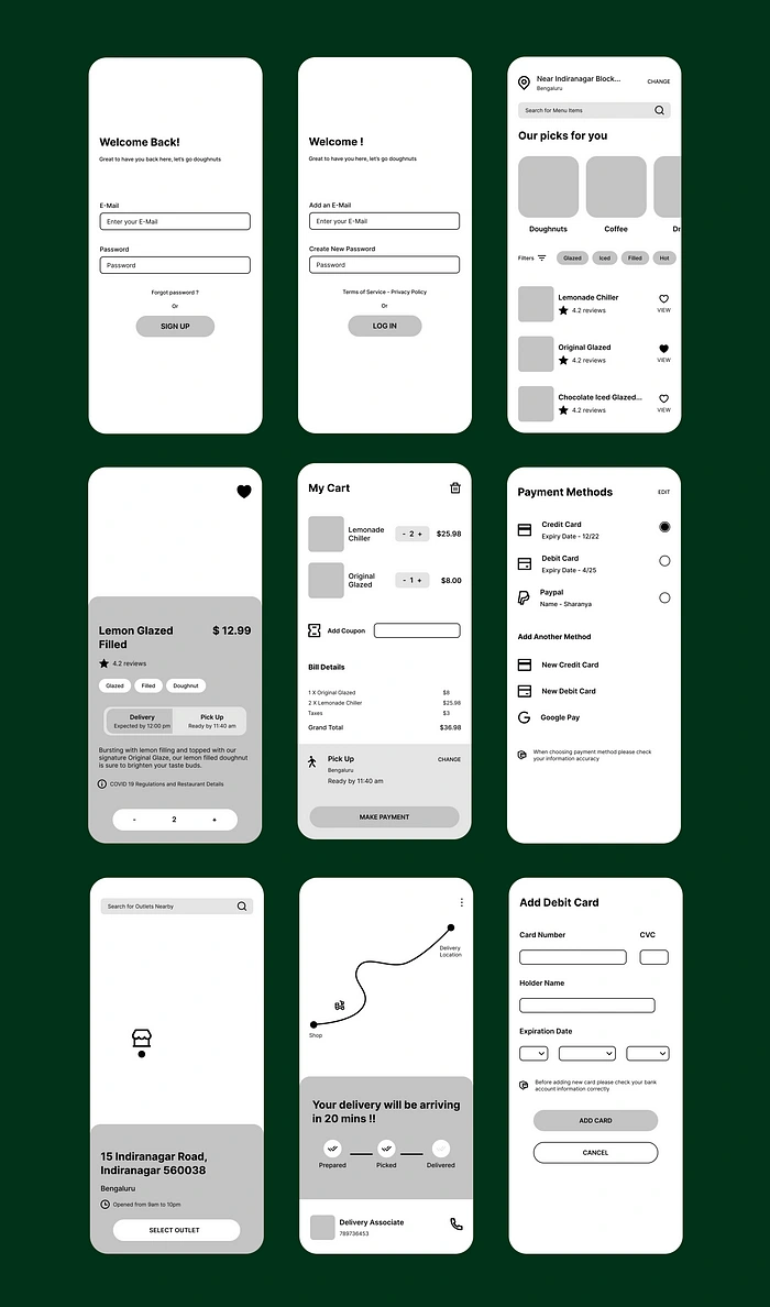
High Fidelity Wireframes
Style Guide
I went with a single font to make the overall design uniform and minimal. Inter has many font weights, thus easier for me to play around and display hierarchy.
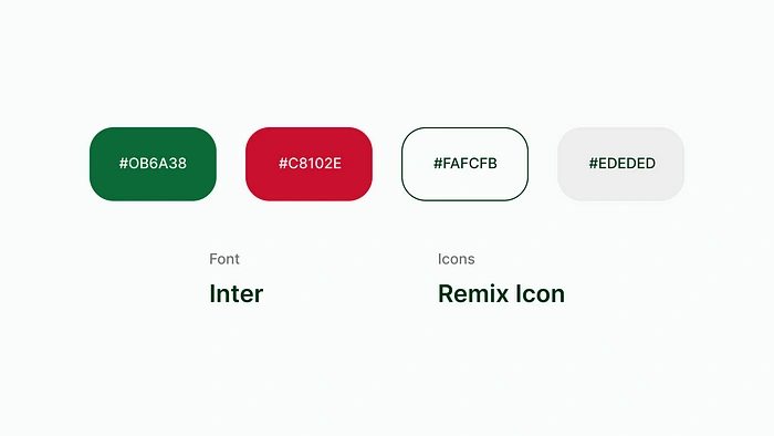
I used the classic green and red color from Krispy Kreme’s branding, to establish trust between the users and the brand. Green being the primary color and red as secondary.
For icons, I chose Remix Icon as my go to.
Final Screens
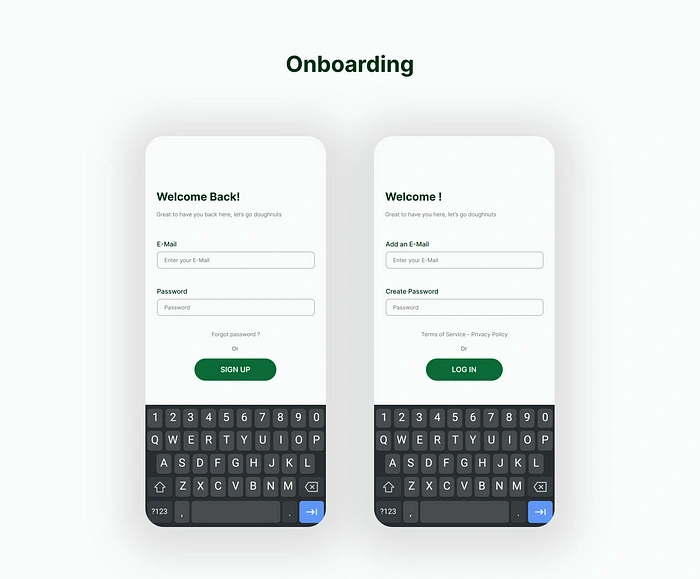
These are the usual login and signup screens without option for social media login integration. Added place holders for people to understand and comprehend the steps easily.
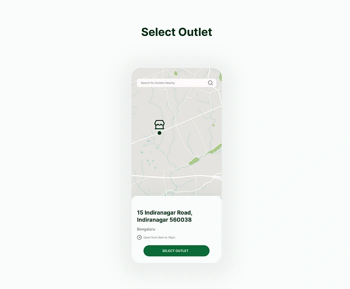
After completing the onboarding process, the users have to choose an outlet around their nearest location. Timings were also shown for more convenience.
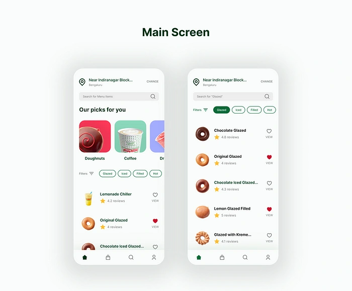
Onto the main menu, users can select their order by:
scrolling vertically and finding every menu item.
selecting various options to filter from e.g. after selecting filled, doughnuts with inner fillings will show up and rest will be gone till filters are unselected.
selecting from common and most sold products listed below search bar e.g. doughnuts, coffee etc.
using the search bar and manually entering the desired item and adding to cart.
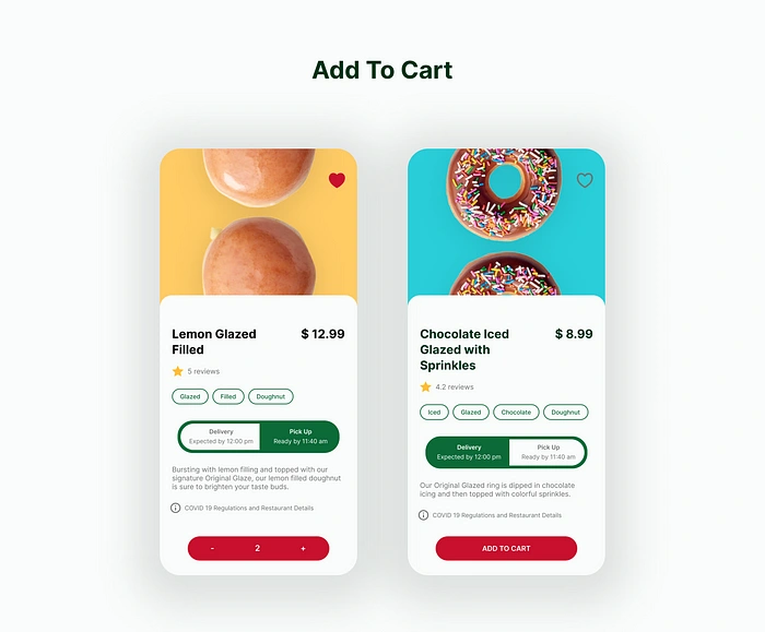
Items are shown with their price, ratings, brief description and CTA for purchase.
Users can choose how they want their order -delivered to their location or by going to the outlet and picking it up themselves.
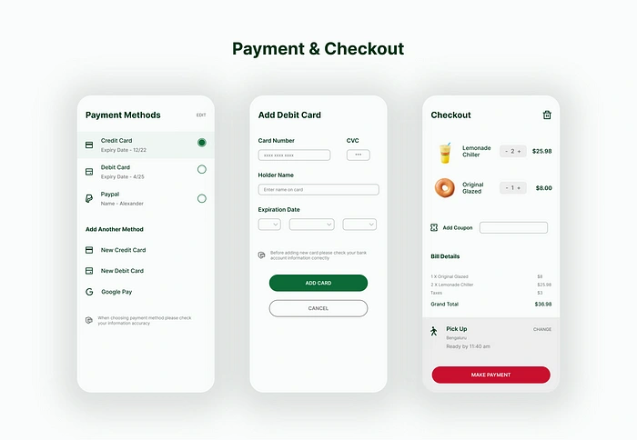
There are 3 options to pay -credit card, debit card and transfer wallets.
At checkout, users can avail coupons and see a detailed bill of their order.
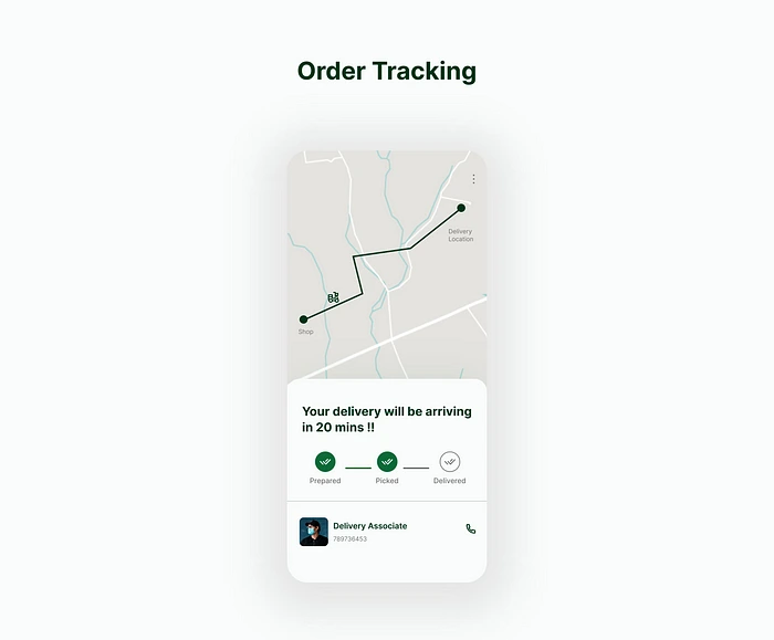
After confirming their order users are shown an estimate delivery time and the current stage it’s in.
Like this project
Posted Jun 28, 2023
Designing a hypothetical application for Krispy Kreme!
Likes
0
Views
16

