UI Design Case Study: Jarvis Project Management App
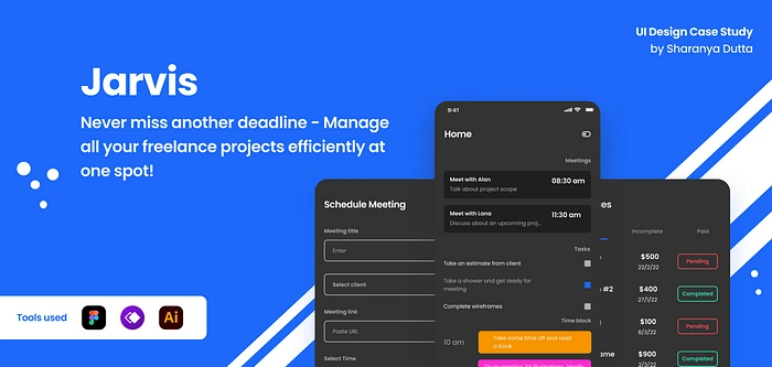
In this case study, I will take you through my entire process of designing the UI for a hypothetical application called Jarvis!
Context & Problem Statement
As a freelance designer myself I often find it difficult to manage my projects and workload when I am fully booked with client work and personal projects.
And sadly I’m not the only one who has this issue, most people I know in the freelancer circles admit to having the same constant issue- failing to keep track of client work, productivity, invoices & meetings etc.
This problem leads to sluggish workflow, irregular productivity and many deadlines are missed which can leave a dent on your reputation in the industry.
Solution ?
Introducing Jarvis -a project management app that lets freelancers keep track of their projects, and everything required for it in one place including invoices, meeting schedules, deliverables and an in-built time blocking feature to divide their day in parts.
And yes, that’s a cheeky Iron Man pun over there.
Business Opportunities
At 1.1 billion in 2019, freelancers accounted for one-third of the global workforce of 3.5 billion workers.
Freelancers decide and control their own schedules which is always changing based on their workload, having an app to manage and take care of it takes much pressure off from them.
Notion’s niche adoption is a good example to justify the need of an app that is simple, less customizable and to the point unlike Notion which comes with a learning curve of customizing everything from scratch.
Key Features
In-built time blocking feature
Meeting reminders at homepage
A dedicated tab to keep track of your invoices
Create client profiles to keep a record of everyone you work with
A checkbox reminder for day to day tasks
Minimal UI. Freelancers are already busy, no point of increasing their stress with too much customization
My Design Process
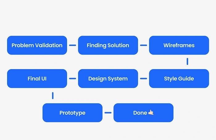
I try to keep my process as simple and straight to the point as possible. Carried out in 3 key phases- defining problem, designing components and style guides & designing final app screens.
Information Architecture
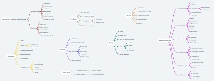
In order to give structure to this imaginary app, I created the information architecture to determine what data goes where on the screen.
Lo -Fi Wireframes
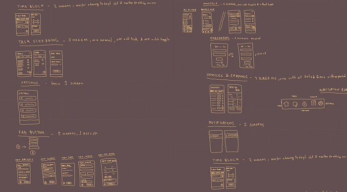
I spent a day ideating, iterating, looking through design inspirations and loosely sketching the base designs which will later turn into a more refined version.
Hi -Fi Wireframes
This step was relatively harder than I assumed- I wasn’t just turning lo-fi wireframes into hi-fi wireframes but also designing the bare bones of the design system I was going to create next.
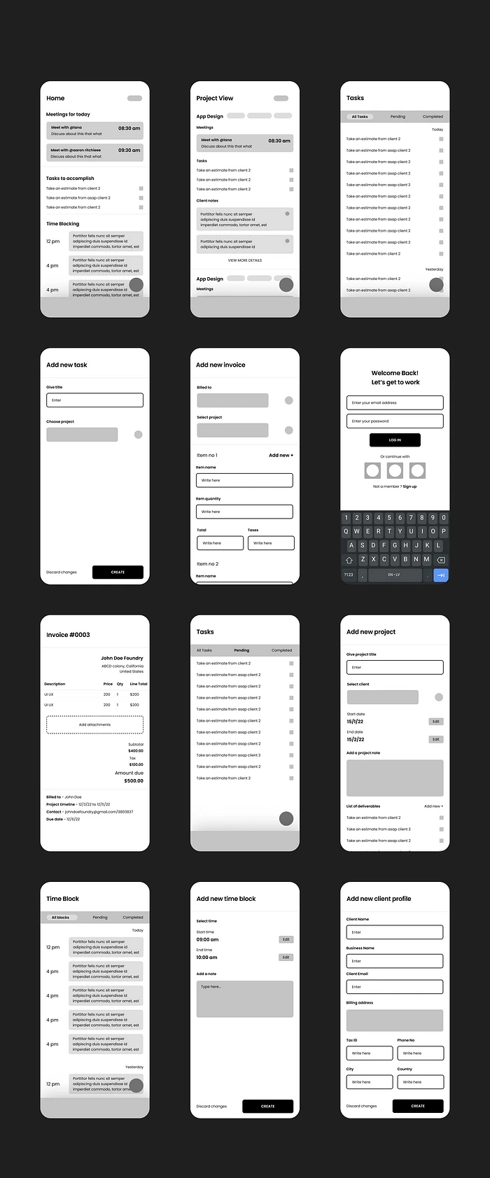
Style Guide
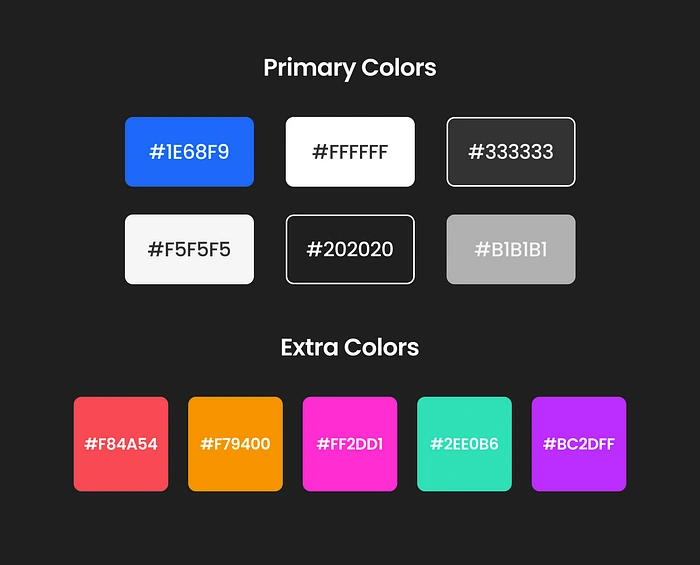
Since Dark mode UI has been gaining traction over the years and in some apps it’s the default theme, I went with it and a blue shade as the primary brand color.
Used a couple vibrant colors for designing at specific screens like time blocks.
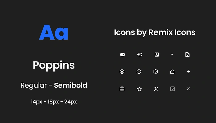
A major goal I was trying to accomplish was visual minimalism and typography covers most parts of UIs thus went with one 1 font and two font weights only.
This increases overall scannability of the screens.
For icons, I chose Remix Icon as my go to.
Design System
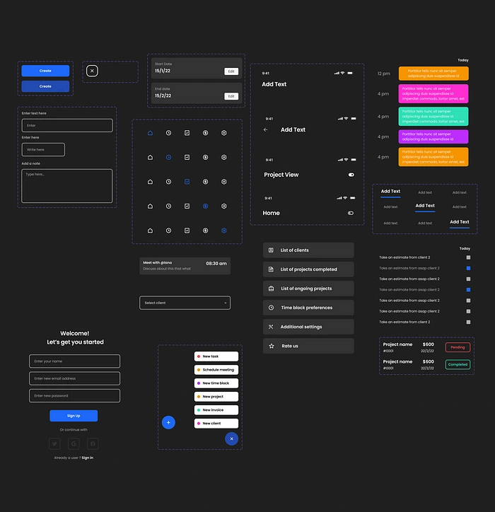
An integral part of designing any functional app is to build a scalable and working design system.
After designing these components, it was easier to drag and drop them into screens and edit as needed to save time.
Final Screens
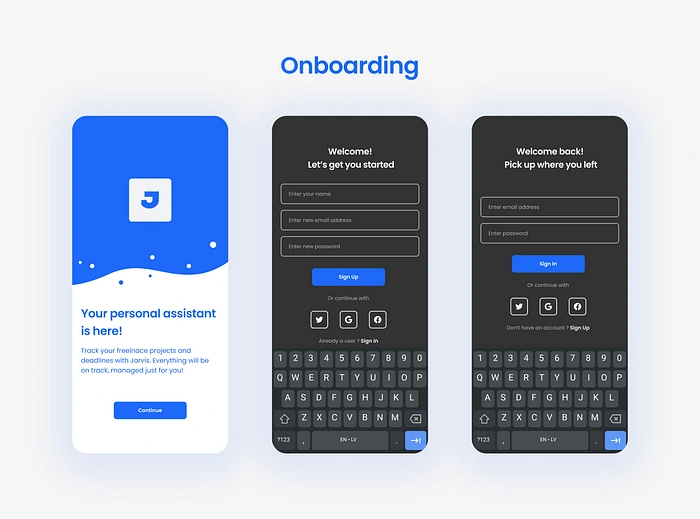
Designed a splash screen with app logo and brief introduction for users and the usual sign in/sign up screens with options to create an account using their socials.
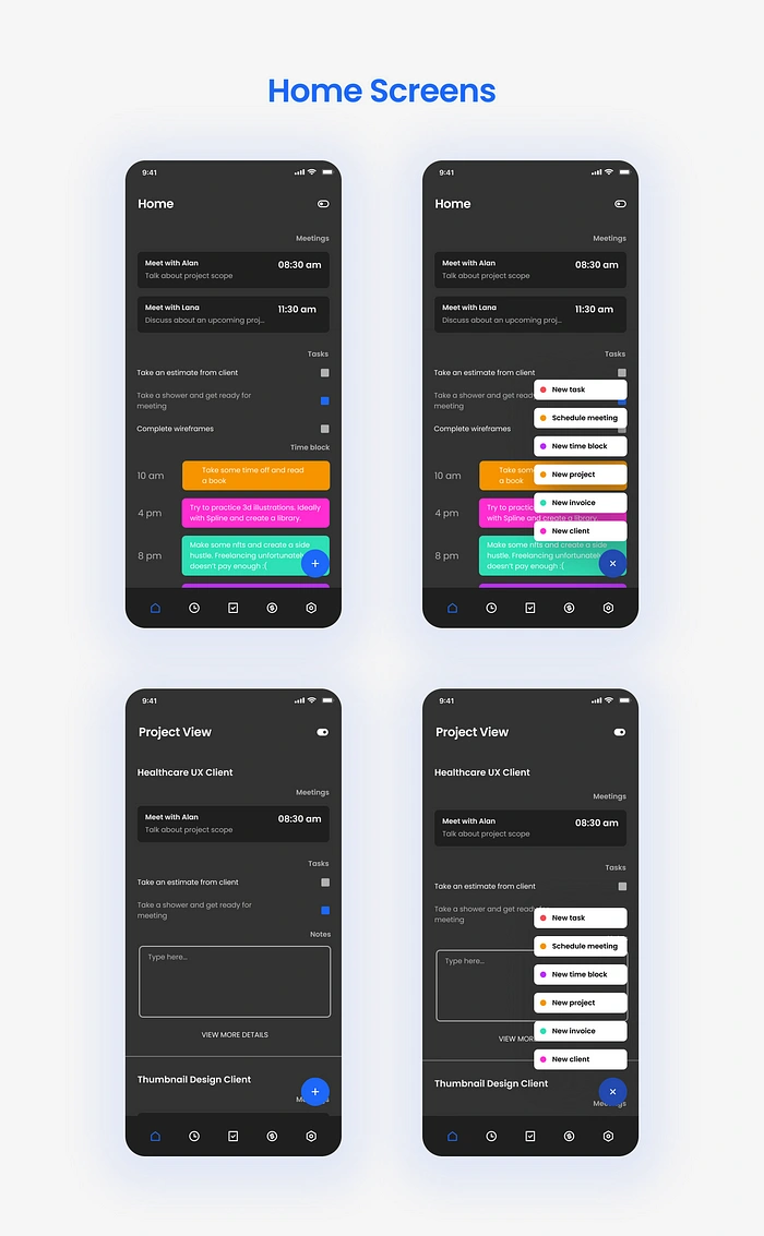
Users can toggle around in the homepage from project focused view to a chaotic view where everything is infront of them, depending on convenience.
Clicking on the FAB allows users to register new inputs - clients, invoices, meetings, time blocks, projects etc.
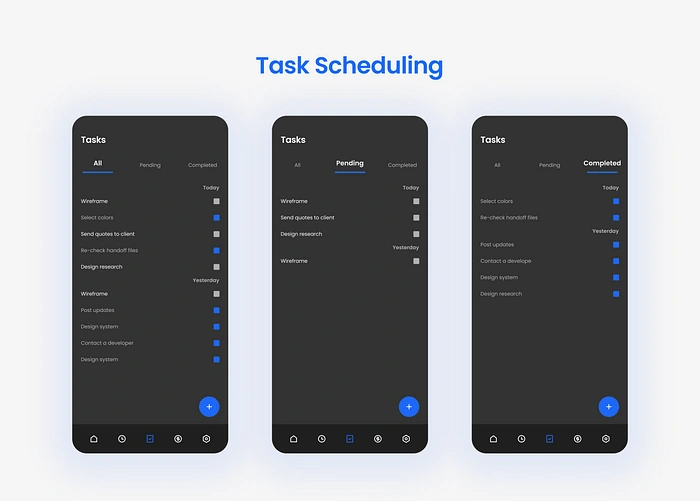
This is where users can go through all their tasks scheduled for the day. Once completed they can check it off.
Users can navigate tasks using like pending or completed section too.
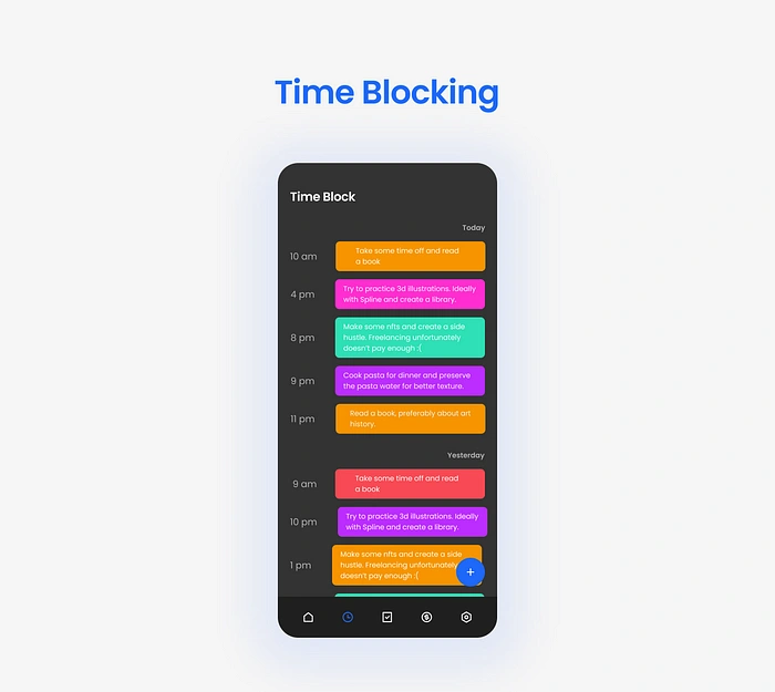
Users can attain particular hours of the day for specific work using this option. This can be related to their current projects or their daily chore.
The most basic approach to time blocking is to slice up your day in 1 or 2-hour blocks and assign specific tasks to those blocks.
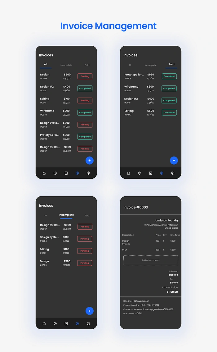
Users can keep track of all their invoices over here. Added navigation options at the top for skimming through both paid and unpaid ones.
Clicking on any of the invoices will pull up a more deatiled one with more data.
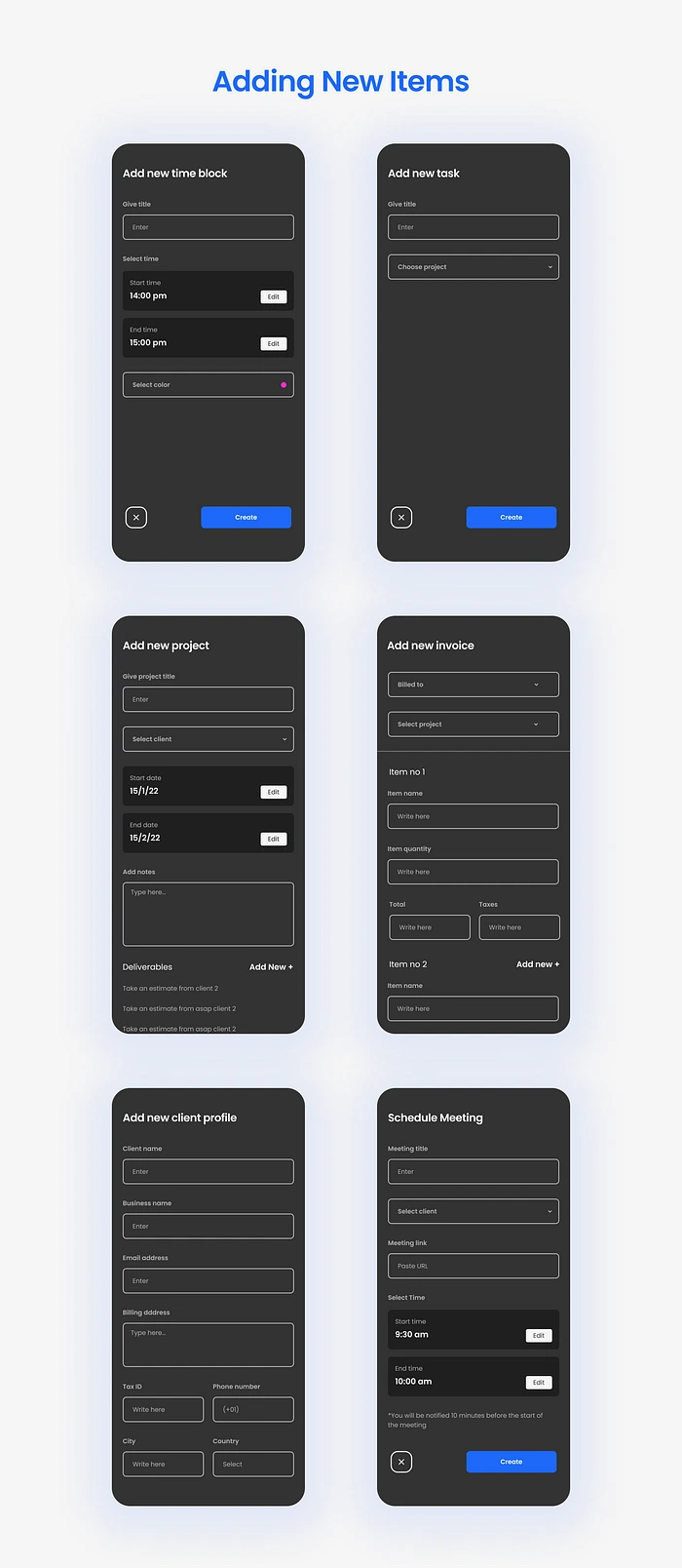
Once the user clicks the FAB they will have the option to add any of the above to Jarvis’s database.
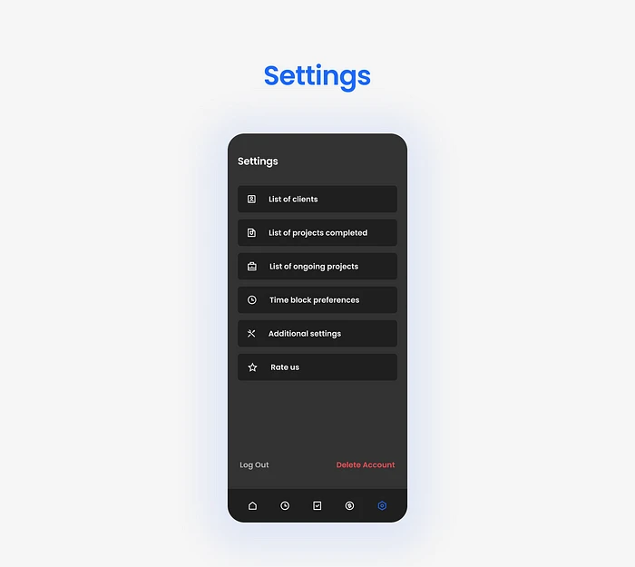
Users can check their client and project history here and use the additional options provided here for tweaking around with the app a bit and customizing it.
Added options for logging out and deleting their account too.
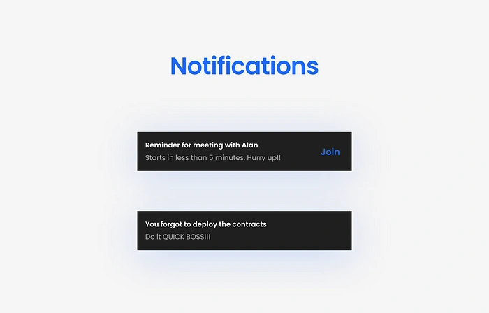
A couple funny taglines put to use here as reminders for users, mainly for attending meetings and finishing pending tasks.
Like this project
Posted Jun 28, 2023
Designing an app to streamline the process of managing work for freelancers!

