Designing Onboarding Experience for a Fitness App
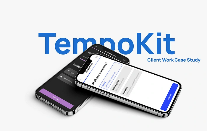
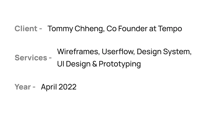
In this project I helped my client’s company (Tempo) by designing a user onboarding flow where the they select their preferences and set up their account for use.
Client’s Problem & Solution
The client wanted a particular questionnaire user flow designed to input data from users and setup their fitness experience. The userflow should be designed in a way for future use on various different trainer apps which Tempokit creates with little tweakings done with help of a design system.
To solve this, I made sure certain screens would be identical in various flows like Macro Calculator and Nutrition Preferences and the main flow as well.
Project Stages
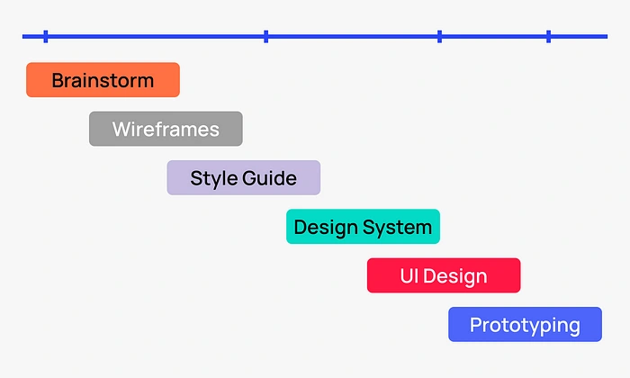
Keeping in mind the deadlines, I framed a timeline that would serve the purpose and deliver the design effectively and quickly.
Wireframes
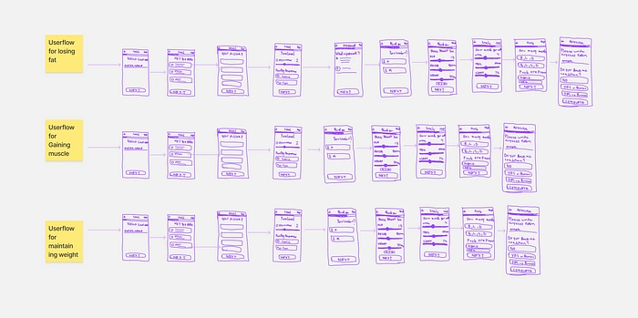
Low Fidelity Wireframes
Once I knew the requirements and made a list of apps to take inspirations from I started sketching out lo fi wireframes. However, the flow shown here was later changed after various considerations but most screens look the same in final design.
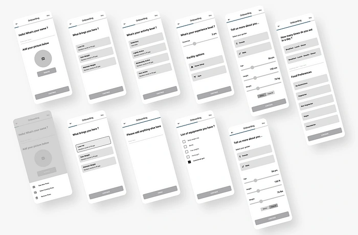
High Fidelity Wireframes
After selecting the perfect iterations from lo fi wireframes, I started making the high fidelity ones.
Design System
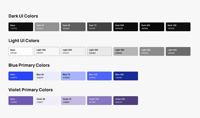
Color Styles
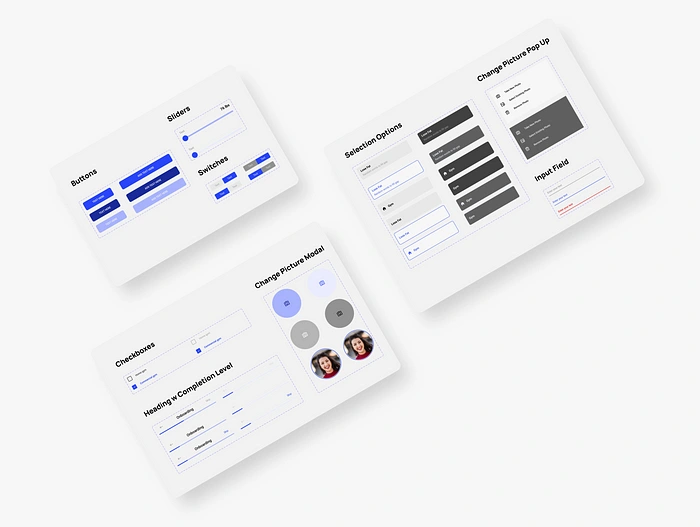
Components
The design system is fairly small and scalable. It houses all the necessary app components for future designers and developers to reference from. Consisting of text styles, color styles, input fields, headers, icons, sliders, switches etc.
Final User Interfaces
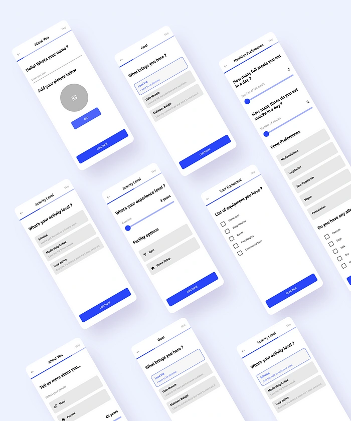
Light Theme UI
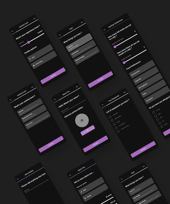
Dark Theme UI
When I was creating the design system, client requested me to design screens separately for light & dark theme. I paired blue with light theme and violet with dark theme.
Various Userflows
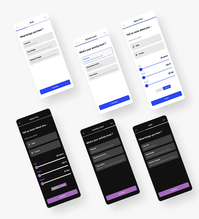
Macro Calculator
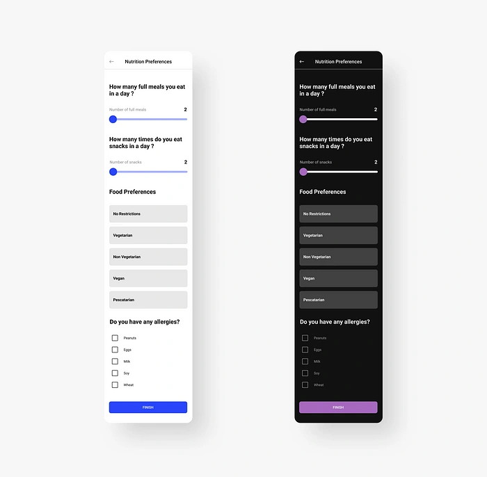
Nutritional Preferences
The screens I designed were used in several different flows such as the sign up questionnaire flow, macro calculator and nutrition preferences.
Like this project
Posted Jun 28, 2023
Designing a user onboarding flow to make the process of entering fitness preferences smoother!
Likes
0
Views
12
