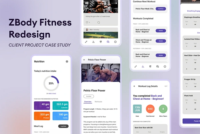
ZBody Fitness App Redesign : Case Study
Overview
I have previously collaborated with Tempo on a fitness app and after delivering great results for them, they reached out to me for another project.
But this gig was a step up from everything else I have worked on previously. Tempo requested me to redesign ZBody Fitness app’s UI from scratch, fix its UX and give a more minimal and branded feel to the app.
There was need for many new features to be added and removed to make the overall app experience better than what it is now. After recieving all the necessary data from the client I proceeded to redesign the app!
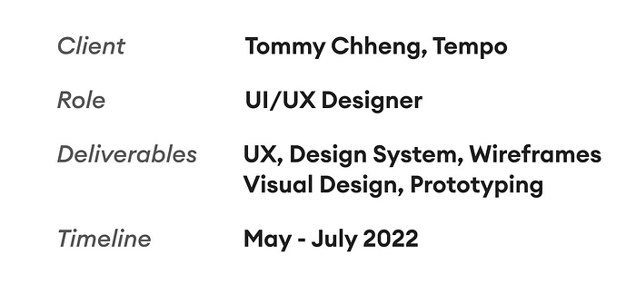
Project Stages

Spotting Flaws in App’s UX
Upon entering the app, a user will be bombarded with a broken design that barely does what it’s supposed to. Given all the issues were sticking out like a sore thumb, it became easier for me to list and start working on them. Issues were -
Inconsistent iconography
Lack of grid system / Inconsistent alignment
Too many text styles
Lack of color constrast among UI assets
Accessibility wasn’t considered during development
Design system isn’t optimized for scaling
No option to offer personalized workout programs
Lack of input options while logging workouts
UI wasn’t pleasing to look at
No proper way to edit or filter through previously logged workouts
No proper way to calculate intake of nutrition in a day
Community tab was cluttered and needed better spacing
Upcoming exercise screen didn’t have an option to log workout or any indicator of which exercise the user was performing at the moment
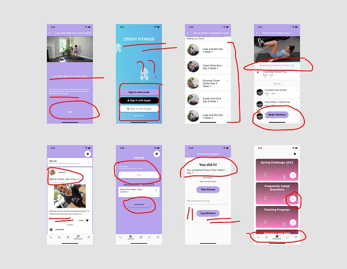
And the list went on and on. These are just a handful of the issues I faced while researching through the app and doing competitor analysis.
Solutions
When working on an app of this scale with many paid subscribers, I had to pick which problems were worth fixing in the first place. The trainer and her subscribers had certain requirements which needed to be solved immediately and then business needs were to be catered separately.
I started fixing the most obvious and important ones, without which the app won’t live upto its expectation and leave a user dissatisfied.
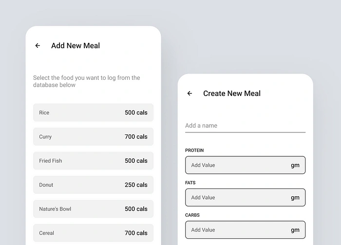
Added a meal library - which made it easier for the user to add new items and log their meals daily to keep a track on their nutritional intake
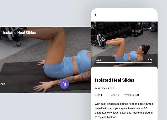
New video player - previously user could only view exercise videos in vertical mode but I added a horizontal option with a tiny dropdown description!
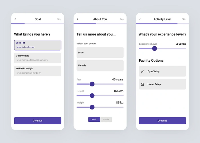
New interactive onboarding - I reused the older flow I designed for Tempo to make the onboarding look familiar with their other apps
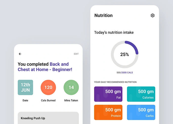
Eye-catchy graphics - a new addition to the app, this will help users to understand important data in a fun new manner
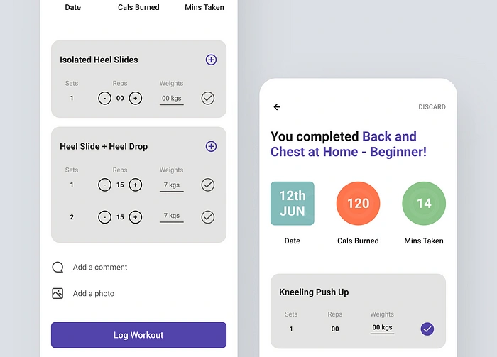
Editable activity logs - a new use case that originated in the middle of desigining; what if a user didn’t input their log correctly and wants to edit it without doing an exercise again from scratch ?
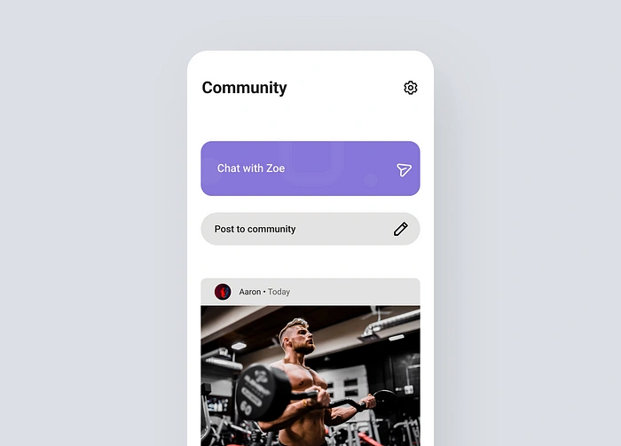
More interactive community experience - this part took some time as I wanted to make all the subscribers feel like a community with same interests. I redid the entire UI here, added new full screen view for posts, date & time on posts and comments to make this section of the app a safe space for users to share and update others about their fitness journey!
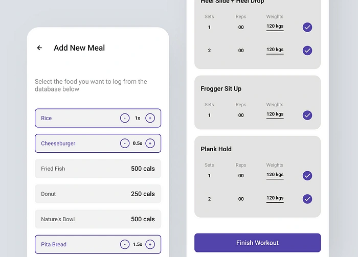
New logging system for meals & exercises - added more diverse options such as adding new sets for individual exercises, made a clear division between exercises and option to attach photos & comments too
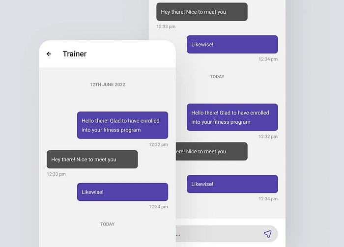
1 on 1 chatting with trainer - many users might need help with their programs or have doubts to be cleared, for which this new feature was added
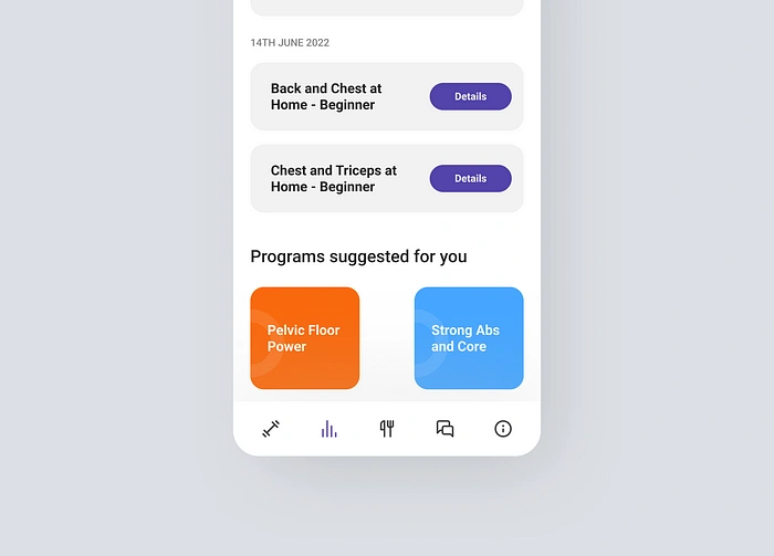
Added customized suggestions - from a business point of view, upsell more programs to your existing subscribers based on their behaviour on the app
Wireframes
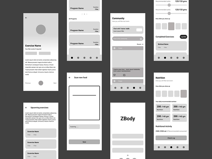
I mapped the screens visually through high-fidelity wireframes after doing my thorough research, analysis and wibbly wobbly sketches of rectangles on my iPad.
Style Guide & Components Library
A robust and detailed library of components and guidelines are important to make sure everything in the app stays consistent and it’s easier to store for future requirements.

Spacing System
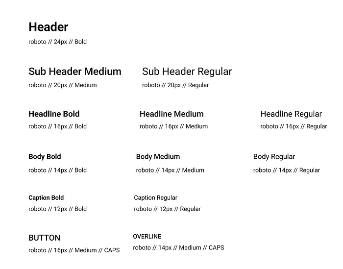
Text Styles
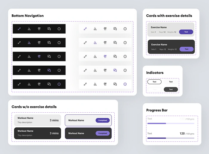
Components 01 — Bottom Navigation, Progress Bar, Cards, Indicators.
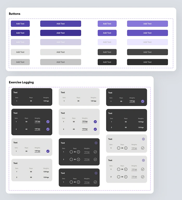
Components 02 — Buttons, Exercise Logging.
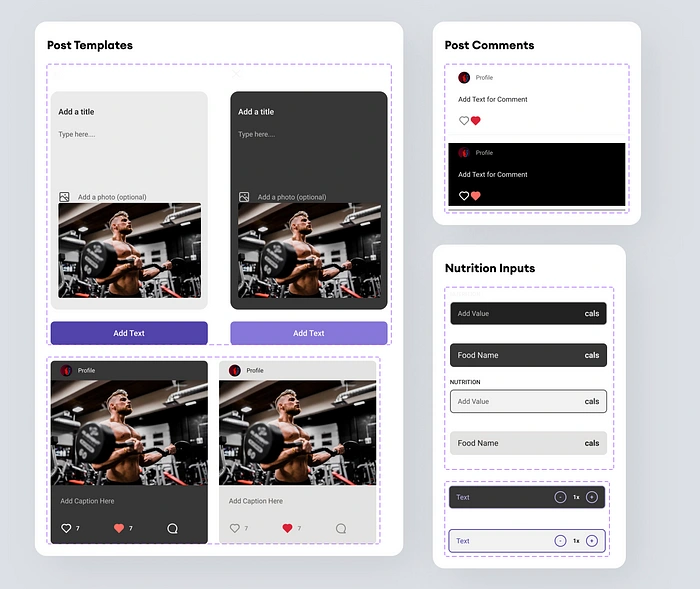
Components 03 — Post Templates, Post Comments, Nutrition Inputs.
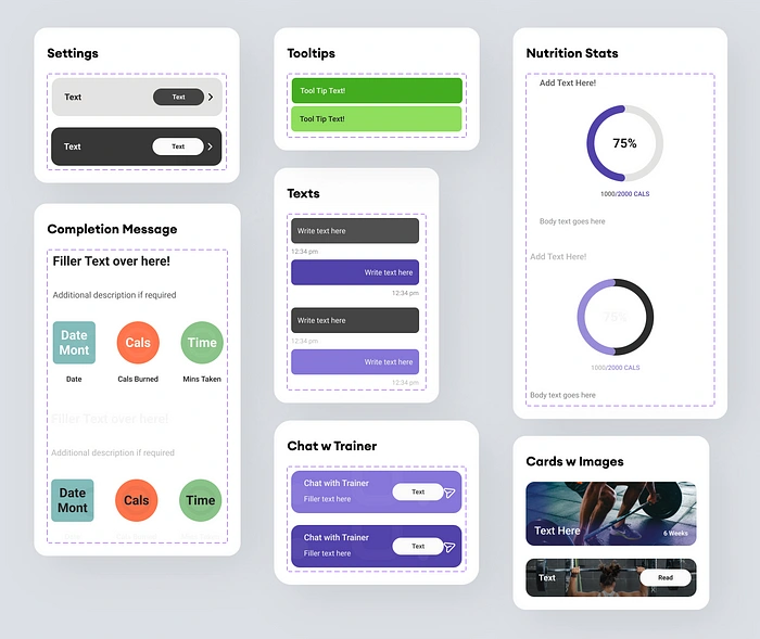
Components 04 — Settings, Completion Message, Text Bubbles, Nutrition Stats, Chathead, Cards, Tooltips.
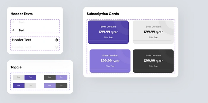
Components 05 —Header Texts, Toggle, Subscription Cards .
User Interfaces
After months of ideation, planning and hardwork it was time to work on the final interface of the app.
Light Interfaces
Main/Default interface of the app would be in light mode, with the brand color of purple used as primary followed up lighter lavender.
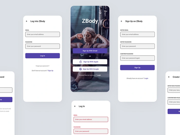
Log In / Sign Up
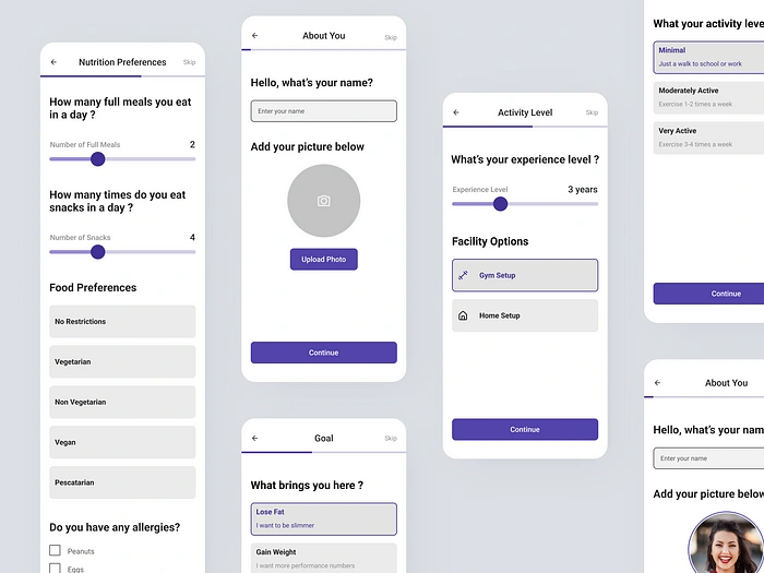
Onboarding & Questionnaire
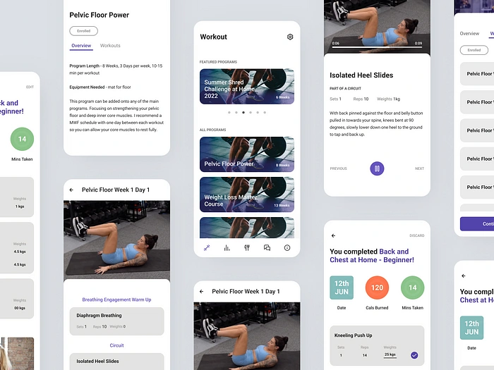
Workout & Exercises
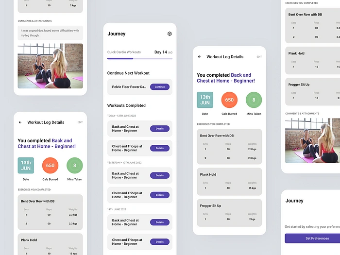
Journey
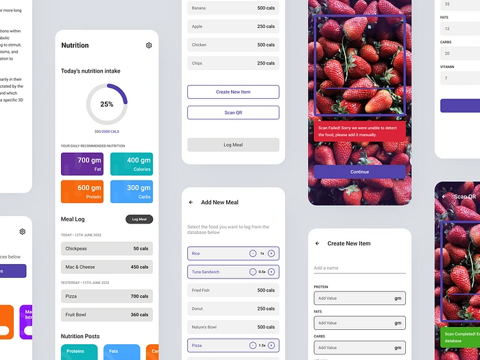
Nutrition & Meal Library
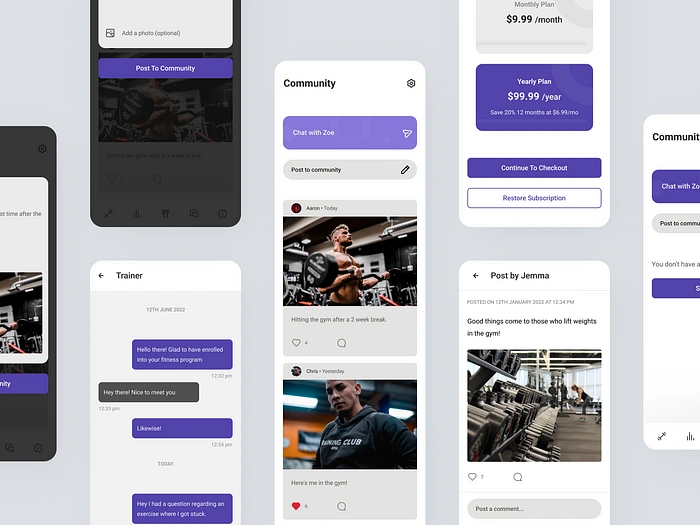
Community
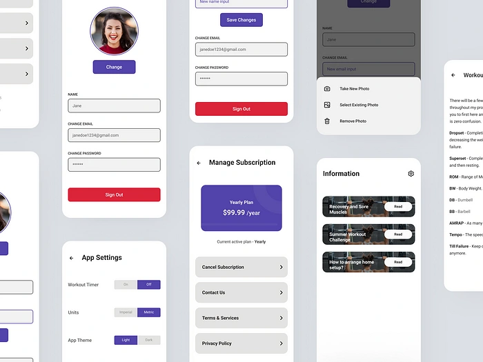
Information & Settings
Dark Interfaces
All the screens created for light mode were also duplicated for a dark theme with the help of the component library I created!
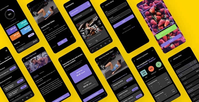
Old Design vs My Design
The project’s main aim was to redo everything from grounds up and introduce new features to make the overall experience better and it would be unfair if I concluded the case study without a “before vs after” showcase of the interfaces.
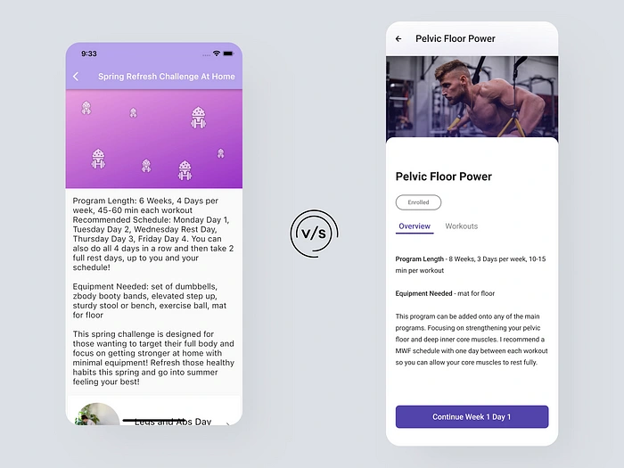
Program Details — Before v After
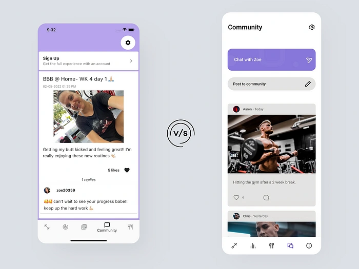
Community— Before v After
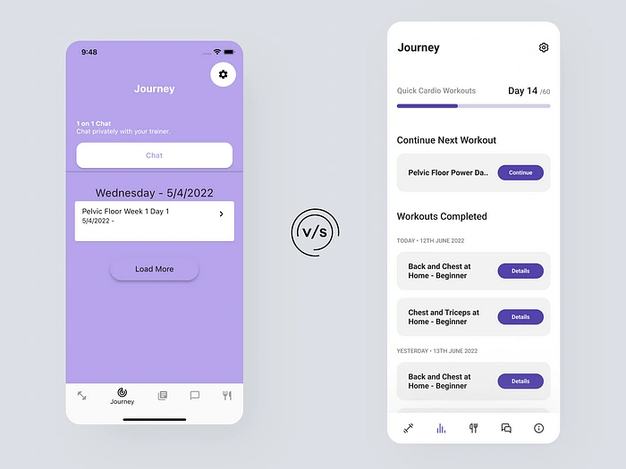
Journey— Before v After
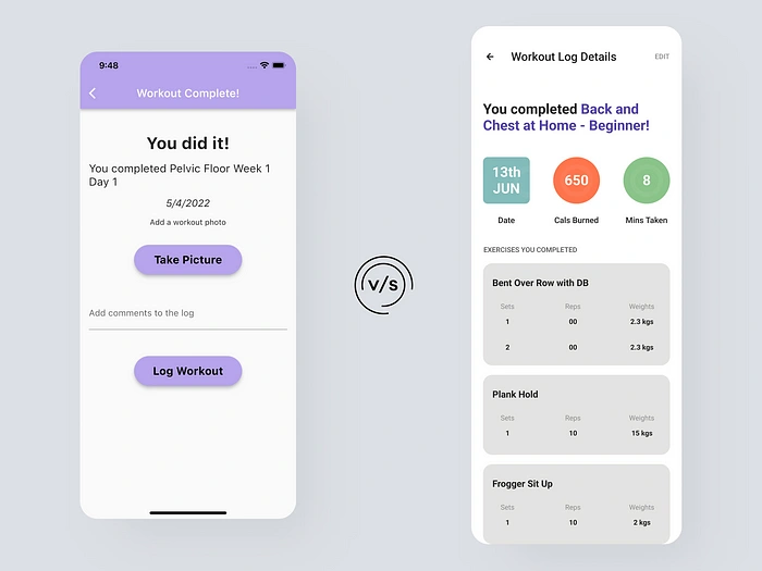
Workout Completion— Before v After
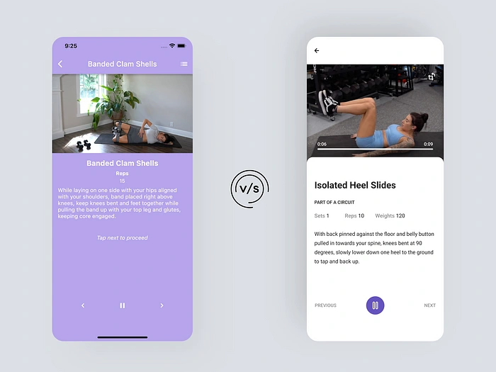
Exercise Video Player— Before v After
Like this project
Posted Jun 28, 2023
Redesigning a fitness app’s UI from scratch, fixing its UX, and giving it a more minimal and branded feel.
Likes
0
Views
21
