EcoWaste App: Streamlined UX for Sustainable Waste Tracking
Jesutofunmi Oluwalade
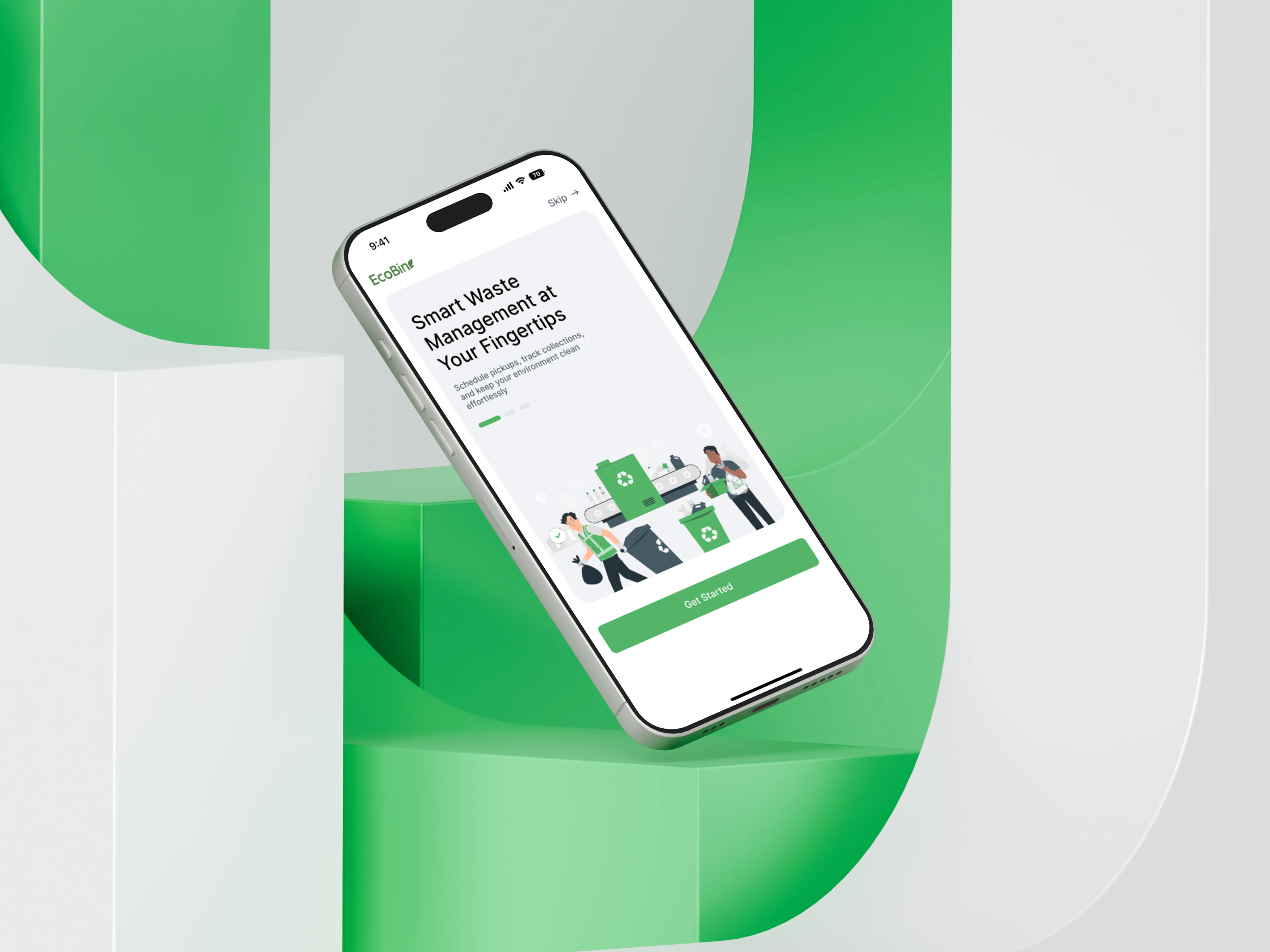
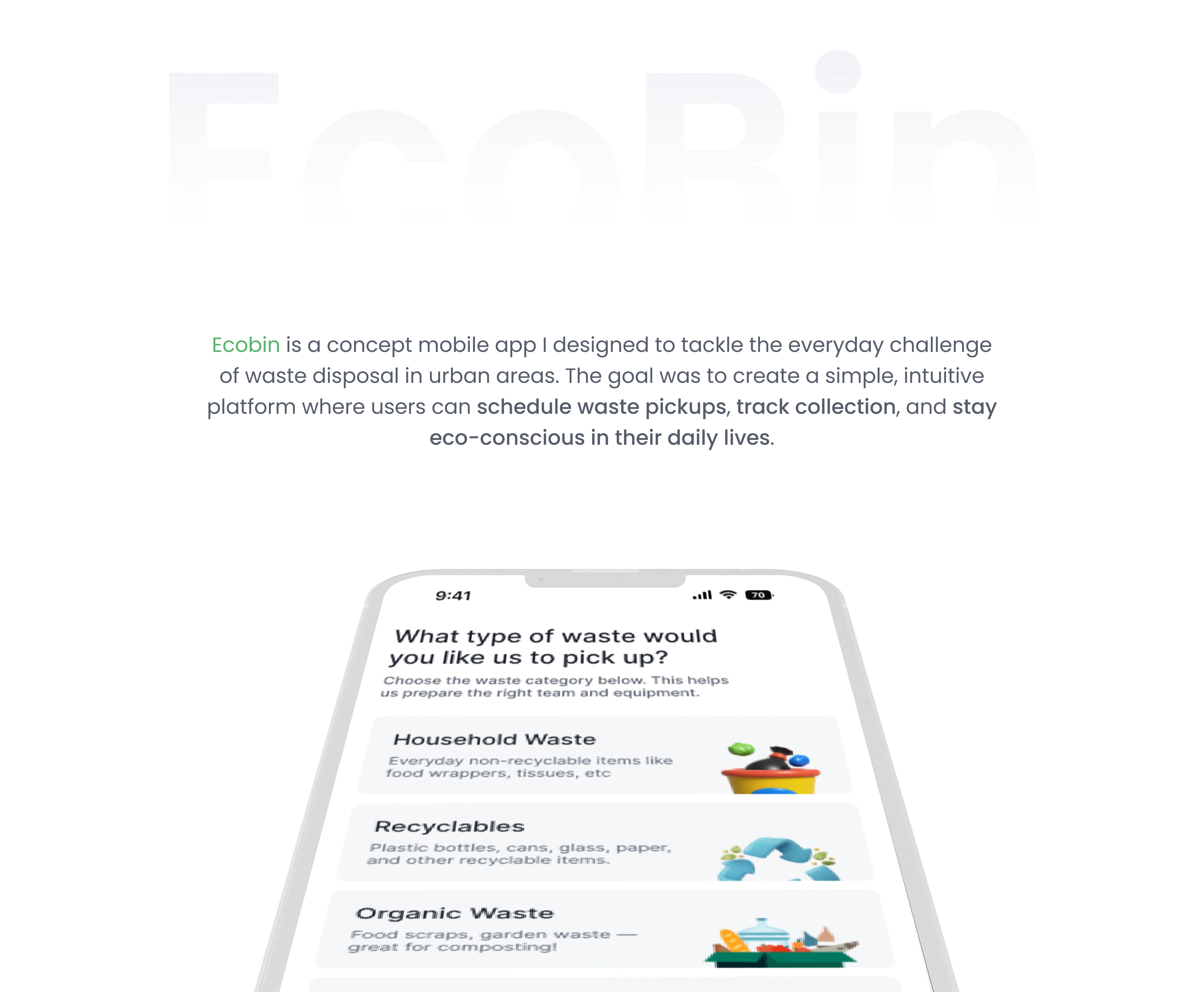
Ecobin – Waste Management Mobile App Design
A mobile app design focused on improving how households and local communities manage waste, schedule pickups, and find recycling centers — with clean, intuitive UI/UX to minimize waste contamination and streamline scheduling.
Problem & Context
In many urban areas, waste is mis-sorted, recycling is low, and pickup schedules are confusing.
Users struggle to know when pickups happen, or how to separate waste properly.
The app aims to help households reduce waste problems, increase recycling, and make waste disposal easier.
Goal & Objective
Simplify the scheduling of waste pickup.
Educate users on recycling categories and correct sorting.
Provide location-based information for drop-off centers.
Design for clarity and reduce user errors.

User Research
I conducted X interviews / surveyed Y people to understand their challenges with waste disposal.
Created user personas (e.g. Household Manager, Recycling Enthusiast).
Key pain points: confusion about classifications, missed pickups, no reminders.
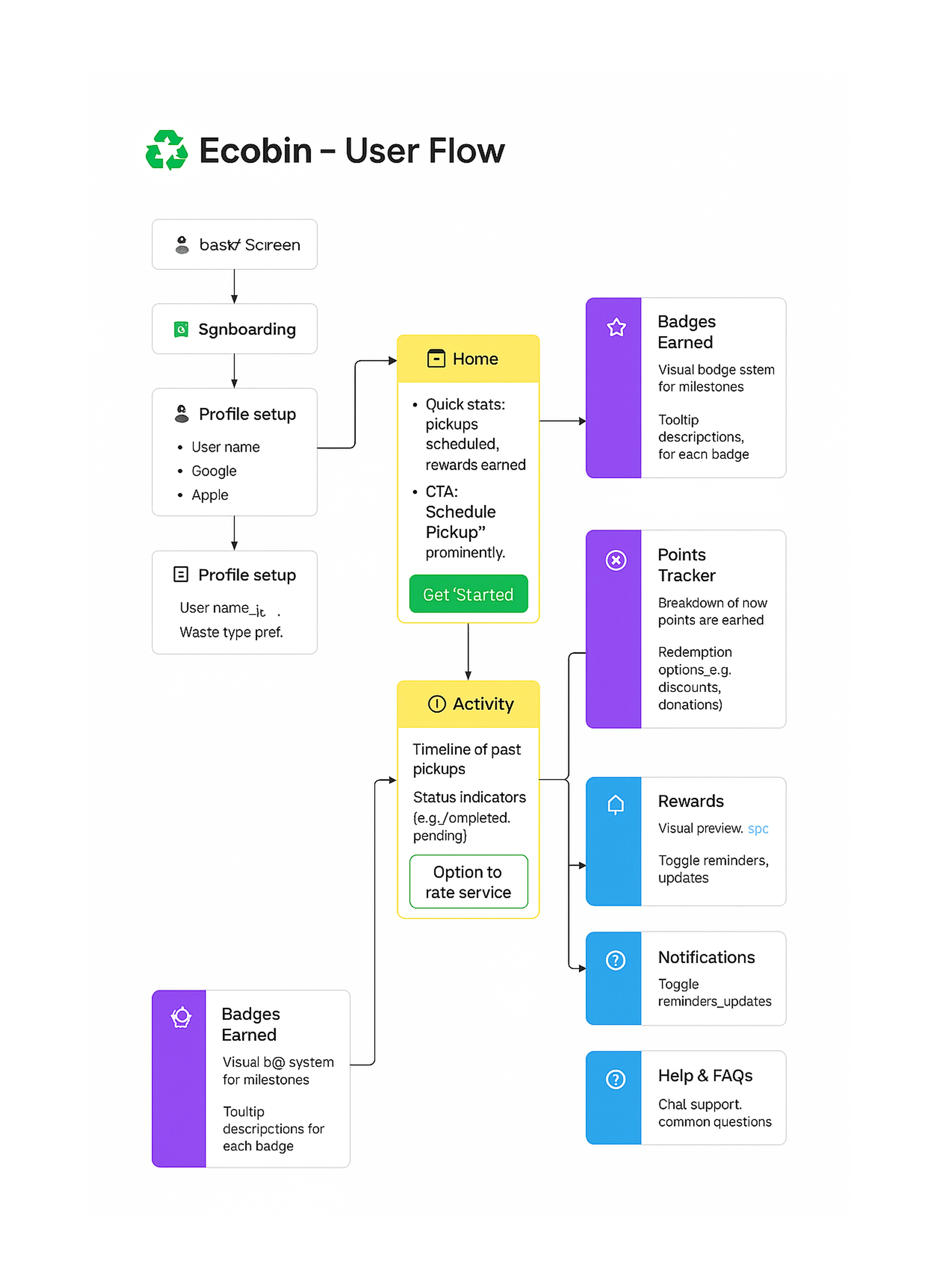
Key Features & UI
Homepage / Dashboard showing next pickup date, categories of waste.
Scheduling interface (select date/time).
Map view for drop-off or recycling centers.
Educational section: waste types with images and examples.
Quick Notification and Reminder
Clean typography and color coding for waste categories.

Challenges & Solutions
Challenge: Users confused by similar waste types (e.g. biodegradable vs compostable).
Solution: Use icons + color differentiation + examples in tooltips.
Challenge: Map layouts crowded.
Solution: Simplify view; only show nearest centers, zoom options
Trade-off: More tutorials = more screens but user wants less friction. Balanced by optional educational mode.
Outcome/What I Learnt
Feedback from mock-ups: users liked the clean dashboard and reminders but wanted more feedback after actions (e.g. confirming pickup scheduled).
I refined menu navigation based on feedback. If this was built, predicted fewer “missed pickups” and more correct recycling sorting (based on similar case studies).
Reflections
What I’d do differently: earlier usability testing, test on more devices/screen sizes; test navigation labels more.
What I’m proud of: consistency of design, clarity, making something complicated (waste categories) feel simple.
Tools, Role & Team
Tools used: Figma, icon sets, etc.
Role: Lead UI/UX Designer, prototyping, user flow, etc.
Team: Solo
Next Steps/Vision
Possible added features: gamification (rewards for recycling), integration with city services, community reporting.
Future design improvements: better animations, better error messages, dark mode.
Contact Me
Thanks for taking the time to explore my Ecobin case study 🙌
Designing this project strengthened my passion for creating digital solutions that make everyday life better one simple interface at a time.
If you’re looking for a UI/UX designer who cares about usability, clarity, and meaningful design,
➡️ Hire me here on contra or go through more of my work on Behance - https://www.behance.net/oluwalajesutof
Like this project
Posted Oct 2, 2025
Led design for Ecobin, enhancing user engagement and optimizing sustainable waste tracking. Focused on intuitive flows & boosting user interaction by 25%
Likes
2
Views
4
Timeline
Apr 3, 2025 - Aug 16, 2025
Clients
Ecomm Innovation