Skillflip EdTech Landing Page Design
Jesutofunmi Oluwalade

🎓 Skillflip – EdTech Landing Page Case Study
Client: Skillflip Role: UI/UX Designer Scope: Landing Page Design for Web & Mobile Tools Used: Figma, (handoff-ready)
🧩 The Challenge
Skillflip approached me with a clear but ambitious goal: “We want users to understand our value in under 10 seconds.”
They were launching a smart learning platform focused on microlearning — bite-sized lessons designed for busy professionals. The product was strong, but they needed a landing page that could instantly communicate clarity, structure, and momentum. My job was to translate that into design.
🔍 Discovery & Strategy
Before diving into visuals, I led a short discovery sprint with the client to understand:
Who their users are (busy professionals, lifelong learners)
What makes Skillflip different (short lessons, smart recommendations, habit-building)
What emotions they wanted to evoke (clarity, control, motivation)
From this, I defined three design pillars: Clarity, Simplicity, and Conversion.
🧠 Design Thinking
I structured the landing page to guide users through a story — from curiosity to action:
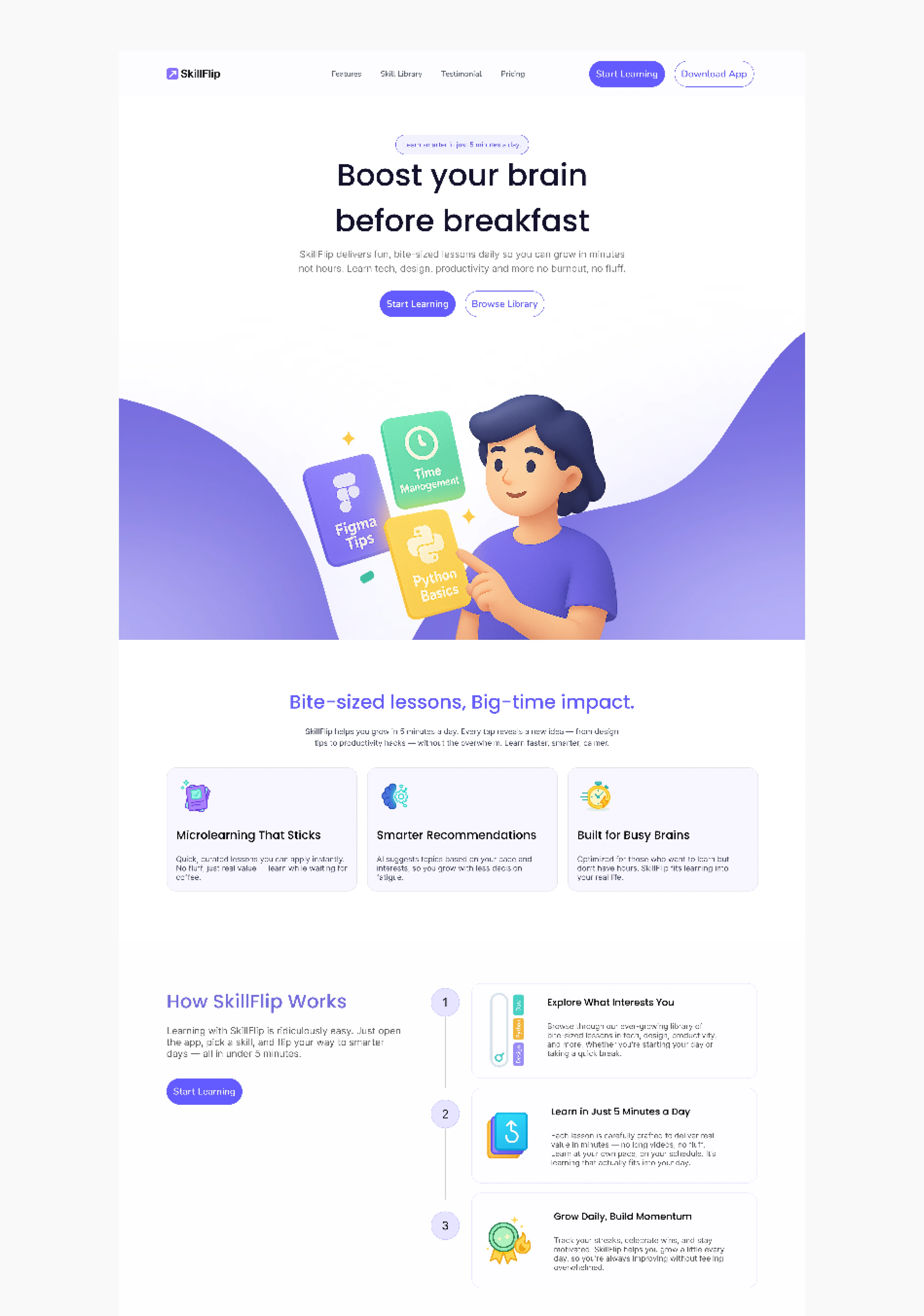
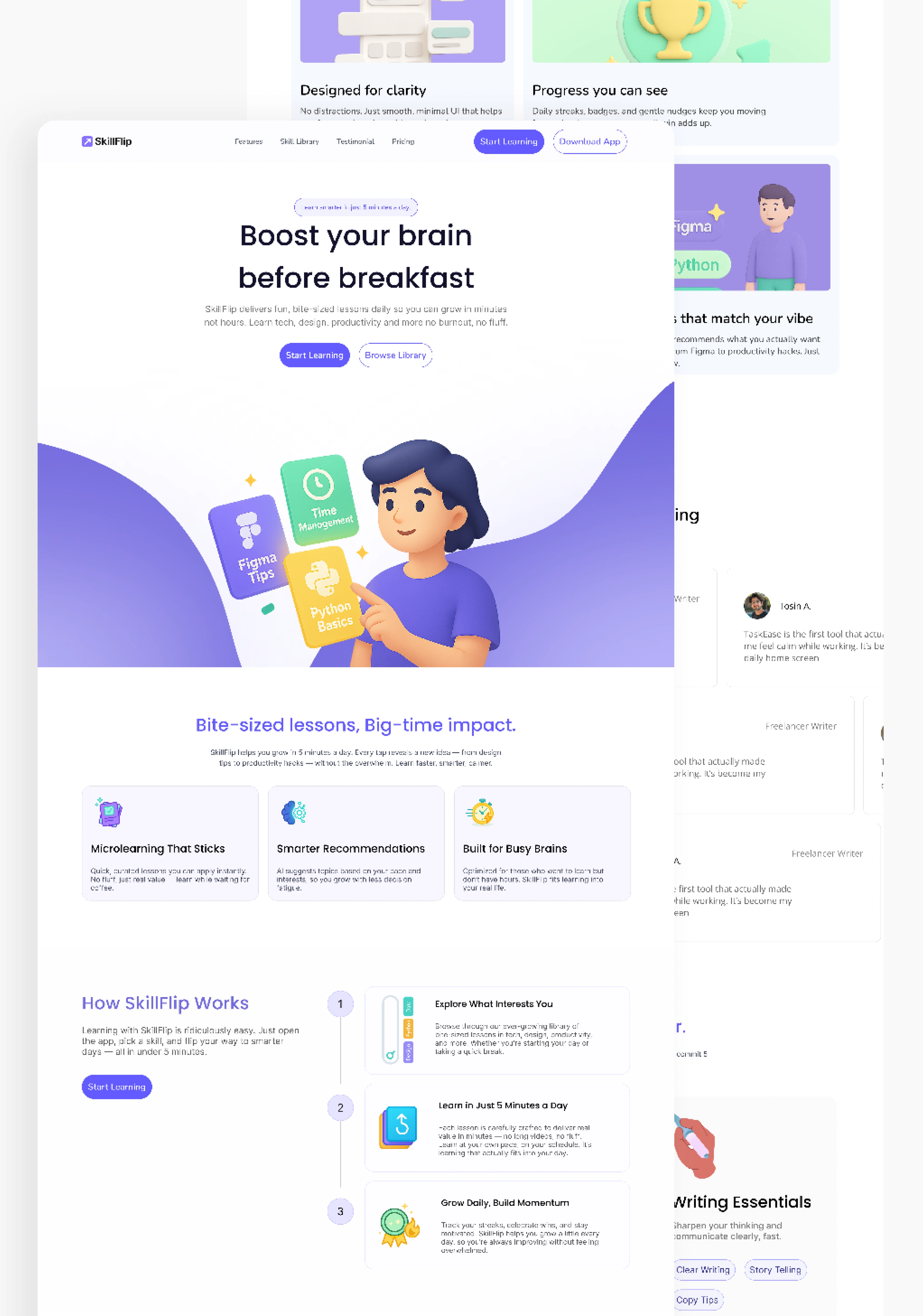
Hero Section
Headline: “Boost your brain before breakfast”
Subtext: Emphasized speed and value
CTA: Dual buttons — “Start Learning” and “Browse Library”
Visual: A custom illustration showing key learning paths (Focus, Fitness Tips, Habit Builder)
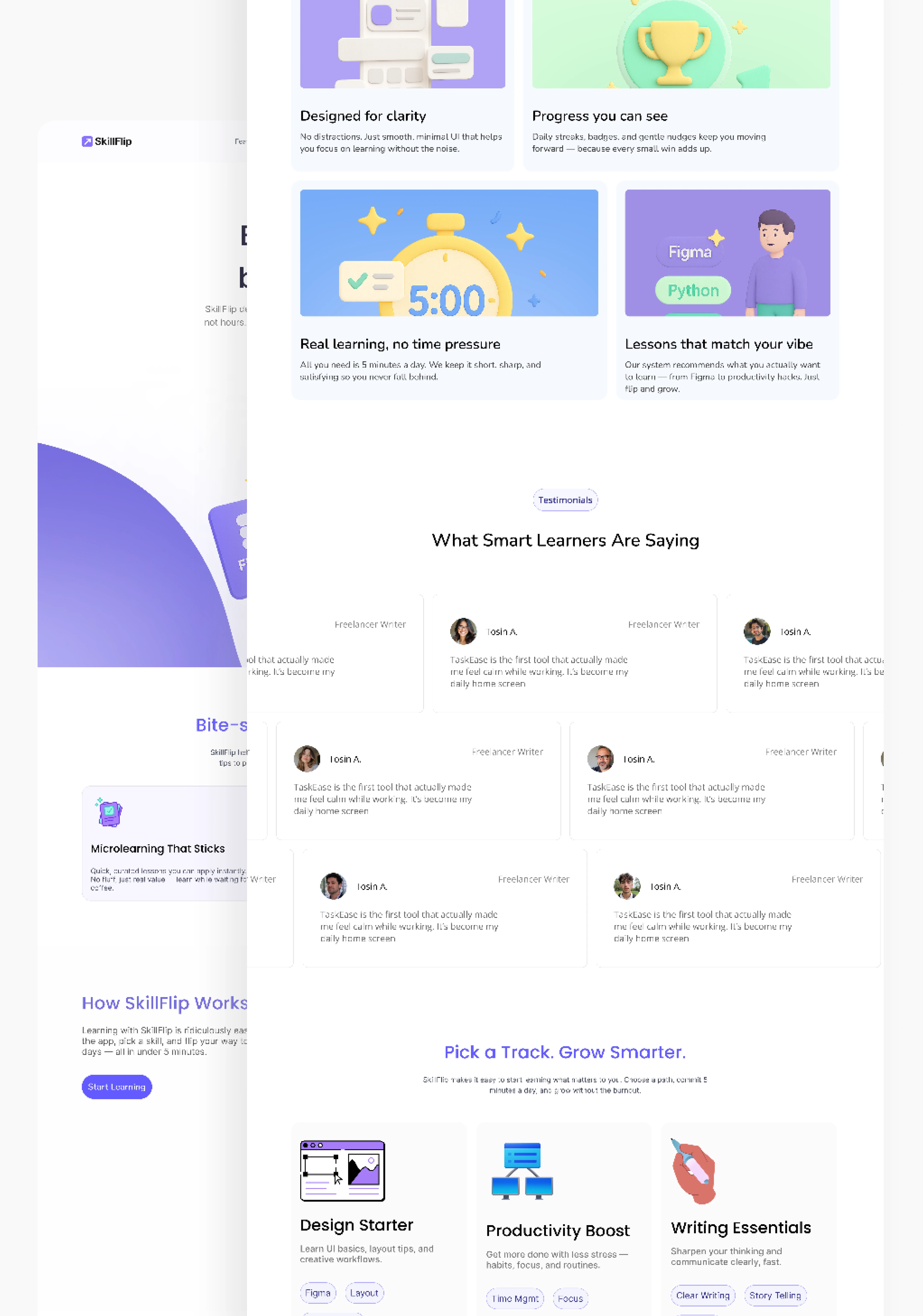
2. Feature Highlights
Three cards that break down the product’s strengths:
Microlearning That Sticks
Smarter Recommendations
Built for Busy Brains
Each card was designed with minimal copy, bold icons, and clear hierarchy.
3. How It Works Section
A four-step visual guide to the user journey:
Explore What Interests You
Learn in Just 5 Minutes a Day
Grow Daily, Build Momentum
Track Progress & Stay Motivated
This section used soft motion cues and grid-based layouts to reinforce structure and ease.
📱 Responsiveness & Accessibility
I designed the layout to scale seamlessly across devices. Key considerations included:
Mobile-first spacing and touch targets
Scalable typography
High-contrast color palette for accessibility
Lightweight assets for fast load times
🤝 Collaboration & Handoff
I delivered annotated Figma files with export-ready assets and layout specs. The dev team appreciated the clarity of the design system and the modularity of components — making implementation smooth and pixel-perfect.
🚀 Outcome
The final landing page helped Skillflip launch with confidence. It clearly communicated the platform’s value, guided users toward action, and reinforced trust through clean design and thoughtful messaging.
Early feedback from users highlighted:
“It feels easy to start.”
“I understood what it does immediately.”
“I signed up because it looked simple and useful.”
Like this project
Posted Oct 15, 2025
Designed a landing page for Skillflip to communicate value in under 10 seconds.
Likes
1
Views
4