Conversion Landing Page for a B2B Data Intelligence Platform
Diana Fabianczuk
PROJECT OVERVIEW
Project: Report landing page for Instantly.
Role: UX/UI Designer.
Note: Data charts and visualizations were created by another designer on the client's team.
Challenge
Instantly needed a landing page to present a data-heavy benchmark report, but the content arrived as long, unstructured text blocks with no visual hierarchy. The risk was obvious: without restructuring, it would read like a document, not a product page, and lose the reader before they reached a single CTA.
The constraint made it harder: performance-first, no heavy visuals, and the design had to follow Instantly's new brand system.
My approach
Before touching any layout, I focused on content logic, reading flow, and user intent. The question wasn't "how should this look, " it was "how does someone actually move through this page, and what do they need to feel at each step."
To validate the structure before committing to visuals, I created two low-fidelity layout directions for the client to evaluate logic, not aesthetics.
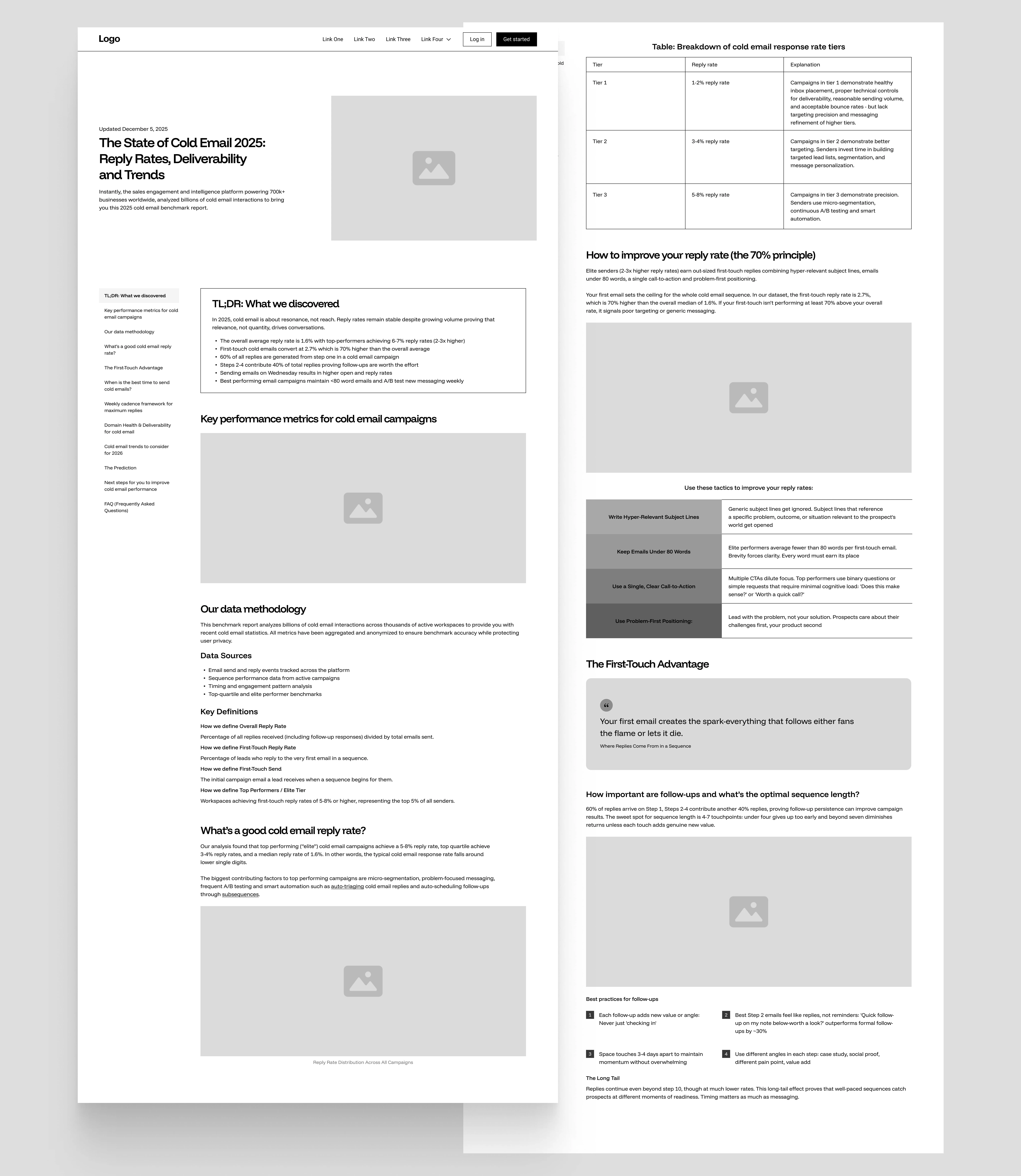
The client provided content in a raw format: long text blocks (see below):
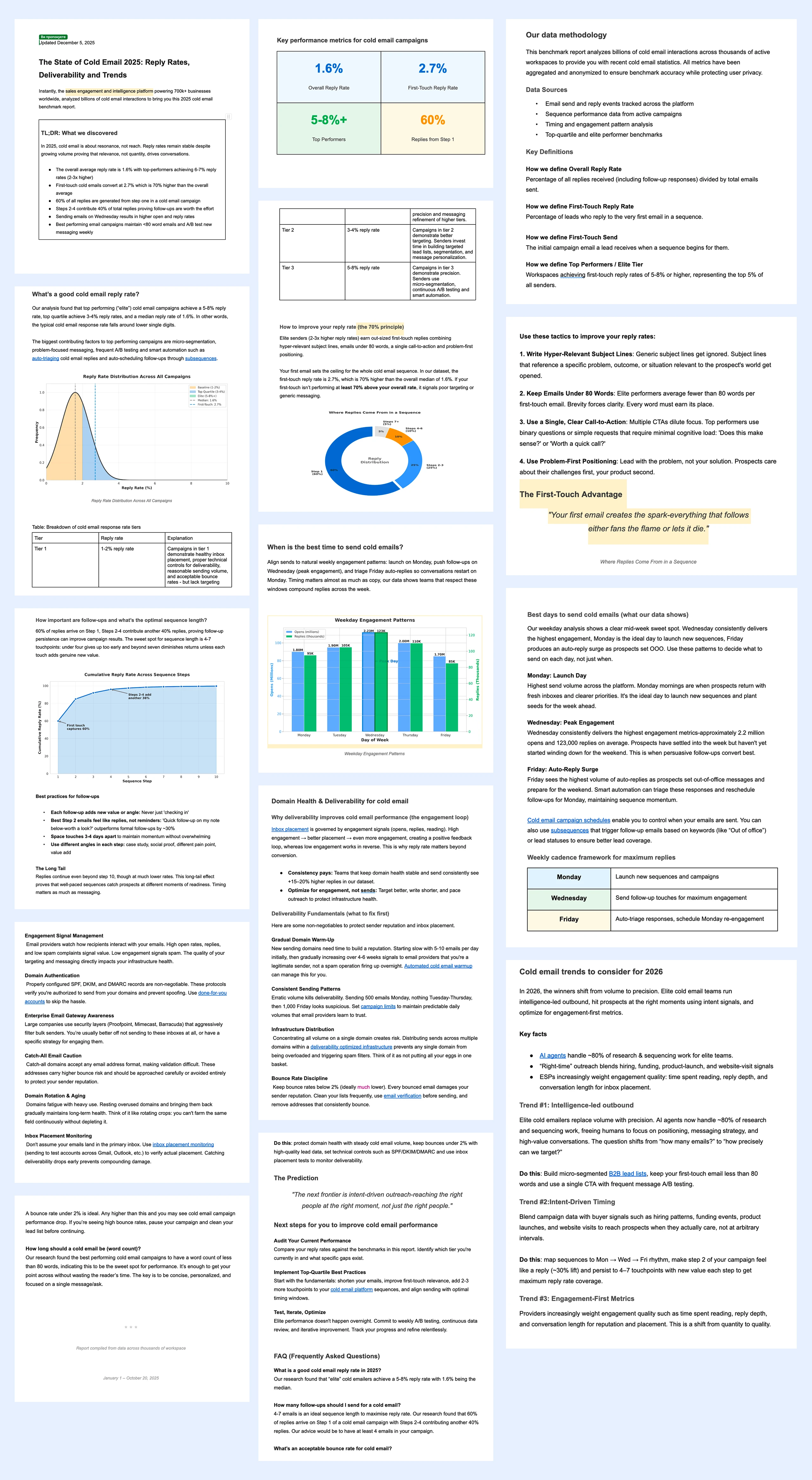
Initial content provided by the client
LOW-FI MOCKUPS
Variant 1 — Text-first layout
A minimal structure built purely on typography, spacing, and reading rhythm. This tested whether hierarchy could work on its own, without any visual support.
First step: building a structure before visuals.
Variant 2 — Structured layout with content boxes
This version introduced section containers, visual grouping, and contrast blocks — testing whether separating content into defined zones improved scannability and reduced perceived complexity.
Alternative layout to test hierarchy and grouping
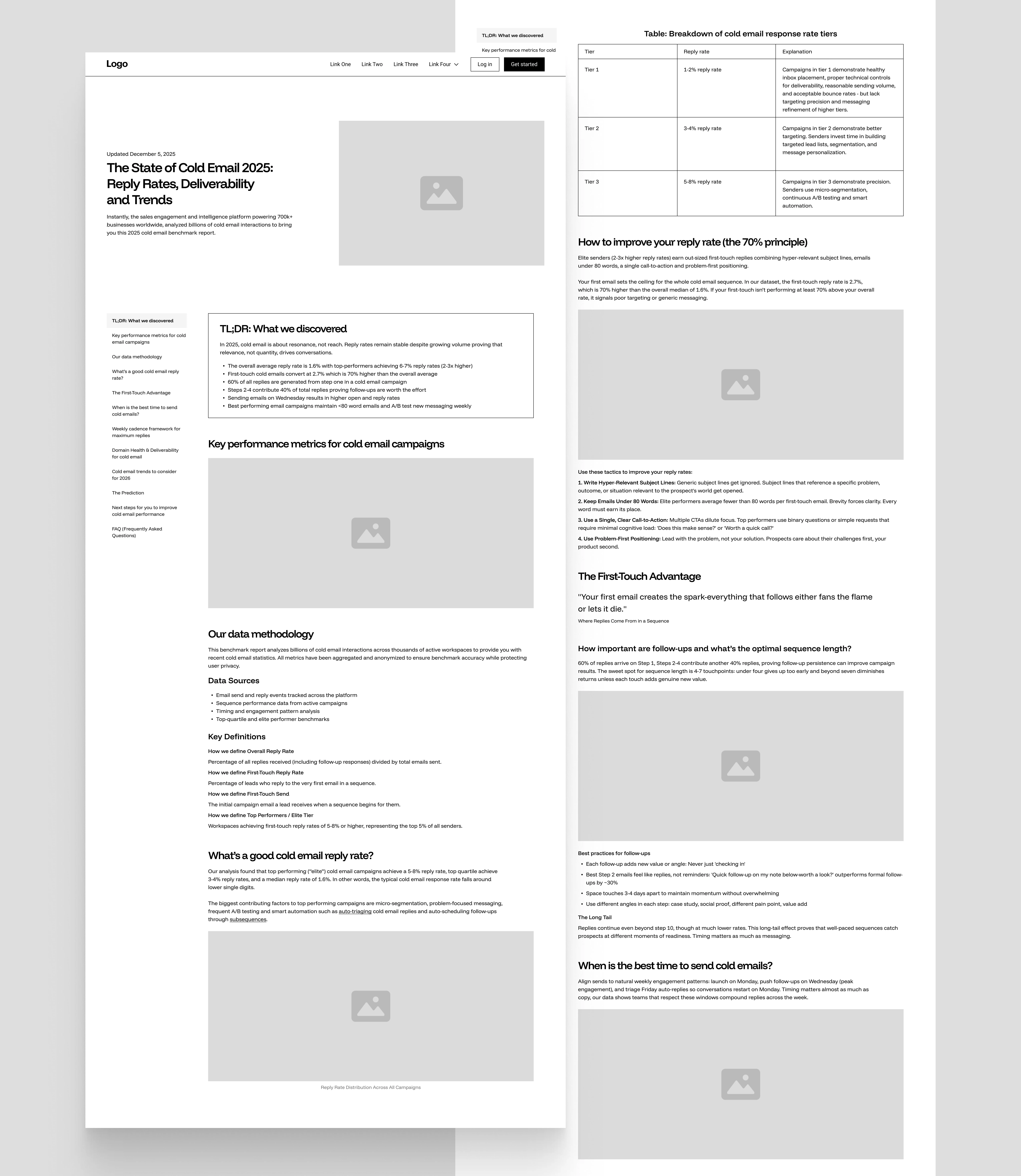
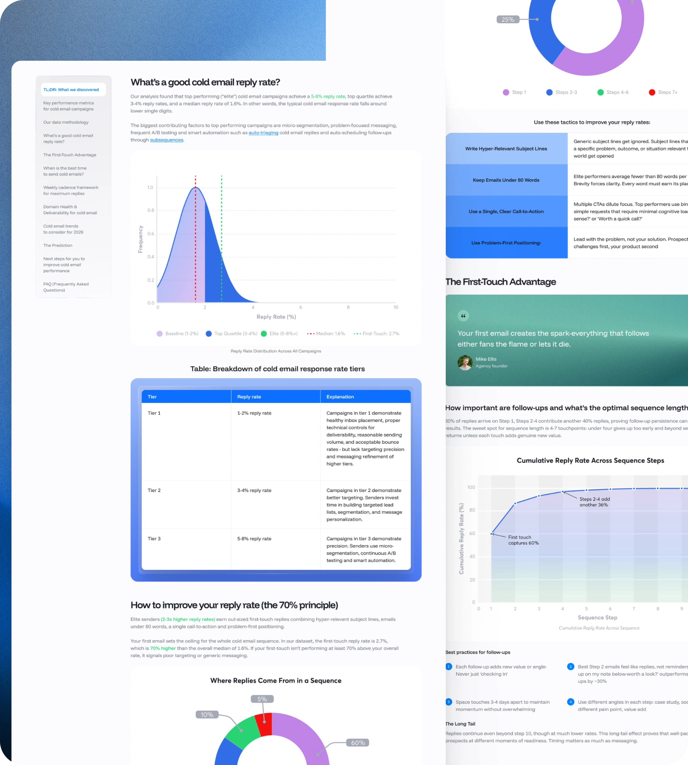
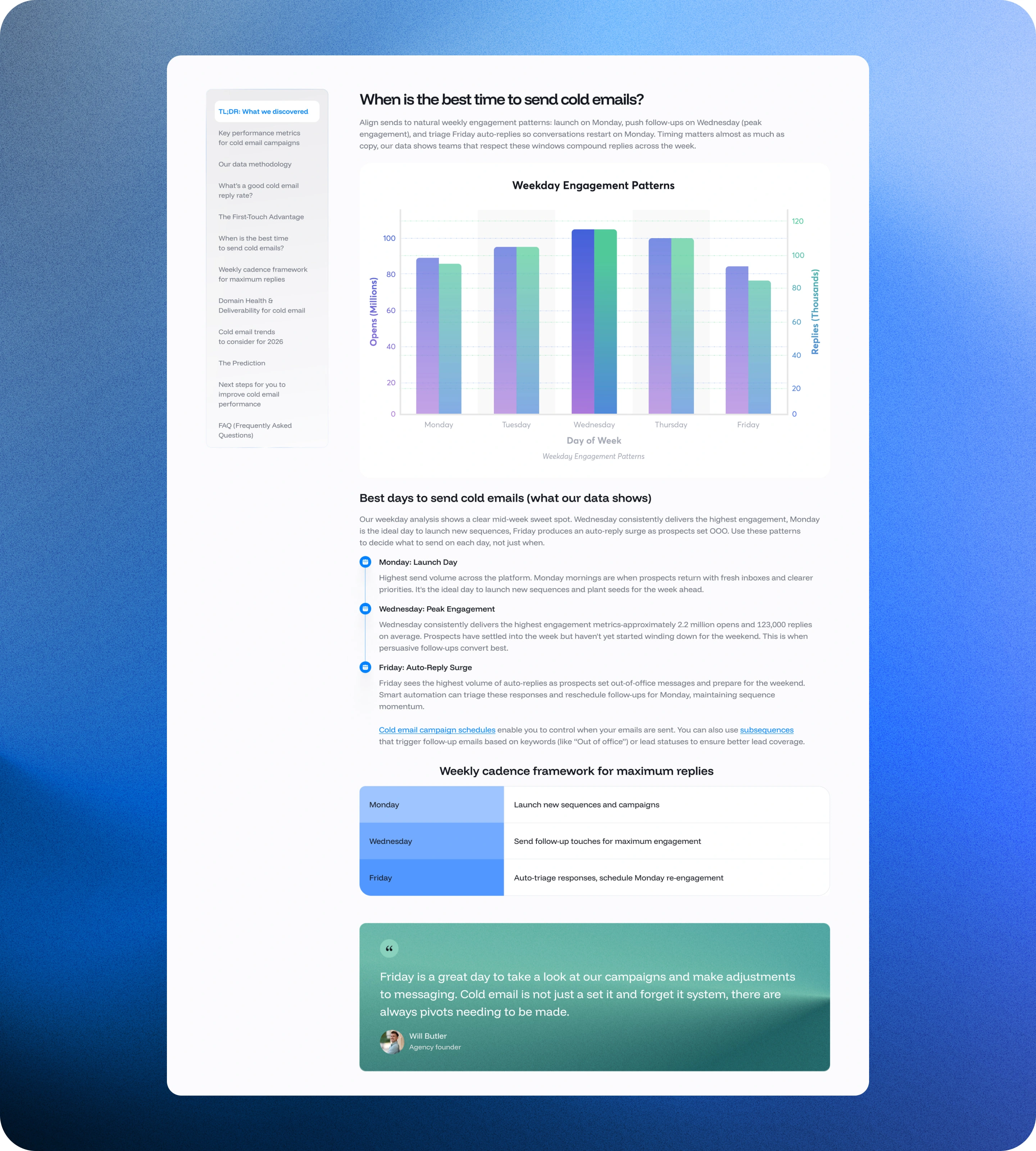
HIGH-FI DESIGN
After the client validated the structure, I translated the chosen layout into a high-fidelity design using Instantly's new brand system. The design principles stayed consistent throughout: lightweight visuals, strong typographic hierarchy, restrained color, and layout over decoration. Every decision was made to support fast scanning, easy section navigation, and focus on content over UI noise.
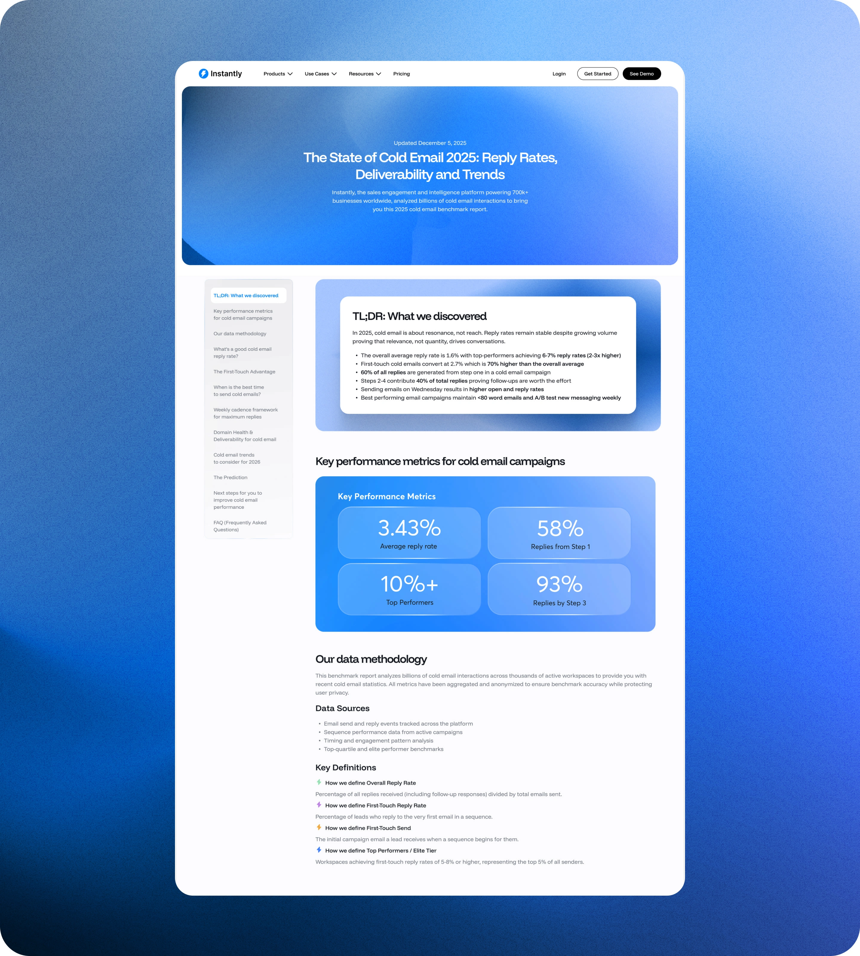
Final design based on validated structure and brand system
Result
The final page transforms a dense data report into a structured, scannable experience, one that feels like a product page, not a document. Designed and fully implemented in Webflow, with a complete handoff to the client's team.
Like this project
Posted Feb 9, 2026
B2B SaaS landing page design for Instantly — built for fast scanning, content hierarchy, and conversion performance within the brand's visual system.