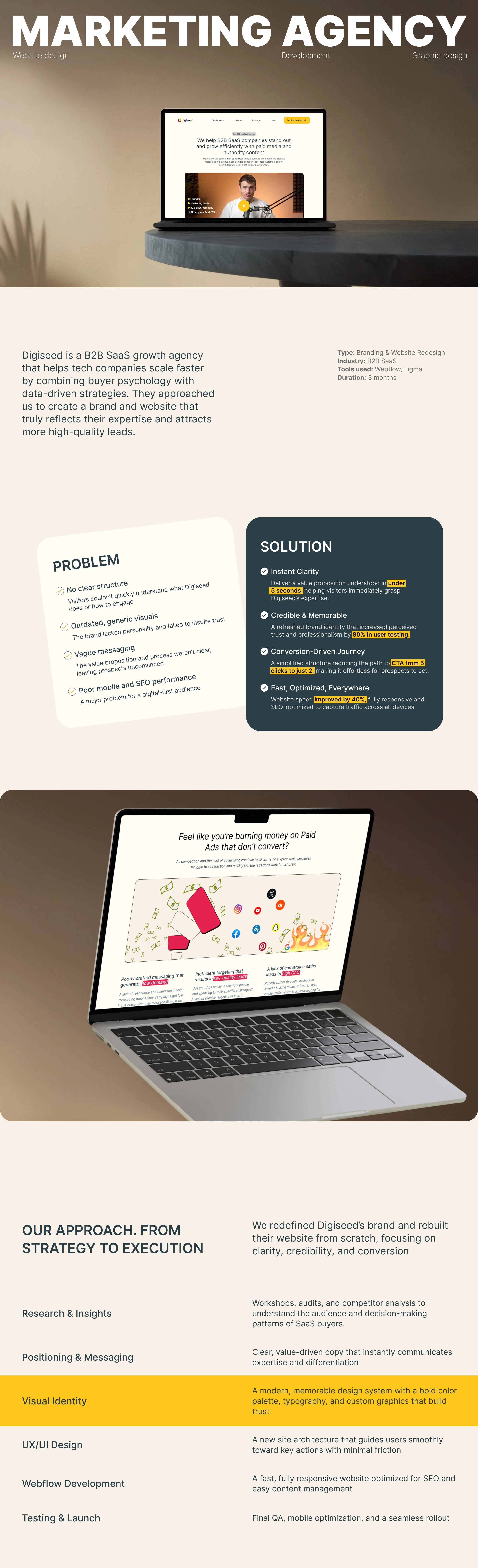
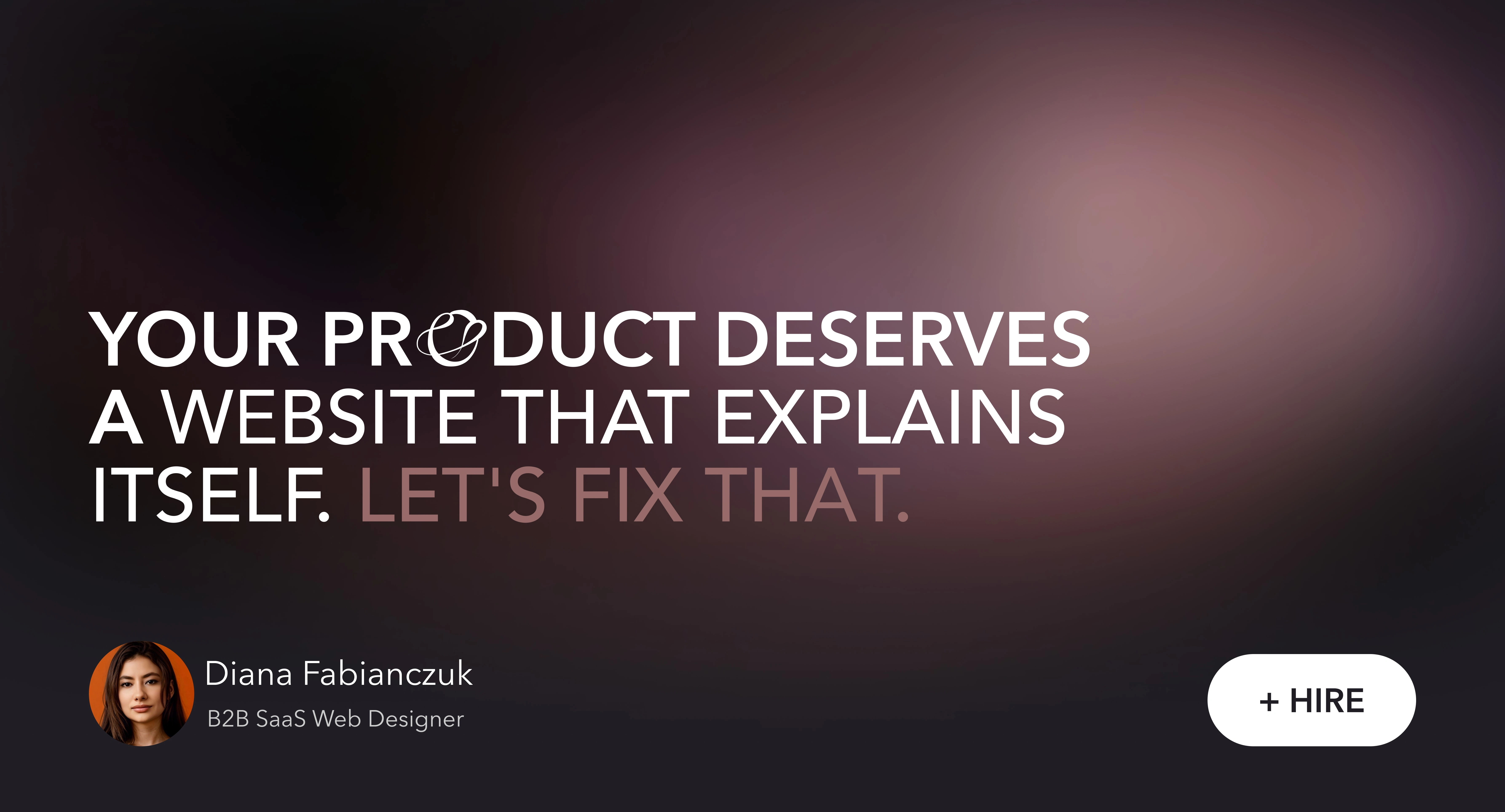
From Outdated to Conversion-Ready: B2B SaaS Website Redesign
Diana Fabianczuk
Home page
Graphics & Icons Creation
For Digiseed, I created a custom set of icons and graphics from scratch, built to speak the brand's language: smart, confident, and conversion-focused.
Every visual element was designed to do more than just look good, it had a purpose. Icons that guide without words. Graphics that explain without clutter. Together, they shape a visual system that feels intentional at every step.
It’s the kind of detail users don’t always notice — but they feel it. That subtle sense of clarity, trust, and “this just makes sense” from the first scroll.
Quick Impact Snapshot
A clearer value proposition is understood within 5 seconds of landing on the page.
Simplified navigation flow, reducing the steps to CTA from 5 clicks to 2.
Mobile experience redesigned to capture leads without drop-offs on small screens.
Website performance optimized, loading 40% faster than the previous version.
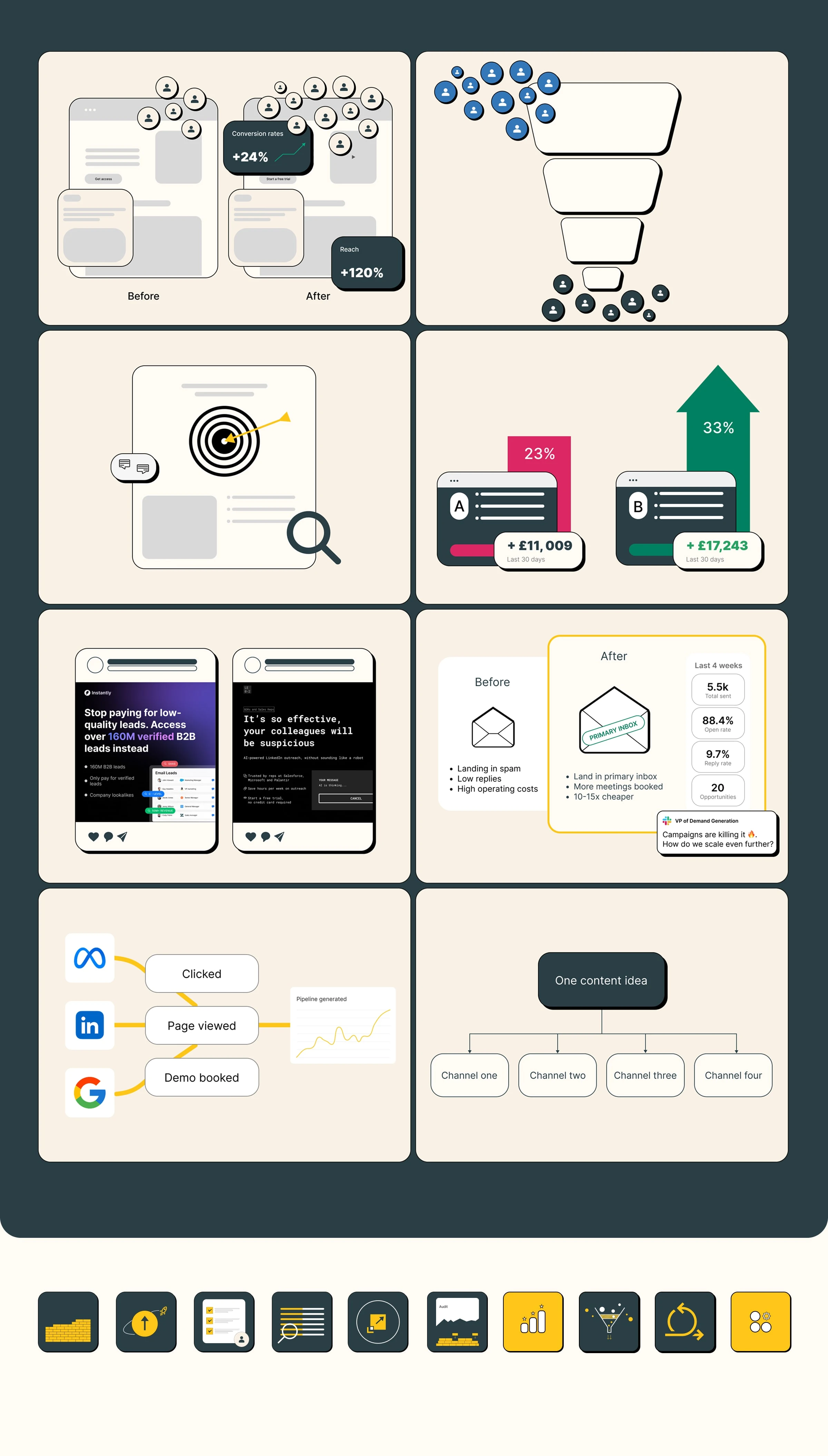
Enhancing Video Impact with Custom Graphics
As part of the project, I designed bespoke graphics to elevate the quality and impact of a video presentation.
One key task was creating a Digiseed-style visual that not only matched the brand’s aesthetic but also made the information more engaging and easier to digest.
Below, you can see a static example of the design, along with a short video that demonstrates how the animated version brought the content to life.
Static graphics
animated version
Visual Transformation
Before: A cluttered website with no clear structure, generic branding, and poor mobile usability.
After: A modern, conversion-focused experience with strong messaging, a distinctive brand identity, and optimized performance across devices.
Result: Before and After
On the left website before branding
My Role & Contribution
I led this project end-to-end, from strategy to post-launch optimization. I handled brand positioning, visual identity, UX/UI design, Webflow development, and continuous improvements after the website went live. Every decision was made with SaaS buyer psychology and conversion best practices in mind.
One of pages
Client Feedback
Founder:
Team member:
Key Takeaways
A clear strategy and buyer-focused messaging are crucial to quickly gain trust;
A sleek, modern UX shortens the decision process, turning visitors into leads faster;
Consistent branding makes your offer memorable and helps position you as a top-tier player;
Continuous improvements after launch keep the site optimized for growth.
All website pages
Like this project
Posted Oct 3, 2023
Through thorough research, I developed a brand strategy that defines the company's mission, and key differentiators, positioning it as trusted B2B SaaS partner.
Likes
2
Views
317
Timeline
Jan 29, 2023 - Jan 29, 2024
Clients
Digiseed