Targeted UX Redesign for an All-in-One Work Management Platform
Diana Fabianczuk
Redesigning Key Website Sections for Clearer Positioning and Stronger First Impression
PROJECT OVERVIEW
Fluid is an all-in-one work management platform for teams managing projects, portfolios, and strategy. Despite operating at scale, key sections of their website were actively losing potential clients. Visitors couldn't understand what the platform offered, why it was better than competitors, or which companies already trusted it.
Our task was to redesign specific blocks to make the website clearer, more trustworthy, and focused on what matters to decision-makers.
My role: UX/UI Designer — I led all design decisions and oversaw Webflow implementation.
First Screen – Lack of Clarity
Problem
Visitors couldn't immediately understand what Fluid does or why it's better than competitors. The headline was unclear, the visuals were static, and the core platform value wasn't visible without scrolling.
Before:
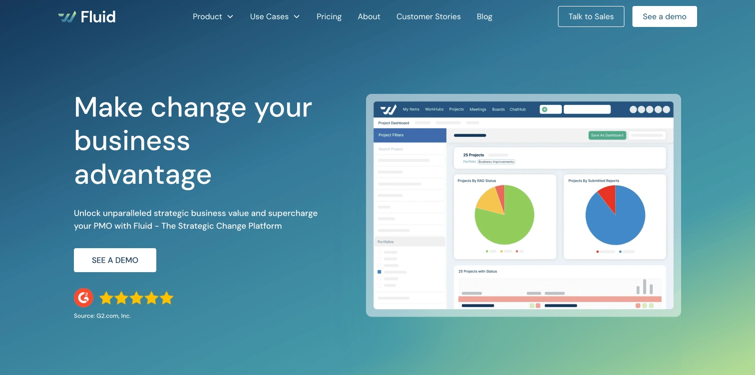
Hero section before redesign
Hero section after redesign
Solution
Clear, straightforward headline to immediately explain what the company offers.
Replaced static image with an animated video (designed and storyboarded by me) that quickly showcases platform features and gives users a 5-second understanding of its value and competitive edge.
Highlighted core functions related to project and portfolio management directly on the first screen for instant visibility.
Video designed and storyboarded by me
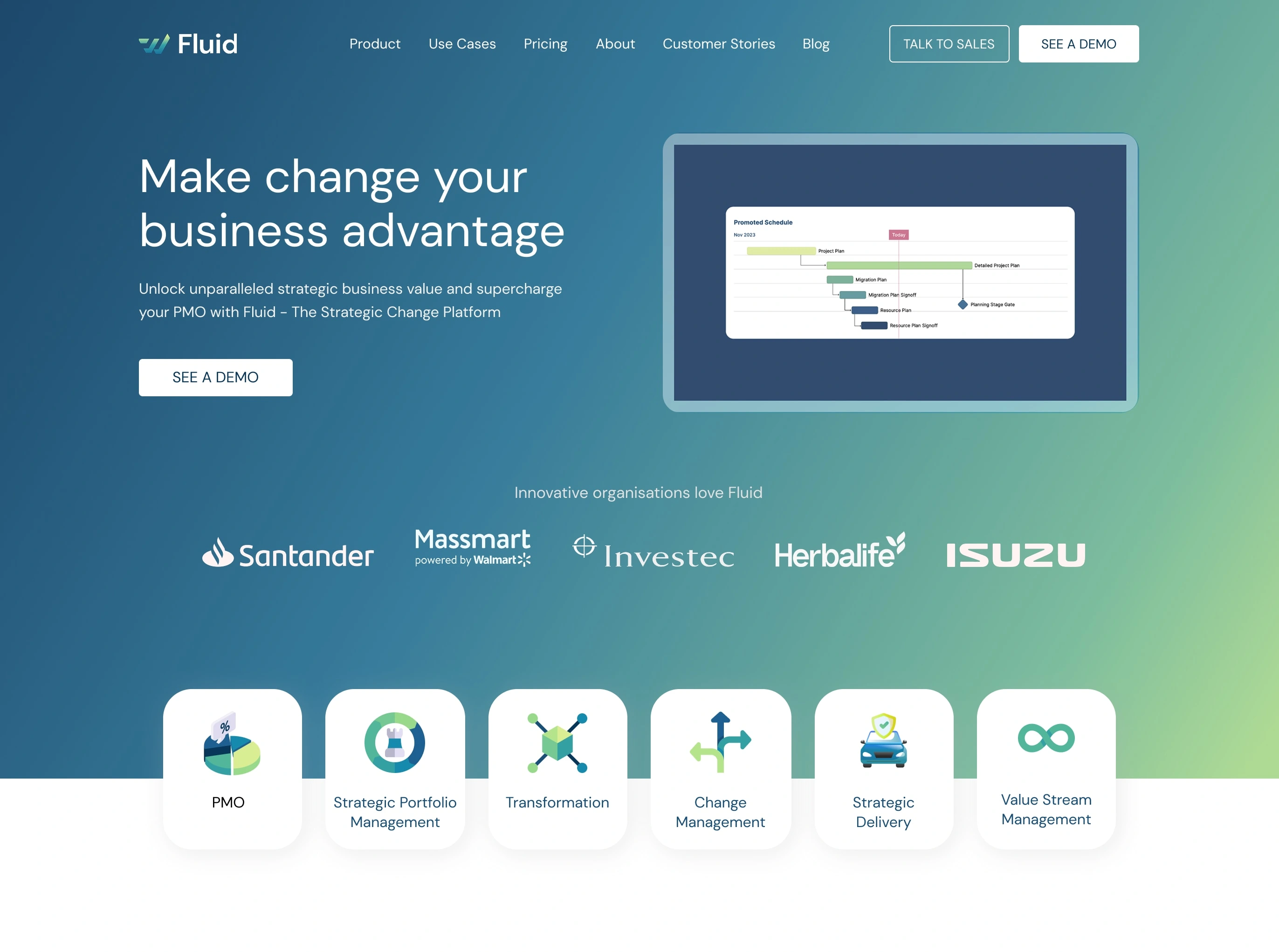
Hero section after redesign
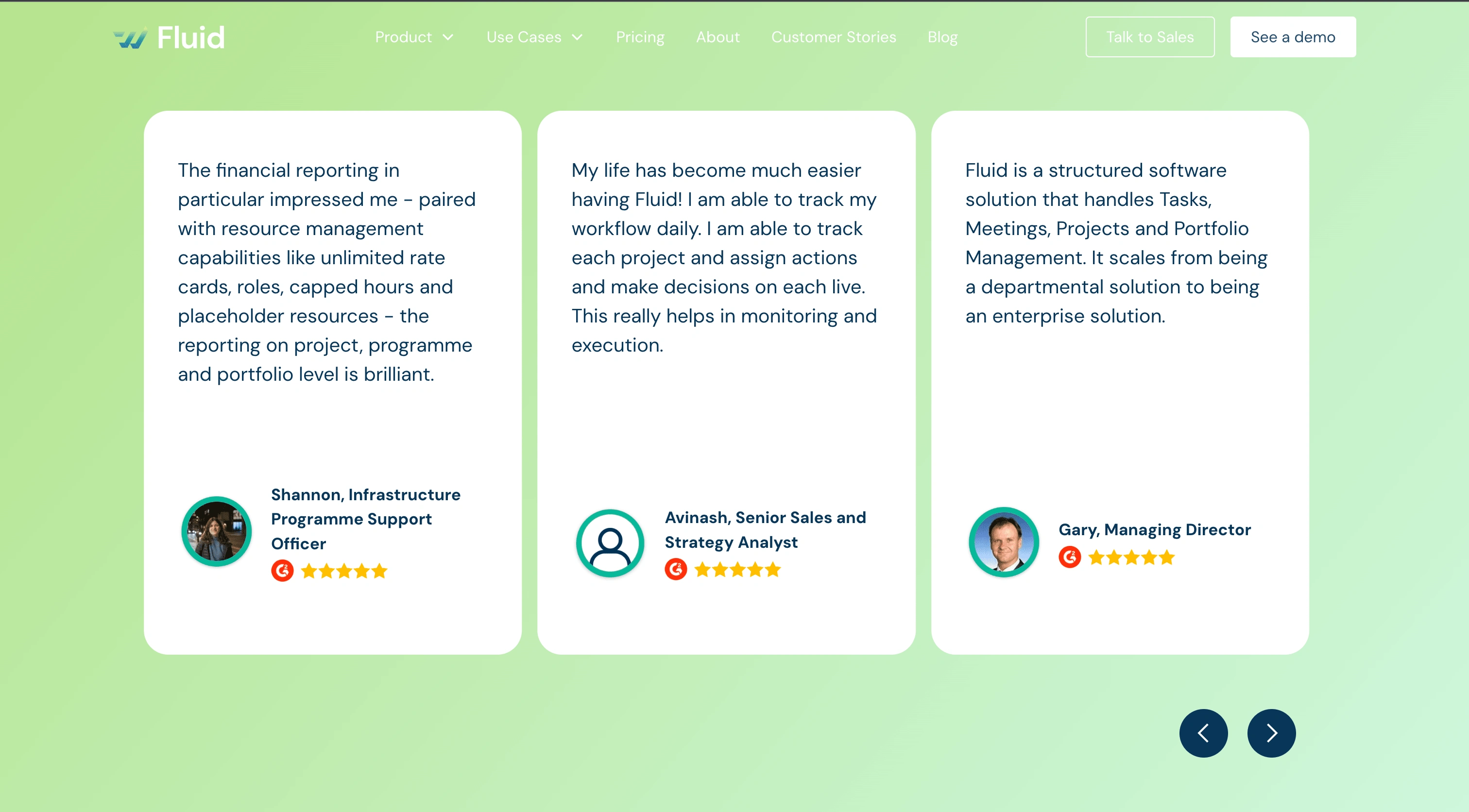
Reviews Section – Weak Social Proof
Problem
Users couldn’t quickly verify whether the platform was trusted or highly rated. Reviews lacked context and weren’t visually convincing.
Before:
Reviews section before redesign
Reviews Section after redesign
Solution
Added a section header to clearly define the block.
Linked to the external review platform, building credibility through verifiable feedback.
Highlighted key metrics such as overall rating and quality of support.
Selected specific client comments that emphasize the strongest aspects of Fluid, making social proof more impactful.
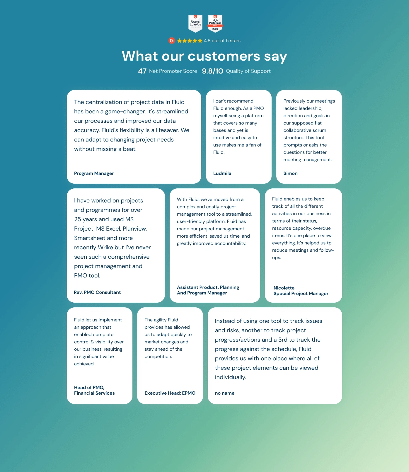
Reviews section after redesign
Integrations Section – Hard to Understand
Problem
The section didn’t explain the available integrations or why they were relevant, leaving users guessing about compatibility and added value.
Before:

Integrations section before redesign
Integrations Section after redesign
Solution
Made the headline stronger and easier to notice.
Rewrote the text for clarity and quick scanning.
Added short descriptions for each integration, helping even non-technical users understand how they fit into their workflow.
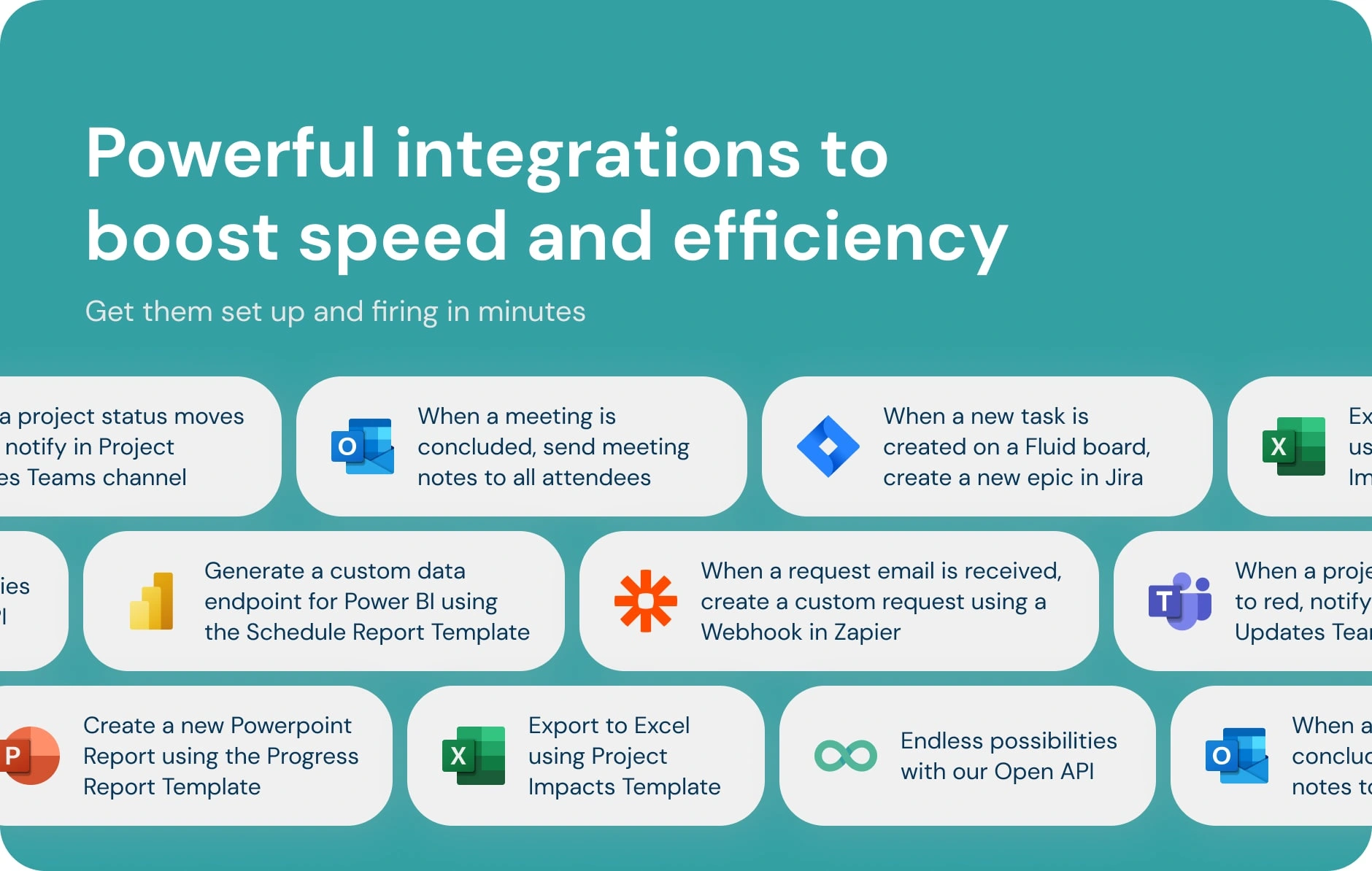
Integrations section after redesign
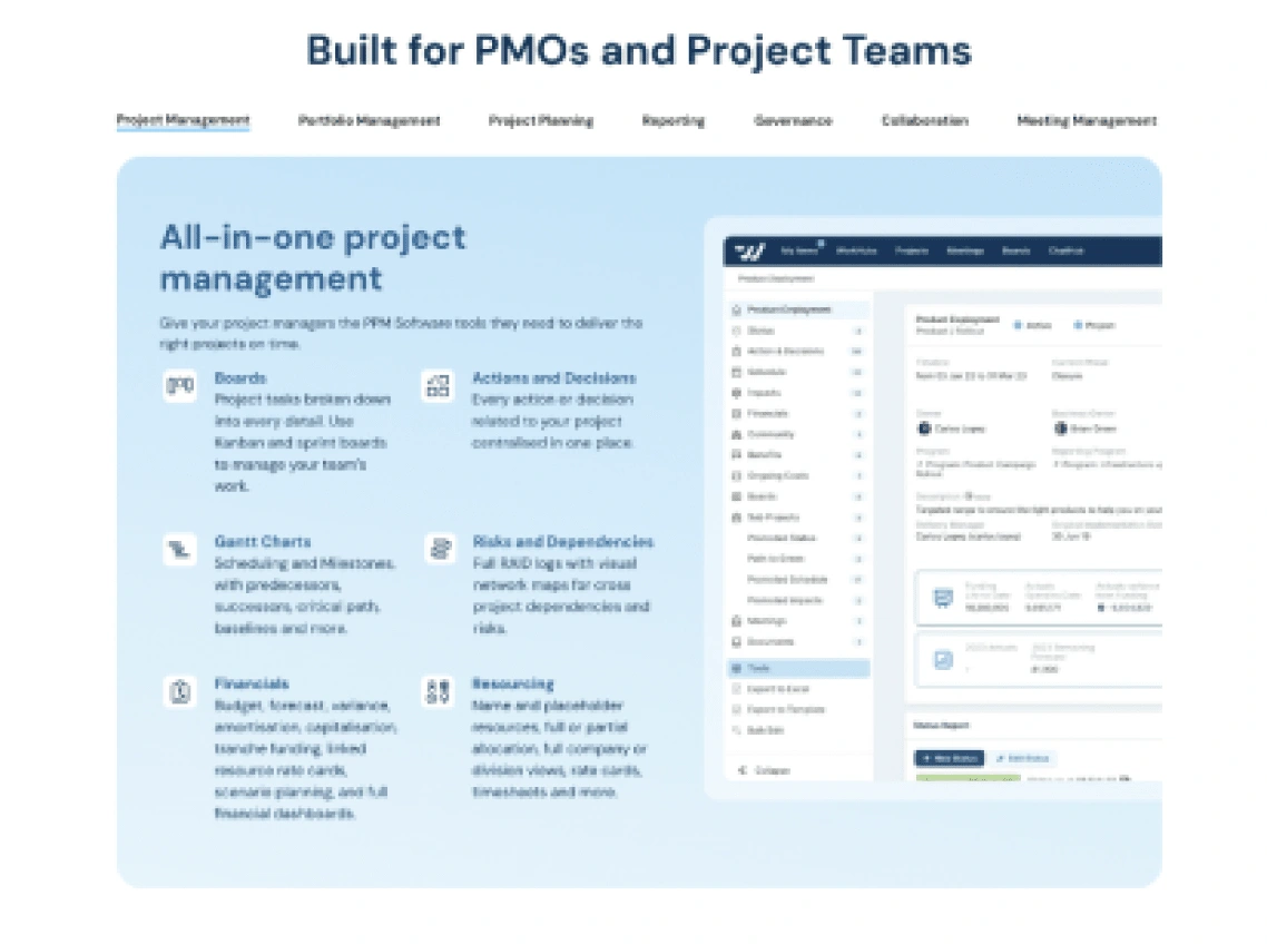
Strategy Block – Overloaded with Functions
Problem
This section tried to list too many platform features at once, making the message diluted and unfocused. Users couldn’t see the strategic value behind the tool.
Before:
Strategy section before redesign
Strategy Section after redesign
Solution
Refocused the message on how Fluid helps PMOs deliver strategic value, instead of listing everything at once.
Created separate pages for each feature with a full description and demo, allowing users to dive deeper only when interested.
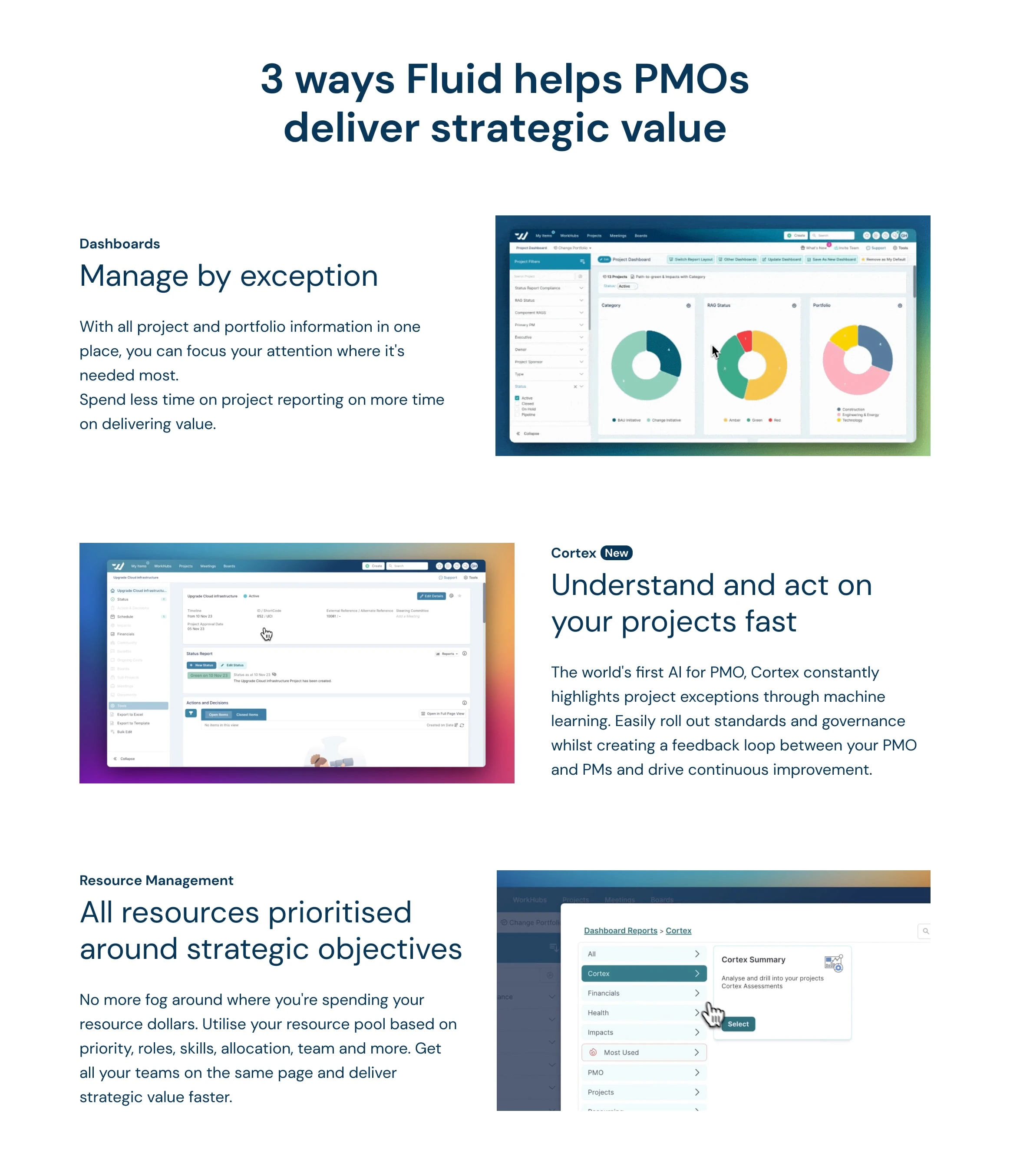
Strategy section after redesign
Result
Visitors now grasp what Fluid is and why it’s different from competitors within the first screen.
Social proof feels real and verifiable, boosting credibility and trust.
Integrations are explained simply, making the platform feel easier to adopt.
The strategy message is clear and focused, guiding users to learn more instead of overwhelming them.
These targeted redesigns helped turn confusing blocks into clear, value-driven sections, making the website more trustworthy and informative without rebuilding it from scratch.

Like this project
Posted Aug 19, 2024
UX redesign for a B2B SaaS work management platform — restructured key pages to improve clarity, highlight product value, and reduce friction for end users.
Likes
3
Views
69