Built with Rive
Deload • Simplifying SaaS Finance Management
Project Overview:
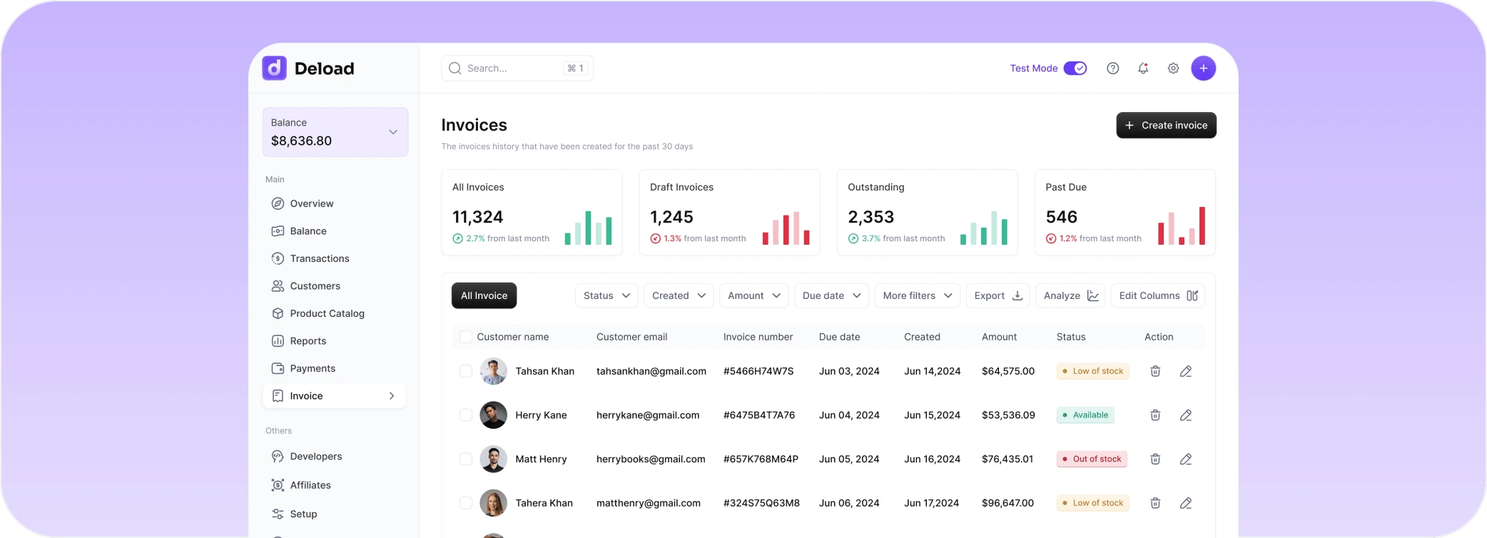
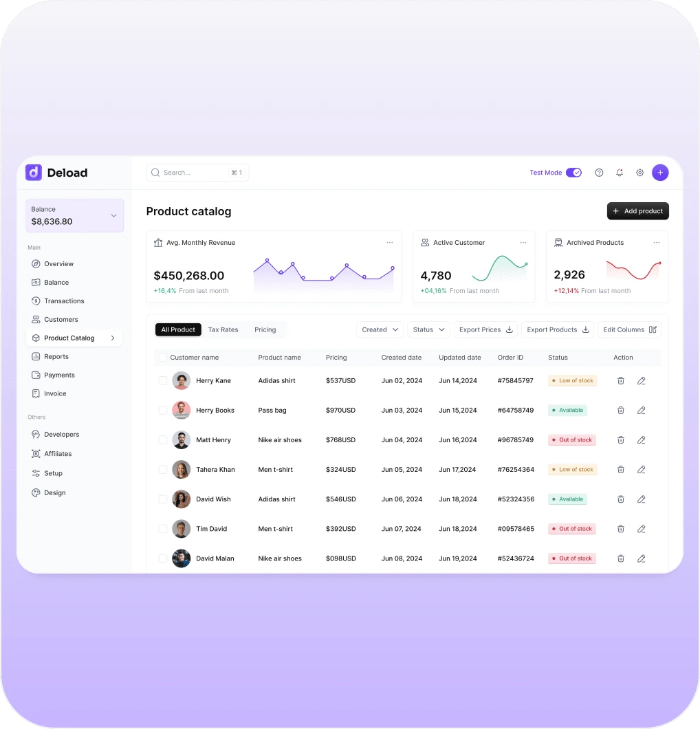
Deload is the no-nonsense platform that makes managing finances and payments feel less like a chore. Designed for businesses that don’t have time to waste, Deload gives you a clear view of everything from transactions to affiliate earnings - all in one slick, user-friendly dashboard. Whether you’re tracking income, managing invoices, or keeping an eye on churn rate, Deload helps you stay on top of it all without breaking a sweat.
Design Highlights:
1. Dashboard Overview:
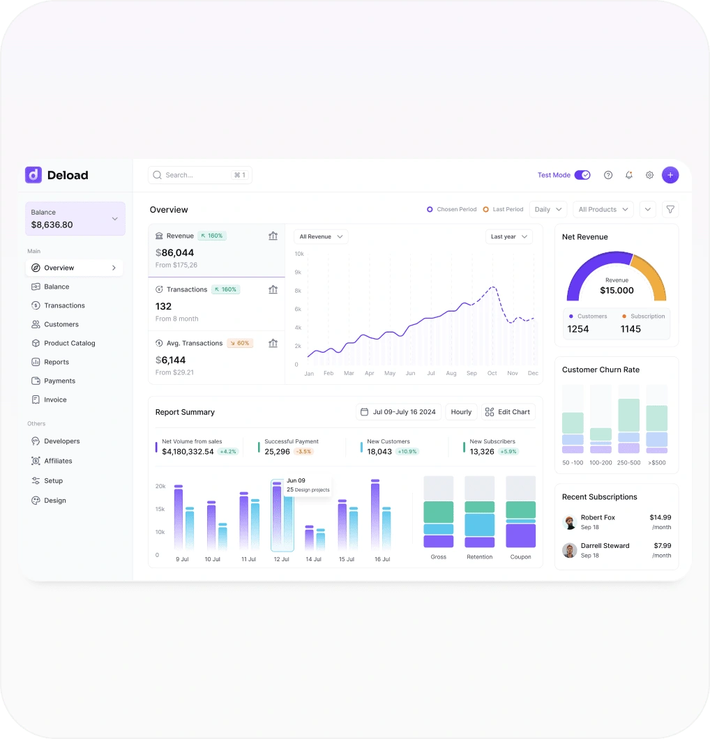
Deload’s dashboard puts all the important stuff front and center—revenue, transactions, churn rate, and customer insights. No fluff, just the data you actually need to run your business. I've packed in some visually pleasing charts to help you spot trends and understand performance at a glance. Think of it as your business’s financial pulse, but without the headache.
2. Account Setup and Management:
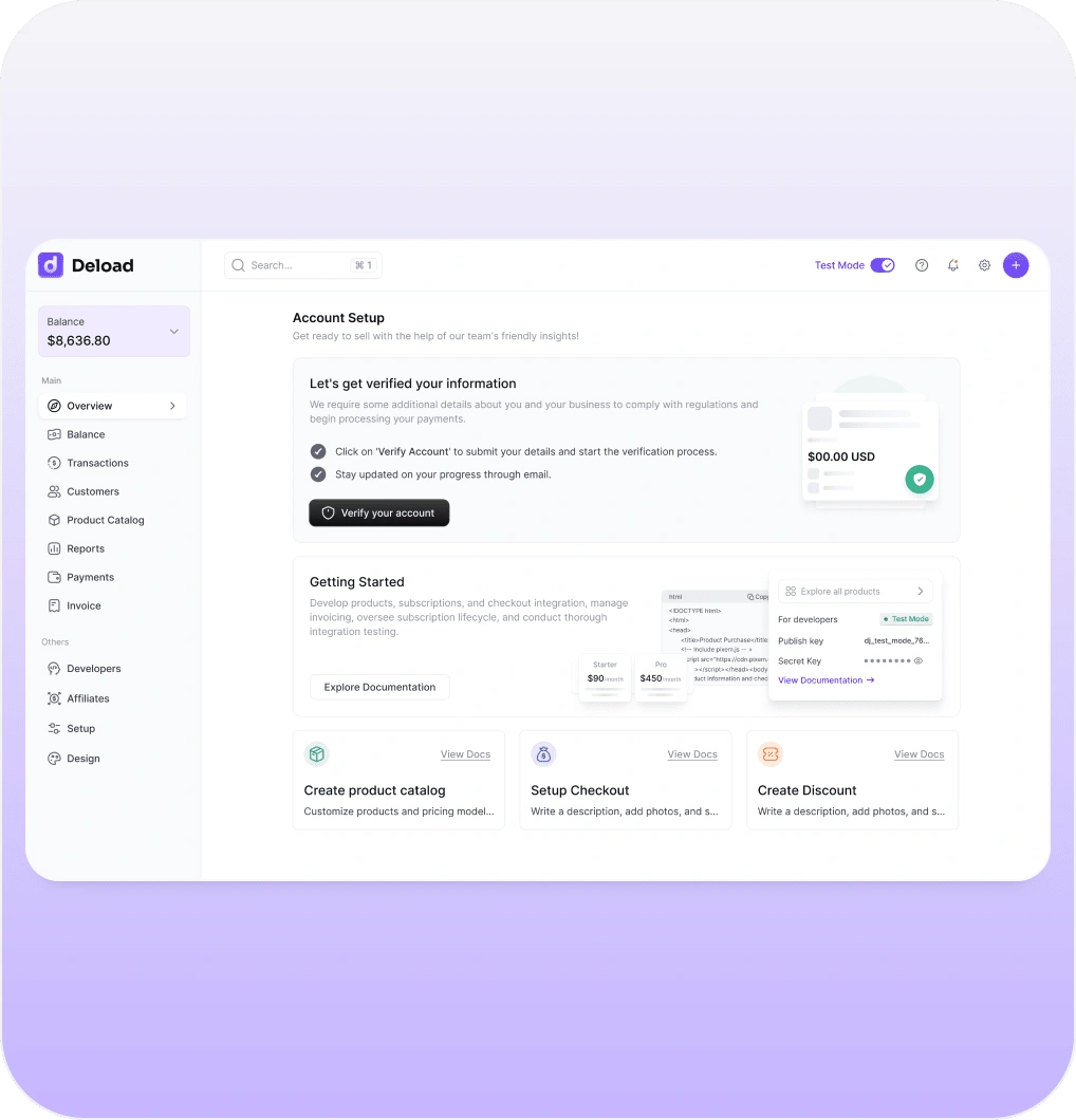
Getting started with Deload is as simple as it gets. The Account Setup page walks you through the verification process like a helpful guide, so you can get compliant and start processing payments fast. I’ve designed it to be intuitive and frustration-free—because nobody likes jumping through hoops when they’ve got work to do.
3. Affiliate and Developer Tools:
Deload is built for growth, which means I didn’t forget about affiliates or developers. The affiliate page lets you track earnings, performance, and all the usual metrics with ease, while the developer section is loaded with data on API errors and webhooks. Basically, everything tech-related is taken care of, so you can focus on scaling up.
4. Payment Solutions and Transaction History:
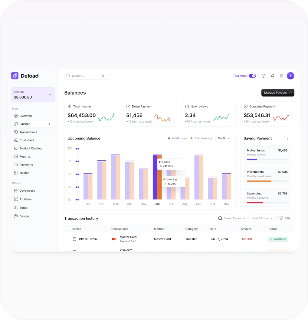
Deload keeps payments moving like clockwork. You can track all incoming and outgoing payments in real-time, with detailed transaction histories that make sure nothing falls through the cracks. Whether it’s payments or expenses, you get full transparency without needing a PhD in accounting.
5. User-Centric Design:
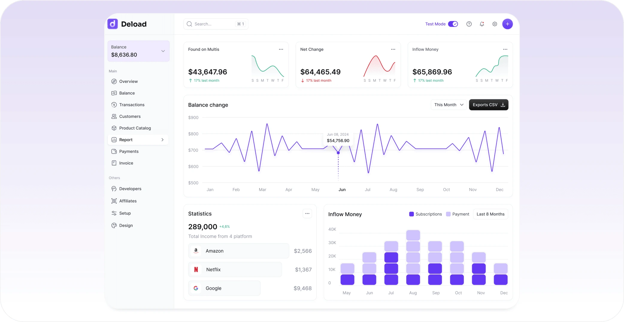
Deload is all about clarity. We’ve designed the interface to be modern, clean, and super easy to navigate. No more hunting for features or squinting at tiny text—everything is laid out so you can handle complex financial tasks without feeling like you’re swimming in numbers. It’s user-friendly in the best way possible.
Like this project
Posted Dec 17, 2024
Created a no-nonsense dashboard for Deload, making finance and payment management feel effortless instead of overwhelming.
Likes
1
Views
73
Timeline
May 20, 2024 - Jun 22, 2025


