Designing a Game-Changing Experience in Climate Tech
First of all: Who are we designing for?Market trendsA life-changing charging experience with ReservationsFirst, the flowsVisual Identity1. Squircles2. Branded Map3. GlassmorphismTesting & Extremely valuable insightsThe first one served for:The second one was useful to:Third test was a demo (we tested app + physical device), and showed us that:Car Play: the Voltpost experience in your carApp Clip: the cherry on top of the cake
First of all: Who are we designing for?
Primary Persona is an Electric Vehicle owner who doesn’t own a garage and therefore can’t charge at home. They will most likely use Voltpost to charge their car while it’s parked during the night.
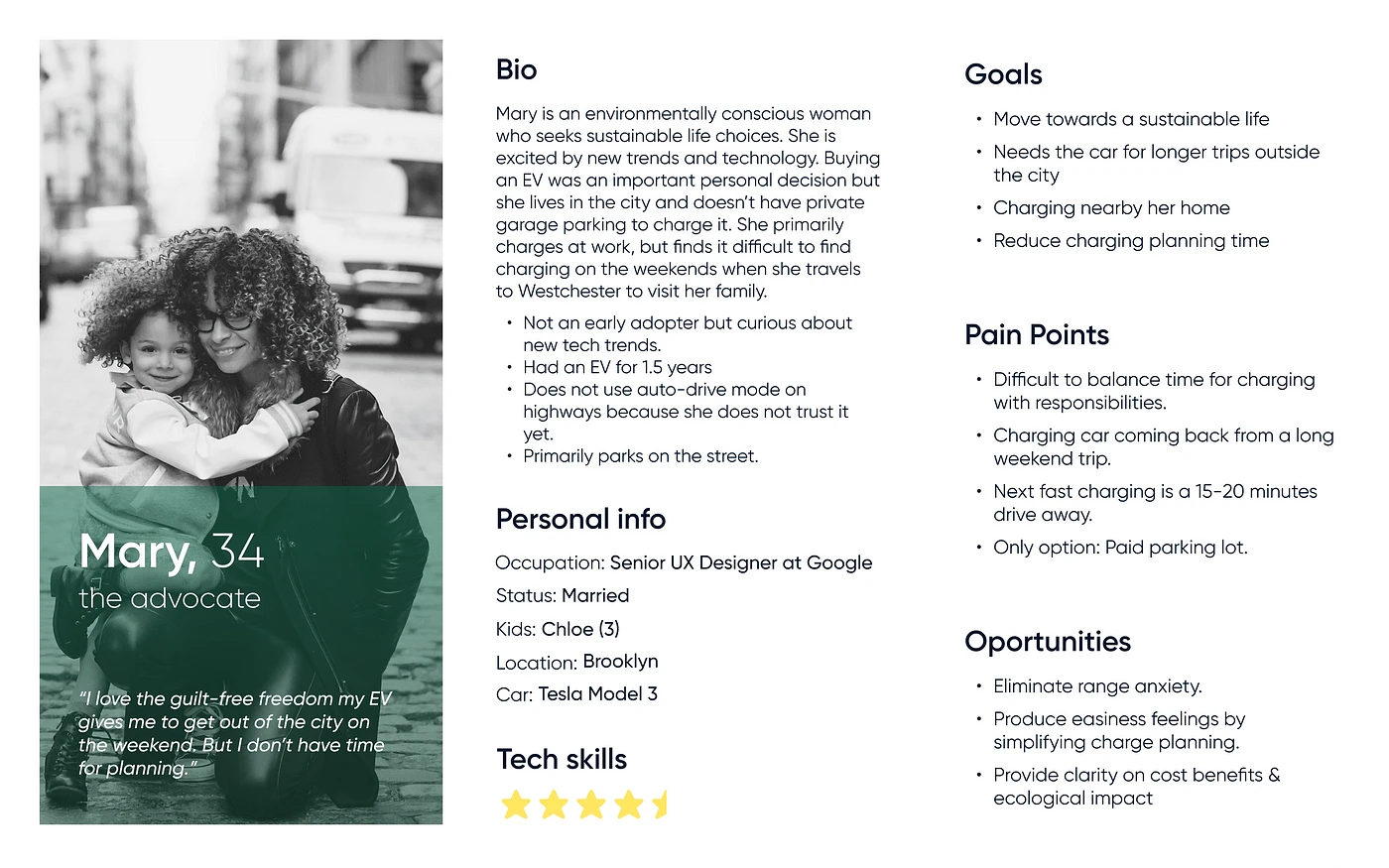
Secondary Persona is an Electric Vehicle owner who does own a garage, and has a charger there. they would use Voltpost occasionally on parking lots or curbside during the day.
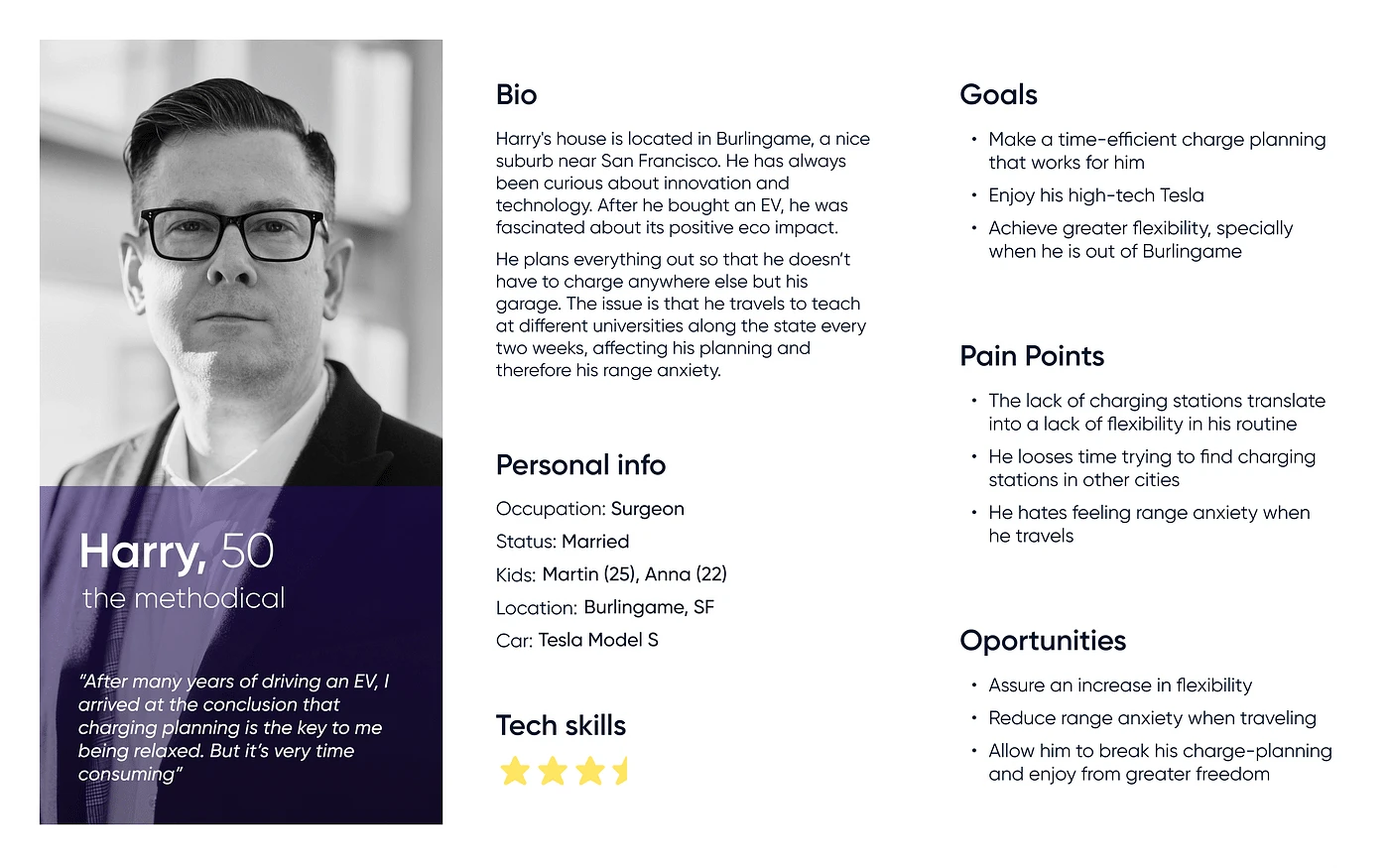
Tertiary Persona is a potential EV owner, who will be able to aqcire this car when production starts being bigger and prices come down a bit. This person will probably use it to work.
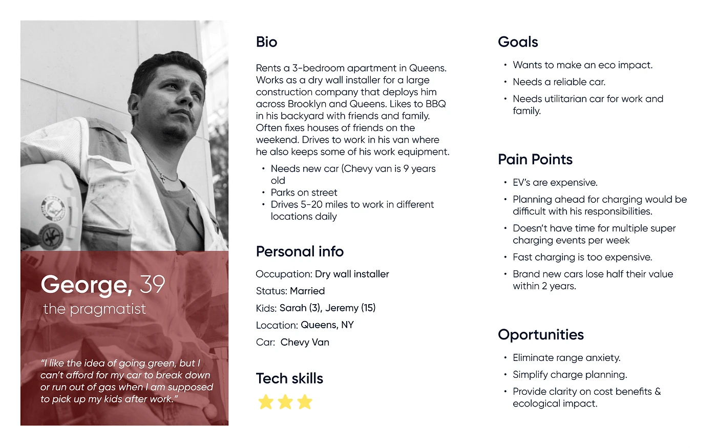
Market trends
Inside the USA, EV fleet sales are expected to grow in the upcoming years, driven by state mandates.
In the next 10 years, EV sales are expected to constitute between 12% and 40% of all light-duty vehicle sales, implying that:
EV buyer age could normalize with the broader electric vehicle buying trend.
EVs could become more affordable
Number of EV buyer with no provision to charge at home could increase
Driving pattern is expected to be similar to the way internal combustion engine vehicles are driven
Gender distribution could become more balances
Source: https://www.fuelsinstitute.org/
A life-changing charging experience with Reservations
Currently, none of the existing charging companies give users the ability to reserve a charge. After deep research and analysis, we came to the conclusion that this would be our distinctive feature.
Of course, this introduced some complexity into the design, but it was worth trying.
First, the flows
So, how could we keep the experience familiar to existing charging apps but still introduce reservations?
While emphasis was made on reservations, we also provided a ‘charge now’ feature that would allow users to find an available device quickly and efficiently.
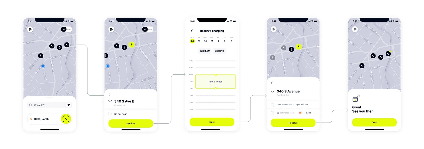
Reserve
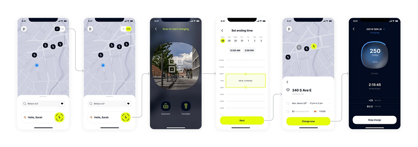
Charge Now
Visual Identity
The UI was not completely polished because of a couple reasons:
Branding got delayed.
We were focused on polishing the UX and demoing.
The look and feel was not a high priority due to the early stage at which the start up was at.
Anyway, we certainly had a some visual items that are worth mentioning.
1. Squircles
Part of the Voltpost personality has to do with this shape. Not only the device handle is shaped in this way but also many of our UI components.

Drawing of the Voltpost + Handle

Our buttons with squircles in the ends
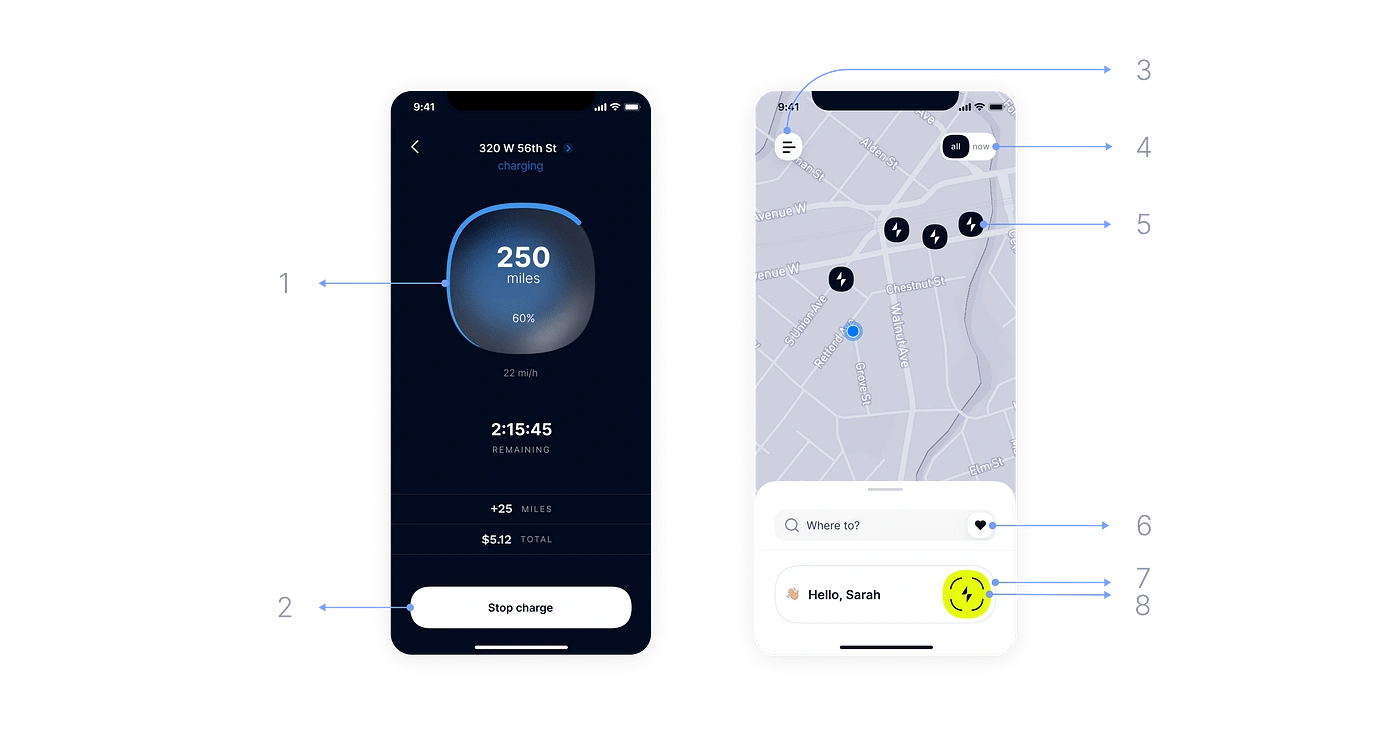
Look how many times this shape is repeated
2. Branded Map
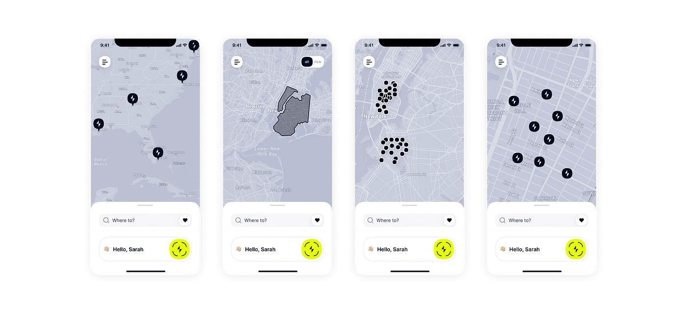
Map with breakpoints
Using the Apple Maps or Google maps default map made these screens on top look overwhelming and crowded, that is why we drastically simplified it. With these changes, screens look sleek, branded, and our chargers stand out.
3. Glassmorphism
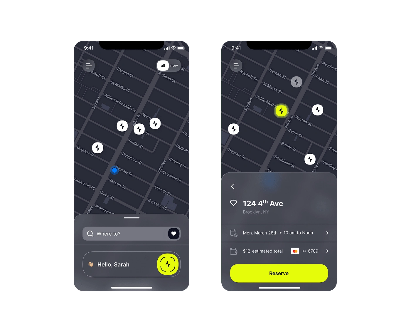
We thought glassmorphic element suited out design perfectly, but because it only works well on a dar background, we couldn’t use it a lot on the light mode version. Glassmorphism was the protagonist of the dark mode design.
Testing & Extremely valuable insights
Three usability testing sessions were carried out.
The first one served for:
Determining the most intuitive navigation pattern.
Structuring the overall reserve and charge now flow.
Acknowledging how important Reservations were for our users.
The second one was useful to:
Polish all kind of details related to: UX writing, accessibility, aesthetics.
Give the final touches to the experience.
Third test was a demo (we tested app + physical device), and showed us that:
The charging experience was too focused on the app, tutorials and prompts were there. But, users didn't really pay attention to that, they were looking for instructions on the actual device.
The overall experience would be optimal when users could charge without having to use their phones to scan a QR code. For this, we needed a special backend integration.
The experience would be enhanced by the presence of a screen in the device. The first version didn’t have this and friction was easily spotted in the tests.
Car Play: the Voltpost experience in your car
We designed several screens for CarPlay. It wasn’t possible to bring all of our features into this new format but what CarPlay did offer was the ability to make the Find & Search task as easy as posible for users.

Some CarPlay screens
App Clip: the cherry on top of the cake
Finally, we designed and developed the App Clip experience. With iOS 16 we are able to shrink the app to its main feature and offer this to users without even asking them to download the whole application. App clip will just allow to ‘Charge Now’, no reservations, no gamification, no registration.
This approach makes us competitive with most charging apps in the market, because we are making it super easy and quick for users to charge their EV.

Like this project
Posted Mar 31, 2023
I happily led a mobile app design that aimed to help decarbonize cities by promoting an increased adoption of electric vehicles in the United States.
Likes
0
Views
231
Clients
Voltpost


