Revamping the User Experience of a Ride-Sharing App
Some Context
MUV is a 100% Paraguayan ride-sharing app.
It is Uber’s main competition in the area.
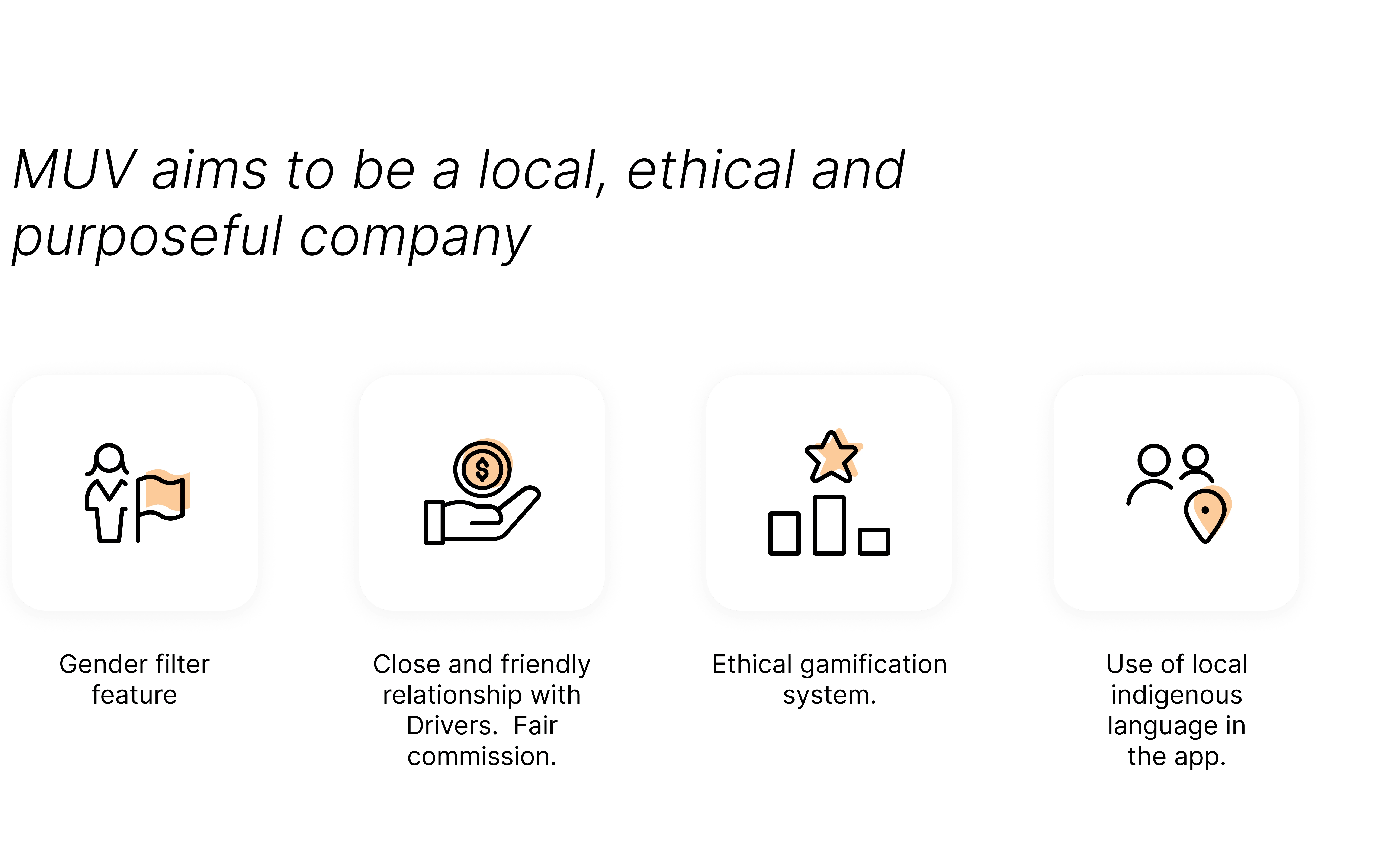
At that time, we wanted to differentiate ourselves from Uber as much as possible and to provide all of our users with a fair, ethical, and delightful experience.
My Responsibilities
Help Product Owners to prioritize the design backlog.
Research (generative and evaluative).
Introduce new features to six different products at the same time.
Continuously enhance the B2C products look and feel.
Make illustrations and give motion to our screens.
Migrating from Sketch to Figma
At one point, the whole product has to be moved from Sketch/ Invision to Figma, this was mainly because we, UX designers, suggested it. But it was not a simple task. MUV had at that point six different products, which means: six different design systems, and six massive Invision prototypes.
Luckily, the Figma migration tool helped, but we had to polish every single file and re-create the design systems from scratch. We managed to do this just after the auto-layout tool was launched, so our DSM happened to be extremely flexible, updated, and easy to edit in the end.
Adapting UI to New Branding
Another one time task was applying MUV's new branding to all of the B2C products. I took care of this personally, and it was a very fun and dynamic activity. Nevertheless, it took a month to finish this since the whole visual style was changing and we wanted to be sure we were on the right path.
I also took care of the new icon and illustrations set.
Features Designed
What I did most in MUV was adding features to the product. This meant thinking about how this new functionality would work in several products at the same time. Adding a feature required all types of tasks from a designer, usually the roadmap was like this:
Research, mainly desktop research, and benchmarking.
UX phase: agree with stakeholders on how should this new feature work in detail
UI phase: polish the designs and bring them to life. Add motion and a beautiful look.
Usability Testing phase: test and iterate
Handoff
Delivery Feature
I designed an end-to-end delivery feature, adjusted it to the flows we did have at the moment, conducted a usability test, and iterated afterward.
There were substantial edge cases to consider, which made this sprint more complex and slow than others.
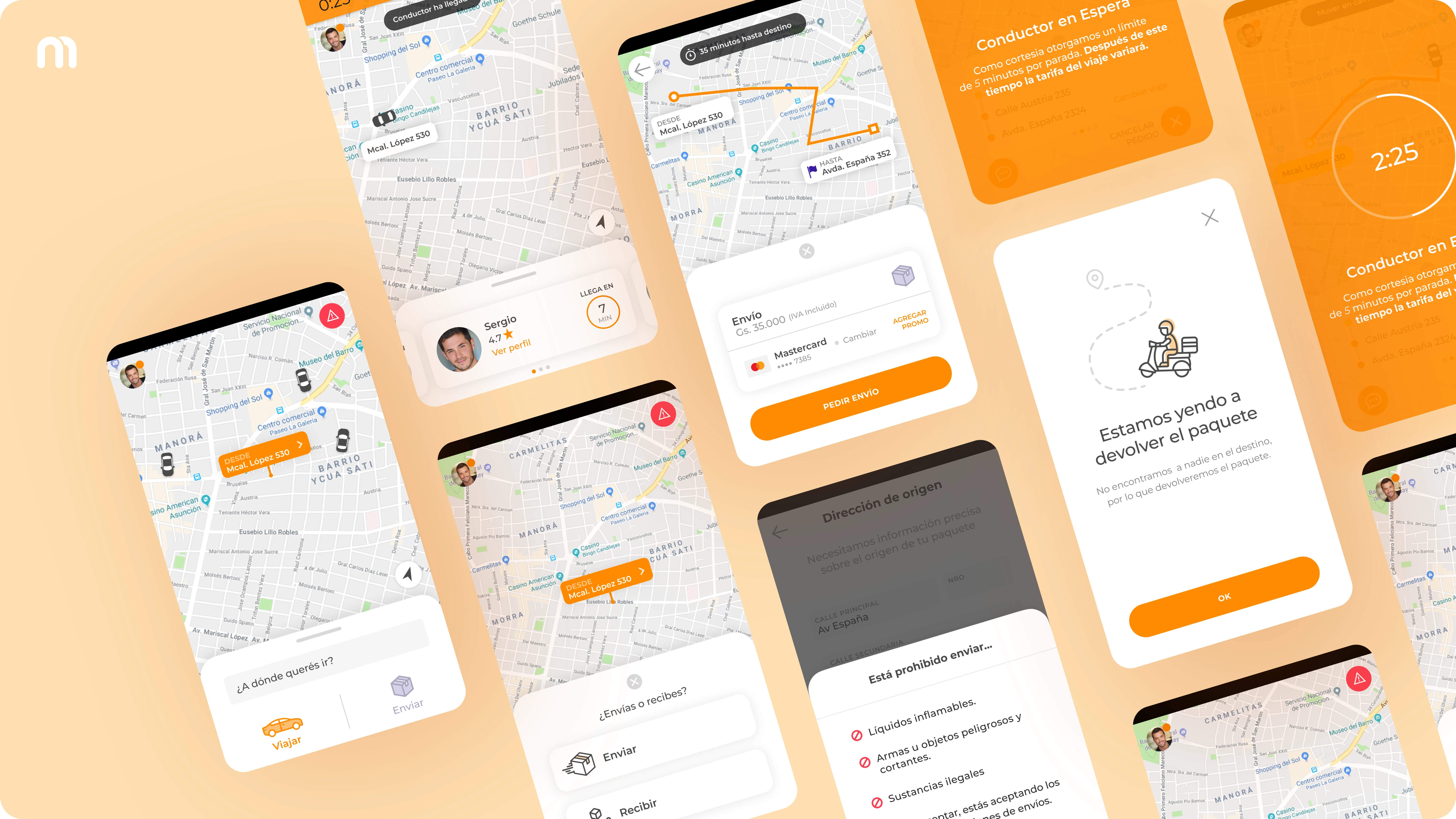
Some Delivery Feature Hi-Fi Screens
Gender Filter
This was a beautiful idea and I felt pleased to design it. This unique and generous feature idea consisted in letting women users apply a gender filter, so they could have a female driver. to do this, passengers and drivers should go through a strict security verification, also, we would ask them to take selfies in order to be sure it was them who were using their account.
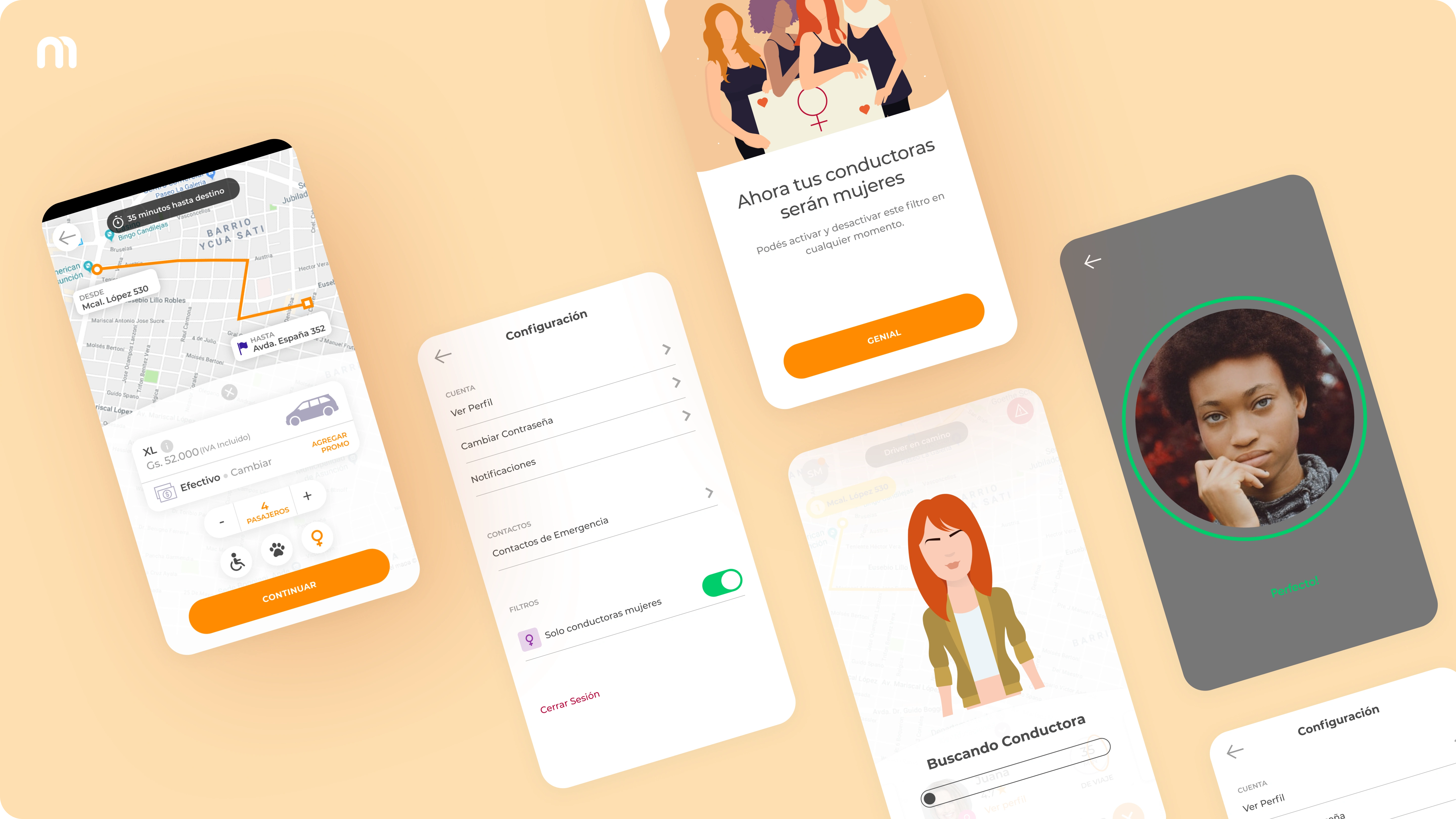
Gender Filter Hi-Fi Screens
Gamification
Gamification 1.0 was mainly focused on the driver app. It had a badge system and a point system that unlocked benefits. Passengers had something similar, but without the point system.
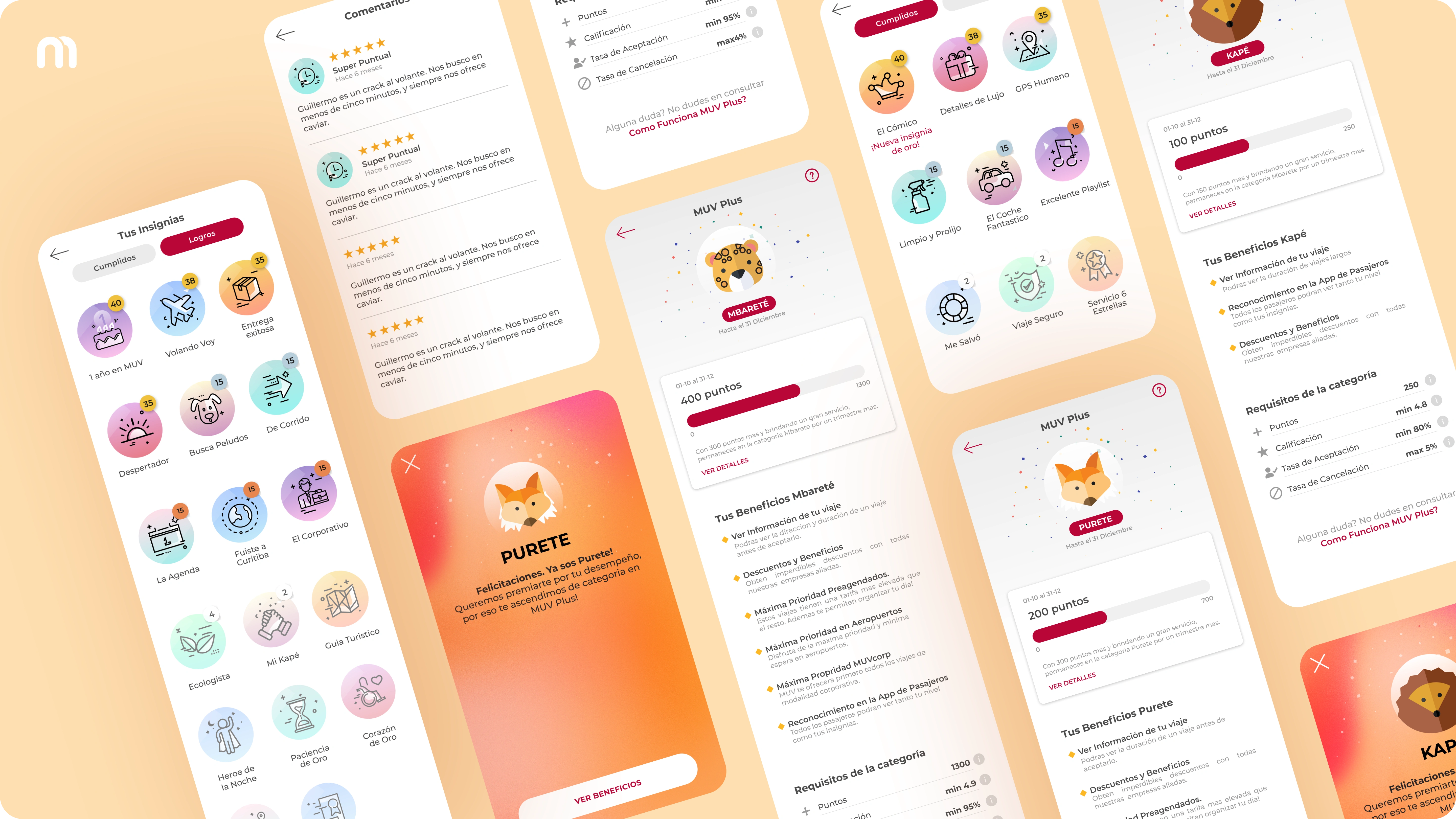
Some Driver Gamification Hi-Fi Screens
Scheduled trips
Scheduled trips were easy to design but hard to conceptualize. The rules and the working mechanism definition required deep competitor research.
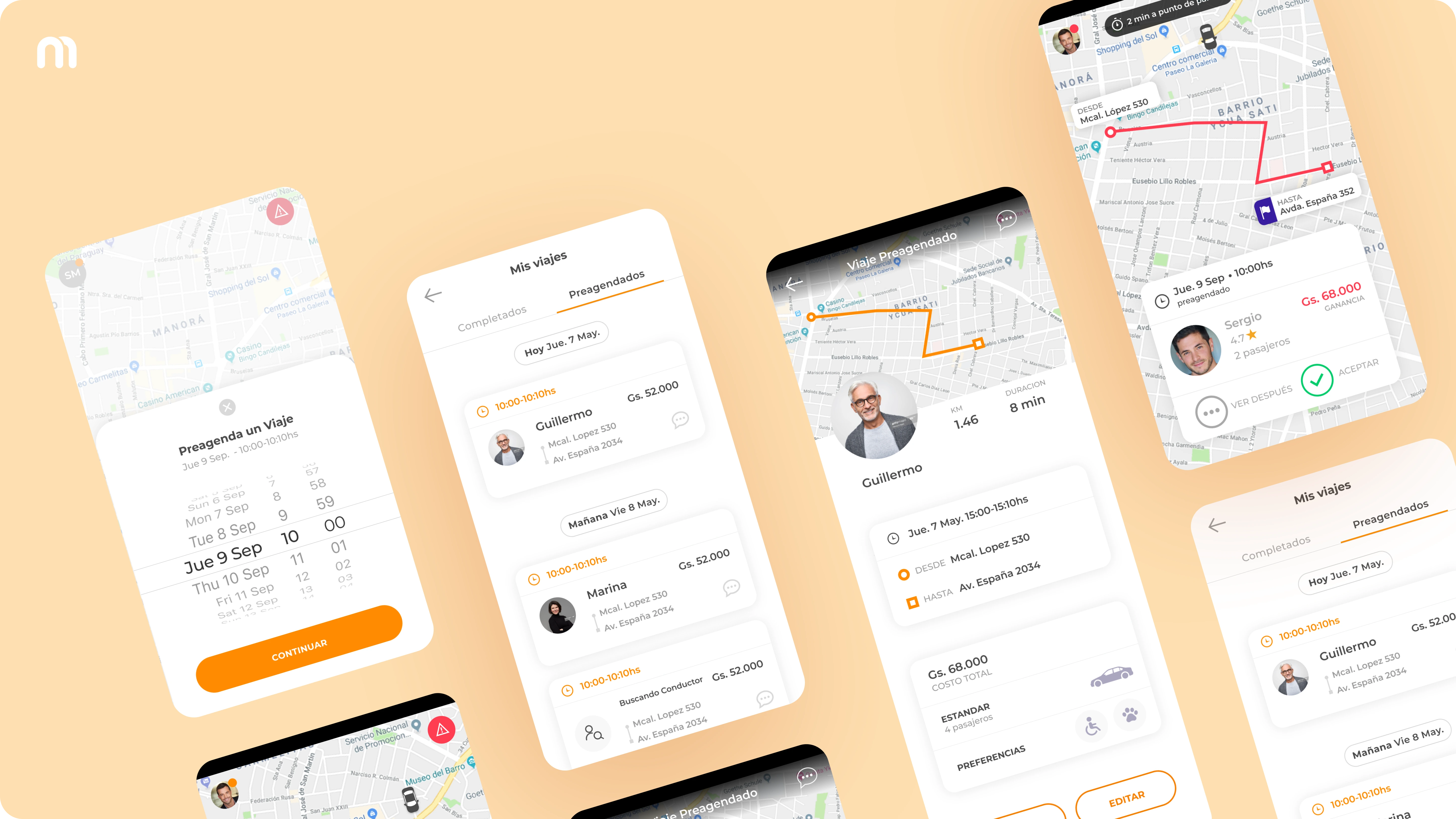
Scheduled Trips Hi-Fi Screens
MUVcorp Admin
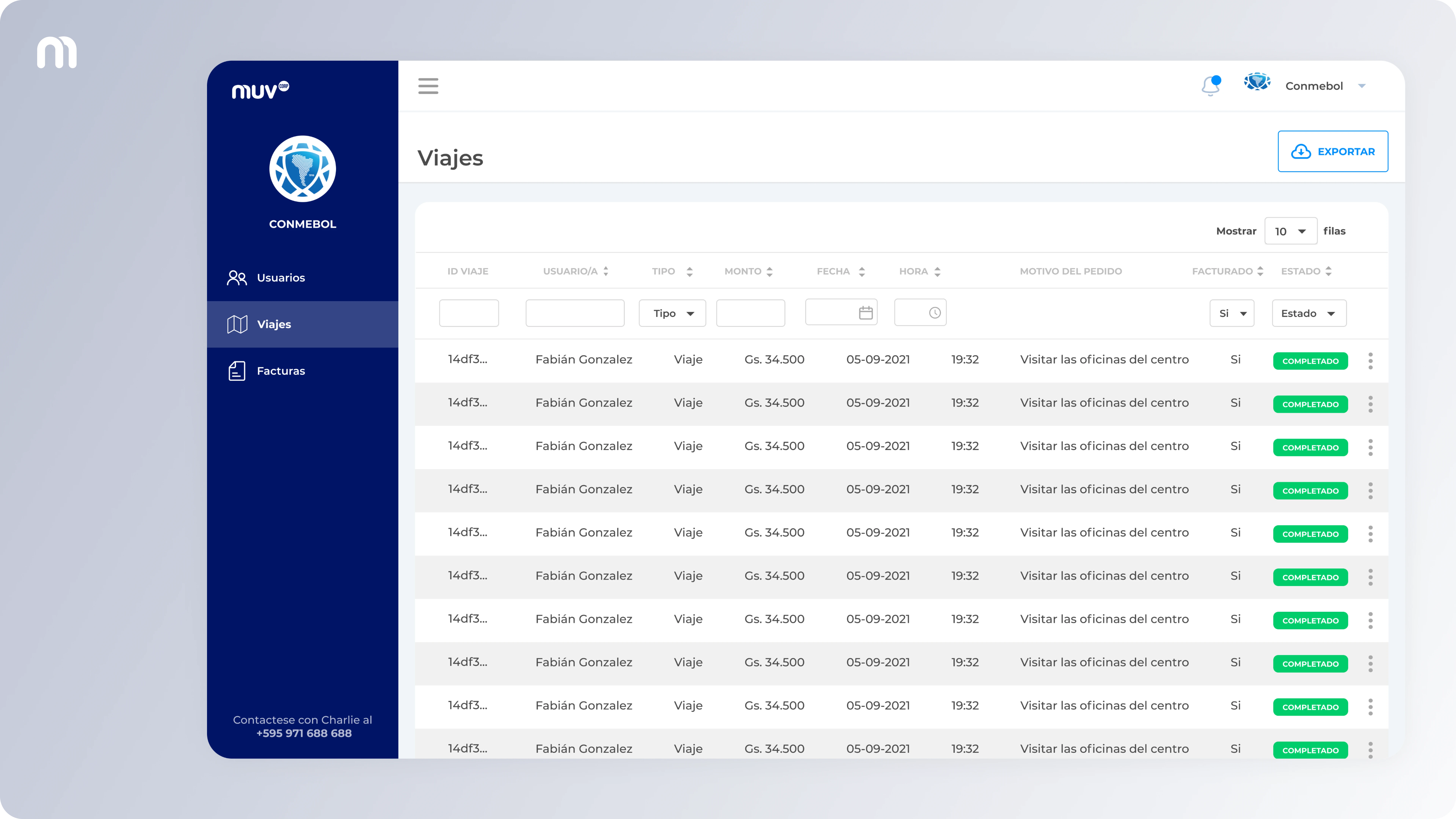
Trip List
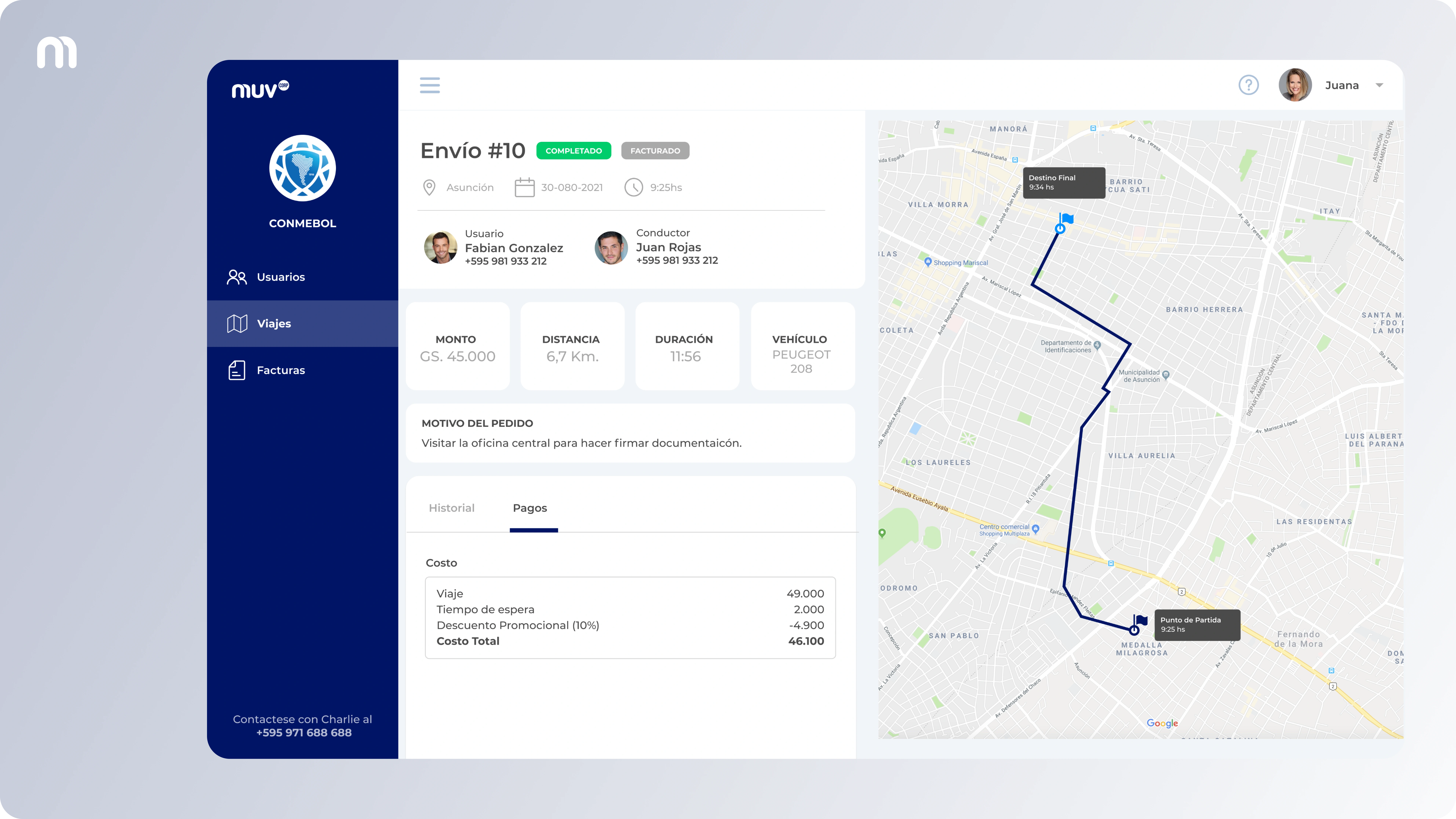
Trip Detail
Like this project
Posted Apr 3, 2023
This is a summary of my almost 2-year work in a Latin American ride-sharing company. Check it out!
Likes
0
Views
168
Clients
MUV

