Ramen Restaurant Website UX/UI Redesign
Kornel Turek
Ramen Restaurant Website
UX/UI Redesign - A fresh and flavourful redesign that combines Japanese tradition with modern digital experience.
My role: UX/UI Designer
Process: UX Research, Wireframes, UI Design, Design System, Responsive Design
Tools: Figma, FigJam, Coolors, Unsplash, Typescale
Project duration: 5 weeks
“Ramen is more than food — it’s an experience. Our goal was to capture that essence in a modern, high-performing website for a Japanese restaurant.”
Challenge
The websites lacked a clear structure and visual consistency. Users struggled
to find menu information and there was no simple way to book a table online.
Result: Such issues likely contributed to a high bounce rate — for example,
in the Food & Beverage industry the average bounce rate is around ~56.6%.
In this context, many users probably left the site quickly without exploring
further or completing a booking.
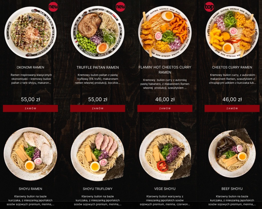
Example of a competitor’s menu. Long, scrollable layouts make it harder for users to quickly spot the dish they’re looking for.
The visual style and content layout didn’t reflect the restaurant’s authentic atmosphere and high-quality dishes. The outdated design failed to communicate the brand’s unique character and made the overall experience feel less appealing.
Result: When site design does not align with brand perception, user trust and engagement tend to drop. A lower engagement rate or shorter session durations can be expected — for example average session durations for Food & Beverage tend to be under 3.5 minutes on mobile. This reduced engagement then diminishes likelihood of completing key actions like bookings.
The mobile experience was inconsistent — images and text formatting issues affected readability, and key information such as opening hours or contact
details was hard to access without multiple clicks.
Result: With a poor mobile experience, conversion rates drop
(especially for actions like bookings or reservations). For the food & beverage sector an average conversion rate is ~2.6%. Also mobile bounce rates
are typically higher than desktop, meaning many users leave before engaging.
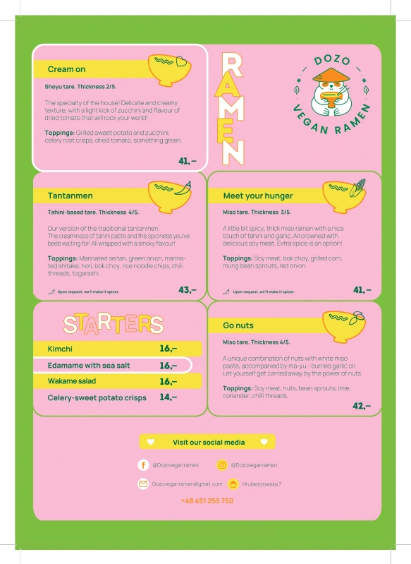
An example of a competitor menu where visual overload and unclear structure hurt readability.
The goal of the project
The redesign aimed to simplify navigation, highlight key offerings, and make online reservations effortless for customers. By addressing key usability and visual issues, the project focused on creating a smoother and more engaging experience that reflects the restaurant’s authentic character and premium quality.
Key objectives
Increase online reservations by +30%
Improve information structure and menu discoverability
Strengthen the premium brand perception through cohesive visuals and storytelling
Reduce bounce rate by 20%
Increase average session duration by +25%
Expected outcome: After the redesign, users will navigate the website more intuitively, spend more time exploring, and complete reservations faster and
more frequently.
Research and insight
Conducted a competitive analysis, created proto-personas, architecture information AI and mapped user journeys to identify pain points.
We began by conducting competitive research on five ramen restaurants
in Poland, evaluating both functionality and visual design.
We analysed key categories including
Unique selling points (USP)
Strengths and weaknesses
Information architecture
Navigation and CTAs
Responsiveness
Additionally, we reviewed user feedback from platforms like Facebook, Google, and Instagram to gain real insights into customer frustrations and expectations.
We also created a reference board by studying five additional restaurants for visual and UX inspiration.
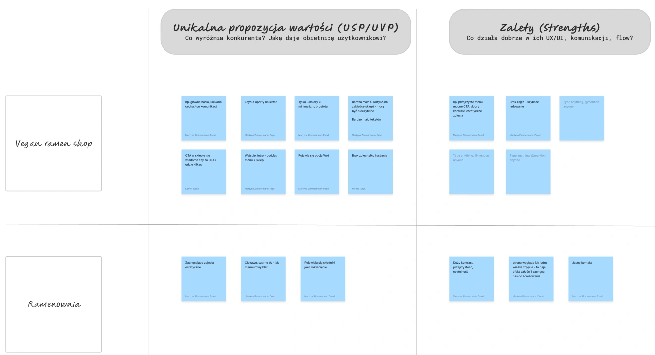
A snapshot of our competitive research based on five restaurant websites.
Competitive benchmarking
Users strongly prefer clean, minimalist menus with clear navigation and concise text. They value easy scrolling, high-quality visuals, and a well-structured layout that supports effortless browsing.
However, they quickly lose trust when facing unclear interfaces, broken CTAs,
or poorly optimized UX. Outdated online order systems or complicated forms
are major pain points that negatively impact engagement.
Websites that include authentic storytelling, a cohesive Japanese theme, and credible customer reviews create a stronger emotional connection. In contrast, mismatched design styles, dark interfaces, and cluttered pages feel overwhelming and fail to reflect the authentic atmosphere expected from a Japanese ramen brand.
Key findings included
Low-quality and poorly visible images
Illogical site structures and confusing navigation
Outdated food-ordering forms
Missing or hidden CTAs in hero sections
Overwhelming layouts discouraging users from staying on the site
Overly long menus requiring excessive scrolling
Poor text contrast and dark backgrounds reducing readability
User Flow
Then we designed a detailed User Flow, mapping every step a user takes to reach their goal — from exploring the menu to making a reservation.
This stage helped us
Create smooth and intuitive navigation that prevents frustration
Simplify key actions such as booking or ordering, which boosted conversion rates
Facilitate collaboration between designers, developers, and stakeholders through clear communication diagrams
Identify friction points early to refine user experience before development
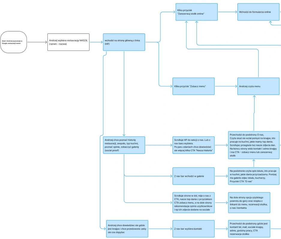
Part of diagram that visually represents the path Andrzej takes to complete a task.
Information Architecture
The next step was developing the Information Architecture (IA).
It allowed us
to organize content logically, ensuring users could move effortlessly through
the site without getting lost.
IA also helped us evaluate which sections
were essential — removing redundant content to keep the experience
clean and efficient.
Next, we defined Jobs-To-Be-Done, User Stories, and Use Cases to better understand user motivations and goals.
This helped us build proto-personas, which evolved into our main persona: Andrzej, a mid-level corporate employee who enjoys dining out not just for the food, but for the full “food experience.”
For him, the restaurant’s atmosphere, aesthetic, and website experience all play
a major role in his decision-making process.
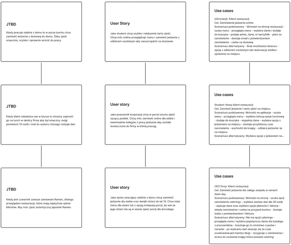
Defining user needs through JTBD, user stories, and use cases to guide design decisions.
Proto-persona
We created three potential customer profiles to better understand our target audience: a student with a low income looking for affordable lunch options,
a corporate employee seeking both good food and an enjoyable dining experience, and a Japanese cuisine enthusiast who values authenticity and quality.
Conclusions
Easy and intuitive reservation flows are essential — users expect to quickly book a table online with clear confirmation and minimal searching or waiting.
Transparency about dishes and ingredients matters, especially to users with dietary requirements — provide accessible descriptions, clear photos, and reviews for every dish.
Personalization and menu variety tailored to different lifestyles and preferences (e.g., quick lunch for students, extensive selection for enthusiasts) will improve satisfaction.
Supporting discovery through recommendations, ratings, and inspiring content helps build trust and engagement.
Mobile-first and cross-device consistency is critical — some users reserve from work on their phone, others at home from a laptop, so your site needs to be responsive and seamless across all platforms.
Incorporating these findings into your design will increase conversion rates and overall user satisfaction.
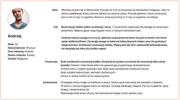
Establishing the main persona helped align the product vision with real user expectations.
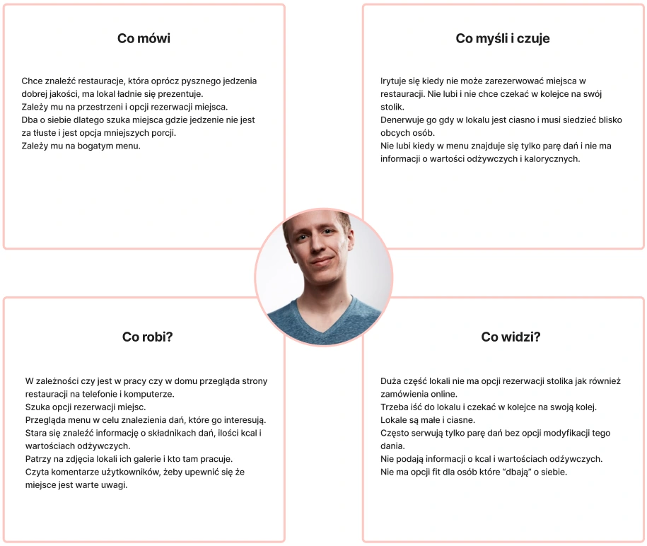
Empathy map — understanding what users think, feel, say, and do to uncover deeper insights.
Overall direction
The redesign should go beyond functionality and become an experience-driven platform — merging premium aesthetics, emotional storytelling, and frictionless usability.
The goal is to turning casual visitors into engaged guests who connect with the brand before stepping into the restaurant.
UI process - from structure to visuals
In the visual phase, we focused on creating a balance between minimalism and cultural authenticity.
Our colour palette was built around amber yellow — selected not only for its popularity in Japan and symbolic meaning of harmony and prosperity, but also because it became the colour of the year in 2025.
This hue served as the main highlight colour, adding warmth and contrast without overwhelming the minimalist layout. The deep black tones complemented the palette perfectly, creating a strong contrast and an elegant, modern aesthetic.
This combination reflected the restaurant’s philosophy:
Order
Simplicity
Visual harmony — qualities that also defined our design approach.
Started with wireframes and information architecture, refined through iterations to final hi-fi designs.
Lo-Fi to Hi-Fi
Low-fidelity and High-fidelity wireframe – homepage structure
Colours
Colour pallet created based on main colour Amber DAB325
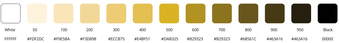
Colours used in our new redesign website.
Contrast
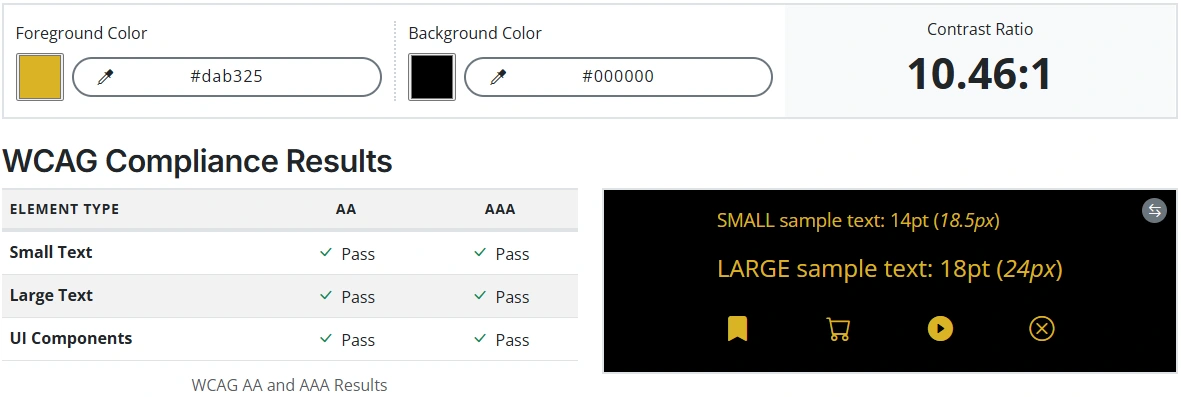
All tested elements meet or exceed WCAG contrast requirements, ensuring accessible readability and compliance with Established web standards.
Typography
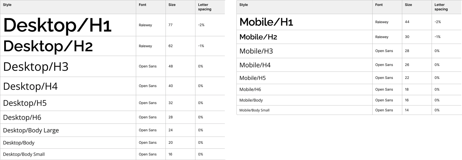
Desktop and mobile typography styles showcasing visual hierarchy, font pairing, and scale for optimal readability and design clarity.
Components
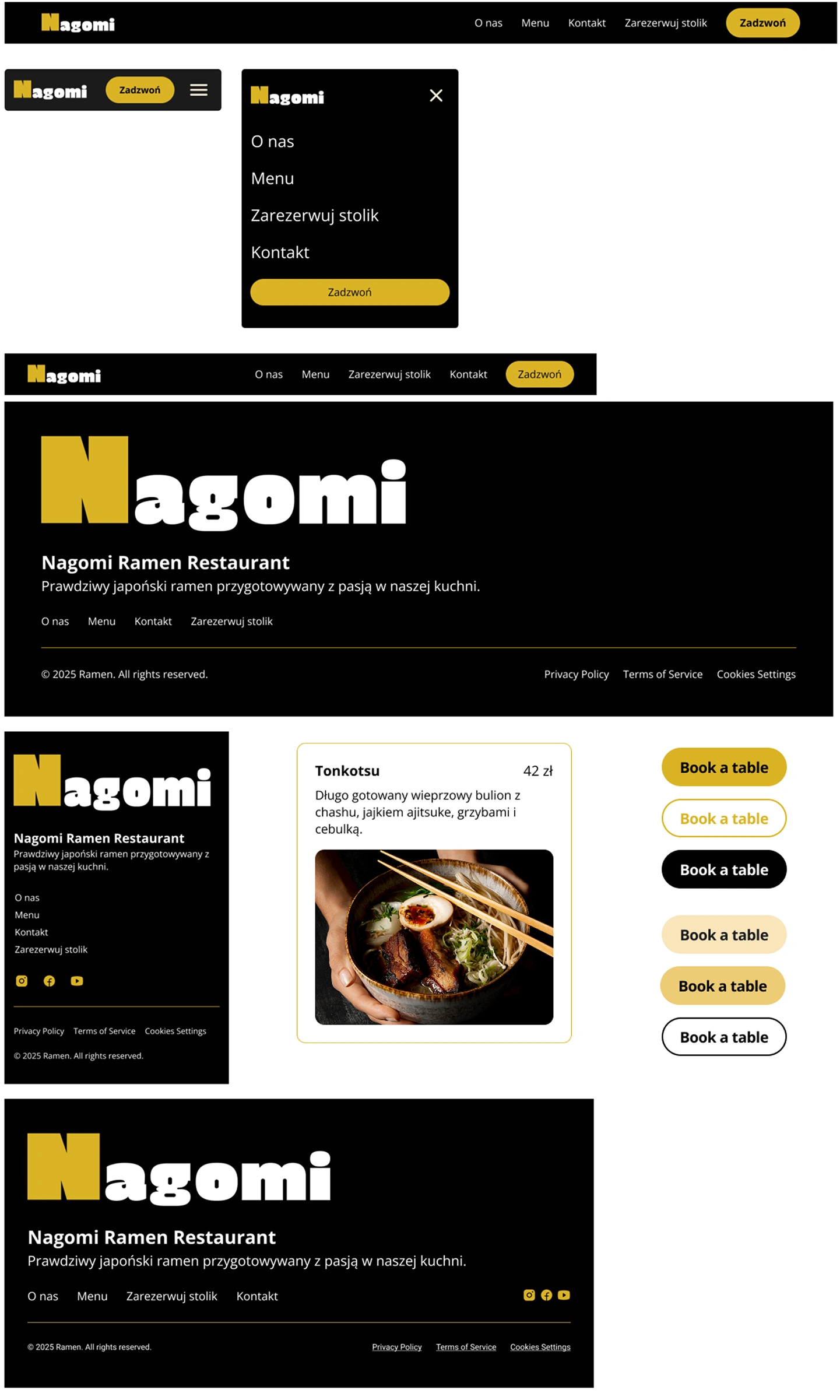
Responsive navigation design — optimized for desktop, tablet, and mobile to ensure a seamless browsing experience across all devices.
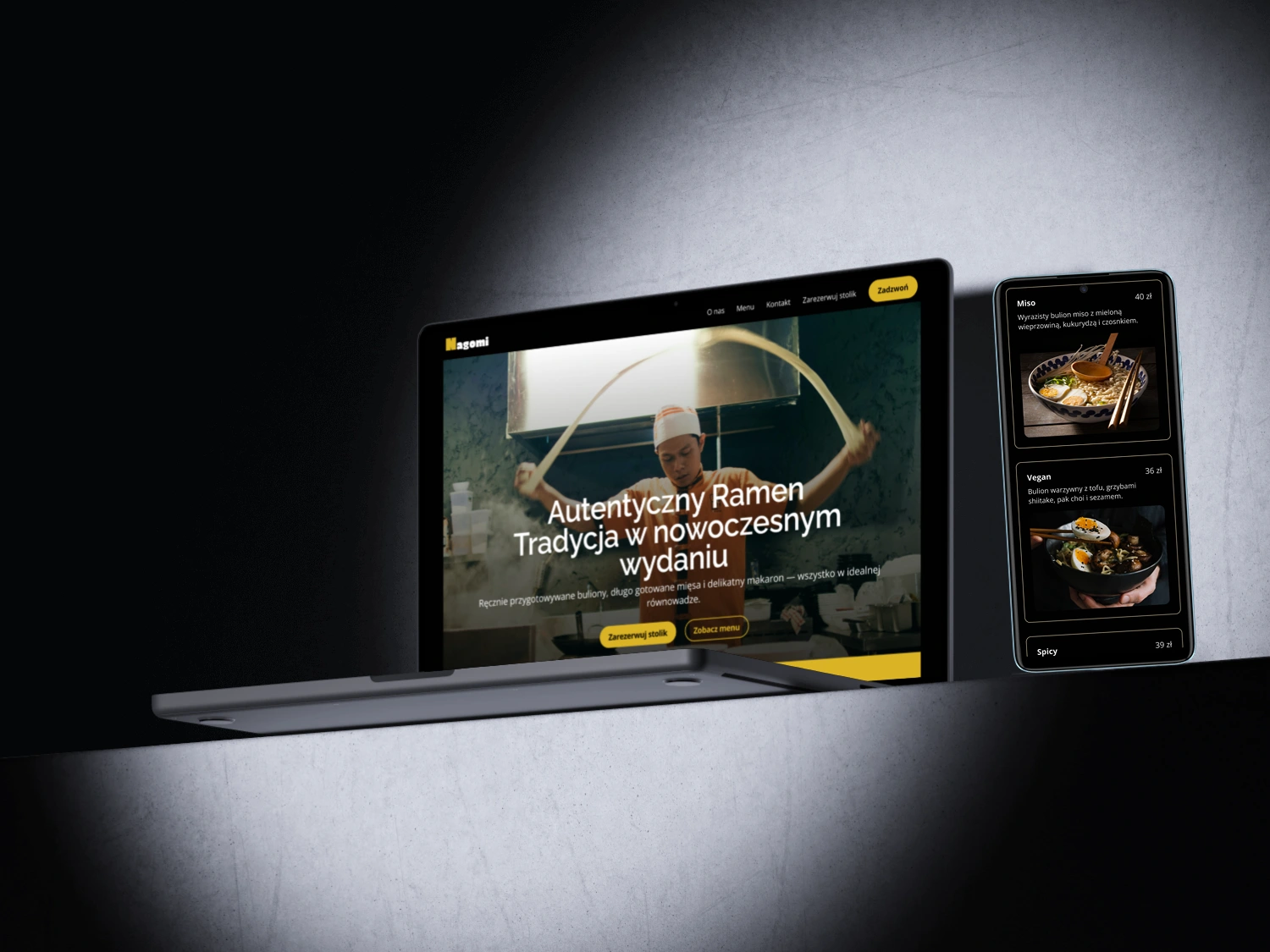
Final Design
Designed with an emphasis on visual storytelling and an immersive
dining experience.
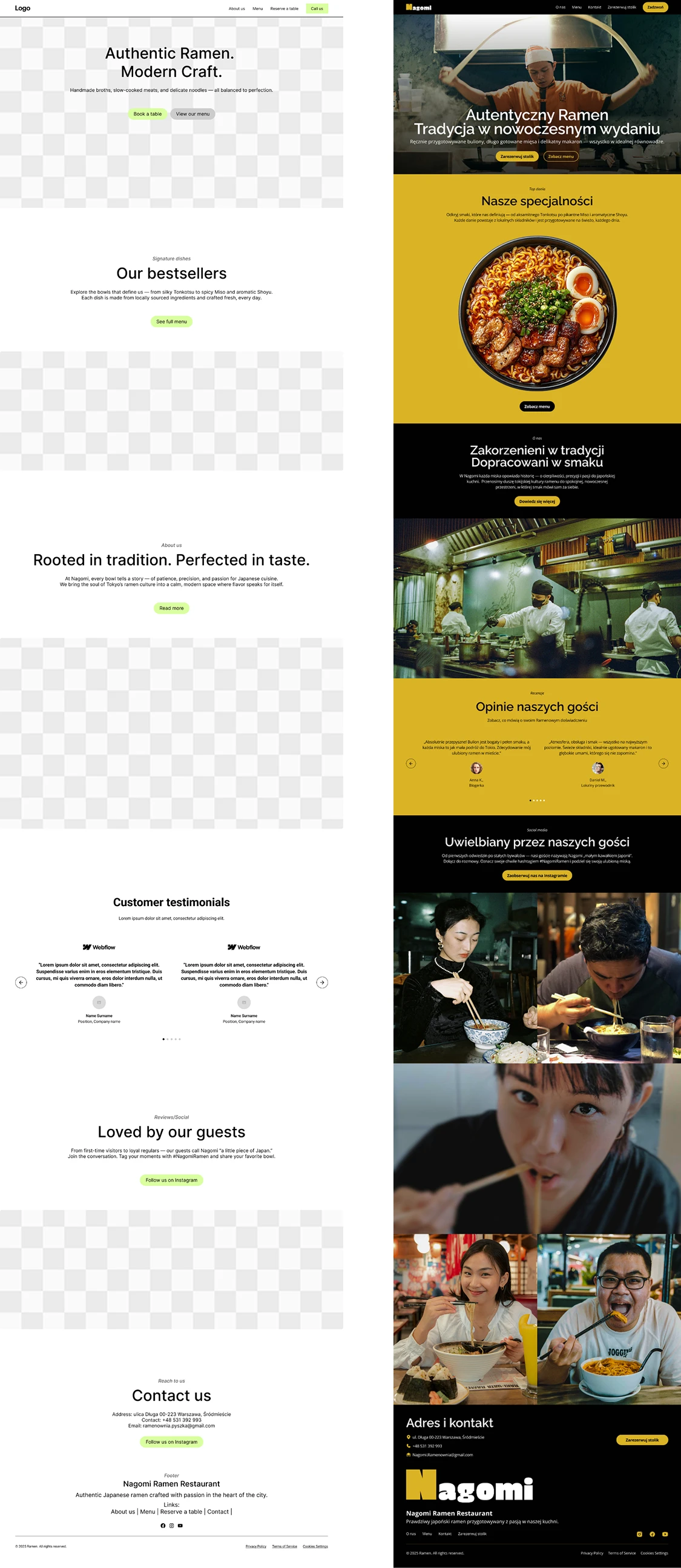
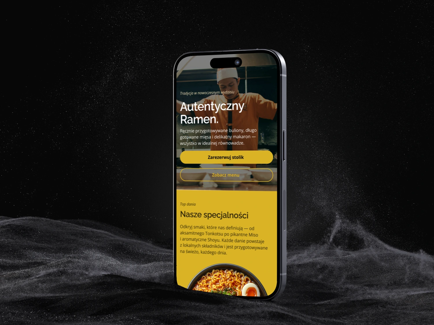
Homepage
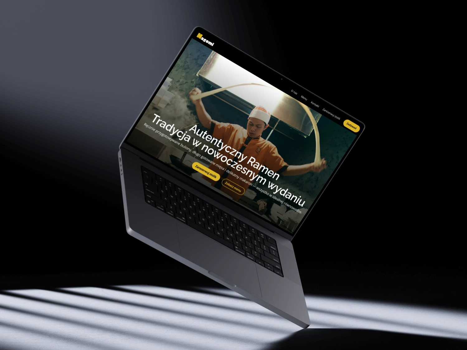
Hero section redesign focused on strong visuals, clear hierarchy, and an inviting first impression.
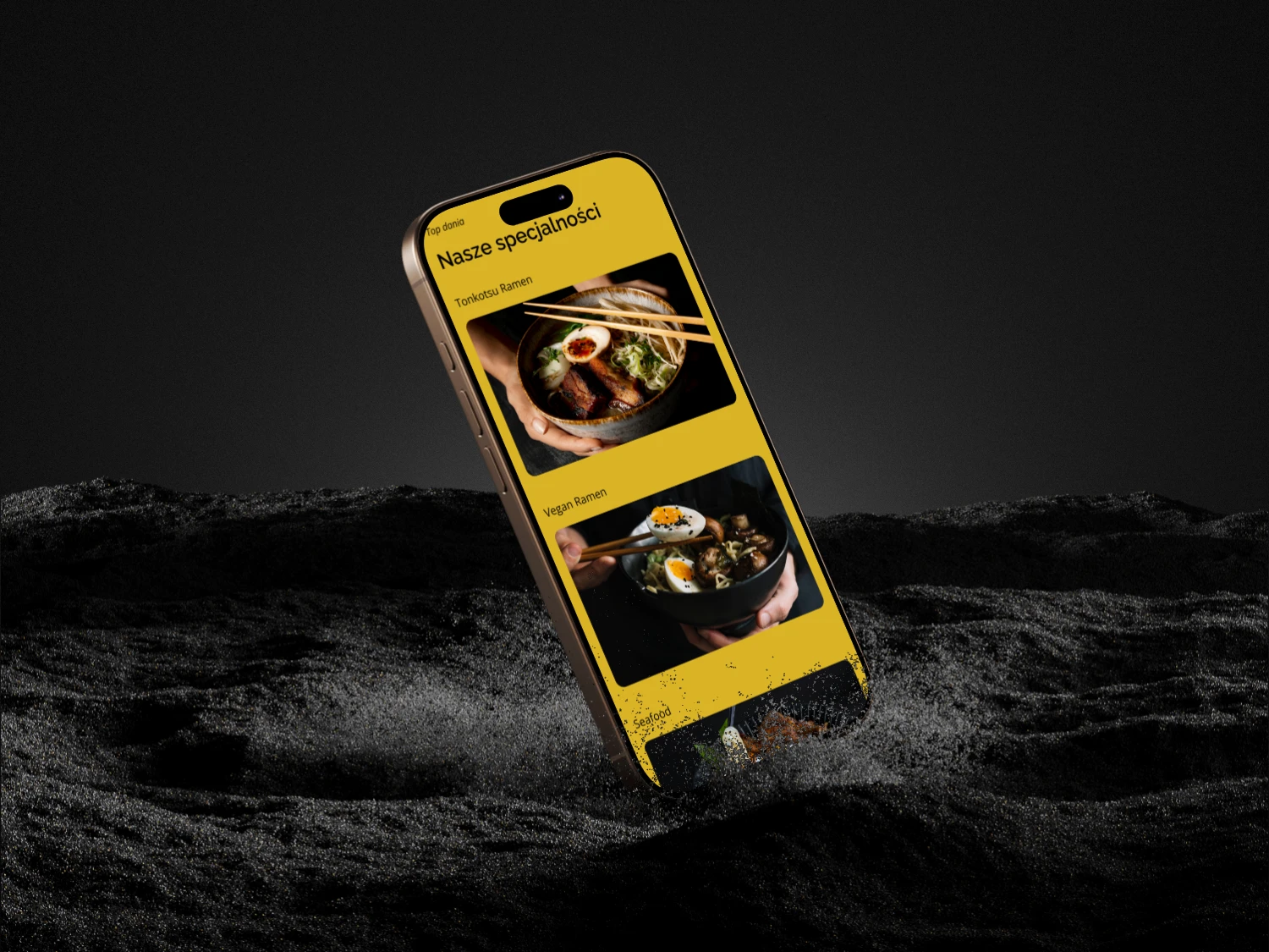
Menu
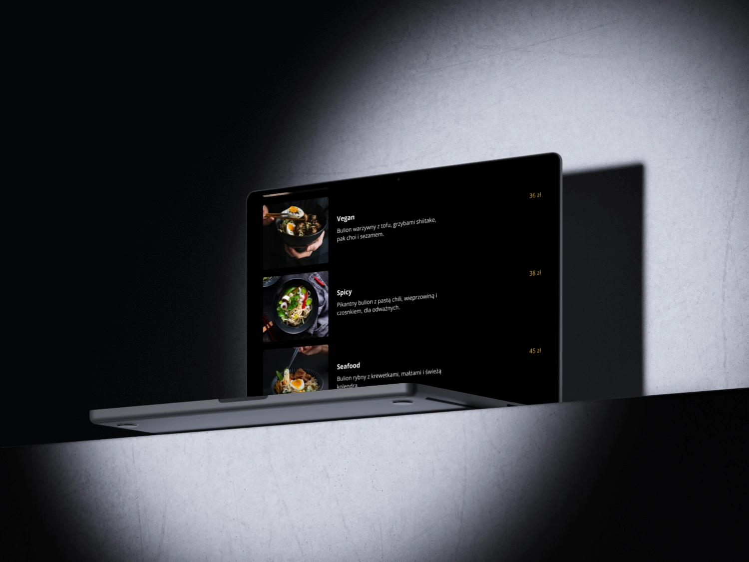
Structured and visually balanced menu layout designed for effortless navigation and quick decision-making.
About us
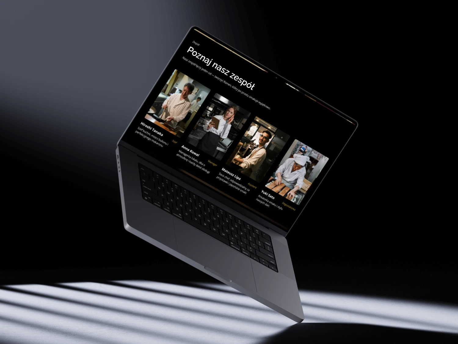
A capture of our team with information's about they responsibilities.
Mobile view
Responsive design of home page screen for mobile version.
Enhanced mobile menu with structured food cards, ensuring clarity and smoother user navigation.
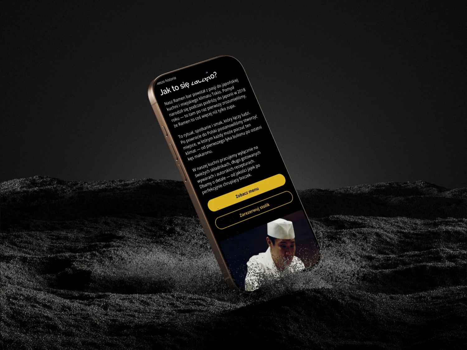
Mobile view of the 'About us' section, showcasing streamlined design for enhanced user engagement.
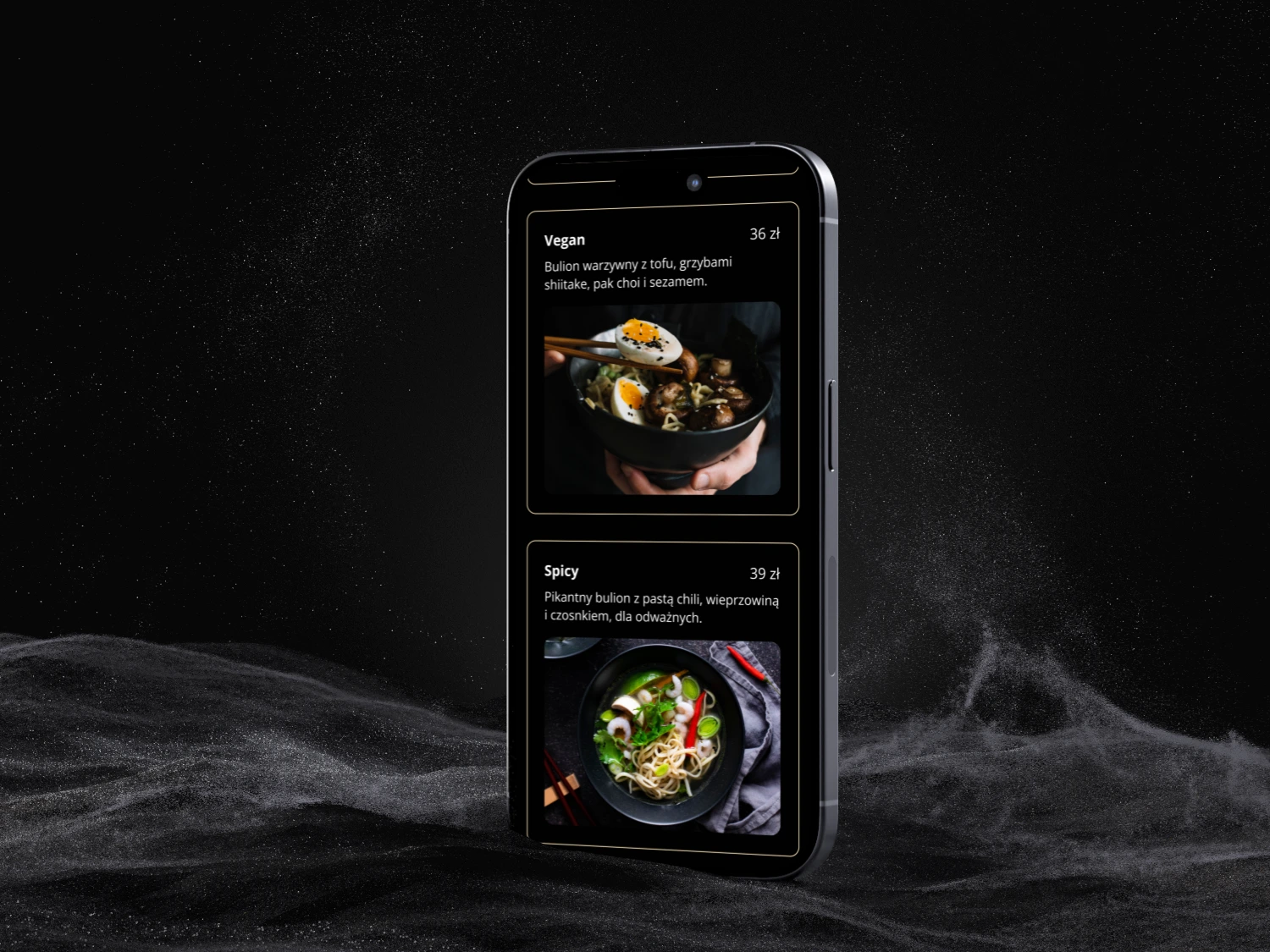
Menu section with created 'Food cards' which helps with structure and hierarchy.
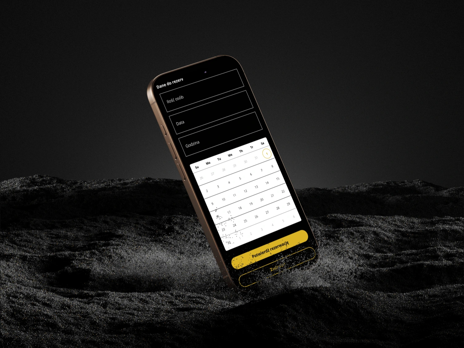
Reservation section with data to fill and integrated calendar on mobile.
Summary
Business Value
Thanks to these improvements, we achieved measurable results
+30% increase in online reservations, as simplified flows and clear CTAs encouraged users to take action
Improved information structure and menu discoverability, helping visitors quickly find what they were looking for
Strengthened premium brand perception through cohesive visuals, refined typography, and storytelling rooted in Japanese aesthetics
−20% reduction in bounce rate, achieved by enhancing clarity and usability across key pages
+25% increase in average session duration, showing higher engagement and stronger interest in exploring the restaurant’s offer
Reflections and learnings
This project taught me the importance of balancing visual appeal with usability.
I learned how to translate brand values into digital design and how small UX details — such as button states or scroll depth — can significantly enhance
the overall experience.
I also realized that less is more: a shorter, more structured menu improved decision-making and increased online reservations.
Another key takeaway was the value of a mobile-first approach. Even the most visually appealing websites lose their impact if they’re not responsive — a common issue we aimed to eliminate.
Streamlining the conversion process resulted in a smoother user flow and faster interactions. The project deepened my understanding of how thoughtful UI and UX decisions directly shape user behaviour. It also made me more attentive to detail and more confident in creating designs that are both functional and
visually coherent.
Like this project
Posted Nov 3, 2025
Redesigned a ramen restaurant's website to enhance user experience and increase online reservations.
Likes
2
Views
106


