Landing Page Design for Synovia AI
Kornel Turek
Synovia AI – Landing Page for a Health-Tech Start-up
My role
UX/UI Designer responsibilities included:
Competitive analysis and UX strategy
Information architecture and user flow
Low-fidelity and high-fidelity wireframes
Visual design and responsive layouts
Prototyping and interaction design
Preparation of case study materials
Project overview
Synovia AI is a Health-Tech start-up developing AI-based tools to support
clinical decision-making in modern medical institutions across Europe and
the United States.
The goal of this project was to design a clear, credible, and conversion-focused landing page that explains a complex medical AI product in a way that is understandable, trustworthy, and human-cantered.
The landing page was designed for desktop, tablet, and mobile, with a clickable prototype to validate user flow and content hierarchy.
Business goal
The main business objectives of the project were:
Clearly explain what Synovia AI does within the first seconds of user interaction
Build trust with medical professionals and decision-makers
Present AI technology as a support tool, not a replacement for doctors
Encourage users to book a demo or request early access
The website needed to balance clinical credibility with a light, modern visual tone suitable for a premium Health-Tech brand
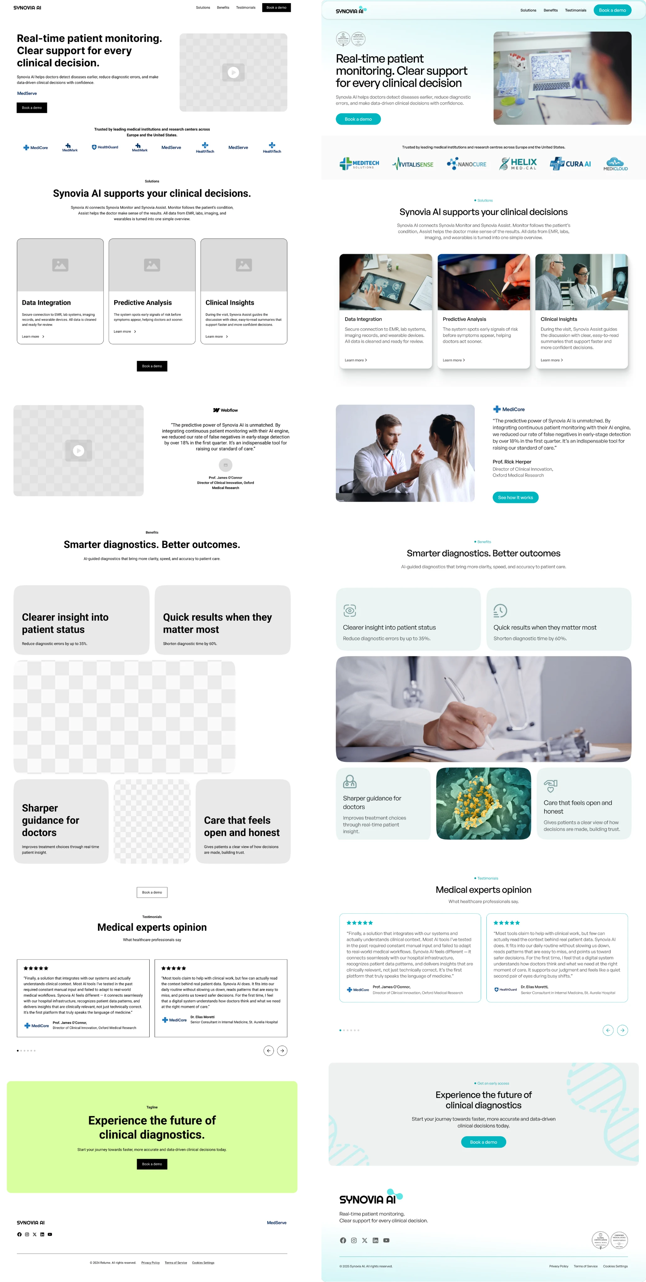
Lo-Fi and Hi-Fi desktop screens comparision.
Target audience
Medical institutions and clinics
Clinical directors and innovation managers
Healthcare professionals involved in diagnostics and research
Users are highly informed, time-constrained, and sensitive to clarity, credibility, and data security
Research and analysis
I conducted a competitive analysis of Health-Tech and AI medical platforms to identify common patterns and gaps in communication.
Key insights:
Many AI medical websites use heavy technical language that increases cognitive load
Visual styles often feel cold or overly technical, reducing emotional trust
Clear value propositions and benefits are frequently hidden below the fold
Based on these insights, the structure and content were designed to prioritize clarity, early trust signals, and a clear decision path
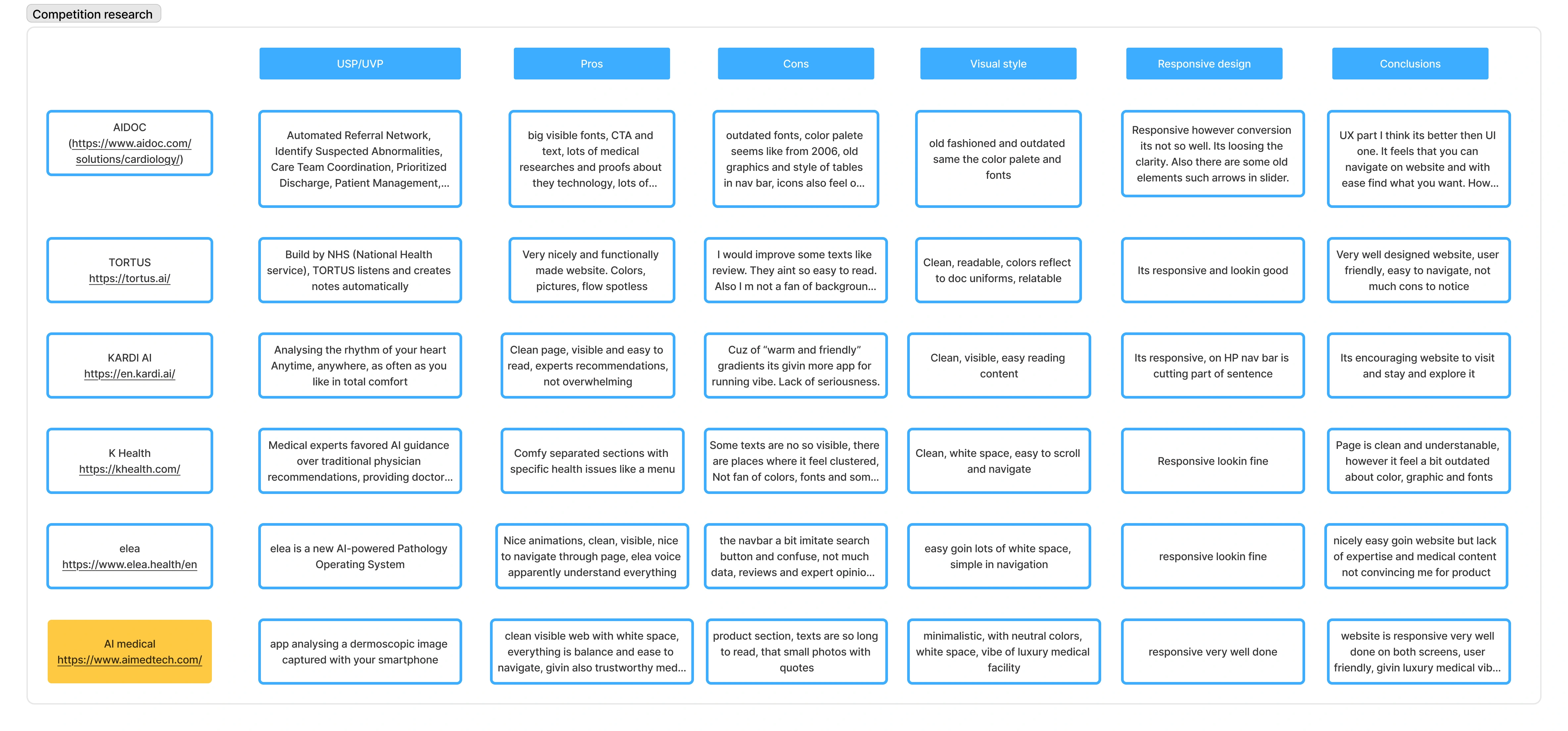
Competition research across six AI-driven healthcare websites.
Information architecture
The landing page was structured around a simple decision flow:
Above the fold:
Clear headline explaining the core value
Supporting subline with clinical context
Primary call to action
Visual combining medical professionals and subtle data elements
Trust signals (logos and credibility markers)
Below the fold:
How the product works (3-step explanation)
Key benefits with measurable outcomes
Testimonials from medical professionals
Final call to action
This structure reduces friction and helps users understand the product without scrolling fatigue
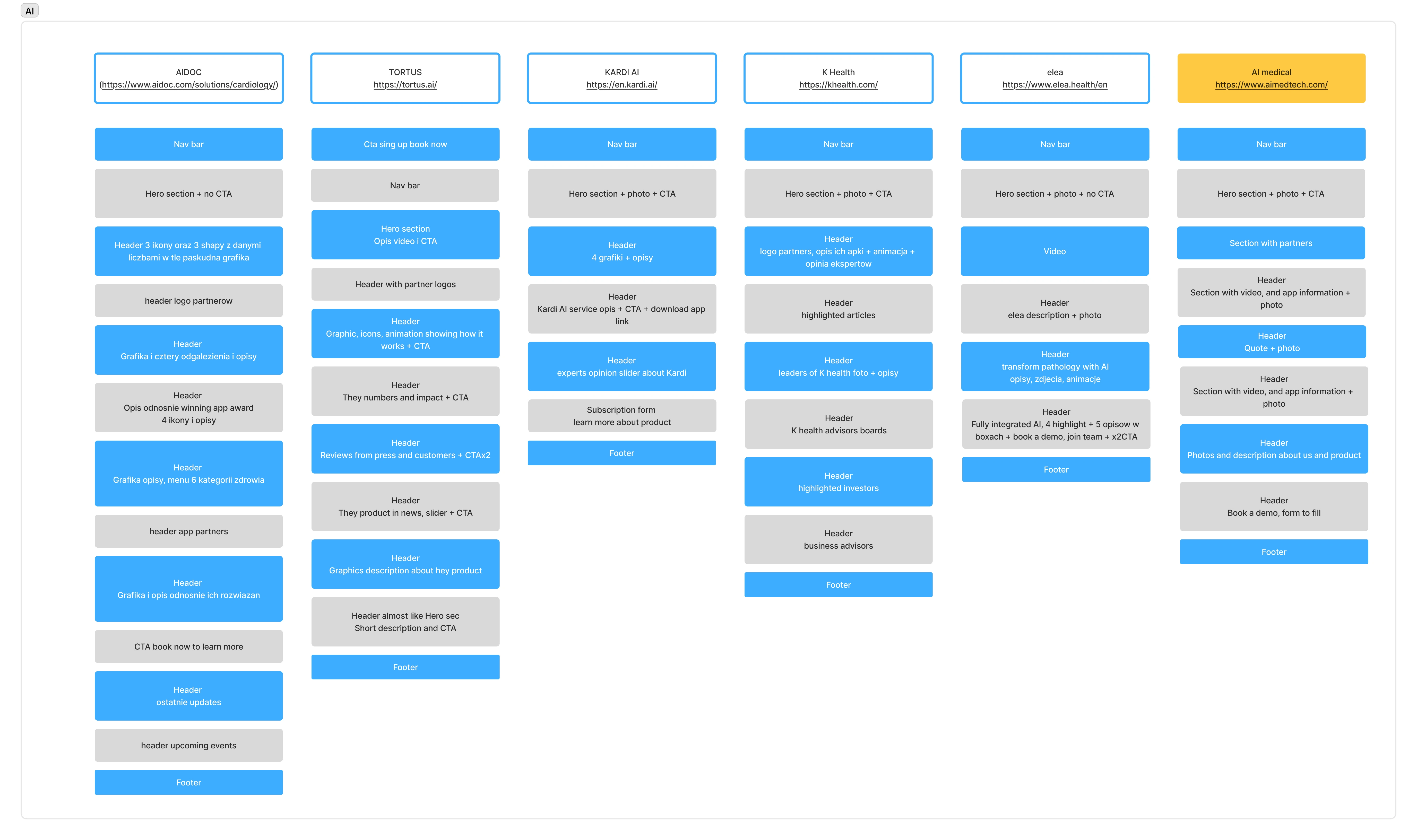
Six core pages and they Information Architecture.
UX and design decisions
Key design principles applied:
High content clarity with short, scannable sections
Generous white space to reduce cognitive load
Soft colour palette (mint, blue, light grey) to build trust
Sans-serif typography for readability across devices
Visual balance between human photography and abstract data elements
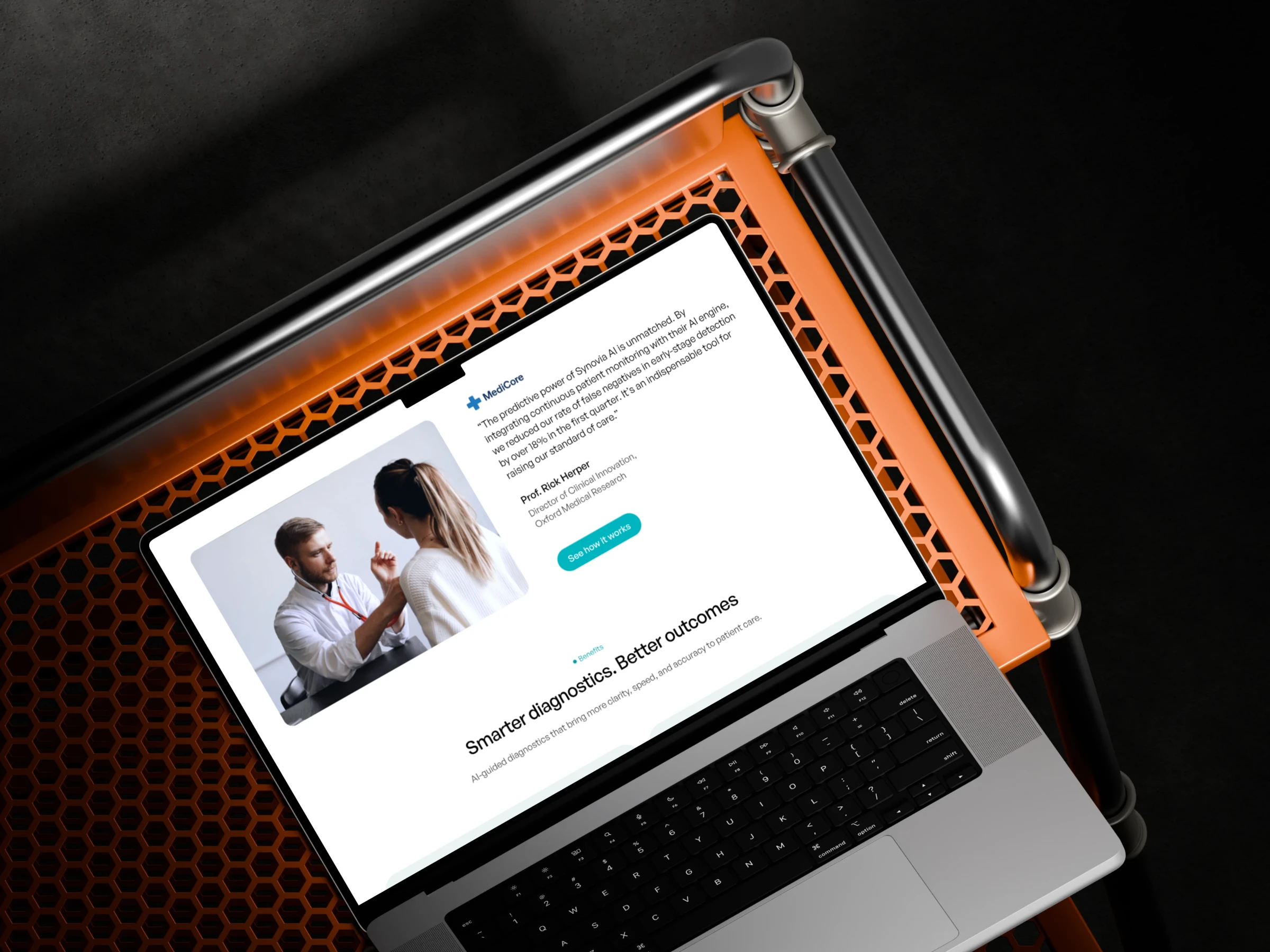
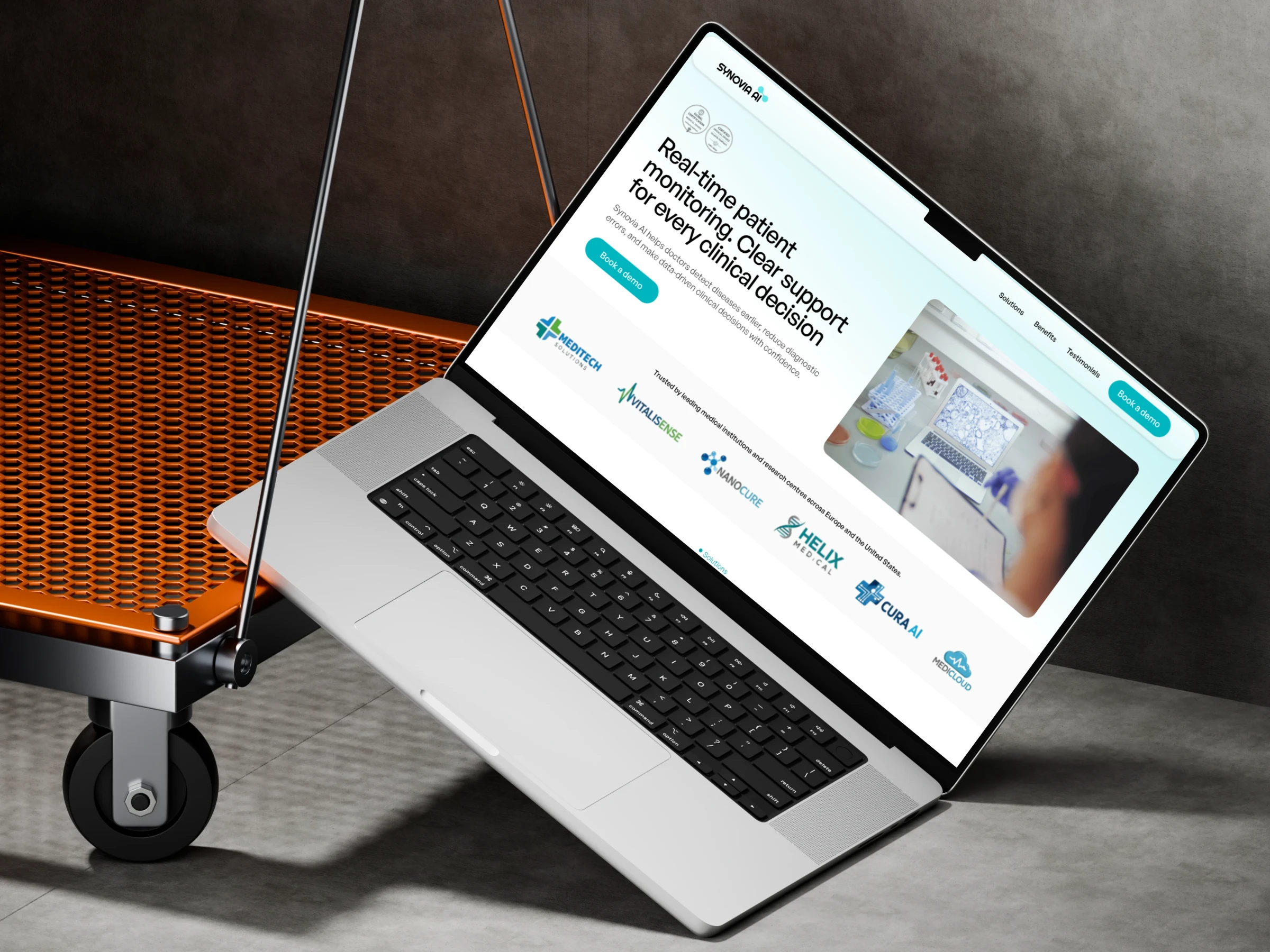
Desktop snapshots with a professional testimonial.
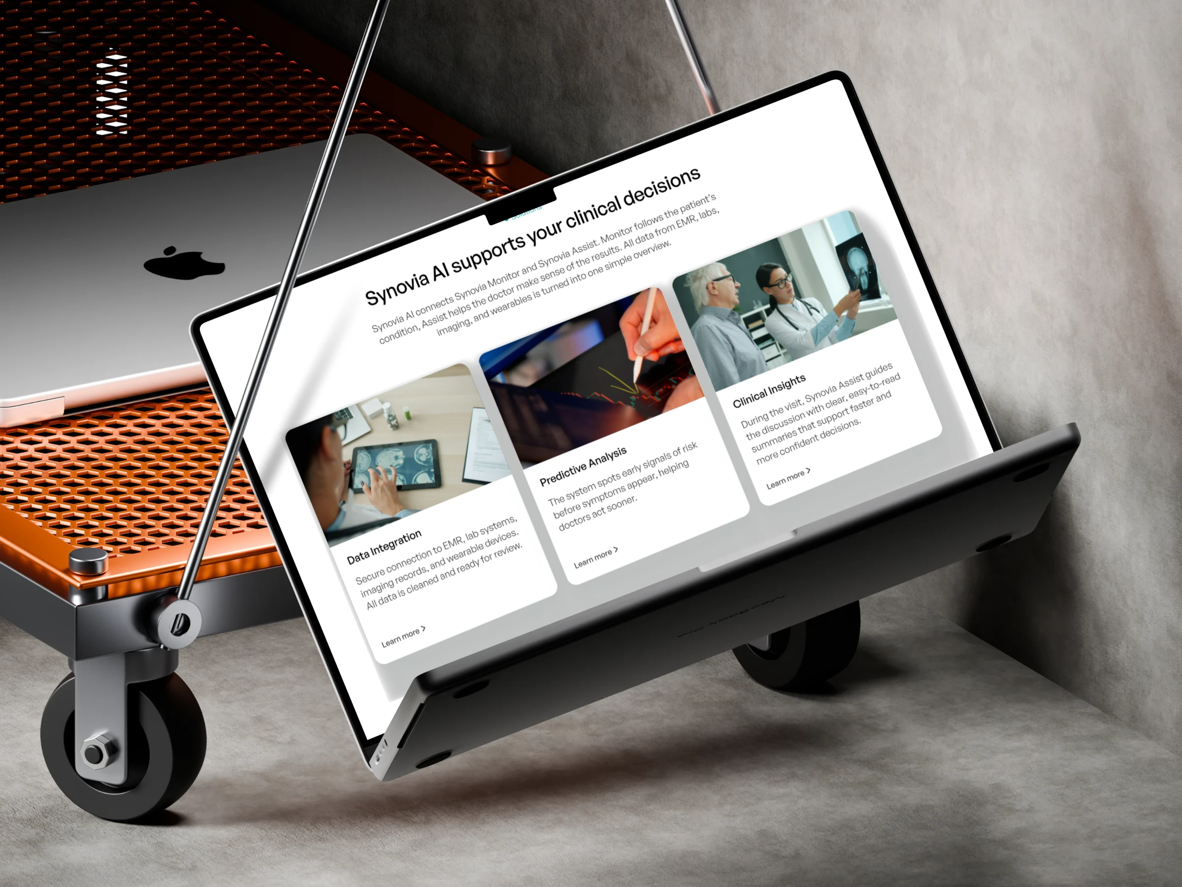
Desktop version showing Synovia AI three main factors.
Micro-interactions and subtle animations were added to guide attention without distracting from the content. Responsive Design - the layout was designed for desktop first, then adapted for tablet and mobile.
On smaller screens:
Content hierarchy was simplified
CTAs were made more prominent
Sections were reordered to maintain logical flow
This ensured consistent understanding and usability across devices
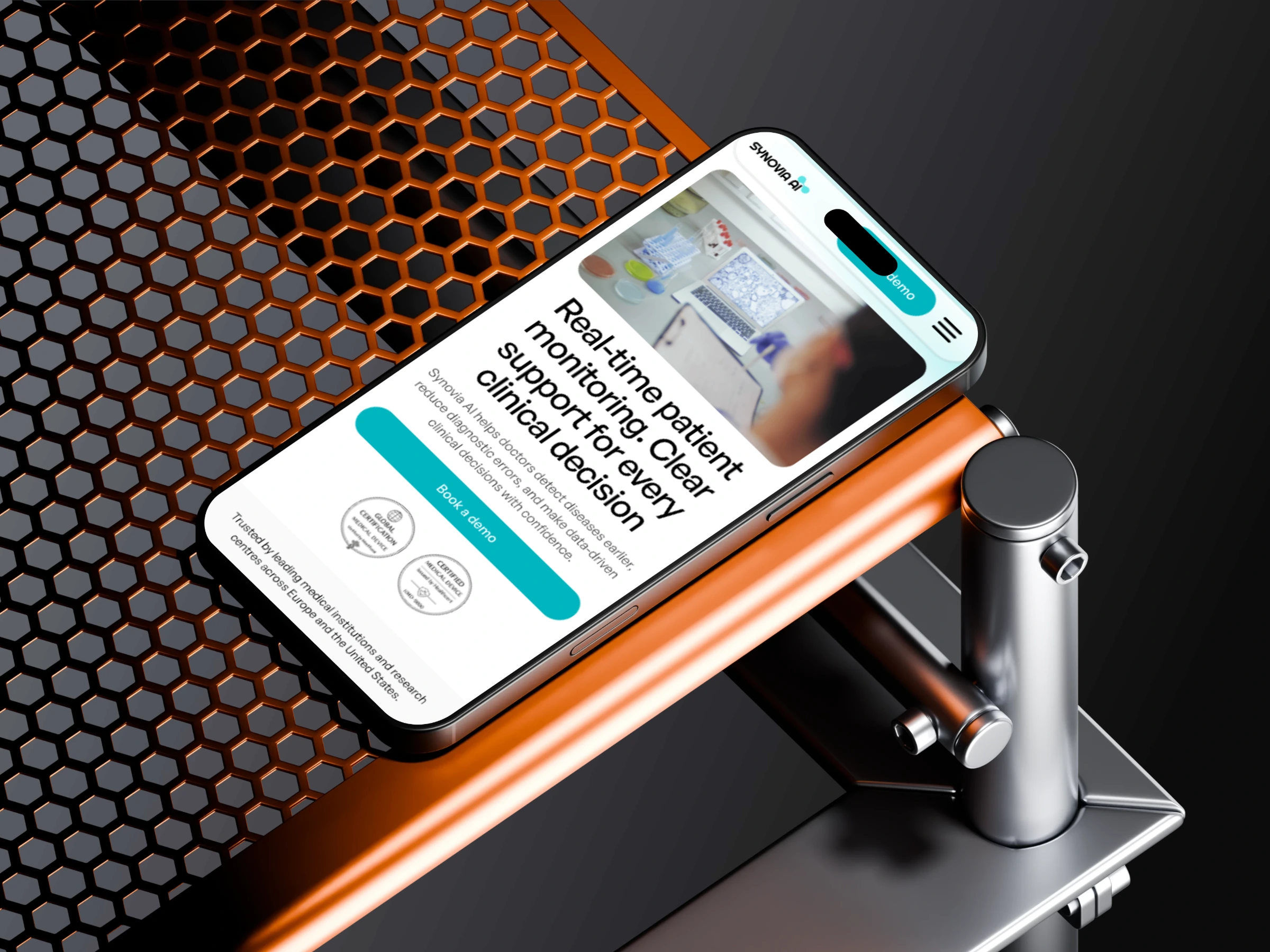
Hero-section for mobile screen.
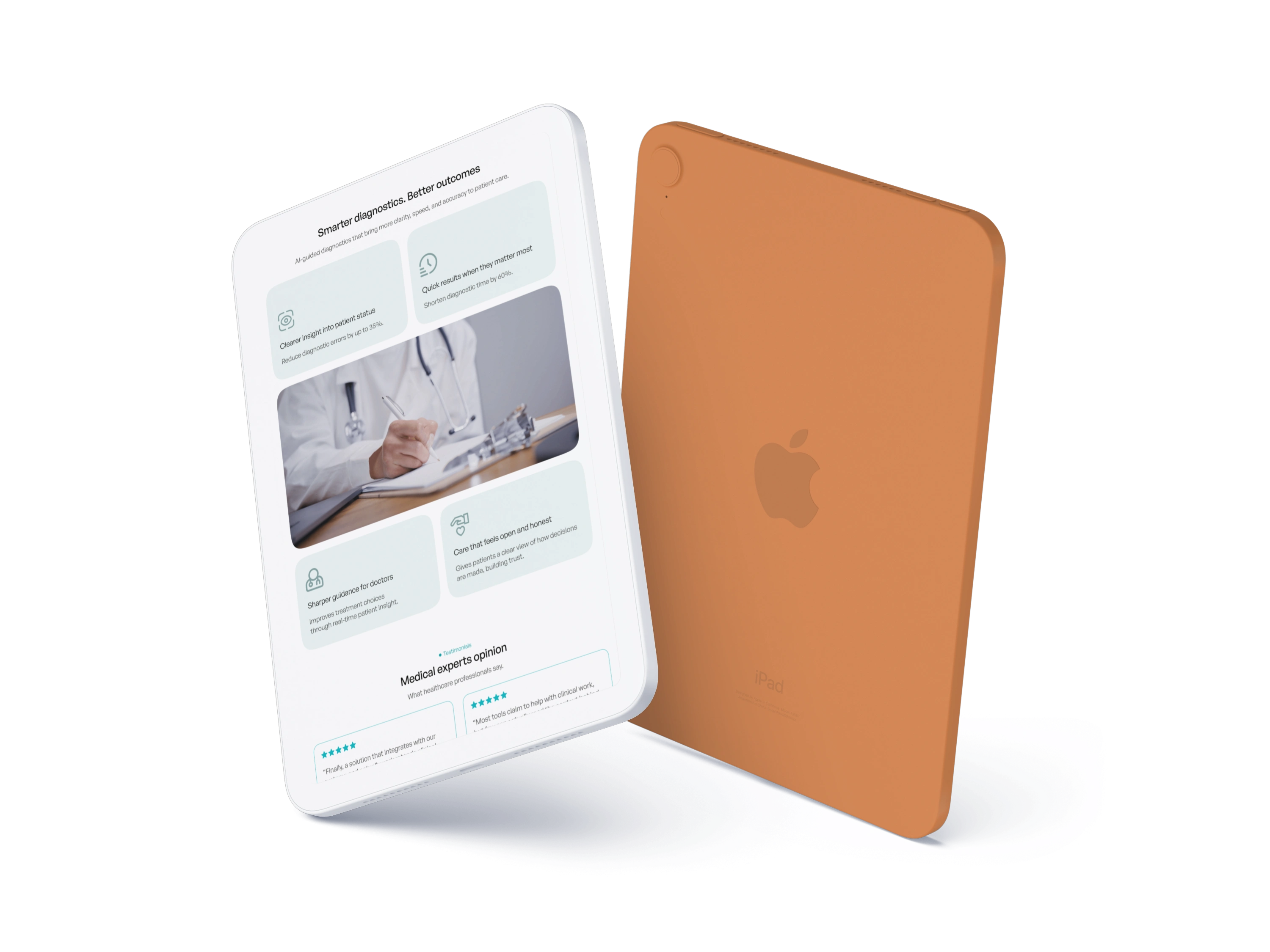
Section with Synovia AI outcomes for tablet screen.
Prototyping
A clickable prototype was created in Figma to test:
Navigation flow
CTA placement
Content hierarchy
Section transitions
The prototype allowed early validation of user paths before final delivery.
User flow on mobile version.
Outcome
The final result is a clear, professional landing page that:
Explains a complex AI medical product in simple terms
Builds trust with healthcare decision-makers
Supports business goals through focused calls to action. Presents technology as a supportive, human-centred solution
The project is ready to be used as a foundation for further development and marketing activities
Tools
Figma (design, prototyping, responsive layouts)
FigJam (research and information architecture)
Like this project
Posted Jan 3, 2026
Designed a conversion-focused landing page for Synovia AI for desktop, tablet and mobile screen.
Likes
2
Views
105


