Presentation Designer in Oliver Wyman
Kornel Turek
Presentation Designer in Oliver Wyman.
Due to confidentiality agreements, I can’t share specific projects, but over the past four years I’ve developed significantly as a designer.
For almost five years, I worked at Oliver Wyman as a Presentation Designer, partnering closely with consultants and partners to turn complex ideas into clear, structured, and visually strong presentations. My role focused on business communication, clarity, and consistency across high-stakes client materials.
Year 1. Foundation
I focused on learning the role from the ground up. I mastered PowerPoint and MS Office standards, internal templates, and Oliver Wyman’s brand system. I learned how consultants think, how content is reviewed under time pressure, and how visual structure supports decision-making.
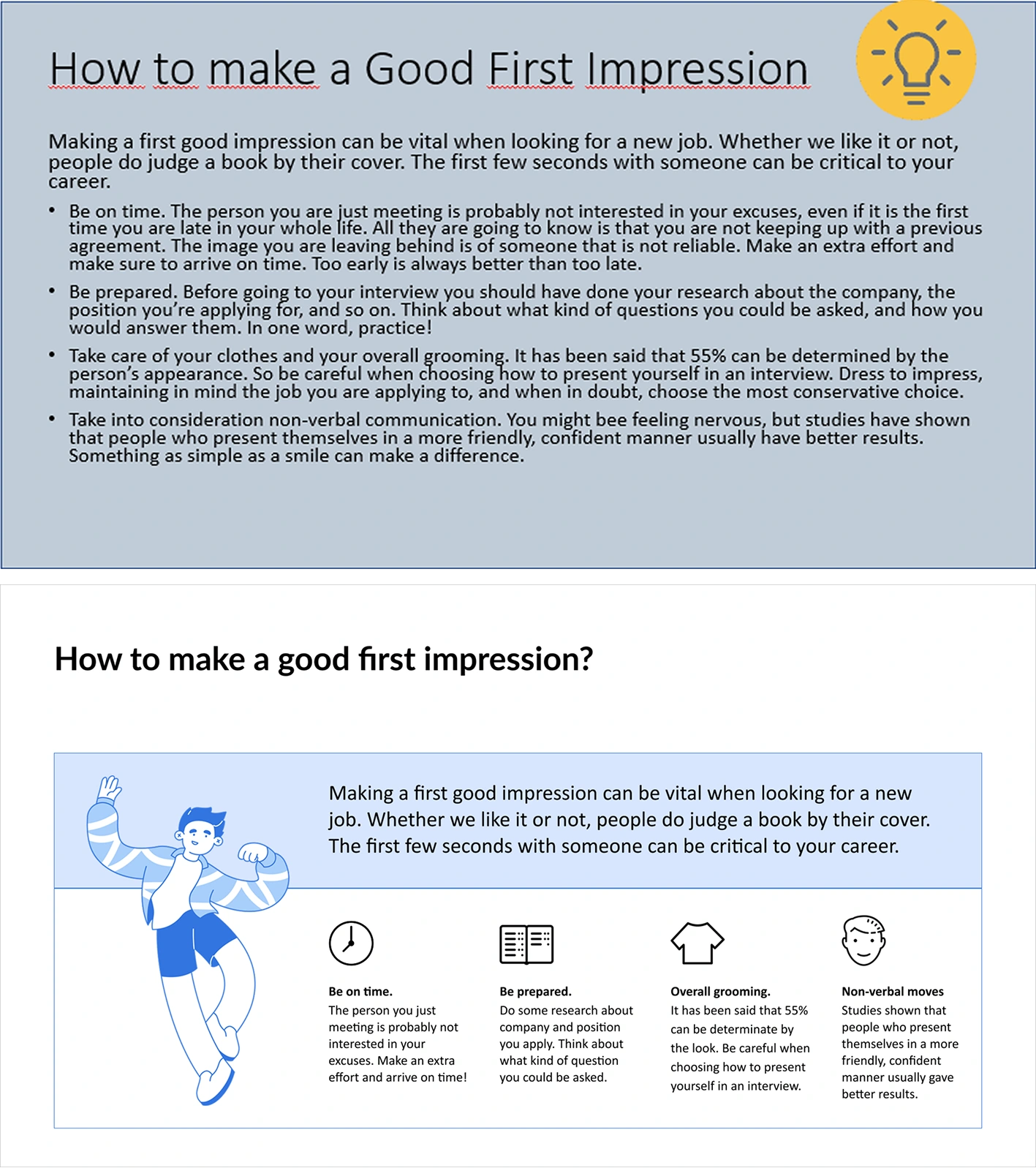
The text was reduced to create more white space and a clearer layout. The main title, key message, and four bullet points are now easy to scan. Icons and clear font hierarchy help separate and support the most important information. This makes the content faster to read and easier to understand at a glance.
Year 2. London team
I joined the London office, where I worked on large, demanding projects for clients such as HSBC, British Airways, and Lloyds Bank. I collaborated with very experienced designers, which pushed my skills forward fast. I designed full decks, refined complex content, and learned how to work on high-profile materials with tight deadlines and senior stakeholders.
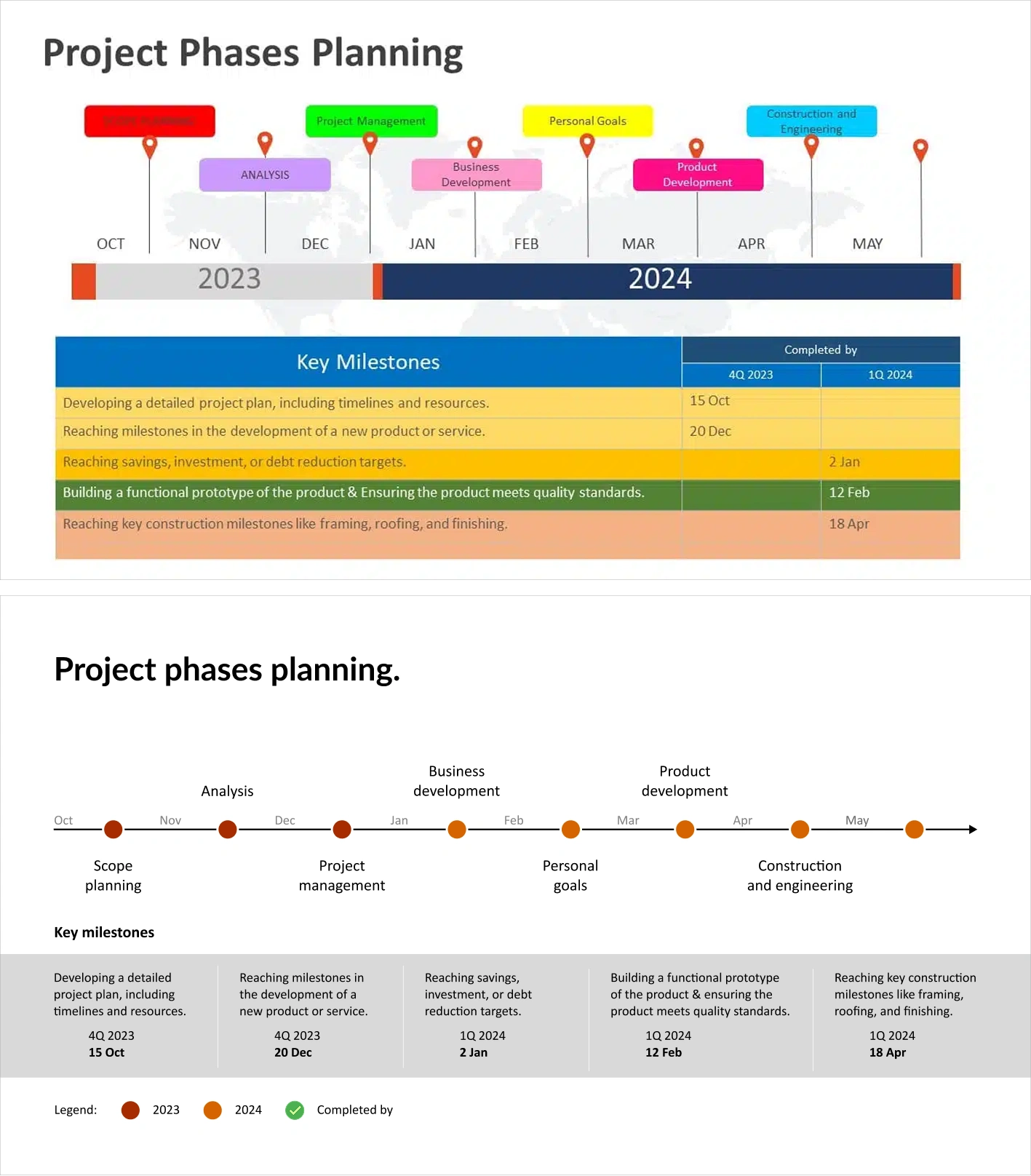
I removed the coloured shapes after confirming they had no functional meaning, which immediately cleaned up the slide. I redesigned the timeline into a simple, minimal format using dots for years. Milestones were taken out of the table and shown separately with icons to mark completion.
Year 3. Knowledge sharing in Warsaw
After returning to Warsaw, I supported onboarding of new designers. I reviewed their work, shared best practices, and helped raise quality and consistency across the team. This year strengthened my communication skills and my ability to give clear, constructive feedback.
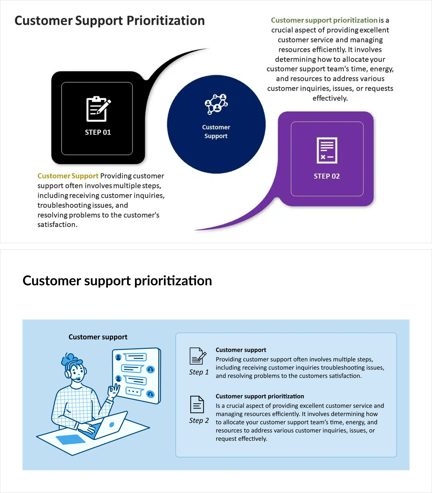
The layout was redesigned to clearly show that Step 1 and Step 2 belong to Customer Support. I used blue only for this section and kept the rest in black to avoid confusion around colour meaning. These changes clarified ownership, reduced visual noise, and made the process faster to understand at a glance.
Year 4. German market
I started working with the German office and German clients. I adapted quickly to a new team, new expectations, and a different working style. I supported complex projects and proved I could work effectively across markets and cultures.
I continued developing through internal training and more demanding assignments. One of my key projects involved leading the visual direction
of a presentation with animation, an area I care deeply about.
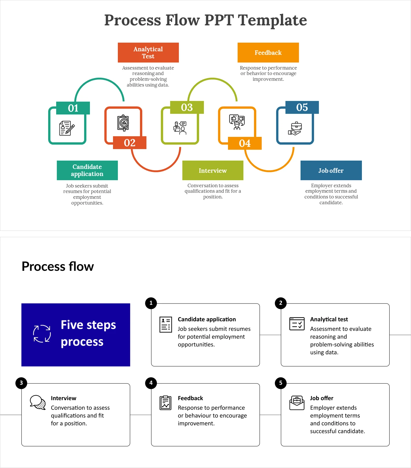
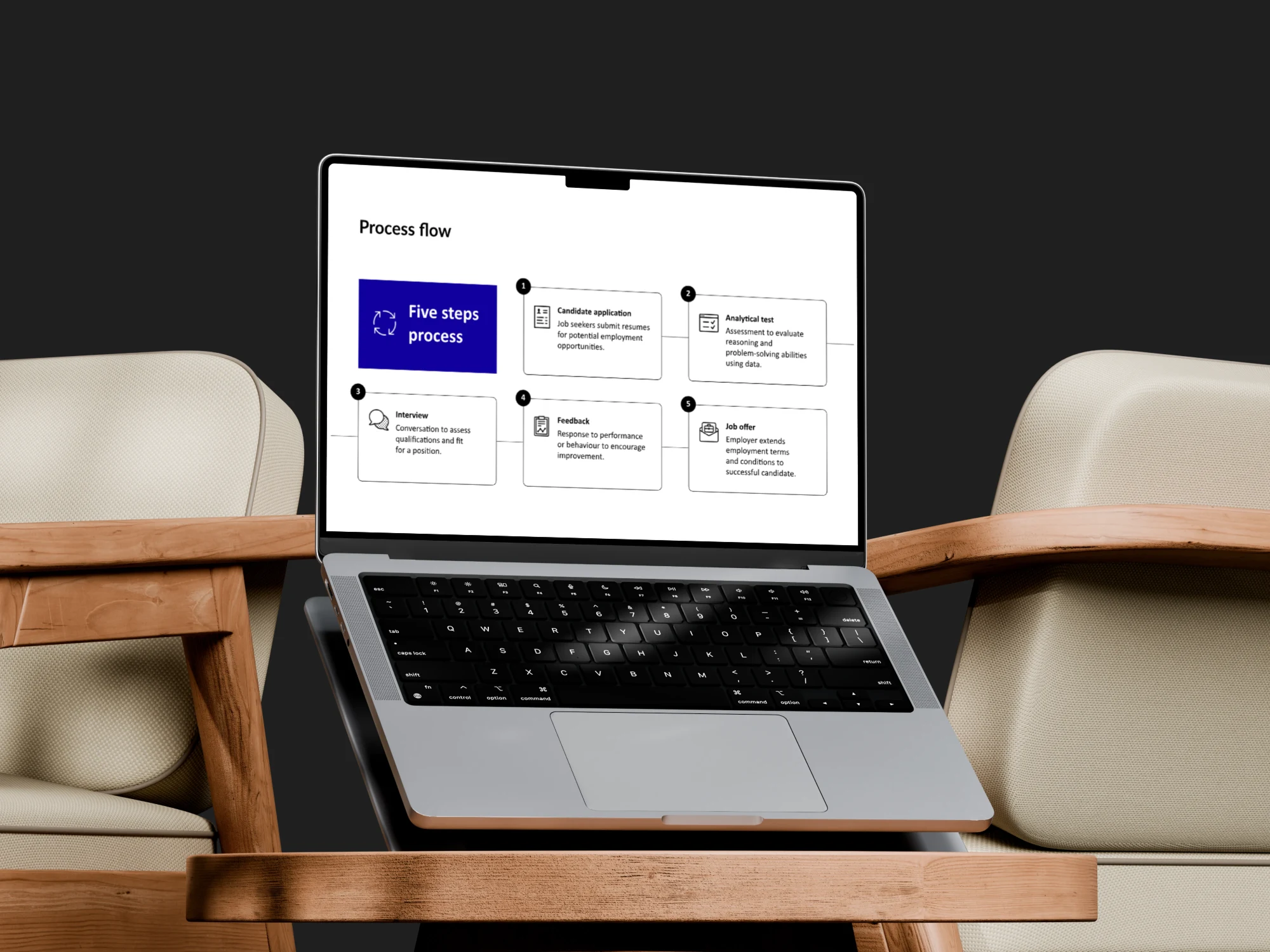
I redesigned the chart into a simple, five-step flow using clear numbering instead of colour. A single line connects the steps to show sequence, and each description now clearly matches its step. These changes removed confusion, reduced visual noise, and made the process easier to understand at a glance.
What I gained
Strong business communication skills, excellent attention to detail, confidence working with senior stakeholders, and the ability to design clear, polished presentations under pressure. This experience shaped how I think about structure, clarity, and visual storytelling in every project I take on.
Like this project
Posted Jan 7, 2026
Designed presentations for high-profile clients at Oliver Wyman, enhancing business communication skills.
Likes
1
Views
38
Clients
Oliver Wyman


