Mått Struktur Furniture Website
Kornel Turek
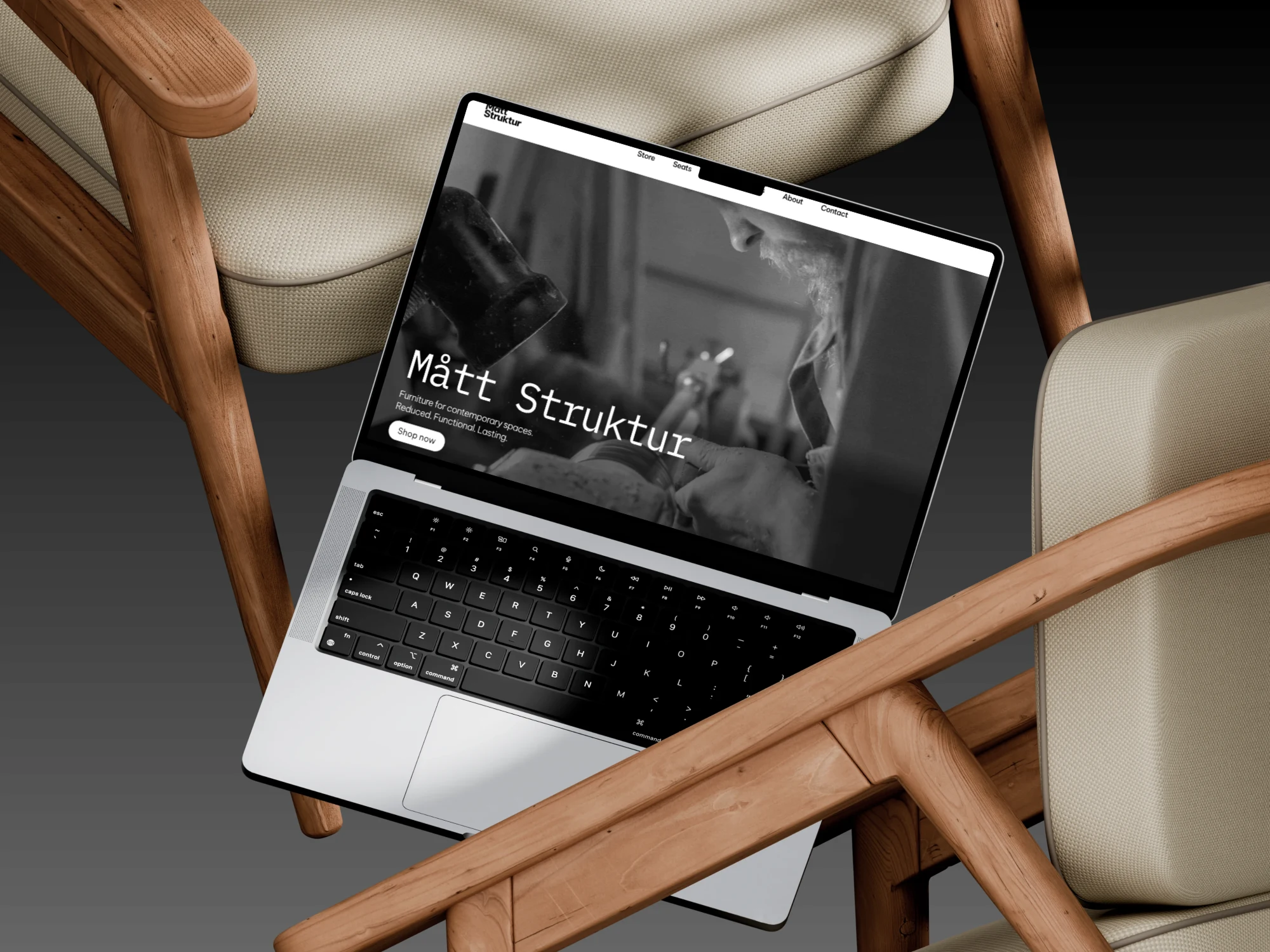
Hero section of Mått Strukture website with "Shop now" CTA
E-commerce furniture website - Case study
Role: UX/UI Designer, Framer designer
Scope:
UX strategy
Information architecture
Lo-fi wireframes in Figma
High-fidelity UI in Framer
Prototype
Website build in Framer
Business goal
Position the brand as premium and design-led
Increase perceived product value through presentation
Guide users from inspiration to purchase without friction
Maintain strong conversion structure within a minimal layout
Target audience
Design-conscious buyers
Users browsing visually before reading
Customers who associate clean design with quality
These users respond emotionally to visuals, but still expect clarity when making purchase decisions.
Overview
I designed and built a minimal, high-end furniture website for a boutique brand focused on bespoke and limited furniture pieces. The objective was to create a visually dominant experience with large photography and strong whitespace, while keeping conversion paths clear and usable. The brand offers only 6 products across 3 categories: seats, beds, chairs.
Research and information architecture
I analyzed six premium furniture brands and mapped their navigation
and IA patterns. Common patterns observed:
Strong brand authorship and design origin
Visual-first browsing with large imagery
Minimal product range presentation
Calm, neutral UI
Desktop-first layouts
Trust built through brand story rather than reviews
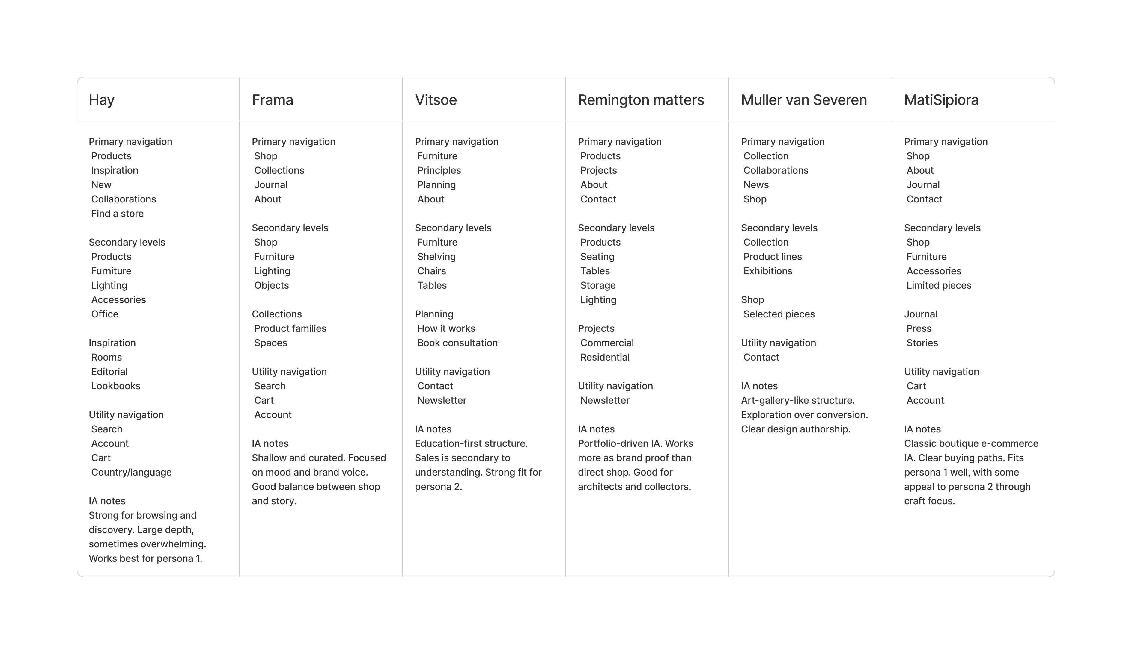
Comparative analysis of information architecture across six websites
Common UX mistakes found
These insights directly shaped my IA and interaction decisions
Weak buying clarity
Hidden pricing or delivery details
Over-prioritized storytelling before products
No comparison support
Visual focus without practical information
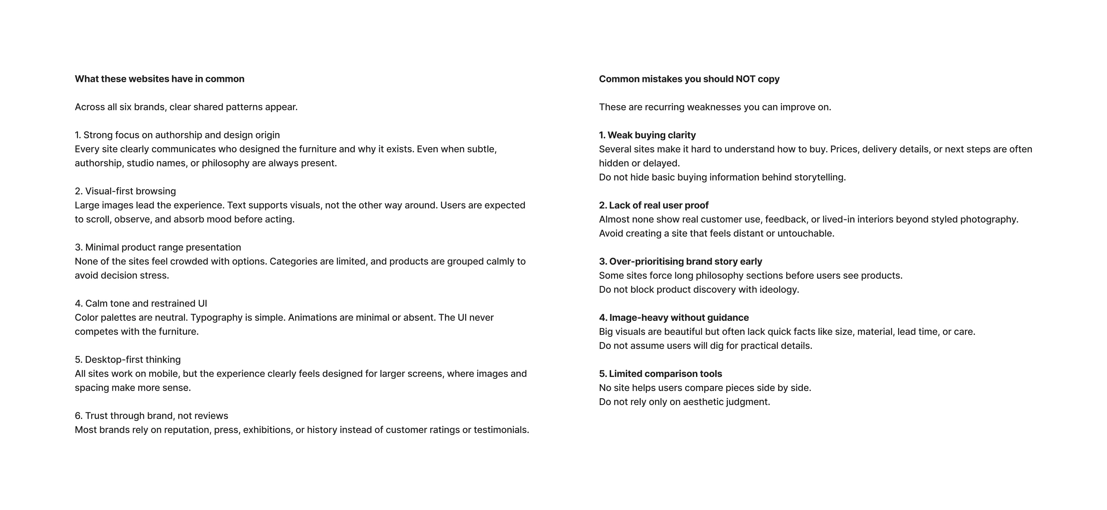
UX benchmark analysis. Common patterns and key mistakes
UX Strategy
Instead of copying art-gallery structures, I introduced clarity without breaking the premium feel.
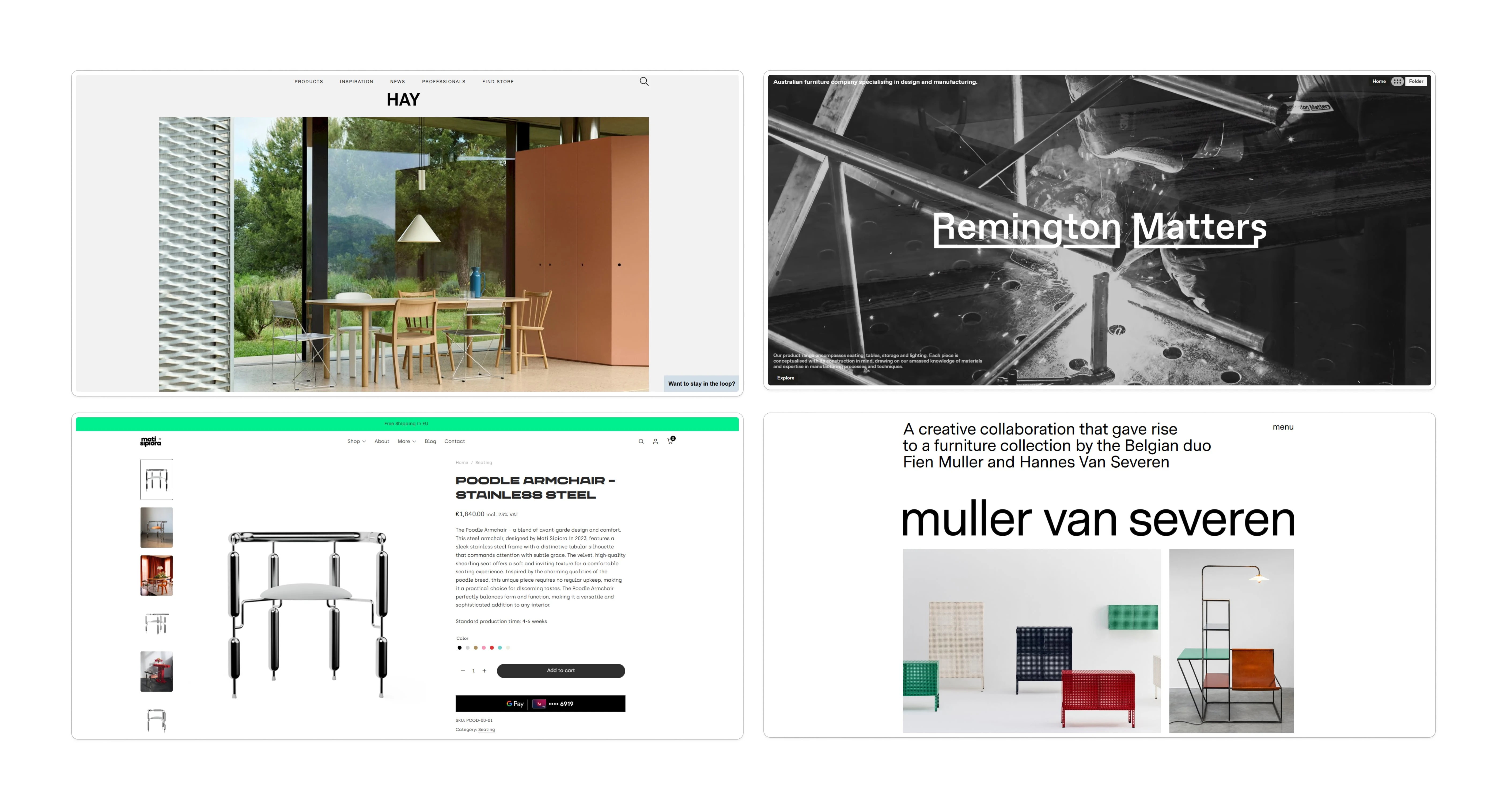
Comparison of homepage hero sections in four furniture websites.
Structure
Homepage
Hero with clear CTA
Video section with CTA
About section explaining craftsmanship and history
Store preview with 3 clear categories
Contact form section
Video presenting the website flow.
Store
3 categories
6 total products
Clear grid
Direct access to product detail
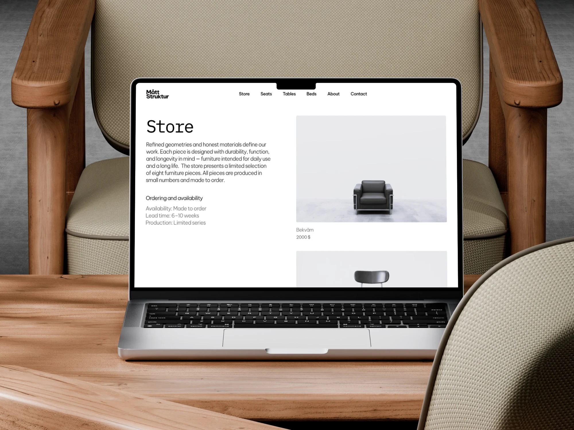
Mock-up presenting the look of the "Store" section
Product pages
Large imagery
Title and price visible immediately
Clear primary CTA
Short description first
Detailed information below
Navigation is simple and direct. No hidden levels. No decorative friction
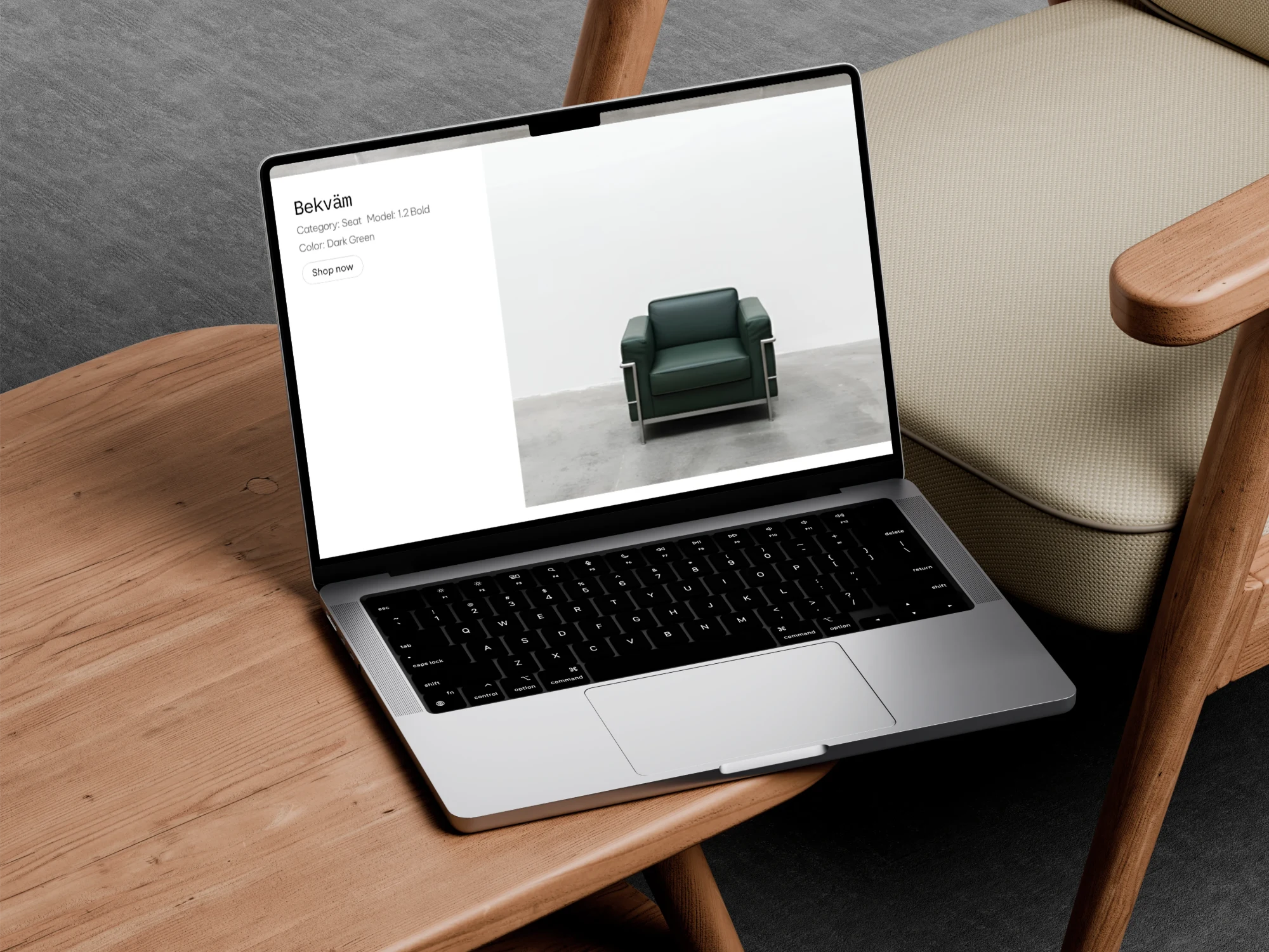
Home-page showing the one of the items Bekväm armchair.
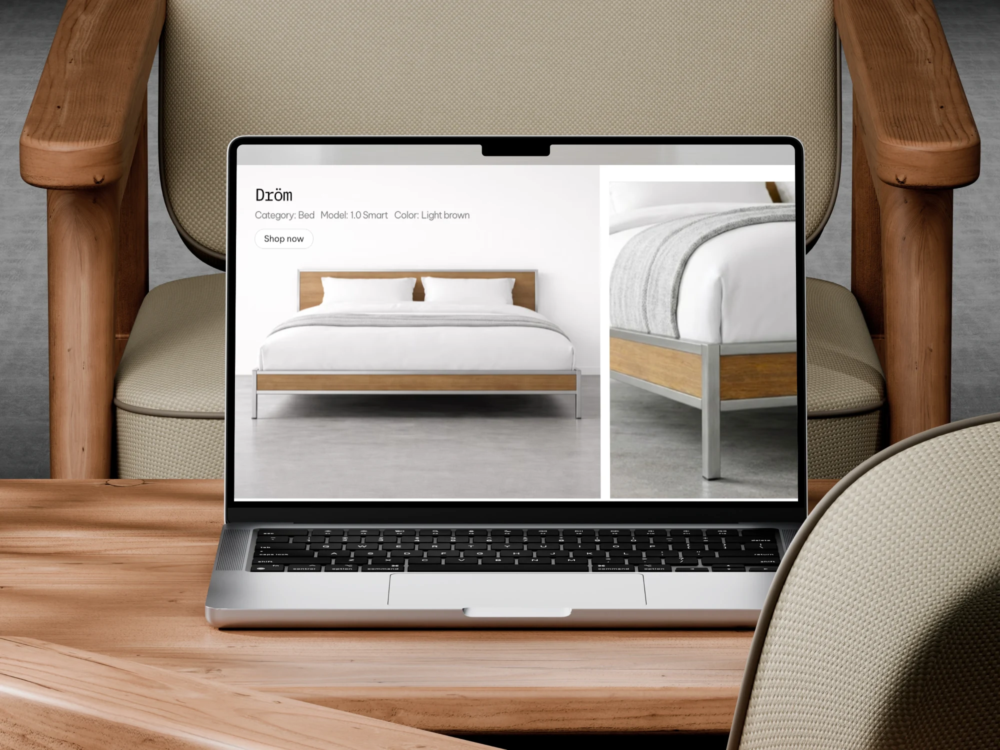
Mockup showing Dröm bedframe.
CTA appears
In hero
Over product visuals
In section "about"
Controlled Minimalism
Whitespace increases perceived product value. Reduced grid density improves focus. Compared to denser layouts, this approach can increase perceived price acceptance by 10–20 percent in premium retail environments.
Readability as priority
Large photography often reduces contrast.
I used:
Strong typographic hierarchy
Be Vietnam for body text
IBM Plex Mono for subtle technical accents
Controlled background contrast
I used:
Strong typographic hierarchy
Be Vietnam for body text
IBM Plex Mono for subtle technical accents
Controlled background contrast
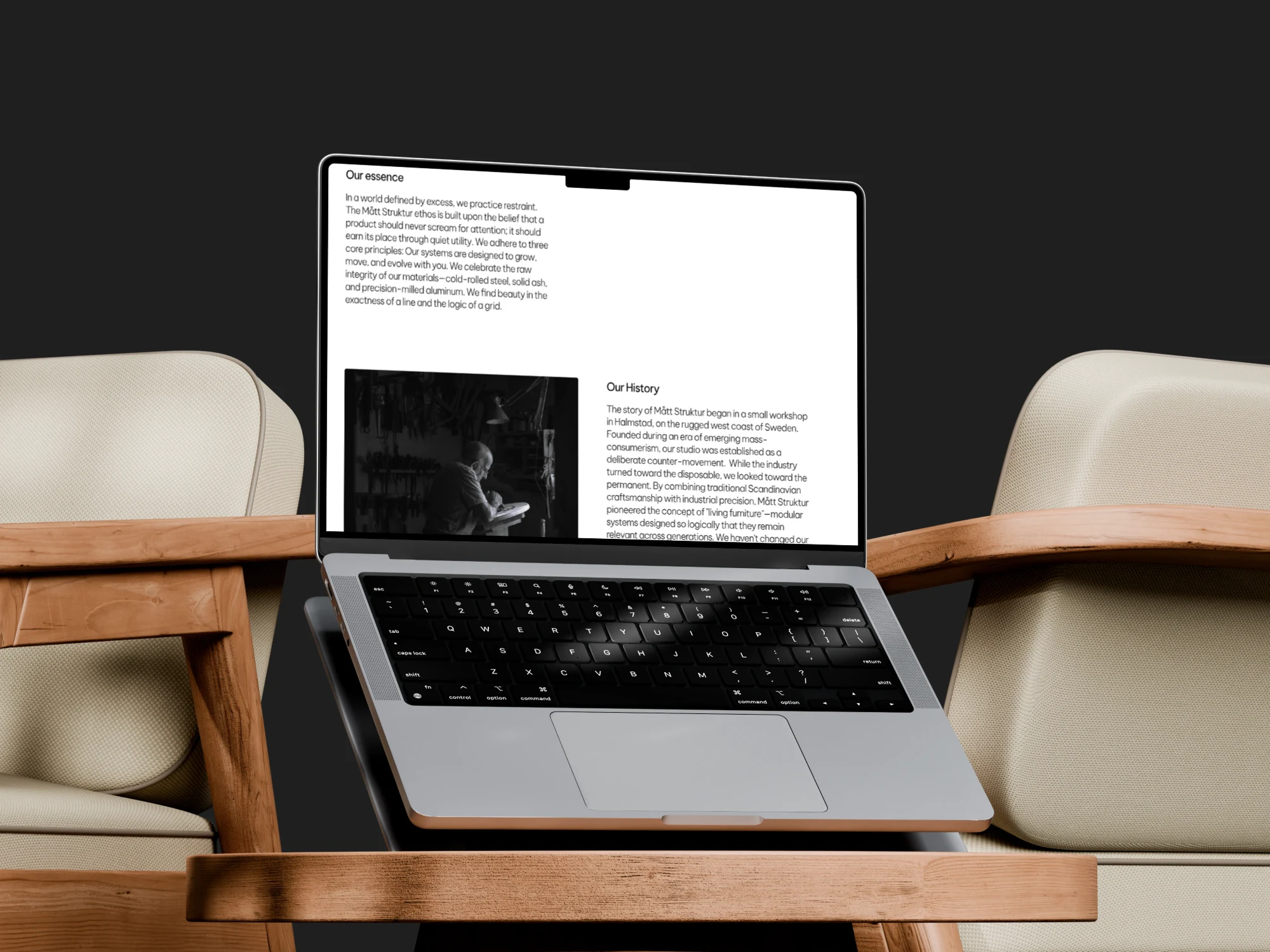
About us section explaining the history and values of company.
Emotional first, structured second
Homepage inspires. Product page converts. This separation supports natural decision flow in furniture buying, where users browse visually before evaluating details.
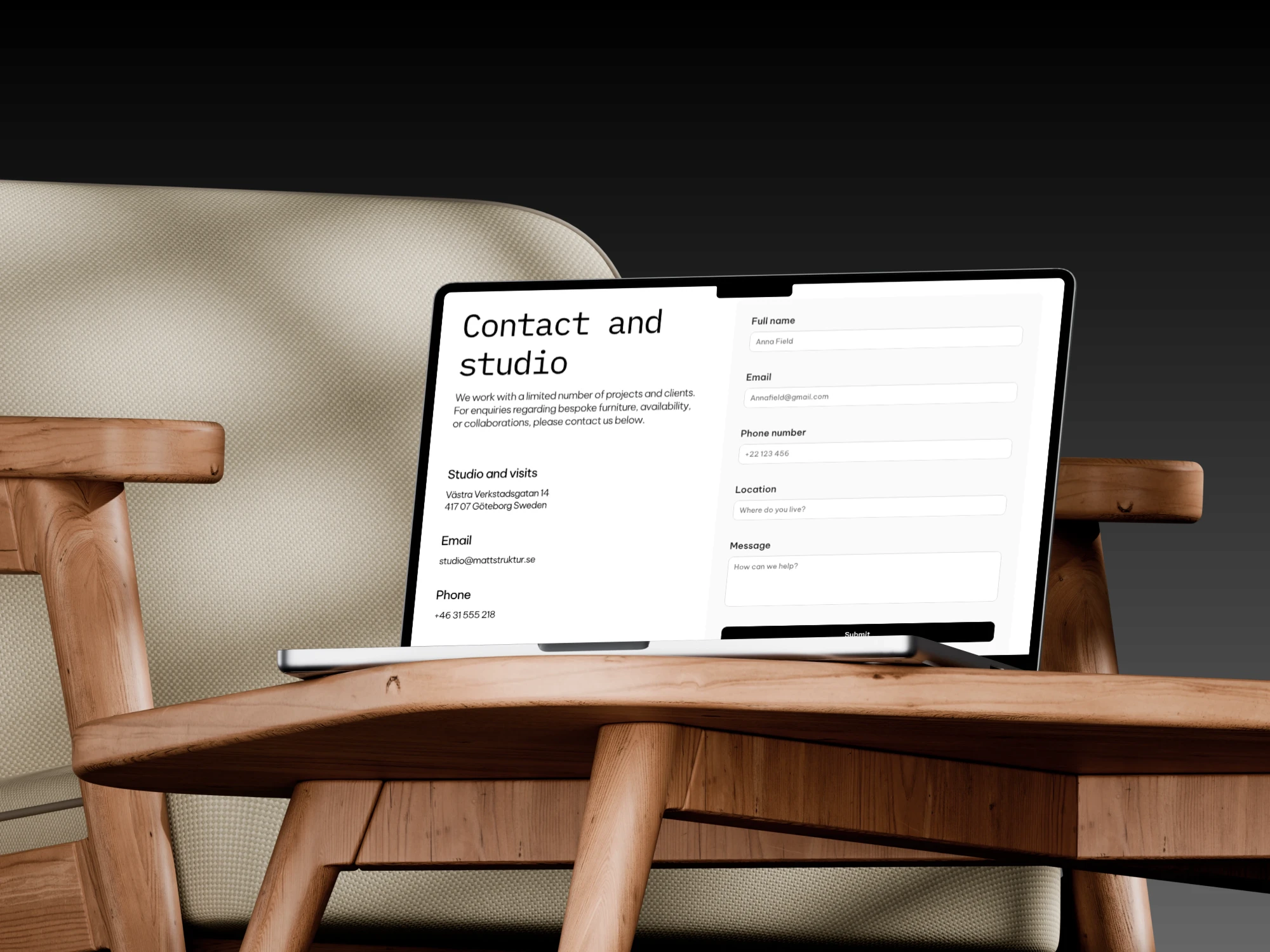
Subpage "Contact and studio" with option to fill the contact form.
Process
Low-fidelity IA and wireframes in Figma
Layout validation and spacing system
High-fidelity UI
Interactive prototype
Full build and responsive refinement in Framer
Working in Framer allowed fast iteration on spacing, motion, and responsive behavior before publishing.
Business Impact
Clear 3-category structure reduces cognitive load. Immediate CTA visibility shortens decision time. Visible pricing increases trust. Minimal but structured layout increases perceived exclusivity. For boutique brands, clarity combined with restraint supports higher perceived value and stronger inquiry intent.
Outcome
A premium, minimal furniture website that:
Feels curated and design-led
Avoids common luxury UX mistakes
Balances brand storytelling with buying clarity
Supports bespoke inquiries through structured contact flow
This project shows that strong UX structure can coexist with a visually dominant, minimal interface without sacrificing usability or business goals.
Like this project
Posted Feb 17, 2026
Minimal furniture designed for everyday use. Solid wood pieces made with care, honest materials, and timeless form. Built to last, made to live with.
Likes
2
Views
71


