Consumer Sales Analysis
Priya Dhari Singh
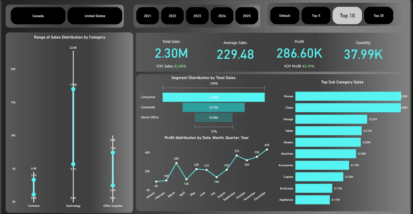
Customer Sales Dashboard:
The dashboard gives a detailed analysis of customer sales.
Card Visuals:
The cards provide an idea about the Total Sales, Average Sales, Profit & Quantity of products sold.
The Total Sales by the company is $2.30 Million & the percentage YOY Sales is 42.88%.
The Average Sales by the company is $229.48.
The Profit incurred by the company is $286.60 thous& & the YOY Profit recorded is 43.19%.
The Quantity sold is 37.99 thous&.
These cards are primarily affected by the country & year slicers located on the top of the dashboard. The Top N sales slicer does not this visual.
Box Plot:
The box plot shows the range of sales distribution in different category like furniture, technology & office supplies. The plot gives an idea that the highest sales is in technology segment, followed by office supplies & then the furniture. This l&s us to the conclusion that the inventory should have a greater number of items from the technology category, followed by the office supplies & then the furniture. This chart is affected by the Year & Country slicers present on the top.
Funnel Chart:
The funnel chart gives an idea about the segment distribution by total sales. The chart states that most of the consumers are buying product from the consumer segment & then the corporate segment followed by the home office. The total sales in the consumer segment are $1.6 Million, in corporate segment is $0.71Million & in the home office segment is $0.43 Million. It also gives an idea that the total sales in the home office segment are just 37% in comparison to the consumer segment. This chart is affected by the Year & Country slicers present on the top.
Line Chart:
The line chart gives us an idea about the profit with respect to the year, month, quarter & date. The graph gives us an idea that greater revenue & profit is generated towards the end of the year that is in the months of October, November & December. This chart is also affected by the Country & Year slicers on the top.
Column Chart:
The column chart shows Total Sales by sub category & is affected by the slicer Top N slicer on the top right corner. The default in the slicer gives us the value of the for all the sub category, top 10 gives us the value for the top 10 sub category by the total sales & the same way top 5 & top 20 are provide the required bars in the chart.
Like this project
Posted Mar 7, 2025
The dashboard provides a detailed analysis of the consumers purchasing behavior. The highlight is the top N filter which helps to find the top N sub category.
Likes
0
Views
0
Timeline
Dec 3, 2024 - Dec 5, 2024