Health Care Analysis
Priya Dhari Singh
This dashboard tells us about the operations of the hospital & that of the patients. The first page of the dashboard talks about the patients while the second page is about diagnosis & revenue generated. The dashboard also has a special flip able card. Additionally the two icons on the top can be used to l& on the different sheets of the dashboard.
Card:
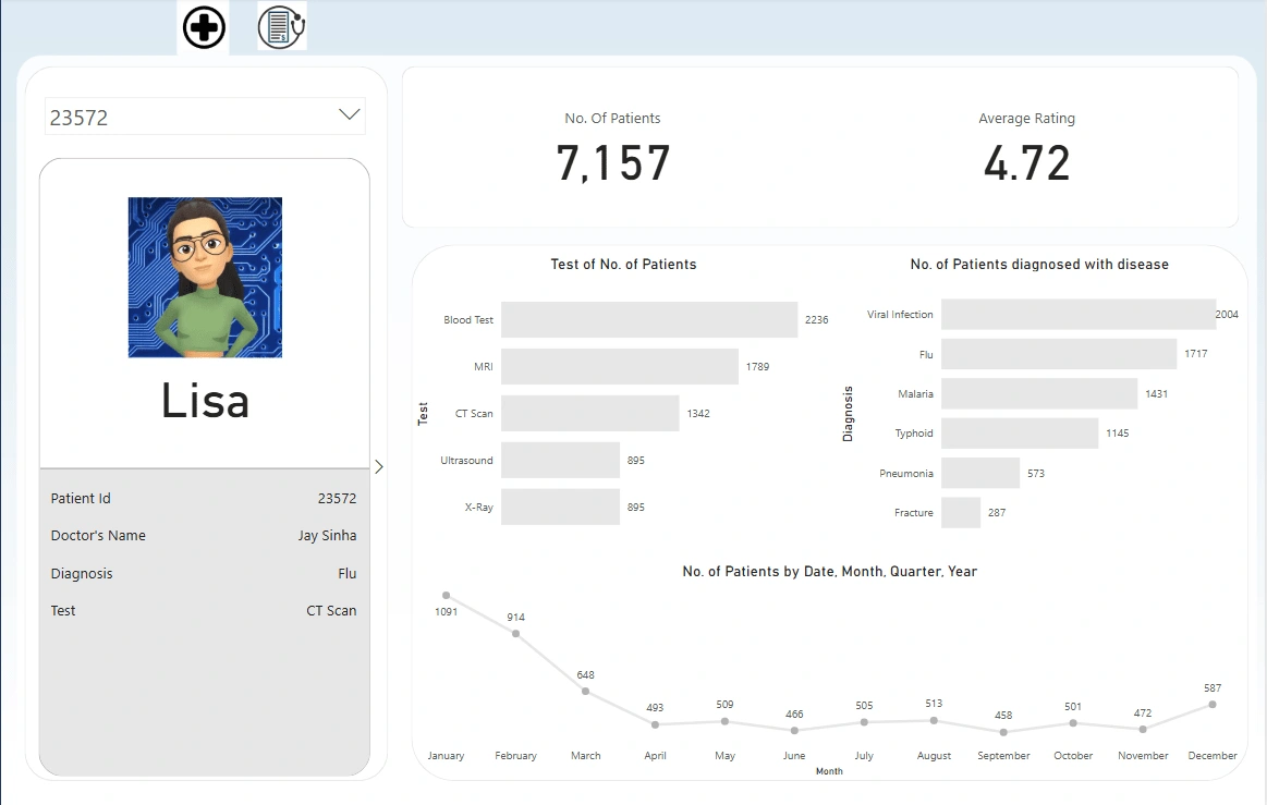
The card gives us an idea about the number of patients coming to the hospital & the average feedback left by them.
The total number of patients received by the hospital is 7157.
The average rating given to the hospital is 4.72.
Flip able card:
The flip able card is of great importance as the first page of the card has the patient picture with their name. Additionally, this page also talks about the patients id, Doctor Name, the disease patient is diagnosed with & the tests patient has gone through.
On flipping the card we get to know additional alongside private information of the patients. This side of the card talks about the date the patient was admitted, the day they were discharged & the next time the doctor has asked them to come that is the follow up date. It also gives & idea about the bed occupancy. Private information like billing amount & health insurance amount are provided. The feedback given by the patient for the services rendered is also mentioned.
This card is affected by the filter above it which filters & provides data with respect to the patient id.
Column Charts:
The first column chart gives an idea about the number of patients undergoing a particular test. Most number of patients undergo blood test. Hence efficient blood testing labs should be set up in the hospital. The other popular tests are MRI & CT scans whereas least prescribed tests are Ultrasound & X-Ray.
The second column chart tells us about the number of patients diagnosed with a particular disease. This graph narrated that there are a greater number of patients of viral infection & flu coming to the hospital. They are followed by malaria, typhoid & pneumonia patients. There are few patients reporting fracture who also visit the hospital.
Line Chart:
The line chart talks about the number of patients received by the hospital on a particular date, month , quarte or year. Talking about the number of patients coming to the hospital on the basis of the month we can state that the hospital receives considerably large number of patients in the month of January, February & March in comparison to any other month. This could be due to the fact that winters results in more viral infections or flu as a result of which there are more number of patients.
A more detailed analysis of this could be found on the diagnosis page. It clearly states that viral infections, flu, malaria & typhoid are a bigger reason for increase in the number of patients in the months of January, February & March. It is obviously due to the change of weather to the winter season. However, fracture & pneumonia do not have any impact with respect to what month of the year is it. They remain unchanged.
Column Chart:
The column chart tells us about the billing amount with respect to the date. Since there are more number of patients in the month of January, February & March, thus the billing amount is more.
Bar Chart:
The bar chart emphasizes on the fact that more amount of money is generated to the hospital by viral infection & flu. This is due to the fact that there are more number of patients of viral infection & flu in comparison to any other disease diagnosed.
Like this project
Posted Mar 7, 2025
This dashboard showcases a analysis of the hospital. It contains a special flip able card containing detailed analysis of about the patient.
Likes
0
Views
0
Timeline
Dec 23, 2024 - Dec 26, 2024