Unifying Table Component Experiences across Tokopedia
👀 Overview
Table literally everywhere, from buyer transaction list to seller analytic dashboard. But these tables stand on their own. No consistency, no standardization. Check out how we standardize and cover from the most simple usages to the most complex and advanced uses of the table.
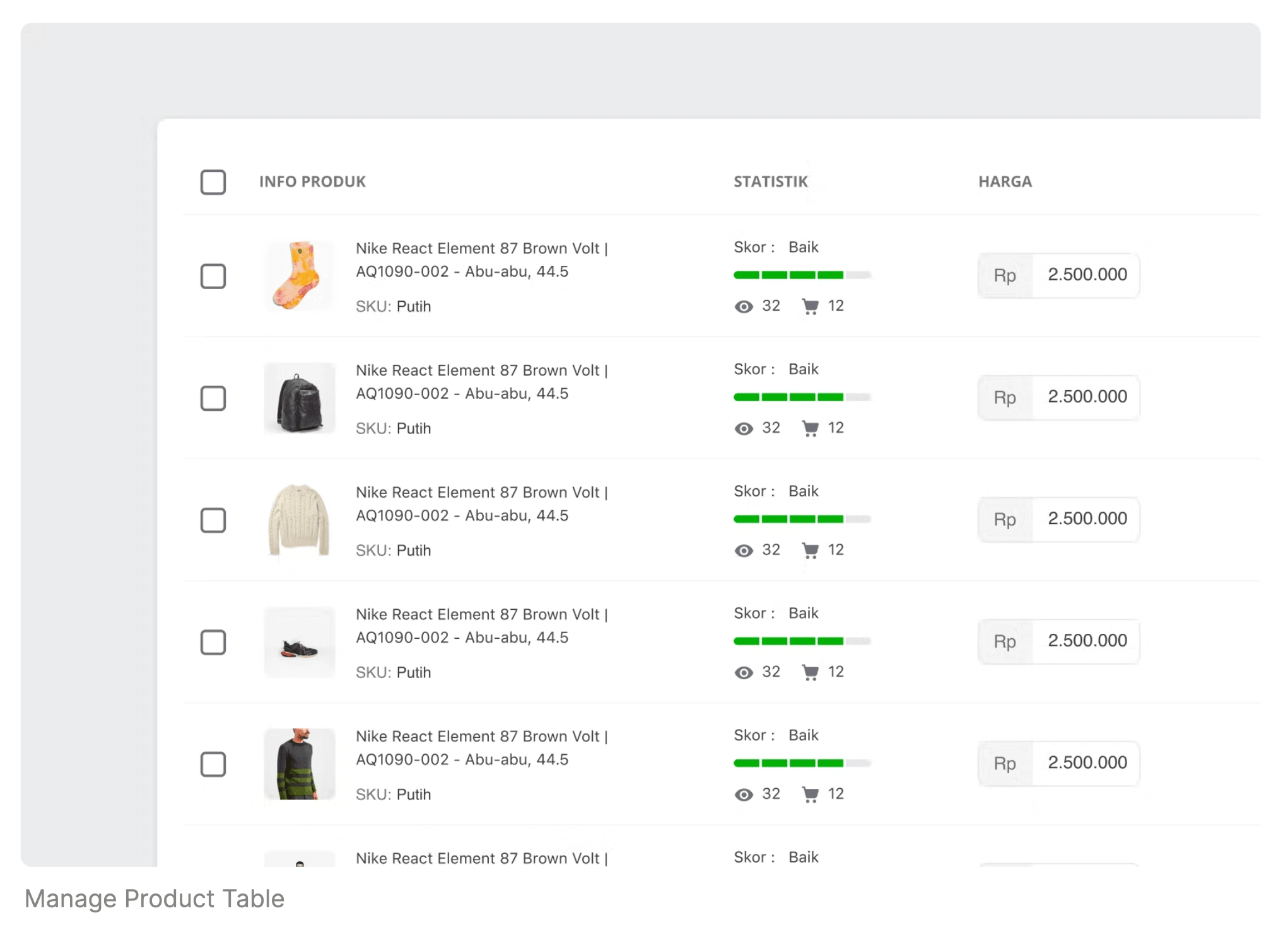
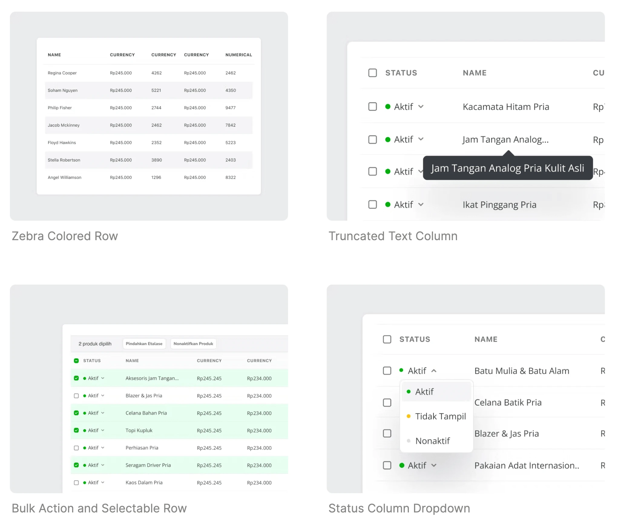
Background: The need for standardization
This initiation was triggered when I worked on one of my projects in my Tribe TopAds. To put it simply, TopAds is an in-app advertising platform that allows sellers to advertise their products across Tokopedia pages.
😵 The trickiness of maintaining pixel perfect complex table system
I was redesigning the main dashboard analytics for seller ads. I spent hours clicking and dragging to make the UI pixel-perfect. Until the point when fed up with this and realize why we don't have any table components in our design system.
😡 Component inconsistency across Tokopedia’s pages
To validate my concern, I take a look at our platform from the buyer’s side to the seller's side. All of our tables look different. The structures, the colors, and the interactions — are all built differently.
🤖 The ineffective development time
I talked with the developers on my team. They said they built it from scratch because there is no shared library on their side. What they do currently is by using a starter code and manually customizing it along the way. But the issue is, different teams are using different starter codes.
⌛️ The high learning curve for users on each encounter
In a special case like my seller’s ads analytic dashboard, the table component could be very complicated. There are many actions and information that could be laid out for it. And TopAds is not the only one that has a complex table in it. This inconsistency could be resulting high learning curves for Tokopedia buyers and sellers.
📆 Planning the roadmap, checkpoints, and assignments.
We gathered all the designers from all tribes who have/use tables in their designs. We set up a slack channel as the main communication channel and initiate the first kick-off call. In this project was in charge as Coordinator along with my colleague Viny Dwi. From the meetings we agreed on how the project will be done in this particular timeline:
→ Kick-off meeting → Case Gathering → Context Mapping → Ideation → Voting → Documentation → Support and Socialize → Track and Measure
2 platforms, 9 products, 12 table types
As the starting exercises, we were collecting all of the tables that were displayed in Tokopedia. This includes the Tokopedia buyer's side to the seller’s side. The result was surprisingly predictable.
We have so many inconsistencies in our tables across our platforms. We also found that tables are used differently in different places. This expands our understanding of the table component.
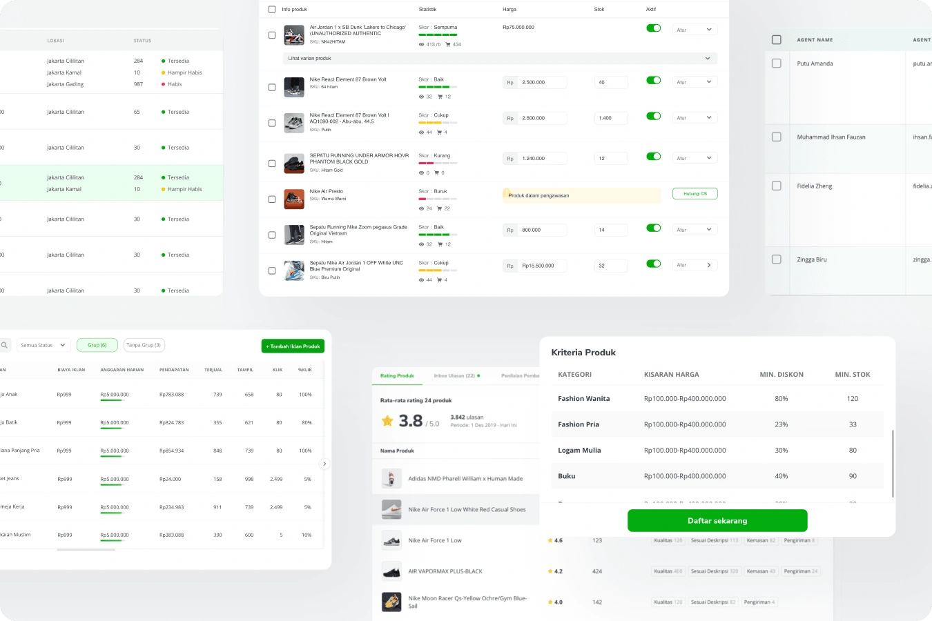
Before we jumped to the design phase, we all aligned to our two core principles of how our table will be.
🎨 A Guideline that Helps and not Limiting Creativity
Many of us felt insecure when it comes to creating guidelines—that it will limit our exploration and slow down the process. But that is not our goal. The goal is to speed up and be the building blocks of our innovations.
⚙️ Customizable and Efficient in Covering Complex Cases
Our guidelines will be customizable and scalable. We cover all cases from the simplest usage of tables to the most complex and powerful usage of tables.
And to solve this project productively and collaboratively, I defined an approach to how we will tackle each task.
🫁 Table Anatomy -> 🧩 State & Variant -> 🧠 Ideation
We will run through each approach in the next section
🫁 Table Anatomy: Dissecting Tables to Bitesized Sections
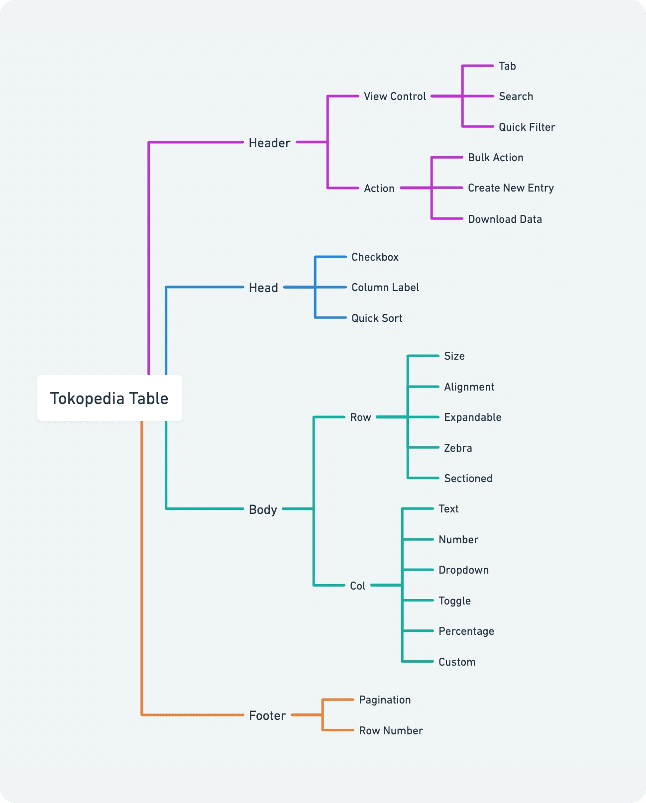
In our case gathering, I found a pattern that all the tables have and I believe this pattern can be a foundation for how we can modularize our table components. I called this pattern table Anatomy. Each of these tables could contain four parts:
a Header, a Table Head, a Table Body, and a Table Footer.
Not gonna lie, this anatomy definition is highly influenced by how tables run in code.
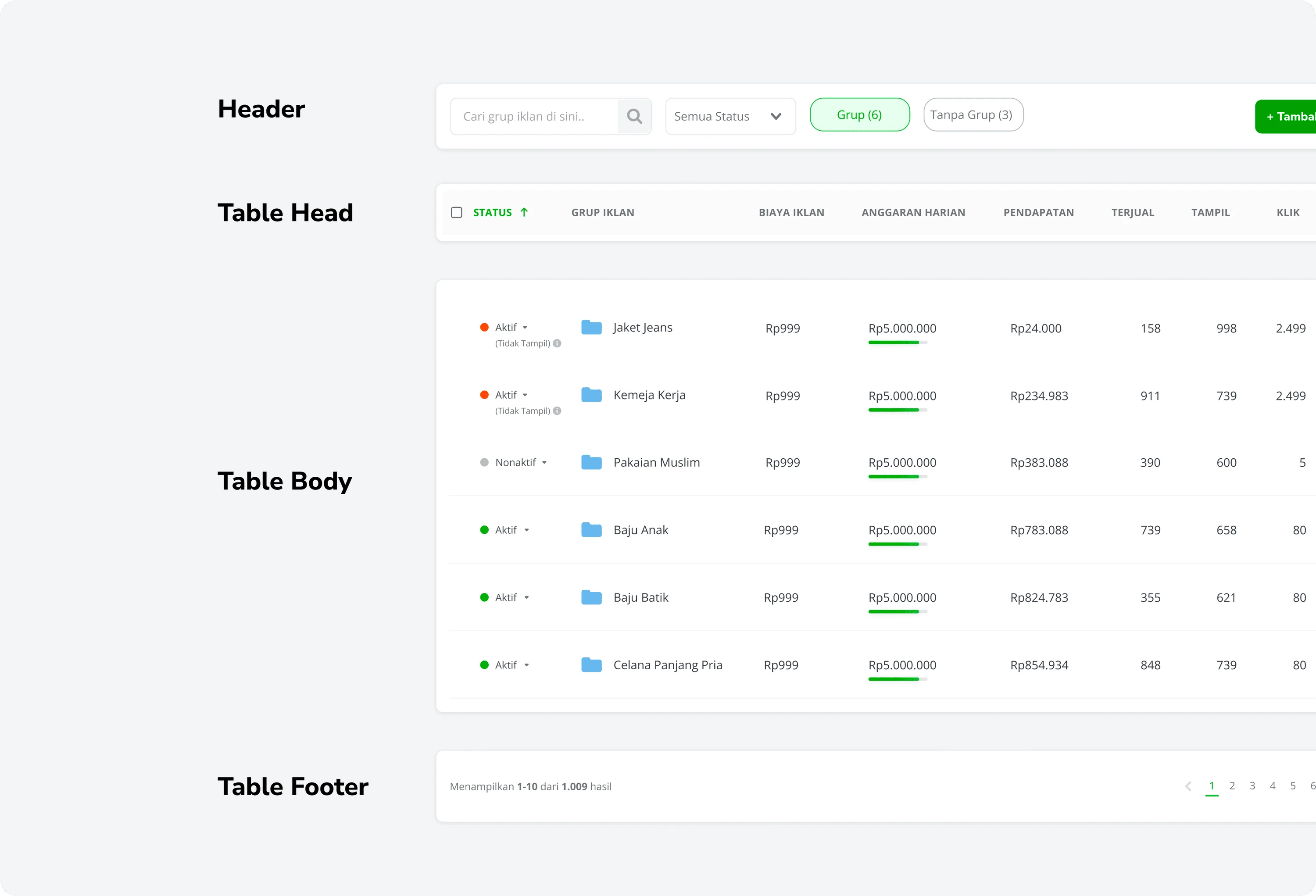
Header
Containing two-part Table View Controls and Table Actions.
Table view controls are all the functionalities that control how the table is presented.
Table actions are where all actions that we can do to the data set group together.
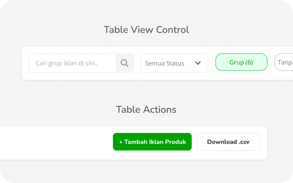
Table Head
It mostly contains info labels for each column below it. These not only serve as labels these labels also could be quick actions on how we want to sort the rows.
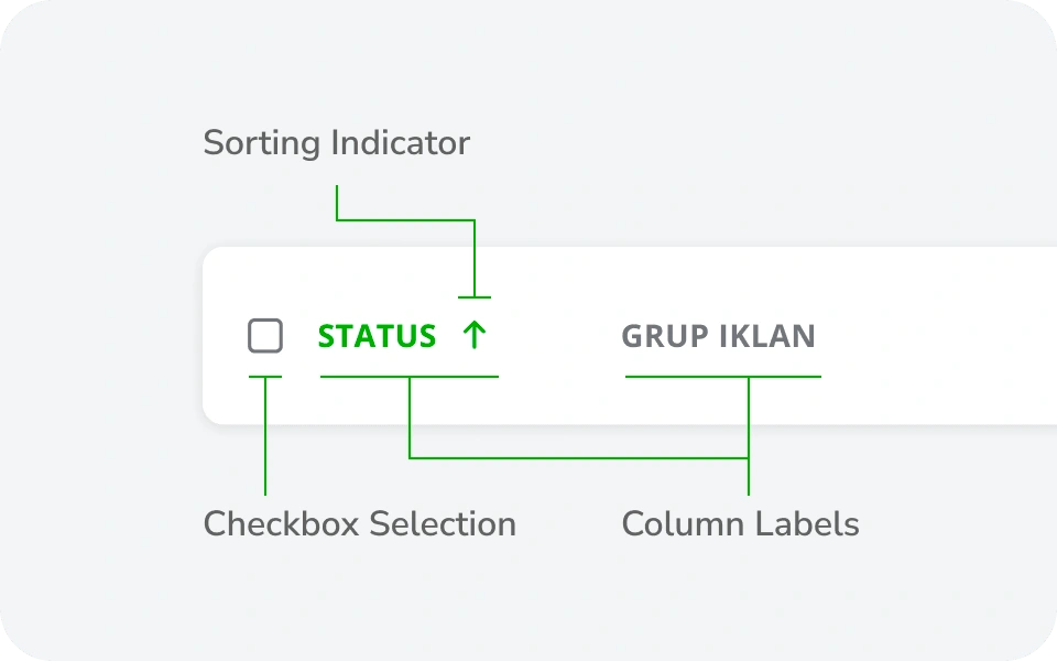
Table Body
It where all the information laid out. A table is containing multiple rows. Each row will contain multiple columns.
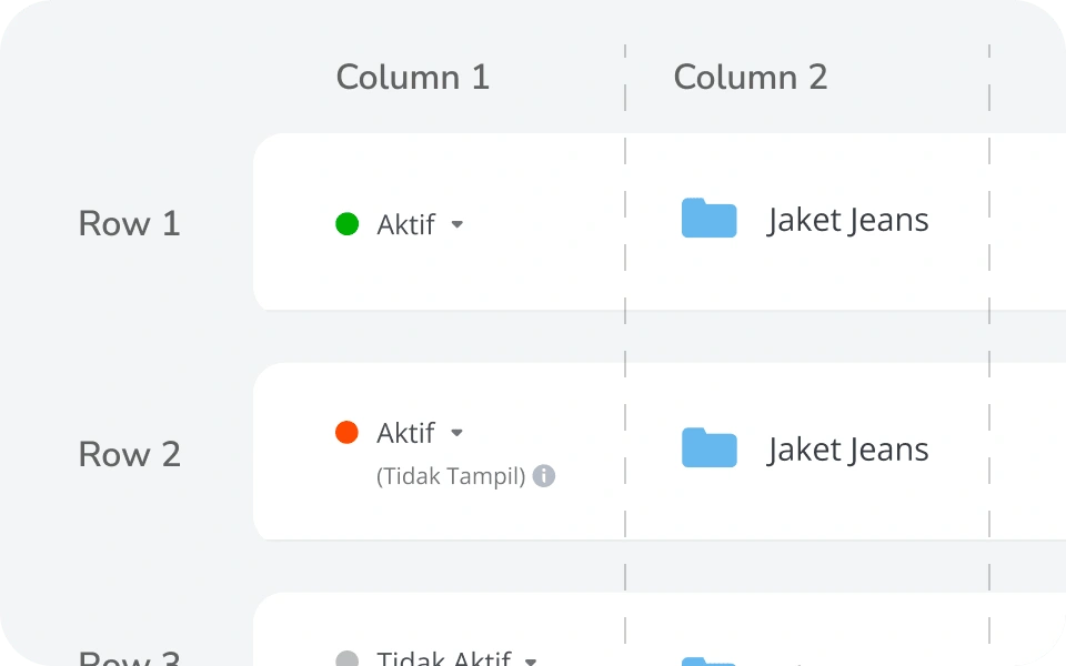
Table Footer
The footer is for table navigation. Most common navigation like pagination, and row number control is located at the footer.
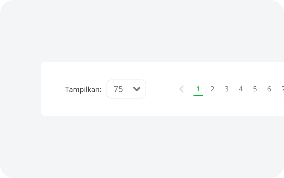
🧩 State & Variant: Breaking down the Component States and Variant
For each component in the table anatomy, we break it down into states that are needed by our cases around Tokopedia. For example, in our Row Component in the Table Body will have several variants like Compact Size, Default Size, or Relaxed Size.
Inside that Row, there will be Column Component to show the table data. Depending on what data type needs to be present, we created several common components like numbers, text, dropdown, toggle, avatar, product, etc.
🧠 Ideation: Asynchronous Design Ideation and Iteration
After the assignments are clear, we split all the designers that joined this working group into several groups with 2-3 designers each.
Each group will be assigned a specific task for a specific component variant. We all run asynchronously with weekly check-in to review our progress.
The output of this approach is a solution proposal for the assigned variant.
👉 Vote for the Future of Tokopedia’s Table
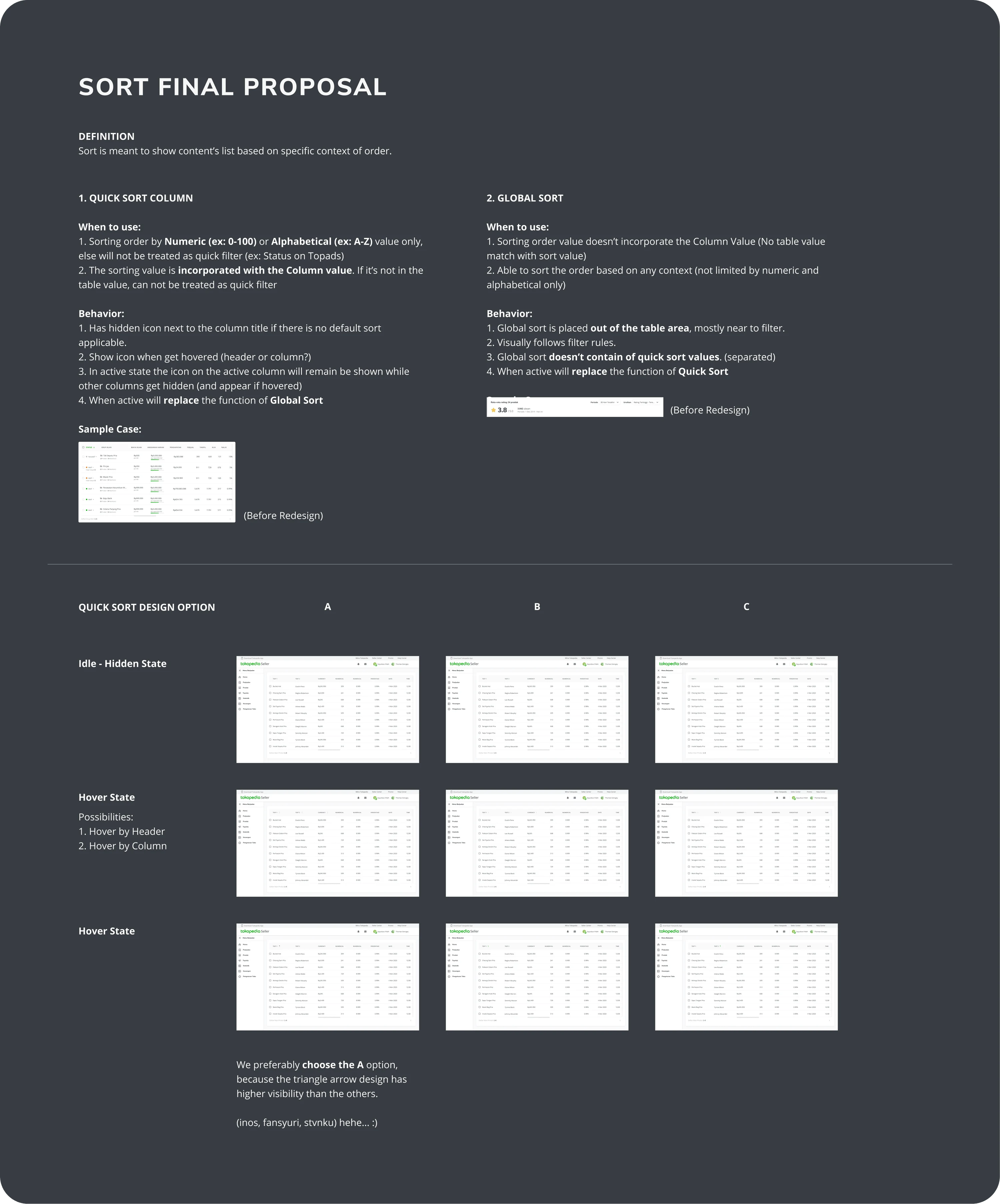
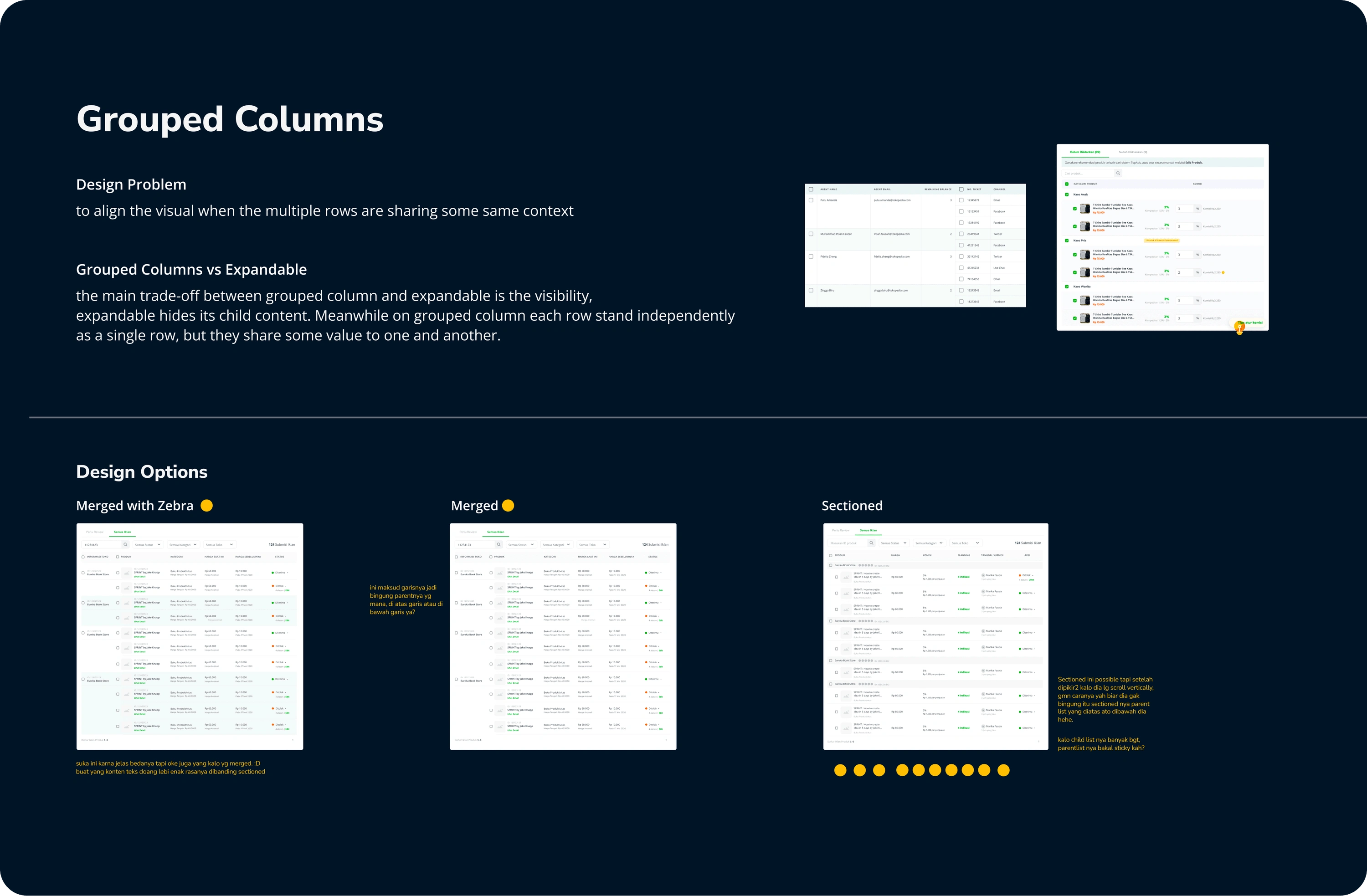
On the assigned deadlines, each team will present its design for its assigned task to the forum. Most of the team come up with several options. We run through each design one by one and allocate 3 minutes for each design to be voted by all teams.
🗂 Documentation: Polishing the Final Design and Creating Component Guidelines
After the proposals are voted on, this is my turn to summarize and collect all the final solutions. We also defined how to use and what to consider in using each component variant and type.
📏 Measure: Tracking Adoption and Satisfaction with the module
After the component release for design teams, we socialize them to use the component library for their ongoing and next project. Also, visit the table component guidelines.
While doing that, we also measure these metrics in the first 3 months after the introduction. And the results are:
💠 ±80% Adoption Rate
Around 80% of the 12 existing tables have already been recreated using the new table component. While the new project always uses this new component.
⭐️ 4.82 Satisfaction Score
The new guideline achieves a 4.82 out of 5 for ease and satisfaction scores from all designers who use it.
Those results mark the finish line of the current project.
While we still keep an eye on the designers’ needs and will improve or scale the guideline and the component whenever it’s needed in the future!
Like this project
Posted Jan 20, 2023
Table literally everywhere, from buyer transaction list to seller analytic dashboard. But these tables stand on their own. No consistency, no standardization. C

