
Brief
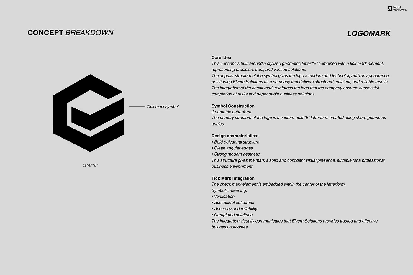
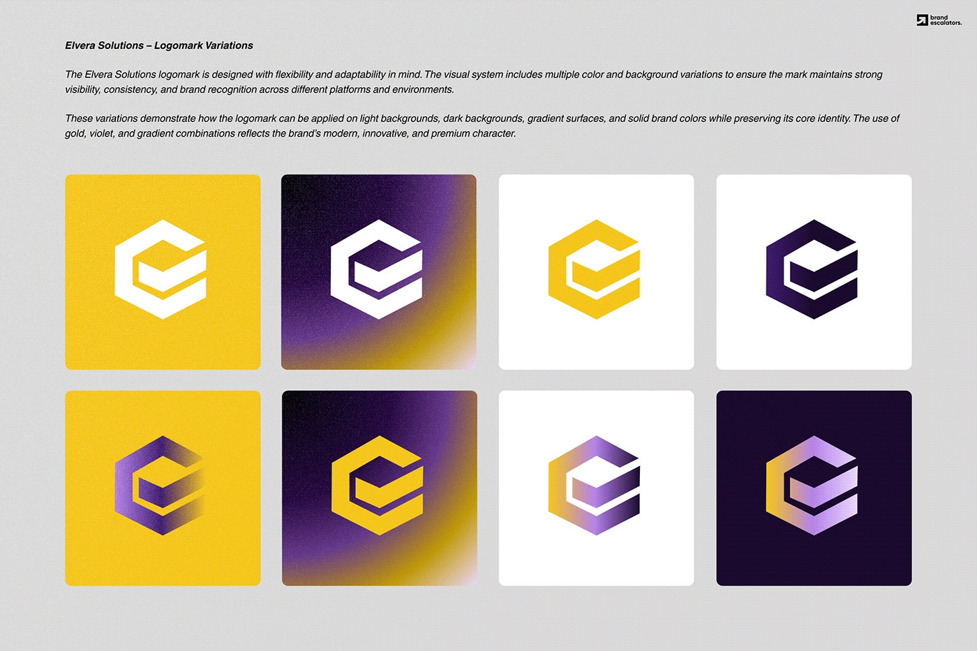
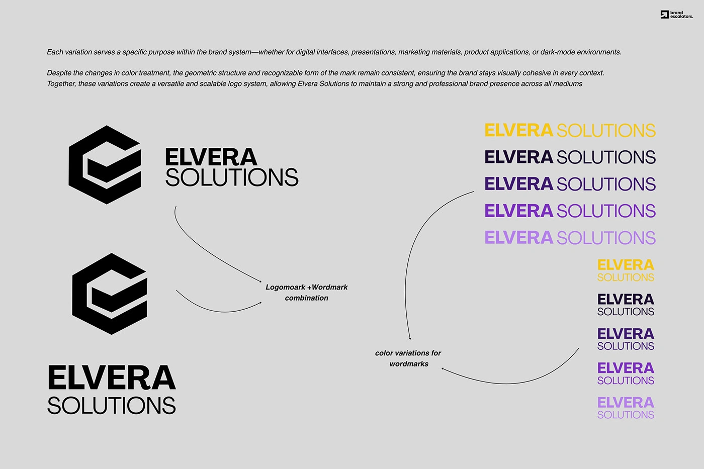
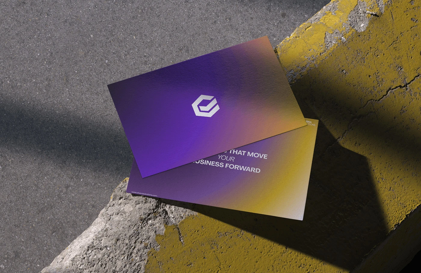
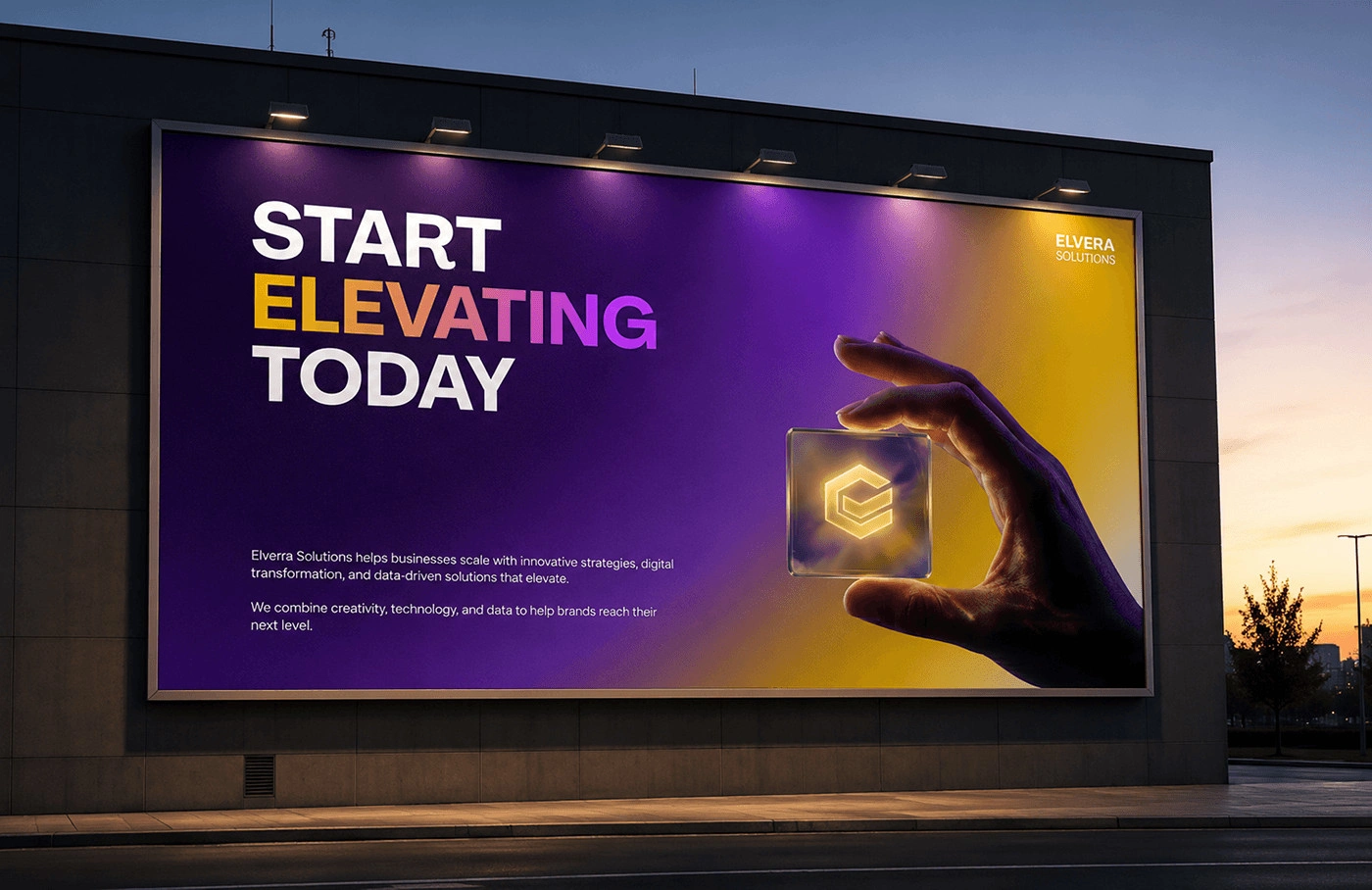
Elvera Solutions is a digital consulting firm. Their brief was specific: an E combined with a tick. The risk was that a literal idea ends up looking like clip-art.
Approach
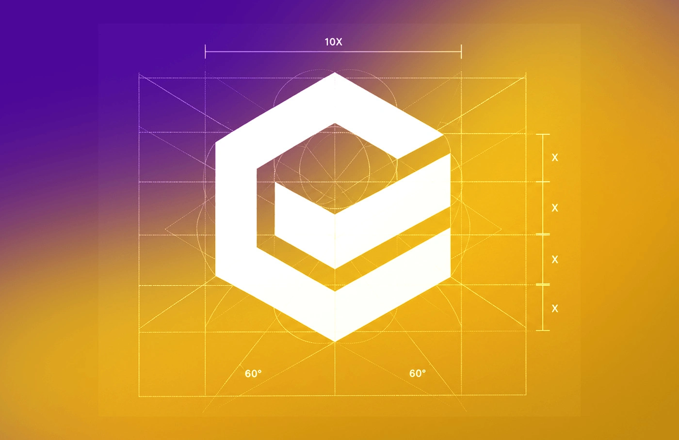
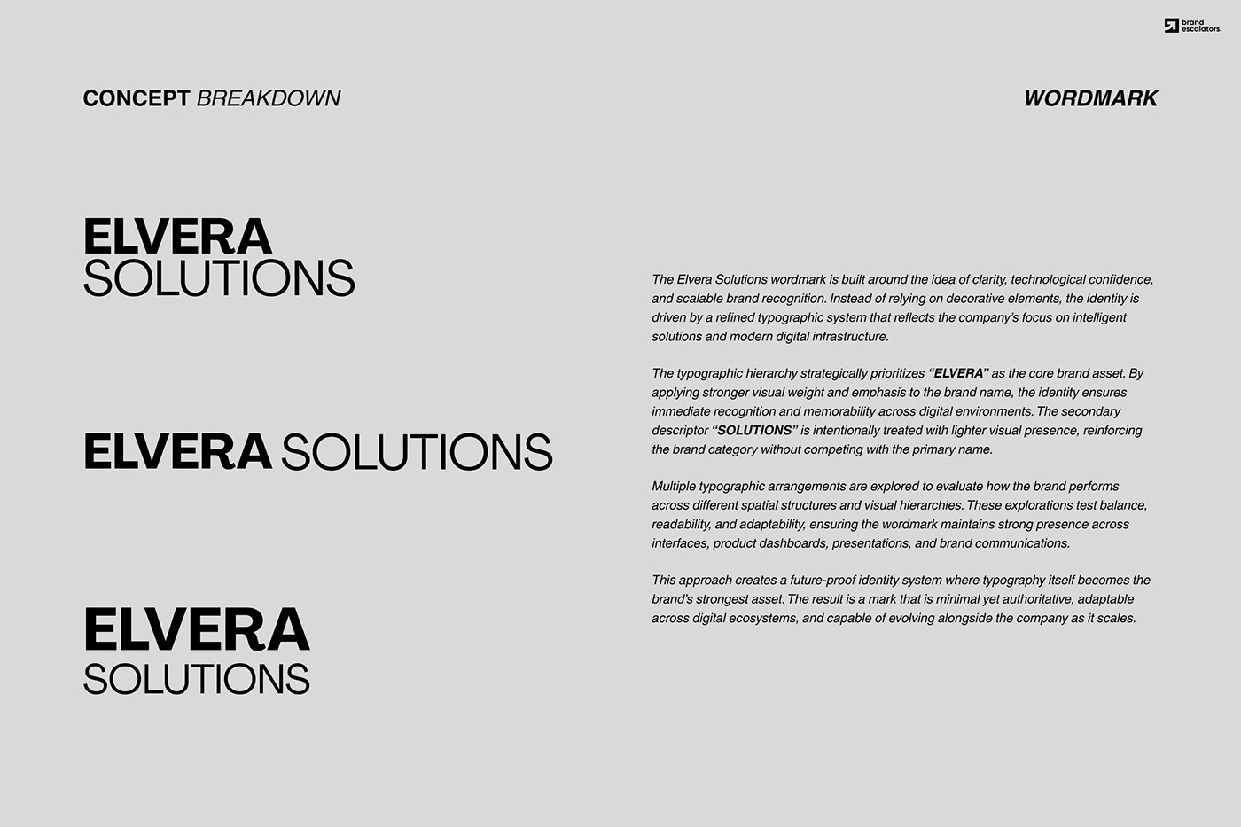
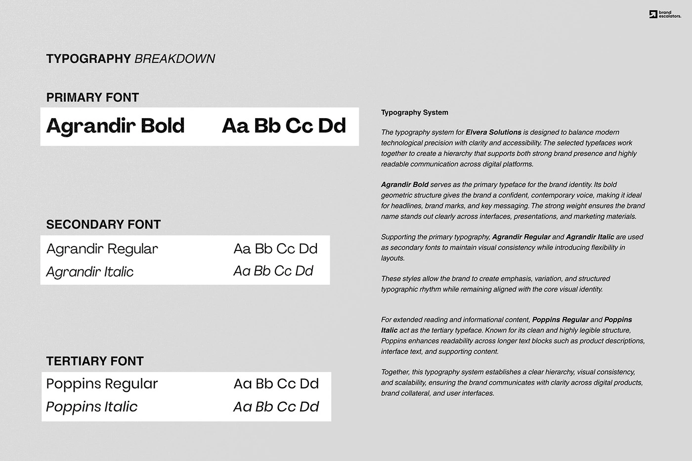
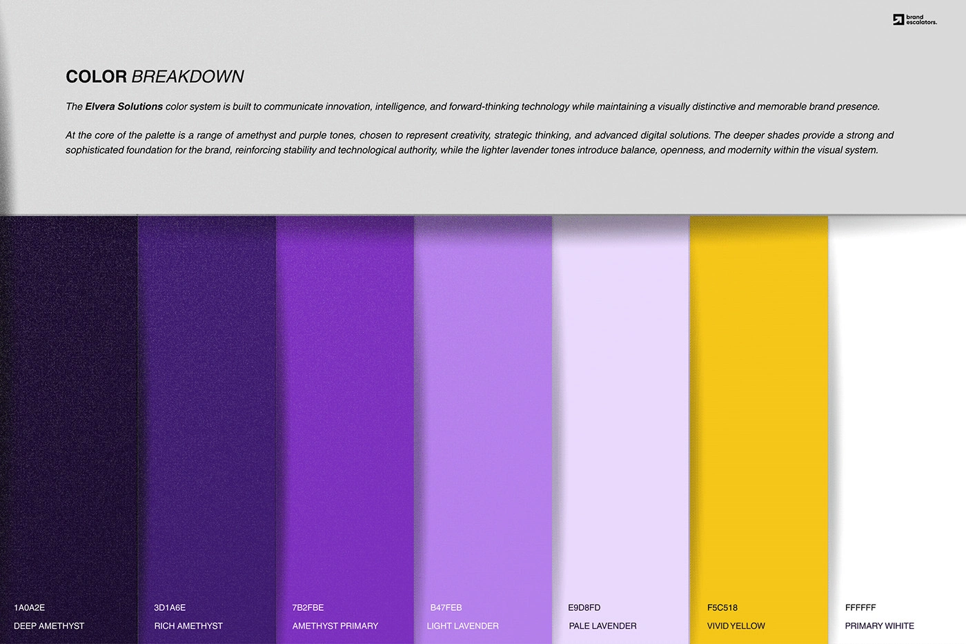
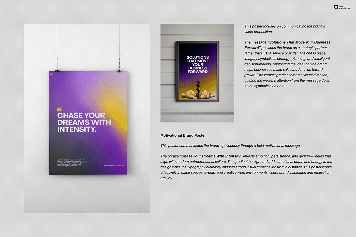
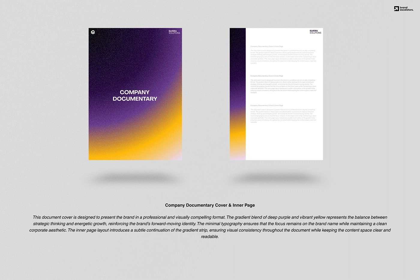
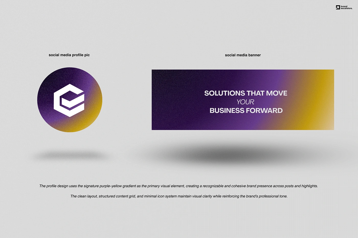
I built the mark on a 60° hex grid, so the E and the tick share the same angles and stroke logic. That geometry is what makes a simple idea read precise and premium. Typography and a restrained palette keep the mark the hero.



Outcome
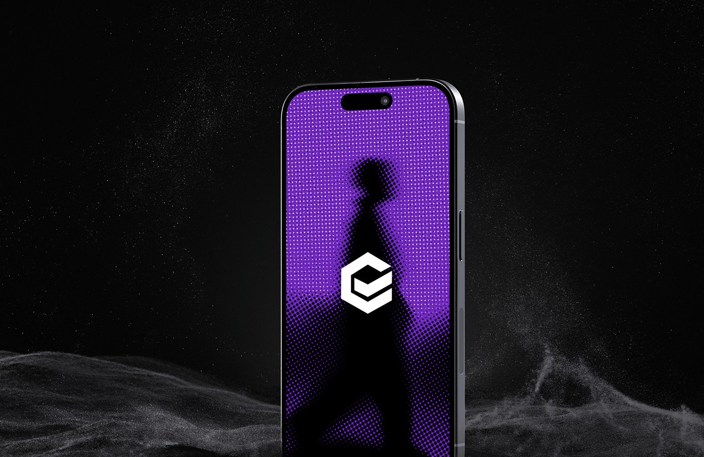
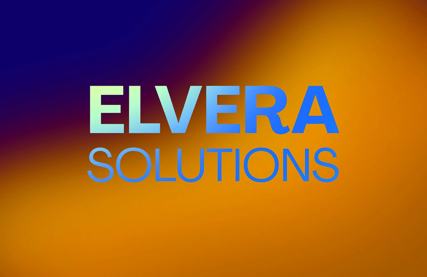
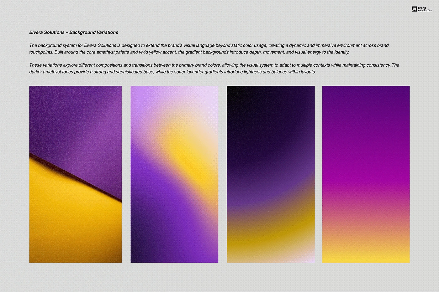
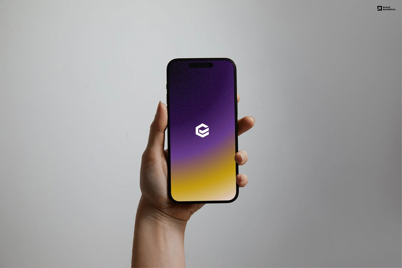
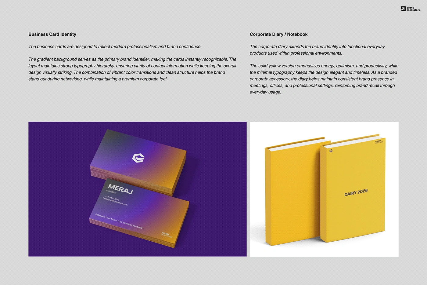
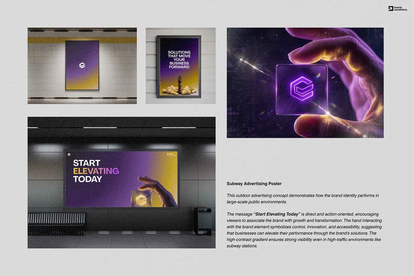
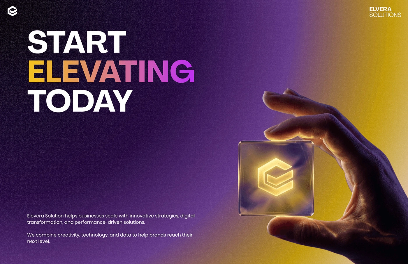
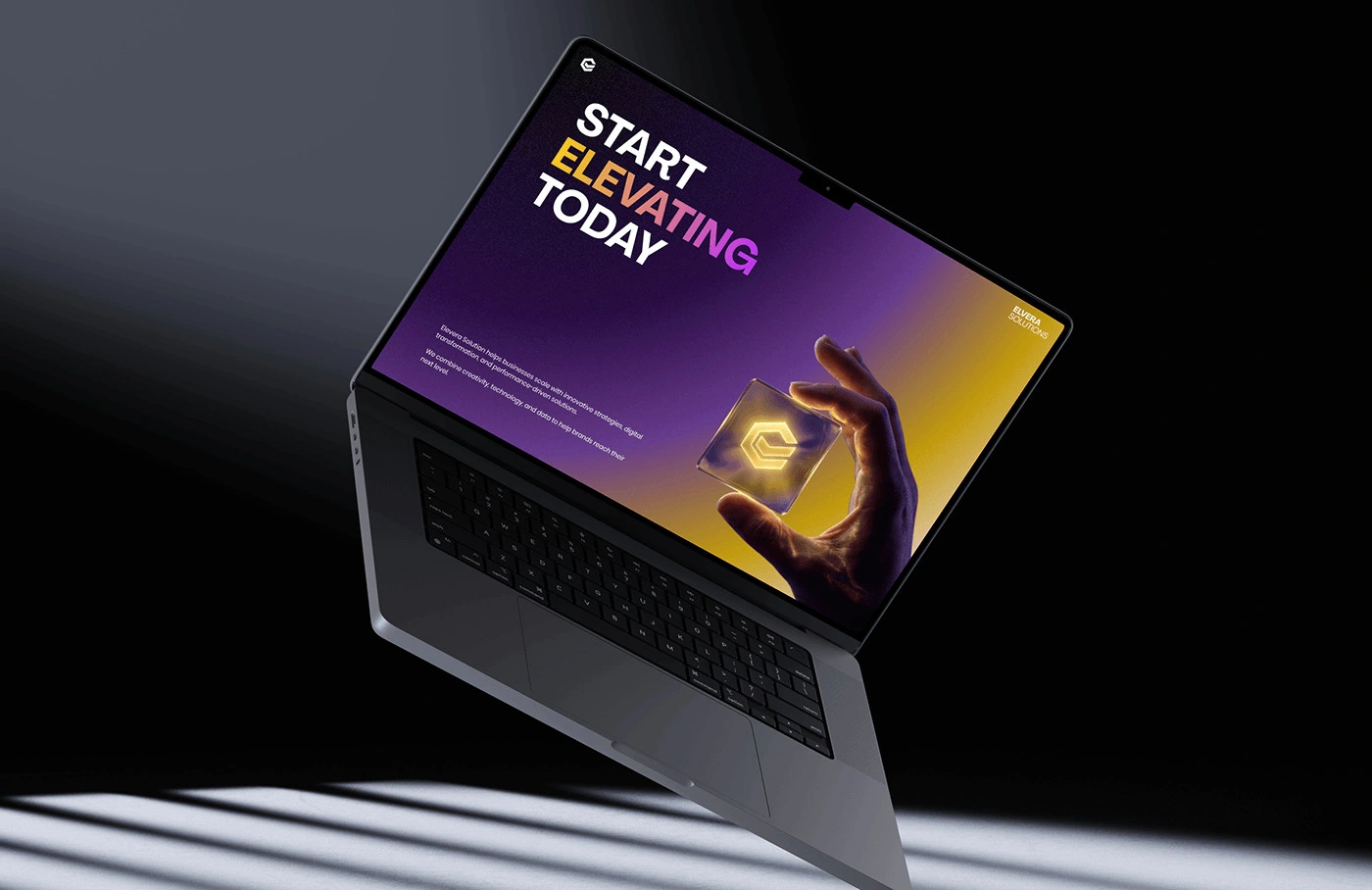
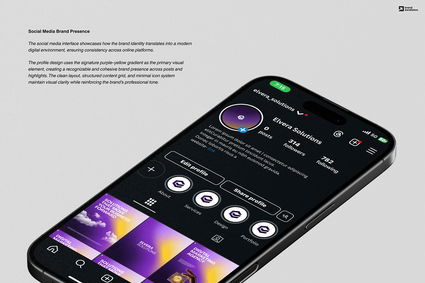
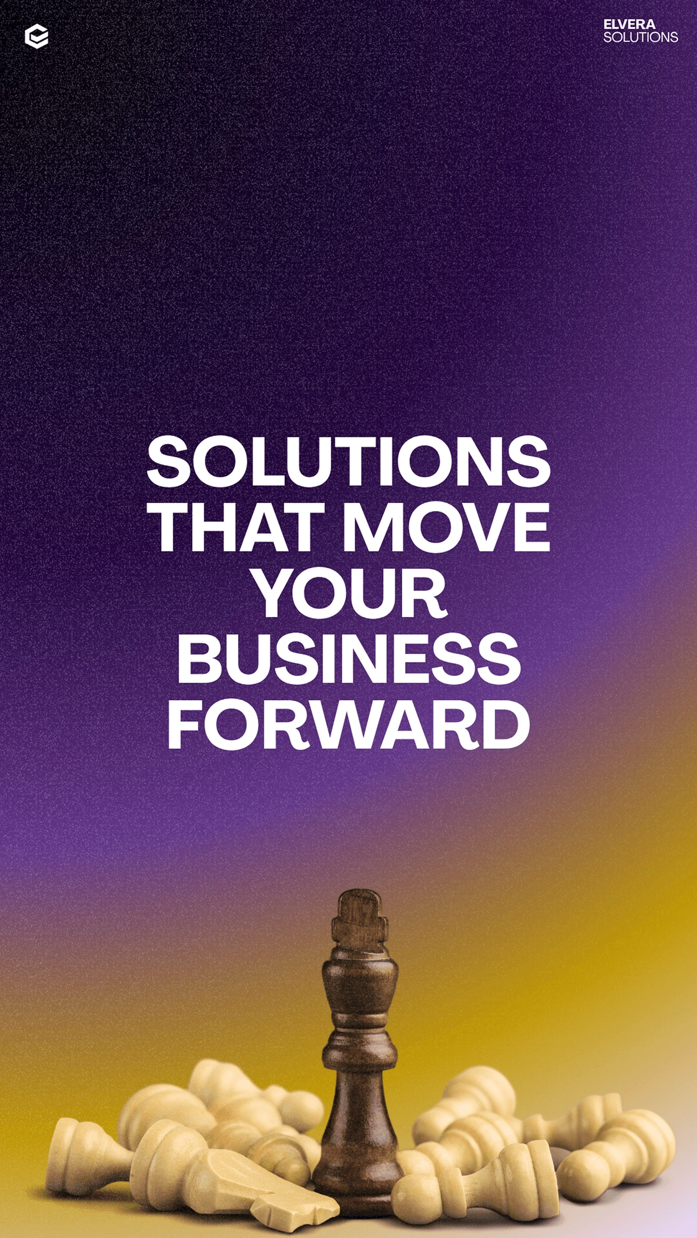
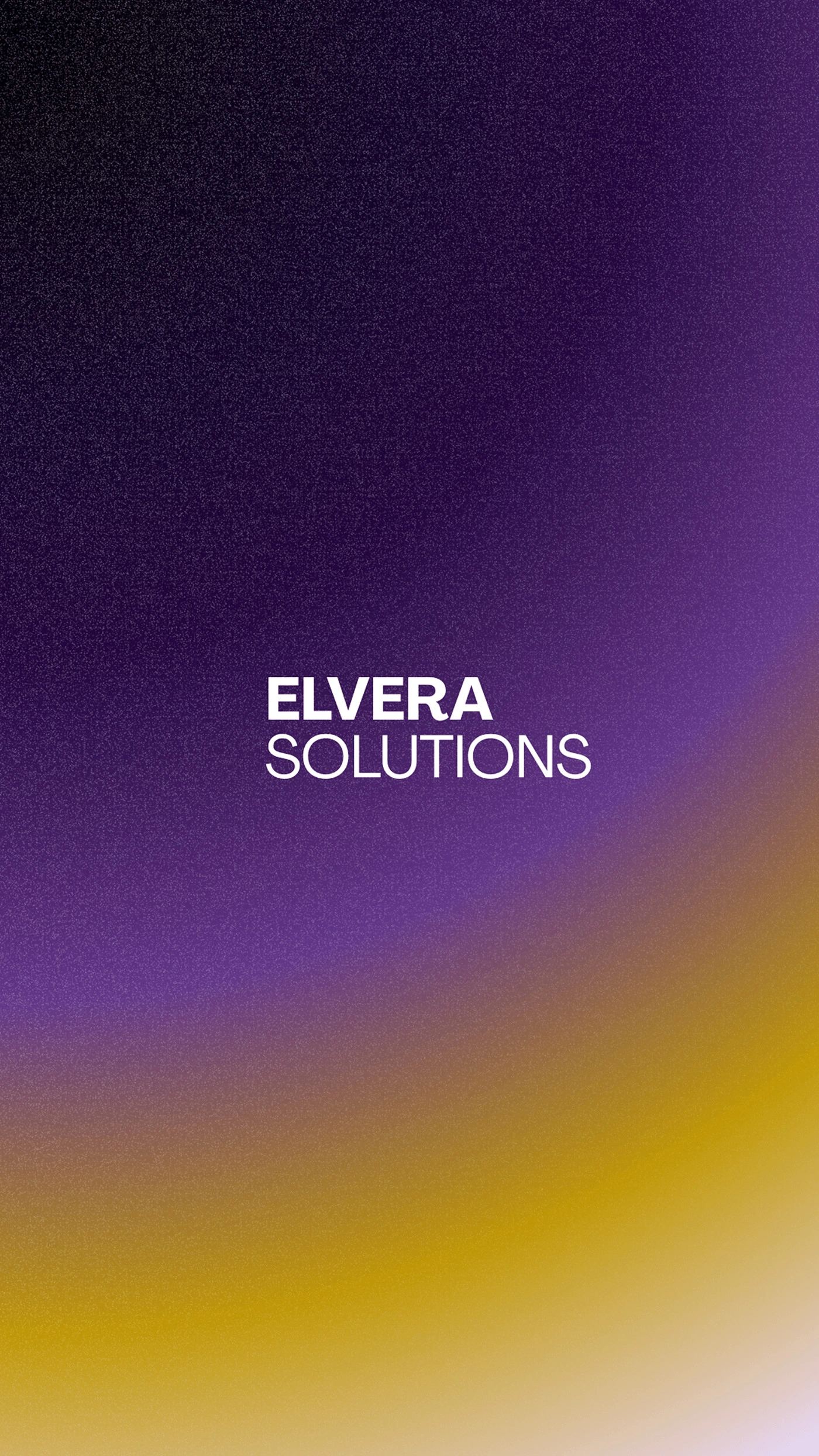
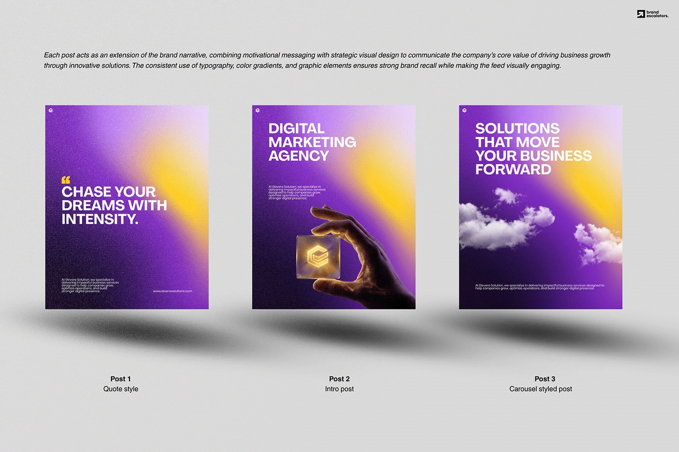
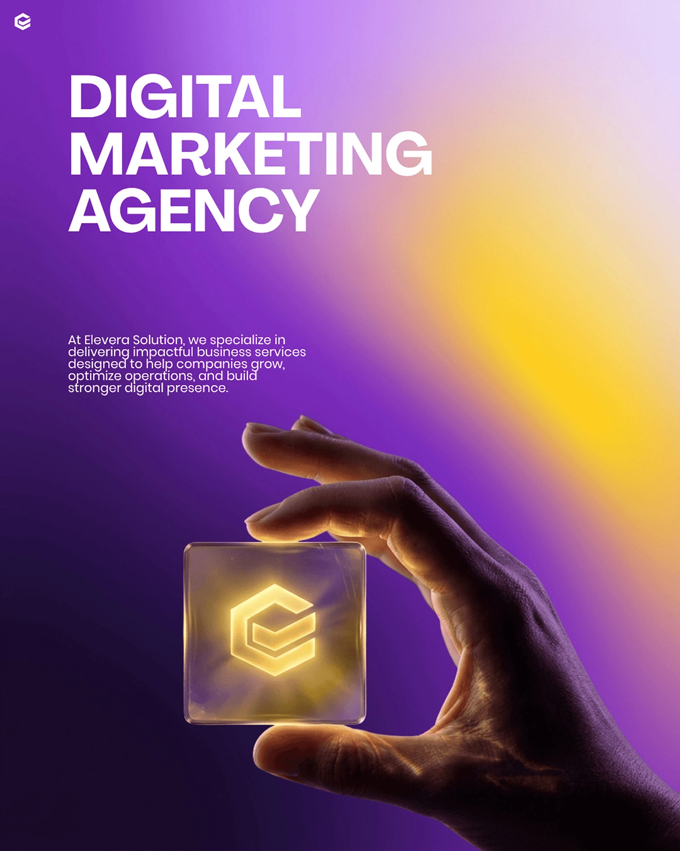
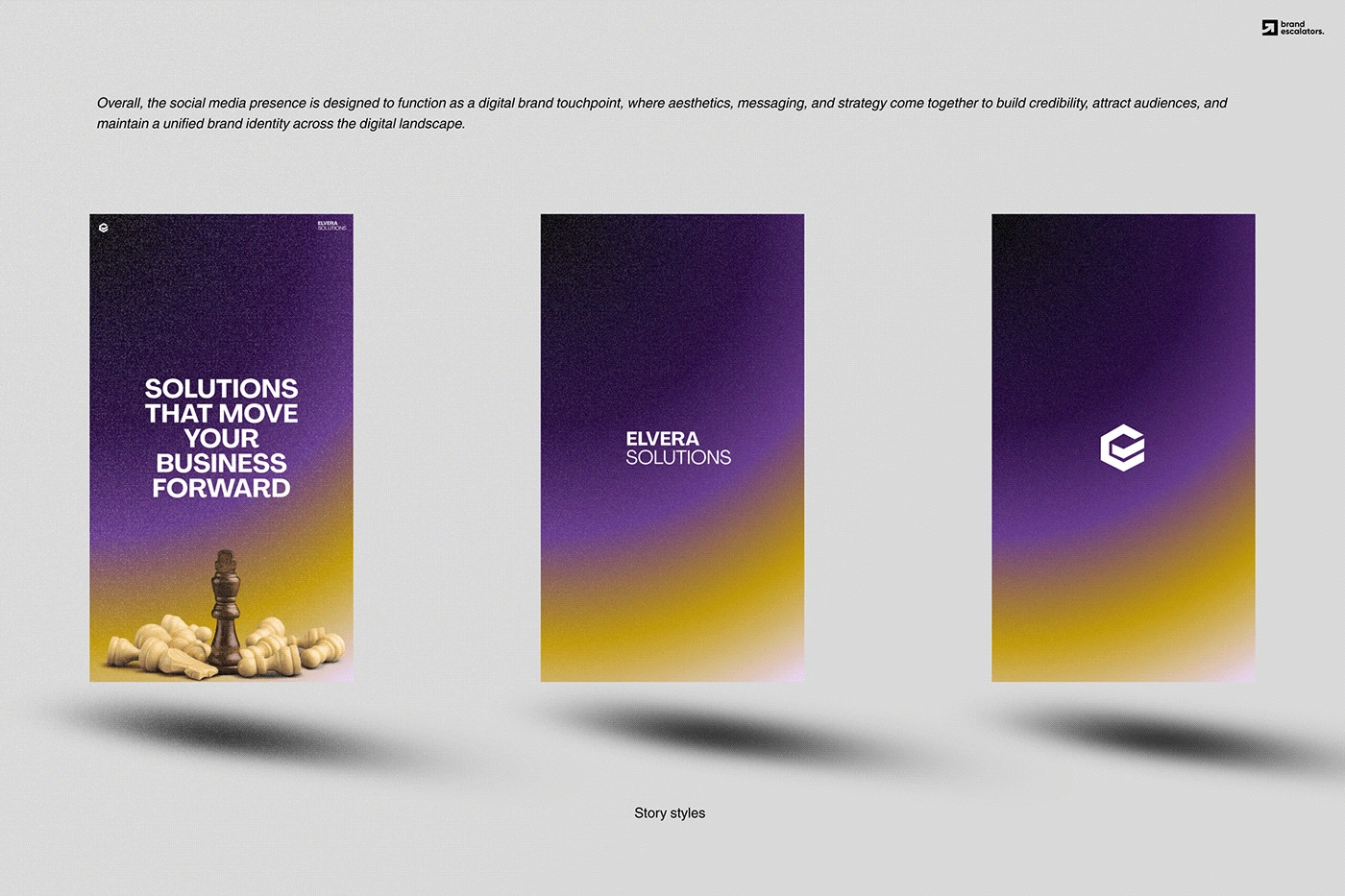
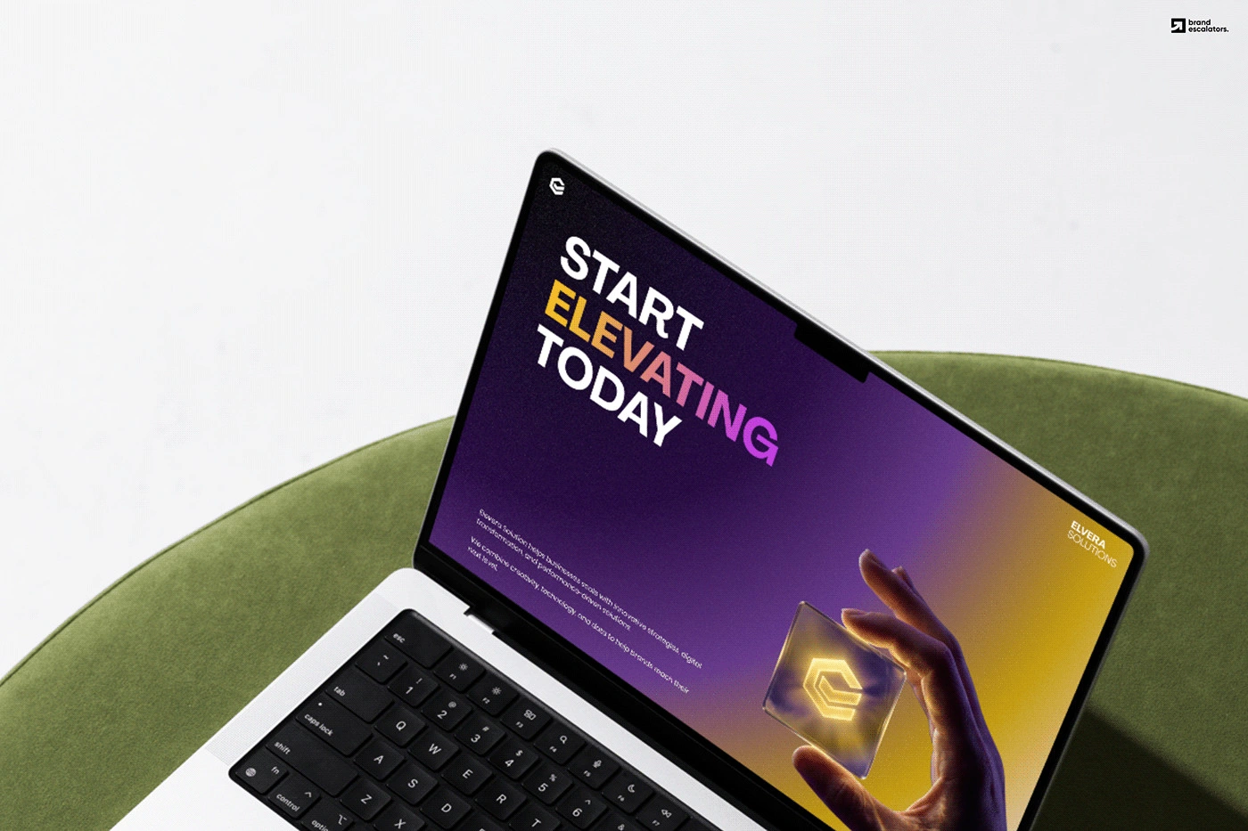
Final logo, colour and type system, plus the brand carried into their website and Instagram content system, which I also designed.
0 likes · 4 views · Sep 29, 2026
Identity for a digital consulting firm. The brief: an E with a tick. I built it on a 60° hex grid so a literal idea reads precise and premium, not clip-art.

