NERA Skincare — Brand Identity & Packaging (Concept)

RAGHAVENDRA NAIK


Brief
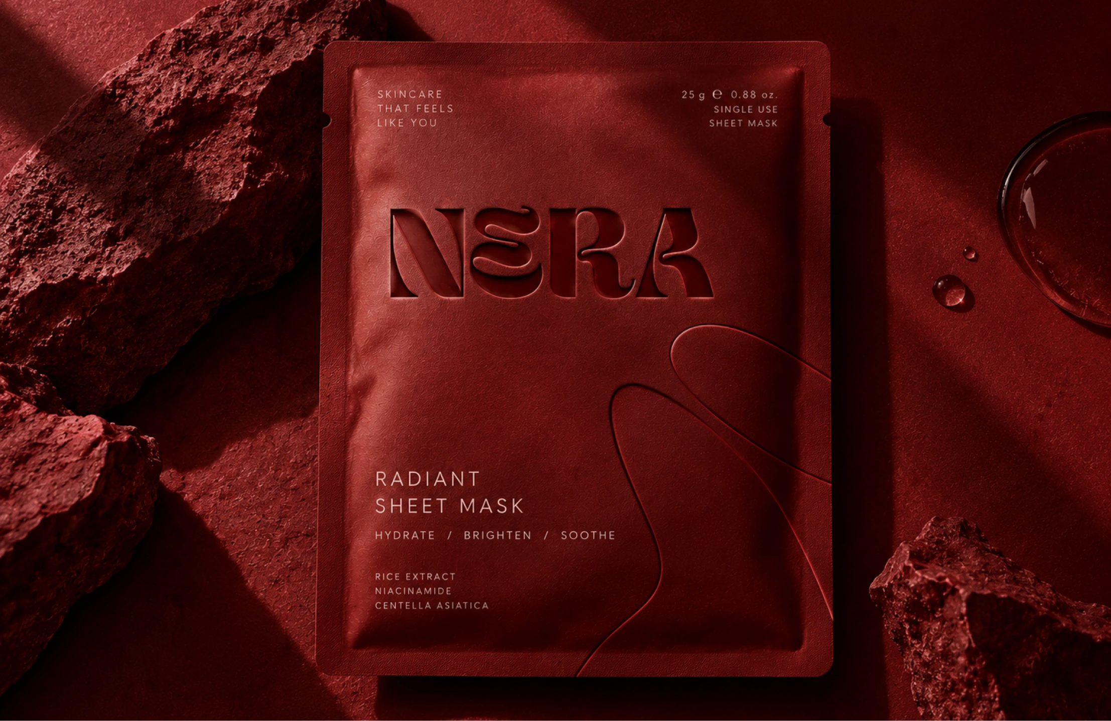
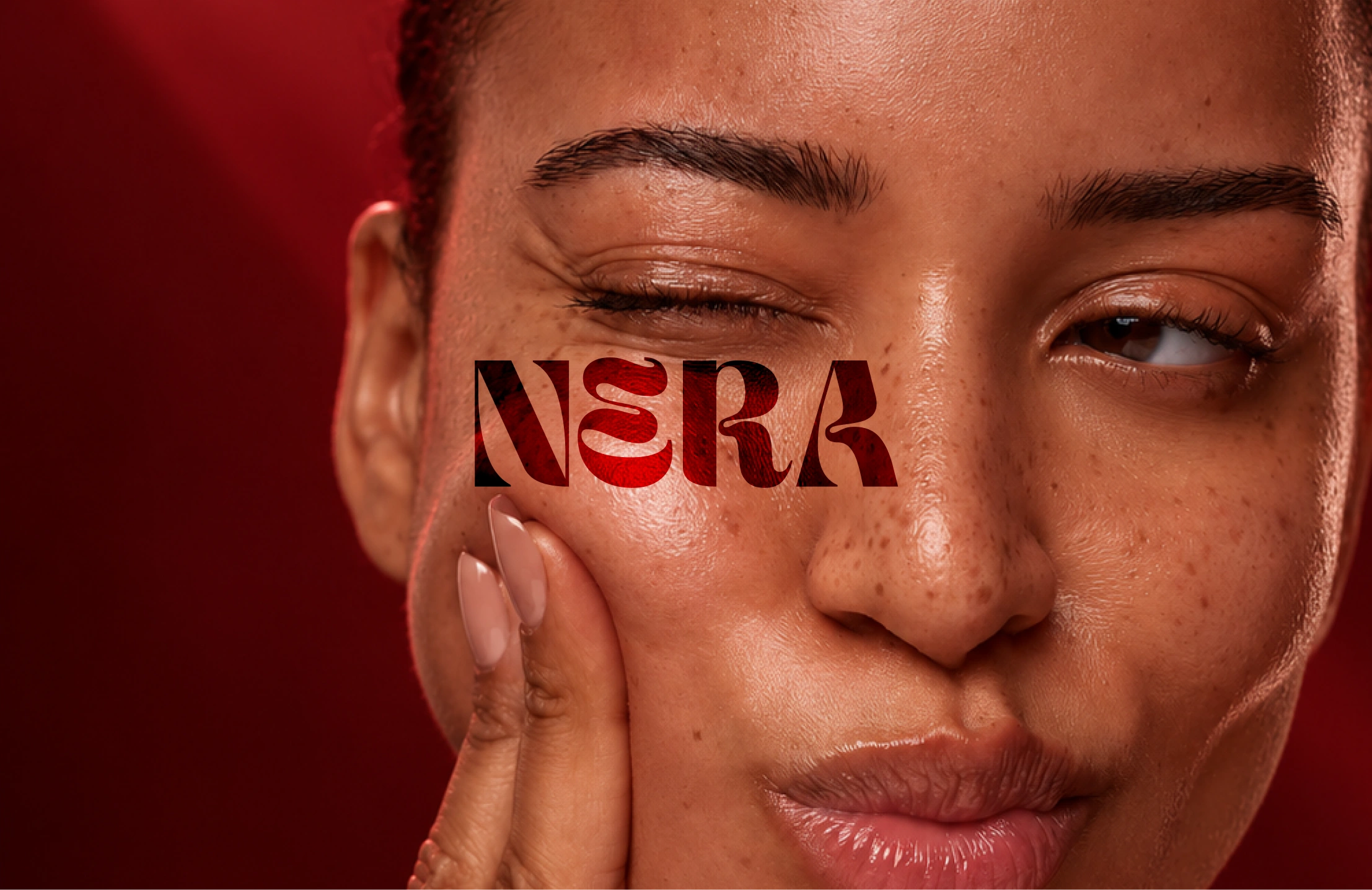
Self-initiated concept. NERA is an imagined premium skincare brand. The goal was one identity that feels intimate, confident and luxe, without the clinical white-and-pastel look most skincare uses.
Approach
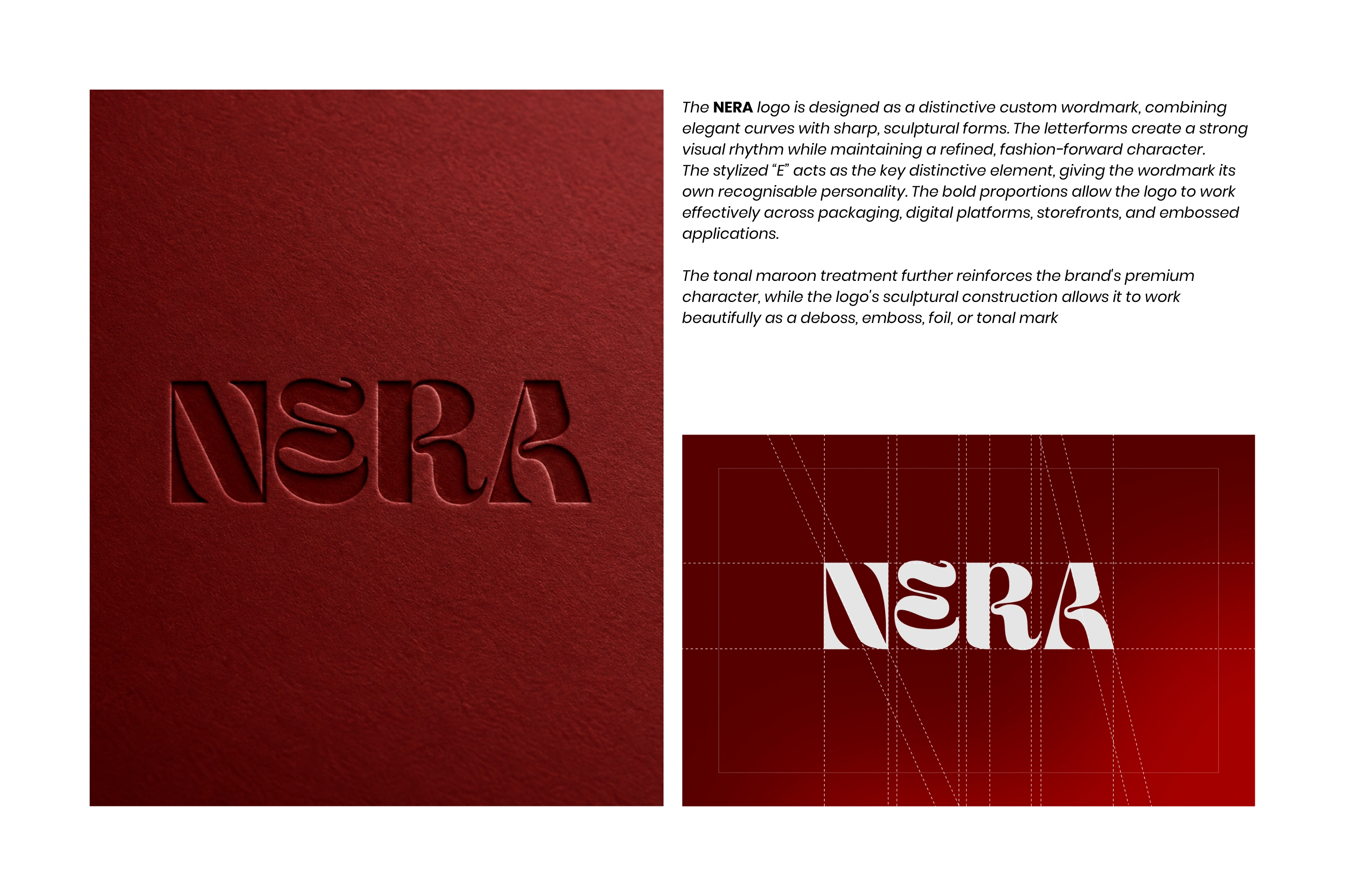
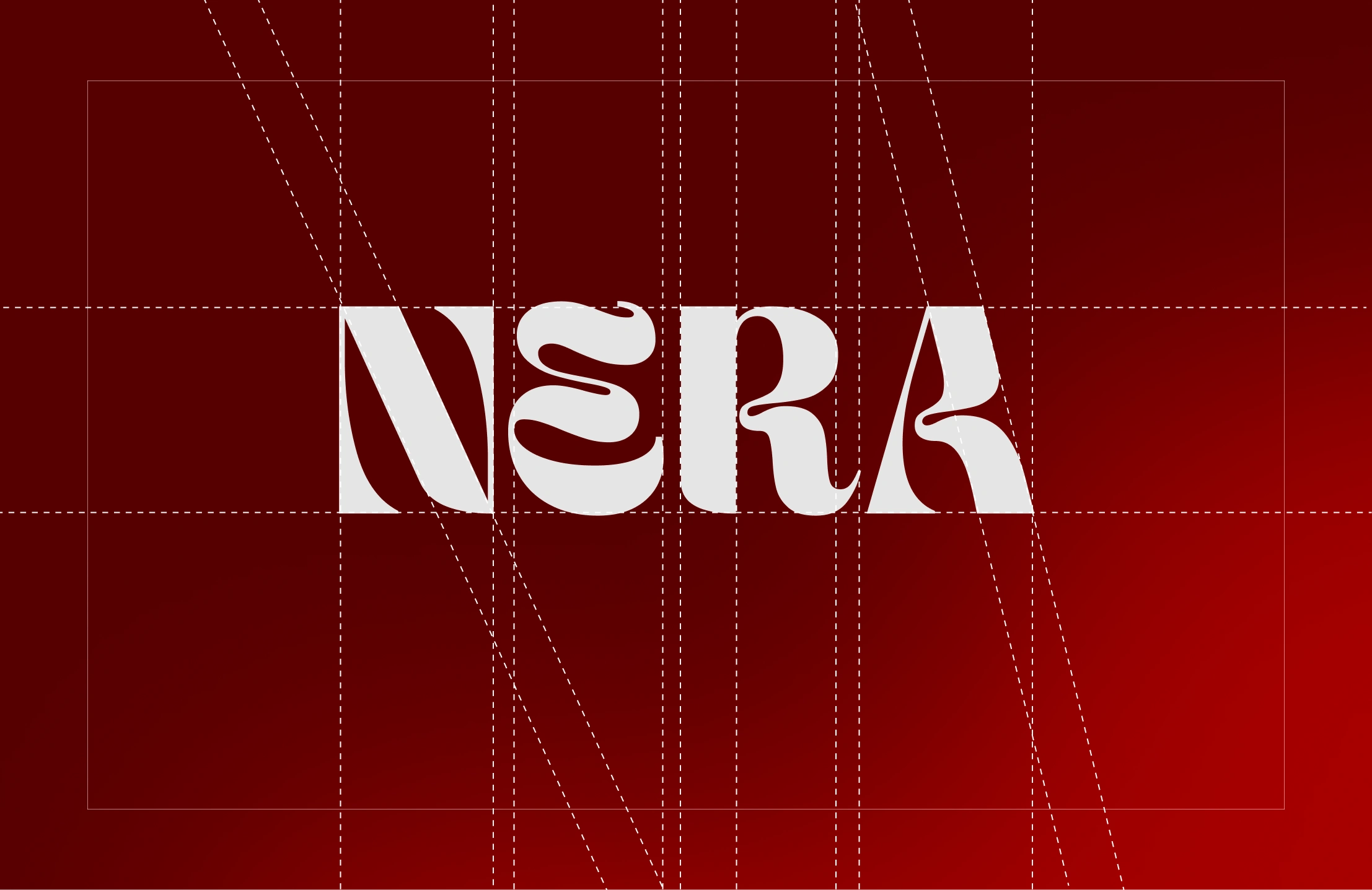
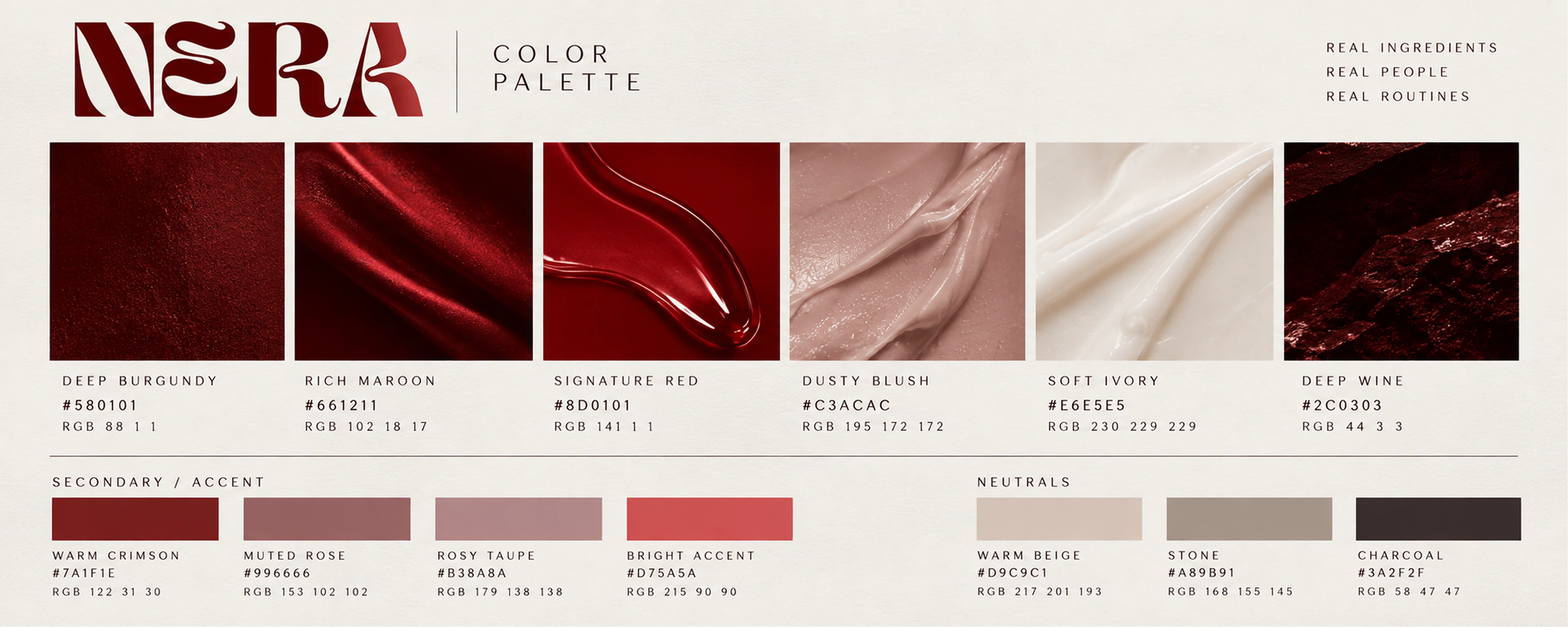
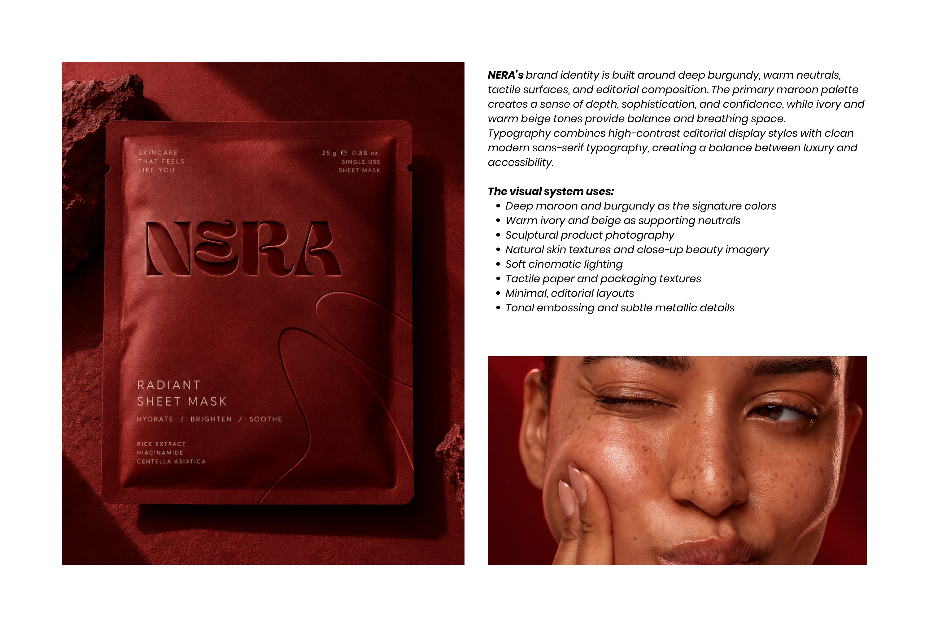
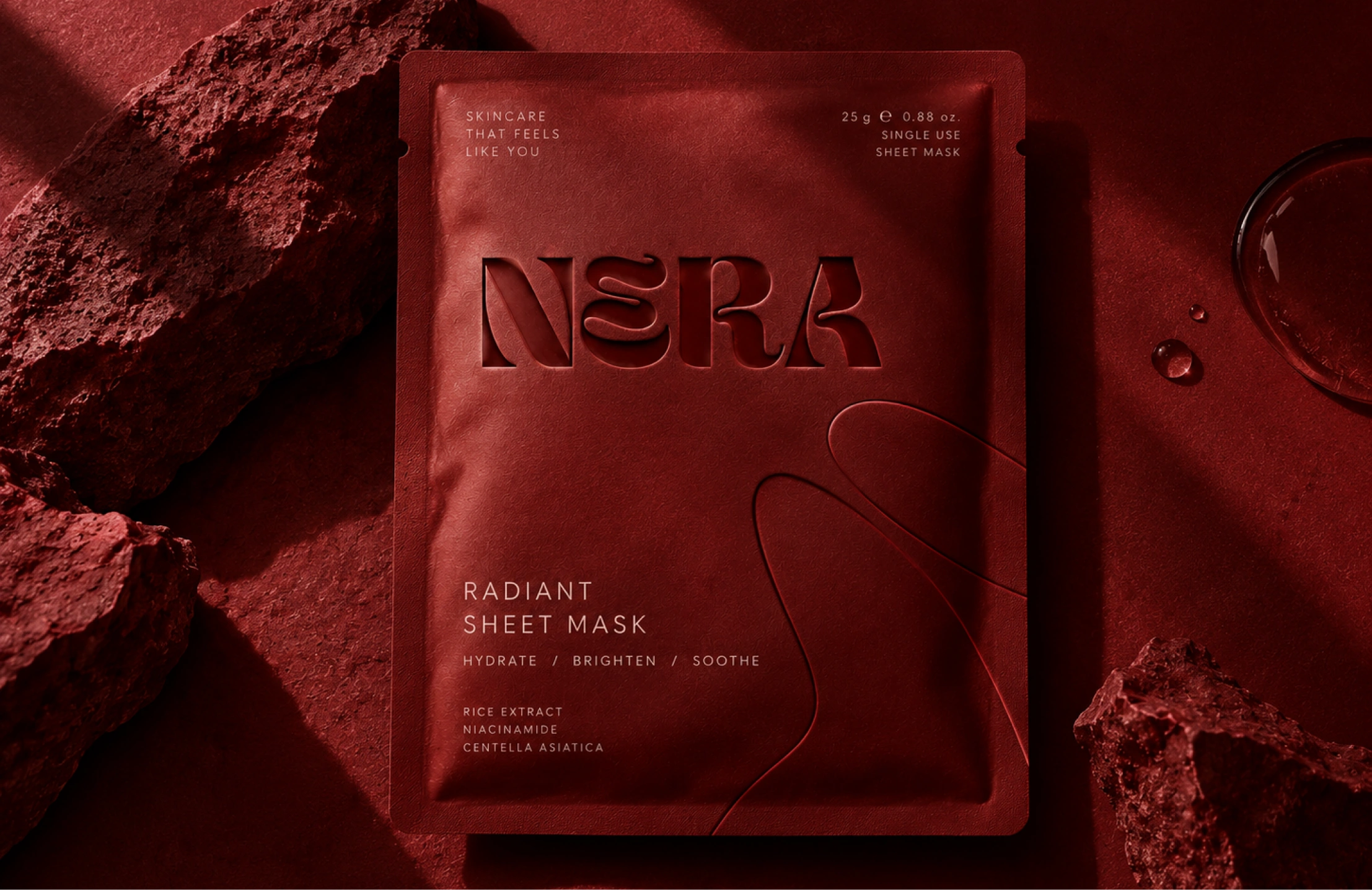
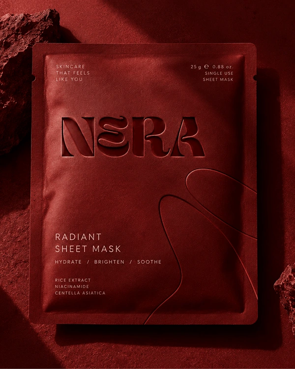
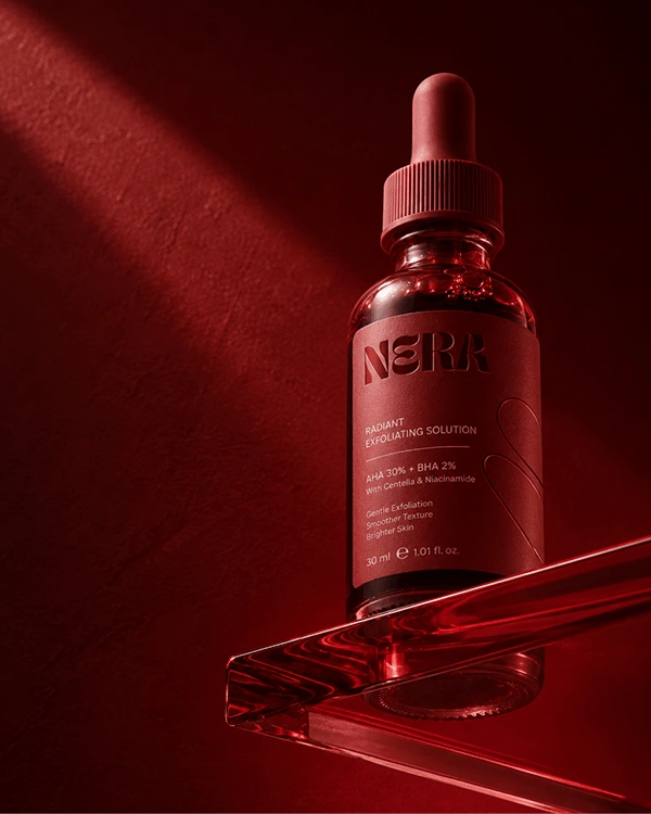
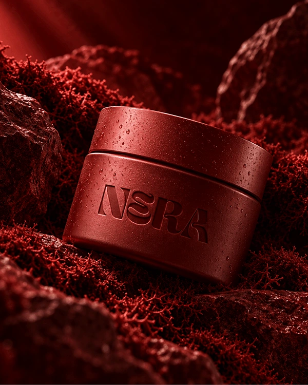
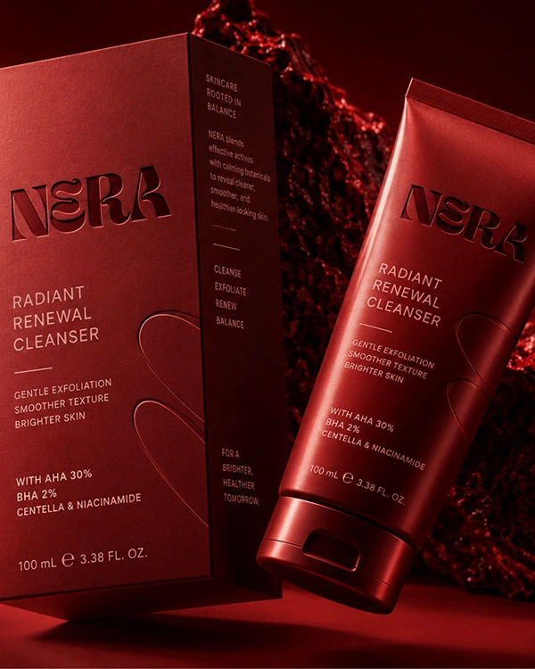
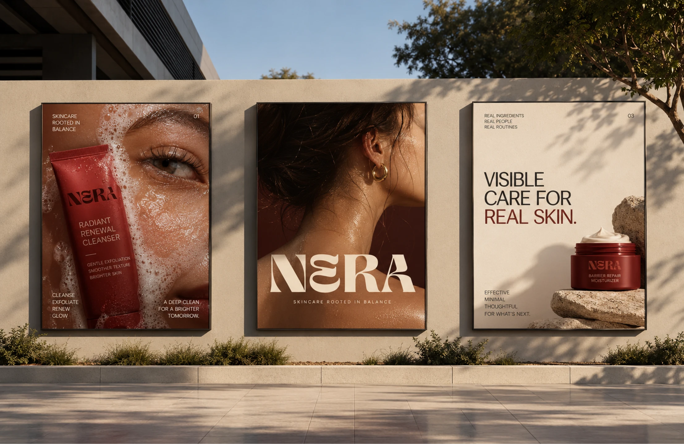
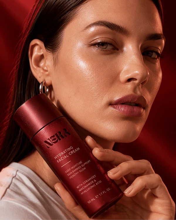
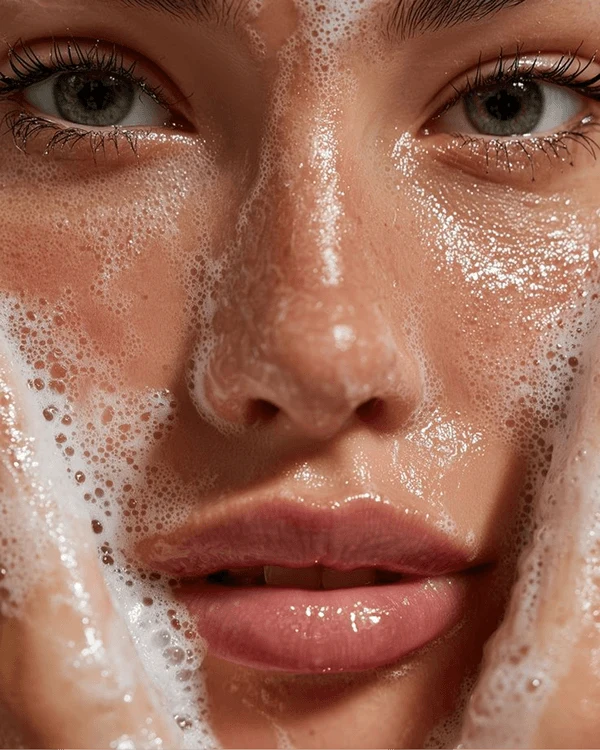
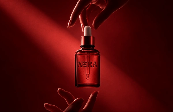
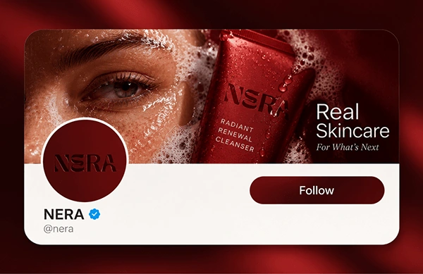
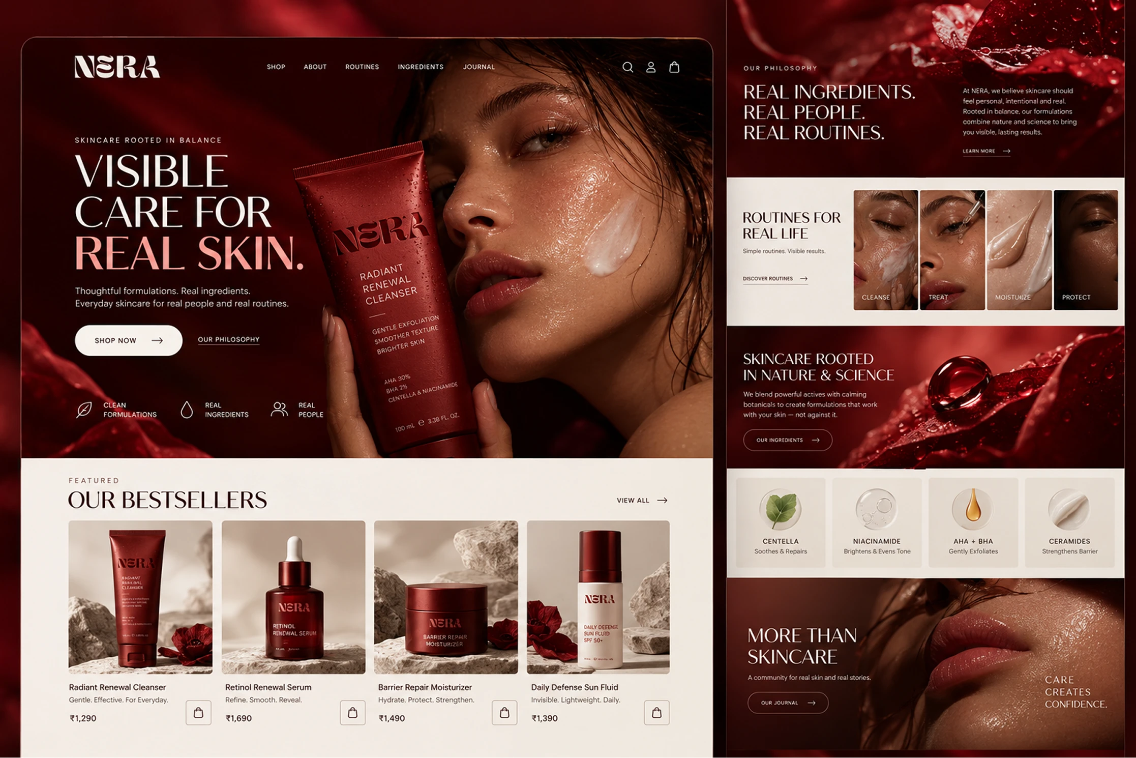
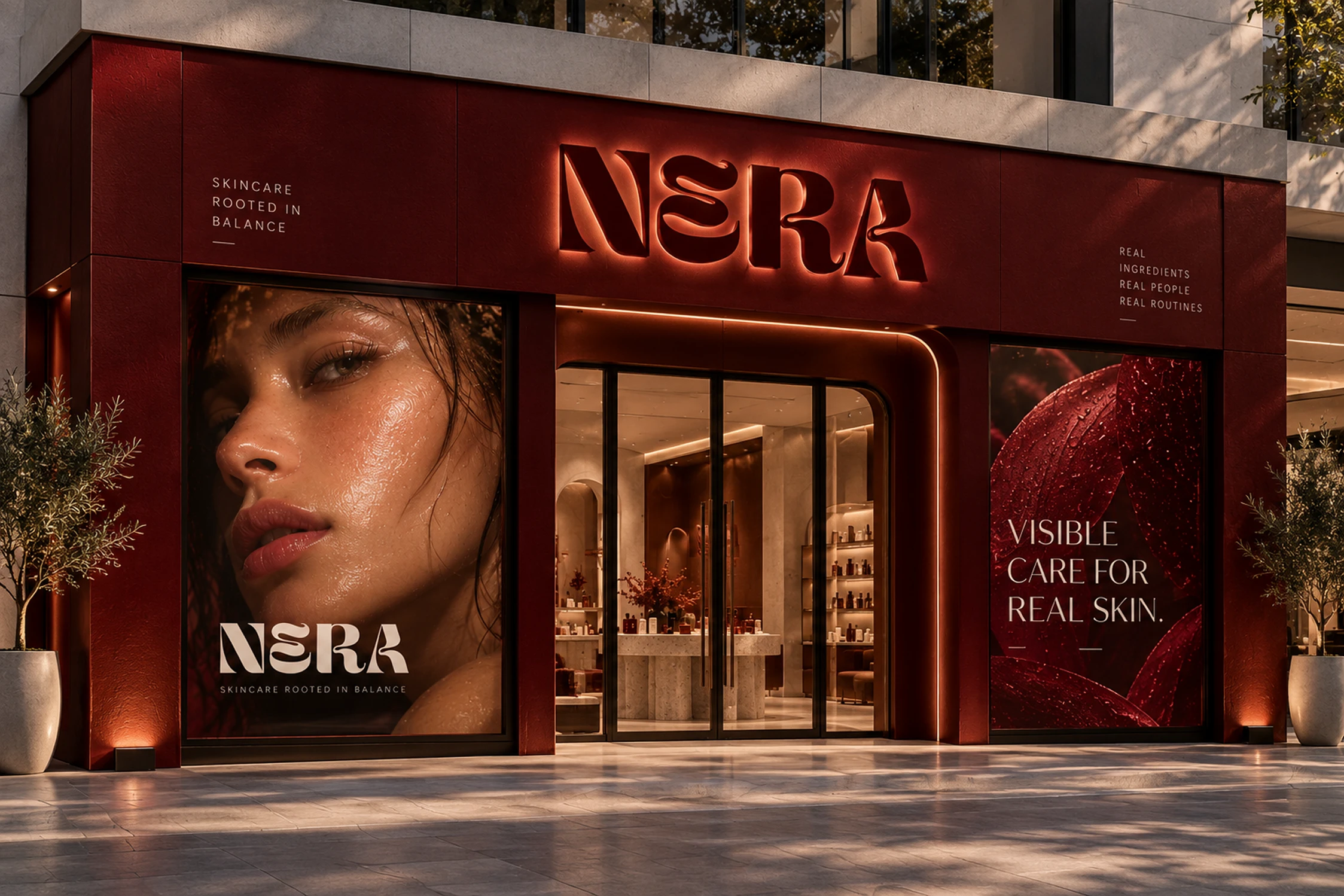
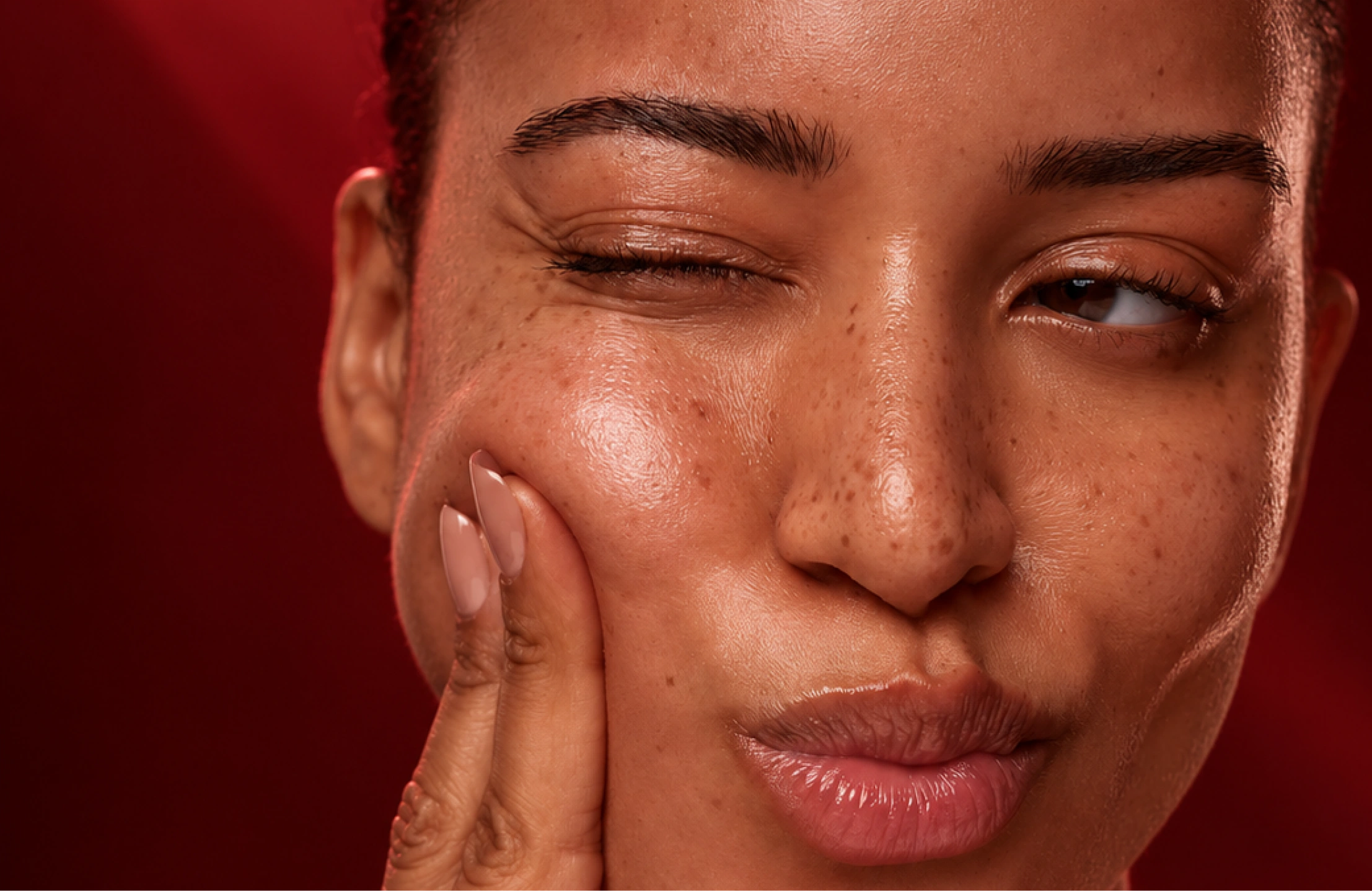
I drew a custom NERA wordmark with refined, custom-drawn letterforms. Deep maroon became the brand colour, chosen to feel warm and grown-up rather than sterile. The system stretches from bottles and boxes to web and retail shelf, with type and spacing rules that keep each touchpoint calm.
Outcome
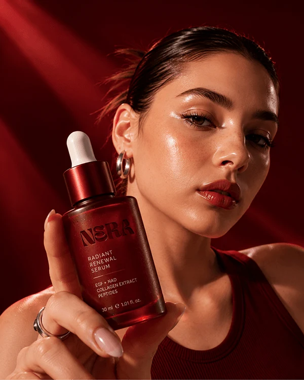
Wordmark, colour palette, typography, packaging range and web plus retail mockups. Built to show how a quiet, colour-led identity can carry a beauty brand.
Like this project
Posted Oct 15, 2026
Premium skincare identity: custom NERA wordmark, deep maroon palette, packaging, web and retail touchpoints. One brand that feels intimate, confident and luxe.
Likes
0
Views
1