UI Kit & Design System
Mathieu-William .
UI Kit & Design System
When working with clients on existing or new products and features, building a UI Kit alongside is often a decision we make together early on. Not as a separate deliverable, but as a way to work. It keeps things consistent as features pile up, and makes the handoff to developers significantly smoother.
I've built UI Kits & Design Systems on multiple freelance projects, both from scratch.
How I approach it
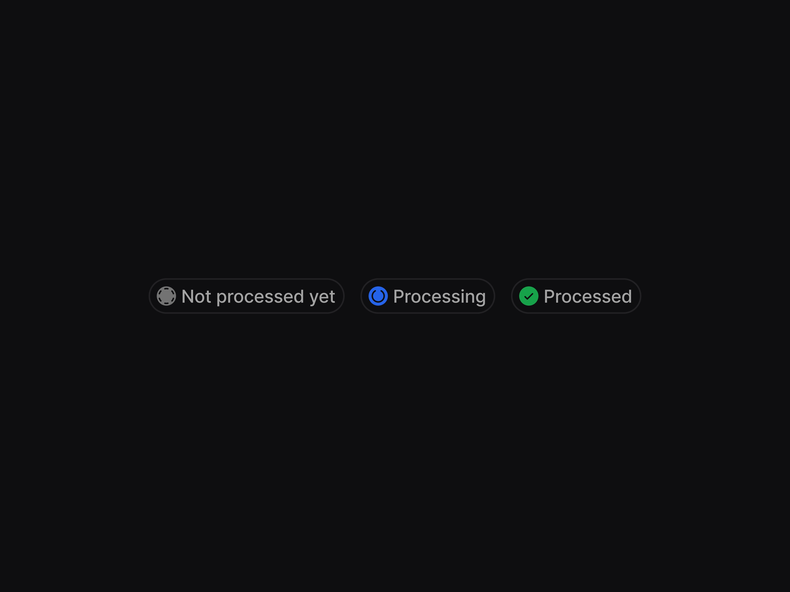
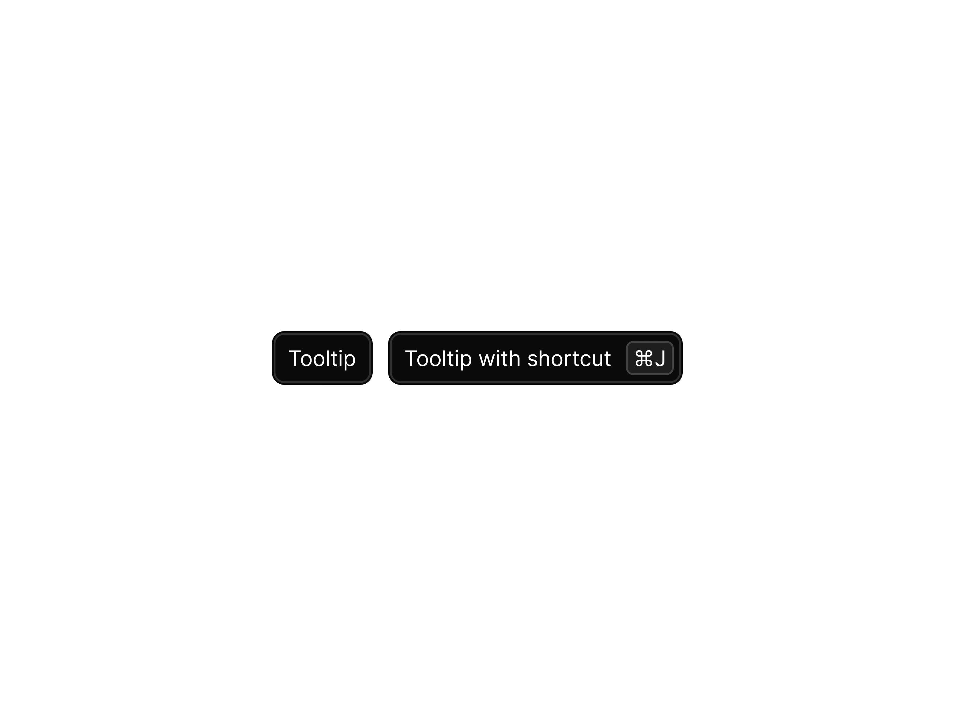
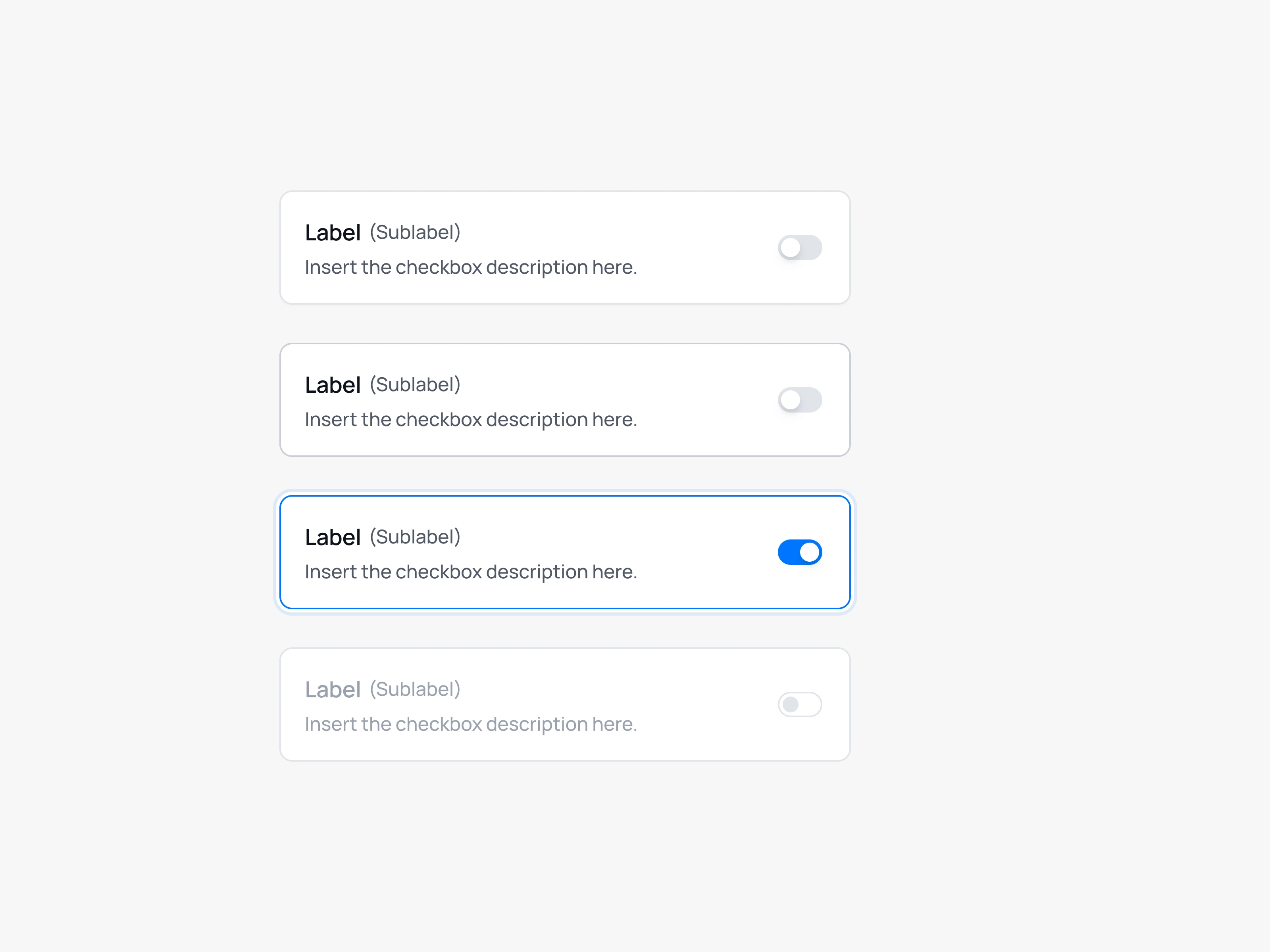
I start with tokens (colors, typography, spacing, radius, shadows) while taking into account what's already in use on the dev side. Whether that's a specific framework with its own color variables, Tailwind's color palette, or any other constraint, the system has to be grounded in technical reality from day one.
Components come after, built on-demand as the product needs them: a button, then its variants, then an input, and so on. Nothing speculative, nothing unused.
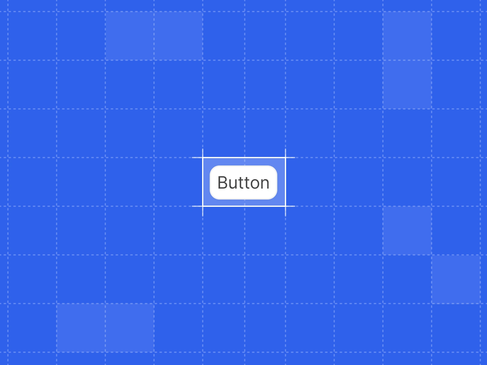
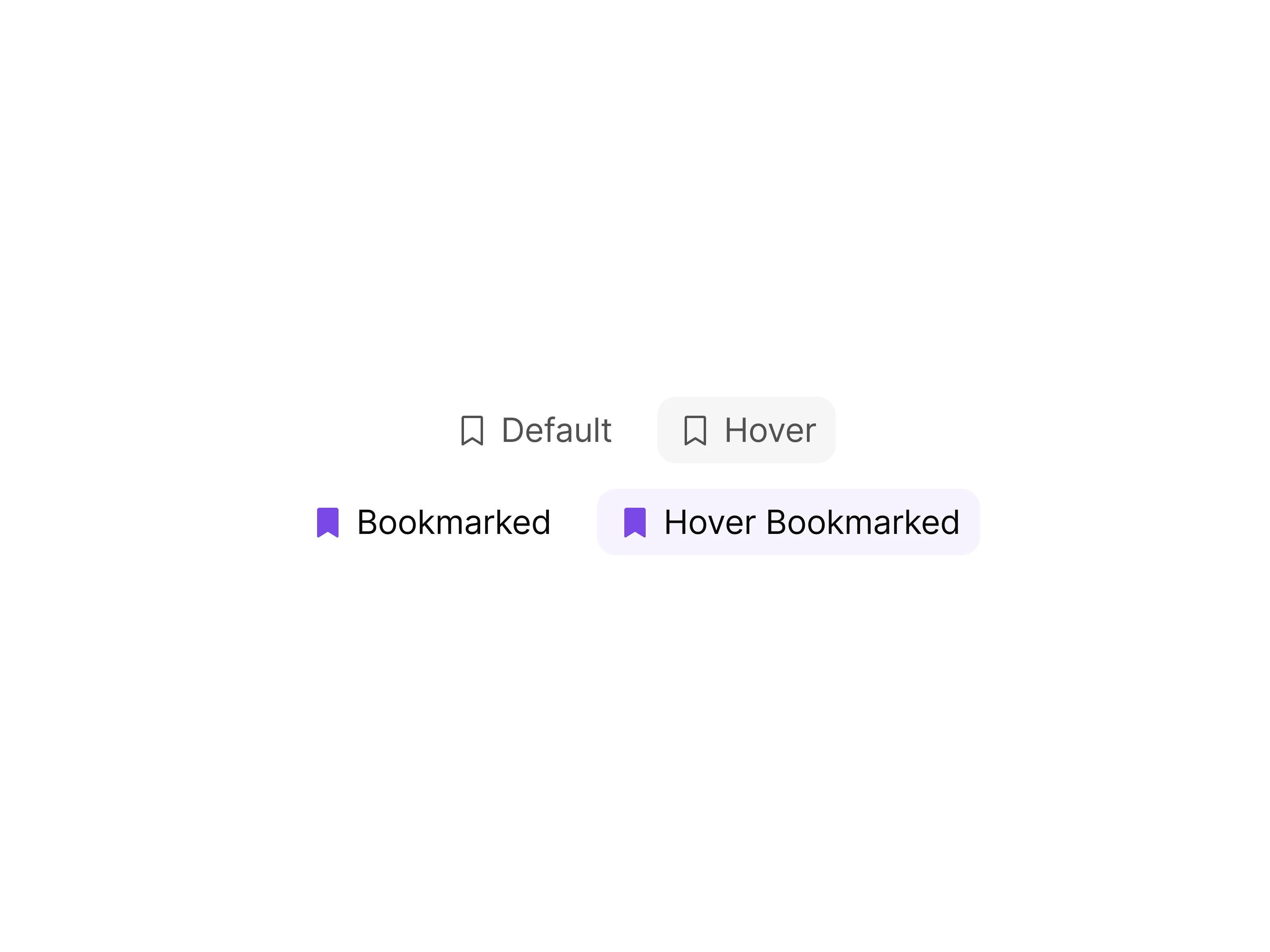
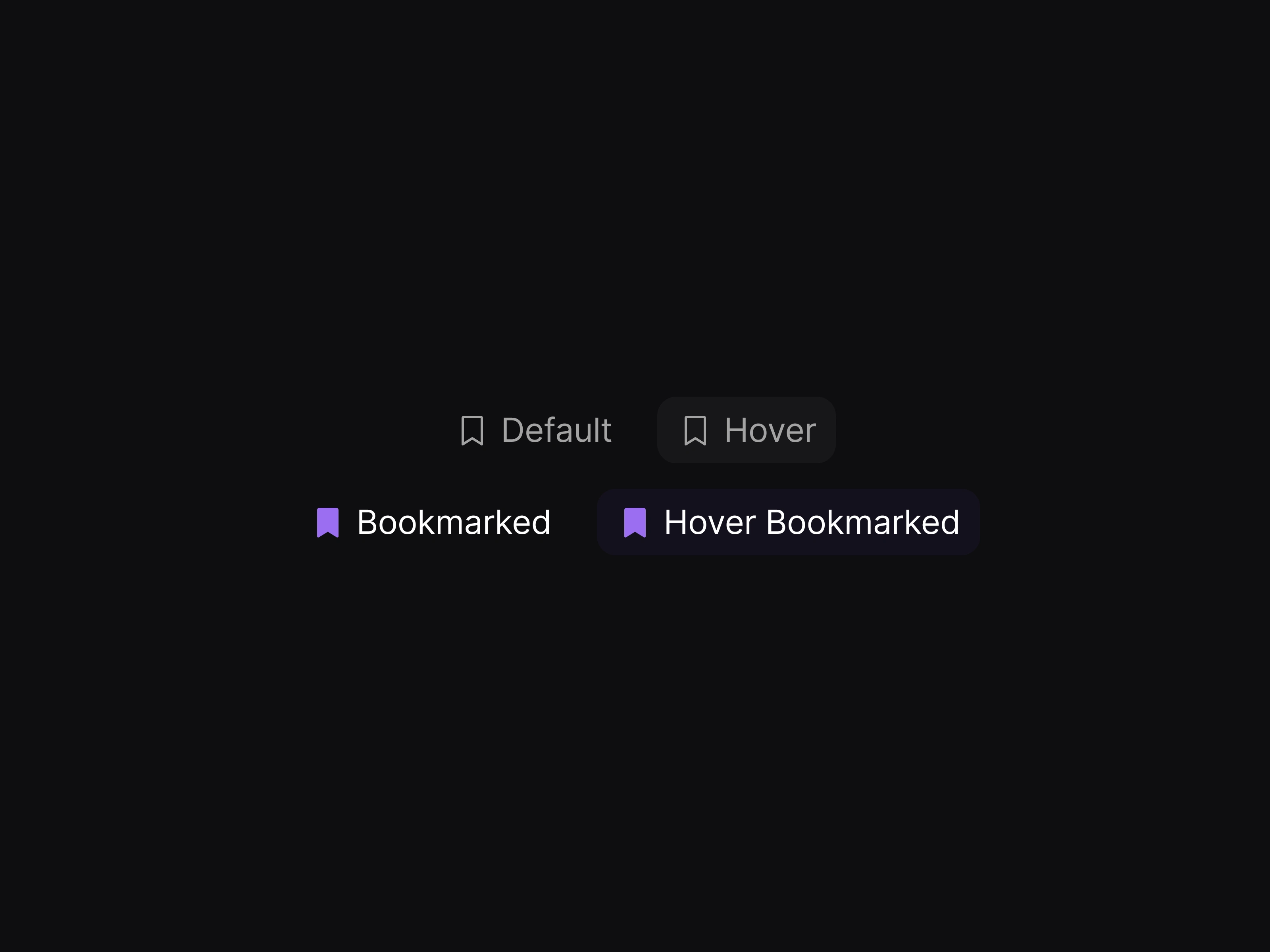
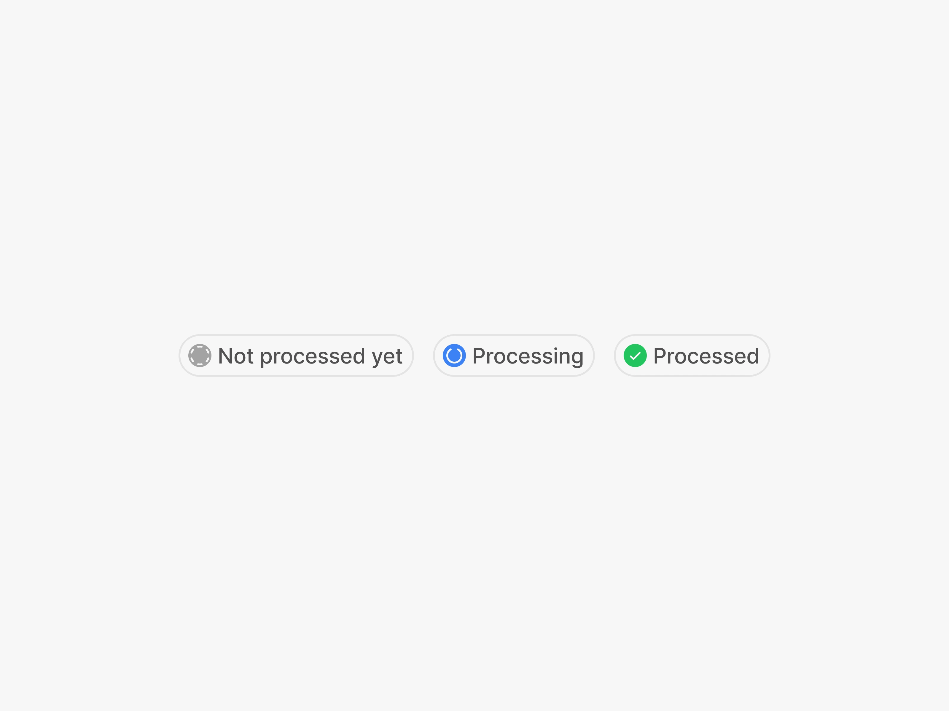
For a button alone, that means thinking through states (default, hover, focus, disabled), types (primary, secondary, ghost, destructive), sizes, and icon choice, and so on. Multiplied across every component, it adds up to a system that covers real use cases rather than ideal ones.
Collaboration
I sync regularly with developers throughout the process: aligning on naming conventions, taking existing technical constraints into account, and adjusting components when needed. The system has to make sense on both sides.
A note on working with existing systems
I've also worked within mature Design Systems: contributing, identifying gaps, and feeding recommendations into larger multi-brand efforts. A different posture, but the same underlying logic.
Like this project
Posted Jun 29, 2026
Designed a UI Kit and Design System for client projects, ensuring consistency and smooth developer handoff.