Design and Development of FUGA
Iria Iglesias
FUGA — Geocaching for ephemeral art
Role: Product design, UX/UI, frontend, illustration, data model
Team: Sergio Blanco Tajes (concept, direction, curation) · Iria Iglesias (design and development)
Status: Live at fuga.website · functional MVP with curated artworks · open submission flow and admin approval in iteration
Stack: [TO CONFIRM] + Supabase, Google Maps, custom globe view
Context
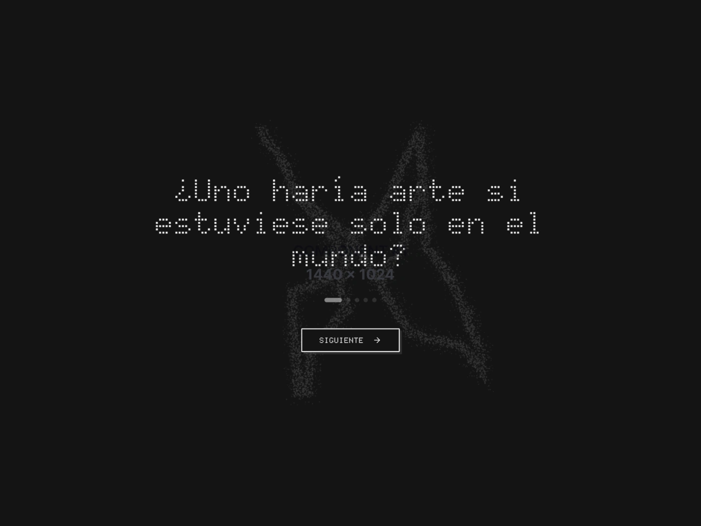
FUGA is a platform for geocaching ephemeral art. Artists leave physical pieces in real-world locations and register them at GPS coordinates inside the app. The work then exists at that point on the map — anyone passing by can find it, anyone anywhere can know it's out there. Pieces fade visually over time on the radar and eventually drop off it entirely, but stay in the gallery as record. Part archive, part scavenger hunt, part statement about what art is when it isn't curated for an audience.
The project is Sergio Blanco Tajes's concept. It grew out of an earlier multidisciplinary piece of his, "no name", about the five elements of communication — sender, receiver, message, channel, code — and the idea of "abandoning" artwork in remote places without a guaranteed audience. FUGA is the operational layer of that idea, turned into something the public can actually use.
My role
The split with Sergio is clean: he holds the concept, the curatorial direction, and the artistic frame; I designed and built the product around it. That means the entire UX architecture, UI system, frontend, illustration of the radar / X mark, data model and admin layer — turning a piece of artistic thinking into something a stranger can open, use, and contribute to without being briefed.
The design challenge
Most apps want to accumulate. FUGA needed to do the opposite. Art that's been fugado — left somewhere — has a lifecycle: bright and findable when new, fading over time, eventually gone from the active map. The product had to reflect that arc both in the data model and in the interface, without losing the works (they stay in the gallery as historical record).
The second tension: a system designed for art that wants to escape curation still needs some curation, or it fills up with noise. Sergio acts as administrator. The product had to make that role almost invisible to contributors — so it doesn't read like submission-for-approval — while still letting him shape the field.
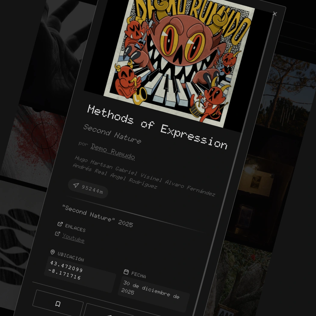
One of the artworks in the gallery
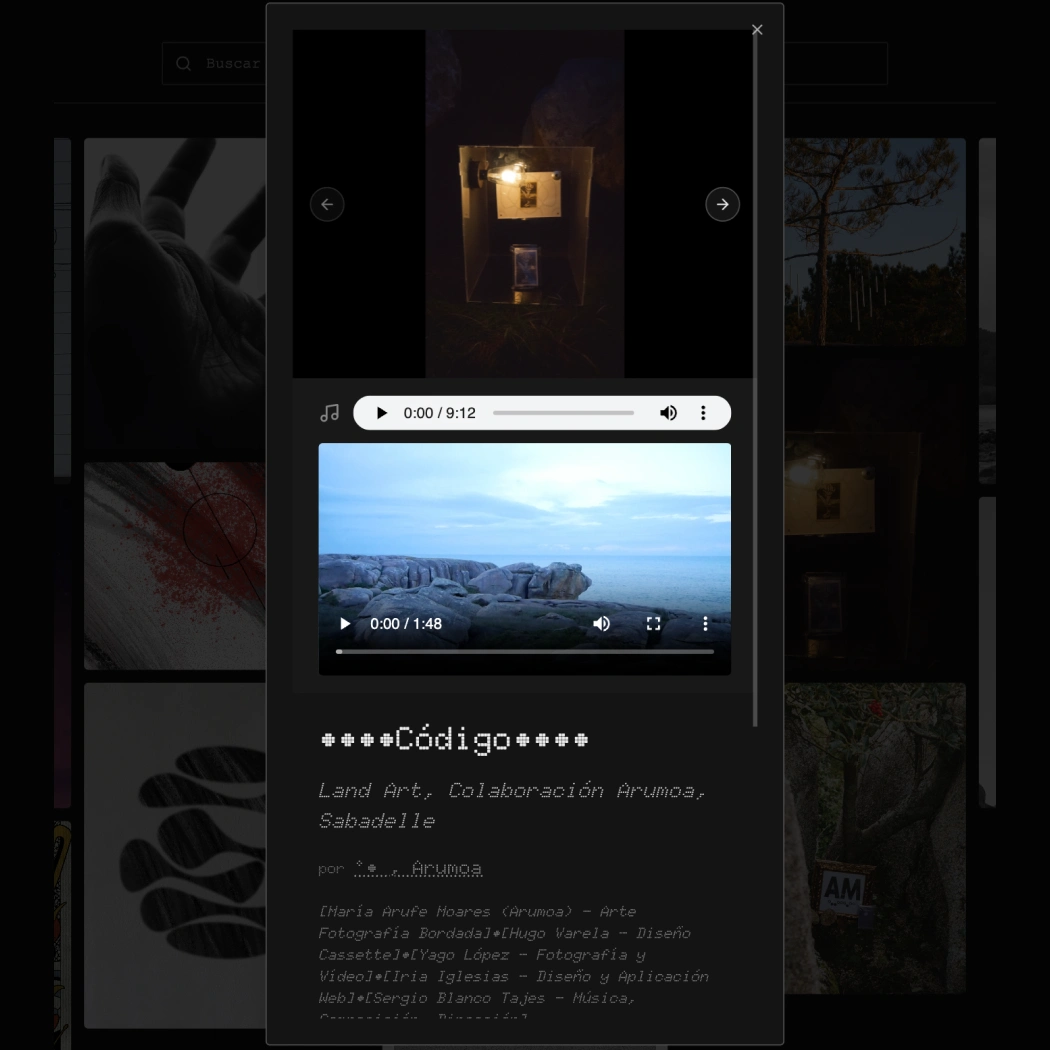
One of the artworks in the gallery
A few decisions I'd point to
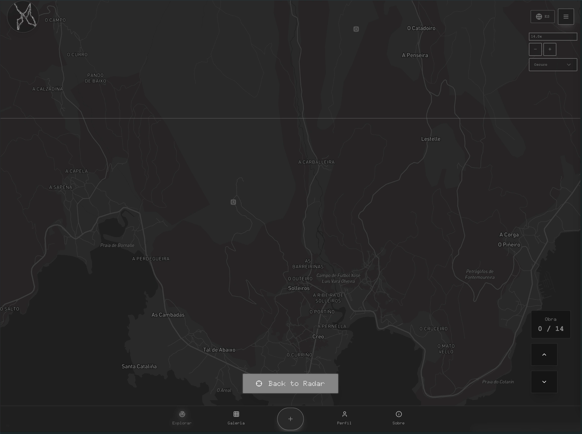
Radar as the primary metaphor, not "list of works". The home screen is a map with a rotating radar overlay. You find pieces by exploring geographically, not by scrolling a feed. Each work is a small square on the map; brightness encodes recency. The UI borrows from scanning instruments: radar, sonar, geographic survey,.. rather than from social apps. There's a zoom indicator, a globe view, a counter ("Obra 0 / 14"). It reads as a tool, not a timeline.
Dot-matrix typographic identity. Titles, descriptions and metadata are set in a pixel / segment-display typeface, the same family present in the original briefing documents. It pulls the app toward signal equipment, things that broadcast and decode, rather than things that present. Text like a readout, not like a magazine.
Time decay built into the data, not just the visuals. Works brighten on publication, dim as they age, and at ten months drop off the radar entirely. They remain in the gallery so the historical record holds. The map view stays a present-tense space; the gallery becomes the archive. The data model carries the ephemerality, not just the styling.
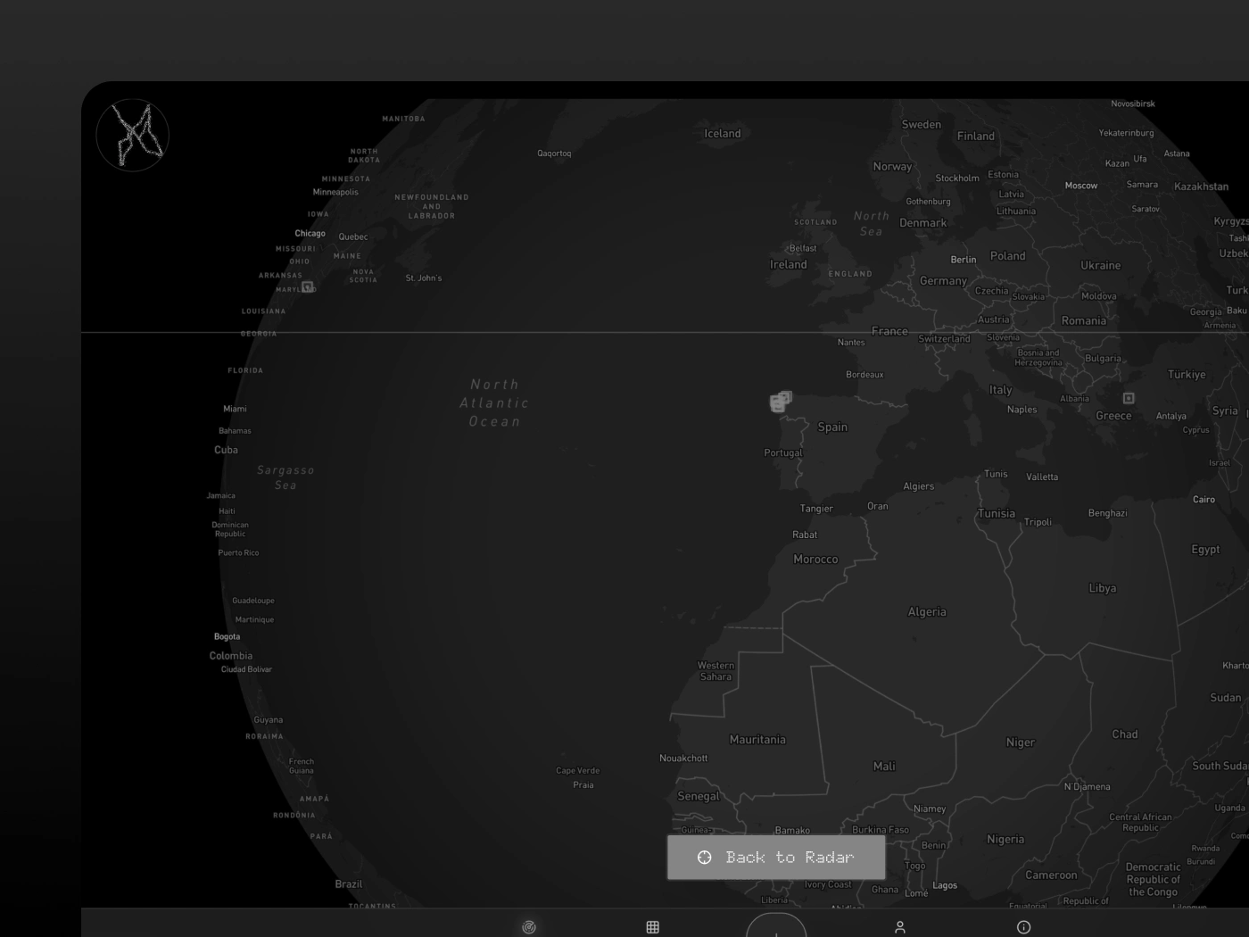
A globe view that is on-purpose unhelpful. Zoomed all the way out, you see the whole earth and a handful of clustered dots. It doesn't help you find anything near you. But it tells you, in one glance, that this is a global, porous, very small thing. The radar view is for finding; the globe is for understanding what the project is. And if you want, you can zoom in and find exactly where each work of art lives/lived.
Build approach
Built in Lovable with Supabase as the backend (auth, storage, row-level security for the artwork uploads), Open Street Maps for the radar surface, and a custom globe for the zoomed-out view. The admin layer routes new submissions through Sergio for approval before they appear on the map.
Status
Live at fuga.website with a curated set of works. Currently, it includes open submissions to anyone that registers, a Pinterest-style gallery, search by artist or location and more. Try it for yourself! :)
What this project taught me
That sometimes the design challenge is the opposite of what most products optimise for. FUGA doesn't want engagement metrics or daily active users, it wants something closer to patient discovery. Designing a system that rewards going outside, finding something physical, and quietly logging it back into the archive is a different brief from designing for retention. Working inside someone else's strong concept (Sergio's) also taught me where to disappear and where to push back. That balance is, I think, the actual job when you build alongside an artist with clear goals.
Like this project
Posted May 19, 2026
Designed and developed FUGA, a platform for geocaching ephemeral art.
Likes
0
Views
2
Timeline
Sep 1, 2025 - Dec 31, 2025