Azura's Sound Website Development
Iria Iglesias
Azura's Sound — Website for a new studio & live sound business
Role: Design, frontend development, ongoing digital partner
Status: Live at azurasound.com
Stack: React, Netlify, custom domain · paired with Claude Code, Codex and Gemini
Context
Azura's Sound is the new studio and live sound business of Rober Fernández, based in O Barco de Valdeorras — a small town in eastern Galicia. Rober has years of experience working under contract for other sound companies, but Azura's Sound is the first one that's his. When we started, he had a logo, a name, and not much else. He's registering as autónomo in summer 2026; until then, the business is on a quiet pre-launch.
The brief, and the framing I chose
The literal brief was "I need a website." The real problem was more interesting: how do you introduce a brand-new business, run out of a small Galician town, without sounding either provincial or like every other sound studio site? Rober's mental competition is the studios in Madrid and Barcelona. His geographic reality is rural. I wanted the site to read both facts as strengths.
A few design decisions
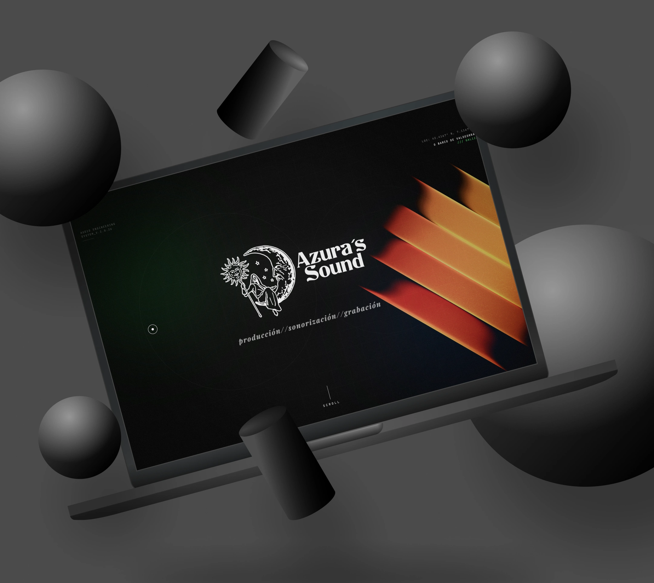
Geography as identity, not apology. The hero opens with GPS coordinates (LOC: 42.4167° N, 7.1167° W / O BARCO DE VALDEORRAS /// GALIZA) using the Galician spelling Galiza. The location isn't tucked into the footer; it's the first thing you read. The contact page doubles down: "Disponible para desplazamientos desde Valdeorras a toda la península." The town isn't a limitation, it's the home base.
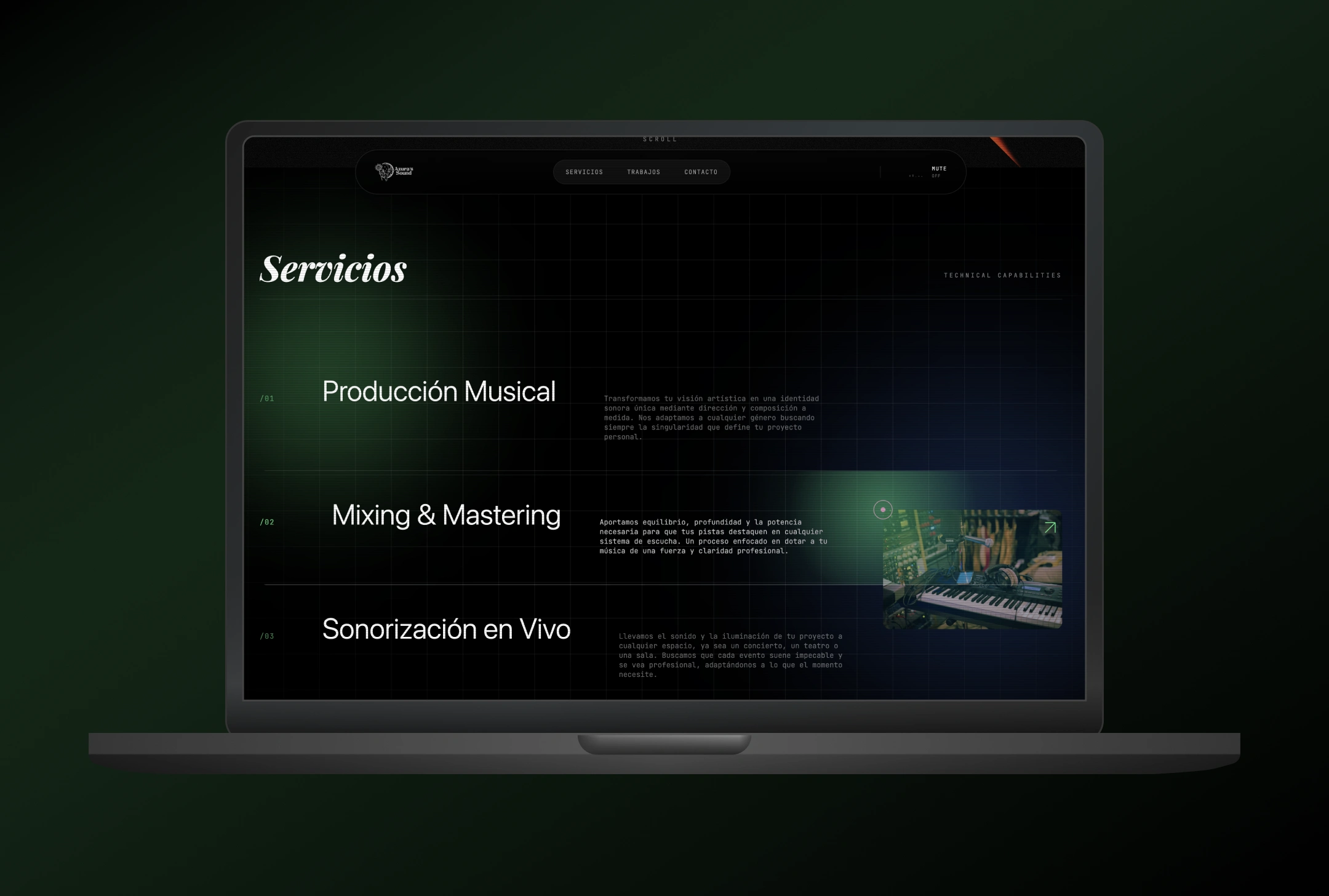
Typographic dialect: italic serif + monospace. Display headers are a high-contrast italic serif (Servicios, Trabajos, ¿Hacemos ruido?) — the typography of liner notes and album sleeves. Body copy and metadata are monospaced — the typography of DAWs, mixing desks, signal flow. The mix is the whole point: this is where the artistic and the technical meet, and the type system says so before any image does.
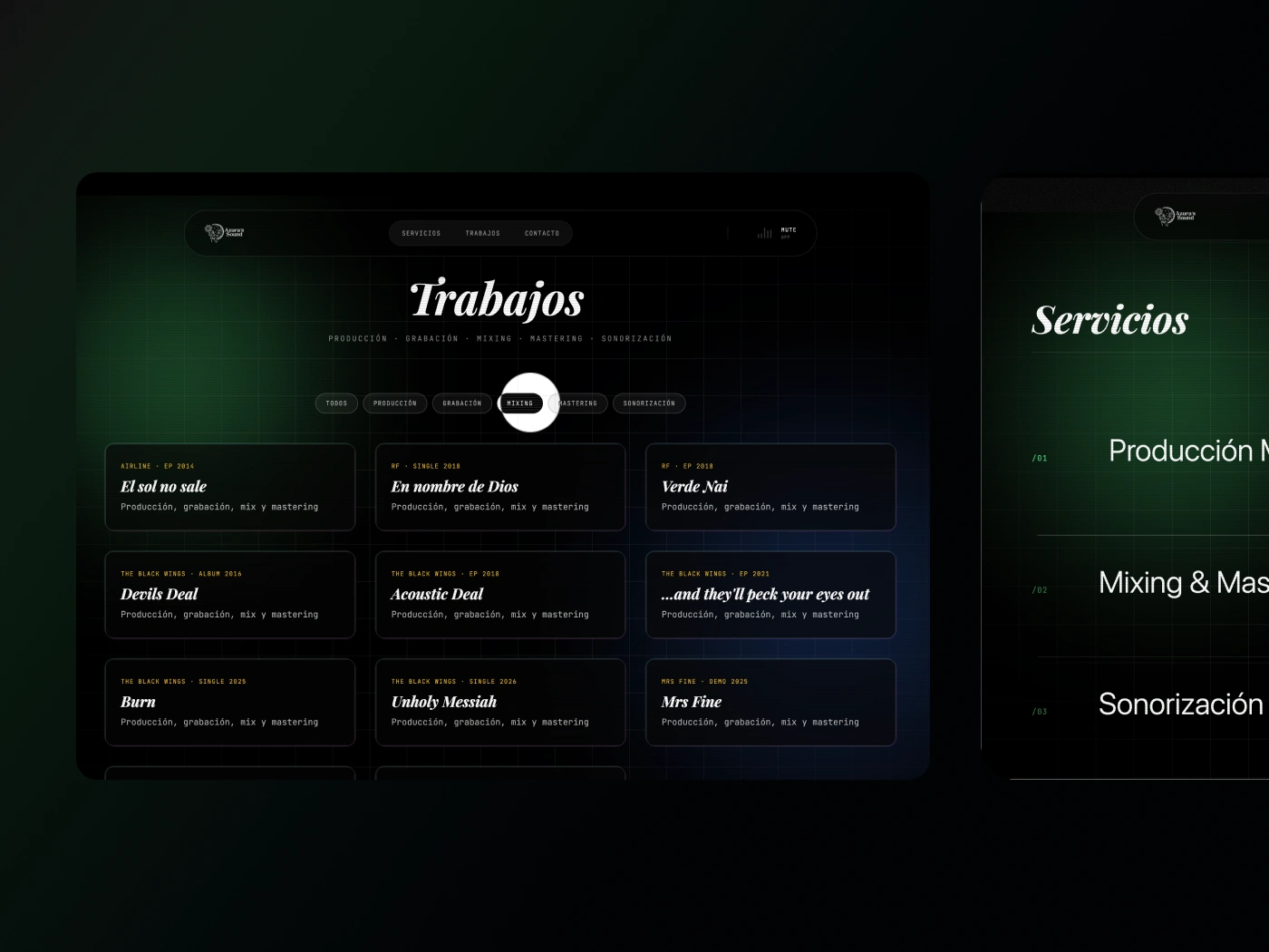
Numbered services on a faint grid. Services are labelled /01 to /04 in green mono against a subtle grid. Visually, it borrows the layout language of a session sheet. It also signals rigour without writing the word.
Designing around an existing mark. Rober came with his logo, a sun/moon engraving and a script wordmark based on the Skyrim daedric deity Azura. My job was to build the entire web language around it without fighting it or falling into the classic fantasy epic: letting the mark sit as the anchor, and designing typography, palette (black with a green technical accent, plus small orange and yellow highlights), and layout to surround it.
Build approach
I wrote this one by hand in React, hosted on Netlify, paired with Claude Code, Codex and Gemini for snippets and review. It's part of a pattern in how I work: using real client projects as a sandbox for tools and approaches I want to get fluent in. Rober has been generous with that — he lets me experiment, and in exchange he gets something tighter than a templated approach would have produced.
Where it is now
The infrastructure is ready: site live, contact form working, content structure in place to add new works as they come. The relationship continues, as Rober has been my testbed for several other technical experiments since. When he opens for business this summer, the front door is built.
Like this project
Posted May 19, 2026
Designed and developed a custom website for Azura's Sound, using React and Netlify.