Zyler.ai Landing Page Redesign
Bashar Nebeaa
Zyler.ai: AI Marketing analytics Platform - uplifting an AI Brand with a modern Landing page redesign
Zyler.ai: AI Marketing analytics Platform - uplifting an AI Brand with a modern Landing page redesign📝 Introduction👀 Project Details🫣 The Problem🌐 Old Website🚀 The Upgrade1️⃣ Step1: Understand2️⃣ Step 2: Benchmarking3️⃣ Step 3: Failing4️⃣ Step 4: We got it!🎨 Colors✍🏼 Fonts😲 The wow⛹️♂️ The prototypeScreens
📝 Introduction
📝 IntroductionZyler.ai is an up and coming startup that provides an AI analytics tools to help users make sense of the data the receive, so instead of report jargon they get an explanation!
While they had a decent functioning landing page, the founders of Zyler craved more, they wanted to reflect the creativity and power of their platform.
👀 Project Details
Timeline: March 2025 - May 2025
My Role: UI/UX Designer
Deliverables: Wireframe, User research results, Design System, Website UI design and prototype
🫣 The Problem
The current website had a high bounce-off rate and the founders of Zyler wanted to know why and how to resolve it
🌐 Old Website
the old website had a basic design that helped with conveying the goal of the website and a clear CTA
Old Zyler.ai
🚀 The Upgrade
1️⃣ Step1: Understand
So we started with discovering what works and what doesn't:
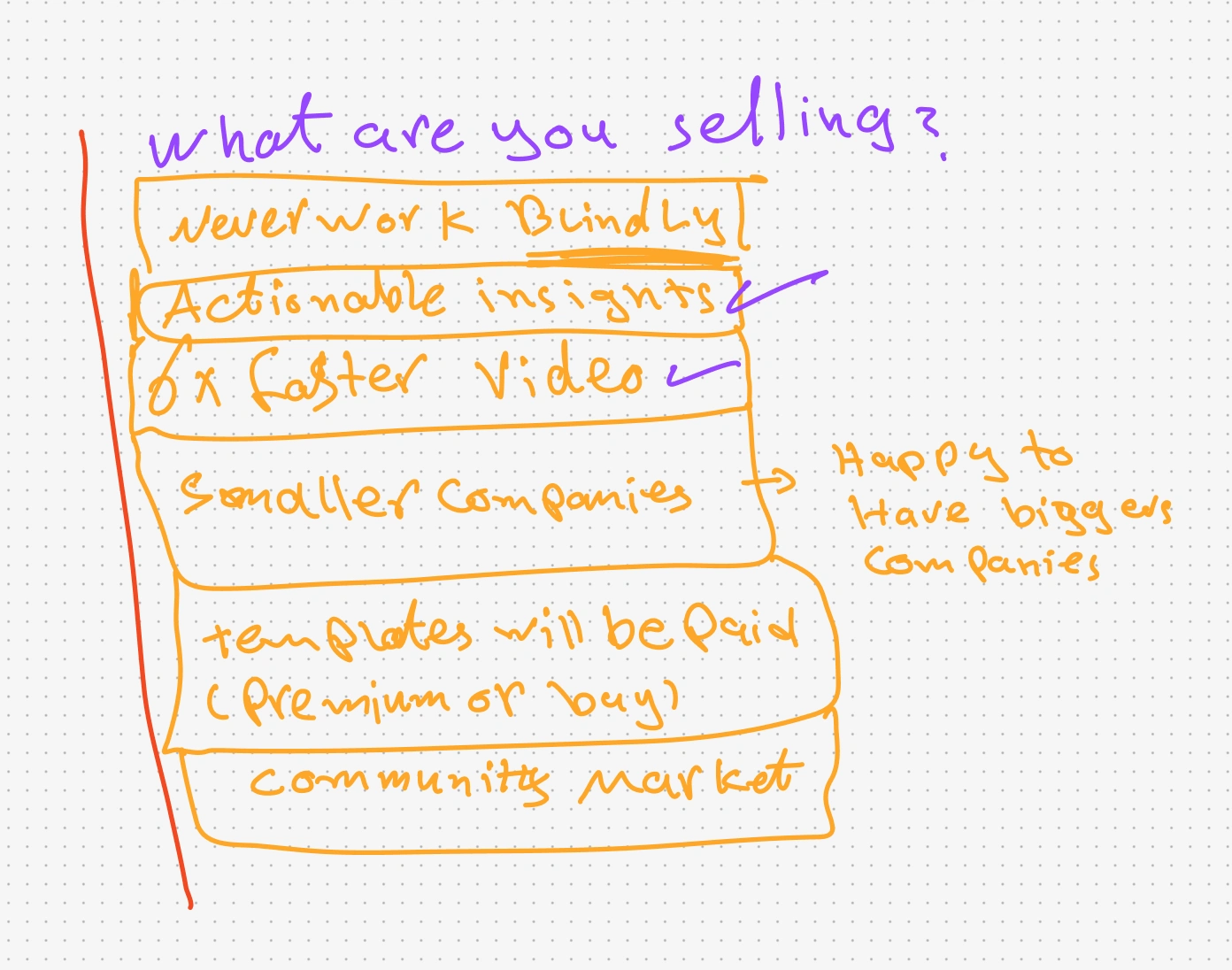
Through multiple conversations with the founders of Zyler I collected a lot of insights about their goals and what actually fits those goals on the current website
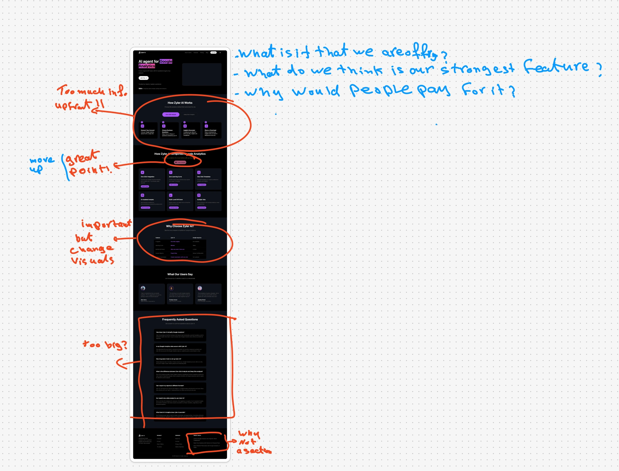
Start of the Ideation
2️⃣ Step 2: Benchmarking
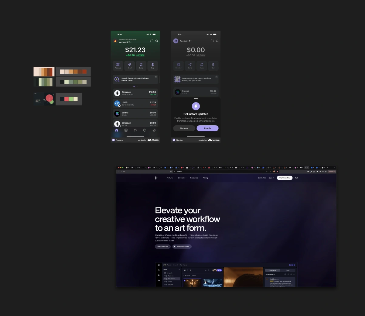
Benchmarked some applications and websites for visual elements mostly as it was pretty clear what was the landing page trying to achieve
3️⃣ Step 3: Failing
So...we tried a lot of things, and none of them seemed to stick, but they sparked a direction and a vision
Wall of shame
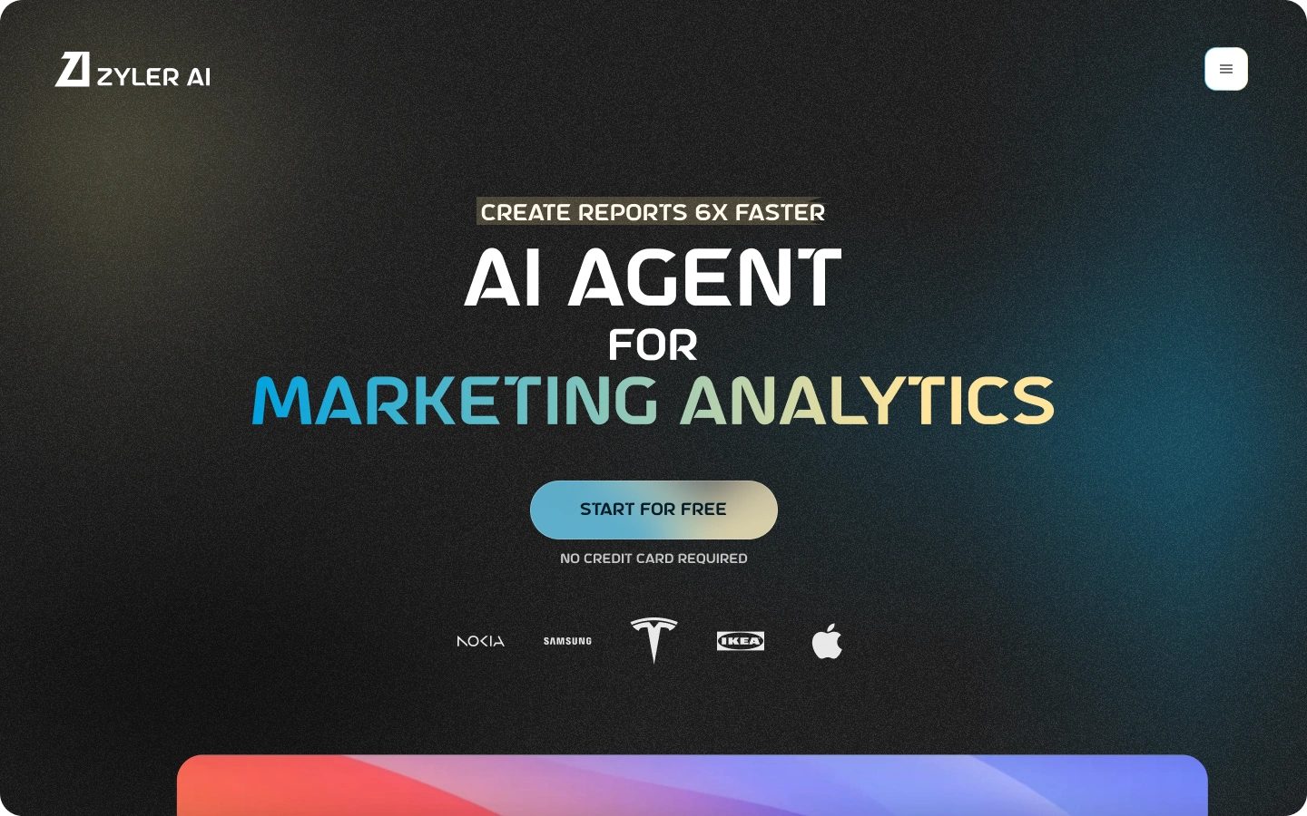
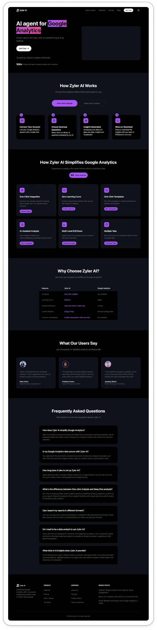
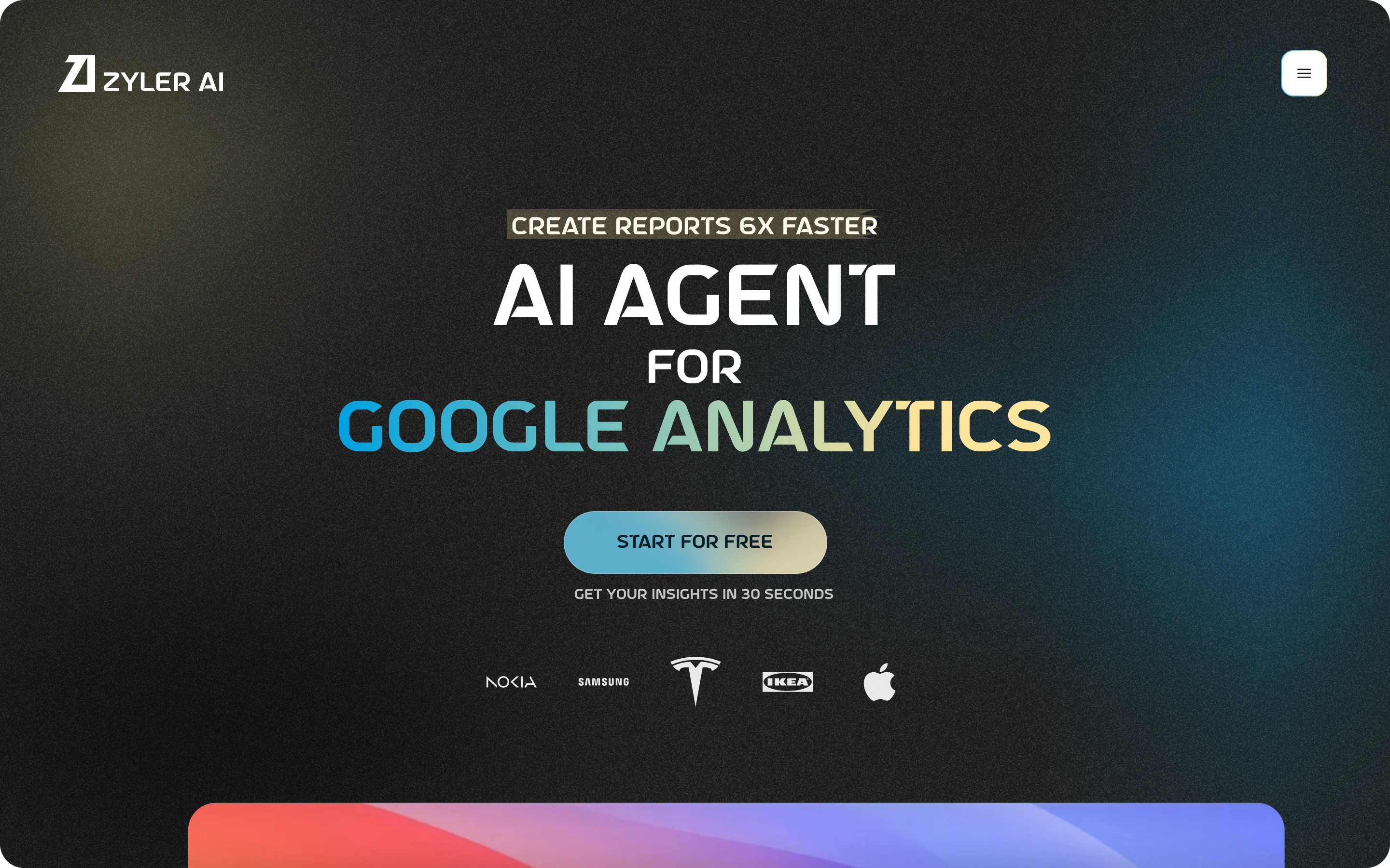
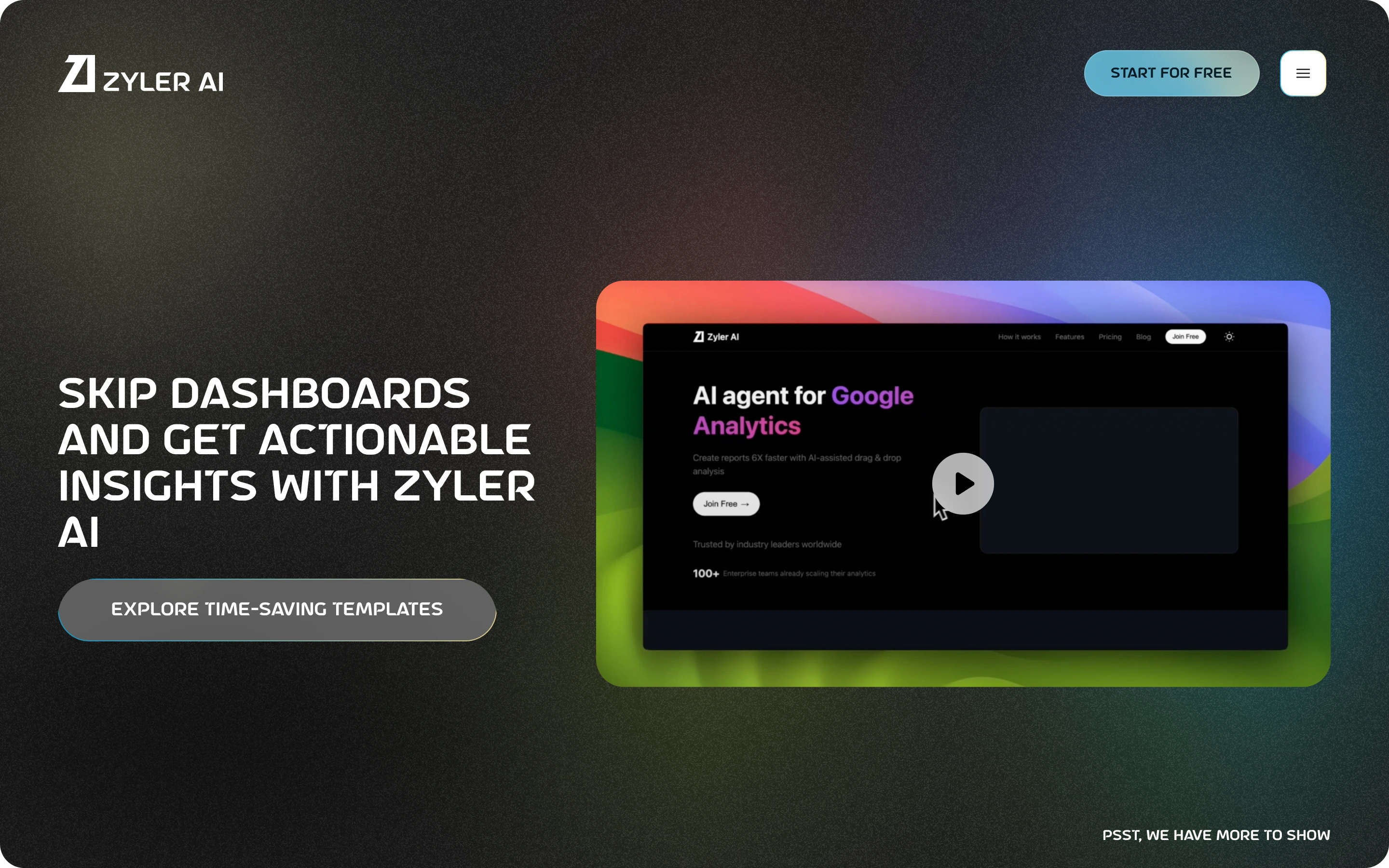
4️⃣ Step 4: We got it!
The first Version was born! and we loved it
🎨 Colors
This color combination brings out the best of each other, each colors feels like a friend to the other and they reflect robustness, modernism and trust

✍🏼 Fonts
We used a lovely font paring
a Astro Space: for Heading & Titles
Roc Grotesk: for everything else
😲 The wow
we wanted the website to feel special and look different than the 123142141 ai websites out there, so here comes the 💫subtle animation💫.
we added a background animation so subtle that you have to look for it but also dynamic enough that you will feel it
The Noisy background: we love solid colors, but we love noisy backgrounds even more
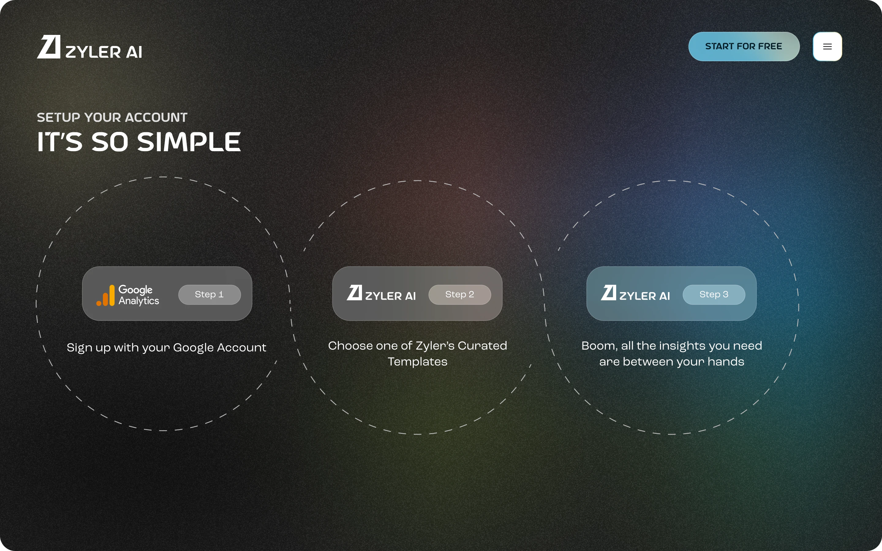
⛹️♂️ The prototype
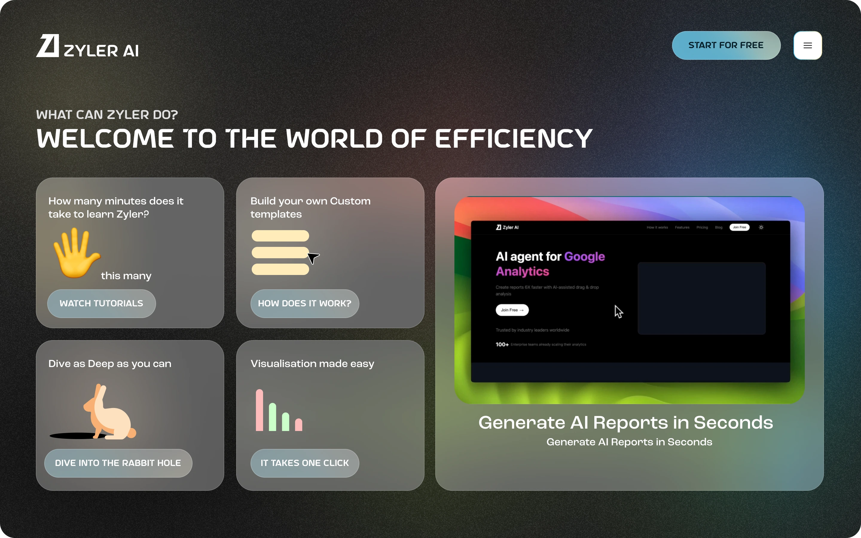
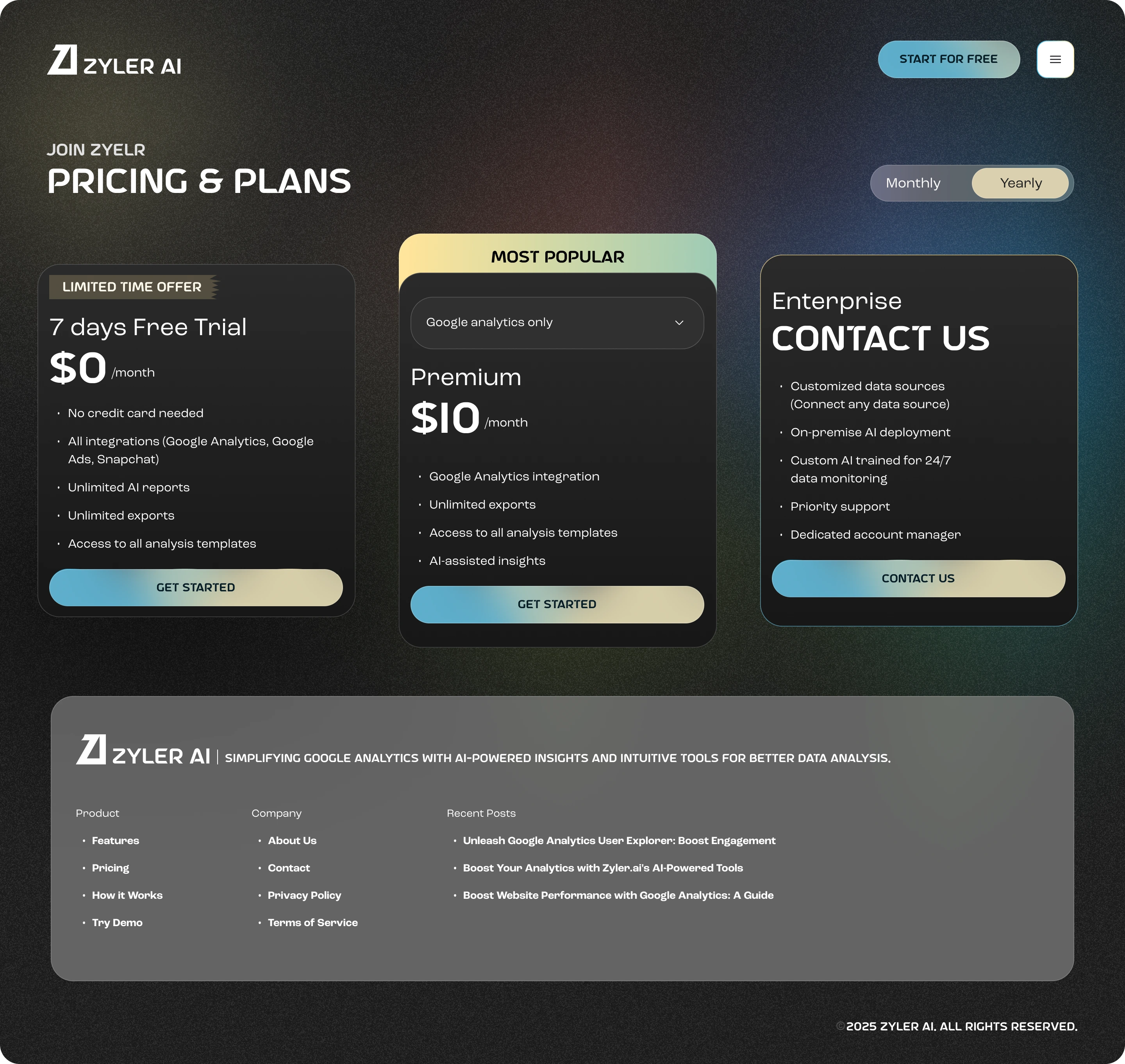
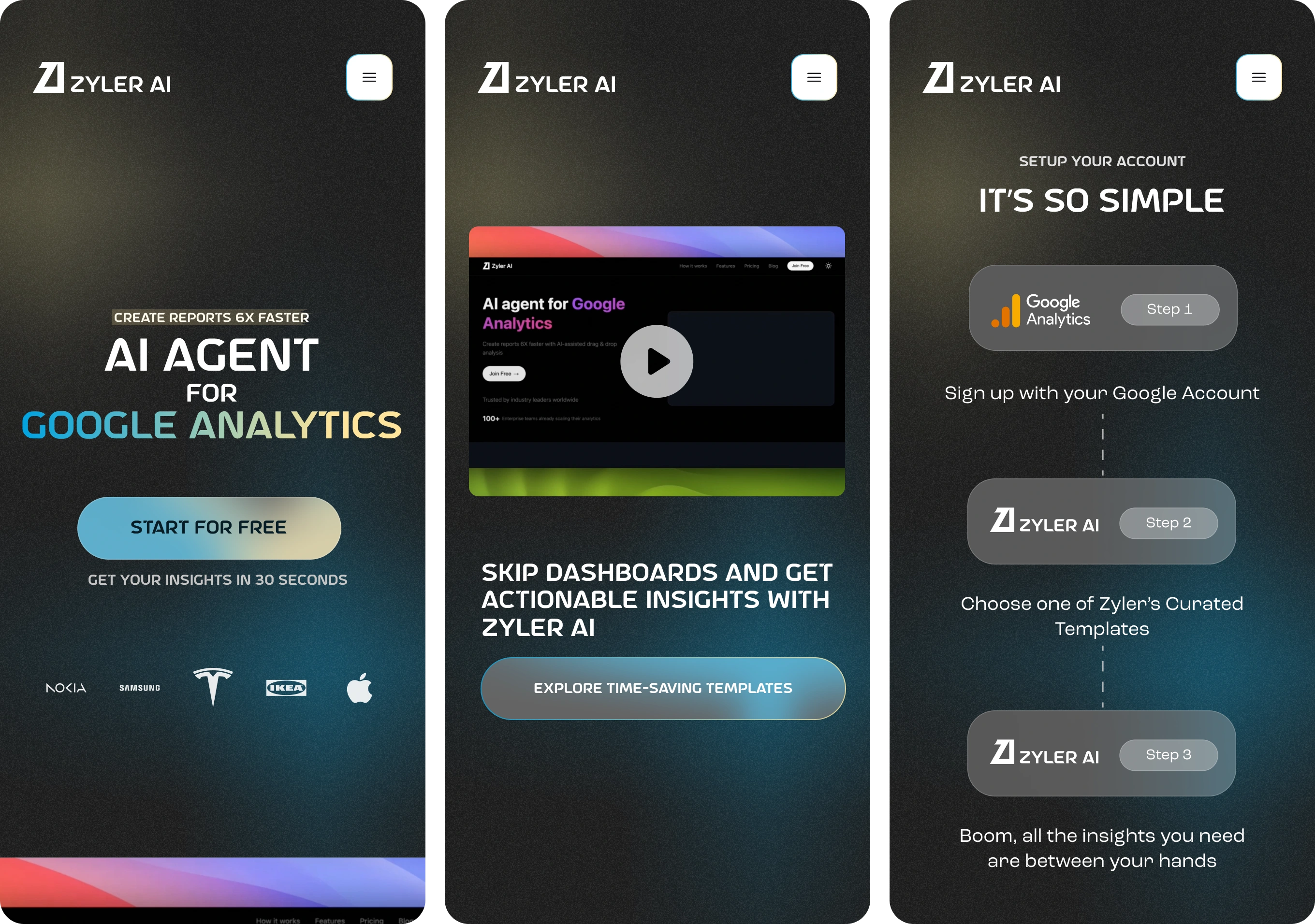
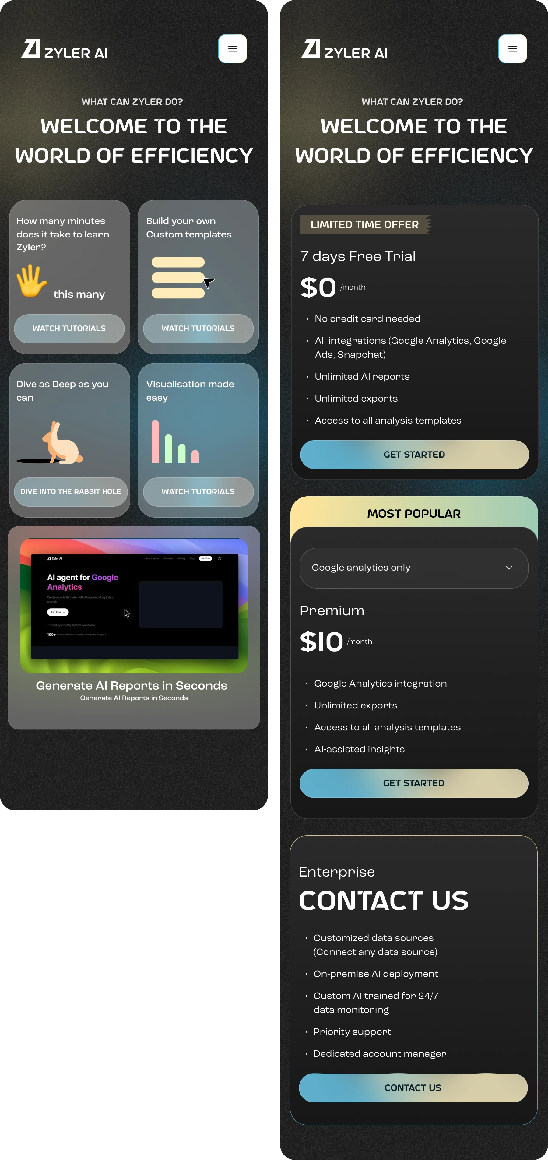
Screens

Like this project
Posted May 22, 2025
Zyler.ai's landing page, redesigned to reflect the great creativity and power of the platform and showcase its true potential.
Likes
1
Views
16
Timeline
Mar 1, 2025 - May 31, 2025