Matiz — Handmade Ceramics Brand Identity

Nadia Ariefdien


MATIZ
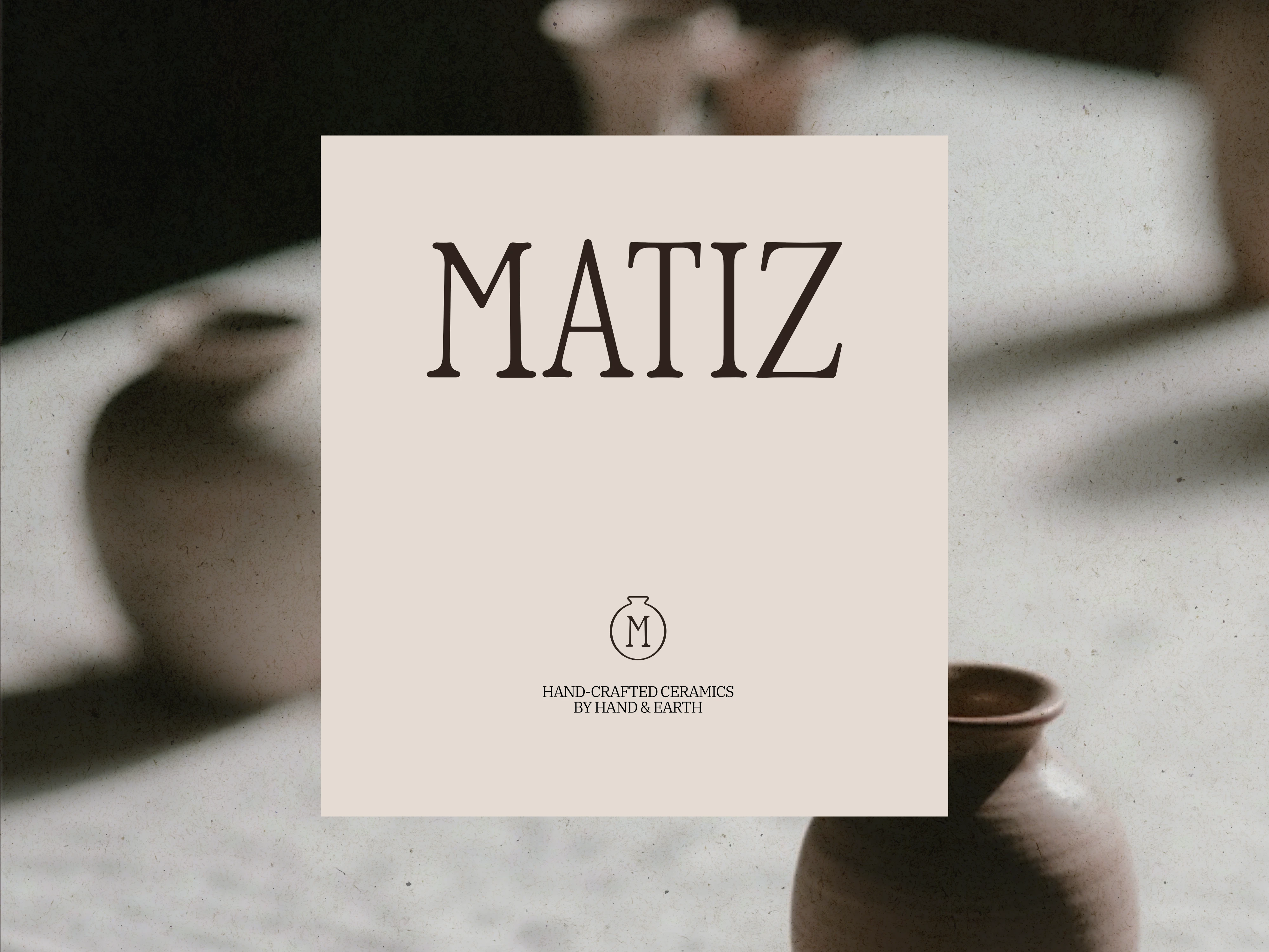
Matiz is a handmade ceramics brand built around raw texture, natural pigment, and the small imperfections that make something feel truly made by hand. Matiz creates mugs and bowls designed for slow mornings, and decor for quiet, tactile homes.
The Logo
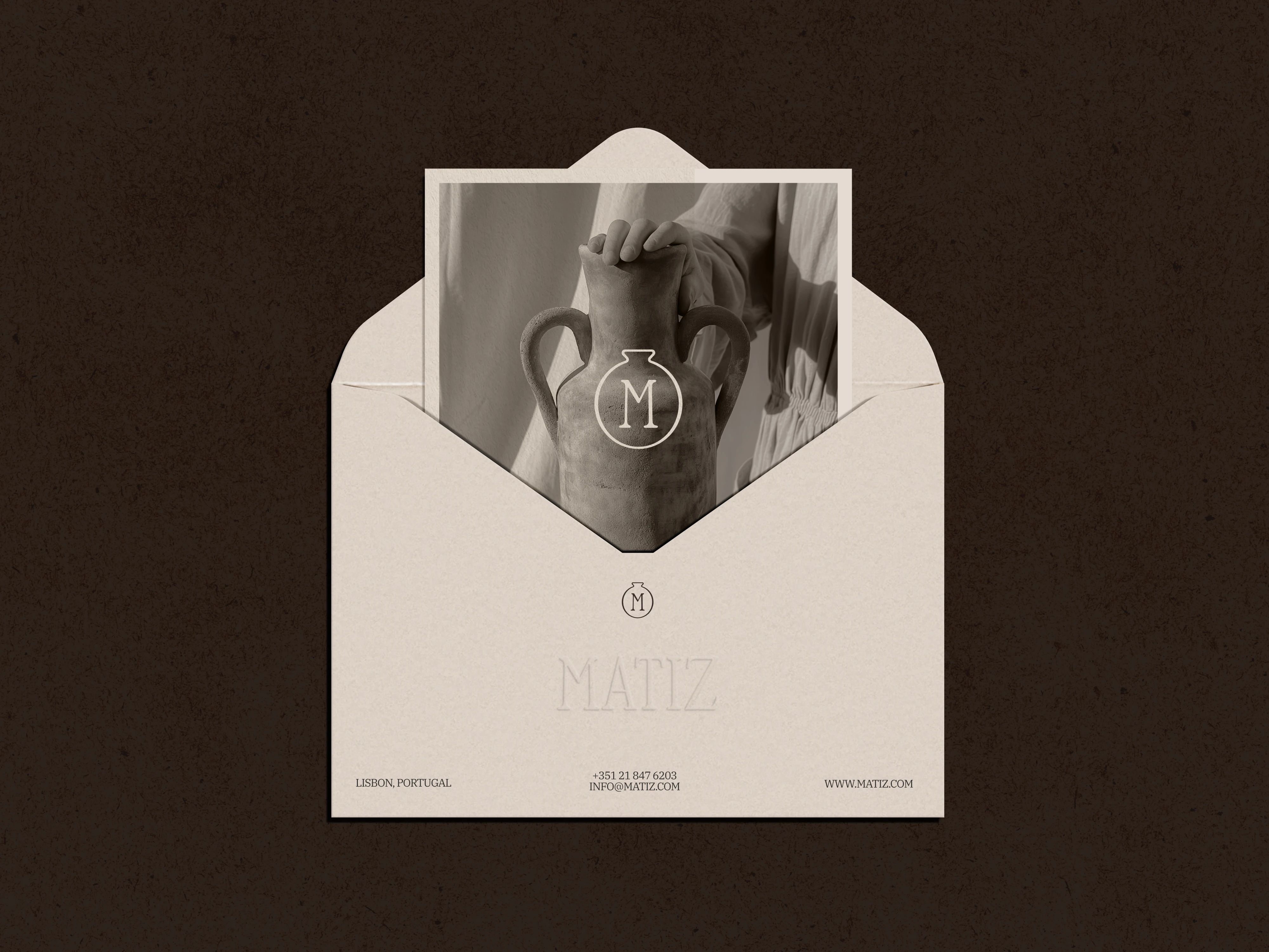
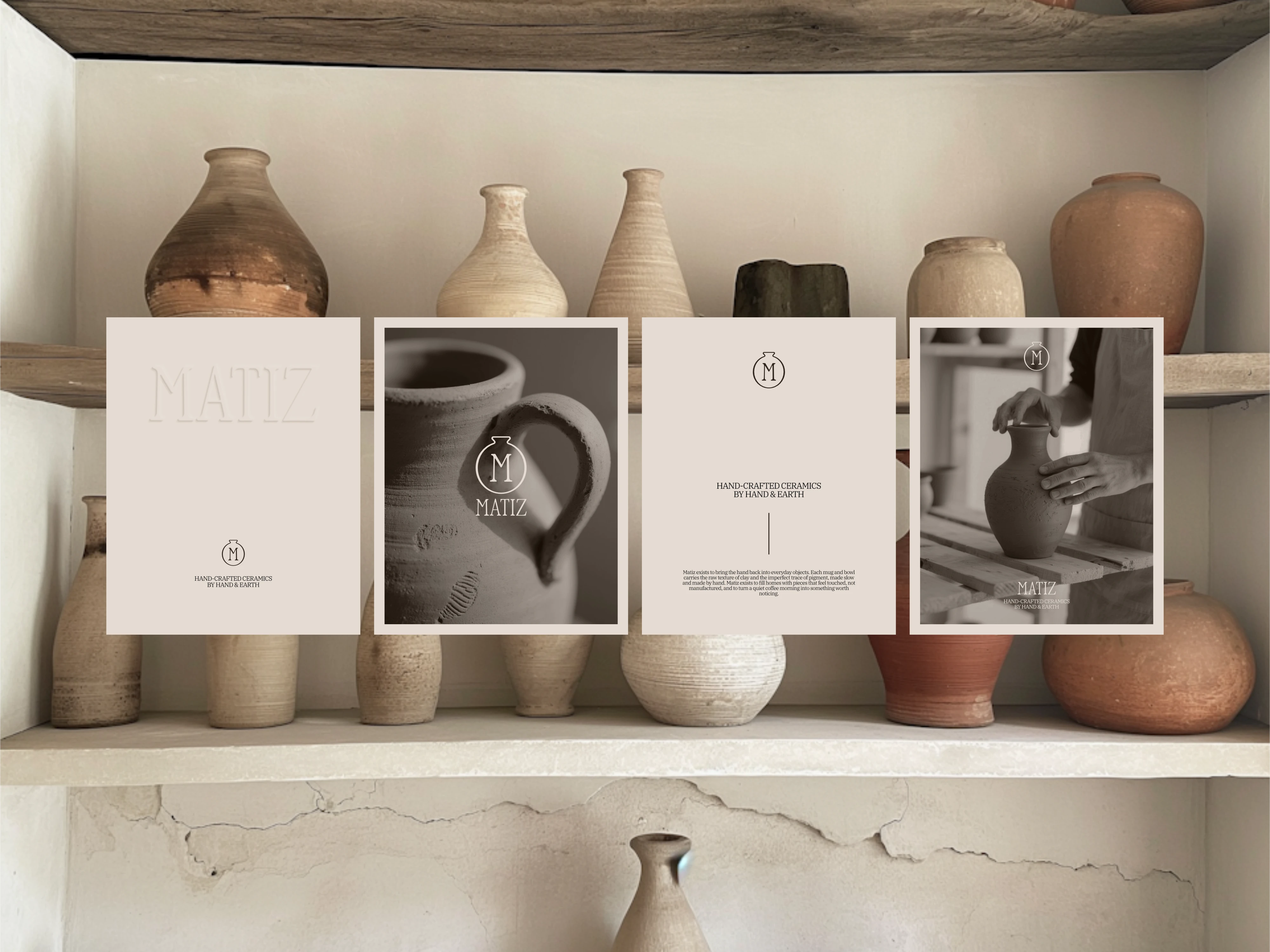
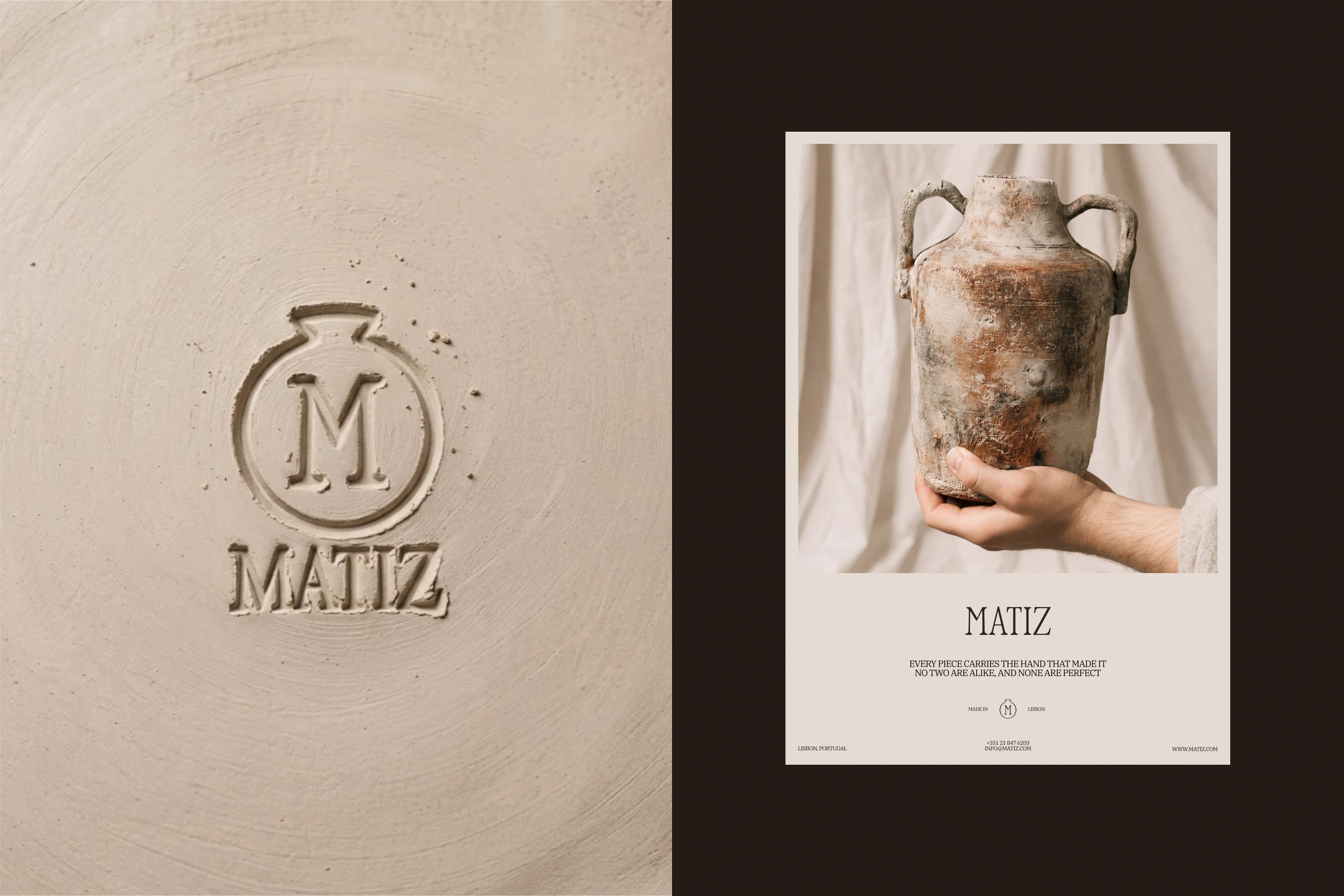
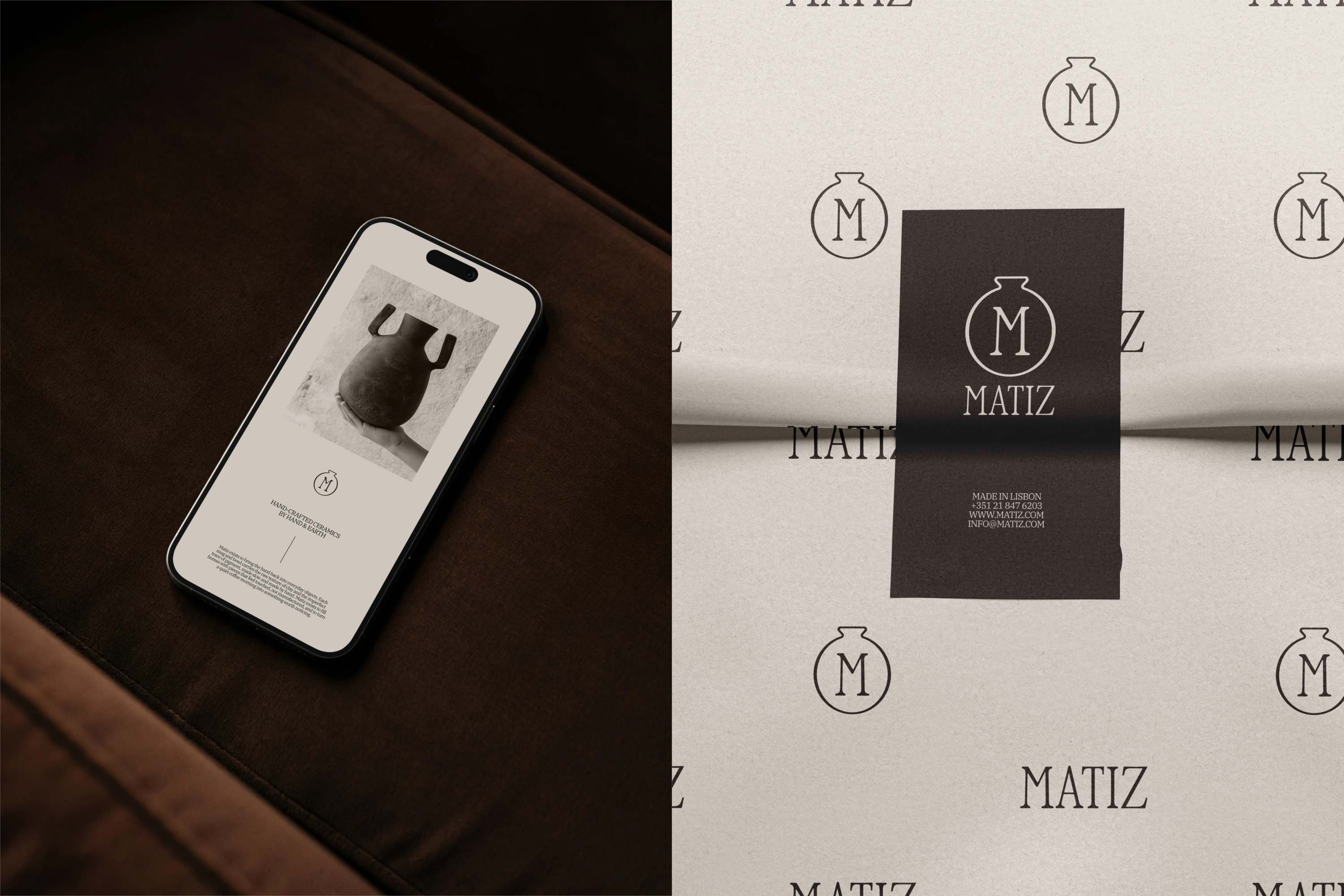
The logo features a simple illustration of a ceramic pot with the brand initial ("M") inside it. The goal was to create a mark that felt elegant, understated, and timeless.
Typography
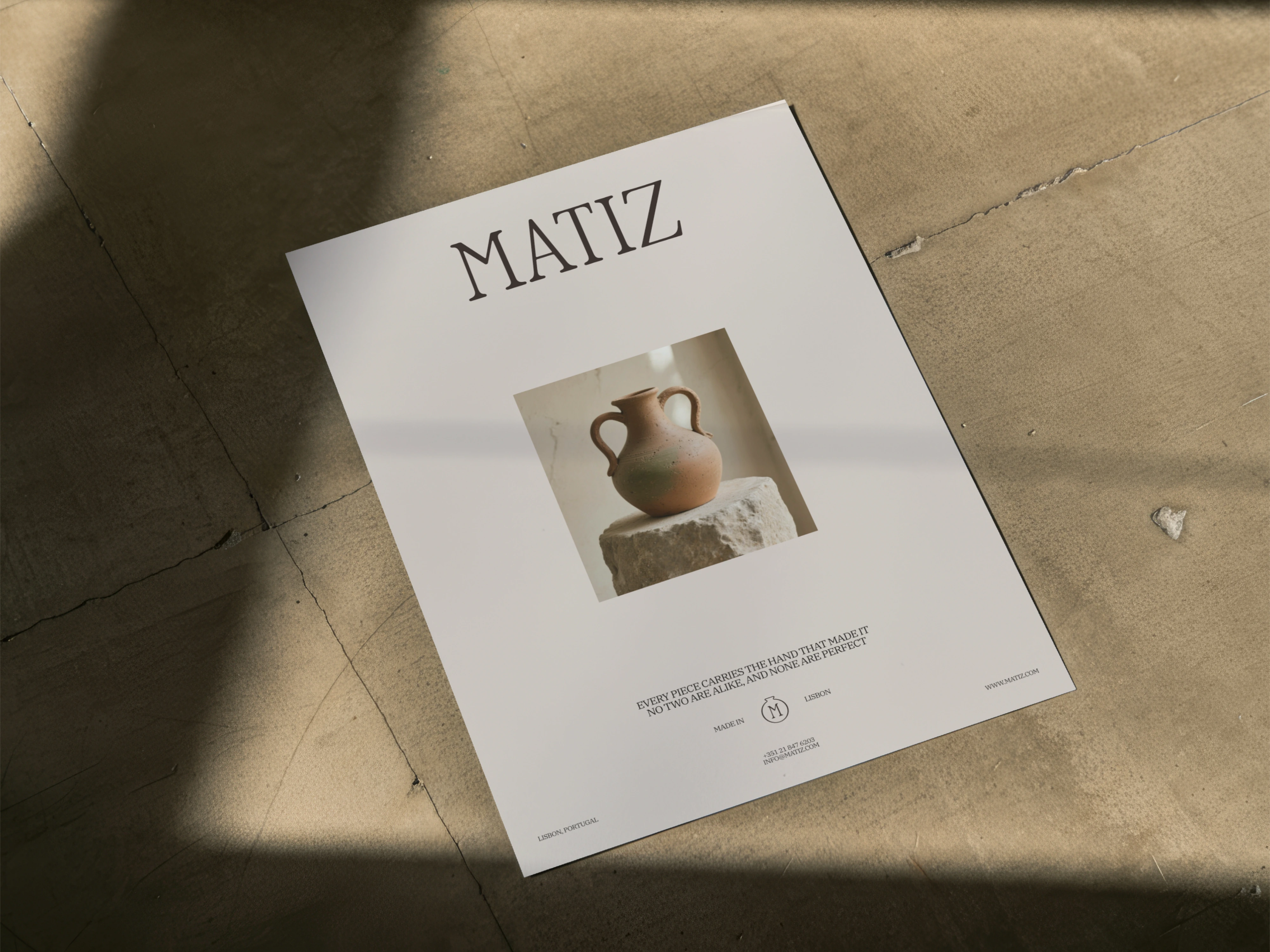
The typeface ZT Bros Oskon 90's by Zelow Type was used for the wordmark and headers. ZT Bros Oskon 90's is a retro-feeling serif typeface with an understated vintage ambiance. I chose this typeface for its elegance and simplicity.
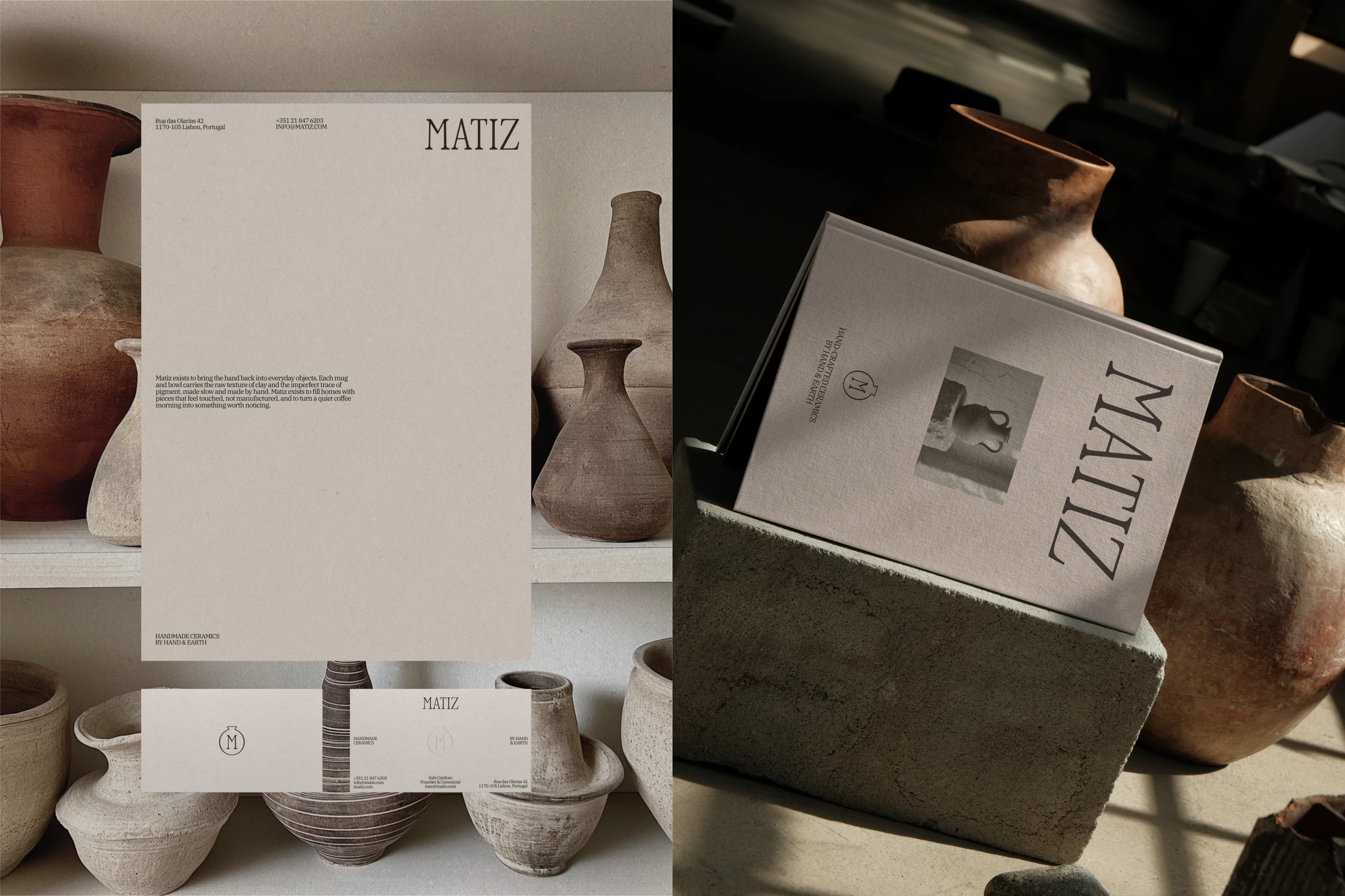
For body copy, I chose IBM Plex Serif by Mike Abbink and Bold Monday. IBM Plex Serif is a simple serif typeface that complements the primary typeface beautifully and is legible at smaller scales, thus making it suitable for smaller font sizes.
Colors
The color palette consists of various shades of warm beiges and browns. I aimed to create a cohesive color scheme that feels earthy, timeless, and elegant. I also aimed to select colors that resemble clay, tying the color palette into the brand's craft.
The Identity
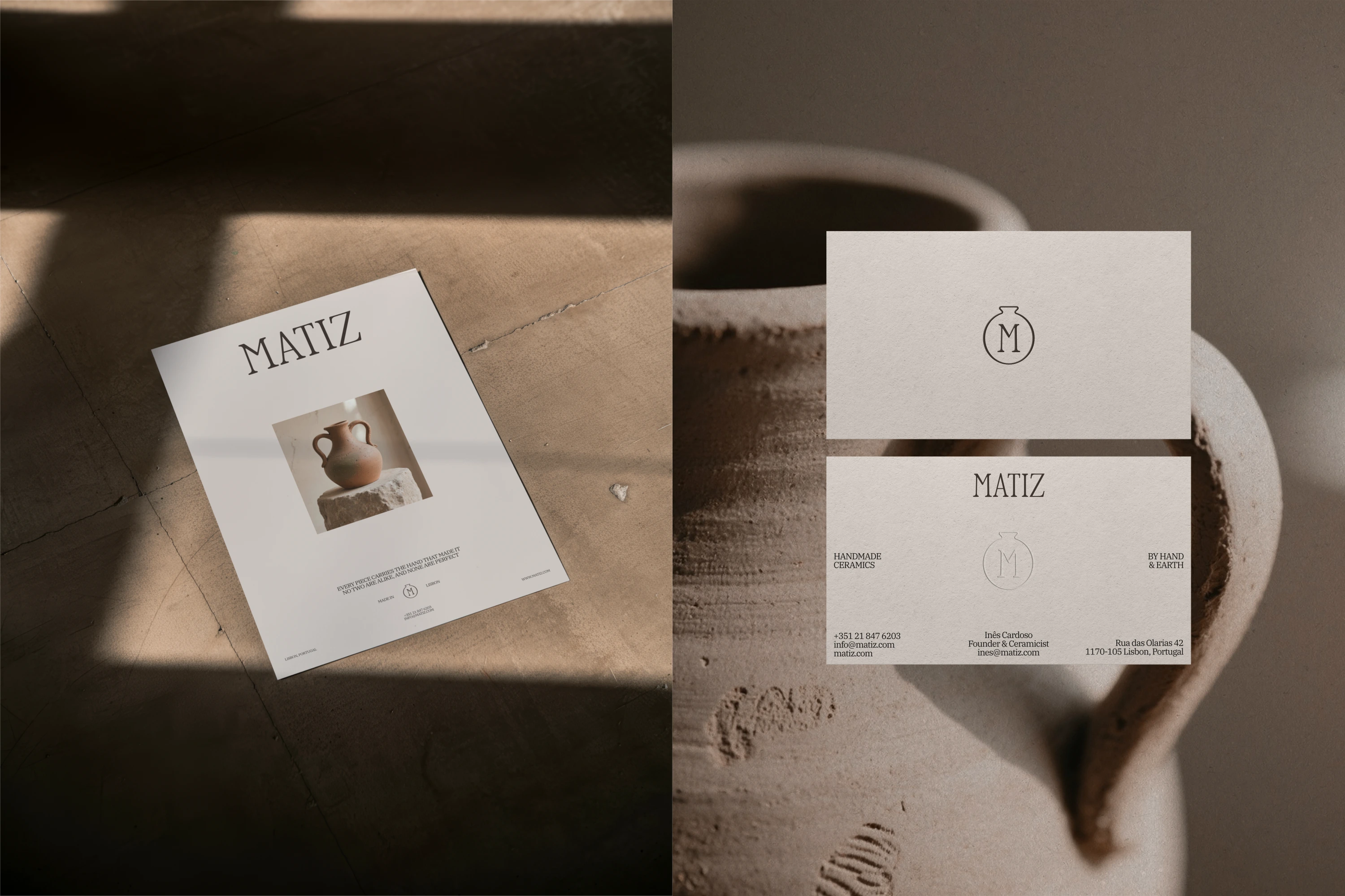
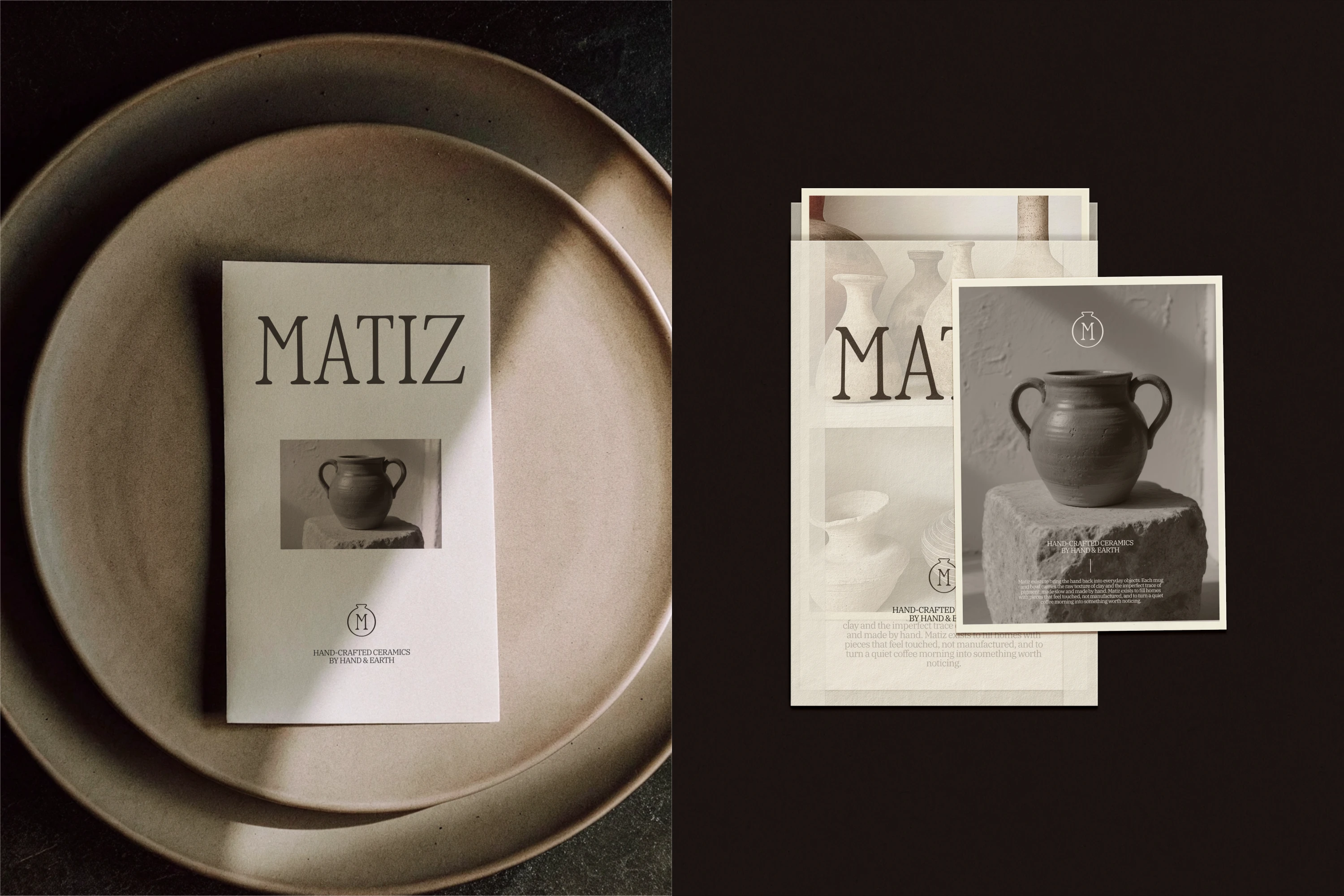
The goal for this identity was to create something that feels earthy and tactile, but also elegant and refined. The identity was designed to communicate the quality of the brand's craft, but also to express the tactility and human element of working with clay.
Like this project
Posted Sep 5, 2026
Designed an elegant and tactile brand identity for Matiz.