
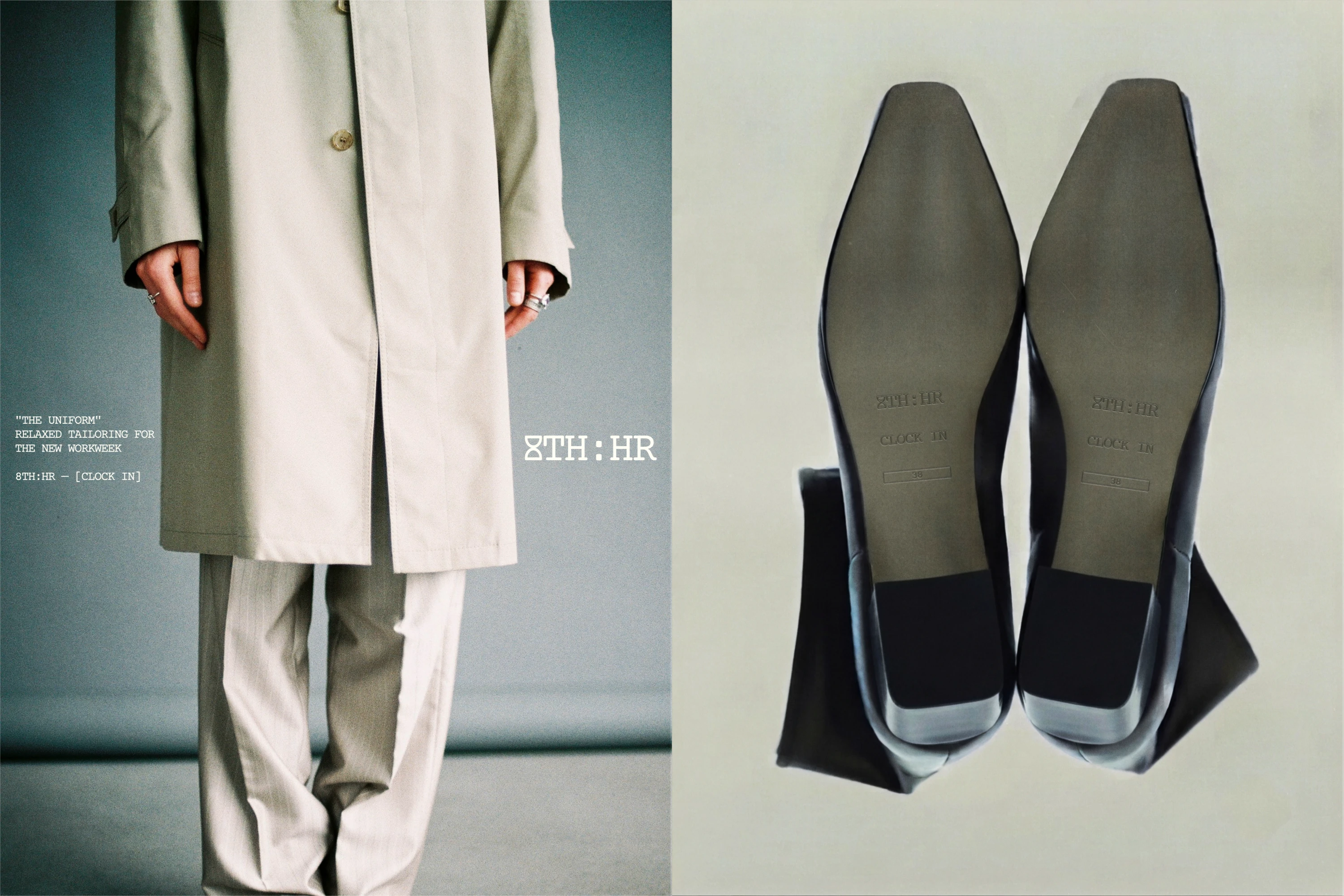
8TH:HR
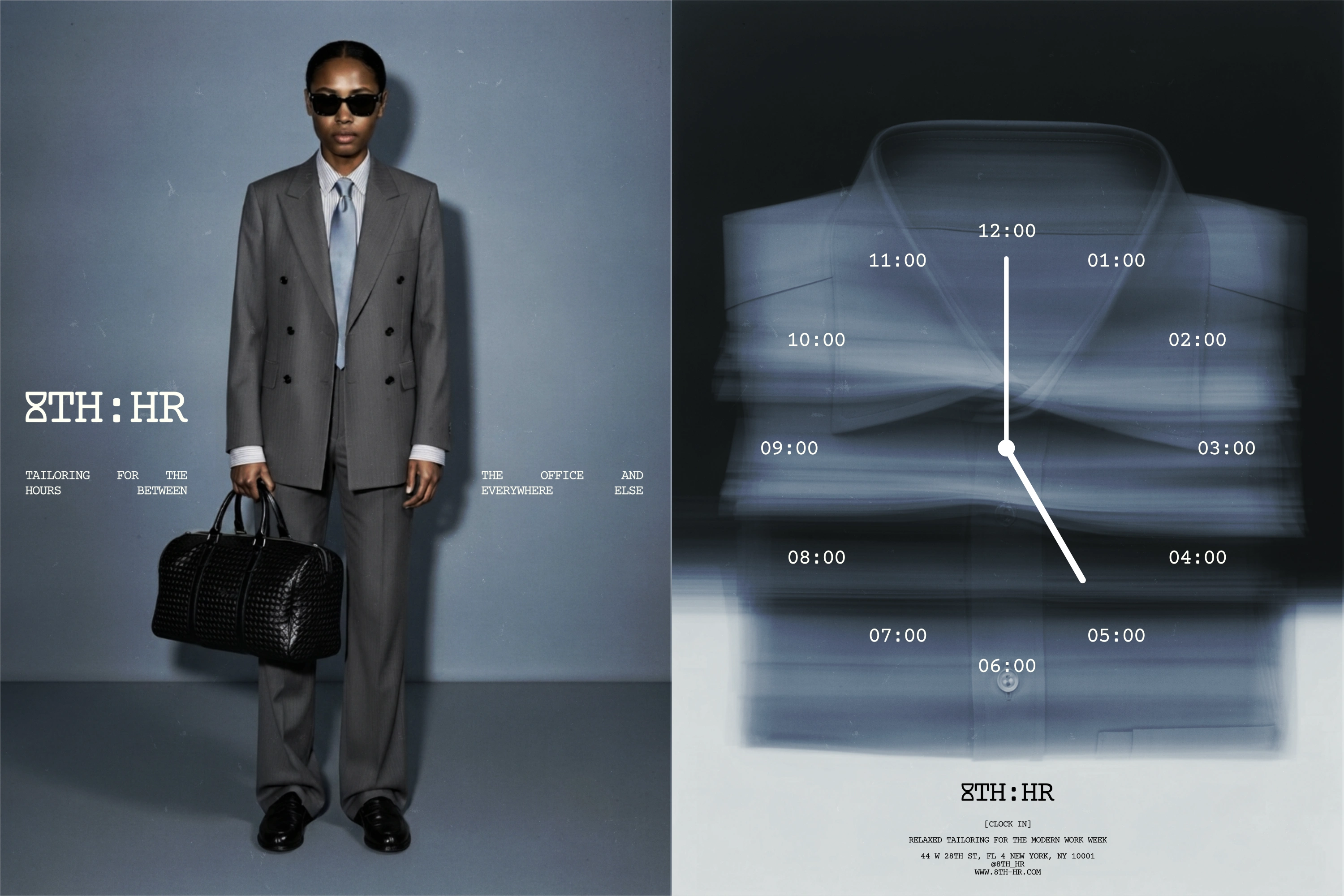
8TH:HR is a modern workwear and tailoring brand redefining the corporate uniform. Born out of the tension between office culture & street style, the brand crafts relaxed tailoring for a new generation of creatives.
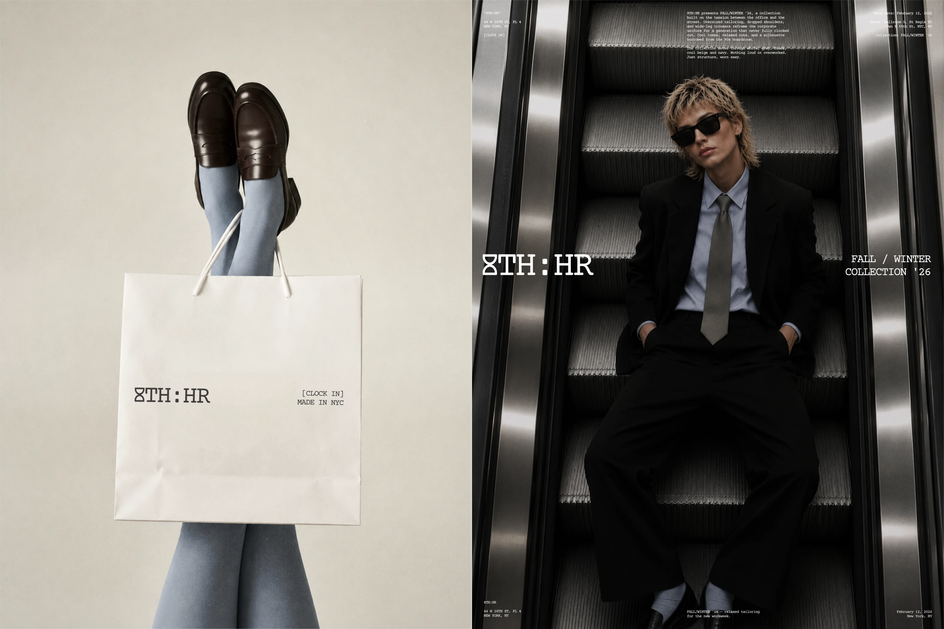
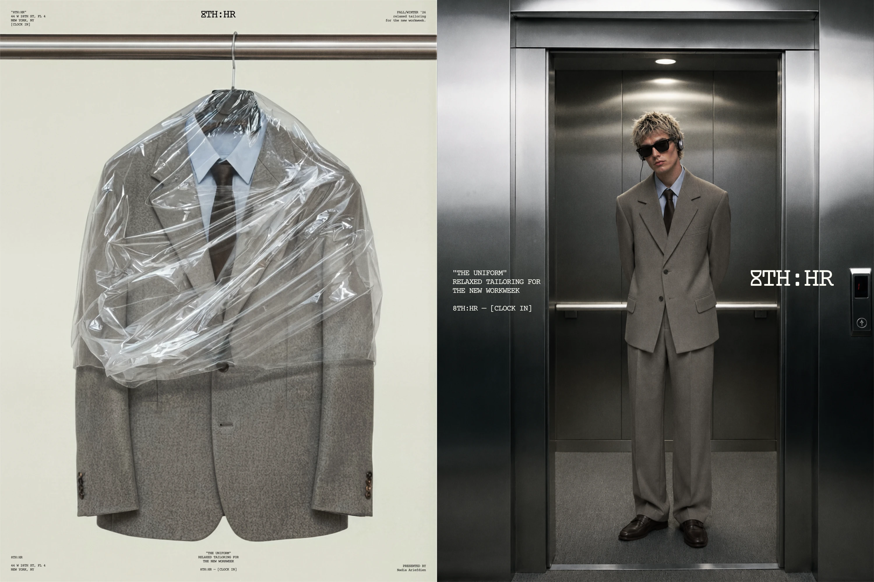
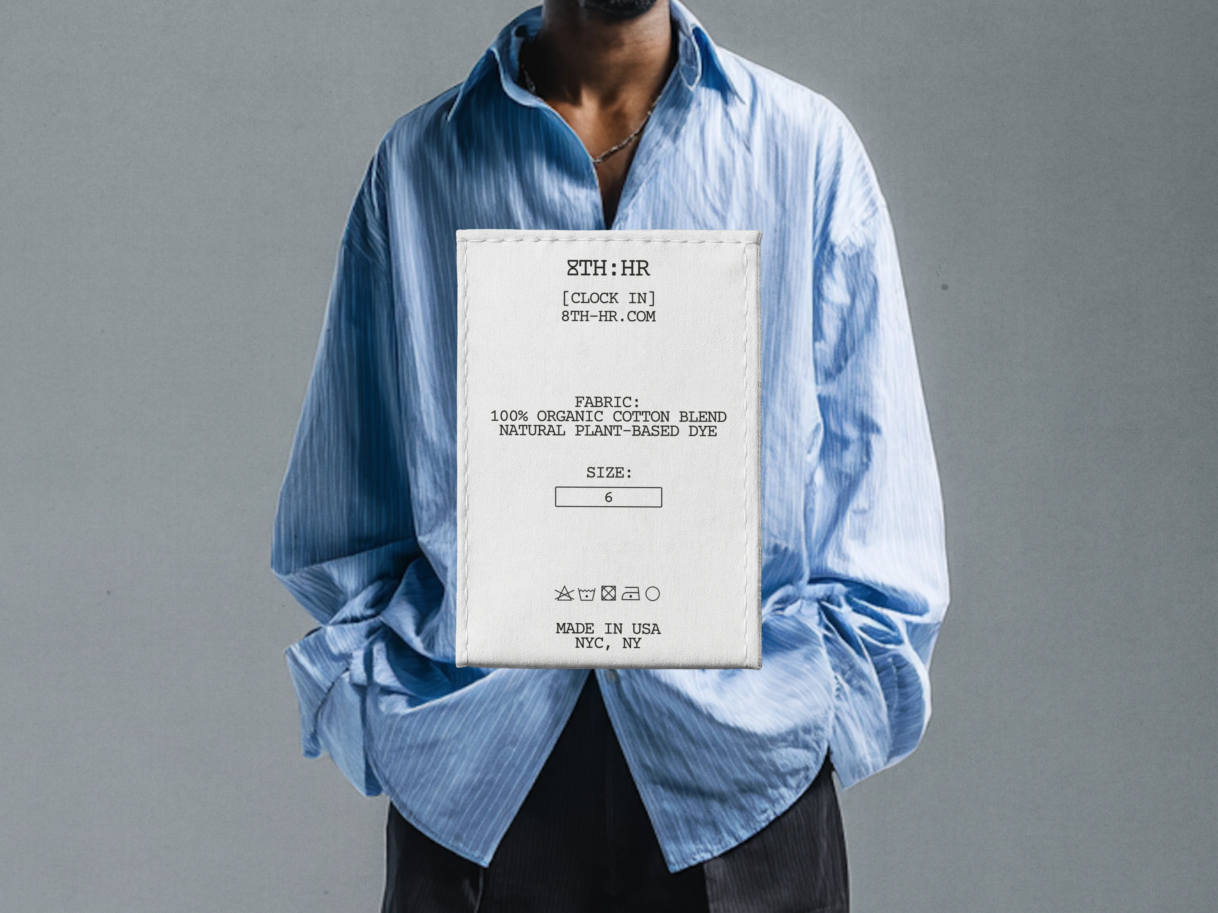
8TH:HR is built on the tension between the office and the street. Oversized tailoring, dropped shoulders, and wide-leg trousers reframe the corporate uniform for a new generation. The brand's identity and signature style is built on cool tones, relaxed cuts, and a silhouette borrowed from the 90s boardroom. It's understated but edgy, and nothing is loud or overworked.
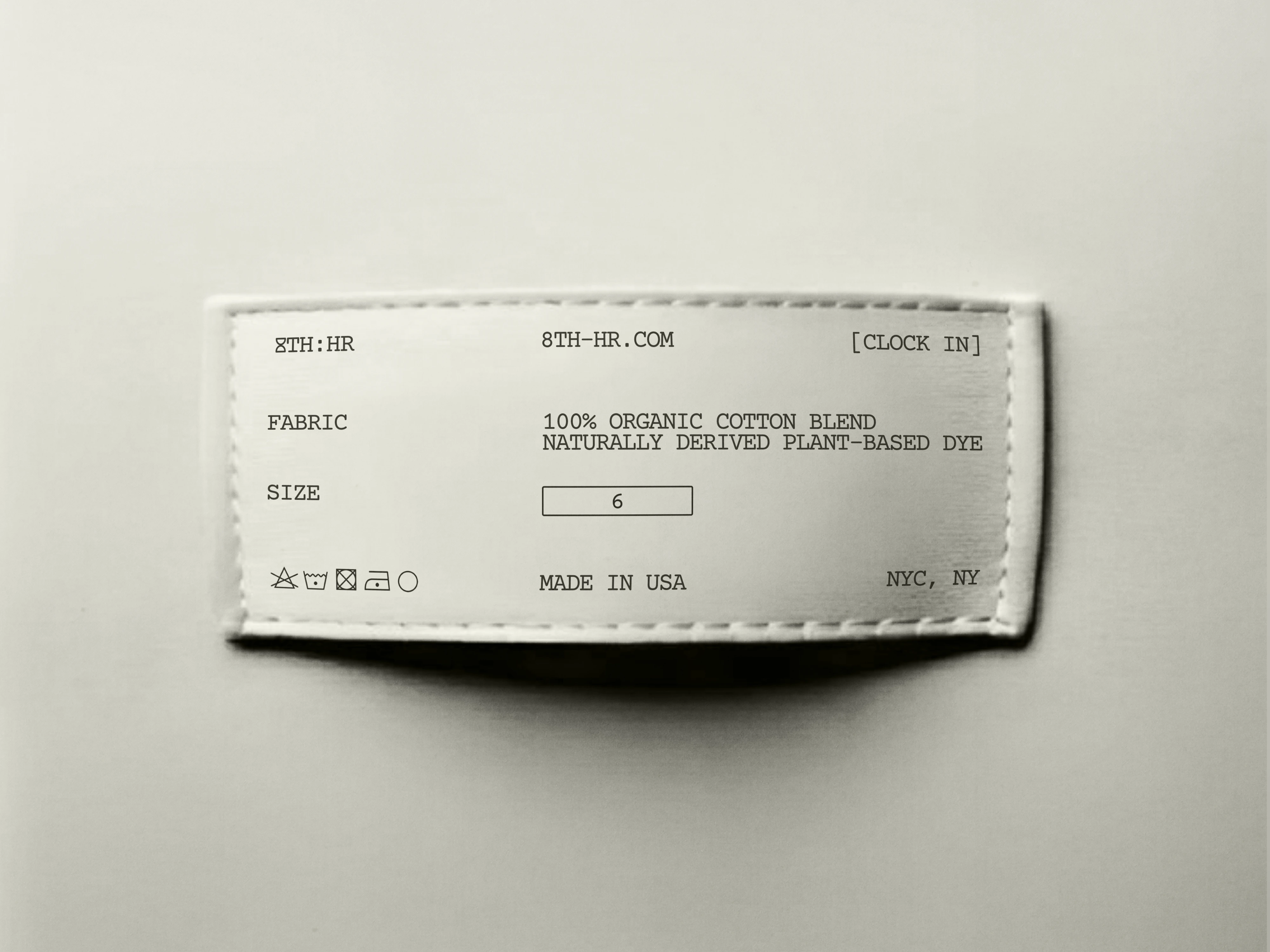
Typography
For typography, I utilized Courier Prime by Alan Dague-Greene as the brand's primary typeface. Courier Prime is a simple analog-feeling monospaced typeface reminiscent of old typewriters and vintage office life. This typeface feels like a nod to the past, but is still clean and simple enough to keep the visual identity feeling chic and elevated.
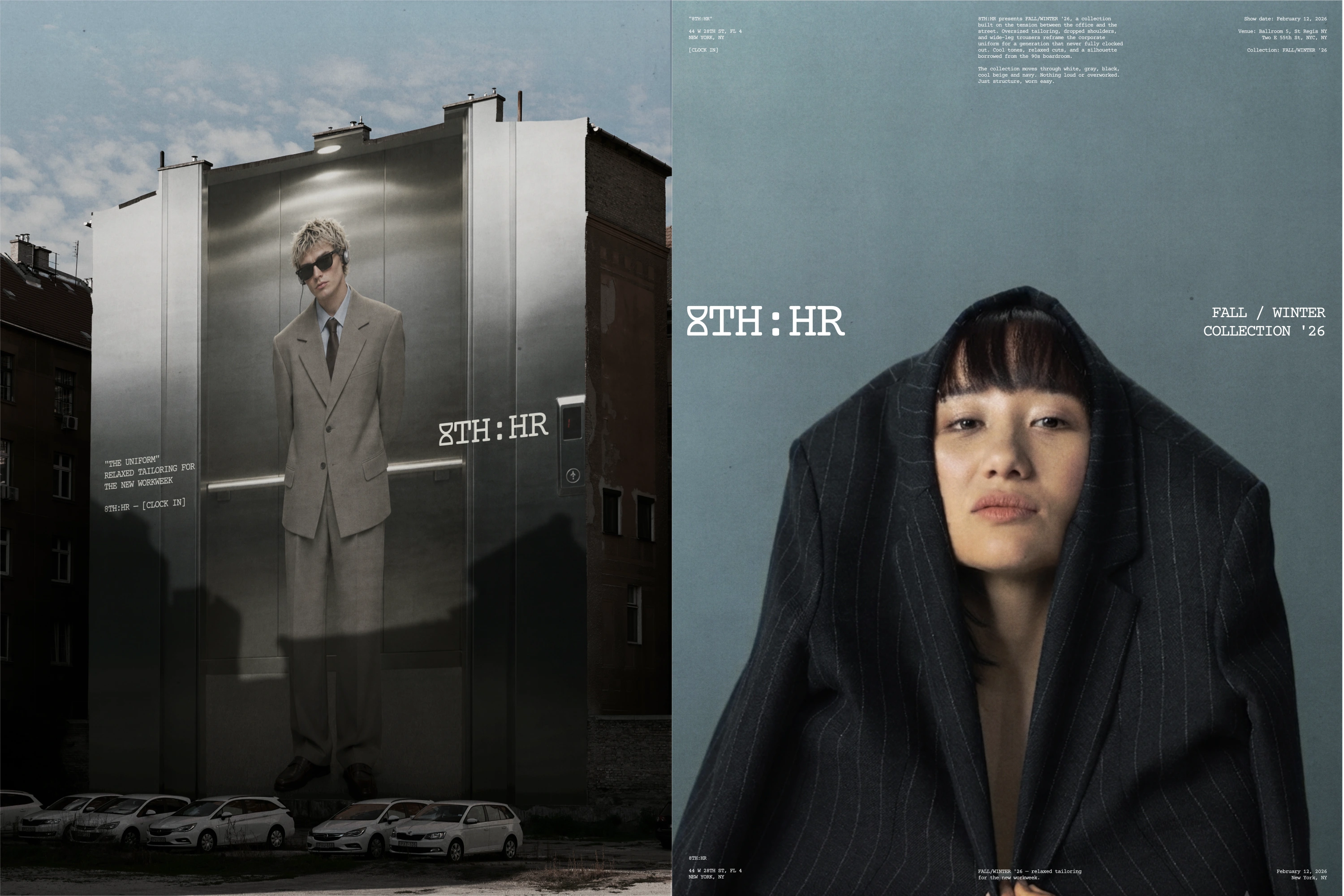
The Wordmark
The wordmark features the brand name in the primary typeface, but replaces the 8 with an hourglass illustration that fits seamlessly into the brand name alongside the typography. The hourglass is a subtle nod to the meaning of the brand name, referring to working hours and the 8-hour work day.
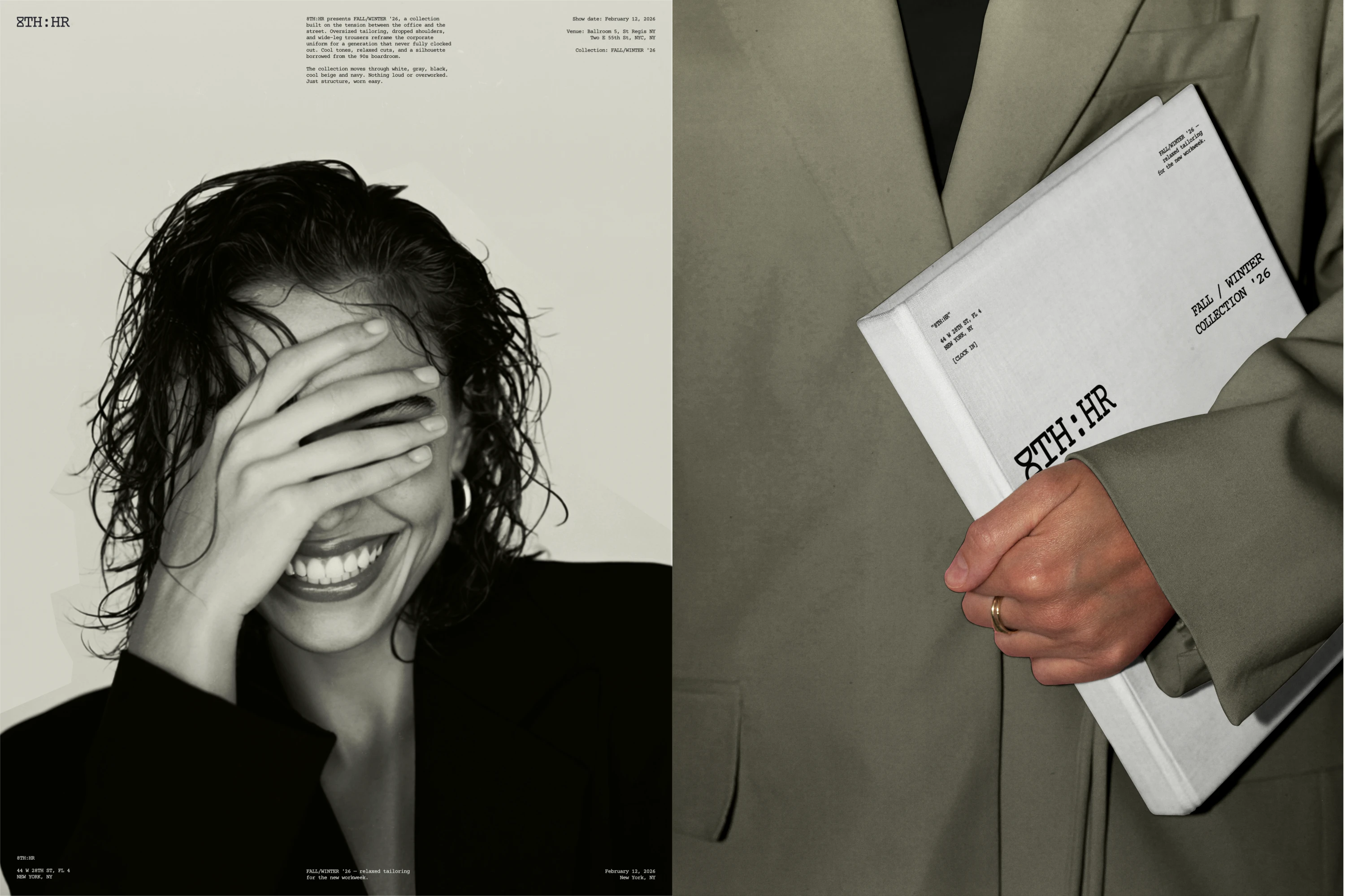
The Slogan
The slogan "CLOCK IN" is a clever play on the brand name as well. It plays on the common gen-z term "lock in", referring to locking in and getting things done, but the words "clock in" also refer to clocking into a work shift.
Look & Feel
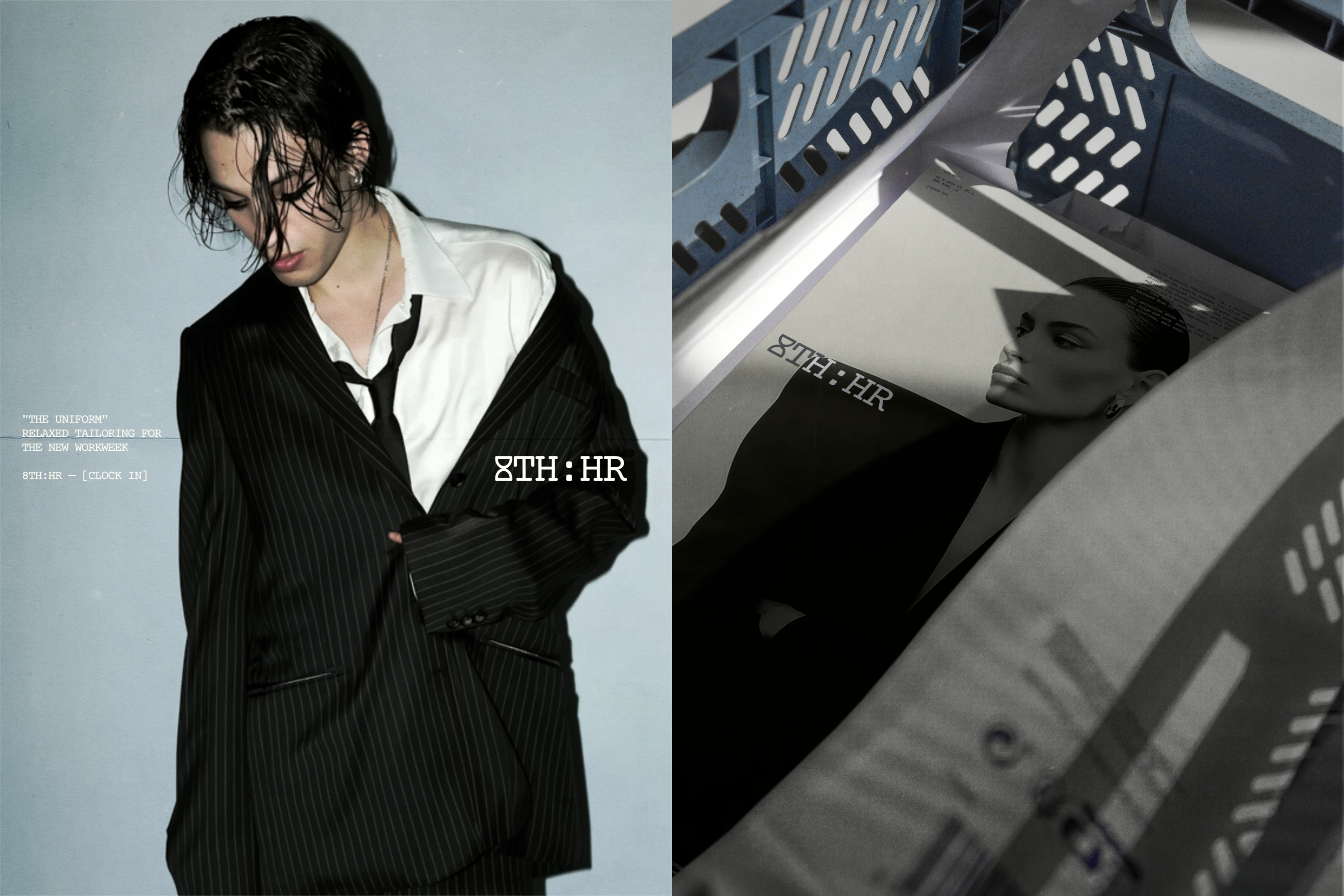
The designs feature simple layouts with lots of white space, small text, and micro graphics to give the identity an elevated, uncluttered feel that sits perfectly within the high fashion space.
Overall, the identity feels chic, minimalist, and elevated. It features a subtle nod to the past, borrowing from 90's fashion aesthetics, but still feels clean enough to fit in the modern landscape.
3 likes · 40 views · Aug 22, 2026
Created a chic, minimalist brand identity for 8TH:HR.


