Spacelance Platform Redesign for Enhanced UX and SEO
Habeebah Owojori
How I Helped Spacelance Redesign Their Platform to Simplify Virtual Office Access Across India
Client: Spacelance
Role: Product Designer
Timeline: 4 weeks
Tools: Figma
Industry: Virtual Office, Coworking, Business Services
Scope: UX Research, UI Design, Content Architecture, Interaction Flow
Before: A Platform That Needed Clarity and Cohesion
Spacelance is a company that provides virtual offices, coworking, and business registration solutions across major Indian cities — enabling entrepreneurs and growing businesses to get official business addresses, mail handling, and compliance-ready documents with ease.
However, the existing website had several usability and structural issues:
A cluttered layout and inconsistent hierarchy
Confusing navigation between services and locations
Overwhelming one-page signup process
Poor SEO structure and underutilized content
Outdated interface with weak visual hierarchy
The platform offered immense value, but the user experience didn’t reflect its reliability or simplicity, which impacted conversions and trust.
Spacelance Old Landing Page
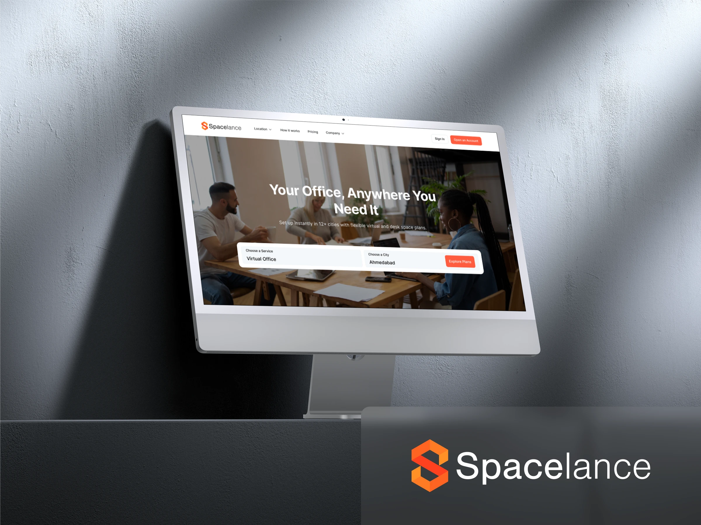
After: A Streamlined, Scalable, and Conversion-Focused Experience
I redesigned Spacelance’s entire digital experience, from information architecture to visual identity and flow logic to make it intuitive, modern, and scalable across multiple service types and locations.
Spacelance New Landing Page
Restructured Information Architecture
The site was reorganized to highlight Spacelance’s three main offerings: Virtual Office, Desk Space, and Coworking.
Each service and location (e.g., Kochi, Bangalore, Pune) now has a dedicated SEO-optimized landing page, allowing users to quickly find plans, compare offerings, and subscribe directly.
Simplified Sign-Up Flow
I replaced the old one-page form with a guided step-by-step signup process, minimizing cognitive load and improving completion rates.
Users now move from selecting a plan → entering business details → reviewing their summary in a clean, linear flow that builds confidence and transparency.
Clear Plan Presentation
Pricing and inclusions were restructured for clarity, emphasizing value and benefits rather than just cost.
A summary card at the top of the signup page allows users to review or change their selected plan anytime, improving control and decision-making.
Consistent Visual Language
The interface was redesigned using a modern, minimal design system, clean typography, balanced white space, and contextual icons ensuring scalability across future pages and services.
SEO-Optimized City Pages
Each city page (e.g., “Virtual Office in Bangalore”) includes a local SEO section, improving organic visibility and supporting Spacelance’s multi-location business model while maintaining uniform design consistency.
Results
Streamlined signup experience for faster onboarding
Improved plan comprehension and transparency
Enhanced content clarity and hierarchy
Consistent visual system across all service types
Strengthened SEO performance with localized structure
Deliverables
UX Research and Sitemap Redesign
Low & High-Fidelity Wireframes
Full UI Redesign in Figma
Design System Documentation
SEO & Content Strategy Framework
Spacelance About
Outcome
The redesign positioned Spacelance as a modern, trustworthy platform that makes setting up a virtual office in India simple, clear, and conversion-focused, reducing friction for new users and strengthening brand credibility across all locations.
Let’s Redesign Your Platform for Clarity & Conversion
Loved what I did for Spacelance? Let’s transform your product into a seamless, high-performing experience.
Book a Free 15-Minute Discovery Call
Like this project
Posted Oct 20, 2025
Redesigned Spacelance's platform for improved UX and SEO, enhancing user experience and brand credibility.