Built with Framer
Keel — AI-Native Deployment Platform

Habeebah → Framer


Overview
A premium website template designed for deployment platforms, cloud infrastructure products, and modern developer-focused SaaS companies.
Built around a fictional deployment platform, the template explores how thoughtful design can make complex products feel approachable without sacrificing technical credibility.
Rather than focusing on infrastructure itself, the website communicates a simple promise:
Ship software faster, with confidence.
The Challenge
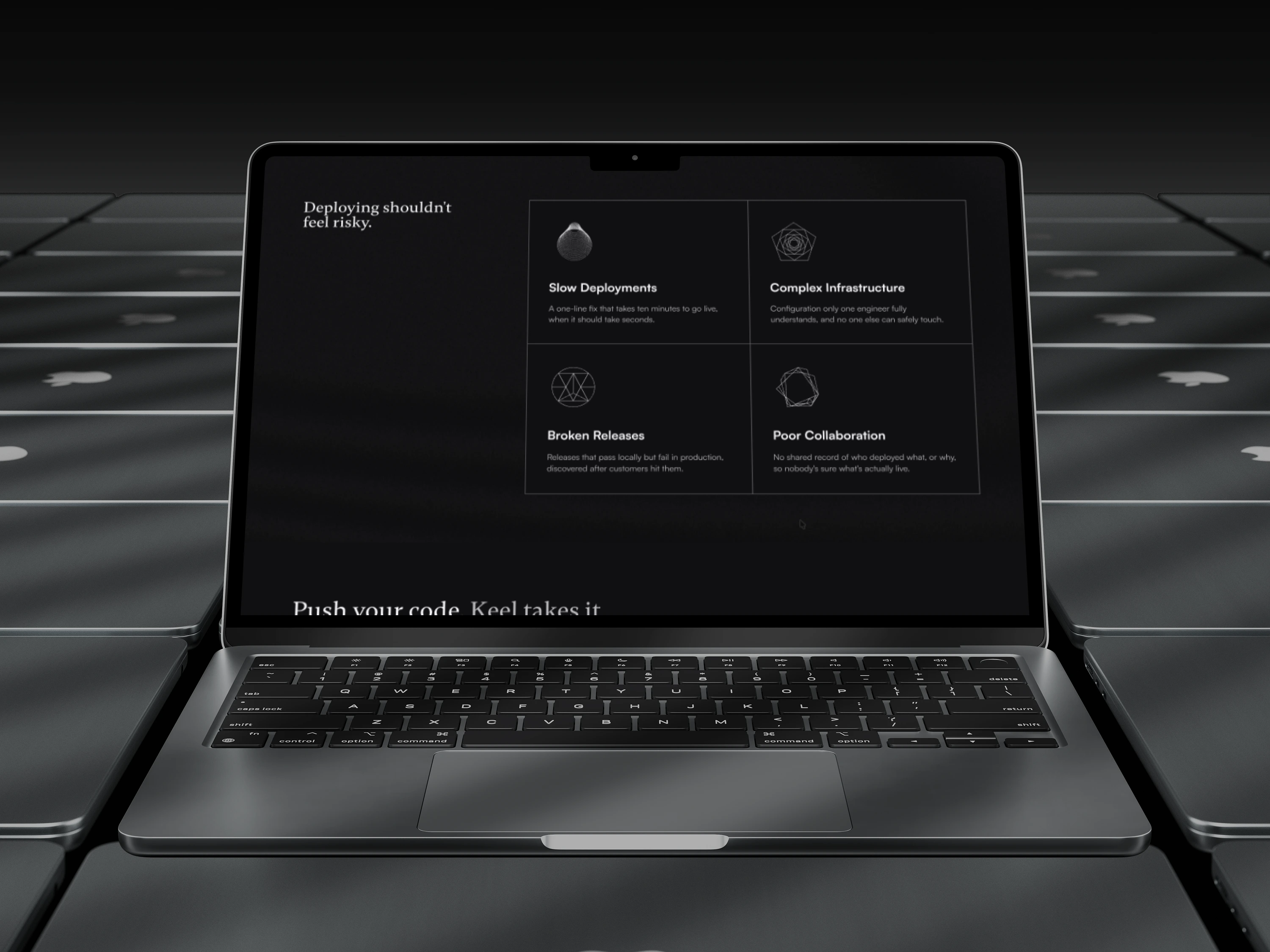
Developer tools often speak almost exclusively to engineers.
The messaging is highly technical, interfaces are dense, and marketing websites frequently assume visitors already understand concepts like deployments, CI/CD, observability, or cloud infrastructure.
The challenge wasn't simply designing another SaaS landing page.
It was learning enough about an unfamiliar industry to communicate it clearly through design.
The Approach
Before opening Figma, I spent time understanding how modern deployment platforms work.
That meant studying:
Software Development Lifecycle (SDLC)
Git & GitHub workflows
Deployment pipelines
CI/CD
Cloud infrastructure
Monitoring & observability
AI-assisted development
Alongside the technical concepts, I analyzed leading products such as Vercel, Railway, Render, and Cloudflare Developers to understand how they communicate with engineering teams.
The goal wasn't to copy their layouts—it was to understand the decisions behind them.
Design Direction
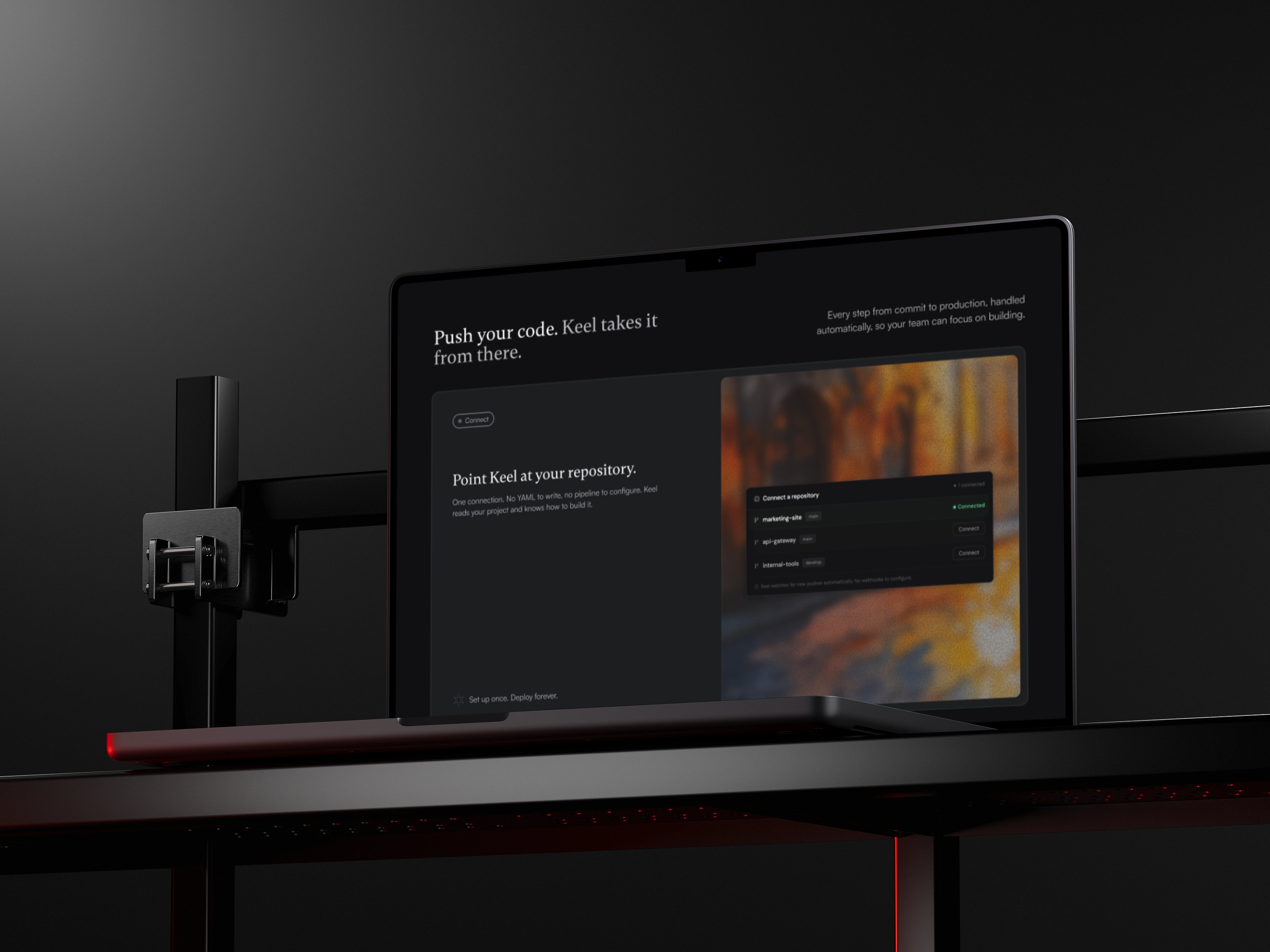
The visual language balances technical credibility with approachability.
Instead of leaning into an overly futuristic or intimidating aesthetic, the interface emphasizes calm, clarity, and confidence.
The core idea became:
Deployment should feel uneventful.
That philosophy influenced everything from the messaging to the dashboard concept and overall information hierarchy.
Visual System
The interface combines editorial typography with minimal UI components to create contrast between brand storytelling and functional product information.
Typography
Gambetta for expressive headlines
Satoshi for interface elements and supporting content
Color Palette
Background:
#202124Primary Text:
#F7F7F9Secondary Text:
#B9B9BDThe restrained palette allows deployment states and system feedback to stand out without overwhelming the interface.
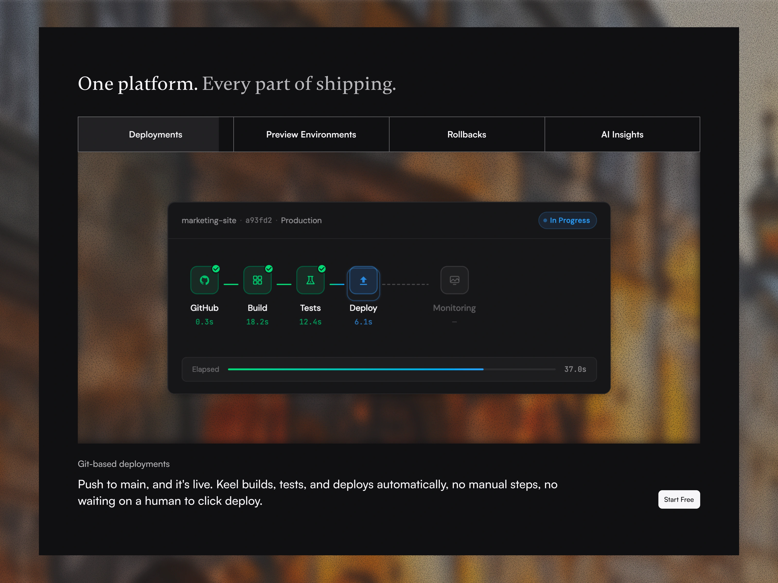
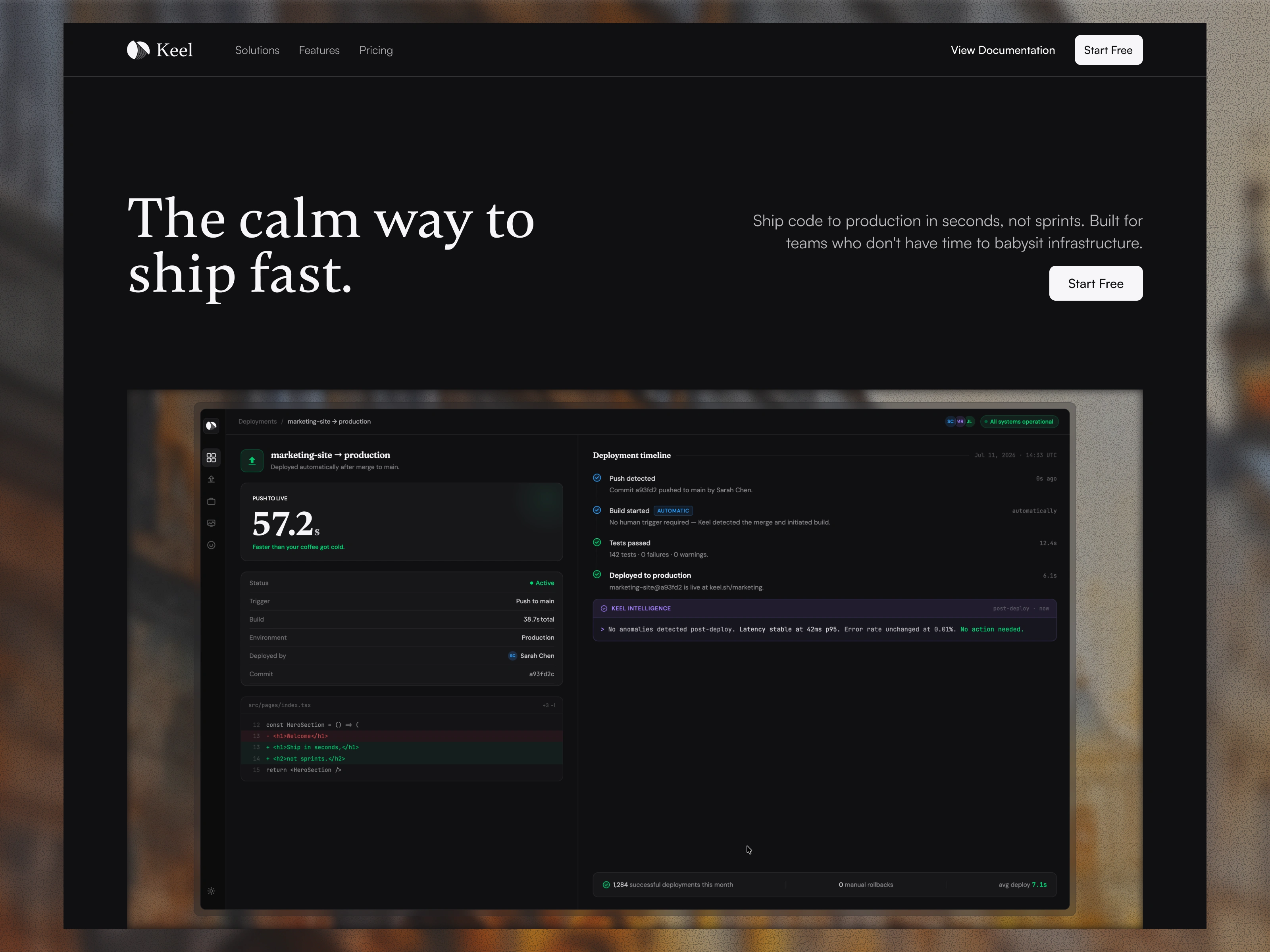
Dashboard Concept
Rather than creating another analytics-heavy dashboard, the product interface focuses on reassurance.
The dashboard tells a story where everything is working exactly as expected.
Instead of highlighting failures, it highlights confidence:
Automatic deployments
Successful build pipeline
AI deployment summaries
Infrastructure health
Deployment history
Operational status
The interface reflects a product that quietly handles complexity in the background so engineering teams can stay focused on building.
Website Goals
The landing page was designed to:
Communicate a technical product with clarity.
Build trust quickly.
Reduce perceived complexity.
Demonstrate product quality.
Encourage users to start a free trial.
Outcome
What started as an exploration for a premium developer tools template gradually became an opportunity to better understand the industry it was designed for.
As the project evolved, so did the process. Instead of relying solely on visual references, I found myself learning how deployment platforms work, the language developers use, and the problems these products are built to solve.
That extra layer of understanding helped shape the design into something that feels more intentional and believable.
Need a custom website design?
Let’s explore your project in a short FREE 15 min call and see how we can bring your idea to life through thoughtful design.
Book a call 👍➡️
Like this project
Posted Jul 18, 2026
Keel is a Framer template built for the next generation of developer tools.
Likes
1
Views
22
Timeline
Jul 8, 2026 - Jul 17, 2026