Early on, I thought strong UI came from flashy visuals. Turn...
Daniel Igbokwe
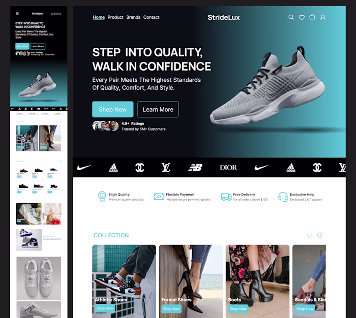
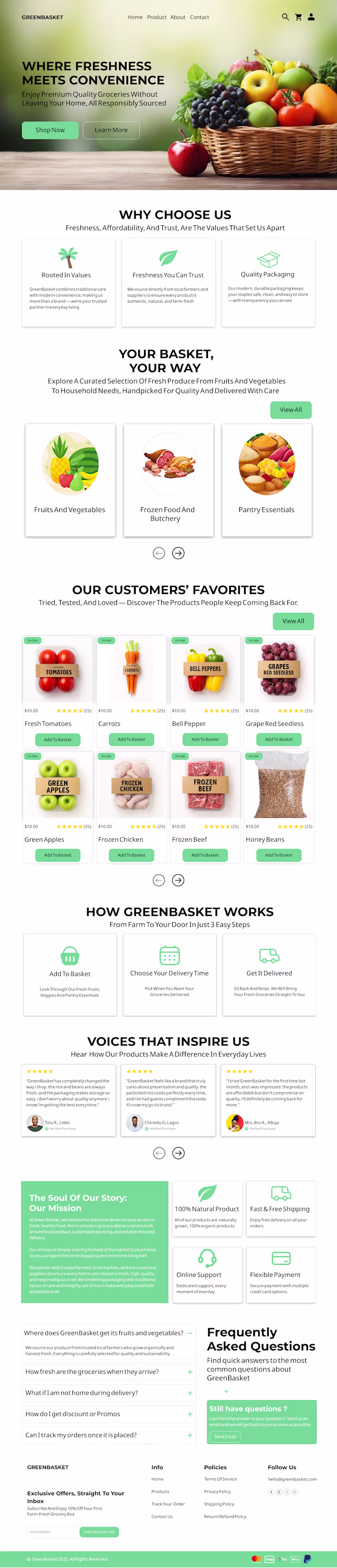
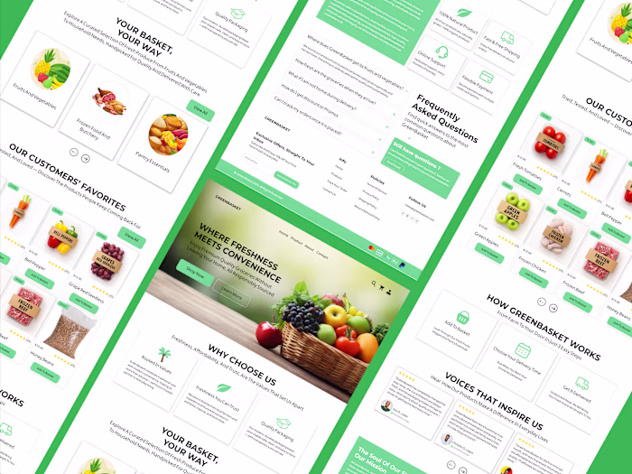
Early on, I thought strong UI came from flashy visuals. Turns out, the real difference is in three basics: colour, layout, and typography.
Colour guides attention and sets the tone. Good contrast builds clarity and trust. Bad colour choices create instant confusion.
Layout is how a screen breathes. Spacing and hierarchy help people know where to look without thinking. When layout is off, everything feels harder.
Typography shapes both readability and personality. The right type makes an interface feel calm and confident. The wrong one quietly hurts the experience.
Master these three, and even simple designs feel polished.
Which one do you find hardest to get right?
Like this project
Posted Jan 28, 2026
Early on, I thought strong UI came from flashy visuals. Turns out, the real difference is in three basics: colour, layout, and typography. Colour guides atte...
Likes
0
Views
0