
Daniel Igbokwe
Product Designer helping start-ups build intuitive products.
Profile in progress
Daniel is building their profile!
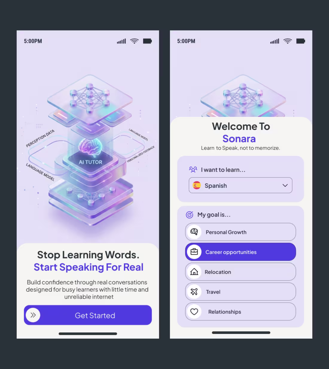
A few weeks ago, a client reached out to me right here on LinkedIn with a clear but challenging brief: build an onboarding experience for Sonara, an AI-driven language learning platform that cuts through the noise of traditional memorization.
The goal wasn't just to make it look "premium." The goal was to solve for intent.
In language learning, the biggest drop-off happens in the first 60 seconds. If the user feels like they are just filling out another form, you’ve lost them. I approached the Sonara design with three specific psychological levers:
1. Visualizing the Complex 🧠
The hero illustration isn't just decoration. It’s a literal map of the "AI Tutor" engine—showing how perception data, language models, and personalized feedback stack up. By making the tech tangible, we build immediate authority before the user even types their name.
2. The "Intent-First" UX 🎯
Instead of a generic signup, I designed the "My goal is..." selector. By forcing the user to identify their "Why"—whether it’s career opportunities or relocation—we create a micro-commitment. When a user tells the app their goal, they are more likely to stick with the habit.
3. Reducing Cognitive Friction ⚡
Notice the "Get Started" anchor. It uses a high-contrast purple pill against a soft cream background. This creates a clear physical focal point on mobile. If a user has to think about where to click next, the design has failed.
Whether I am designing for Healthcare or EdTech, my philosophy remains the same: Design for the user’s emotional state.
In Healthcare, we design for Certainty.
In EdTech, we design for Momentum.
To the founders and product leads in my network: When you’re building your onboarding flow, are you focusing on collecting data, or are you focusing on building excitement?
Let’s talk in the comments! 👇
hashtag#UIUX (https://www.linkedin.com/search/results/all/?keywords=%23uiux&origin=HASH_TAG_FROM_FEED) hashtag#ProductDesign (https://www.linkedin.com/search/results/all/?keywords=%23productdesign&origin=HASH_TAG_FROM_FEED) hashtag#EdTech (https://www.linkedin.com/search/results/all/?keywords=%23edtech&origin=HASH_TAG_FROM_FEED) hashtag#AILearning (https://www.linkedin.com/search/results/all/?keywords=%23ailearning&origin=HASH_TAG_FROM_FEED) hashtag#Figma (https://www.linkedin.com/search/results/all/?keywords=%23figma&origin=HASH_TAG_FROM_FEED) hashtag#UserOnboarding (https://www.linkedin.com/search/results/all/?keywords=%23useronboarding&origin=HASH_TAG_FROM_FEED) hashtag#DesignStrategy (https://www.linkedin.com/search/results/all/?keywords=%23designstrategy&origin=HASH_TAG_FROM_FEED)
1
12
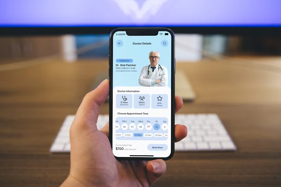
In Healthcare, a "Book Now" button is a Trust Fall. 🏥
We spend weeks perfecting onboarding, but the real UI challenge happens at the "Utility Gap", the exact moment a user stops browsing and starts executing.
When a patient is looking at this screen, they aren't just "shopping." They are seeking reassurance. I built this Doctor Details interface to answer three silent questions before the user even clicks:
1. Can I trust this person?
We lead with credentials (MBBS, DNB) and professional "social proof" (12 Years Experience, 3000+ Patients). In MedTech, seeing a face and a track record reduces the "clinical coldness" of a digital app.
2. Is this the right fit?
The hierarchy is intentional. Specialty (Pediatrician) and rating (4.9+) are placed in the primary eye-scan path. We validate the doctor’s expertise before the user even looks at the price.
3. Is this a headache to schedule?
The "Choose Appointment Time" isn't a hidden menu; it’s a horizontal scroller that shows immediate availability. Friction is the enemy of care. If it takes more than two taps to see a slot, you’ve lost the user.
The Design Philosophy: Great UX isn’t about keeping a user in your app; it’s about getting them to their destination as fast as possible. In healthcare, clarity equals comfort.
To my design network: When you're building for high-stakes industries (Health, Finance, Legal), do you prioritize a "warm" approachable aesthetic or an authoritative "professional" look?
Let’s debate in the comments! 👇
1
12
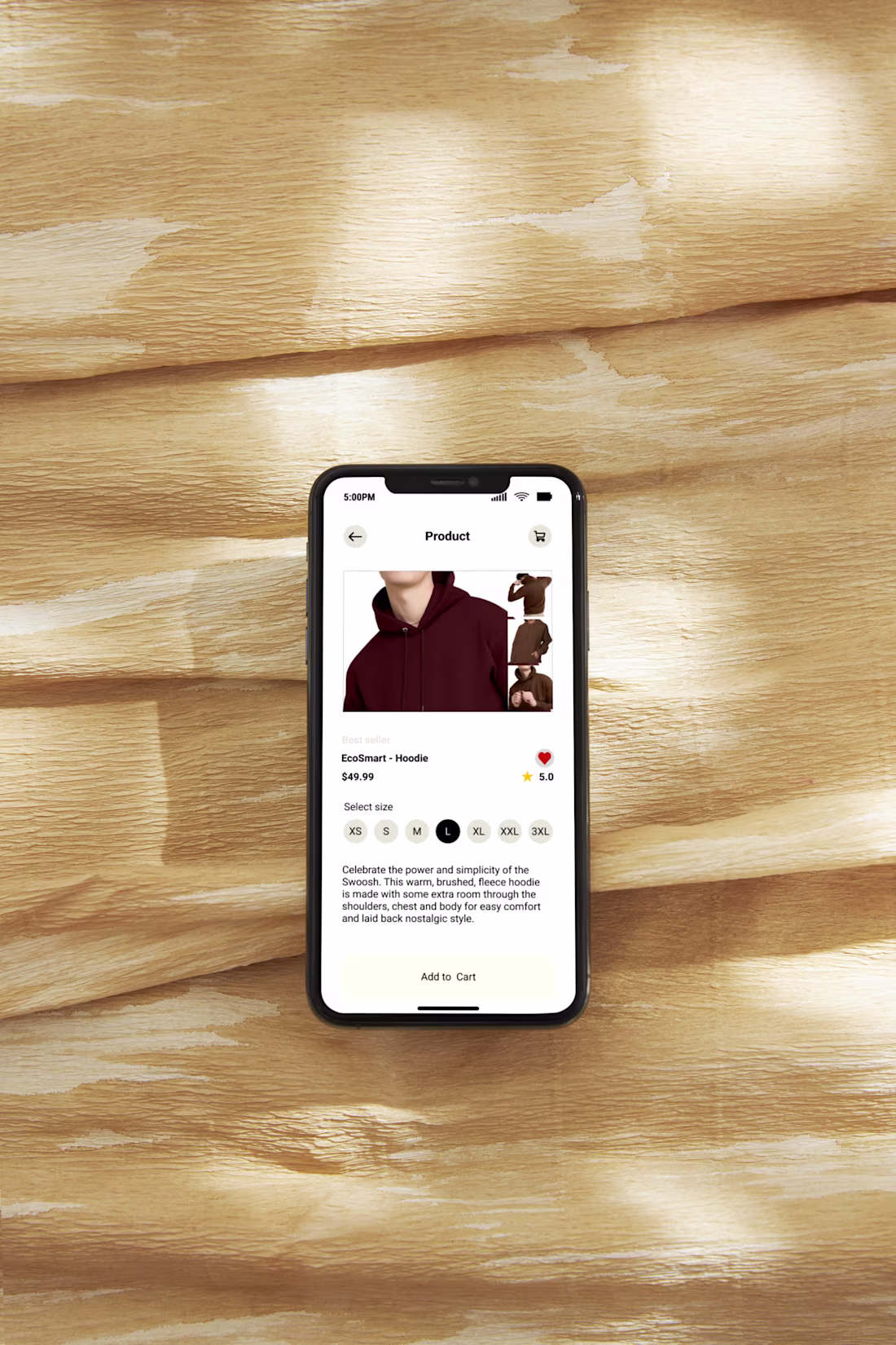
The Hidden Language of "Add to Cart" 🛒
In e-commerce, micro-interactions are where the sale is won. Looking at my latest hoodie detail page, the design is a silent conversation with the user:
No Selection Anxiety: The size selector uses high-contrast black for active choices. It’s a tiny detail that eliminates guesswork.
The Thumb Zone: The "Add to Cart" button is a high-contrast pill anchored at the bottom. If a user has to stretch to buy, they won't.
Instant Validation: Placing the 5.0-star rating next to the price pairs "cost" with "trust" in one scan.
The Goal: If you make the user think, you’ve lost them. If they feel confident, you’ve won.
Question: Do you prefer "sticky" buttons that follow the scroll, or are they too intrusive? 👇
#ProductDesign #UXDesign #Ecommerce #MobileUX
0
6
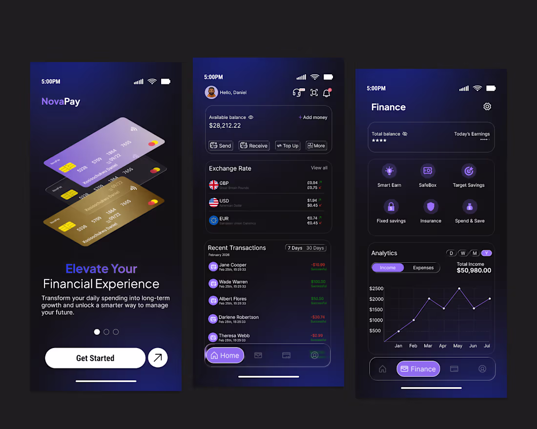
Fintech design is not about looking premium. It is about making money feel clear and controlled.
For this mobile finance concept, the goal was reducing cognitive load while presenting complex data like balances, exchange rates, transactions, and analytics.
I focused on three things:
Clear hierarchy so key numbers stand out instantly
Action-first layout with send, receive, and top up easily accessible
A calm dark UI with intentional accents to guide attention
Finance products carry emotional weight. Good design builds trust through clarity, structure, and predictability, not decoration.
0
14
The difference between a beginner and an experienced designer shows up when a product has problems.
Beginners often improve how a screen looks.
Experienced designers identify why users are struggling in the first place.
Common product issues I help solve:
Users do not know the next step
Interfaces feel crowded and overwhelming
Key actions are hard to reach on mobile
Flows create friction that hurts conversion
Experienced level design is about structure, hierarchy, and decision making. It is about designing systems that guide users clearly, not just creating attractive layouts.
I focus on turning complex product challenges into simple, intuitive experiences that work in real world conditions.
If your product feels harder to use than it should, let’s fix the friction, not just the visuals.
0
14
Early on, I thought strong UI came from flashy visuals. Turns out, the real difference is in three basics: colour, layout, and typography.
Colour guides attention and sets the tone. Good contrast builds clarity and trust. Bad colour choices create instant confusion.
Layout is how a screen breathes. Spacing and hierarchy help people know where to look without thinking. When layout is off, everything feels harder.
Typography shapes both readability and personality. The right type makes an interface feel calm and confident. The wrong one quietly hurts the experience.
Master these three, and even simple designs feel polished.
Which one do you find hardest to get right?
0
13
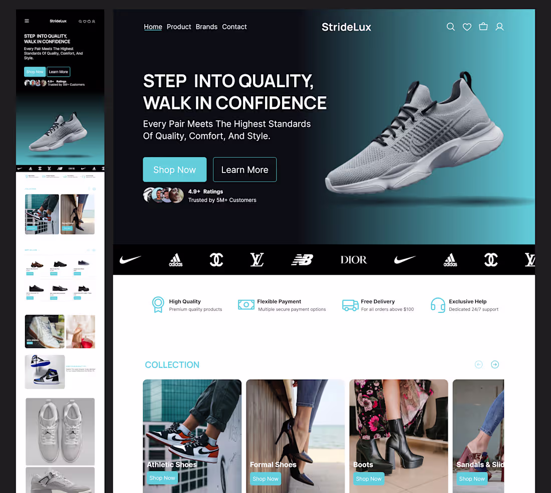
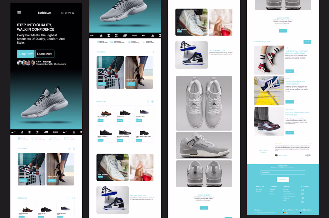
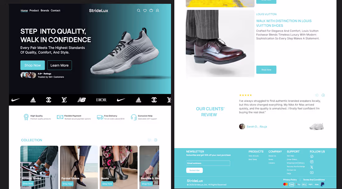
I tried to buy a pair of sneakers last week. The website looked great on desktop, but on my phone the experience broke down. Buttons were small, images loaded slowly, and the checkout flow made me pause and think too much. I closed the tab.
Moments like that are why I care deeply about how products feel, not just how they look.
When designing a modern footwear e commerce experience, I focus on confidence. Does the layout make the brand feel trustworthy? Do product images load quickly and clearly on mobile? Can users move from browsing to checkout without questioning their next step?
The same design must work well on desktop for exploration and on mobile for fast decisions. Most users are not at a desk. They are on the move, multitasking, and impatient. This is where conversions quietly succeed or fail.
1
30

GreenBasket Mobile App UX Redesign
0
2
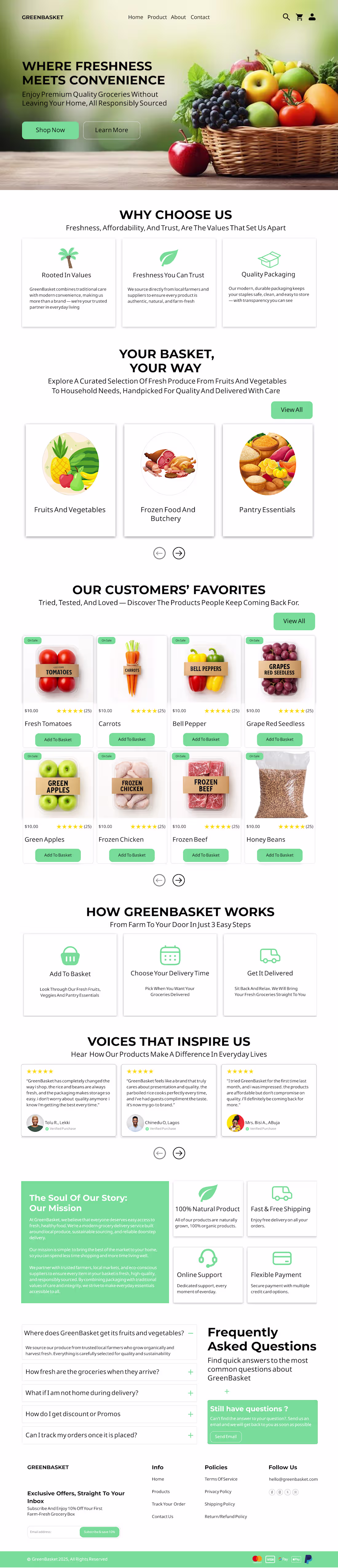
GreenBasket Mobile App UX Design
Role: Product Designer (UX/UI)
Tools: Figma, User Flow Mapping, Wireframing
Project Overview
GreenBasket is a grocery delivery app helping users order fresh produce quickly. The project aimed to improve usability, reduce onboarding friction, and create a cleaner, more intuitive shopping experience. Users struggled with navigation, product discovery, and onboarding, leading to confusion. I led the end-to-end design process, including user flow restructuring, wireframing, and high-fidelity UI design. I analyzed existing apps, defined user journeys, tested layouts with low-fidelity wireframes, and created accessible high-fidelity screens. The designed onboarding, simplified navigation, and clear CTAs improved usability, reduced cognitive load, and delivered a scalable, smooth shopping experience.
0
13
Designing this GreenBasket landing page reminded me how much trust is built before a user ever clicks “Buy”.
Every section had a clear job to do. The hero needed to communicate freshness and convenience instantly.
The testimonials needed to feel credible, not decorative.
The product categories needed to reduce choice overload, not add to it.
What guided most of my decisions was a simple question:
Would a first time visitor feel confident shopping here within a few seconds?
From hierarchy and spacing to tone of copy and visual balance, everything was shaped around clarity and reassurance. Not just how the page looks, but how it makes the user feel.
I'm intentional about designing experiences that feel calm, trustworthy and easy to navigate.
Always open to conversations with teams building thoughtful, user centred products.
1
25