Kanaira: Brand Identity for a Jewelry Brand

Avikshith Rao


Kanaira's brand identity.
Kanaira
Kanaira makes contemporary luxury jewelry with a focus on Indian craftsmanship. We worked on its brand identity and digital product design, aiming for a modern look that kept a connection to its ceremonial heritage.
The identity
We paired a symbol inspired by the Kaner flower with the Kanaira wordmark. The identity needed to work across collections, packaging and digital screens, so we kept the forms simple and the styling restrained.
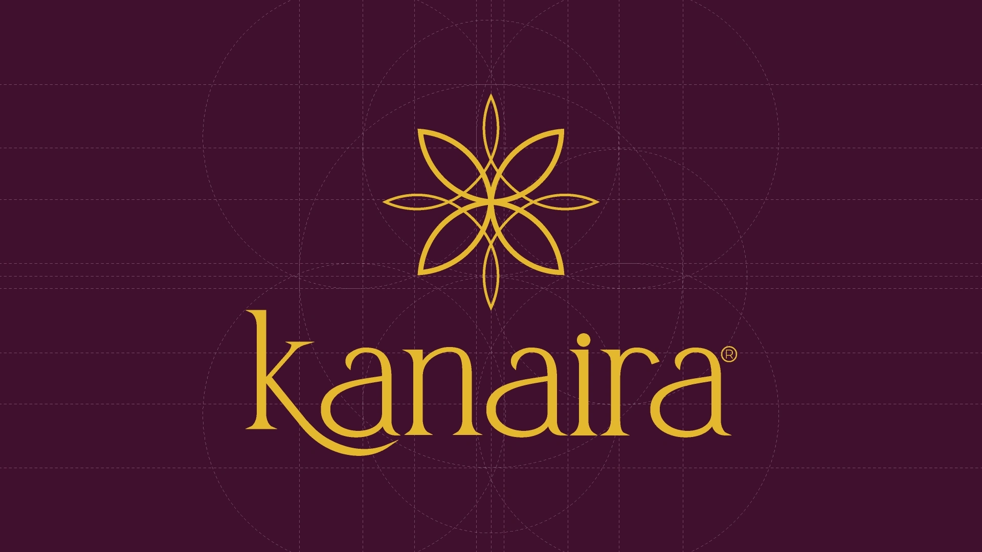
The Kaner-inspired symbol with the Kanaira wordmark.
The flower behind the mark
The Kaner flower gave us a way to connect the symbol to the brand's Indian roots. We simplified it into a form that could sit beside the wordmark or be used on its own.
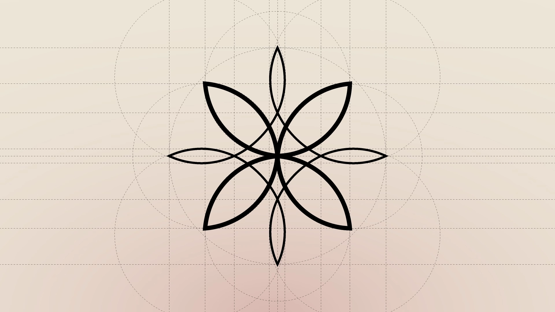
The Kaner flower as the starting point for the symbol.
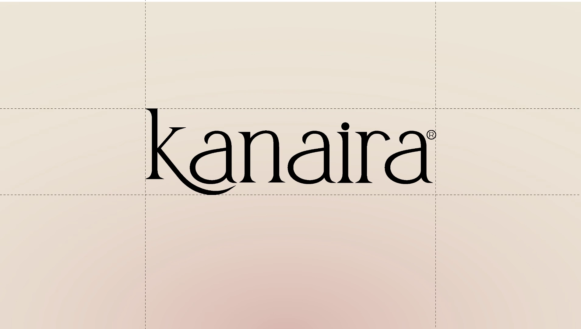
Details of the Kanaira identity.
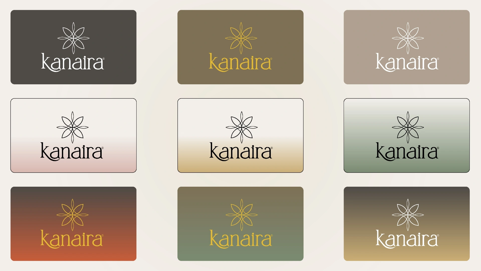
The logo variations show how the same mark works on different backgrounds. Keeping the symbol and wordmark consistent lets the colours change without making each application feel like a separate brand.
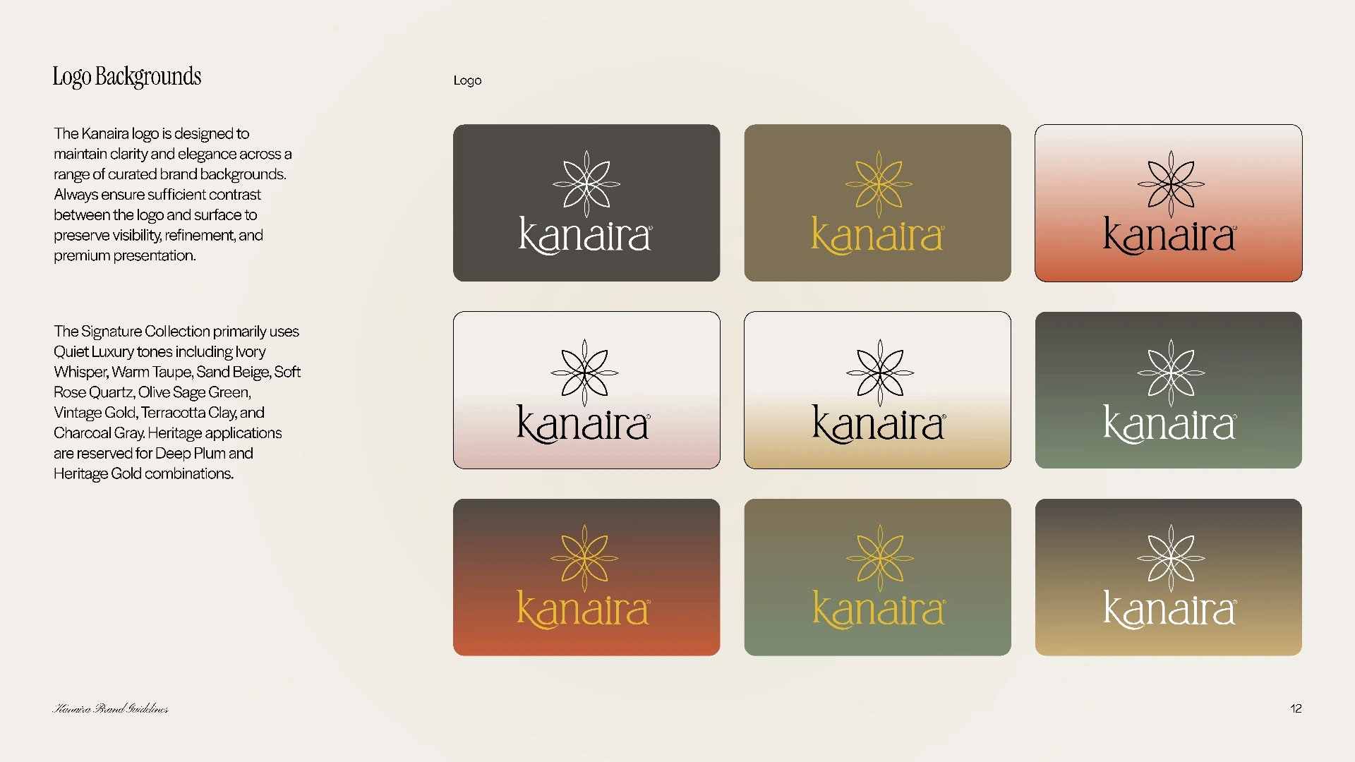
Variations of the identity for different uses.
Signature and Heritage
Kanaira has two collections, and they needed different moods within the same brand. Signature is the everyday expression, with warm neutrals and softer accent colours. Heritage uses Deep Plum and Vintage Gold for premium pieces and more ceremonial occasions.
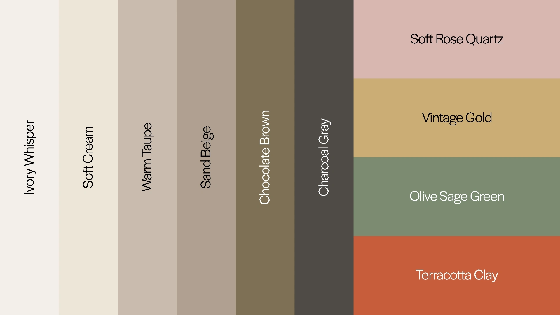
Warm neutrals and accent colours for Signature, the everyday collection.
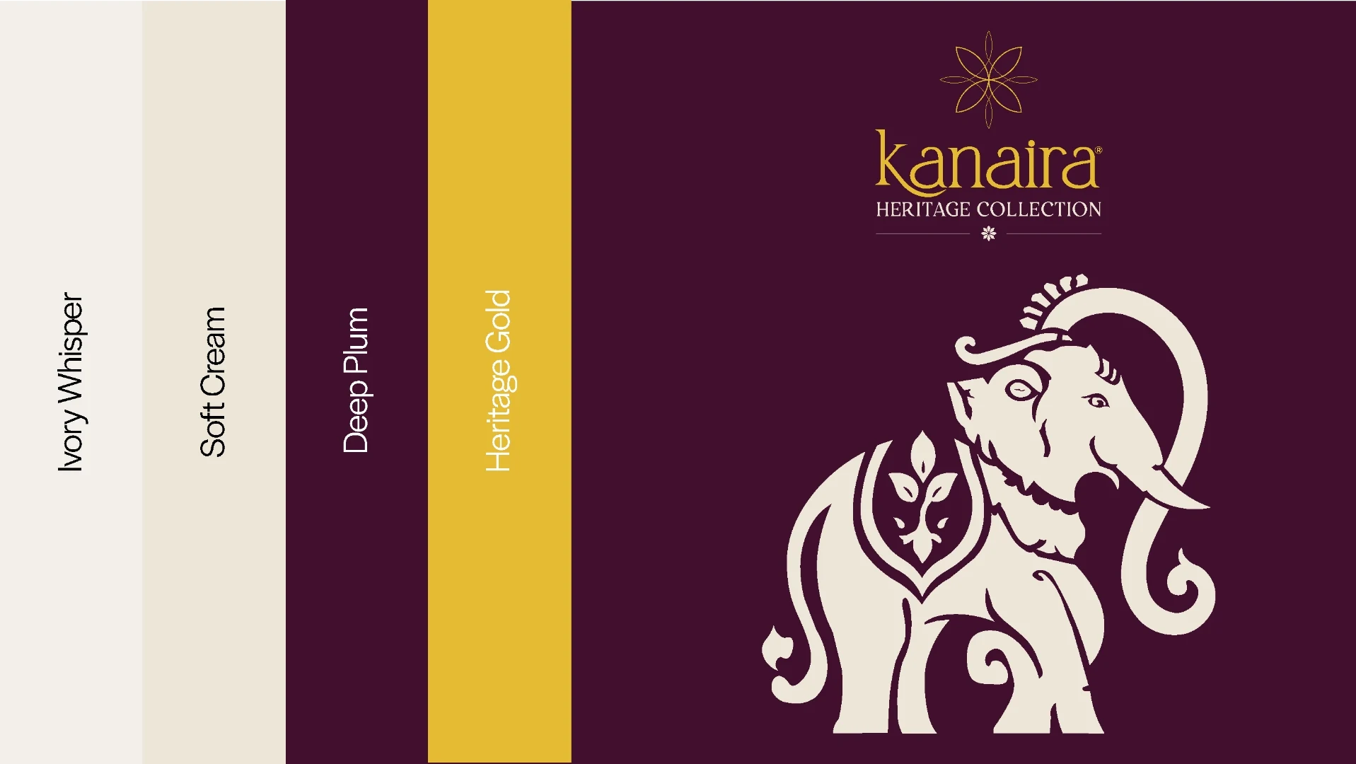
Deep Plum and Vintage Gold for Heritage, the premium and flagship collection.
A motif for Heritage
For Heritage, we also introduced an elephant motif drawn from Indian craft traditions and its associations with prosperity and wisdom. It gives the premium collection a pattern to use alongside the logo on packaging and other brand materials.
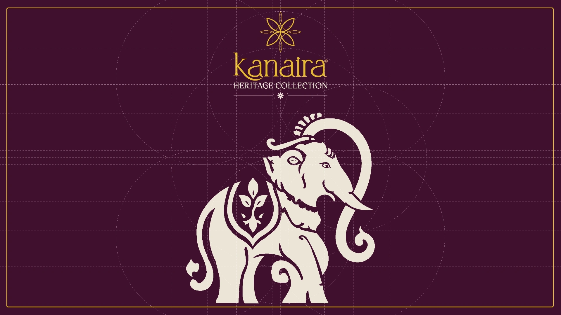
The elephant motif draws on Indian craft traditions, where it represents prosperity, wisdom and heritage.
Type, colour and digital use
We set rules for typography, hierarchy and spacing so the identity would hold together in print and on screen. The type needed to suit the jewelry while staying easy to read in smaller digital layouts. The two collection palettes give the team different colour combinations to work with.
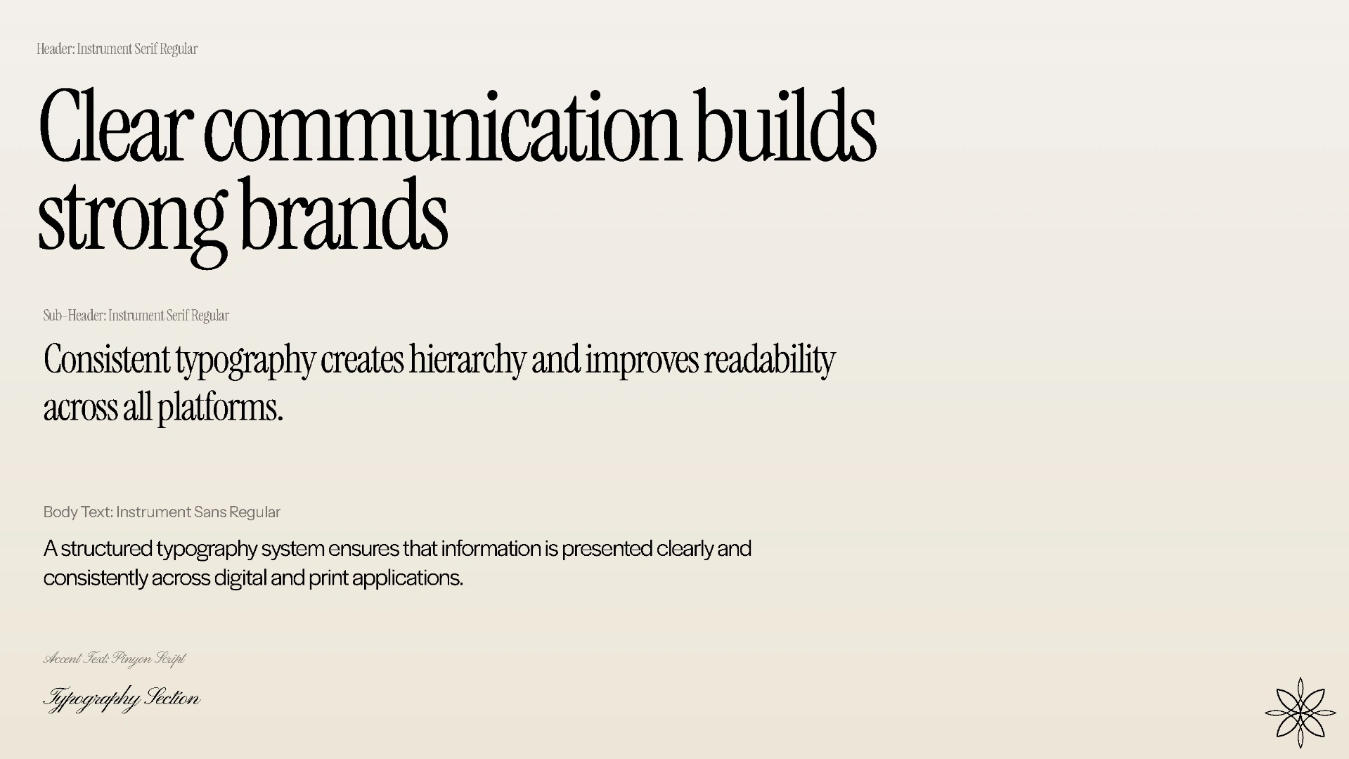
Typography and spacing rules for readable, consistent text in print and on screen.
The colour palettes for Signature and Heritage.
On digital screens, we carried through the same symbol, type and colours. The app example shows how the identity can stay recognisable in a smaller space.
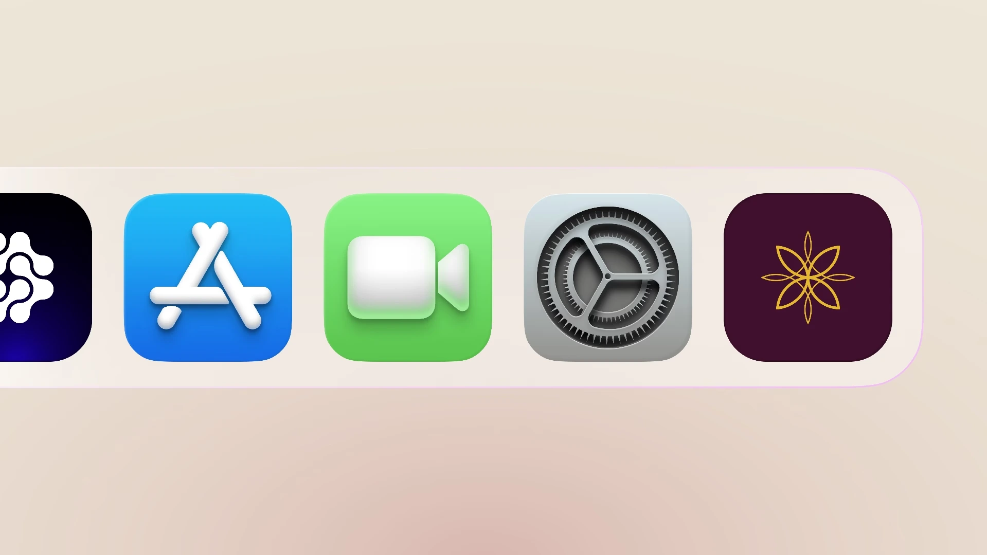
The identity on an app screen.
The identity in use
The applications below show the identity on physical pieces and brand materials. The Heritage collection has its own motifs and patterns, while both collections use the same logo system.
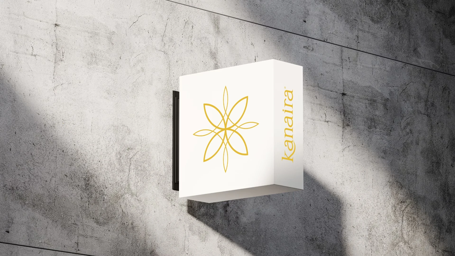
The Kanaira logo on a physical application.
The physical applications use the same elements as the digital work. Heritage's motifs and patterns give its packaging a more ceremonial feel, while the shared logo keeps it connected to the wider Kanaira range.
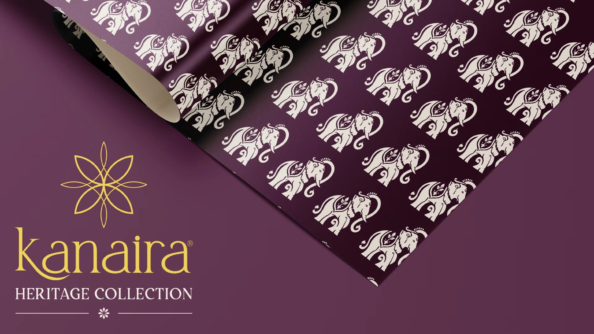
Custom motifs and patterns for the Heritage collection.
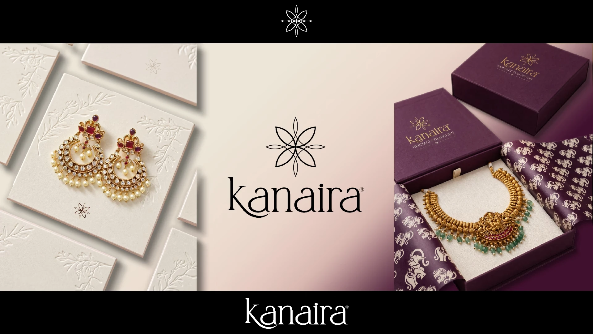
The identity across collections, packaging and brand communication.
Like this project
Posted Nov 6, 2026
We designed Kanaira's jewelry identity around a Kaner-inspired symbol, with separate palettes for its Signature and Heritage collections.